10,000 search results
(0.024 seconds)
- Big Sur by Mysterylab,
$11.00 Big Sur is a six-width slab serif font family with a unique look. At first glance, it is clearly in the tradition of old west style alphabets, with its chunky top and bottom strokes and serifs. But it also features a whimsical vibe in the curvy and pointed flourishes, the wavy baseline, and the swash terminals on many of the glyphs. It's a true standout with unique identifiers, and is bound to grab the eye as something new and different; yet it's traditional enough to establish a solid Western or vintage Americana style. Great for rodeo, county or state fairs, saloons, pubs & taverns, cowboy gear, and even vintage psychedelic posters.
 - Drustic Dialy by Adam Fathony,
$12.00 Drustic Dialy - Four Combinations Rustic Fonts With a lot exploring the typographic design, content, and style. Most of them are created with the combinations of the typeface. Referring to the outdoor, vintage and old style design there so many great artwork with the textured typeface. So, I in collaborations with my friend choose the styling like this, without needed to add any rough filter effect. The Four Combinations, helps you to create the made a pair of your typography artwork. Comes with the Serif Style, Sans Style, Condensed (also in italic), Script (Original and Halftoned texture) and the last is Catchword for complete the small pieces of artwork.
 - Future Concept by Logofonts,
$10.00 Future Concept is Sans Serif fonts inspired by future design concept great for product logo, technology, game, design, space concept, poster, headline, card logo, web, magazine, packaging, stationery and much more. Easily creates your own logo type with fonts. Future Concept has an Open Type feature to access a large selection of unique alternative letters and many ligatures to make it easier for you to create. Future Concept can be accessed perfectly on design applications such as Adobe Illustrator, Adobe Photoshop, Corel Draw, Affinity Designer but does not rule out the possibility that it can also be accessed using web-based applications such as kittl, canva, artboard studio and others.
 - Kansas Casual by Kyle Wayne Benson,
$10.00 Kansas Casual offers a more upright, gothic, and modern alternative to the conventional sign painter's one stroke. Kansas provides a completely unique take on a overdone classic with proportions and crossbar heights inspired by the more friendly Chicago style. This all-caps set provides six weights so that you can adjust size with weight to maintain that authentic single brush weighted look. The proofing process included projecting, tracing, and then painting the letters out to see how true the small details were to the medium. The set also includes wide language support, opentype fractions, and arrows. You can learn more about its development here.
 - Nauman Neue by The Northern Block,
$39.95 Nauman Neue is a modern humanist sans serif typeface made for the screen. Broad open letter forms are combined with precise geometry to create a functional and legible font that’s ideal for web and on-screen applications. In 2021 Nauman was expanded to sixty styles, including two helpful widths condensed and semi-condensed. Included in the font are 900 characters per style, ten weights and three widths with matching italics. Opentype features consist of seven numerals variations, including inferiors, superiors, fractions, tabular, lining, and old style. It also has alternate lowercase a, e, I, M, small caps, arrows and language support covering Western, South, Central Europe and Vietnamese.
 - Emmeline by Dear Alison,
$19.00 There's something about the endless variations of handwriting, the tactile process of pen, pencil or brush to paper, and the personal and ephemeral quality as a whole. I recently came across some old handwritten letters from when my younger sister was going to college, and as soon as I saw them, a flood of memories came back to me. All just from seeing her handwriting. That's just one thing handwriting can do. I hope you find enjoyment in my sister's handwriting as much as I still do. This font is complete with alternates that will auto-typeset via the ligature feature to give a more handwritten feel.
 - FF Info Correspondence by FontFont,
$72.99 German type designers Erik Spiekermann and Ole Schäfer created this sans FontFont in 1998. The family has 6 weights, ranging from Regular to Bold (including italics) and is ideally suited for advertising and packaging and logo, branding and creative industries. FF Info Correspondence provides advanced typographical support with features such as ligatures, alternate characters, case-sensitive forms, fractions, super- and subscript characters, and stylistic alternates. It comes with proportional lining and tabular lining figures. In 1998, FF Info Correspondence received the The Big Crit award. This FontFont is a member of the FF Info super family, which also includes FF Info Display and FF Info Text.
 - Breuer Condensed by TypeTrust,
$30.00 Breuer Condensed is a mechanical sans ideal for captions and headline settings, and may also be suitable for moderate lengths of body copy with its comprehensive offering of OpenType features. The italics are optically adjusted obliques with a selection of augmented lowercase glyphs to provide a warmer read. The overall design ensures a distinct aura of technical precision in a personable tone. This family of eight fonts is designed to accompany the Breuer Text and Breuer Headline sets released in 2007. Breuer Condensed offers a 76% narrower footprint compared to Breuer Text and is fine-tuned to render typographic color equivalent to each sibling Text weight.
 - Polynesiac by Poole,
$22.50Polynesiac was discovered deep in the jungle on a cave wall on Gilligan's Island. "I was looking for ancient pictographs, and I find this crap instead!" says designer Wesley Poole. "But, the more I looked at it, the more I appreciated its charms." Sort of tropical, but not strictly Polynesian, this sans serif face never stoops to caricature, and achieves instead, a mysterious new flavor of the South Pacific Islands. Fun as it is, there's a certain dignity to it. "Living in Hawaii you just absorb this stuff. This is a fun loving culture. I hope I captured that, along with some Island Aloha." - Fun Signs JNL by Jeff Levine,
$29.00 Fun Signs JNL comprises twenty-six humorous signs from a 1930s-era sales list of products manufactured by the Koehler Sign Company of St. Louis, Missouri. Koehler manufactured a large line of stock cardboard "Blue Signs" (presumably blue backgrounds with white lettering) and alongside the many standard phrases used by various businesses was a list of funny sayings. Such placards were bought by merchants to either evoke interest in their services (such as in a bar or restaurant, or jokingly comment on their business policies (as in credit billing). These novelty signs are a fun addition to a flier, ad, web page or announcement and will leave your readers smiling.
 - Metronic Pro by Mostardesign,
$25.00 Created by Olivier Gourvat in early 2013, Metronic Pro is a sans-serif typeface with a technological and minimalist look for text and headlines. It has six versatile weights from Air to Black with an alternative glyph set to improve its use in different graphic contexts. Metronic Pro has a wide range of OpenType features such as: old style and proportional figures, ligatures, case sensitive forms, fractions, stylistic alternates, arrows and an icons/ornaments set. This set of 60 icons, directly inspired from the typeface improves the OpenType features and can be quickly and easily use in your web design, GUI design, graphic design or any other graphic work.
 - Corporate E WGL by URW Type Foundry,
$210.99 The Corporate ASE typeface trilogy was designed by Prof. Kurt Weidemann, a well-known German designer and typographer, from 1985 until 1990. This superb trilogy consisting of the Corporate Antiqua, Corporte Sans Serif, and Corporate Egyptian is a design program of classical quality, perfectly in tune with each other. Weidemann says: My ASE trilogy, quite like triplets, is in perfect harmony and covers all needs of modern typography! Initially exclusively designed for DaimlerChrysler as a corporate font, the ASE trilogy may be now licensed and used without restriction. URW++ digitized the ASE for DaimlerChrysler and Prof. Weidemann and is the exclusive licencing agent for this outstanding and extremely popular typeface program.
 - Mode by Daggertypo,
$24.00 Mode is a typographic experiment exploring how same sans serif form adapts to different circumstances and what are the possibilities in variations of Thin / Black, Contrast / Negative contrast. Two main groups are Mode 0 (with rounded shapes) and Mode 1 (with angular shapes). Each of them varies from Thin to Black in six cuts, in the same manner it varies from contrast shapes to negative contrast. Mode comes in total of 72 cuts regular and italic, it speaks majority of Latin based languages and is equipped with smcp, c2sc, Old style and all caps numerals. Mode is made by DAGGERtypo during a period of 2019/2020
 - Corporate A by URW Type Foundry,
$180.99 The Corporate ASE typeface trilogy was designed by Prof. Kurt Weidemann, a well-known German designer and typographer, from 1985 until 1990. This superb trilogy consisting of the Corporate Antiqua, Corporte Sans Serif, and Corporate Egyptian is a design program of classical quality, perfectly in tune with each other. Weidemann says: My ASE trilogy, quite like triplets, is in perfect harmony and covers all needs of modern typography! Initially exclusively designed for DaimlerChrysler as a corporate font, the ASE trilogy may be now licensed and used without restriction. URW++ digitized the ASE for DaimlerChrysler and Prof. Weidemann and is the exclusive licencing agent for this outstanding and extremely popular typeface program.
 - MTT Roma by MTT Type Firm,
$39.99 MTT Roma is designed to re-create the atmosphere of the city of Rome of the 21st century. The studio for the letterform evolved from the Trajan Column alphabet. Suitable for both display and body-text usage, stylistically MTT Roma aims to distance itself from the proliferation of geometric sans-serif families of its time. The result is a sharp, subtly humanist typeface inspired by modern day Rome, the city of contrasts and eternal beauty. Featuring an extended character set to support Central and Eastern European as well as Western European languages, the typeface comes with six weights – from thin to black — with matching italics.
 - Corporate E by URW Type Foundry,
$179.99 The Corporate ASE typeface trilogy was designed by Prof. Kurt Weidemann, a well-known German designer and typographer, from 1985 until 1990. This superb trilogy consisting of the Corporate Antiqua, Corporte Sans Serif, and Corporate Egyptian is a design program of classical quality, perfectly in tune with each other. Weidemann says: My ASE trilogy, quite like triplets, is in perfect harmony and covers all needs of modern typography! Initially exclusively designed for DaimlerChrysler as a corporate font, the ASE trilogy may be now licensed and used without restriction. URW++ digitized the ASE for DaimlerChrysler and Prof. Weidemann and is the exclusive licencing agent for this outstanding and extremely popular typeface program.
 - Selektor by Tour De Force,
$25.00 Selektor is a small font family characterized as geometrical sans. Inspired and after that designed with charm of technical letters, it contains a few letters with specific endings that gives Selektor a peculiar impression. Global overview of Selektor says it's a neutral, corporate, stable, well balanced font family, but not cold and heartless to leave readers without remembrance on its characteristics. It is fully appliable in all kinds of publications, from long texts in paragraphs to titles and product names. Contain 3 weights - Light, Regular and Bold and matching Italics. All family members include Small Caps and Fractions as well as additional OpenType features.
 - ITC Tempus Serif by ITC,
$29.99ITC Tempus is the work of British designer Phill Grimshaw. He claims that every calligrapher's aspiration is to draw perfect roman capitals with a pen, but admits that this is extremely difficult. For this typeface, Grimshaw used a fountain pen on cheap, porous paper and, of course, the ink bled. The resulting forms are classic but their rugged edges deviate from the perfection of roman type. And Tempus Sans is just Tempus with the serif surgically removed, yet the proportions of the characters work nicely," says Grimshaw. Because of its rough quality, the typeface works best in larger point sizes, yet maintains its characters even in smaller sizes. - Prima Script by Wiescher Design,
$24.00 »Prima Script« was designed especially for use in Menus and Cook-books. One of my sons is a chef in Munich and he was always bugging me to make a new font for his menus. I already designed one for him »Konstantin« but he likes to have new stuff every couple of years what I understood. So here is the new »Prima Script« (that’s what he said when he first saw the font). To give it more usability I made alternate initials and end letters as well as medieval cyphers. Then I did a couple of swashes and a handdrawn Sans font to complete the set. Have fun!
 - Fransk Nougat by Bogstav,
$18.00 Let me tell you a secret: This font has got absolutely nothing to do with nougat or France. I just love nougat, and I actually ate some while finishing this font! My wife is a good at making cakes, and lucky for me is that she too adores nougat - that way I often get delicious cakes with nougat :) Well, back to the font - a handmade rounded sans-serif, comic, organic, all-purpose with a playful attitude. Goes very well in both UPPERCASE and lowercase. I'd say you can use this for pretty much anything, but categories such as organic, packaging, kids product or sweets come in mind!
 - Kandin by Hashtag Type,
$32.00 Kandin is a modern geometric sans inspired by Scandinavian interiors. With a cool and collected feel and low-key luxury, Kandin has a crisp and uncluttered feel providing legibility with strong doses of aesthetic pleasure. Being one of the most static and clinical of all classifications, Kandin successfully brings its playfulness in a subtle manner, keeping its minimalist, restrained, supremely peaceful feel. Although Kandin has geometric proportions, it has been carefully adjusted by eye for a simple pleasing look. It is suitable for a wide range of applications where a clear yet wonderful impression is required. Details include six weights, 470 characters, manually edited kerning, ligatures and case-sensitive punctuation.
 - Scene by Monotype,
$29.99 Work on Scene began some time after designer Sebastian Lester joined Monotype Imaging in 2000. Clean, calm, and highly legible — thus the design brief Lester set for himself. With Scene, he wanted to provide graphic designers and creative directors with a suite of fonts that would serve as a strong foundation for identity projects, incorporating what he had learned about on-screen and print legibility. Scene was developed during two years of after-hours and weekend work. The family comes in six weights with matching italics, there is a set of “semi-sans” characters to introduce more expressive word rhythms into headlines and blocks of copy.
 - FF Kievit Slab by FontFont,
$65.99FF Kievit Slab is an industrial strength, do anything, go anywhere, kind of design. Its exceptional legibility and straightforward strength contrasts with a friendly humanistic underpinning. Michael Abbink and Paul van der Laan carefully revised character shapes and stroke contrast of FF Kievit, when they adapted them to FF Kievit Slab. The result is that the striking and powerful FF Kievit Slab easily complements the other members of the FF Kievit super family, that also includes FF Kievit and FF Kievit Serif, and stands on its own in as a multi-talented design. Though created from the sans, FF Kievit Slab is not FF Kievit with slabs serifs tacked on. The family is the fruit of a four-year collaboration between Abbink and Van der Laan, to make the perfect companion to the FF Kievit family. Each glyph was painstakingly adjusted and to achieve proper density, contrast, and balance, while remaining a perfect companion to its sans serif and oldstyle cousins. Its nine weights and italics also harmonize perfectly with the original FF Kievit design. Each of the FF Kievit styles is a typographical all-rounder that is equally at home in headlines as it is in text copy. Together, the three designs of the FF Kievit super family span a wide and deep typographic universe in which they support one another perfectly. These fonts will help you achieve your typographic goals, no matter how lofty. Featured in: Best Fonts for Websites - Mi Negra by Letritas,
$25.00 Mi negra is a funny and hilarious typography designed especially for children, thought and created by Isabel de Gregorio. It could be described as an original combination between a semi-handwright and semi sans-serif font. Thanks to its structure and nice endings "Mi Negra" is recommended for composing short texts (logotypes, packing, posters, etc.). It may similarly be used for illustrations and comics, as well as in printing press works for children from 6 to 13 years old for instance. Mi Negra has been conceived to be a useful support in all kinds of illustrations works (please note that Isabel, the type designer, considers herself primarily an illustrator). The font designer of Mi Negra tells that every time she needed to provide some text data (i.e. in children infographies) and needed to make them more understandable and suitable for children, she used this typography. The former idea was than to create a font who could be a second option to comic sans, but as the project started to reveal its forms, it was clear that it was revealing another connotation and its own character. In this way, Mi Negra went on modifying its forms and the more it developed, the more it was showing its new characteristics and concepts. The family is composed of three weighs: Light, regular and black. It provides also interesting functional ligatures. It also includes a dingbat with nice doggies. It has 434 characters and can work with 208 languages.
 - KT Nirma by Kotivoro Lab,
$14.00 KT Nirma Sans Nirma is a typeface with 9 Weight Sans Serif from thin to Black, inspired by Founders Grotesk, This project start from April 2022 and start from the stretch until shaped the solid character to represent the Dynamic Sans Serif. Nirma has total 462 glyph and 218 Support language. Nirma support Latin Basic, Latin-1 Supplement, Latin Extended A-B, Spacing Modifier Letters, and Combining Diacritical Marks. The Solid Character has multi function Display Sans & Body text based on Display Grotesk. Especially in te Thin to Regular is more legible for body text and the black one good for Display Sans, with dinamyc shape and more wide.
 - Elido by Kontour Type,
$50.00 Elido (Odile in reverse) is the sans counterpart to the Odile type. Together they form a sans/serif superfamily with a wide range of variations for editorial use. Elido follows Odile’s proportions and matches the weight and typographic color of its serif twin. Elido is a sans with classical proportions. A slight geometric hint and open counters convey an airy feel. Elido’s family structure and relations within echo the conceptual approach of Odile. The arched stroke low off the stem reveals a script characteristic most pronounced in the Elido Upright Italic. This particular interpretation is gradually diminished in the Italic and becomes even less emphasized in the Regular. Six balanced weights, from an elegant Light to a pronounced Black, are in tune with three display solutions and a set of beautiful Ornaments. These variants allow for a diverse and multifaceted typography for the discerning type user. Sans serif initials amount to a rare finding. The charming monolinear Elido Initials come in two flavors, elaborate and rational, designed to hold their own in editorial and headline sizes. This type design boasts an extensive character set, many OpenType features including roman and italic Small Caps, five sets of numerals, beautiful ligatures, and many more. OT stylistic variants (with accents) offer a one-story “a” for the roman weights, alternate “g” and “s” designs for the italics, and a variant glyph “s” for the Upright Italic. These distinct qualities with its versatile and sincere traits make Elido an excellent choice for text and display use.
 - Grenale by insigne,
$24.00 The elegant Grenale brings a new look to the classic didone. This shimmering sans-serif family with its mild deco shades alters the typical serifs and terminals of the classic style to form a gracefully eye-catching, high-contrast font. While high-contrast, sans serif forms tend to disappear in the copy, Grenale's meticulously designed features exhibit proper balance in the spacing and in the thorough improvements of its contours. The rigorous consideration given these details leaves a delicate typeface that doesn't get washed out in certain applications. Its pure, polished, geometric structure has a glamorous sensitivity, drawing heavily from the inspiration of the haute couture influence. Grenale's thin weights are simple but vibrant--elegant forms that naturally lend themselves to high fashion journals, high-end branding, and other five star applications. With added energy and power, the thicker weights with their ink traps and optical compensation intensify the gravitas for a statelier look to the graceful forms. Grenale's upright versions are also matched by optically adjusted italics, intentionally tailored to maintain their counterparts' sharp edge, causing the font's fierce characteristics to shine through the refined face. The typeface also includes a wide variety of alternates that can be accessed in any OpenType-enabled application. The stylish features include a large group of alternates, swashes, and meticulously precise details with teardrop terminals and alternate titling caps to accessorize the font. Also included are capital swash alternates, old style figures, and small caps. Take a look at the informative PDF brochure to see these features in action. OpenType enabled applications such as the Adobe suite or Quark can take full advantage of the automatic replacing ligatures and alternates. This family also offers the glyphs to support a wide range of languages. It's time to think high-class. Graceful and confident, Grenale's carefully crafted features transfer pleasantly to each page with elegant charm. With its variety of alternate glyphs and its high, classy contrast, this five star font is a great option for bringing a more refined look to your work. Production assistance for Grenale provided from Lucas Azevedo and iKern.
 - Device by Hanken Design Co.,
$45.00 Device™ display typeface is inspired by industrial type used for decals and signage. This typeface pairs nicely with geometric sans serifs like Cerebri Sans and HK Grotesk.
 - Cottsmic by Maulana Creative,
$15.00 Cottsmic Sans Serif Font is a contemporary sans serif font. With bold weight, unique and fun character with a bit of ligatures. To give you an extra creative work. Cottsmic Sans Serif support multilingual more than 100+ language. This font is good for logo design, Social media, Movie Titles, Books Titles, a short text even a long text letter and good for your secondary text font with script. Make a stunning work with Cottsmic Sans Serif Font. Cheers, Maulana Creative
 - Inovasi by XdCreative,
$29.00 Inovasi Sans "Inovasi Sans is the youngest brother of Clinto Geometric sans font family by Faldykudo, released a few months ago. Inovasi is constructed based on geometric principles, emphasizing simplicity and modernity. The font comes with comprehensive multilingual support, offering more than 300 languages. Notably, Inovasi Sans features a distinctive characteristic in its lowercase 'a', offering 8 alternate characters. Additionally, each lowercase letter from 'a' to 'z' has stylistic alternates, providing a unique look and feel for a modern and futuristic impression."
 - Modula Round and Ribbed by Emigre,
$49.00 See also Modula.
 - Grafical by Halbfett,
$30.00 Grafical is a contemporary take on 19th-century sans serifs. In this family, the amount of geometry inherent within the letterforms has been amped up. Many shapes have received further streamlining, too. All the geometric forms you see have been optically corrected, ensuring their delivery of better legibility. Grafical ships in two different formats: depending on your preference, you can install the typeface as two Variable Fonts or use the family’s 16 static OpenType font files instead. The static fonts offer eight weights, running from Extralight through Black. Each weight has an upright and an italic font available. While the static-format fonts offer a good intermediary-step selection, users who install the Variable Fonts have vastly greater control over their text’s stroke width. The Grafical Variable and Grafical Variable Italic font’s weight axes allow users to differentiate between almost 1,000 possible font weights. That enables you to fine-tune your text’s exact appearance on-screen or in print. Grafical is the perfect tool for a range of design uses, including text on the web, text in print, and text in motion graphics. Its fonts are typographic workhorses – not just from their legibility perspective but also because of the amount of OpenType features they include. There are ligatures, for instance, as well as proportional and tabular lining and oldstyle figures, fractions, numbers placed inside circles, and even Roman numerals. Users can also substitute alternate versions of the “a”, “g”, “i”, “j”, “y”, “G”, and “Q” into their work.
 - Mellar by Creativemedialab,
$20.00 We are introducing Mellar, a Variable display font. Mellar is an obese font with a simple and bold modern look. It consists of 2 styles: round and square, also three widths on each type: Toppo - Medio - and Botto. Mellar is a variable font, officially known as Open-Type Font Variations. You can generate many styles with the three available slider axes. Mellar will add fresh fun vibes to your designs. This font is perfect for clothing, book covers, titles, etc.
 - Venusian Bold Extended by Wooden Type Fonts,
$15.00 Bold Sans Serif.
 - Venkmann by Fatchair,
$9.95A Sans Serif - Trakya Rounded by Bülent Yüksel,
$19.00 Thrace (/θreɪs/; Greek: Θράκη, Thráki; Bulgarian: Тракия, Trakiya; Turkish: Trakya) is a geographical and historical region in Southeast Europe, now split among Bulgaria, Greece, and Turkey, which is bounded by the Balkan Mountains to the north, the Aegean Sea to the south, and the Black Sea to the east. It comprises southeastern Bulgaria (Northern Thrace), northeastern Greece (Western Thrace), and the European part of Turkey (East Thrace). Trakya Rounded is a modern sans serif with a geometric touch. It has a modern streak which is the result of a harmonization of width and height especially in the lowercase letters to support legibility. Trakya Rounded is softer and rounder than it's sibling Trakya Sans. They're both ideally suited for advertising and packaging, editorial and publishing, logos, branding and creative industries, posters and billboards, small text, way-finding and signage as well as web and screen design. Trakya Rounded provides advanced typographical support for Latin-based languages. An extended character set, supporting Central, Western and Eastern European languages, rounds up the family. The designation “Trakya Rounded 500 Regular” forms the central point. The first figure of the number describes the stroke thickness: 100 Thin to 900 Bold. "Trakya Rounded" comes in 5 weights and italics and has the company of "Trakya Rounded Alt" that also comes in 5 weights and italics for a total of 20 styles. The family contains a set of 630+ characters. Case-Sensitive Forms, Classes and Features, Small Caps from Letter Cases, Fractions, Superior, Inferior, Denominator, Numerator, Old Style Figures are easily accessible in all graphic programs. Trakya Rounded is the perfect font for web use. Enjoy using it.
 - Southmore by Ergibi Studio,
$18.00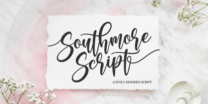 Southmore Script - Lovely Modern Script, Southmore that contain lowercase, uppercase, symbol and also support multi-language in this font. Southmore also comes with Swash and doodle font, is perfect for logos & branding, photography, invitation, watermark, advertisements, product designs, stationery, wedding designs, label ,product packaging, special events or anything that need special taste. or handwritten quote. Also already PUA
 - Cut Cut Cut by Green Type,
$19.00 Cut Cut Cut is a decorative font family. Designed for use in outdoor advertisements, branding, packaging. Cut Cut Cut is also perfect for children's books and cartoon, greeting cards and posters. It is also suitable for use in online activities. Cut Cut Cut contains latin, cyrillic and greek gliphs. There is also a free symbols style.
 - Aurelie Smith by Sarid Ezra,
$13.00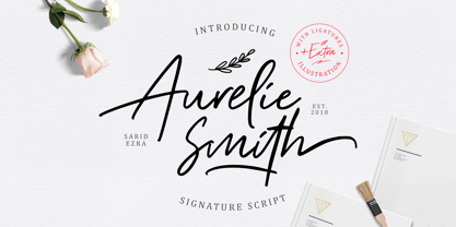 Aurelie Smith is fashion signature that contain lowercase, uppercase, symbol, and also support multi language. There's a lot ligatures in this font. Aurelie Smith also comes with doodle illustration that you can use to make a logo for branding, beautiful fashion design, suitable for wedding invitation, or handwritten quote. Also already PUA Encoded. Foreign Languages Support: ÀÁÂÃÄÅÇÈÉÊËÌÍÎÏÐÑÒÓÔÕÖØÙÚÛÜÝßàáâãäåæçèéêëìíîïðñòóôõöøùúûüýÿ
 - Directa Serif Variable by Outras Fontes,
$170.00 Directa Serif Variable is a text type family in one single font file. It explores new possibilities for the original type family released by Outras Fontes some years earlier, which is designed to save space with the highest readability. The variable font is composed of two axes of variation: Weight (100–900) and Italic (0–1). It also contains 18 predefined styles between Thin and Heavy and their respective italics. So now you can adjust the weight of the type by interpolating it in real time using any variable font compatible app. There are hundreds of possibilities between the values of 100 (Thin) and 900 (Heavy). And if you're feeling adventurous, you can also use the Italic axis to interpolate instances between Roman (0) and Italic (1) and see what happens in the middle. This new technology can be very useful for web and video animations. Directa Serif Variable is also highly recommended for newspapers, magazines, corporate communication and so on. It has a large set of characters, including Western, Central European, Baltic, Scandinavian, Icelandic, Romanian and Turkish unicode ranges. The variable font also includes several ligatures, a complete set of small caps, sets of lining, old style and tabular figures, as well as fractions, superior and inferior numbers. These features can be easily accessed using any OpenType-compatible software.