10,000 search results
(0.02 seconds)
- Quickline Slab by Jonahfonts,
$35.00 Quickline-SLAB OpenType font family in four weights supporting Central-European languages, containing ligatures, fractions and an abundance of alternates for upper and lower case glyphs. Quickline-SLAB also comes in a matching Quickline ”SANS” version containing four weights as well. Quickline-Slab works well as a text and display font.
 - Black Orchard by ErlosDesign,
$19.00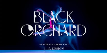 Black Orchard is a sans serif font with modern style. It includes uppercase letters, numeral, a large range of punctuation and also multilingual support. Perfects for poster, web design, magazine cover, album cover , branding and many more. The file you will get is: • Works on PC & Mac • Simple installation Enjoy!
 - Calasans by Letterhend,
$13.00 Calasans is a sans serif font with 7 layered style. You can create a 3D look without using any add-ons, only with fonts! This font is suitable for a vintage poster, 3d type, or retro. Including numbers and punctuations, also support multi-language. Create your own 3D type now!
 - Serba by Sealoung,
$15.00 Serba is a fun, unique look serif display. With a modern look, it looks perfect when paired with a conventional serif/sans serif. It can be used for mastheads, posters, business identity and just about anything else. The all-inclusive also includes the complete set: All caps Multilingual character Number Punctuation
 - Yorka by Huruforia,
$5.00 Yorka is a mecha style display sans serif font, this font only consists of Uppercase Letters & multilingual support. Yorka is perfect for Logotype, Print Design, Label, Product, and more. OTF format fonts are also easy to install and support for Mac or Windows. Hopefully, our work is useful for you.
 - Ladies Wear JNL by Jeff Levine,
$29.00 Aside from his 1920s and 1960 editions of Sam Welo’s “Studio Handbook – Letter and Design for Artists and Advertisers”, Welo also published “Lettering - Practical and Foreign” in 1930. A monoline Art Deco Alphabet from that book is now available digitally as Ladies Wear JNL in both regular and oblique versions.
 - Minomu by Owl king project,
$37.00 Minomu consists of twenty sans serif font families, With a thicker weight, Minomu can be applied as an attractive and bold appearance for title letters, not only that, but Minomu's family with lowercase letters can also be used in designs with use as body text, to create more detailed descriptions.
 - KyivType Variable by Dmitry Rastvortsev,
$- KyivType superfamily, consisting of three subfamilies: Sans, Serif and Titling. Fonts have variability in weight and contrast. There are also alternates. Initiated by Projector, Dmytro Bulanov Creative Büro, and Banda Agency for Kyiv city (Ukraine) identification and promotion. Freeware. Fonts are free for commercial and non-commercial use. More at Behance
 - Blattwerk by Volcano Type,
$39.00 The shapes of "Blattwerk" (german for leafage) are based on an abstract leaf. The geometrical sans serif font has several standard and decorative ligatures and will work best as a display typeface for logos, headlines and short texts. The individual letters can also be used to form symbols or patterns.
 - Blont by 160 Std,
$22.00 Blont is a simple, minimal and techno looking sans serif font. Add it confidently to your favorite creations and let yourself be amazed by the outcome generated. Perfect for logos. and also suaitable for headlines, titles and posters. comes with alternates to make unique, you can choose the best for you.
 - Ahimsa by Satori TF,
$12.00 Ahimsa is a dynamic humanist sans serif family. It comes in 6 weights with matching italics. It contains a lot of contrast in the connection to the stems in order to give it a more dynamic feel, and also has low descenders and a large x-height and great legibility.
 - Texicali by FontMesa,
$25.00 Texicali is a multiple weight type design based on our FontMesa logo. The idea was simple: create a sans serif with a few slab serifs added resulting in a style that could feel at home just about anywhere. The regular/standard set works well for general use while the Alt set is perfect for when you want to add a little country charm. The Alt set has a few additional alternate letters built in which are easily accessed using Adobe Creative Suite products such as Illustrator and In Design. The X version, with its higher x-height lowercase, is ideal for signage where you want the look of a lowercase, however your sign still needs to be readable from the street. Larger x-heights also come in handy for web use helping to make the text more readable on smaller devices. The price of font styles are subject to change without notice.
 - Yassitf by Ingrimayne Type,
$6.00 Yet another san serif typeface, Yassitf is a generic sans, a font meant to blend in rather than stand out. It has little contrast and is almost monoline. It includes three widths: condensed, narrow, and regular. The widths have four to six weights: ultra thin, thin, light, plain, bold, and extra bold. Further, each width and weight combination has both upright and italics styles. The thirty fonts in the family contain several open-type features, including both proportional and tabular (monospaced) numbers.
 - Pastry Shop JNL by Jeff Levine,
$29.00 In the 1960 edition of Sam Welo’s “Studio Handbook – Letter and Design for Artists and Advertisers” you’ll find a bold, hand lettered Art Deco sans serif typeface designed by Welo with a decidedly 1930s-1940s look. This is now available as Pastry Shop JNL, in both regular and oblique versions.
 - Oksana Greek by AndrijType,
$25.00 Oksana Greek has only basic Latin and monotonic Greek characters from multilingual Oksana. It has six weights with real italics, and Alt faces with Old Style figures, ampersand, alternative characters -a-g-k-y- and Greek -Ε-Ξ-β-ε-θ-φ-.
 - Oksana Cyrillic by AndrijType,
$25.00 Oksana Cyrillic has only basic Latin and european Cyrillic characters from multilingual Oksana. It has six weights with real italics, and Alt faces with Old Style figures, ampersand, alternative characters -a-g-k-y- and Cyrillic -а-в-д-з-у-ў-.
 - Comic Mode by 38-lineart,
$24.00 Comic Mode is a warm, fun and comical sans serif family, "its an alternative for comic sans, with a more formal looks". Availavle of 9 weights from thin to black. with a curved character that is round on thin and increasingly elliptical on black. The unique look of comic Mode is the combination of a technical sans serif and casual handwriting . These 9 diffrent weights also come with oblique style, so there are 18 styles in this family and 1 variable font that are a relatively new font format that allow one font file to contain multiple stylistic variations. Fresh, unique and casual, make this font really worth having.
 - URW Form by URW Type Foundry,
$35.99 URW Form by Volker Schnebel is the quintessence of a modern sans. Originally inspired by the timeless classic Futura, URW Form is a mix of classic and modern geometric typefaces, yet still incorporates the fundamental rules of design and looks and functions like a contemporary sans. In addition to its strong identity, URW Form has all the quality characteristics we come to expect from a Schnebel typeface. Available in 80 styles and four widths, there is also a much sought-after semi-condensed extension to broaden its creative spectrum. Weights range from the filigree Thin to the forceful Poster, making it a truly versatile sans serif typeface.
 - English Grotesque by Device,
$39.00 English Grotesque is based on the proportions of an early 20th century signwriter’s sans, emphasising the characteristic idiosyncrasies of type of the period. Sharing a similar Roman circle-and-square construction as Gill Sans or Johnston Railway, it has a wide T and W, a narrow S, and a long-tailed R. The Roman alphabet did not include a lower-case, and therefore early sans-serifs tended to base theirs on handwritten or cursive models, resulting in more even character widths. English Grotesque, by contrast, carries the more characterful proportions of the capitals through to the lower case. Available in six weights, with optional alternative versions for the Q, &, £ and J.
 - Recta by Canada Type,
$24.95 Recta was one of Aldo Novarese’s earliest contributions to the massive surge of the European sans serif genre that was booming in the middle of the 20th century. Initially published just one year after Neue Haas Grotesk came out of Switzerland and Univers out of France, and at a time when Akzidenz Grotesk and DIN were riding high in Germany and Gill Sans was making waves in Great Britain, it was intended to compete with all of those foundry faces, and later came to be known as the “Italian Helvetica”. It maintains traditional simplicity as its high point of functionality, while showing minimal infusion of humanistic traits. It shows that the construct of the grotesk does not have to be rigid, and can indeed have a touch of Italian flair. While the original Recta family lacked a proper suite of weights and widths, this digital version comes in five weights, corresponding italics, four condensed fonts, and small caps in four weights. It also includes a wide-ranging character set for extended Latin language support.
 - Maris by insigne,
$25.00 Maris is a rich, elegant script, subtly characterized by a whimsical handwritten calligraphy. The family is composed of six different weights, each one bolder than the last but all equally as filling. The lighter weights move delicately through each line, showing a gentle strength in their smaller frame. The six weights from these lighter forms to the bold include some textured versions such as jean, wood, print, rough and halftones. The Maris family performs superbly in custom headlines and logotypes. Turn on Swash, Stylistic or Contextual Alternates for even greater emphasis. Opentype lets you "auto-magically" swap out letter sets with alternate versions and creates the visual diversity that gives you the one-of-a-kind look of custom lettering. It also uses OpenType features to assist with letter flow. When you choose to make use of its open-type decorative glyphs, your headlines will dazzle. For the greatest benefit, grab the entire Maris family. Thanks to its variety of styles, Maris makes it easier for you to design. With this large font family, solve your design problem with just one typeface.
 - Steel Grrrder Script by ULGA Type,
$9.00 Steel Grrrder is an industrial-style joining script with a stencil effect, available in six weights ranging from Light to Black. Great for all kinds of display purposes including posters, film titles, book covers, magazines, advertising, signage, packaging, logos and tanks, this is a script with a sharp personality and a steely presence. However, if you’re searching for a “nice” script - sorry, bud - you’re looking in the wrong place. Steel Grrrder Script doesn’t entice the reader with voluptuous curves, flowing swashes or frisky letterforms, instead its sharp chiselled features compel the reader to pay attention. Characters muscle their way along like robotic bulldogs in steel-toe cap boots. Steel Grrrder Script is a veritable slab fest, best categorised as a constructivist joining script. Forged from carbon steel and wrapped in a layer of Graphene, this is a robust display typeface family able to withstand even the most demanding typographical situations. The Steel Grrrrder extended family also includes a six-weight sans-serif with corresponding italics and two display fonts, Groove & Nutjob - all designed to work with each other.
 - Steel Grrrder by ULGA Type,
$9.00 Steel Grrrder is a robust, industrial-style stencil typeface family consisting of six weights, from light to black, with corresponding italics. Suitable for all kinds of display purposes including posters, film titles, book covers, magazines, advertising, logos, packaging, signage and games design, Steel Grrrder is especially useful where the message needs some serious geometric bite behind it. Steel Grrrder is best categorised as a constructivist sans family. The character shapes are sharp, angular and slightly condensed - it’s a rigid, no-frills, no-curves, mega-metallic design. Legible? Not really. Readable? I think not. In your faceable? Absolutely! This is a tough display typeface, designed to work in the most demanding typographic situations. It won’t buckle under pressure or wilt when the heat’s turned up. Forged from carbon steel and wrapped in a layer of Graphene, Steel Grrrder is unashamedly rugged, a rock-hard pound-for-pound boxer specialising in thumping knockouts. The Steel Grrrrder extended family also includes a six-weight joining script and two display fonts, Groove & Nutjob - all designed to work with each other.
 - Patihan Variable by Jehoo Creative,
$119.00 Introducing Patihan Variable, a variant that makes it easy for you to access fonts with sharp, strong, bold characters. Patihan Variable is a combination of three different styles – Sans, Slab, and Serif – which are united into 2 Axes weight axes and serif axes, where weight axes have instances: Thin, Extra Light, Light, Regular, Medium, Semibold, Bold , Extrabold, and Black. This font has beautiful Ligature and Stylistic Alternate settings, Patihan font is also equipped with the Smallcaps feature which gives more control over typography, allowing you to create elegant and unique typography. The sans version of this typeface is versatile and easy to read, with a minimalist but impactful aesthetic. The Slab version is characterized by its solid and powerful strokes, while the Serif style has that extra classic flair with elegant curves and a stark contrast to the look. Patihan Variable is optimized to make it easier to access each variation, all you have to do is slide the slide in the software, and then you can access the style you want. Without sacrificing easy readability, this makes it a great choice for headlines, titles, and any long-form content. Ligature settings and discretionary styling add an extra layer of sophistication, making this font a great choice for magazines, branding and advertising. Overall, this font is a great choice for those looking to make a lasting impression. Its versatility, readability and unique features make it an excellent choice for any project.
 - The Acres by Set Sail Studios,
$20.00 Introducing The Acres Font Duo - A luxury Sans & Serif all-caps font duo. Take away the painstaking search for the perfect font pair, as these typographic partners were made for each other. The Acres Serif is a wide, high contrast serif font, designed with high-end looking branding in mind. The Acres Sans is a simple, elegant sans font, designed to compliment the serif font as secondary text. Accessing Ligatures & Extras • The Acres Serif Also contains 33 specially designed ligatures (double and triple letter combinations), to give you extra customisability. These Standard Ligatures should switch automatically when using OpenType capable software. The font is all-caps, however the ligatures will only switch when typing in capitals (i.e. turning off caps-lock gives you a quick way of turning off ligatures). There are also raised small-caps for A,E,I,O,U, these can be accessed by turning on 'Stylistic Alternates', and simply typing each letter in capitals. All special characters can also be manually inputted via a Glyphs panel. Language Support • Both fonts the following languages; English, French, Italian, Spanish, Portuguese, German, Swedish, Norwegian, Danish, Dutch, Finnish, Indonesian, Malay, Hungarian, Polish, Croatian, Turkish, Romanian, Czech, Latvian, Lithuanian, Slovak, Slovenian
 - Alpha by URW Type Foundry,
$39.99 Alpha is a modern Sans Serif design, very elegant and readable but still also economic. Alpha is offered in regular, bold and italic, with the bold italic still in the works. Alpha is strikingly clear and without any flourishes. Its pretty large x-height guarantees excellent readability, and the design is easily recognized.
 - Dominatrix BB by Blambot,
$20.00Dominatrix is a dirty little font who won't let up until you say the safe word. And I'm not telling you what the safe word is. This font comes with autoligatures so consecutive duplicate letters won't look identical. It also has more European characters than you can shake a leather whip at. - Balise by NamelaType,
$19.00 Introducing our new product that called �Balise� A retro sans serif influenced from 60s style typeface and coupled with a touch of rounded corners to provide a playful concept with a vintage design style. Balise has 5 weights, and is also equipped with open type features and is supported by various international languages.
 - Purista by Suitcase Type Foundry,
$39.00Purista is a strict, orderly typeface based on a well-tried principle of geometric sans serifs from mid-20th century. Its obsession with technological precision makes it perfect for use in corporate systems and visual communications of technocratic businesses. Thanks to its broad range of cuts, it is also ideal for display advertising. - Norpeth by The Northern Block,
$32.00 A modern humanist sans serif typeface. The proportions of each character have a strong lateral dynamic that makes it ideal for on screen uses. Also consistent stroke contrast is used throughout each weight to maintain an optical balance. Details include 9 weights and italics, over 570 characters, manually edited kerning and opentype features.
 - Galexica by Ingrimayne Type,
$6.00 Galexica is a geometric, modernistic, sans-serif typeface. The original family had five members, but an upgrade in 2019 expanded that to ten, with five weights and italics for each of those weights. The eccentric letter forms have a techno or futuristic look. There is also a monospaced version of this design,
 - Pragma ND by Neufville Digital,
$45.25 Pragma ND is a sans serif typeface with calligraphic features. Its vital rhythm facilitates the reading of long texts. It also has an “authentic” italic imitating the movement of handwriting. Its high legibility makes it an ideal typeface for long texts in analog and digital contexts. Pragma is a Trademark of BauerTypes SL
 - Annuario by Resistenza,
$39.00 Annuario is a sans serif multi-weight font family initially designed for a calendar. 48 fonts with 2 axes, a flexible family for many purposes. More About Opentype Features: https://bit.ly/opentype-rsz
 - Lunar Modular by Comicraft,
$19.00 TOUCHDOWN! This is not a Hoax, not a What If, not an Imaginary Font! The Eagle has Landed... Comicraft's latest manned mission: Space Age Faces for Space Age Spaces! Our Apollo Modules have settled in the moondust and our Astronauts are buckled up in the Rover collecting little rocks and looking for suitable spots to play golf. We invested billions and billions of dollars to send these fonts into space using the largest and most powerful rockets ever built, and rest assured, our Orbiter is coated with a phenolic epoxy resin ablative heatshield to protect you for your journey back to Earth. Features: Six fonts (Modular, Modular-Bold, Orbiter, Orbiter-Bold, Rover, Rover-Bold) with upper and lower case characters. Opentype version of Orbiter also includes 52 auto-ligatures.
 - Document by Aah Yes,
$11.00Document is an easy-to-read sans serif with large lower-case letters, but with one difference - it is slightly slanted to the right, but a lot less than a conventional italic angle. This is intended to give it a more informal and modern look than a perfectly upright font would be, and which also contributes extra dynamism while reading. It's a sort of in-between font, for situations where a boring old upright typeface is too formal and staid but where the italic version is too slanted and obvious. There are six weights, giving adequate representation for most jobs, from large bodies of text to headlines. The zip package contains both OTF and TTF versions - install either OTF or TTF, not both versions of a font on the same machine. - Meccanica by Monotype,
$25.00 Meccanica is pretty unique and difficult to describe, suffice to say that it’s a geometric sans typeface with some hexagonal DNA. Meccanica’s defining features include soft, chamfered edges, angular bowls and shoulders, angled/hexagonal terminals, and semi-hexagonal ink traps (in a nutshell). View the microsite for full info: http://meccanica.info Meccanica was inspired by the mechanics of engineering – the humble nut and bolt in particular – it is a versatile typeface that will give your own typography a distinctive voice. Initially designed as a display typeface (for headlines, logotype, branding and short runs of text), Meccanica also reads well as body copy – particularly at smaller point sizes. Key features: • 9 weights in Roman and Oblique • Small Caps and Alternates • Full European character set (Latin) • 640+ glyphs per font.
 - ITC Ironwork by ITC,
$29.99ITC Ironwork is the work of Serge Pichii, who was inspired by a piece of decorative lettering done by Jan Tschichold in the early 1920s. Tschichold had interlocked a series of rough sans serif letters and embellished them with scattered decorative elements. The original was of only capital letters, touching and overlapping like an ironwork gate made of letters. Pichii completed the typeface with lowercase forms and smoothed the edges. The scrolls of the capitals were extended to the lowercase and Pichii based them on iron scrollwork he found in Vienna and Prague. A lot of attention was paid to the elements of the typeface in order to 'smooth out' and balance proportional relations between the elements," says Pichii. ITC Ironwork is great for signage and display but also works well in short texts." - Sancoale by insigne,
$22.00 Sancoale is a new sans serif that is simple and geometric. It is a contemporary design that is distinctive and unique, but not too far outside the box. This makes for a typeface family that is very useful for many applications. The design is simplified without stems or spurs in the default character set. The OpenType alternates do include alternates with stems, and there are six weights with true italics. Please see the informative .pdf brochure to see these features in action. OpenType capable applications such as Quark or the Adobe suite can take full advantage of the automatically replacing ligatures and alternates. This family also includes the glyphs to support a wide range of languages. Sancoale is a great choice for a professional designer that wants to achieve a simple but still unique look.
 - Le Havre Width by insigne,
$- Le Havre Width is the loveable putty of fonts. Stretch it. Squish it. Squeeze it. Whichever way you play with it, you’re bound to find hours of fun ahead. This avant-garde typeface family has six distinct weights--each one including a set of four different widths. It’s randomized rhythm also includes selectable glyphs for customization, enabling you to bounce plenty of ideas around for diverse logotypes as well as for specific looks focused on a single width. Looking for even more fun with this geometric sans? Try adding in some of the alternate ligatures, or use the two different art deco styles included with the font. The all-around whimsical nature of Le Havre Width is perfect for toys, posters, T-shirts, cards, and anywhere else where fun is the name of the game.
 - Caupako by Trustha,
$17.00 Caupako is a display font. Inspired by the shape of the axe. Nostalgia on the legendary old action film. A young man armed with a deadly axe. Comes in two font styles, regular and oblique. Caupako comes with 400+ glyphs, which also include multilingual languages. It's perfect for headlines, branding, and many more.