10,000 search results
(0.017 seconds)
- Ronal Diana by Sulthan Studio,
$12.00 Ronald - diana is a handwritten font of modern letters, very simple and light. This font is also very cute ... equipped with Alternative swash, and supports international languages as well., this font can also be connected by heart, it will be beautiful to look at.
 - RMU Belvedere by RMU,
$30.00 RMU Belvedere is a revival of Heinrich Wieyncks design, which was released by Bauer in 1906. The font was completely redrawn and redesigned, and comes with a long s, two framing elements and two tailpieces. Get the long s by typing [alt] + b or turn the round s into a long s by using the OT feature Historical Alternative. Start making the frame by typing [alt] + >, and continue with [alt] +
 - Fluire by Lián Types,
$37.00 MAS AMOR POR FAVOR (1) (more love, please) Fluire means -to flow- in Italian and that’s what this font is all about. The story began when a friend of mine asked for a tattoo with the word -Fluir- (to flow in Spanish). She didn't want a tattoo full of swashes and swirls, like I'm used to doing, but something more fluent, soft and minimal. My very first attempts were more related to copperplate calligraphy but I wasn't even close: I discovered that I needed to forget a little bit about the classic contrast and speed of the engrosser's nib and started playing with a tiny flat metal nib. Letters started to flow, and I immediately thought of turning them into a font. Inspired by the tattoo I created and by other tattoos I saw, I started the journey of what would be a very fun process. The result is a very cute, almost monoline font with a wide range of uses. USES If not used for a tattoo (my first ‘target’), the font delivers amazing results in combination with Fluire Caps: These two need each other, they go together, they talk. I designed Fluire Caps Down and Fluire Caps Up so it’s easier to manage their colors. Also there’s Fluire Caps Down Lines, which has a decorative thin line to add yet another dimension. Use the fonts in magazines, book covers, posters, greeting cards, weddings, lettered walls, storefronts! TIPS Since the font is Open-Type programmed, I strongly recommend using it in applications that support that feature. Also, the font looks way better when -contextual alternates- are activated, but it’s your choice :) Try Fluire, and keep flowing. NOTES (1) The phrase alludes to maybe the most tattooed phrase in Latin America.
 - Bouncy Color by Mans Greback,
$59.00 Bouncy Color is a funny cartoon font with pre-set coloring, outline and shine effects! Drawn and created by Mans Greback in 2021, this comic-style lettering has a happy, quirky personality and optimistic humour. It has a colorful graffiti and street art look, while being a childish and cute sans-serif – a typeface for boys and girls alike. Bouncy Color is provided in five styles: White, Blue, Pink, Highlight and Outlined. Use it in Photoshop, Illustrator, InDesign or any other modern software that supports color fonts, and you'll give any project a fun and happy appearance.
 - Ambient by IHOF,
$24.95 “When you push the stage props of the life aside, there will remain the truth ...” Ambient is a deconstructed sans-serif font, which captures the essence of basic Roman letterforms... with a few twists. Gabor Kothay was born July 19th, 1962. He works as a graphic designer and teaches second-form art students. Typeface design was a hobby for many years but it has become an everyday routine with Fontmunkasok and Fontana Type Foundry. He lives with his wife and two daughters in a suburb of Szeged, a sunny southern Hungary town that lies on the banks of the Tisza river.
 - POLIGRA by Borutta Group,
$39.00 POLIGRA is an experimental typefamily and a homage to traditional printing of the pre-war era in Poland. Most of the typefaces based on traditional printing are either clean, geometric typefaces or completely distressed lettering. The POLIGRA project explored everything in between. The letters, cleaned up, redesigned where necessary, and defined in their entirety, have a friendly and warm character, as if taken out of the press. The selection of typefaces was based on theater and sports posters. All of them have blocky and geometric character, each of them is an all-caps typeface. The POLIGRA family includes 13 typefaces.
 - Dot To Dot by A New Machine,
$9.00 This font is for parents and educators that want to easily be able to print out the alphabet in order to have their child or student then trace them. This eliminates the need for creating the dotted lines by hand and lets the user type out exactly what letters they need instead of relying on pre-made charts. The font is upper and lowercase letters and numbers only - no punctuation. Comes in Regular and Guides (get both for the same price as one) which draws guidelines with the letters. Best when used at a large point size.
 - Grotesk Polski FA by Fontarte,
$39.00 Grotesk Polski FA developed in 1998-2006, was inspired by the Polish eminent pre-WWII text typeface - Antykwa Półtawskiego. Adam Półtawski designing his antiqua had took into consideration the special qualities of Polish language. He designed unique letters: k, w, y, z and R, K, Y. Another unique element of his typeface was polygonal dot. Grotesk Polski keeps all that shapes and goes further. It is a contemporary sans serif in four cuts: Regular, Italic, Bold and Stencil. The proportions of the typeface were rebalanced to give it a neo-grotesque form with a Polish twist.
 - Floorwalker JNL by Jeff Levine,
$29.00 On February 15, 1926, the Display Material Company of St. Paul Minnesota patented a sign making outfit consisting of a series of stencils in various sizes and styles, paints, brushes, instructions for use and all stored inside a convenient wooden case. Sold to any business in need of making many signs at low cost, this versatile stencil set enabled many a merchant to produce posters, show cards and price tags for pennies over what a commercial sign shop would charge. Floorwalker JNL is the digital version of one of these stencil fonts, solidified into a pre-Art Deco-era typeface.
 - Morning News by Wiescher Design,
$39.50 Morning News is the sister font of Evening News which I designed some years ago for use with my local newspaper Abendzeitung. Morning News is an adaption, a little bit rounder, which gives the font a much softer touch. The general design dates back to the pre-Hitler era, the time when Germany had already lost the first World War and was taking a short deadly breath to start the second big war. Lets hope there will be a day when there will never be another war in Europe (or elsewhere!). Another new peaceful font by your pacifistic designer, Gert Wiescher.
 - Arcron by Fontron,
$35.00Arcron is a first release. There is also an Italic version. - Halfron by Fontron,
$35.00Halfron is a first release. There is also an Italic version. - Foldron by Fontron,
$35.00Fontron is a first release. There is also an Italic version. - Banished GRP by Grype,
$16.00 Banished was inspired by posters for the 1968 Cult Cinema Classic, “Astro Zombies”, but it exudes the rough and tumble, chewed up and spit out Old West era. Banished dives head first into all of the nostalgic clichés of the old west, as well as the cult classic that inspired it. Here's what's included with Banished: 388 glyphs - including Capitals, Lowercase (Alt. Capitals), Numerals, Alt. Numerals, Punctuation and an extensive character set that covers multilingual support of latin based languages. (see the 6th graphic for a preview of the characters included) Contextual Alternates that auto-switches between Capitals & Lowercase (Alt Capitals) glyphs, as well as Numerals and Alt Numerals for visual randomness. To access the Contextual Alternates feature, you will need to be using software with Opentype compatibility otherwise you can access the alternate glyphs via a Glyphs panel. Stylistic Alternates feature that swaps all default Numerals with their Alternates Numerals Font is provided in TTF & OTF formats. The TTF format is the standard go to for most users, although the OTF and TTF function exactly the same. Here's why Banished is for you: You're in need of a good rustic slab serif typestyle with a narrow width and gritty feel You're planning a Western themed party and need a unique western typeface You're a fan of the 1968 Cult Classic "Astro Zombies" as just have to have the font to match You've got one of those Old West photography studios and need a great Wanted poster font You just like to collect quality fonts to add to your design arsenal
 - Maestrale by Catharsis Fonts,
$25.00 Maestrale is a paradigm-breaking new take on calligraphy, built around a compact, serif-style core and outrageously long, flamboyant extenders. At large sizes, its confident, charismatic lettershapes are ideally suited for branding and decorative uses, whereas longer texts at smaller sizes naturally weave themselves into a flowing texture. The font comprises 1299 glyphs, including many stylistic alternates, ligatures, small capitals, and initial, terminal, and linking forms, and offers extensive OpenType programming to support them. The calligraphic form of Maestrale is complemented by a matching text font (Maestrale Text) with short extenders, available in three cuts (a serif-style Roman, an upright Cursive, and a tilted Italic). Maestrale is all about the lowercase; its capitals are deliberately understated so as not to steal the limelight. In fact, the font works very well when set exclusively in lowercase. Maestrale�s small capitals are fitted into the core space of the lowercase, allowing them to be freely interspersed with lowercase characters. Alternately, an OpenType feature is available to replace a and e in small-caps text with their lowercase equivalents for a fresh unicase look. Since alternates and ligatures play such an important role, Maestrale offers three different modes of use. The most straightforward approach is simply to start typing using Maestrale Pro � the extensive OpenType programming will ensure that collisions between extenders are avoided and attractive ligatures are substituted for common glyph combinations. A more interactive approach is provided by the font Maestrale Manual, which allows the user to manually select alternate forms and ligatures even in typographically unsavvy applications, such as PowerPoint (as long as standard ligatures are supported). Stylistic alternates are simply represented as ligatures of their base forms with one or more instances of the rarely-used by easily-accessed characters "~" (ASCII tilde) and "`" (spacing grave accent); linking forms are built with �_� (underscore), multi-character ligatures with "|" (pipe), and initial and terminal forms with the �less than� and �greater than� characters. For instance, the Maestrale wordmark in the posters above was simply typeset with the string (`ma`est|r_a```l```e)| in Maestrale Manual (The parentheses represent �less than� and �greater than� characters here.) Feel free to type this string into the test line below and see what happens! Make sure Standard Ligatures are enabled. An instruction sheet listing all alternate forms and their accessibility is available from the Gallery tab on this page. The third mode of usage is aimed at professional designers, who make use of sophisticated software with extensive OpenType support. These power users are advised to use the font Maestrale Pro again, where all glyphs are accessible as stylistic alternates. Maestrale Text is a less extravagant but more versatile variation on the design of Maestrale, replacing Maestrale�s swashes with efficiently compact extenders. It is intended to serve as a perfectly matching text companion to Maestrale calligraphy, but constitutes a full-fledged typeface in its own right. It is equally at home at display sizes as it is in pull quotes, titles, and high-impact blocks of text. Maestrale Text comes in three complementary faces: A serif-style Roman, an upright Cursive, and a tilted Italic. Maestrale is the Italian word for �masterful�. It is also the traditional Italian name for the northwesterly mediterranean wind, better known by its French name, Mistral. Acknowledgements: I am grateful to the helpful souls on the Typophile forums for extensive feedback and encouragement on Maestrale, and to the TypeDrawers forum for feedback on Maestrale Text. This font is dedicated to Simone.
 - Type Maestro by VP Creative Shop,
$39.00 Type Maestro is an exquisite ligature serif font that exudes creativity and elegance. With over 100 meticulously crafted ligatures, this font is the perfect choice for designers looking to elevate their projects to new heights. One of the key features of Type Maestro is its extensive language support, boasting compatibility with 87 different languages. This makes it an incredibly versatile font that can be used for a wide range of projects, no matter where your audience is located. But what truly sets Type Maestro apart are its alternate glyphs. These unique characters add a touch of individuality and personality to your text, allowing you to create truly one-of-a-kind designs. Whether you're designing a logo, a website, or a social media post, Type Maestro has the flexibility and style to help you stand out from the crowd. Language Support : Afrikaans, Albanian, Asu, Basque, Bemba, Bena, Breton, Chiga, Colognian, Cornish, Czech, Danish, Dutch, Embu, English, Estonian, Faroese, Filipino, Finnish, French, Friulian, Galician, Ganda, German, Gusi,i Hungarian, Indonesian, Irish, Italian, Jola-Fonyi, Kabuverdianu, Kalenjin, Kamba, Kikuyu, Kinyarwanda, Latvian, Lithuanian, Lower Sorbian, Luo, Luxembourgish, Luyia, Machame, Makhuwa-Meetto, Makonde, Malagasy, Maltese, Manx, Meru, Morisyen, North Ndebele, Norwegian, Bokmål, Norwegian, Nynorsk, Nyankole, Oromo, Polish, Portuguese, Quechua, Romanian, Romansh, Rombo, Rundi, Rwa, Samburu, Sango, Sangu, Scottish, Gaelic, Sena, Shambala, Shona, Slovak, Soga, Somali, Spanish, Swahili, Swedish, Swiss, German, Taita, Teso, Turkish, Upper, Sorbian, Uzbek (Latin), Volapük, Vunjo, Walser, Welsh, Western Frisian, Zulu Ligatures : IS, FO, OD, FA, TY, EX, NN, EY, SS, LL, FU, US, UT, AS, AN, AM, CI, LO, ES, RO, ET, TE, CK, OH, OO, OE, OC, KO, KE, KC, CH, SE, EA, UR, RS, KS, TH, TU, TT, TK, TL, HE, RG, EP, ER, RE, RC, LE, ND, ED, OF, HA, EN, CT, ST, NT, ON, ME, MO, NG, NC, UG, UC, OU, GH, OR, OP, EE, YO, VE, IT, WE, TI, VO, WO, SA, MA, OL, VA, YP, YR, OX, XO, BA, OT, TO, BE, RU, KU, TW, EN, NT, FAS, FAST, CKS, OOD, FOOD, FOO, TEE, TOR, TOP, TWE, NTY, TYP, OUT, UST, URS, WAS, THE, WES, EST, EEN, ERS, EAS, LES, ENT, FOR, OUG, ERE, TER, YOU, VER, HER, THER, THA, AND, ITH, THI, MENT, WERE, WER, ROM, THE, ERG, ERE, ERC, ERU, ERO, NTH, FOU, HRO, HRE, HRC, HRU, TWO, GHT, OUR, OUP, STO, VEN, ORT, MEN How to access alternate glyphs? To access alternate glyphs in Adobe InDesign or Illustrator, choose Window Type & Tables Glyphs In Photoshop, choose Window Glyphs. In the panel that opens, click the Show menu and choose Alternates for Selection. Double-click an alternate's thumbnail to swap them out. Mock ups and backgrounds used are not included. Thank you! Enjoy!
 - Lindsay Brown by Sarid Ezra,
$12.00 Lindsay Brown Script is a script that contain lowercase, uppercase, symbol, and also support multi language. This font also contain an alternates in each characters. There's a lot ligatures in this font. Lindsay Brown Script is a font that you can use to make a logo for branding, beautiful fashion design, suitable for wedding invitation, or handwritten quote. Not only that, this font also contain EXTRA DOODLE in font! For another questions, please send a mail to saridezra@gmail.com. Thank You!
 - The Knight by Putracetol,
$24.00 The Knight is a bold script font. This font is inspired by magazine titles and posters as well as streetwear lettering styles. This font has bold and modern characteristics, so it's also perfect for logos. Also ideal for logos, badge, label, apparel, club, event, handwritten quotes, product packaging, header, poster, merchandise, social media & greeting cards. The Knight come with opentype feature like a lot of alternates. Its help you to make beautiful lettering. This font is also support multi language (áâàäåãæçéêèëíîìïıðñóôòöõøœšúûùüýÿžþÁÂÀÄÅÃÆÇÉÊÈËÍÎÌÏÐÑÓÔÒÖÕØŒŠÚÛÙÜÝŸŽÞ)
 - Rajin black by Sulthan Studio,
$10.00 A cool black font combined with bold letters that have lines inside is very suitable for any logo and also for all titles, both books and crafts and also used on T-shirts. comes with complete upper and lower case letters, numbers, punctuation, and language support
 - Fragilly by Sarid Ezra,
$15.00 Fragilly is a modern calligraphic font that will make your project more stunning. It comes with cute and quirky vibes. There's also essential ligatures that will you often use! Also comes with multilingual support and PUA encoded! Sent me an email to saridezra@gmail.com for more information!
 - Bigstorm by Letterhend,
$14.00 Bigstorm is a unique hand made font that will capture the attention at glance. This font is perfect to be used as signature, headline, lettering quotes, wedding invitation, fashion, etc. It also comes in uppercase, lowercase, punctuations, symbols & numerals, stylistic set alternate, ligatures, etc also support multilingual.
 - Rikkia by Matt Chansky,
$21.00 Rikkia is synonymous with glamour and innovation and has an immediate high-end look that is both timeless and universally appealing. The font family is distinguished by modern ovals and subtle architectural angles. Stylish and versatile, Rikkia comes in wide and standard widths – from hair to bold. The font also has an alt character set for key glyphs like "a" and "R." You'll find a professional set of ligatures, multilingual options, fractions, and a the estimated symbol. Cosmetics, AI, engineering, healthcare, sports, editorial – and all points in between, Rikkia has you covered for a variety of layout needs. Clean, distinctive, memorable, and easily readable — an ideal choice for both print and screens.
 - Blue Goblet Serif by insigne,
$6.99 Blue Goblet is a series of fonts and ornaments by Cory Godbey and Jeremy Dooley. This best selling series has now been extended to include a new member, Blue Goblet Serif. Blue Goblet Serif comes with a variety of weights and also an outline version. Blue Goblet is hand-lettered by the artist, Cory Godbey, and is organic, spontaneous and exuberant. Characters bounce and dance above and below the baseline and x-height, making this a whimsical and fun script. Not only is Blue Goblet Serif a excellent choice, it also is a member of a wide family of different fonts. You can use it side by side with the original Blue Goblet, and there are a wide range of ornaments available, totaling over 350 illustrations! These illustrations include frames, florals and other text ornaments that can be inserted into your text and resized at will. This makes the Blue Goblet series a great pick when you want a type system that works very well together for a very unique and consistent look. The Blue Goblet series continues to grow and be expanded, making it a valuable investment. Blue Goblet Serif also includes auto replacing ligatures that make it appear that the script was drawn by the artists own hand, just for you! Blue Goblet Serif also includes a wide variety of alternates that can be accessed in any OpenType enabled application. Blue Goblet includes over 150 OpenType glyphs, and is loaded with features including an even more unique alternate alphabet. Included are swash alternates, style sets, old style figures and small caps. Please see the informative PDF brochure to see these features in action. OpenType enabled applications such as the Adobe suite or Quark can take full advantage of the automatic replacing ligatures and alternates. This family also includes the glyphs to support a wide range of languages. Blue Goblet Serif is great choice for display and short blocks of display text, children's books, packaging, or other unique applications. Fill in the counter spaces with color for a unique look, or alternate the different weights. Use Blue Goblet whenever you want to inject a sense of fun and whimsy to your designs. Give the Blue Goblet series a try today!
 - ID Gotira by Izouuss Design,
$15.00 Inspired by many Blackletter styles, ID Gotira Blackletter is a contemporary take of the historic Blackletter, also sometimes referred to as Old English. Modern, versatile, while not losing it's classic touch, it's also equipped with multi-language support and works best for headlines, body text, branding, packaging and posters.
 - Folklore Story by Sarid Ezra,
$15.00 Folklore Story is a cute handwritten font that contain lowercase, uppercase, symbol, and also support multi language. This package also comes with italic, and bold version. You can use this fonts to make a logo for branding, for book cover, merchandise, or handwritten quote. Foreign Languages Support: ÀÁÂÃÄÅÇÈÉÊËÌÍÎÏÑÒÓÔÕÖØÙÚÛÜÝßàáâãäåæçèéêëìíîïñòóôõöøùúûüýÿ
 - Bombalurina by Sarid Ezra,
$15.00 Bombalurina Script Family contains 4 styles including alternates, Ligatures, Swash, and also Underline. It comes in Regular, Italic, Bold, and Bold Italic. Bombalurina Script is a signature font that you can use to make a logo for branding, beautiful fashion design, or a handwritten quote. Also already PUA Encoded.
 - Vierra Moon by Sarid Ezra,
$15.00 Vierra Moon is a quirky handwritten font that will make your design more cheerful! You can use this font for your brand, your cover book, kids event, or even your quote. This font also including double ligatures that will make this font more handy. This font also support multilingual.
 - Pixel_Block by fontkingz,
$19.00The Pixel_Block font-family is specially designed for use with Flash so that it doesn't blur or fill. In contrast to most other pixelfonts Pixel_Block also works well in dynamic and input text fields. Pixel_Block fonts include a full character set and also contain outlines for any print application. - Gallardo by Motokiwo,
$23.00 Gallardo is custom brush lettering font with tons of alternates. It's clean, strong, and elegant script that very useful for various projects. It's great for urban style and also for vintage. You can easily customize your words with Gallardo because this font has been PUA Encoded and also support special characters for multilingual. You will also get the Prototype Version, a rough version of Gallardo. Features: Stylistic Alternates Stylistic Sets (ss01, ss02, ss03, ss04, ss05, ss06, ss07, ss08, ss09, ss10) Swash Access All Alternates PUA Encoded
 - Dear And Fans by Anaya Studio,
$8.00 Dear and Fans is all class. A stylish modern font that is a mix of serif and sans serif. It's soft curves mixed with high contrast glyphs lend it self to both feminine and masculine qualities. With a contrasting light italic, Dear and Fans works great in layout design for quotes or body copy. The Elegant curves also make for a unique logo or masthead. Dear and Fans comes with multilingual support also. Full upper/lower case, numbers, punctuation and multilingual support. Full italic style included also.
 - Extreme by BA Graphics,
$45.00A wild extreme-looking font that can also be used as chalk writing. - MLE by Martin Wait Type,
$26.00This is a close spaced tagging style that needs to be auto kerned. - LOVE-BOX - Personal use only

- Rockwell by Monotype,
$40.99 Whether you call them slab serif, square serif, or Egyptian, you know them when you see them – sturdy, nearly monoweight designs with blunt, straight-edged serifs and a no-nonsense attitude. The Rockwell® Nova family is a fine example of this appealing and eminently usable type style. This is a design that is both robust and adaptable. Marked by the flat top-serifs on the cap A, unusual Q tail and high-legibility two-storied lowercase a, Rockwell has a bit of handmade charm that distinguishes it from the cool, more modern interpretations of the slab serif style. The family is excellent for branding, headlines and other display uses. The simple shapes and hearty serifs also make it a good choice for short blocks of textual content in both print and on-screen environments. The light and bold weights are perfect for setting blocks of text copy, while the extra bold and condensed designs bring authority to display copy. Throw in a little color, and you amp up Rockwell’s messaging power. The regular and italic designs perform handsomely, in the most modest of screen resolutions. With four weights of normal proportions, each with a complementary italic, and three condensed designs, two with italics, the family is a commanding and versatile graphic communicator. Rockwell’s large x-height, simple character shapes and open counters, make for an exceptionally legible design. It should not, however, be set so tight that its serifs touch, as this will erode legibility and impair readability. A benefit to Rockwell’s slab serifs, however, is that the design combines beautifully with both sans serif typefaces and a variety of serif designs. Rockwell OpenType® Pro fonts have an extended character set supporting Greek, Cyrillic, most Central European and many Eastern European languages, in addition to providing for the automatic insertion of ligatures and fractions. Looking for its perfect pairing? Look no further than ITC Berkeley Old Style, Between™, ITC Franklin Gothic®, Harmonia Sans™, Metro® Nova or Frutiger® Serif.
 - Garamond Premier by Adobe,
$35.00Claude Garamond (ca. 1480-1561) cut types for the Parisian scholar-printer Robert Estienne in the first part of the sixteenth century, basing his romans on the types cut by Francesco Griffo for Venetian printer Aldus Manutius in 1495. Garamond refined his romans in later versions, adding his own concepts as he developed his skills as a punchcutter. After his death in 1561, the Garamond punches made their way to the printing office of Christoph Plantin in Antwerp, where they were used by Plantin for many decades, and still exist in the Plantin-Moretus museum. Other Garamond punches went to the Frankfurt foundry of Egenolff-Berner, who issued a specimen in 1592 that became an important source of information about the Garamond types for later scholars and designers. In 1621, sixty years after Garamond's death, the French printer Jean Jannon (1580-1635) issued a specimen of typefaces that had some characteristics similar to the Garamond designs, though his letters were more asymmetrical and irregular in slope and axis. Jannon's types disappeared from use for about two hundred years, but were re-discovered in the French national printing office in 1825, when they were wrongly attributed to Claude Garamond. Their true origin was not to be revealed until the 1927 research of Beatrice Warde. In the early 1900s, Jannon's types were used to print a history of printing in France, which brought new attention to French typography and the Garamond" types. This sparked the beginning of modern revivals; some based on the mistaken model from Jannon's types, and others on the original Garamond types. Italics for Garamond fonts have sometimes been based on those cut by Robert Granjon (1513-1589), who worked for Plantin and whose types are also on the Egenolff-Berner specimen. Linotype has several versions of the Garamond typefaces. Though they vary in design and model of origin, they are all considered to be distinctive representations of French Renaissance style; easily recognizable by their elegance and readability. Garamond Pemiere Pro was designed by Robert Slimbach, and released in 2005." - Poliphili by Flanker,
$19.99 Hypnerotomachia Poliphili, which can be translated in English as “Dreaming Love Fighting of Poliphilus”, is a romance about a mysterious arcane allegory in which the main protagonist, Poliphilo, pursues his love, Polia, through a dreamlike landscape. In the end, he is reconciled with her by the “Fountain of Venus”. The author of the book is anonymous, however, an acrostic formed by the first, elaborately decorated letter in each chapter in the original Italian reads “POLIAM FRATER FRANCISCVS COLVMNA PERAMAVIT”, which means “Brother Francesco Colonna has dearly loved Polia”. Despite this clue, the book has also been attributed to many other authors. The identity of the illustrator is less certain than that of the author. It was first published in Venice, in December 1499, by Aldo Manutio. This first edition presents an elegant and unique page layout, with refined woodcut illustrations in an Early Renaissance style and a refined Roman font, cut by Francesco da Bologna, which is a revised version of the type used in 1496 for the De Aetna of Pietro Bembo. The print quality is very high for the time, but nevertheless it presents many inconsistencies and imperfections due to the non-ideal inking and adherence of the matrix to the paper. For that reason numerous samples of the original have been used to create every single glyph which will result in an appropriate reconstruction and not a mere and humble reproduction. Some letters like \J, \U and \W were extrapolated, because they are not part of the original alphabet of the period. Some letters like \Q, \X, \Y, \Z and \h have been updated to more modern variants, but the original shape is accessible by Stylistic Alternates Opentype Feature, which also changes the shape of the \V and the \v. The original numerals \zero, \one, \tree, \four and \six have been accompanied by reconstructions of the missing numbers and extended by modern figures. Finally, swashed lower cases and original scribal abbreviations were also included. The font has joined by a matching Italic variant, closely inspired from Aldo Manuzio's 1501 "Vergilius", the first book printed entirely in Italic type by Francesco da Bologna.
 - Pollen by TypeTogether,
$49.00 This typeface finds a perfect balance between technical excellence, careful design of letter forms for extended reading, and a measured dose of charm and personality. Its informal feel allows for successfully typesetting a wide range of applications, from magazines and fiction books to advertising and websites. Calligraphy, be it done with the broad-edge pen, brush, or other tools, has been fundamental in the development of Pollen. Its influence is clearly visible in the construction of the top serifs contrasting the curved bottom serifs and the fluid aspect of terminals and tails, such as on “g” and “r”. The shapes of the diagonal letters are based on a less formal calligraphic model, but still uses the broad edge pen. The letters were then subject to a further process of pencil drawing and digital re-interpretation, which gave them the final shape. The designs of “e” and “c” are derived from drawings made with only one continuous line, with the pencil always touching the paper. The letters “g” and “y” express the intention to bring informal elements to a typeface intended for long text reading, usually characteristic of casual writing. Pollen consists of 3 basic styles with an extended OpenType Pro character set and large language support, perfectly serving the most common typographic needs.
 - Louise Walker by Sarid Ezra,
$15.00 Introducing, Louise Walker - Font Duo | Organic Serif & Script Louise Walker is perfect combination between serif with script font. Contain two fonts, the organic serif and a free handwritten signature script. This font duo also support multilingual, number and symbol, contextual alternates and many ligatures. Also this fonts already PUA Encoded.
 - Daybird Script by Letterhend,
$14.00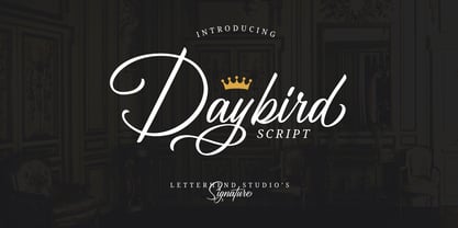 Daybird is an elegant signature that contain lowercase, uppercase, symbol, and also support multi-language. There's a lot of alternates in this font. You can use this font to make a logo for branding, beautiful fashion designs, it's suitable for wedding invitations and authentic signatures. Daybird is also PUA Encoded.
 - Nouveau Rock by Okaycat,
$29.95 Nouveau Rock creates a blend of old & new combined. Classic, yet funky. This font has a rough-cut elegance—surprisingly nostalgic. However, the influences of urban folk art also bring a modern familiarity. Nouveau Rock is extended, containing West European diacritics & ligatures, making it also suitable for multilingual environments & publications.
