10,000 search results
(0.013 seconds)
- FS Koopman Variable by Fontsmith,
$299.99New York to London via Europe The hardworking FS Koopman is a crossbred workhorse which draws inspiration from Swiss and Germanic grotesks, American gothics and early British grotesques, but refuses to fit neatly into any of these categories. Its neither one nor the other, but all of the above. Fontsmith designers Andy Lethbridge and Stuart de Rozario decided to take the characteristics they admired from each category and distill them down into one functional family. Neo meets Neue FS Koopman aims to swim against the tide of Helvetica-ish derivatives by bringing some personality and soul to a genre that all too often ends up feeling bland and sterile. FS Koopman subtly embraces the quirkiness and charm often seen in early twentieth century designs but pairs this with the functionality of later pioneers of the genre. It’s a grotesque isn’t it? The term grotesque surfaced around the early 1800s and refers to the early sans serif designs that many initially believed were strange or ‘grotesque’ due to their lack of elegant serifs. Later variations became known as neo-grotesques and this moniker stuck around even after they gained mass popularity. Some American variants became known as gothics. FS Koopman takes cues from all three categories and blends them into one cohesive design. - Schorel by insigne,
$29.00 Schorel commands the room and sets the audience at ease. This new Scotch Roman typeface from insigne is a confident personality with a tasteful amount of contrast. Cool, sharp, balanced, and contemporary, Schorel not only delivers well in longer texts, but can use its mass to meet the needs of subheadlines, callouts, and other similar projects. Scotch typefaces initially come from Scottish foundries, popular in the United States in the late 18th century. This beautiful genre of type grew in popularity through the Victorian era and most of the 20th century to make regular appearance in books, magazines, newspapers, and advertisements. Schorel itself, with its moderate contrast and organic design, features short ascenders and descenders and calligraphic italics. The design features a few ball terminals, but mostly touts its bracket serifs, which come to a sharp point. The typeface, ideal for medium to large sizes, is useful for both headlines and text, carefully created for both print and screen. This OpenType font supports most Latin-based languages. Schorel has nine weights and a true italic, and many special features such as small caps, fractions, old-style figures, and numerous extras complete each font. It’s every bit a delight to your reader’s eye.
 - Funtrude by Colllab Studio,
$9.00 "Hi there, thank you for passing by. Colllab Studio is here. We crafted best collection of typefaces in a variety of styles to keep you covered for any project that comes your way! When you have a project that needs a fun, unique font to make it pop, you can’t go wrong with Funtrude. Funtrude comes in three styles: Basic, Extrude, and Hole. Each style has more than 350 of the most beautiful glyphs you could ever dream of seeing. The Extrude style is great for titles, headings, and any other text where you want to use a bold font but don’t want it to be overly bold; the Basic style will work great for things like product names or subheadings; and the Hole style is perfect for anything else! Each individual style comes with its own swashes—so your fonts can look just as beautiful when they’re all capitalized as they do when they’re in normal text. What makes us so excited about this product is how much we love to use it ourselves. When we saw Funtrude for the first time, we couldn’t believe our eyes—it was everything we had ever wanted in a font, plus it was super affordable. GET IT NOW....!!! A Million Thanks Colllab Studio www.colllabstudio.com
 - Astronef Std Super by Typofonderie,
$59.00 The Astronef Super borrows from the charm of retro-futuristic universes. Without concessions, and even radical, the Astronef Super, declined in three styles, pushes the weight limits as far as possible systematically while preserving a unique design. Using the Astronef Super in large size is a real pleasure, it is a very identifiable typeface family, recognizable immediately. Undeniably, choosing the Astronef Super in your designs is not insignificant. This typeface used in large sizes will strengthen your graphic identities. Background The Astronef Super could be considered as the “Spin-off” of the Astronef currently being designed, that will offer an important variation of styles. Of course the Astronef, is wiser in his drawing, it places himself in the tradition of the Univers more than the Helvetica. Genesis and the creative process The idea for an Astronef Super comes from an excerpt from a 60s TV show which shows a logo in the background with a very bold S and this super thin in the middle. The Astronef is already modular in its design. The brief then becomes simple for the Super: accentuate the strongest weights of the Astronef by minimizing the counterform that will remain constant for the three styles. It is the mass effect that maintains the overall cohesion of the Astronef Super family.
 - TX Signal Signifier by Typebox,
$39.00Eight designers present a set of icons that indicate the fun and fantastic world of signage. Each collaborator's solution represents a completely different interpretations on signage vernacular. Akira Kobayashi's "Subsumption", obscured by foliage, offers a perspective that signs on Japanese roads can be vague and beautiful. M.A.D.'s "People Signs" is a graphical association of people signage with a variety of well known situation symbols. Cynthia Jacquette's "Honest Arrows" are a series of arrows that attempts to honestly tell you how to get from point A to Point B in a big, confusing city. Mike Kohnke's "Road Kill" and the "Bump & Bruise" highlight how signs make for perfect targets when unloading a round of buckshot, and the licking a contruction barrier often endures. Joachim Muller-Lance's "Traffic Blends" places faces on things! Hey, didn't you give your first car a nickname? Cars are alive, you know - they guzzle and smoke all day. Jean-Benoît Lévy's "Inner-State" was inspired while reading the California driver handbook to pass a driver's test. Kevin Roberson's "Tail Lighting" reminds us to drive carefully and not to forget to signal. Diana Stoen's "Drivers Out There" shows us "driver personality archetypes", including the lil'ol lady that everyone tries to avoid. - Scotch by Positype,
$29.00 Clean, crisp, rational, familiar, modern… serifed. Positype Scotch reaches back to history just enough to produce something warm and easy on the eyes. No corners were cut, no quick tricks… this type suite was drawn for specificity: Text, Display, and Deck… ALL in 3 widths that now include Condensed and Compressed. Each unique, each inter-connected, each part of the whole. Scotch Text is offered in 6 weights with matching true italics. Drawn for economy and an easy read, the family is a workhorse for long-passage text settings. 4 sets of numerals, well-proportioned small caps, and a plethora of extras round out each font. Scotch Display is not just a thinner version of Scotch Text wrapped in a higher contrast. Display sports shorter ascenders and descenders, a unique footprint, great contrast, and a more folded, calligraphic italics. Display subtly oozes sophistication and provides an attractive, exhuberant companion to Scotch Text. Scotch Deck rounds out the offering by choosing to be specific to its offering. Deck utlitizes traits and proportions shared between Text and Display, but alters its overall mass to balance out the needs for settings that require subheadlines, callouts and other similar uses. Essentially, something not so high-contrast and not so stress dense that works great for middle-sizes.
 - Springate by Putracetol,
$24.00 Springate is a modern script font that inspired by streetwear lettering and combination hand lettering style. And also this font has elegant and stylish characteristics, so it is also suitable for logos or product titles. Also ideal for logos, badge, label, apparel, club, event, handwritten quotes, product packaging, header, poster, merchandise, social media & greeting cards. Springate come with opentype feature like a lot of alternates. Its help you to make beautiful lettering. This font is also support multi language.
 - Sancoale Narrow by insigne,
$22.00 Sancoale Narrow is a carefully honed and meticulously crafted new family member for the Sancoale series. Sancoale Narrow has been specially designed to allow for even more versatility for the Sancoale Family. Sancoale Narrow continues with Sancoale's successful simple, geometric and legible structure. It is a contemporary design that is distinctive and unique. This new narrow addition can be used in conjunction with the original Sancoale, but it can also stand on its own. Narrow type comes in a handy in a myriad of situations, from poster design to book covers, web pages to editorial layouts. Sancoale Narrow's six weights make for a typeface family that is very useful for many applications, and also includes a set of true italics. The design is simplified without stems or spurs in the default character set. OpenType alternates do include alternates with stems, Small Caps, Fractions, Tabular Figures, and plenty of alts, including "normal" capitals and lowercase letters. Please see the informative .pdf brochure to see these features in action. Sancoale Narrow also includes a full array of Latin diacritics for multilingual support. OpenType capable applications such as Quark or the Adobe suite can take full advantage of the automatically replacing ligatures and alternates. This family also includes the glyphs to support a wide range of languages. The Sancoale superfamily is suitable for a wide range of uses and is a very economical and versatile addition to any designer's font collection.
 - Awards by Sarid Ezra,
$17.00 Introducing, Awards, a stylish and unique all caps sans! Awards is a modern and styled typeface based on sans. Including unique lowercase that will compliment your branding and logo. The stylish ligature also included in this font that will make your design even more stunning. Also including starry alternates for additional. Awards also support multilingual.
 - Modula Round and Ribbed by Emigre,
$49.00 See also Modula.
 - Southmore by Ergibi Studio,
$18.00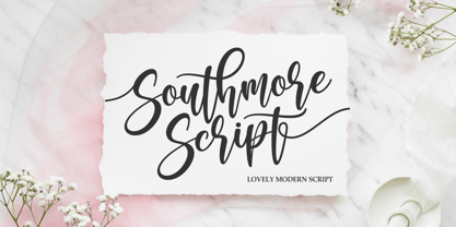 Southmore Script - Lovely Modern Script, Southmore that contain lowercase, uppercase, symbol and also support multi-language in this font. Southmore also comes with Swash and doodle font, is perfect for logos & branding, photography, invitation, watermark, advertisements, product designs, stationery, wedding designs, label ,product packaging, special events or anything that need special taste. or handwritten quote. Also already PUA
 - Cut Cut Cut by Green Type,
$19.00 Cut Cut Cut is a decorative font family. Designed for use in outdoor advertisements, branding, packaging. Cut Cut Cut is also perfect for children's books and cartoon, greeting cards and posters. It is also suitable for use in online activities. Cut Cut Cut contains latin, cyrillic and greek gliphs. There is also a free symbols style.
 - Aurelie Smith by Sarid Ezra,
$13.00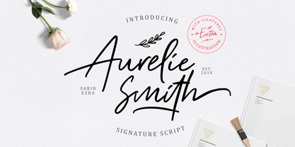 Aurelie Smith is fashion signature that contain lowercase, uppercase, symbol, and also support multi language. There's a lot ligatures in this font. Aurelie Smith also comes with doodle illustration that you can use to make a logo for branding, beautiful fashion design, suitable for wedding invitation, or handwritten quote. Also already PUA Encoded. Foreign Languages Support: ÀÁÂÃÄÅÇÈÉÊËÌÍÎÏÐÑÒÓÔÕÖØÙÚÛÜÝßàáâãäåæçèéêëìíîïðñòóôõöøùúûüýÿ
 - Mohr by Latinotype,
$29.00 Mohr is a neutral, versatile and contemporary font based on some characteristics found in geometric sans-serif typefaces. Mohr’s features, together with its design characteristics, make it suitable for a wide range of applications, from display use to small text. The Mohr family comes in three versions: normal, alt and italic, each with 9 font weights, from Thin to Heavy, resulting in a total of 27 fonts. Mohr also includes initial and terminal swashes in most of the uppercase and lowercase characters. This gives the font a unique personality and provides a greater range of uses such as branding and packaging.
 - Mohr Rounded by Latinotype,
$29.00 Mohr Rounded—the new version of the original Mohr typeface—features curved and softer terminals which make the font look more organic, warm and friendly. The Mohr Rounded family comes in three versions: normal, alt and italic, each with 9 weights, from Thin to Heavy, resulting in a total of 27 styles. The versatility of the font makes it suitable for a wide range of applications, from small text to high-impact headlines. Mohr Rounded also includes initial and terminal swashes in most of the uppercase and lowercase characters. This provides a greater range of uses such as branding, packaging and identity design.
 - Genera by Wahyu and Sani Co.,
$25.00 Introducing Genera, a strong & clean modern sans serif font family designed in two versions – Genera & Genera Alt, which complement each other for body copy & display text. It comes in 10 weights with matching italics (oblique) styles with 4 variable weight fonts for a total of 44 fonts, will give you a freedom to choose the weight you need between Thin & Black. This typeface also equipped with useful OpenType features such as Ordinal, Superior, Stylistic Alternates, Proportional Figure, Fraction, Numerator & Denominator. Each font file has 470+ glyphs which covers Western & Eastern Europe Latin language, as well as other Latin based languages – over 200 languages supported! This typeface has 44 font members consisting of: 4 variable fonts (Genera; upright & oblique, Genera Alt; upright & oblique), 40 single fonts (Genera; upright & oblique in 10 weights, Genera Alt; upright & oblique in 10 weights). Genera will be a Swiss knife for your creative projects, a real multi-purpose typeface that’ll be perfect for logo, packaging, greeting cards, presentations, headlines, lettering, posters, branding, quotes, titles, magazines, headings, web layouts, mobile applications, art quote, typography, advertising, invitations, packaging design, books, book title, & nearly any other type of creative design you’re working on.
 - Elipses by Lián Types,
$30.00 It all began with an ellipse. Like an artist who goes from a pictorical logic to a more abstract one, in Elipses geometry is stripped of any distractive or ornamental detail. The font is naked and it shows that it does not need complex shapes or decisions in order to be very attractive. The font is a compendium of ellipses and stems, with a didone 'pensiero'. It also gets some inspiration from the art-deco letters and architecture, due to obvious reasons. Geometry at its best. Elipses will be useful for magazines, books, ads, or any piece of design that needs elegant letters. Note about the styles The styles named "Alt" (from Alternative) have their swashes with less loops. Use them if you are more into naked geometry. Apart from many alternates and ligatures, I've included some different sized glyphs in all the styles so you can also play on the rhythm! Have fun!
 - Kiperman by Harbor Type,
$29.00 🏆 Selected for Tipos Latinos 9. 🏆 Selected for the 13th Biennial of Brazilian Graphic Design. 🏆 Hiii Typography 2018 Merit Award. Kiperman is a text typeface designed in honor of Henrique Leão Kiperman, founder of the publishing house Artmed, now Grupo A. Its forms are simple and straightforward, with no unnecessary embellishments that could disturb the reading. The fonts are slightly narrower than normal, which yields higher efficiency without compromising reading comfort. Besides that, its italics are not just a slanted version of the romans, but rather a separate drawing. With a slope of 8°, its calligraphic structure provides the right amount of emphasis when necessary. The Kiperman typeface works best when setting books, magazines, ebooks and websites. It will also work very well in branding and packaging projects where a sober typeface is needed. The inspiration for the design came from the personality of the honoree. Just as Henrique always wanted to stay away from spotlights, the Kiperman typeface was designed so that it would not call attention to itself or impose any obstacles in the understanding of the text. In this way, the fonts revere Henrique’s legacy by respecting and honoring the published content. Henrique Leão Kiperman began his career in 1958, selling medical books in travels through the interior of the Brazilian states of Paraná and Santa Catarina. In 1973, he opened a bookstore in downtown Porto Alegre, the Artes Médicas Sul, and a few years later edited his first book. Since then, his company has grown to become one of the most important publishers in Brazil in the area of scientific, technical and professional books, with more than 2400 active titles distributed among the McGraw Hill, Bookman, Artmed, Penso and Artes Médicas imprints. Henrique passed away in 2017 at the age of 79. The Kiperman type family has been commissioned by Grupo A and is available for licensing. This was the way found for the fonts to be read by more people, spreading some of his spirit around the world.
 - Shiny Ink Display by Lloyd David Designs,
$14.99 Hi there, thanks for looking at my first typeface. It began as one of my original sketches back in 2019 as a freelance graphic designer trying to create unique letterforms that I could use for posters or websites with other possible use cases in mind for commercial use. The sketches were then passed on to and worked on with Vladimir Tsagolov who has more experience in creating professional typefaces, the experience for me was invaluable, and I have many more typefaces I'm now working on. Shiny Ink Display is a collection of hand drawn fonts based on the flow of reflective viscous ink with 7 styles, some styles can be interchangeable and used on top of each other. For example, Shiny Ink Display Plain, can be used with Shiny Ink Display Plain Lined to create shadows underneath it, at angles not available with the Shadow styles you'll see in the font collection. Shiny Ink Display has various use cases, maybe even infinite, but more specifically for posters or websites with large text, though it bodes quite well at smaller sizes, and is visually appealing to its viewers as long as it's at a legible font size. When it comes to font pairing, Shiny Ink Display works especially well with Monospace and sans-serif fonts. You can check the poster examples on this page to help you imagine what you could do with the font styles. I also had in mind manufactured products, but I could leave that to you to create your ideas with the available font styles. In regards to languages or typing on a keyboard, most of the English/European latin or cyrillic language keys are supported, so you'll have lots of glyph characters to play with for a number of ideas you may have. All the best with your projects using my fonts, if there are any issues, don't hesitate to contact me for support: lloyddaviddesigns.co.uk - Lloyd David
 - Black Mountage by Sarid Ezra,
$12.00 Black Mountage is brush font that contain stylistic alternate, swash, etc to create your own customized signature, quotes, and also great for apparel. This font is support multi language. Also Support PUA.
 - OnO Display Pro by David Engelby Foundry,
$30.00 Go grab this rock’n’roll display typeface especially suited for posters and headlines in general. This typeface also has many banner dingbats which can be combined in many ways, but there are also finished banner dingbats ready to use. The quality doesn’t stop there, as you can also make use of Central European characters, adjusted Scandinavian characters and fine ligatures. Enjoy!
 - Engrave by BaronWNM,
$14.00 Engrave is a vintage-style scrips font. This font is an elegant font, and has a luxurious impression with sweet curves on the alternate letters. "Engrave" is perfect for branding luxury fashion products, jewelry, and is also great for use as a lettering in logos and mockups. The use of this font is also not limited to that, but can also be used for writing book covers, movies, posters, taglines, etc. "Engrave" also has ligatures and alternatives that give each lowercase style a choice of styles and add a luxurious feel to this font.
 - Buttoni by Letterhend,
$9.00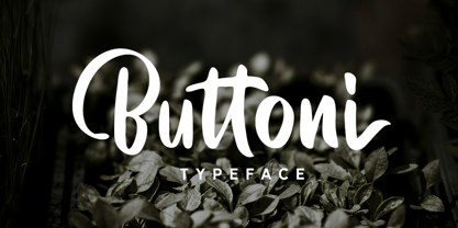 Buttoni is a playful font that you can use for many things. Perfect for quote or anything you want. This font also includes numbers, symbols, and multi-lingual support. Also comes with ligatures and alternates.
 - Aether Rain by Fenotype,
$12.00 Aether Rain is an elegant modern script family that fits both casual and formal use. Aether Rain includes basic latin alphabets, numerals and punctuation. Aether Rain is equipped with Standard Ligatures that work automatically and it also has Stylistic Alternates (OpenType feature) for each character - and scripts are also PUA encoded so you can access the characters also with Silhouette Studio, Cricut Design Space.
 - Phillia by Sarid Ezra,
$15.00 Phillia is minimal and essential signature script that you can use for any purpose such as your own customized signature, logo design, even quotes. You also can use this font for pairing to another font like sans and script. For additional purpose, this font also contains contextual alternates that you can activated from opentype features in Adobe . This font is also support multi language.
 - Mega Drone by Sarid Ezra,
$17.00 Mega Drone is a black and fat display font with unique lowercase. You can use this font for many project that require strong and bold vibes. This font also including icons and catchwords that you can access just from ligature. Just mix the uppercase and lowercase in a word for better looks. This font also suitable for logo and more. Mega Drone also support multi language!
 - Riverside by Letterhend,
$12.00 Riverside is a handmade monoline script and one caps weight. This font is perfect to be used as t-shirt design, logo / brand, signature, headline, lettering quotes, etc. It also comes in uppercase, lowercase, punctuations, symbols & numerals, stylistic set alternate, ligatures, etc also support multilingual. It also already PUA Encoded. The Riverside Script contain 3 style, regular, rough, stamp, and a special upright Caps weight.
 - Waschkueche - 100% free

- Berlin Email - 100% free

- XAyax - 100% free

- cbe - 100% free

- Keep Calm by K-Type,
$20.00 Keep Calm is a family of fonts developed from the now famous World War 2 poster that was designed in 1939 but never issued, then rediscovered in 2000. As well as the original Keep Calm font, the medium weight of the poster, new weights are now available – Keep Calm Book (regular weight), Heavy and Light – and each weight comes with a complimentary italic. Version 2.0 (2017) is a comprehensive update which consists of numerous refinements and improvements across all weights. The family now contains a full complement of Latin Extended-A characters, Welsh diacritics and Irish dotted consonants. The four italics have been optically corrected with revised, ‘true italic’ forms of a and f. The crown motif from the top of the Keep Calm poster is located at the plus minus ± and section § keystrokes (Alt 0177 and Alt 0167 on Windows). The lowercase g follows the Gill/Johnston eyeglass model, but also included is an alternative, single-story g at the Alt G keystroke (Alt 0169 on a Windows keyboard), the normal location of the copyright symbol which has been relocated elsewhere in the fonts. An alternative lowercase t, without the curved wedge cutaway, is provided at the Alt T (dagger) keystroke (Alt 0134 on Windows). When I first saw the Keep Calm and Carry On poster, I wrongly assumed the letters to be Gill Sans. Recent research at the National Archive by Dr. Bex Lewis of Manchester Metropolitan University has revealed that the original poster was hand drawn by the illustrator and painter, Ernest Wallcousins. The Gill Sans influence is apparent, in the R particularly, the M’s perfectly pointed vertex is redolent of Johnston’s Underground, and the most anomalous character, the C, resembles the ‘basic lettering’ of engineers that provided the vernacular sources for the Gotham typeface. Developing the Keep Calm typeface has been an exercise in extrapolation; an intriguing challenge to build a whole, high quality font family based on the twelve available capitals of the Keep Calm poster, and on similar lettering from the other two posters in the original series. This has required the creation of new lowercase letters that are believably 1939; that maintain the influence of Gill and Johnston while also hinting at the functional imperative of a wartime drawing office. Wallcousins’s lettering balanced intuitive human qualities and the pure pleasure of drawing elegant contemporary characters, against an underlying geometry of ruled lines, perfect circles, 45° terminals, and a requirement for no-nonsense clarity.
 - Texicali by FontMesa,
$25.00 Texicali is a multiple weight type design based on our FontMesa logo. The idea was simple: create a sans serif with a few slab serifs added resulting in a style that could feel at home just about anywhere. The regular/standard set works well for general use while the Alt set is perfect for when you want to add a little country charm. The Alt set has a few additional alternate letters built in which are easily accessed using Adobe Creative Suite products such as Illustrator and In Design. The X version, with its higher x-height lowercase, is ideal for signage where you want the look of a lowercase, however your sign still needs to be readable from the street. Larger x-heights also come in handy for web use helping to make the text more readable on smaller devices. The price of font styles are subject to change without notice.
 - Hebrew Stam by Samtype,
$34.00 Beautiful Caligraphic font and also readable font.
 - Jushley Shine by Ergibi Studio,
$19.00 Jushley Shine is a brush font made from handwriting. It contains lowercase, uppercase, symbols, and also support for multiple languages. Jushley Shine also works well on posters, branding, packaging, beautiful fashion design, wedding invitations and handwritten quotes.
 - MVB Embarcadero by MVB,
$79.00 MVB Embarcadero lies in a space between grotesque sans serifs and the vernacular signage lettering drawn by engineers. It’s a style that happens to convey credibility and forthrightness without pretense—it’s anti-style, actually. All of this makes for the most versatile of typefaces, capable of delivering any kind of message while staying out of the way. As is often the case with a type design that develops over several years, Embarcadero isn’t the realization of a specific concept. In the ’90s Mark van Bronkhorst began digitizing a blocky slab serif from the Victorian era, which was then set aside for many years. He later revisited the design, paring it down to its bare essentials, and as more time passed, it evolved from a grid-based outline to curves that echoed the rigid skeleton of the original. Eventually it became a complete family with all the readability requirements of a text sans serif, yet maintaining the subtle eccentricities of its inspiration. Functionally, the Embarcadero family is as adaptable as its design. The OpenType Pro set of 20 fonts contains two widths and five weights, each with italics, small caps, a full set of figures, bullets and arrows, and support for most Latin-based languages. In all, Embarcadero is suitable for headlines or text. And—thanks to its simple, square form—it’s ideal for type on screen too.
 - Century Gothic Paneuropean Variable by Monotype,
$209.99 Century Gothic™ is based on Monotype 20th Century, which was drawn by Sol Hess between 1936 and 1947. Century Gothic maintains the basic design of 20th Century but has an enlarged x-height and has been modified to ensure satisfactory output from modern digital systems. The design is influenced by the geometric style sans serif faces which were popular during the 1920s and 30s. The Century Gothic font family is useful for headlines and general display work and for small quantities of text, particularly in advertising. Century Gothic family has been extended to 14 weights in a Pan-European character set from Thin to Black and their corresponding Italics. The already existing 4 weights of Regular and Bold with their Italics are additionally still available in the STD character set. For international communication, the W1G versions offer the appropriate character set. They contain Latin, Greek and Cyrillic characters and thus support all languages and writing systems that are in official use in Western, Eastern and Central Europe. Century Gothic Variable is features two axes: Weight and Italic. The Weight axis has preset instances from Light to Black. The Italic axis is a switch between upright and italic. Looking for the perfect way to complete your project? Check out Aptifer™ Slab, ITC Berkeley Old Style®, FF Franziska™, Frutiger®, ITC Legacy® Square Serif or Plantin®.
 - Century Gothic Paneuropean by Monotype,
$50.99Century Gothic™ is based on Monotype 20th Century, which was drawn by Sol Hess between 1936 and 1947. Century Gothic maintains the basic design of 20th Century but has an enlarged x-height and has been modified to ensure satisfactory output from modern digital systems. The design is influenced by the geometric style sans serif faces which were popular during the 1920s and 30s. The Century Gothic font family is useful for headlines and general display work and for small quantities of text, particularly in advertising. Century Gothic family has been extended to 14 weights in a Pan-European character set from Thin to Black and their corresponding Italics. The already existing 4 weights of Regular and Bold with their Italics are additionally still available in the STD character set. For international communication, the W1G versions offer the appropriate character set. They contain Latin, Greek and Cyrillic characters and thus support all languages and writing systems that are in official use in Western, Eastern and Central Europe. Century Gothic Variable is features two axes: Weight and Italic. The Weight axis has preset instances from Light to Black. The Italic axis is a switch between upright and italic. Looking for the perfect way to complete your project? Check out Aptifer™ Slab, ITC Berkeley Old Style®, FF Franziska™, Frutiger®, ITC Legacy® Square Serif or Plantin®. - Edcosmic by Colllab Studio,
$14.00 "Hi there, thank you for passing by. Colllab Studio is here. We crafted best collection of typefaces in a variety of styles to keep you covered for any project that comes your way! CALLING ALL CREATIVE PEOPLE and any other creator who wants their work to stand out. Edcosmic is an urban glyphic font that pours unique character into your creation. The traditional way of having graffiti style is to draw every letter manually. For every styles that you want to create, you’ll have to draw each letter by hand. This will take you days and most likely months to finish your project. With technical development, it limits the use of graffiti style in real life because it is so time consuming. Edcosmic is a graffiti font with an elaborate character set that makes creating the new styles easier than ever before. You don’t have to draw every single letter by hand anymore. What took months can now be done within hours if not minutes! You are still limited by your own creativity instead of time consumption. Edcosmic is a font with a new graffiti character set that gives creative freedom to your world. The font has very detailed characters, this will make your design different from all the others. By having a special font you can create a new style and make the world your own! A Million Thanks www.colllabstudio.com
 - Cas Pixalatte by Casloop Studio,
$10.00 Cas Pixalatte Typeface - Dive into Y2K Nostalgia with Pixel Perfection Unleash the power of pixelated aesthetics with Cas Pixalatte Typeface, a cutting-edge font inspired by the iconic Y2K era. This unique typeface is a masterful blend of typography, graphic design, and pixel art, crafted to infuse your projects with a distinct visual style that's both nostalgic and contemporary. Two Distinct Pixel Font Styles Tailor your designs with precision by choosing between the 'Regular' and 'Rounded' styles, allowing you to achieve the perfect balance between retro charm and modern aesthetics. Multi-Language Support Cas Pixalatte goes beyond borders, offering comprehensive support for Latin-based languages across Western Europe, Central Europe, South Eastern Europe, South America, Oceania, and Esperanto. Why Cas Pixalatte? Here's what sets it apart: Visual Versatility: Whether you're working on a gaming interface, website design, or branding project, Cas Pixalatte adds a unique visual flair, making your creations truly stand out. Easy Integration: With a range of file formats, seamless integration into your design workflow is guaranteed, ensuring a hassle-free creative process. Global Appeal: Break language barriers with multi-language support, allowing you to reach audiences around the world without compromise. Elevate your design, embrace nostalgia, and make a lasting impression with Cas Pixalatte Typeface. Discover the possibilities, unlock creativity, and transform your projects into unforgettable visual experiences.


