10,000 search results
(0.031 seconds)
- Frayhord Monoline by FallenGraphic,
$25.00 Frayhord Monoline Script is a modern monoline script font. It has a natural feel and is perfect for signatures, branding, and much more! Features : -PUA Encoded 100% Accessibility -Standard Ligatures -Stylistic alternate -Stylistic Set SS01-SSO4 If you don’t have a program that supports OpenType features such as Adobe Illustrator and CorelDraw X Versions, you can access all the alternate glyphs using Font Book (Mac) or Character Map (Windows).To Access Alternate Characters Click The Link Below: How to access alternates in Adobe illustrator CS https://www.youtube.com/watch?v=geL0Ye02Ryk How to access alternates in Adobe illustrator CC https://www.youtube.com/watch?v=V25yiUh8BcE How to access alternates in Ms Wordhttps://www.youtube.com/watch?v=HxkhZiCuwEw How to access alternates in Coreldraw X7 https://www.youtube.com/watch?v=UBVsufJjons How to access alternates in Indesign CS https://www.youtube.com/watch?v=HgZTCxKG14Q How to access alternates in Adobe Photoshop CC https://www.youtube.com/watch?v=BYKXl58AdNY If you have any question, don’t hesitate to contact me by email vavaaryanto666@gmail.com Thanks and happy designing!
 - FF Aircraft by FontFont,
$41.99 French type designer Albert Boton created this display FontFont in 2002. The font is ideally suited for advertising and packaging, music and nightlife as well as sports. FF Aircraft provides advanced typographical support with features such as ligatures, alternate characters, and case-sensitive forms. It comes with a complete range of figure set options – oldstyle and lining figures, each in tabular and proportional widths.
 - Go Braille by Echopraxium,
$4.00 A Braille font designed with the look of the Go Game. Lowercase glyphs use black stones while uppercase use white stones. To make the text more like within a Goban, Corner and border glyphs are provided. Also the font allows a "new kind of ASCII Art" by providing the missing glyphs (black stones) which enable this usage (see "drawille" project on Github).
 - Braisetto by Adam Ladd,
$25.00 Braisetto is a handwritten, signature family with five weights, multiple alternates, and natural ligatures. Inky and expressive yet readable and functional, this typeface is designed to look personal and be useful in a variety of applications like branding, packaging, products, cards, and more. Features include multiple stylistic alternates, automatic double-letter ligatures, automatic title-case ligatures, initial stroke alternates, ending flair alternates, five weights, and matching ornaments.
 - Conneqt by Roman Melikhov,
$15.00 Conneqt is a font for design of minimalist logos. The font is suitable for creating wordmarks, titles, taglines. Use alternates to emphasize separate letters in your text. All alternate options of the characters are included in each font. You can use alternates in most major image editors, just find menu item Glyphs (Alternates) there. For any questions about the font please contact: arbuzzu@gmail.com
 - San Louis by Inumocca,
$25.00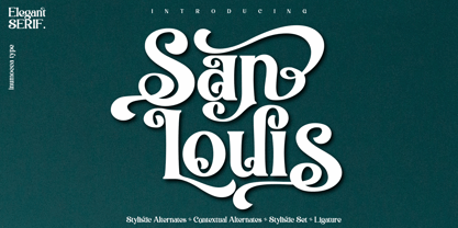 San Louis is an Elegant Serif typeface , Modern , Classy and Glamour Worlds. Awesome Stylictic Set, Beautiful Ligature and unique contecttual alternates, stylistic alternates. Really playful typeface to covering your Project, like Lettering, Website Interface, Magazine, Branding, Poster, wedding invitations, Quotes Lettering, Logos, and more your project design. - Unique glyphs - Multilingual Characters - UPPERCASE - Lowercase - Numeric - Symbol - Punctuation Character - Ligature - Contextual Alternates - Stylistic Alternates - SS01, SS02, SS03, SS04
 - Rational TW by René Bieder,
$39.00 Rational TW is the typewriter addition to the Rational family. It is a monospaced font building on the same principles as its proportional, neogrotesque brother, such as maximum legibility and flexibility while combining Swiss and American gothic elements with a modern aesthetic. Due to the monospaced environment, some of its letter shapes like “r”, “m”,“f”, “i” and “w” have been slightly adapted but kept the same in appearance. Rational TW comes in two version: Rational TW Display and Rational TW Text. As indicated by its name, Rational TW Text is not limited to, but works best in small font sizes because it features distinctive letter shapes like a double storey “a” or “g” in order to help differentiate similar glyphs in small sizes. Rational TW Display, on the other hand, creates a geometric uniformity by implementing round shapes in “a” and “g”, giving it a subtle friendly and open character. Unlike many other monospaced fonts, Rational TW has a large amount of opentype features like small caps, alternative glyphs, case sensitive shapes, and many more making it the perfect choice for countless scenarios. With more than 700 glpyhs per font, it performs excellently in any project from print to digital.
 - Cocogoose Classic by Zetafonts,
$39.00 Download PDF Specimen Created as a display typeface in 2012 by Cosimo Lorenzo Pancini, Cocogoose is one of Zetafonts most loved typefaces. A sans serif typeface of geometric proportions, with very low contrast and slightly rounded corners, it was the first typeface to be produced in the Coco series, an ongoing research on the design variation in gothic typefaces through the ages. Cocogoose extreme x-height and ultrabold weight (with regular being comparable to heavy weights of other typefaces), have since then made it very popular for effective display and logo use, also thanks to decorative versions like Cocogoose Letterpress. Since 2016, Andrea Tartarelli has been improving the typeface expanding the original glyph set to include cyrillic and greek and adding extra weights, widths, and italics to the original family range, and bringing Cocogoose to an impressive count of 52 variants. In 2019, Francesco Canovaro has teamed with Andrea Tartarelli and Cosimo Lorenzo Pancini to create a new variant subfamily: Cocogoose Classic, featuring 8 weights and matching italics. Cocogoose Classic keeps the original design for uppercase characters while developing a new design for lowercase, with a smaller x-height, round dots and expanded open-type features, including positional numerals, alternate forms, and extended ligatures and bringing the glyph count to over 1000 characters.
 - Terminus by Dresser Johnson,
$25.00 The Terminus typeface is an exploration of what occurs to letterforms when flip-disc display and variable-message signs begin to malfunction. Whether caused by analog or computer error, there is a mechanical beauty and randomness in the deterioration of the forms. Dresser's wild take on this concept purposely pushes the limits of legibility along with incorporating historical bits and pieces from blackletter and uncial script forms into this modern digital grid. OpenType font features provide the user with four options to use the typeface. Simply load the default Terminus for a surprisingly legible breakdown of digital characters. Select “Contextual Alternates” for a random selection of altered forms from the 994 glyphs included in the font. With the Glyph Palette open, manually select from the five full character sets to create your own unique settings. Lastly, choose “Stylistic Alternates” for an extreme test of legibility. This setting combines characters from the default font with the most elaborate set of alternates and best exemplifies the organic disintegration of Terminus.
 - Fajowy by Edyta Demurat,
$22.00 Fajowy is a hand drawn typeface. The family is available in 12 weights. Fajowy has only upper characters with up to three alternate glyphs. Build in OpenType Contextual Alternates feature will automatically set alternate glyphs depending on frequency of appearance of the same character.
 - Fajny by Edyta Demurat,
$22.00 Fajny is a hand drawn typeface. The family is available in 12 weights. Fajny has upper and lowercase characters with up to three alternate glyphs. Build in OpenType Contextual Alternates feature will automatically set alternate glyphs depending on frequency of appearance of the same character.
 - Narcost by Skypia,
$15.00 Narcost is a modern vintage serif font packaged in a modern and classy style, complete with access to your OpenType features to access a large selection of alternates letters and ligatures, the choice of letters you like from variations of uppercase and lowercase letters to get a display luxurious and elegant. Unique, playful and versatile serif family with 35 ligatures and 61alternates to beautify the design you like. This font is perfect for branding projects, Logo design, Clothing Branding, packaging, magazine headings, advertising, T-shirts, postcards and much more. What is included: Narcost Regular Narcost Italic Features · All Uppercase and Lowercase · Number & Symbol · Supported Languages · Alternates and Ligatures · PUA Encoded Thank you, Skypia
 - Magical Source by Java Pep,
$19.00 Introducing Magical Source is a stylish serif font, every character uppercase and lowercase have alternates font. This font is equipped with more than 200 alternative fonts so you can mix and match every alternate based on your taste. This font still outstanding look, although you don't switch on the alternate. Magical Source font is a versatile font, the font can covering to headlines, titles, logotype, branding, pull quotes & monograms, and etc.
 - Honey Bumbles by Rachel White Art,
$18.00 I am crazy about my font, Honey Bumbles! It has sweet curls, very round loops, and lots of fun alternates and ligatures to create amazing designs. It is super smooth. Every character is special, and has unique curves, swirls, and loops. Includes: - alternate glyphs for selected characters - initial lowercase alternates for shown characters - terminal lowercase alternates for shown characters - ligatures for selected double letter combinations - 4 options for ampersands
 - Al American Legend by Aluyeah Studio,
$125.00 Hello Aluyeaholics! So we tried playing with the script, we hope you like it. American Legend is inspired by vintage handwriting. Comes with 220+ stunning alternates and ligatures. Super easy to use alternates and ligatures. Super Easy to Use alternates - You can easily call alternates using special combination like a.2 a.3 b.5 e.r a.r l.l etc. To get results like the preview just type Ame.rican Leg.9end
 - Alyesina by Sealoung,
$15.00 Alyesina is a very luxurious elegant calligraphy font for your classy projects that is complemented by a pretty and stylish alternative. This font includes alternatives, style sets, ligatures, swashes and multilingual support with the Pua encode opentype feature. In some glyphs it has a pretty stylistic alternative. Perfect for startup projects, wedding invitations, logos, packaging, quotes, branding, web, blogs, etc. FEATURES : Uppercase Lowercase Number Punctuation Multilingual PUA Encode Opentype Stylistic Alternate
 - Simplo by Durotype,
$49.00 Simplo: the ‘Italian Futura’. Simplo is a geometric sans serif typeface, built in sixteen styles. It is a tribute to the 1930s typeface Semplicità, designed by Nebiolo’s Alessandro Butti. Although many details of Simplo differ from Semplicità, it preserves the spirit of the original. Simplo is ideal for use in display sizes. It is also quite legible in text, and is well suited for graphic design and corporate identity design. Simplo has sixteen styles, extensive language support, eight different kinds of figures, sophisticated OpenType features — so it’s ready for advanced typographic projects. The most notable characteristics of this typeface are the ‘t’ and the ‘f’. The ‘t’ is the culmination of simplicity: a vertical line with just a simple right-side crossbar. The ‘f’ also has just a right-side crossbar, and is really tall: it reaches both the highest and lowest vertical position of the typeface. The top of the distinctive ‘s’, is much narrower than its bottom. The ‘a’, ‘b’, ‘d’, ‘g’, ‘p’, ‘q’, and ‘u’ are spurless, and show a family resemblance with Hans Reichel’s 1990s typeface Dax. However, these letters are rounder and more geometric than Dax’s counterparts, because of Dax’s higher x-height and narrower design. In Paul Shaw’s Imprint article about typefaces that have been overlooked and/or underappreciated, “Overlooked Typefaces”, he concluded his discussion of Semplicità as follows: “These idiosyncrasies suggest that Semplicità might find a warm reception today, given the current love affair with Gotham, Neutraface and Proxima—and the resurgence of ITC Avant-Garde Gothic.” Free demo font available. For more information about Simplo, download the PDF Specimen Manual.
 - Stofer by Roman Melikhov,
$19.00 Stofer is a font for creating minimalistic logos, wordmarks, titles, taglines. Use stylistic alternates to emphasize separate letters in your text. You can use alternates in most major image editors, just find menu item Glyphs (Alternates) there. For any questions about the font please contact: arbuzzu@gmail.com
 - Scaramouche by Fenotype,
$25.00 Scaramouche is a decorative and playful connected script. Scaramouche family has three weights and matching ornament sets. For the best price, purchase the whole family. Scaramouche has plenty of alternate characters; click on Swash, Contextual or Stylistic alternates in any OpenType savvy program for decorative alternates.
 - Jhoiboy by OCSstudio,
$12.00 Jhoiboy is a casual grunge texture with many variations of font shapes to create a perfect and unique design. Jhoiboy has 8 alternatives, 7 alternatives for lowercase letters and 1 alternative for uppercase letters, along with ligature and multi-lingual support that will match your desires.
 - Positive Feature by PizzaDude.dk,
$15.00 Positive Feature is a handmade, layered font. All layers come with contextual alternates, which means you have 4 different versions of each lowercase letter to play around with. What's cool about the two layer versions is that they mix in a lovely way! Try typing your text with layer 1, copy/paste layer 2 on top in a different color - perhaps even alter the transparency a bit...and all of a sudden a nice effect sees the light of day!
 - Graced Script by Mans Greback,
$59.00 Graced Script is a calligraphic brush font in high quality, with a full alternate alphabet. Turn on contextual alternates to get natural letter variations.
 - Fungis by Ivan Petrov,
$30.00 Fungis is a somewhat �brother� of Fungia. These two typefaces were conceived simultaneously as an experiment on designing typeface based on natural shapes. In both cases it was mushrooms. Of course the main theme of these typefaces is not mushrooms itself (it was just a start point) but the interaction between form and counterform. In spite of unquestioning individuality the font has some associations with wood typefaces from wild west, typefaces from circus posters of 19th century and even slight feeling of gothic. The font can be useful in different cases: posters, titles, book covers, billboards, street signs, magazine spreads and all situations that demand expressive typography.
 - Jarohy by Twinletter,
$15.00 This is a JAROHY gothic font that you should use to design Labels, Retro, Stamp, Badge, Oktoberfest Poster or others, Packaging, Headline, Beer, Logo, barbershops, Whiskey, tattoo, Music, Movie, certificate, Quotes, This is a font that is perfect for making any type of design. Whether you are creating a label for a beer bottle, a certificate for a whiskey bottle, a tattoo for your arm, or a headline for a poster, this font is what you need to make it happen. It is bold and masculine, making it perfect for any design that calls for a strong and memorable impression. You can choose the one that best suits your needs.
 - ITC Angryhog by ITC,
$29.00The name Angryhog came out of nowhere out of free association. "When you're working on a typeface on the Mac it demands a name from you which I find a bit confrontational" says Donaldson. ITC Angryhog brings together Roman and Gothic influences in a quirky and sophisticated display face. Characteristic of this typeface are its sharp, pointed forms, especially noticeable in the serifs, which give ITC Angryhog a restless, almost aggressive feel. It is as though the letters have a mind of their own and ignore all rules and regulations. ITC Angryhog is a perfect typeface for comics or satire, best suited to short to middle length texts and headlines. - Dusk Till Dawn by Comicraft,
$19.00 The Vampires have risen from their graves! Innocent young virgins (also goats, sheep, sheep dogs, cows and other sundry farmyard animals) may not see out the night. DUSK TILL DAWN has been exhumed, lightly dusted in dry earth and exsanguinated for your convenience. Bury your tombstones in Gothic Chic with a font that may very well be worth dying for. We cannot guarantee you will come back to life however. We waited to unleash this font until the midnight hour, so grab your wooden stakes, silver bullets, crossbows, slingshots and any supernatural weaponry you may have at hand. Garlic capsules and Holy Bibles are also recommended!
 - RyuGothic by StudioJASO,
$42.00 RyuGothic Family is a humanistic interpretation of the Hangul Gothic style. It delivers messages in a soft, calm tone that does not overpower. The narrow counter design of consonants in Hangul and the narrow counter of the Latin lowercase letters are connected to create a sense of structural unity between the two sets of characters. This enables you to read long lines and works well in a variety of media and situations. Each font includes: 2,350 Hangul syllables, the smallest unit for expressing modern Korean; Latin Basic; punctuation; symbols for Korean codepage. Cyrillic, Greek, and Kana alphabets were excluded. The punctuation is designed in the preferred location for Korean typesetting.
 - Gerucht 2.0 by Rumors Foundry,
$11.00 Gerücht Typeface is a family of digital fonts designed in 2019 by Gabriele Bellanca for Rumors Foundry in three different weights and their corresponding slanted versions. All rights reserved. Gerücht (in English rumor) is the name of the font-family: today the name of a font is part of the graphic design itself, unlike in the past, where it usually consisted of a simple retrospective description (such as in the case of Gothic Condensed No.2) of its characteristics. It's a "one-word advertising slogan", writes Tobias Frere-Jones, which serves to build an idea and a charm to associate with that type of character.
 - Agatha by Underground,
$25.00 2015 First Prize TipoType award. Agatha is a new typeface for titles and short texts in big sizes. It can be use both in editorial publishing and brand design. From gothic geometric bases, the letters resemble the Nordic style in order to be more feminine, rhythmical and vertical. The two versions, Regular & Outline, let the designer choose between two contrasts: one heavy version that emphasize the rhythm and a lighter one that intensifies the subtlety. The third version, Blossom, combines light and color with ornaments that highlight the style. The three fonts have in addition a ligature set and some decorative glyphs that increase the possibilities of use.
 - Fette Fraktur by Linotype,
$29.99 This font is one of the most used broken letter fonts today. Fette Fraktur is used to invoke a nostalgic or rustic feeling and found often on restaurants with hearty homemade food’ or breweries who use the good old recipes’ of the founder. The font was designed in the 19th century and from the beginning intended as an advertisement typeface. The lower case letters have a gothic character with only the ornamental flourishes making them broken letters, while the capital letters are more characteristic of broken letter typefaces. One could say Fette Fraktur is a true mix of styles, not unusual for typefaces created at the turn of the 19th century.
 - Hiragino Sans GB by SCREEN Graphic Solutions,
$200.00 Based on the Hiragino Sans (Kaku Gothic) design, this is the first Chinese-language font from a Japanese font manufacturer to be certified compliant with China’s GB 18030-2000 standard. Unique features are a contemporary typeface design that sets it apart from existing Chinese typefaces and a dedication to high quality down to the slightest detail. Multi-language composition using both Japanese and Chinese Hiragino fonts offer a sense of unity With demand growing rapidly in China, Hiragino Sans Simplified Chinese is the optimal font for uses in those fields that need both readability and contemporary vibe such as product packaging, catalogues, books, magazines, websites, and sign and displays.
 - Jane Roe by deFharo,
$10.00 JANE ROE is a family of 10 Sans Serif condensed fonts of geometric construction and neo-Gothic style, a friendly typography with maximum readability, specially drawn for the composition of texts of any size for both printing and screen, signage or headlines and where you need savings in horizontal space. This typeface contrasts its neutral aspect with the humanistic modulation of the antlers in the characters, giving the opportunity to compose texts adaptable to any context and concept of design. The typeface includes small letters with support for Latin Extended-A, dynamic fractions, several set of numbers, etc. Look at the PDF with all the functions.
 - Agatha by TipoType,
$25.00 2015 First Prize TipoType award. Agatha is a new typeface for titles and short texts in big sizes. It can be use both in editorial publishing and brand design. From gothic geometric bases, the letters resemble the Nordic style in order to be more feminine, rhythmical and vertical. The two versions, Regular & Outline, let the designer choose between two contrasts: one heavy version that emphasize the rhythm and a lighter one that intensifies the subtlety. The third version, Blossom, combines light and color with ornaments that highlight the style. The three fonts have in addition a ligature set and some decorative glyphs that increase the possibilities of use.
 - Empire State Deco by Comicraft,
$19.00 Every face tells a story but this font is 77 stories high (1,046 feet with antenna included)! A lofty companion to Empire State Gothic , Empire State Deco is a tall, stately font containing four different styles, sometimes contradictory, united by the desire to be modern. Those familiar with the Exposition Internationale des Arts Décoratifs et Industriels Modernes will notice a post-postmodernism combined with the fine craftsmanship and rich materials for which those awfully nice chaps at Comicraft are known. During its Art Deco heyday, Comicraft represented luxury, glamour, exuberance, and faith in social and technological progress -- this new font recaptures those halcyon days in letter form.
 - Faizer by Differentialtype,
$10.00 Faizer is a slab serif typeface font with a display theme. Great for presentations, billboard fonts, logo fonts, and more. Faizer has 3 styles, regular, rounded, and outline. The faizer also features alternates with bouncing styles, as well as alternate lowercase and alternate numbers with in-circle styles.
 - Adeston by Sealoung,
$25.00 Adeston is a modern multilingual serif enhanced by ligatures & alternates. Adeston is a very versatile font - with it's classic forms and modern features it will cover a wide range of design projects starting from greeting cards to magazines, wedding invitations, websites etc. The amount of alternates is tremendous, from simple stylistic alternates to ligatures and their alternates. Languages supported: English, German, French, Italian, Spanish, Swedish, Portuguese, Irish, Norwegian, Luxembourgish, Basque, Breton, Corsican, Faroese, Galician, Icelandic.
 - Marshfield by Adam Fathony,
$10.00 Monoline Fonts with strong identity for an outdoor design, camping, wild, journey, adventure, masculine, and etc. Opentype features are available on Marshfield such as Ligatures, Stylistic Alternates (Up to 6 Alternates), Contextual alternates, and Terminal Alternates. Marshfield Comes with 2 Type of Fonts, Script and Cursive. On each type of fonts have 3 different style, Clean (sharp corner), Round (Rounded Corner), and Rough (Rough Version). 6 Fonts in Total for completing your design style.
 - Sainthorn by Maculinc,
$18.00 Sainthorn Script is a typeface thick and easy to read, it would be so comfortable to wear .You can use it as a logo, badge, headline, and on insignia, packaging, posters, t-shirts/apparel, greeting cards, business cards, wedding invitations and more. The flowing characters are ideal to make an attractive messages to your taste. Mix and match with many alternative characters to fit your project.It will be more interesting if you add swash / alternative swash. The alternative characters in this font were divided into several OpenType features such as Stylistic Alternates, Ligature and Ligature Alternates. Mail support : maculinc@gmail.com Thank you! Maculinc
 - Brother Home by Letteralle,
$18.00 Brother Home is a charming handwritten brush font that will bring an attractive feel to your designs. Brother Home includes 2 fonts : - Brother Home Regular: The main font with uppercase, lowercase, numbers, punctuation, and also multi-lingual support. - Brother Home Alternate: You can access alternative characters from the Regular weight via OpenType in your application, or you can also install this alternative weight. Brother Home Alternate will give you alternative characters, which will add a natural impression. That’s it! Please do let me know what you think, feel free to comment if there are issues or queries. Happy designing, Thank You!
 - Floro by Andinistas,
$29.95 Floro is a typographic family with 3 members designed by Carlos Fabian Camargo. Its idea combines medieval ideas, grotesque, stencil and grunge for T-shirts, stickers, advertising material design. More specifically the concept of Floro join several DNAís coordinating X height, ascendant, descendant and wide, in which proportions and adaptive optics were determined to inject great visual impact when composing titles. Its forms and counter forms have imperfections controlled with vitality and consistency. Floro is useful for ranking words and phrases with corroded edges and creases between the lines of his letters. In that vein, Floro refers to improvised design, deletion and copying. For that reason, its determinants seem stencil patterns that attract the attention of the reader. Its inaccurate decisions were planned that way, in which the type of contrast seems made with a flat tip and the amount of contrast between thick and thin is medium. Its sizes, regular and italic shine by their systematic wear and terminations sometimes in pointed forms resembling medieval darkness. In short, we can say that Floro comes from the miscegenation of Gothic calligraphy texture, foundational calligraphy and some refinements of gothic writings with italic sans-serif ideas of late 19th century. Even with the blur appearance, floro has ideal proportions to pile for horizontal and vertical areas when composing titles with striking looks and robust. And finally, floro dingbats are related shields and stamps, to accompany the written resulting useful at the level of visual support and hierarchical.