10,000 search results
(0.041 seconds)
- Tuerca by Graviton,
$24.00 Tuerca font family has been designed for Graviton Font Foundry by Pablo Balcells in 2021. It is a slightly extended sans serif typeface with a strong technical appearence. Its squared, angular shapes provide a futuristic and robust aesthetics. It has been conceived to be most suitable for logos, headlines and display design pieces as well as short length text blocks. Tuerca consists of 8 styles, each containing small caps and glyph coverage for several languages.
 - Queenty by Zamjump,
$13.00 Queenty is a fun monoline font that can be applied to many of your precious designs. It's really handwriting that's kept simple and has an elegant style that makes this font a lot of fun. Queenty has a unique additional swash to complement this font, and it's very easy to pop it just by pressing a+underscore.. You can use it for posters, titles, greeting cards, packaging, invitations and more. Included : - Multi-language - Unique Swash
 - Lancenia by Digitype Studio,
$16.00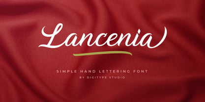 Lancenia - a stylish and simple handletter script typeface. This font will looks awesome and amazing in many ways on your latest design project. Lancenia is perfect for lots of different uses such as logos & branding, invitations, stationery, wedding designs, social media posts, advertisements, product packaging, product designs, labels, photography, watermarks, special events and more. This font has many OpenType features like ligatures, stylistic alternates, contextual alternates, swashes, and has multi-lingual support.
 - Binaria by Graviton,
$24.00 Binaria font family has been designed for Graviton Font Foundry by Pablo Balcells in 2018. It is a sans serif typeface with a mechanic appearence. Its squared, angular shapes provide a futuristic and robust design. It has been conceived to be most suitable for logos, headlines and display design pieces as well as short length text blocks. Binaria consists of 12 styles, each containing small caps and glyph coverage for several languages.
 - Modern Love Slanted by Resistenza,
$39.00 Modern Love has been one of our most popular fonts during last year, so we decided to create a new version of this sweet character set. Modern Love Slanted is a new casual slanted brush-handwritten family. It has the effortless hand-painted feeling and keeps a high density of contrast like Modern Love Regular and It also includes a set of ornaments, swashes and alternates accessible through Opentype features. Check out also ‘Modern Love’
 - Sugar Medley by Scrowleyfonts,
$16.00 Sugar Medley was originally inspired by piped icing writing on celebratory cakes. It lends itself to any project requiring a ‘controlled messy’, fun feel. It has a total of 885 glyphs, every letter has 5 alternates to create that hand lettered look. Sugar Medley also includes a full set of stylistic alternates which really goes wild with curls and swirls. These are complemented by a total of 38 ornaments including reflections and rotations.
 - Destine by Ef Studio,
$15.00 Destine is a modern display typeface that has high contrast and hairline serif. The typeface inspired by Didot and Bodoni. Destine typeface has opentype features like stylistic ligatures and stylistic alternate to beautify any design project. This typeface is compatible for branding, logo, book magazine, headline, wedding invitation, and so on. You will get : Destine Regular font with full set of lowercase and uppercase letters, numerals and punctuation, multilingual characters, ligatures & alternates.
 - Marttabuck by Letterhend,
$10.00 Marttabuck Script - The bold and straight-forward look script. This script comes with two types, the regular and special. The special type has its unique tiny slices which gives more personal touch and makes the font looks being customized. This font is suitable to use as a logotype, apparel, wedding invitation, signboard, sport club, motor / car, etc. This font has many opentype features like ligature, stylistic alternate, contextual alternate, swash, etc and support multi language.
 - Gloria Beauty by Lettersams,
$18.00 Gloria Beauty is a script with a new idea that has letter characters connected to each other, so it looks unique and romantic with others. This font has beautiful, well-balanced characters, making it suitable for a variety of purposes. such as posters, wedding invitations, logos, branding, titles, signs, labels, mugs, quotes, and others. Gloria Beauty features 620+ glyphs covering characters, alternatives, and binders, including start and end letters, alternates, binders, and multiple language support.
 - Felicity by Fenotype,
$35.00 Felicity is a tightly cut heavyweight display serif. Felicity has strict kerning and it creates strong looking words just by typing - but if you need even more try any of Felicity’s many OpenType features: Discretionary Ligatures, Stylistic, Titling or Swash Alternates. Felicity has also a small selection of ornaments you can from the Character Window. Felicity is also equipped with Contextual Alternates and Standard Ligatures that prevents letters from colliding. Both features are automatically on.
 - Slice by Superfried,
$32.50 Slice is an experimental, circular, display typeface designed by Superfried. Slice, like its big brother Slash, also features key incisions to form the glyphs. Unlike Slash, Slice is much simpler in design based on basic geometric forms and features both upper and lowercase. Slice has a very retro feel and its chunky structure leads to a distinct, high-impact display font. Slice has been featured on the Behance curated typographic gallery TypographyServed.com.
 - Astoria Classic by Alan Meeks,
$45.00 The latest addition to the Astoria Range, Astoria Classic has the same basic characteristics as Astoria but with vertical stress. The characteristic subtle top left serif which makes it not quite a Roman and not quite a sans has been retained. Unlike Astoria, the Italics in form are old style yet have a modern look. This is designed specifically as a text face, however it still works very well as a headline font.
 - Kanaya by Putracetol,
$14.00 Kanaya is a beautiful modern script font. Kanaya has a very beautiful alternate character, and has modern, elegant and luxurious swashes in each lowercase character. Kanaya is perfect for wedding events, anniversaries, birthday, greeting cards, logotype, branding, wedding invites and cards, elegant logos, posters, packaging, stationery, websites, and many more. Includes OpenType features with a lot of alternates, to help you to make great lettering. This font is also support multi-language.
 - Aflah Akbar by Studio Hello Good,
$12.00 Aflah Akbar is an elegant sans serif font with lots of ligatures in it, this font has 354 glyphs so it is perfect for those of you who want to use it as a logo or other design needs, whether it's for magazines, skincare, perfume, jewelry, stationary offices, newspapers, book covers. , web designing. The Aflah Akbar font has regular, smooth, slant, shadow, line and 3d options, the Aflah Akbar font itself can support 67 languages.
 - Hyugos by Fateh.Lab,
$20.00 Hyugos is a condensed type of font that has a different character from the previous condensed font, Hyugos has a strong but soft character, with a cheerful and fresh theme, supported by 24 choices of font types. Hyugos is able to answer your current needs who are designing something great. Its weight is superior in posters, social media, headlines, magazine titles, clothing, large print formats - and wherever you want to see it.
 - Somnium Amor by Salsabiyl Studios,
$15.00 Introducing Somnium Amor Modern Serif Font Somnium Amor is a modern and elegant serif font. This serif font is perfect for your next branding project. This serif font has plenty Characters and has Multilingual Support. Somnium Amor is perfect choice for people looking for clean, modern, minimalist, elegant, beauty design styles. Suitable for almost any graphic designs such as logo, branding materials, business cards, gift cards, t-shirt, cover, thumbnail, print, poster, photography, quotes .etc.
 - Taguro by Twinletter,
$18.00 Taguro Groovy is a geometric font and the curved lines in each anatomy with high contrast and bold characters make this a powerful font for your projects. This font has an elegant and distinct style that makes it visually different from many other fonts. It makes your design stand out from the rest. This delightful font has precisely defined Curves and the subtle strokes of the typeface make this font very pleasing to the eye.
 - Hamptons BF by Bomparte's Fonts,
$40.00 Hamptons BF is a beautiful, elegant sans serif with dramatic individuality. A font that steps out in Art Deco style. As a design movement Art Deco came into prominence during the 1920s and 30s when forms were typically sleek, symmetrical, geometric or highly stylized. Today the influence of this enduring style can be clearly seen in architecture, industrial design, fashion, art, graphic design, and yes, even type design. Art Deco style exemplifies luxury, glamour and modernity. I believe Hamptons BF captures something of that retro look in a nod to the past without ever looking dated, all the while retaining a contemporary flair. Named after the well-known New York resorts synonymous with style and elegance, this gothic or sans serif type is based upon University Roman, an early 1970s serif design which in turn was influenced by yet another serif design called Forum Flair (late 1960s); and that in turn owes its pedigree to the late 1930s’ Stunt Roman, which is the original source of inspiration for all of these. Quite a family tree! There’s dynamic interplay between certain wide, full-round letters such as C, D, G, O, P, Q, R, S and narrow ones like A, E, F, H, K, L, M, N, U, etc. This contrast repeats throughout certain lower case letters and serves to create a unique look of distinction. Light and Regular weights communicate a romantic, feminine appeal while the Bold offers a complementary emphasis. The font is somewhat versatile as in addition to its primary purpose for display, Hamptons BF also succeeds in settings containing short blocks of large text. It’s right at home in a variety of typographic environments: branding, packaging, signage logos, magazine headlines, invitations, menus, trendy cafes and more. Among the included OpenType features are Stylistic Alternates, Automatic Ligatures and Fractions. There is extended language support for Western, Central and Eastern Europe and Turkish.
 - Amico by Hackberry Font Foundry,
$24.95 This is a new barely modulated, slightly narrow, sans serif font family. It has eight styles: thin, thin italic, regular, italic, bold, bold italic, black, & black italic grouped into two 4-font families: Amico Thin with the Bold; and Amico with the Black. Amico has the standard feature set developed at the end of 2007. It has many OpenType features and 654 character/glyphs: Caps, lower case, small caps, ligatures, discretionary ligatures, swashes, small cap figures, old style figures, numerators, denominators, accent characters, ordinal numbers (1st-infinity): lining and oldstyle), and so on. It is designed for text use in body copy. However, Amico really shines as the choice for heads & subheads when using Amitale or Brinar for the text family.
 - Migoove by Twinletter,
$14.00 Migoove is a script font that is attractive and has powerful characteristics in every letter. You will find it easy in your work since this font will beautify your every project. There are many different options in this font, making it simpler for you to create a blend for your creative requirements. Let’s get started using this typeface to complete the job. Not only that, but this font has a genuine handwritten feel to it, which has been developed to create a portion and composition that matches your demands. As a result, this typeface is appropriate for craft projects, children’s writing, adventure posters, food banner titles, wedding invitations, product packaging logos, quotations, social networking page covers, and furniture banners, headlines, book covers, and much more.
 - HU Ketchup by Heummdesign,
$15.00 HU Ketchup is special headline font that has waving strokes like script font. It can be used to stress out something important, and for any artwork that has retro vibe. It also looks good with food packaging, so it has diverse usage. HU Ketchup - это особый шрифт заголовка, который имеет волнистые штрихи, как шрифт скрипта. Его можно использовать, чтобы подчеркнуть что-то важное, а также для любых произведений искусства в стиле ретро. Он также хорошо смотрится с пищевой упаковкой, поэтому имеет разнообразное применение. Το HU Ketchup είναι μια ειδική γραμματοσειρά επικεφαλίδας που έχει κυματοειδείς πινελιές όπως γραμματοσειρά σεναρίου. Μπορεί να χρησιμοποιηθεί για να τονίσει κάτι σημαντικό και για οποιοδήποτε έργο τέχνης έχει ρετρό ατμόσφαιρα. Φαίνεται επίσης καλό με τη συσκευασία τροφίμων, επομένως έχει διαφορετική χρήση.
 - Ezekiel by MYSTERIAN,
$9.00 Ezekiel Script is the font become flesh—mythic gesture imposed upon forms of mechanical medium. Typography has changed the internet; our phasing mimetic desires tend toward posture rather than rationale, and the face is a concept that explores that concept. Obviously some reading of McLuhan has infliunced this concept of analysis. The script has ample diacritic extensions, as well as an alternative for the ampersand (characteristic of MYSTERIAN type) and the eszette: an upper and lower case. The upper and lower case alphabets are diverse in that the majuscules do not have linking strokes while the miniscules do. This was the first script that I've made, and great attentiveness was taken to ensure that links were set accurately, and spacing harmonious throughout.
 - Melloner by Alit Design,
$10.00 Present the new and charming Melloner Trio, with an additional swash weight. It is suitable for additional fonts collection because it can be used for any type of design. Melloner has a beautiful script font and is very easy to use, with simple and unique characters. It is very interesting to use Melloner yourself or in combination with Melloner Fun and Melloner Happy which has a handwritten character with a brush. Melloner Fun is a handwritten font with a relaxed and unique sans serif style, while Melloner Happy has a slightly more formal serif style, plus a unique swash and lots of choices to enhance your letter design. So you get everything you need to make your lettering design. Thank you and enjoy :)
 - Charming Gesture by Pen Culture,
$19.00 Introducing "Charming Gesture // Modern Vintage Typeface" Charming Gesture is a brand new serif font which has a modern and vintage feel. In total this font has 255 glyphs and has more than 50 alternates and ligatures that will enhance a vintage feel to this font. Gesture would be perfect for branding, logo design, web design, poster, magazine, fashion and many more. What inside and what will you get: Uppercase and lowercase Beautiful ligature and alternate Number and Punctuation Multilingual Support PUA Encoded I really hope you enjoy it – please do let me know what you think, comments & likes are always hugely welcomed and appreciated. More importantly, please don’t hesitate to drop me a message if you have any issues or queries. Thank you
 - Space Race by Comicraft,
$19.00 Attention Space Rangers -- the Race into Space is on again! Science Fiction long ago became Science Fact and scientists are looking Beyond Earth, Beyond the Moon to Mars, Infinity -- and BEYOND! Comicraft’s Ace Rocket Scientist and Secret Weapon, John “Buzz” Roshell has spent years in our Underground Laboratory developing Accelerated Font Technology for the Space Age in which we live. SPACE RACE has curved contours and a sleek fuselage that will ensure our Rangers will be the FIRST WOMEN (and MEN) on planets in this Solar System and those of other stars! Now available for less than the cost of powdered astronaut ice cream. Space Race has been expanded into Hyperspace Race, a forty-weight family with a variable font.
 - Le Bonjour by Vintage Voyage Design Supply,
$14.00 Classic retro sans with some modern looks. Contrast vertical and horizontal lines in Bold style and elegant and airy Light style. This font has no lowercase letters, only the small caps which makes it very suitable for Headers, Logotypes, sub-headers, etc. This family has a French mid-century spirit with the alternate underlined O, inherent in that time, ligatures for L-pairs and T-pairs letters and some decorative alternates for A, C, H, J, O, Q, and U letters. The Le Bonjour has three widths: Bold, Regular and Light. Four styles for Bold and Regular: Clear, Offset Decor Line, Pressed and Stroke. And two styles for Light: Clear and Stroke. (the light style is too narrow for Offset decor and Press styles)
 - Holy Mordigan by BlackLotus,
$10.00 Holy Mordigan is a modern script font that is inspired by luxury. Holy Mordigan font makes every design created has an elegant aura. so it has its own value for everyone who sees it. Holy Mordigan also has a variety of alternate options that can be used. What's included in this font pack : -- LARGE GLYPH SETS : There are 409 total glyphs in this font pack. Holy Mordigan comes with a large range of glyphs including punctuation, numerals, international language support, ligatures & additional extra glyphs for stylistic sets. It includes 182 Glyphs of Stylistic Sets to make your text looks natural and beautiful. -- NO SPECIAL SOFTWARE REQUIRED -- INTERNATIONAL LANGUAGE SUPPORT : This font supports English, French, Italian, Spanish, Portuguese, German, Swedish, Norweigen, Danish, Dutch, Finnish, Indonesian, Malay.
 - Altissimo by Soneri Type,
$32.00 Altissimo is a display type family, derived from the Ample typeface, it has large x-height, optical mono linear and a bit squarish in nature. It has a smooth curve instead of sharp angles formed by the junction of two strokes, which is a prominent feature of its design. It is designed to be a little eye-catching yet legible. It has clear and distinguishable letterforms, which helps to elaborate and emphasise the message. It is graphically strong and commands viewer's attention. The overall appearance of this type is suitable in setting it as heading, title, headline, etc. The type family consists of seven weights viz. Thin, ExLight, Light, Regular, Medium, Bold and ExBold. Altissimo is designed by Aakash Soneri in a period between 2017 and 2018.
 - Valverde Rounded by Jehoo Creative,
$20.00 Valverde Rounded is the more playful and gentle variant of Valverde Family. It still remains a super-serif font family with 2 widths condensed and normal, each width consists of 18 fonts and has a complete weight from thin to black combined with beautiful italic cuts to meet the needs of any design in any format. Inspired by the type of vintage rounded look that has recently become a trend, this round letter character has a comfortable and friendly impression. Opentype features such as Stylistic Alternate and Ligature on the Valverde family make it look more aesthetic so that it fits in a classy modern look. Stunningly beautiful and vintage rounded serifs make them an essential addition to any type of tool kit.
 - Playland by Monotype,
$29.99 Playland is a monoline script typeface designed by Oscar Guerrero exclusively for Monotype. It was inspired by the lettering in Italian urban signage. The Playland typeface has a copperplate calligraphy structure and its letterforms explore different endings in some letters which gives it an informal and fresh touch to words. Playland has a unique and fresh appearance. Unlike similar typefaces that are lighter and more spontaneous, the design of Playland features careful and deliberate curves that give it a slightly more formal and firm look. Its design can lend itself to branding projects, advertising, packaging and editorial purposes. It has a versatile character set, with an attractive suite of OpenType typographic features including ligatures, swashes, alternates and icons that increase its possibilities of use.
 - Warkat by Wahyu and Sani Co.,
$29.00 Back in late 2019, Wahyu Wibowo designed a logotype for Wahyu and Sani Co., he decided to shorten the name to be WSCo. for the logo. Then by the end year of 2021, he got an idea to develop the typeface he did for the logo and start developing a font family which can be used for company branding. Now the typeface has come to life with the name "Warkat". The font family comes in two styles, upright and italic. It has 14 styles in total and additional two variable fonts. Each font has more than 580 glyphs including the alternates which covers Western and Eastern Europe Latin based languages and equipped with functional OpenType features like standard and discretionary ligatures, various format for numbers, ordinal, etc.
 - Eloquence by Monotype,
$31.99 Eloquence has a modern aesthetic with a strong classical influence – this is the “Renaissance Remixed”. While being inspired by the first printed texts of the Renaissance period, this typeface has contemporary features such as a high x-height, open bowls and counters, along with razor-sharp serifs and terminals. It has been designed specifically for creating a pleasant reading experience. With a comprehensive character set, Eloquence can comfortably handle printed documents such as novels, magazines, annual reports, along with their equivalent online/digital formats. This 14-font family also has a few tricks up its sleeve by means of some neat, complementing discretionary ligatures and alternates that will prove to be useful embellishments to your typography. Small Caps are included too, along with corresponding diacritics meeting the Latin Extended specification. You can view more details, design examples, and a specimen PDF at eloquence-font.com Key Features: • 14 font family – 7 weights in Roman and Italic • Small Caps, Alternates, Ligatures, with Proportional, Old Style, Small Cap, Fractions, Numerators, Denominators, Superior, and Inferior Figures • Full European character set (Latin Extended) • 900+ glyphs per font.
 - Contenu by Hackberry Font Foundry,
$24.95 Because Contenu is designed for text use, it is spaced for body copy in the 9-12 point range. That is far too much spacing for heads, subheads, and the like. So I made the display version of Contenu Book to use for headers. In the process of tightening the spacing at the very large sizes, I also made some minor modifications to the glyph shapes to make this version a little more elegant. Contenu Opentype has two Opentype families for print design. Contenu Book has five fonts: Regular, Italic, Bold, Bold Italic, and Display. Contenu has Medium, Medium Italic, Black, and Black Italic. The name is French for content and this is what the family is designed for: text, body copy, and book layout. If it has a style, it is a modern take on oldstyle serif font using Jenson as a mask. There are no plans for display versions of the bolder weights or the italics. If you want them, use Contenu Medium, Book Bold, Contenu Black, or any of the four italics and tighten the tracking.
 - Contenu Book by Hackberry Font Foundry,
$24.95Because Contenu is designed for text use, it is spaced for body copy in the 9-12 point range. That is far too much spacing for heads, subheads, and the like. So I made the display version of Contenu Book to use for headers. In the process of tightening the spacing at the very large sizes, I also made some minor modifications to the glyph shapes to make this version a little more elegant. Contenu Opentype has two Opentype families for print design. Contenu Book has five fonts: Regular, Italic, Bold, Bold Italic, and Display. Contenu has Medium, Medium Italic, Black, and Black Italic. The name is French for content and this is what the family is designed for: text, body copy, and book layout. If it has a style, it is a modern take on oldstyle serif font using Jenson as a mask. There are no plans for display versions of the bolder weights or the italics. If you want them, use Contenu Medium, Book Bold, Contenu Black, or any of the four italics and tighten the tracking. - Sonata Allegro by Tamar Fonts,
$35.00 “The Emperor Has Clothes” Like in music — the Allegro Sonata form consists of three main sections—the Exposition (section), the Development, and the Recapitulation — so in regard to this Allegro Sonata font family — there is an Exposition (font), a Development, and a Recapitulation—in which each theme is restated alongside its development material. While the Recapitulation font is perfect for titling and branding, the Exposition is perfect for branding {as demonstrated in the Inspiration Gallery pertaining this font} as well as being a comfortable read in long runs of text. The Exposition rounded, mono-line, with great x height, contemporary—A Synthesis Between Geometric & Hand-drawn—font, is at times geometric and at times hand drawn; in the end it all came down to finding the balance in a typeface between the robustness needed to function as a text face and enough refinement to look good as a display font. Following the Exposition, comes the Development (section), decorative, botanic-like, exuberant and playful font, signifying ABUNDANCE [of possibilities] & BENEVOLENCE—in regard to each theme/character, and to demonstrate—that 'structures' in music, are solid structures—like architecture {contrary to the words of J. W. von Goethe, who said: “Music is liquid architecture; Architecture is frozen music”}, just in some spiritual domain that is far beyond one's physical senses to grasp. Like in my art and music works in which I consider its 'Texture' element of vital importance, so is the case when it comes to type, as apparent in my previous Phone Pro/Polyphony font, as well as in this current Sonata Allegro/Development font. Each glyph has its own uniqueness, and when meeting with others, will provide dynamic and pleasing proximity. And due to the [individualistic] nature of this Development font, just a minimal amount of kerning/pairing were necessary... The development font is an extravagant design that looks best when used at large sizes—perfect for titling, logo, product packaging, branding project, wedding, or just used to express words against some [light or dark] background. Finally, “The (Exposition Font) Emperor Has (the Development Font) Clothes!” As said, there are three fonts/styles altogether in this Sonata Allegro type family, designed with the intention of harmonizing between Latin and Hebrew, which makes it an ideal font for the side-by-side use of Latin and Hebrew characters. However, they are being sold separately (kindly search for “Sonata Allegro Hebrew” on this MyFonts site), so they are economical for those interested just in either one of them. My aim is to shake up the type-design world with a range of distinctive fonts which break away from the generic letterforms, to make your design projects stand out—as a graphic designer, add this font to your most creative ideas for projects. This typeface has [lots of ligatures /] OpenType features, to enhance your designs even more — happy designing! Sonata Allegro Features: · 3 Weights/Styles · Multilingual Support · Proportional Figures & Ligatures While using this product, if you encounter any problem or spot something we may have missed, please don't hesitate to write to us; we would love to hear your feedback—in order to further fine-tune our products. Copyright Tamar Fonts/Hillel Glueck 2022 ALL RIGHTS RESERVED Any unauthorized distribution of my work is strictly prohibited, and will be prosecuted; do the right thing, and do not participate in the piracy of my typefaces; if you appreciate my work, then please pay for it and help me prosper — thank you!
 - Sonata Allegro Hebrew by Tamar Fonts,
$35.00 “The Emperor Has Clothes” Like in music — the Allegro Sonata form consists of three main sections—the Exposition (section), the Development, and the Recapitulation — so in regard to this Allegro Sonata font family — there is an Exposition (font), a Development, and a Recapitulation—in which each theme is restated alongside its development material. While the Recapitulation font is perfect for titling and branding, the Exposition is perfect for branding {as demonstrated in the Inspiration Gallery pertaining this font} as well as being a comfortable read in long runs of text. The Exposition rounded, mono-line, with great x height, contemporary—A Synthesis Between Geometric & Hand-drawn—font, is at times geometric and at times hand drawn; in the end it all came down to finding the balance in a typeface between the robustness needed to function as a text face and enough refinement to look good as a display font. Following the Exposition, comes the Development (section), decorative, botanic-like, exuberant and playful font, signifying ABUNDANCE [of possibilities] & BENEVOLENCE—in regard to each theme/character, and to demonstrate—that 'structures' in music, are solid structures—like architecture {contrary to the words of J. W. von Goethe, who said: “Music is liquid architecture; Architecture is frozen music”}, just in some spiritual domain that is far beyond one's physical senses to grasp. Like in my art and music works in which I consider its 'Texture' element of vital importance, so is the case when it comes to type, as apparent in my previous Phone Pro/Polyphony font, as well as in this current Sonata Allegro/Development font. Each glyph has its own uniqueness, and when meeting with others, will provide dynamic and pleasing proximity. And due to the [individualistic] nature of this Development font, just a minimal amount of kerning/pairing were necessary... The development font is an extravagant design that looks best when used at large sizes—perfect for titling, logo, product packaging, branding project, wedding, or just used to express words against some [light or dark] background. Finally, “The (Exposition Font) Emperor Has (the Development Font) Clothes!” As said, there are three fonts/styles altogether in this Sonata Allegro type family, designed with the intention of harmonizing between Latin and Hebrew, which makes it an ideal font for the side-by-side use of Latin and Hebrew characters. However, they are being sold separately (kindly search for “Sonata Allegro Hebrew” on this MyFonts site), so they are economical for those interested just in either one of them. My aim is to shake up the type-design world with a range of distinctive fonts which break away from the generic letterforms, to make your design projects stand out—as a graphic designer, add this font to your most creative ideas for projects. This typeface has [lots of ligatures /] OpenType features, to enhance your designs even more — happy designing! Sonata Allegro Features: · 3 Weights/Styles · Multilingual Support · Proportional Figures & Ligatures While using this product, if you encounter any problem or spot something we may have missed, please don't hesitate to write to us; we would love to hear your feedback—in order to further fine-tune our products. Copyright Tamar Fonts/Hillel Glueck 2022 ALL RIGHTS RESERVED Any unauthorized distribution of my work is strictly prohibited, and will be prosecuted; do the right thing, and do not participate in the piracy of my typefaces; if you appreciate my work, then please pay for it and help me prosper — thank you!
 - September Spirit by Set Sail Studios,
$14.00 Introducing the September Spirit Font Duo! A hyper-realistic handwritten font duo, which utilises a large range of ligatures (uniquely designed letter combinations), and alternate characters—all taken from real handwritten words—to achieve an incredibly natural handwritten style. As well as the fast-flowing handwriting font, September Spirit also include an all-caps version, great for combining with the regular font for adding emphasis to words, or even as it's own standalone font. Not only that, a bonus font of extra circles, underlines & arrows is included to add even more emphasis and an additional hand-crafted aesthetic. The September Spirit family includes; September Spirit • A fast-flowing handwritten font containing upper & lowercase characters, numerals, and a large range of punctuation. September Spirit Alt • This is a second version of September Spirit, with a completely new set of both upper and lowercase characters. If you wanted to avoid letters looking the same each time to recreate a custom-made style, or try a different word shape, simply switch to this font for an additional layout option. September Spirit All Caps • An uppercase-only font, perfect for pairing with the regular September Spirit fonts to add emphasis to words or phrases. September Spirit Extras • A bonus font containing 19 hand-drawn arrows, cirlces and underlines. Ideal for adding to your September Spirit text for extra emphasis. Language Support • September Spirit supports the following languages; English, French, Italian, Spanish, Portuguese, German, Swedish, Norwegian, Danish, Dutch, Finnish, Indonesian, Malay, Hungarian, Polish, Croatian, Turkish, Romanian, Czech, Latvian, Lithuanian, Slovak, Slovenian
 - Acarau Display by Tipogra Fio,
$30.00 Acarau is a 6 fonts display typeface with high reverse contrast—since from Roman capitals and calligraphy, usually Latin alphabet letters have thiner horizontal steams and thicker verticals, these features being optical or visual—quite adequate for logos, headlines and posters. Moreover, the style of the typeface is inspired by Italics form factor: lowercase letters having less strokes to make their shapes; A has one story; E has one stroke shape, such as K, G, Y and Z; F has a descent. To give it more calligraphic feeling, there is contrast for uppercases as well, this is very perceived by the diagonal letters like A, K, M, N, V, W, X, Y and Z. J also has a descent. Q and R have natural swashes, but they have alternates in case the costumer want to go for more usual forms—including accent marked letters. Acarau is a 12 months project, the contrast for uppercases were increasing as the process was made. In the middle it is found suitable blend the letter shapes with the history of Brazilian music from the 70’s and 80’s, since the font has a tropical, warm, spicy and nostalgic feeling. Songs from bands and singers that emerged on Rio de Janeiro like Paralamas do Sucesso, Cazuza, Lulu Santos and Kid Abelha bring the beach accent and rhythm that this font has. OpenType features complement the set, which has Multi-Lingual support for a comprehensive Latin set, including Vietnamese—meaning more than 640 glyphs: Case-Sensitive forms, so symbols can properly align to uppercase letters; Ligatures, to better reading for z_y and L_I, and style for s_s, w_w_w; also for ease arrows and punctuation typing; Stylistic Set 1: two story a—including accent marked letters; Stylistic Set 2: two story g—including accent marked letters; Stylistic Set 3: diagonal (usual) z—including accent marked letters; Stylistic Set 4: flower i and j dots; Contextual alternates; Terminal forms, for R and Q; Ordinals.
 - TT Bluescreens by TypeType,
$35.00 TT Bluescreens useful links: Specimen PDF | Customization options Please note! If you need OTF versions of the fonts, just email us at commercial@typetype.org Meet the upgraded TT Bluescreens! TT Bluescreens is a geometric sans serif with narrow proportions. The font has a memorable character, while remaining neutral, so it can be used in various design projects. The range of possibilities of the updated TT Bluescreens has become much wider! Condensed styles with narrowed proportions have been added. The classic styles of TT Bluescreens are universal and suitable for setting both in headings and in text arrays. Condensed styles are intended for non-standard design solutions. In small sizes, they are perceived as if having a texture, thanks to which they can become part of packaging or poster design. In large size they look extraordinary, but they are highly readable and convey information well. Variable font now changes along 3 axes: weight, width and slant. Even more options for those who love variety. The character set of TT Bluescreens was expanded, and additional extended Cyrillic and Latin characters were added. Expanded character set. Each style has 874 characters. This is 253 characters more than it there were in the previous version. New currency signs, arrows, punctuation and fractions were added. Number of OpenType features increased from 18 to 31! The font has become even more functional and convenient thanks to a large number of ligatures, stylistic alternatives and localizations. The quality of the contours has become even higher, diacritics were improved. The updated TT Bluescreens is suitable for the design of covers and posters, it will look aesthetically pleasing in packaging design. It can be used in the design of titles and disclaimers. Condensed styles are preferably used in large size. The TT Bluescreens font has 37 styles: 9 upright and 9 italics of standard width, 9 upright and 9 italics in Condensed, 1 variable style. Each style contains 874 characters. The font has 31 OpenType features, including ligatures, stylistic sets, and localizations.
 - TT Chocolates by TypeType,
$39.00 Introducing the third reincarnation of TT Chocolates! The popular typeface was updated to stay up-to-date with the latest requirements and trends in design! TT Chocolates is an elegant Humanist sans serif with a dense typesetting and well-balanced proportions similar to the classical tradition. This font's nice and friendly nature makes it seem like something close and familiar. It has earned a reputation among designers as the perfect font for confectionery, but the application range of the TypeType's "sweetest" typeface goes well beyond that! In 2023, we decided to do a full-scale font update referring to extensive sans-serif market research. We figured out where the trends are headed and what users want—this information helped us enhance TT Chocolates. Specifically, we introduced a new Condensed font version, a narrow font style with the authentic proportions of the standard version. At the same time, TT Chocolates Condensed boasts a more expressive personality than the base subfamily, which allows designers to solve even more creative tasks using only one typeface. The third version of TT Chocolates has become even more modern and advanced. A large number of characters, various OpenType features, and stylistic sets make the font suitable for multiple purposes and tasks. TT Chocolates is a perfect match for both branding and layouts. The font's dynamic shapes make it easy to read in small point sizes, allowing the eye to move effortlessly across the line. This typeface can also be used in web design due to the TrueType manual hinting option. TT Chocolates 3.000 includes: 29 font styles: 14 roman, 14 italic, and one variable font; Condensed version consisting of 14 new font styles; Carefully crafted contours; Optimized font rhythm and completely new kerning; Enhanced italics in basic subfamily; Variable font with three axes of variation: width, weight, and slant; 32 OpenType features, counting in 13 new ones; 901 characters in each font style—the character set has grown compared to the previous version, which had 629 characters in each font style; 230+ languages support, including the new ones: 35 Cyrillic-based and 16 Latin-based. Elevate your design's appeal with TT Chocolates!