10,000 search results
(0.039 seconds)
- Circensis by RMU,
$35.00 Picking up a concept of Fritz Richter, Circensis is the realization of an adorned diplay font which had not been hitherto available, neither as a hot-metal font nor digitally. It is a great and legible font for circus and variety ads and posters, as well as for films, cafés, ice-cream parlors etc.
 - Upperclass by Enrich Design,
$24.95Upperclass was a font I created back in 1995. I had a brainstorm about the uppercase letter “A”. I noticed that the cross bar for the letter A is always toward the bottom, what if I moved it toward the top. The result is a unique font, a great addition to your font collection. - Ghost Show by Solotype,
$19.95Back in the days when we earned our living with a travelling magic show, we took the shaded font Lithotint, filled it in, modified some characters, and here is the result. In those days, to use the font we had to cut and paste stats of individual letters by hand. You have it easier! - Karara Shadow by Kufic Studio,
$20.00 Karara Shadow, a complete font set and additional font style of Karara. The word Karara means patience & steady. The style is achieved by practicing and studying the modern techniques to deliver high-end professional font. This specific font had a tint of wall chalking & texture. Carefully engraved and stenciled to delivery clean cuts and design.
 - Drakoheart Revofit Sans by G3 Typefaces,
$- Drakoheart Revofit is an initiative to make sans fonts. It’s one of my personal favorites, in fact. In its first release, this font had a cool appearance but was improved with better kerning and a cool look in this new release. Perfect to write some digital texts as in web articles, blogs and branding.
 - 1543 Humane Jenson by GLC,
$38.00 In 1543 the well-known “De humani corporis fabrica” treatise on anatomy by André Vesale, was printed by Johann Oporinus in Basel (Switzerland). Various typefaces were used for this work, mostly in Latin but including Greek characters. Its Jenson-type font was the one which inspired this font. It is a very elegant one, including the “long s”, a few abbreviation forms and ligatures. As it was a Latin text, there were no accented characters and a few capitals were absent. I had to reconstruct them. A render sheet, in the font file, makes all characters easy to identify on the keyboard. This font may be used as a “modern” one for web-site titles, posters and flier designs, publishing ancient texts... and anything else you want! One of the most elegant types ever cut, it stands up very well to enlargement, remaining as readable as in its original small size.
 - Mont Rose by Eurotypo,
$24.00 Rose fonts are based on examples published in the book "Script Lettering" written by M. Meijer in 1957. These kind of handmade lettering were served as a point of departure or inspiration for many other designers along the time. These writings had flowing lines, elegant curves and flourishes, which gave him a lot of rhythm and unique personality. Mont Rose is thin, feminine, friendly and sexy, each font contain 637 glyphs with many stylistic variations, swashes and ligatures in all its letters, and a set of interesting catchwords that you can mix and match to achieve a more interesting effect in your design project. They support also, Central, Eastern and Western European languages. Mont Rose are very versatile fonts, ideal for high-end logos, magazines and book covers, fashion, headlines, cards, posters, websites, packaging. Using these fonts you will achieve a very elegant and warm work.
 - Dracula by Storm Type Foundry,
$37.00 The best way to radicalize your typographic expression is to use Blackletter! Gothic calligraphy had been used throughout all historical periods without much of the principal development the Latin typefaces underwent. However, since the invention of movable type, even now its slight variations over time can be seen. Blackletters are always used where emotions are required, be it spiritual literature, romantic novels, decadent poetry or extreme music. Dracula is a typeface dedicated to classical horror. I started to draw its letters along with my illustrations for Argo publishers in spring 2017. I needed a specific typeface for book cover and chapter titles to emphasize the mysterious atmosphere of the text. Sharp teeth and claws on a thin blackletter skeleton shall remind of the early vampirism in literature. Its slightly narrowed face enhances a thrilling feel of anguish and despair, whereas the darkest cut may work well on funeral announcements.
 - Slivowitz by Hanoded,
$15.00 First off, Slivowitz is written with a v (SlivoVitz), rather than a w, but I liked it better with a w. Slivowitz is a plum brandy from Eastern Europe. My father used to be an international truck driver and he often had to go to Eastern Europe. He took all kinds of ‘western’ goods with him to give away (plastic bags, beer, cigarettes - remember, Eastern Europe at the time was still communist!). He always came back with bottles of Slivowitz. I never tasted it, as I was too young, but I liked the name and I decided to name this font after a fond memory! Slivowitz is an easy-going handwritten script font - it looks good on fashion items, book covers and fancy magazines, but greeting cards will look just as great. Comes with a bunch of ligatures, alternates and a whole lotta diacritics!
 - Privilege Sign Two JNL by Jeff Levine,
$29.00 Unique and decorative signage for many drive-ins, motels, food stores and other businesses of the 1940s had what was referred to as “privilege signs” provided by one of the major cola brands. Consisting of the brand’s emblem on a decorative panel, the remainder of the sign would carry the desired message of the storekeeper (such as “Drive-In”) in prismatic, embossed metal letters. Inspired by the Art Deco sans serif style of those vintage signs, Privilege Sign Two JNL recreates the type design in both regular and oblique versions. The typefaces are solid black, but adding a selected color and a prismatic effect from your favorite graphics program can reproduce the look and feel of those old businesses. This is a companion font to Privilege Sign JNL, which recreates the condensed sans serif lettering of other privilege signs from the 1950s and early 1960s.
 - Sublime by Coniglio Type,
$19.95 Sublime45-Regular Sublime Revised for 2021. One font in Opentype format as Sublime45. Families and all TT Truetype versions eliminated in this wonderful stand alone. The Spring 1997 original release of Sublime —borne an organic creature of black water soluble ink & digitized by Coniglio Type. Sublime is a fun font to use in commercial layouts. It is soft and fluid as ink. Like the wrinkles of time, it is imperfect. That in itself makes it incredibly attractive, warm and “human factor”. Sublime offers legibility so sorely missed in the current recreational font market. Sublime was inspired by World War II US fighter pilot Donald Alling. He flew missions over Nazi Germany. His squadron also dropped food, medicine and relief supplies over the Netherlands. Known as “the Colonel” to his friends. Don as a civic engineer ruled literally miles of ink letter callout’s with a template device called a LeRoy in peacetime on vellum and mylar across his career as a technical illustrator. You didn't want to screw up inking into a template with wet black permanent ink. You really had to have a steady hand and it was all done by hand. You can say Don worked “unplugged”. And that is cool! He was part of the broad stroke of postwar industrial expansion that helped keep America strong, rendering exploded views on top secret projects. Many of us were not even born yet when all this was going on. Today at over 80 years young Don is like a national treasure, savvy and bright—and the ladies love him! The Colonel remains a dedicated master airbrush man, stand–up man, caricature artist and letterman all without use of a computer! He was lucky enough to retire before a desktop cathode tube was put in his face. Today the Colonel enjoys restoring VW’s, flying and freelance consulting when not being called to supper by his lovely wife Rea.
 - Wasser - Unknown license

- Riddleprint - Unknown license

- Pandorama by Bogstav,
$17.00 Comic brush font with bouncy letters. The font has multilingual support as well as contextual alternates!
 - KG Beautiful Ending by Kimberly Geswein,
$5.00 This font was created by request and has a quirky tone that is playful and unique.
 - Scriptelle by Jonahfonts,
$39.95 A script that has a freedom-ring to it, inspired by my personal feeling of liberty.
 - Planchette by Aerotype,
$29.00 Based on a 19th century Toscanienne typeface, Planchette has two hand ornaments accessible by the < and > keys.
 - FG Suzanne by YOFF,
$13.95 Suzanne in a can is an expressive yet naive writing that has a straightforwardness about it.
 - KG Be Still & Know by Kimberly Geswein,
$5.00 Inspired by typewriter-style lettering, this font is legible and still has a bit of flair.
 - Burgues Script by Sudtipos,
$99.00 Burgues Script is an ode to the late 19th century American calligrapher Louis Madarasz, whose legendary pen has inspired schools of penmanship for over 100 years. His talent has caused some people to call him “the most skillful penman the world has ever known.” I use the word ‘ode’ in a colloquially ambitious manner. If I was an actual poet, my words would be about things I desire but cannot attain, objects of utter beauty that make me wallow in humility, or people of enormous talent who look down at me from the clouds of genius. But I don’t write poems. My work consists of letters drawn to fit together, that become an element of someone’s visual poetry. I am the poet’s assistant, so to speak. Once in a while, the assistant persists on what the subject of the poem will be. And occasionally, the poet gives in to the persistence. I hope you, visual poet, find my persistence justified in this case. The two main sources for Burgues were the calligraphy examples shown in Zaner Bloser’s The Secret of the Skill of Madarasz: His Philosophy and Penmanship Masterpieces, and C. W. Jones’s Lessons in Advanced Engraver’s Script Penmanship by L. Madarasz. These two references were the cornerstone for the concept I was trying to work with. I did have to change many of the letters in order to be able to produce digital calligraphy that can flow flexibly and offered the user a variety of options, while maintaining its attractive appearance. To this end, many ligatures and swashes were made, as well as full flourished sets of letters for use at the beginnings or endings of words and sentences. All of this has been tied together with OpenType and tested thoroughly within today’s standard design and desktop publishing software. After working with digital scripts for so long, at one point I thought that Burgues Script would become a bit of a chore to complete. I also thought that, like with most other scripts, the process would regularize itself after a while and be reduced to a mechanical habit. Surprisingly, and fortunately for me, this did not happen. The past holds as many surprises as the future. Madarasz’s method of penmanship was fascinating and challenging to translate into the strict, mathematically oriented language of the computer. It seems that the extremely high contrast of the forms, coupled with the required flow and connectivity of such lettering, will always be hard work for any visual artist to produce, even with the aide of a powerful machine. I can only imagine what steady nerves and discipline Madarasz must have had to be able to produce fully flourished and sublimely connected words and sentences on a whim. When I think of Madarasz producing a flourished calligraphic logotype in a few seconds, and try to reconcile that with the timelines of my or my colleagues’ work in identity and packaging design, the mind reels. Such blinding talent from over a hundred years ago. Burgues is the Spanish word for Bourgeois. In the end, I hope Burgues Script will serve you well when a flourished word or sentence is required for a design project. One of the wonders of the computer age is the ability to visually conjure up the past, serving both the present and the future. With Burgues, you have a piece of “the most skillful penman the world has ever known,” at your service. Burgues received important awards such as a Certificate of Excellence TDC2 2008 and a Certificate of Excellence at the Bienal Tipos Latinos 2008.
 - Fried Chicken by FontMesa,
$25.00 The name of this font brings back memories of an old fried chicken restaurant in Willow Springs Illinois circa 1960’s and 1970’s, my family would all get in the car and take a long drive down to an old country road Illionis Rt 171 through a forest preserve where we’d come upon the old Willowbrook motel with a bar and restaurant next door. The restaurant was called Kegal’s, when you entered the building you had to walk through the smoky bar first to get to the restaurant, I can still see the hard wood floors with all the finish worn off from decades of foot traffic. Up until the mid 1960’s Kegal’s used to raise their own chickens behind the restaurant, back then fried chicken in the Midwest was either coated in flour or bread crumbs, Kegal’s was covered in a beautiful layer of golden bread crumbs. Before your meal arrived they’d bring a basket of dinner rolls along with crackers, bread sticks and country butter, on the side they’d serve coleslaw with a vinegar sauce, which is very common in the Midwest, the first time you try it your face puckers up like you just sucked on a lemon but you get used it over time. After waiting for what seemed like forever to a child the waitress comes out of the kitchen with a huge tray of that golden deliciousness and your mouth begins to water, in her other hand was another tray filled to overflowing with crinkle cut french fries all made by hand, I’d eat a hole handful of those french fries first then take a bite of that tender juicy farm raised chicken. Today a fine Italian restaurant occupies the old Kegal’s building and the motel is long gone, only my fond memories remain. Fast forward to 2020 and FontMesa has just made some Fried Chicken as an eight weight type font family with alternates. With the Fried Chicken slab serif font family we’ve broken some rules by removing a few of the slabs on certain letters for a unique homemade look. Fried Chicken is perfect for your next product label, t-shirt design, logo, headline or cookbook cover. Treat yourself to some good ol’ Fried Chicken today.
 - Brik by Michael Hill Design,
$6.00Brik is a constructivism inspired sans serif typeface. Great for signage, the bold characters are made to create impact Available in Regular, Rough, alt and Lined. Great for mixing and matching and layering with each other. - Tape Font by Vladimir & vladimir,
$- Although this condensed type is ideal for titles and headlines, it has small caps and letters with diacritical marks included as well. It keeps readability at mind, while trying to be as much "done-by-hand" as it can. It has unique tears on each edge of each letter and tilting on certain "slices of tape".
 - Tomatoes Cake by Balpirick,
$15.00 Tomatoes Cake is a Cute Handbrushed Font. Whether you’re using it for crafts, digital design, presentations, or making greeting cards, this font has the potential to become your favorite go-to font, no matter the occasion! This font only has allcaps letters. - also multilingual support Enjoy the font! Feel free to comment or feedback! Thank you!
 - Baraquiel by Scriptorium,
$18.00Baraquiel is based on an interesting style of calligraphic script we found in a turn-of-the-century magazine ad. It is much more acutely slanted than most scripts, and has pretty dramatic variations in weight. Nonetheless it has high readability and works well in combination with many of our text fonts, particularly Evadare and Albemarle. - Badona by gravitart,
$29.95 Badona is a custom typeface which is applicable for web, print especially for magazines, brochures, posters, flyers and motion graphics. Both weights are perfect for logos (light size has an elegant look and the regular one gives a unique feel). Regular size is also applicable for text. Badona has 232 glyphs and supports Turkish and West European languages.
 - Qwatick by Ingrimayne Type,
$7.95 Qwatick is a decorative serifed family with three weights, each with an italic style. It is squarish and has small serifs. The bold style has high contrast and the regular style remains readable even at small point sizes. The family originated as a reworking of the odd display font Quidic, moving it toward normality and greater legibility.
 - Aerofoil by Mans Greback,
$59.00 Aerofoil is a vintage script typeface. This high quality font gives any project a genuine spirit. Designed and created by Måns Grebäck, Aerofoil has a timeless and classic style, while still being original. It has several alterate characters, ligatures and OpenType functions, and the font also supports hundreds of languages. Use _ for an underline. Example: Aer_ofoil
 - Quessera by Oui Studio,
$21.00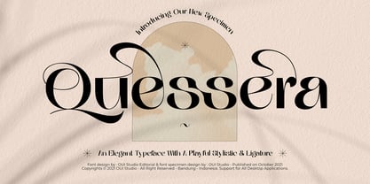 Hello, friend! 'Quessera' font is coming; an elegant typeface with huge playful stylistic & ligatures. Quessera has a complete stylistic of uppercase and has many unique ligatures, so you have many choices to determine the most perfect one for your work and make it look stunning. Quessera is perfect for branding, logo, invitation, wedding vibes, fashion, headlines, and more.
 - Katharine by Teweka,
$20.00 Katharine is a fresh new font, Made in Upright style, Katharine Has 417 glyphs with lots of swash options. This Katharine font is very easy for you to work with, because it has automatic letter and number combinations to change the swash inside the letters. This font is suitable for: Branding, Logotype, Poster, Social Media and others.
 - Veggie Spray by PizzaDude.dk,
$16.00 I bet a lot of people would love to have a Veggie Spray - I bet they would use it to turn candy, ice cream, cakes and other fattening products into something more healthy! Well, this font has zero calories and is 100% handmade, and comes with contextual alternates - which means that every letter has 5 different versions!
 - Cupid Gummies by Balpirick,
$15.00 Cupid Gummies is a Sweet and Cute Handbrushed Font. Whether you’re using it for crafts, digital design, presentations, or making greeting cards, this font has the potential to become your favorite go-to font, no matter the occasion! This font only has allcaps letters. - also multilingual support Enjoy the font! Feel free to comment or feedback! Thank you!
 - Shearman Std by UFF,
$25.00 Shearman STD has a simple design, based on industrial fonts, in particular at the typewriters fonts. It's a geometric font with curves elimination, noting in particular the O and Q letters. It has smooth angles and clean forms which combine in a font with modern appearance. It include five weights with two italics and an extended European character set.
 - Display Black Serif by Gerald Gallo,
$20.00 Display Black Serif is a display font not intended for text use. It was designed specifically for display, headline, logotype, branding, and similar applications. Display Black Serif has an uppercase alphabet located under the character + shift keys and a complete set of alternate uppercase characters located under the character set keys. It also has numbers and punctuation.
 - Quethy by Zamjump,
$10.00 Quethy is a playful font that can be applied to many of your precious designs. It's very simple handwritten and has an elegant style that makes this font a lot of fun. Quethy has a characteristic that is handwriting with a simple pen. You can use it for posters, titles, greeting cards, packaging, invitations and more.Included : - Multi-language
 - Caronta by Ixipcalli,
$22.00 The Caronta typeface is a modern, clean and easy-to-read sans serif typeface. It has been used for texts and documents where you want to show a minimalist appearance. The contrast between the light and bold fonts makes for a visual game that is pleasing to the eye. It has ten styles, and five weights.
 - Argenta by Ingrimayne Type,
$9.95 Argenta is an informal, "hand-printing" font that has the appearance of writing by a child in elementary school. Argenta comes in three weights and has an oblique style for each weight. The child handwriting characteristic is developed in the ArgentaBobbed fonts, which add dots or little balls to the ends of letters. (Could they be called, "Ball Serif?")
 - Shelton Slab by HVD Fonts,
$19.00 Shelton Slab is a Typeface with an eroded, printed look. The letters seem to be from different alphabets to support the wood type feeling. Every letter has an alternate character. Shelton Slab has an extended character set to support Central and Eastern European languages and also contains arrows and other special glyphs available through the OpenType contextual alternates feature.
 - Honey Love by Dhan Studio,
$15.00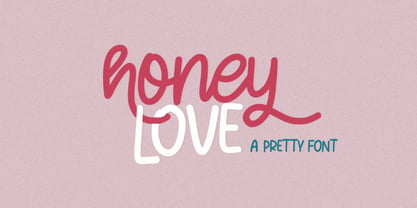 Honey Love is a pretty font that has a unique and attractive style, this font also has a lovely alternatives, which will make your designs even more perfect if you want to mix them in each of your designs. Perfect for logos and quotes or you can use it in any design you want to use.
 - Onthel by 38-lineart,
$16.00 Onthel is a bold-script with a touch of rhythmic brush that is very charming and has character. It was inspired by Onthel Bicycles, which is a Dutch design bicycle that is characterized by an upright sitting position and has a very strong and high-quality reputation. This font is a good choice for your logotype and lettering craft.

