10,000 search results
(0.018 seconds)
- Scoth Brace by Heinzel Std,
$12.00Scoth Brace is an elegant and modern serif font. Fall for its ravishing style and use it to create gorgeous logos, headlines, branding, wedding invitations, beautiful stationary art, eye-catching social media posts, and much more! This font is PUA encoded which means you can access all of the amazing glyphs. Scoth Brace Features : Scoth Brace Regular and Italic Version Uppercase, Lowercase, Numerals, and more punctuations. Multilingual support for various languages - Dortmund by Punchform,
$39.00 Dortmund v1.02 2023, Oct 02 Dortmund is a sans-serif type family designed to offer support for most Latin script languages. Dortmund has nine weights, each with corresponding italics, 710 glyphs, and 17 OpenType features (aalt, calt, case, ccmp, dnom, frac, locl, numr, ordn, pnum, sinf, ss01, ss02, subs, sups, tnum, zero). Dortmund supports 377 languages and covers 3 Unicode blocks (Basic Latin, Latin-1 Supplement, Latin Extended-A).
 - Barachiel Alternate by Stefani Letter,
$14.00 Barachiel is a beautiful script and Monogram font designed with an incredibly modern feel. Whether you’re looking for fonts for Instagram or calligraphy scripts for DIY projects, Still Love will turn any creative idea into a true piece of art! This font is PUA encoded which means you can access all of the glyphs and swashes with ease! It features a varying baseline, gorgeous glyphs, and stunning alternates.
 - Fonseca by Nasir Udin,
$10.00 Fonseca is a modern sans serif inspired by art deco and typography poster in early 20th century. The key of this all-caps family is simple straight geometric forms and modernized letterforms. This display family is perfect for headlines, posters, logos, branding projects, magazines, and packaging. The modernized retro-look makes this family great to presents any contents related to travel, history & culture in the present/modern way.
 - Kneebls by Ingrimayne Type,
$9.95 Kneebls was inspired by Art Deco lettering. It is monoline and all caps, with most of the letters on the lower-case keys different from those on the upper-case keys. It comes in three weights: thin, regular, and bold. There is also a distorted, wavy version, KneeblsRuffled, and a shadowed version. The shadowed-inside style is designed to be used in a layer with the shadowed style.
 - Billyjo by Stefani Letter,
$12.00 Billyjo is a elegant, soft hand-lettered handwritten font. Fall in love with its authentic feel and use it to create gorgeous wedding invitations, stationary art, eye-catching social media posts, greeting cards, advertising, packaging, and logo. This font is PUA encoded which means you can access all of the glyphs and swashes with ease! It also features a wealth of special features including alternate glyphs and ligatures.
 - Lansere by omtype,
$37.00 Lansere is an art-deco typeface inspired by lettering of Russian graphic artist, painter and sculptor Evgeniy Lansere (1875–1946). A strongly geometric lettering style of his late book covers and an elegance of early ones has been combined in a modern typeface . This all-caps font has two versions for each letter and more than 60 discretionary ligatures (both Latin and Cyrillic). The initial graphic idea by Denis Bashev.
 - Paget by Greater Albion Typefounders,
$8.50 Paget is a modern exploration of Tuscan design. Here you'll find simple geometric outlines with an 'Arts and Craft' charm about them. Paget is beautifully clear and easy to read, but offers a distinctive charm that conventional sans serif and serif faces don't. Paget is offered in regular and oblique forms and is an ideal way to merge tradition and all that is new and fresh in your designs.
 - Steffinella by Stefani Letter,
$12.00 Steffinella is a sweet, soft hand-lettered handwritten font. Fall in love with its authentic feel and use it to create gorgeous wedding invitations, beautiful stationary art, eye-catching social media posts, cute greeting cards, apparel, and logo. This font is PUA encoded which means you can access all of the cute glyphs and swashes with ease! It also features a wealth of special features including alternate glyphs and ligatures.
 - Angelviews by Jonahfonts,
$40.00 Angelviews a sans serif font with over 80 variations in the lower case, including Latin and Central European diacritics. Alternates in the lower case can be involked in ONE FELL SWOOP with the the Contextual Alternate Opentype feature (calt), or by selecting each single Alternate (aalt). There are some faint differences in the lower case glyphs but enough to give the designer a creative choice in texts or small captions.
 - Etched Stencil JNL by Jeff Levine,
$29.00 The American Sign Museum in Cincinnati houses an amazing collection of vintage signage from all kinds of sources and covering many eras of retail advertising. Someone visiting the museum posted online an image of one particular piece of glass with hand lettering saying “gold leaf” in a bold Art Deco stencil style. Etched Stencil JNL was inspired by that image and is available in both regular and oblique versions.
 - Burnic by Storictype,
$19.00 Introducing vintage classic display typeface its called Burnic Typeface. Inspired by antique, mix victorian and art deco period with decorative shapes*. Those all will make you work easily to create : Posters, Logos, Print, Quotes, Headers, Clothing, Labels, Packaging etc. Features : Character Set A-Z Numerals & Punctuations (OpenType Standard) Accents (Multilingual characters) Ligatures Above the description of this font, I hope you're satisfied with what I have created. Thanks and enjoy designing.
 - Moreva by HIRO.std,
$17.00 Moreva is a new casual modern script font. This font describes about girly, feminist, elegant, catchy, dynamic, humanist, easy to use and will bring a good harmony when the letters are connected and paired each other. FEATURES - Support Opentype Features - Support Ligatures - Automatic stylistic alternates am an ar at att bb bl cl ct dd fl el elt em en er et ett ff gg gt hh il im in ir it itt kk ll lt mm nn nt oo ol olt om on or ot ott pp rr ss se sh sk sl so st tt the um un ur utt yl yt Sl Sk St Sh Gl Gh Kl Kh Ch Cl Bl Bh - Uppercase - Lowercase - Numbering and Punctuations - Multilingual Support - Works on PC or Mac USE Moreva works great in any branding, logos, magazines, apparel, wedding designs, social media posts, advertisements, quotes, product packaging, product designs, label, photography, watermark, invitation, stationery and any projects that need handwriting taste. Enjoy using! Thanks. HIRO.std
 - A10 STAR Black by Mogtahid,
$90.00 As a former typographer / lino and calligrapher, Abdallah NASRI had recourse to the nature of the idea of an "INTERCHANGEABLE" collection for types who in reality offer a police collar parallel to the complex typeface of the variable. Our fashion is outlined by a simple calculation defined by superimposed geometric circles where we used only its ¼ to fill the need for the angles of each of our letters. Always with the idea of having in the same allocated space, the same letter nested as many times as fat example from Hairline to Ultrabold. It was in this way that I was able to obtain a large number of styles, with a very interesting kerning which prompted me to extend the font to other languages with +1000 characters and +600 glyphs. I have always been treasured by the all in "1". I assure you that I sought to obtain the maximum of Visibility for a use S / Titling TV, WEB Pages and Typography Typo; once the difficult thing was done, I was rewarded by a font that has countless typographic openings for the world of graphics with 10 styles of weights in hand, and again I am happy to have personalized the charm of each letter by new details; I do not regret the time spent on thinking about it so that it is useful and at the same time pleasant as a working tool, finally profitable in all sectors and more multilingual, without forgetting that it is a family of inter change c ' is to say: All the types occupy the same height of the body and it is their fats which differs in the same space width of each of the letters, therefore no interference in spacing. Here, an additional alternative, a participation of a septuagenarian in the service of the love of modern digital typography. • TEST: At 50% screen in a body of 12 pixels, the A10 STAR Alphabet subjected to a test, has a clear Readability / Visibility. • P.S: A10 STAR integrates Diacriticism in all its forms. Texte d'origine : Abdallah NASRI a eu recours en étant ancien typographe/lino et calligraphe à la nature de l'idée d'une collection "INTERCHANGEABLE" pour les types qui en réalité offre un collier de police parallèle à la fonte complexe du variable. Notre mode est esquissé par un calcul simple défini par des ronds géométrique superposés où on a utilisé seulement son ¼ pour garnir le besoin des angles de chacune de nos lettres. Toujours dans l’idée à avoir dans le même espacement alloué, la même lettre imbriquée autant de fois de graisse exemple du Hairline à Ultrabold. C’est de cette manière que j’ai pu obtenir un grand nombre de styles, avec un crénage très intéressant ce qui m’a incité à étendre la police à d’autres langues avec +1000 caractères et +600 glyphes. J’ai toujours été prisé par le tout en « 1 ». Je vous assure que j’ai cherché à obtenir le maximum de Visibilité pour une utilisation S/Titrage TV, Pages WEB et Maquette typo ; une fois le difficile fait, j’ai été récompensé par une police qui possède d’innombrable ouverture typographique pour le monde du Graphisme avec comme atout en main 10 styles de graisses, et encore je suis content pour avoir personnalisé le charme de chaque lettre par des détails nouveaux ; je ne regrette pas le temps passé dessus à réfléchir pour qu’il soit utile et à la fois agréable comme outil de travail, enfin profitable tous secteurs confondus et en plus multilingue, sans oublié que c’est une famille d’inter change c’est-à-dire : Tous les types occupent la même hauteur du corps et c'est leurs graisses qui diffère dans un même espace largeur de chacune des lettres, donc aucune interférence dans l’espacement. Voilà, une alternative supplémentaire, une participation d’un septuagénaire au service de l’amour de la typographie numérique moderne. • TEST : A 50% d'écran dans un corps de 12 pixels, l'Alphabet A10 STAR soumise a un test, présente une nette Lisibilité / Visibilité. • P.S : A10 STAR intégre la Diacritique dans toutes ses formes.
 - Rikkia by Matt Chansky,
$21.00 Rikkia is synonymous with glamour and innovation and has an immediate high-end look that is both timeless and universally appealing. The font family is distinguished by modern ovals and subtle architectural angles. Stylish and versatile, Rikkia comes in wide and standard widths – from hair to bold. The font also has an alt character set for key glyphs like "a" and "R." You'll find a professional set of ligatures, multilingual options, fractions, and a the estimated symbol. Cosmetics, AI, engineering, healthcare, sports, editorial – and all points in between, Rikkia has you covered for a variety of layout needs. Clean, distinctive, memorable, and easily readable — an ideal choice for both print and screens.
 - Krul by Re-Type,
$99.00 ‘Krul’ is a typographic interpretation of the lettering style created by Dutch letter painter Jan Willem Joseph Visser at the end of the 1940s, which decorated the traditional brown bars of Amsterdam. In the beginning, these letters were strongly associated with the pubs connected to the Amstel brewery, given that Visser was the company’s official painter. As the years passed, the style became increasingly popular, and various business owners in Amsterdam and other Dutch and Belgian cities also commissioned its use. In the 1970s and 1980s, Leo Beukeboom, another talented letter painter, continued and expanded this lettering tradition while employed under the Heineken brand. Much of his work can still be found in the Jordaan and De Pijp neighborhoods in Amsterdam. The Amsterdamse Krulletter, or Amsterdam’s curly letter, is strongly inspired by the calligraphic works of the 17th century Dutch writing masters, of which Jan van den Velde was a central figure. However, distinct characteristics of this style, for example, its unusual and beautiful ‘g’, originate from a model that was published by Johannes Heuvelman in 1659, which J. W. J. Visser referenced. Typographic circles have somehow overlooked the Amsterdamse Krulletter and its heritage. The Dutch calligraphic hands preceded and influenced the formal English penmanship which has inspired numerous typefaces in the Copperplate style. In contrast, the models from van den Velde, Heuvelman, and Jean de la Chambre, among others, are a missing chapter in Dutch typographic history, and had never been turned into typefaces until now. Conscious of the cultural and identity issues that arise in reviving a unique style, and concerned about the speed with which the lettering style was disappearing, Ramiro Espinoza focused the project of designing ‘Krul’ on digitally recreating the calligraphic complexity of these beautiful letters. Created through several years of research, ‘Krul’ is not a direct digitization of the Amsterdamse Krulletter, but instead, an interpretation that incorporates numerous alternative characters absent in the original model, and improves upon details where necessary, resulting in an optimal performance on the printed page. The typeface is presented in Open Type format, with an abundance of intricate ligatures, fleurons, and swashes, which permit the creation of numerous calligraphic effects. The very high contrast and rhythm of the strokes in this typeface make it especially suited for media applications conveying a sense of elegance and sophistication. Designers of feminine magazines, advertisements, and corporate identities within the fragrance and fashion industries will find in this typeface to be an extremely useful and appropriate resource.The great Amsterdamse Krulletter is finally back, and we are proud to make it available to you.
 - PykesPeakZero - 100% free

- Moneymachine by Mans Greback,
$49.00 Moneymachine is a sans and serif combined display typeface. Inspired by the art of money printing, the typography used for certificate production and classic letterforms, Moneymachine uses a traditional and perfected serif font and blends it together with a modern and clean sans-serif. The result is an original and confident work, which fits perfectly as a logotype or headline in any context that requires that extra touch of coolness. The Moneymachine family consists of six fonts: The Regular that combines sans and serif. Inverted for a white-on-black version. The Serif and Sans for more basic writing. White and Black for a lettering with a banner. The font is built with advanced OpenType functionality and has a guaranteed top-notch quality, containing stylistic and contextual alternates, ligatures and more features; all to give you full control and customizability. It has extensive lingual support, covering all Latin-based languages, from North Europe to South Africa, from America to South-East Asia. It contains all characters and symbols you'll ever need, including all punctuation and numbers.
 - Scholz Secession by HiH,
$8.00 We named this font Scholz Secession. Fin-de-siecle Vienna, Austria is the source of this Jugendstil design from Schriftgiesserei Eduard Scholz. The original release was under the name Reklameschrift Secession. Most of the curve strokes look like commas to me. The letters are as soft and plump as the comforter on the bed I slept on in a Salzburg B&B many years ago. I was traveling with a college buddy and our next stop was Vienna. There a kind, young student named Hanna and her boyfriend took us under their wing. One of the places Hanna proudly showed us was Otto Wagner’s Majolika Haus, built in 1898, and only about 8 blocks from Secession Hall. Hanna explained to us that the style was called Jugendstil and represented Art Nouveau as interpreted within the framework of their culture. I even took a picture. After all, memories are part of who we are. Figures are old-style for text use. This font would not be my first choice for a spread sheet. Included are German ligatures ch (alt-0123) & ck (125), two period ornaments (135, 175) and lower case o and u with Hungarian long umlaut (215, 247)). A very likeable and easy-to-use font.
 - Saveur Sans by Arkitype,
$10.00 Saveur Sans is inspired by art deco and French cafes. This display family has clean, simple letterforms that feel modern but at the same time have a retro, art-deco styling. This family can add a sophistication to any layout whether it be print or online. Saveur Sans is a great selection for headlines, logotypes and branding. it is an all-caps display family with some neat alternates including an alternate O and E that instantly give your copy that retro-deco look. The promos have been inspired by french food and design. This family is perfect for use in packaging and branding of food products as well as menus and restaurant or cafe branding.
 - Printers Drawer JNL by Jeff Levine,
$29.00 Printers Drawer JNL continues building on a library of letterpress illustrations, cartoons, ad builders, Art Deco ad panels, ornaments, embellishments, and general miscellany. The images are re-drawn from vintage source material, and this font is jam-packed with 89 images spread throughout most all of the standard keyboard positions. This is officially the 1000th release from Jeff Levine Fonts since its inception in January of 2006. Jeff Levine Fonts aims to preserve the almost-lost artwork and lettering styles of the past within a digital type format, and often recreates the designs complete with their evident flaws, idiosyncrasies and eccentricities; allowing for a “real world” and nostalgic look to the computer generated art projects of today.
 - Sweet Treats by Jeff Levine,
$29.00 A piece of British sheet music for “You’re Sweeter than I Thought You Were” [from the 1935 film “Jack of All Trades” starring Jack Hulbert] provided inspiration for a digital typeface based on the credits for Hulbert and the film that rather than the song’s title. What’s interesting is the lettering style was influenced by Art Nouveau at a time when Art Deco was gaining in popularity. The result is Sweet Treats JNL, which is available in both regular and oblique versions. (According to Wikipedia, John Norman ‘Jack’ Hulbert (April 24, 1892 – March 25, 1978) was a British actor, director, screenwriter and singer, specializing primarily in comedy productions, and often working alongside his wife Cicely Courtneidge.)
 - Sabler Titling by insigne,
$- Make the right statement with the elegant Sabler Titling. This showstopping font features an inherent grace combined with the classic style of the Art Deco period. The subtle beauty of its letters is highlighted by the typeface’s stems, which taper towards the baseline highlight--a feature that adds clear distinction to your design. Originally inspired by a WPA poster, this typeface has been expanded to include three equally elegant proportions. Sabler Titling includes more than 60 free alternative forms, including support for most Latin-based languages. Add a hint of seduction to your work with Sabler’s high-contrast letterforms--ideal for magazines, advertisements and books on fashion, fine arts, and luxury goods of all kinds.
 - Inola by WildOnes,
$12.00 Inola Hand Lettered Font in modern calligraphy style. It resembles actual handwritten letters that can make a great font for branding, logo design, and graphic identities. Inola includes ligatures and stylistic alternates for some letters and floral symbols to include in your designs, find them all in the glyphs panel. Inola Hand Lettered Font is perfect for logo design, branding, art prints, wedding cards and invitations, packaging, business cards, greeting cards, posters, magazines, social media, home decors, stationary, blogs, and website design, and more. Inola Hand Lettered Font contains all uppercase and lowercase letters from A to Z and numbers from 0 to 9. Latin Extended letters are supported together with other bonus characters.
 - Uptown Review JNL by Jeff Levine,
$29.00 Cover art for the 1933 sheet music of Harold Arlen and Ted Koehler's "Stormy Weather" (from the musical production "Cotton Club Parade") listed the cast of the show in a condensed hand lettered sans that typified the 1930s and the Art Deco era. This served as the inspiration for Uptown Review JNL; available in both regular and oblique versions. The Cotton Club was a whites-only night club which showcased black acts, and was originally located on 145th Street in Harlem from 1923 to 1935, then existed for a short time in the New York theater district from 1936 to 1940. After the Broadway incarnation of the club closed, its space was taken over by the Latin Quarter.
 - Alfazine Script by Mysterylab,
$24.00 Alfazine Script is a bold and spirited script with extensive ornate detailing. This versatile font is evocative of antique signpainters' letters, circus wagon & carnival booth graphics, groovy 1960s psychedelic scripts, and even sportswear team insignias, all combined with a modern approach towards lively curlicues and ball finial stroke ends. As with all other font offerings from Mysterylab Designs, we take great care with artful kerning and weight-matching of glyphs to allow this font to be used not only at attention-grabbing headline and logo sizes, but also at small body copy sizes in extended passages. Alfazine also features an extruded shadow version that's very useful for designing logos and customized layered lettering.
 - Silvercrush by IKIIKOWRK,
$17.00 Introducing SILVERCRUSH Typeface, created by ikiiko. A rough letters with expressive strokes and have a strong character for street art typeface. Silvercrush typeface is perfect for an poster event, urban brand, hipster magazine, fashion stuff, quotes, and all the design elements that require a street vibes. What's included? Uppercase & Lowercase Number & Punctuation Bonus Alternates Multilingual Support Enjoy our font and if you have any questions, you can contact us by email : ikiikowrk@gmail.com
 - Micaroline by Martype co,
$19.00 MICAROLINE The Classic Art Deco Font with Alternates & Ligatures Micaroline is a family Sans Serif font designed with carefully handcrafted. Also suitable for branding, T-shirt, Wedding Invitation, Classic Design, Logotype, and any project. Comes with a tons of ligature make your life more than comfortable, easier to design and adjust frustrating space in font. All Caps Fonts. You can access the stars by typing (S+1) and then put it anywhere you want.
 - Bloemgracht by Hanoded,
$15.00 In the old Amsterdam neighborhood of 'De Jordaan', you will find a canal called Bloemgracht (Flower Canal). For many years, a coffee store called Schildmeijer could be found here. Their paper coffee bags and advertisements sported a hand made font which I have tried to recreate and the result is Bloemgracht typeface. It is an all caps art deco font, quite angular, but very legible and distinct. Bloemgracht comes with extensive language support.
 - Marcheile by Arterfak Project,
$15.00 Marcheile is a display font, inspired by Gatsby & Vintage looks. The All-Caps font which comes from a combination of art deco and retro style. Luxury shapes, clean & solid that very possible to apply in many design project. Marcheile also has some OpenType features to gives you many alternatives in your creative process. There's some ligatures, many alternates, and 18 accents. Great choice for your headline, editorial, logotype, quotes, typography and more!
 - PAG Novembris by Prop-a-ganda,
$19.99Prop-a-ganda offers retro-flavored fonts inspired by lettering on retro propaganda posters, retro advertising posters, retro packages all the world over. This is perfect font for your retrospective project. PAG Novembris is narrow and serif font with art deco look. “A”, “G”, “H” and “M” have different letter form in uppercase and lowercase, and they give decorative accents on your typography. PAG Novembris is perfect font for your retrospective project. - RMU Siegfried Pro by RMU,
$35.00 RMU Siegfried Pro is another breathtaking Art Nouveau font from the fin-de-siècle period which underlines your stylish projects in a remarkable way. The font was carefully redesigned, some oddieties abolished, and the font was extended to make it usable for Central European languages too. Three embedded graphic elements let you make a fitting frame. The letter k has an alternative form, so look for all OT features in this font.
 - Spirodelic by Mysterylab,
$16.00 Spirodelic is a funky pop-art font with a sassy vintage vibe. This all-capitals design incorporates coiled spirals into the letters, and will add a lot of swirly psychedelic fun to your designs. It's great for retro seventies looks of course, but really also works well on anything modern that needs a loose and lighthearted touch, like kids books, toy packaging, flavored drinks, clothing lines, surf gear, logos... you name it.
 - Swing Era JNL by Jeff Levine,
$29.00 Hand lettered Art Deco lettering for the title on the cover of the 1930s-era song "And I Still Do" provided the inspiration for Swing Era JNL. A bold, casual and friendly typeface, it features an intersecting inline through some of the characters. One could almost picture the hottest big band of the day promoted on a lobby card with this alphabet, beckoning all to come on in and "cut a rug".
 - RMU Edelgotisch by RMU,
$30.00 RMU Edelgotisch is a carefully redrawn revival of the then trend-setting Schelter & Giesecke hot-metal original from the fin-de-siècle period. This fine vintage font elevates all your projects in an Art Nouveau style. To reach the historical long s, either type the integral sign [ ∫ ] or turn the round s into the long s by using the OT feature historical forms. It is also recommended to activate the OT feature discretionary ligatures.
 - Raittens by Gassstype,
$22.00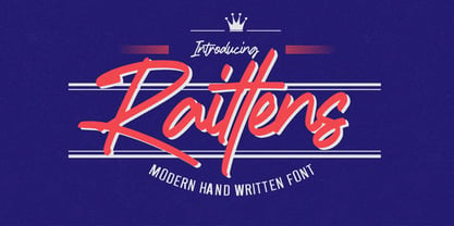 Introducing Raittens is Modern Handwritten Font is a Authentic Style and classy style, Raittens a natural handwritten feel. This handmade font will make your design has a beautiful natural touch for each details. It is perfect for any design project as Invitation,logo, book cover, craft or any design purposes,photography overlays, signs, window art, scrapbooking, tags and so much more! This font is PUA encoded which means you can access all of ligatures.
 - Saxo by Eurotypo,
$35.00 The Saxo family is based on the typefaces of the twenties and thirties, where through the Art Deco and Futurism were built the foundations of the modern movement. Designed from basic geometric shapes (triangle, circle and square). This font transmits his solid character and modern spirit, through 470 glyphs, including Opentype features like ligatures, stylistic alternates and borders based on the geometry of the typeface. All Saxo fonts come with CE languages support.
 - Grand Central JNL by Jeff Levine,
$29.00Grand Central JNL is named for the most luxurious train depot in the nation—Grand Central Station in New York City. This multi-line Art Deco font is reminiscent of all of the glitz and glamour associated with Manhattan in the 1930s and 1940s. Modeled from Jeff Levine's Parkitecture JNL, its roots go back to the popular typeface best known as Eagle—a lettering design most associated with the NRA posters of the Depression era. - Marsheila by Arterfak Project,
$15.00 Marsheila is a display font, inspired by Gatsby & Vintage looks. The All-Caps font which comes from a combination of art deco and retro style. Luxury shapes, clean & solid that very possible to apply in many design project. Marsheila also has some OpenType features to gives you many alternatives in your creative process. There's some ligatures, many alternates, and 18 accents. A great choice for your headline, editorial, logotype, quotes, typography and more!
 - Creazy Xeon by SimpleType Studios,
$23.00 Crazy Xeon is stylish graffiti brush inspired from graffiti street project art. This gorgeous font includes all lowercase and uppercase characters, numbers, punctuation, an array of standard ligatures and a selection of international characters as well. Whether you are using it for cartoon-related designs, lable, children’s games, quotes, t-shirts, titles, merchandise, brand names, book covers, posters, or just any creation that requires a touch of beauty, this font is a great choice.
