10,000 search results
(0.014 seconds)
- Running Hipster by Hanoded,
$15.00 Running Hipster is a tall, thin and all caps font with a funny name. The upper and lower case letters differ and can be mixed. You don’t necessarily have to use it to market your free range sheep woolen jumpers or organic button squash and soy based sour cream soup, feel free to use it for just about anything. Comes with a vintage amount of diacritics.
 - Typographer Rotunda Alt - Personal use only

- Freebooter Script - Alts - Unknown license

- Diehl Deco - Alts - Unknown license

- Reload Alt Stencil by Reserves,
$49.00 Reload Alt Stencil is a rounded industrial geometric stencil typeface available in four flexible and distinct weights. Features include: Slashed zero Romanian s accent language feature Extended language support *Requires an application with OpenType and/or Unicode support.
 - Van Alt JNL by Jeff Levine,
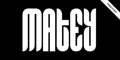
$29.00Looking similar to a Deco-era classic typeface, Van Alt JNL has slightly different character shapes, but pays due respect to its inspiration by the original... - Alt Matey V2 by ALT,
$-
- Alt Ayame Long by ALT,
$10.00 A long version of my Ayame font. Ayame is a display font which looks great on posters, logos, and titles. Ayame Long is a 2-weight family with a heavy retro look. Works great with the regular version of Ayame you can check out the original.
 - Houschka Alt Pro by G-Type,
$72.00 Houschka Alt Pro is a carbon copy of the Houschka Pro family with one key difference: the rounded signature glyphs A & W on the default positions swap places with their straight alternates. Houschka was named after Georg Houschka, a sadly defunct confectioner’s shop in Salzburg, Austria, which had a wonderful 1930s frontage and distinctively rounded letterforms in the sign above the door. Houschka Pro is the follow up to the original Houschka type family which first appeared back in 1999. Character shapes have been improved, kerning and spacing refined, and OpenType features include CE, Baltic, Turkish & Cyrillic language support plus small caps, 3 stylistic sets, contextual alternates, ligatures and 4 sets of numerals. Houschka is a clean and legible modern sans serif typeface which shares the humanist qualities of Gill Sans and Johnston but retains a uniquely charming character of its own (particularly in signature glyphs A, G, Q, W, u & w). The monolinear structure, rounded corners and rolling curves give Houschka a soft and friendly appearance.
 - Alte Schwabacher EF by Elsner+Flake,
$35.00 - Neue Alte Grotesk by VisualWorks,
$20.00 Inspired by German grotesk from XIXth century. Driven by the spirit of 1950s Swiss Style. Designed with a hint of constructivist approach. Neue Alte Grotesk is a minimalistic typeface with a distinct character. It is created to connect both new and old. It will look good in juxtaposition with retro-styled illustrations and ultra-modern graphics.
 - Houschka Rounded Alt by G-Type,
$72.00 Houschka Rounded Alt is a carbon copy of the Houschka Rounded family with one key difference: the rounded signature glyphs A & W on the default positions swap places with their straight alternates. Houschka was named after Georg Houschka, a sadly defunct confectioner’s shop in Salzburg, Austria, which had a wonderful 1930s frontage and distinctively rounded letterforms in the sign above the door. OpenType features include CE, Baltic, Turkish & Cyrillic language support plus small caps, 3 stylistic sets, contextual alternates, ligatures and 4 sets of numerals. Houschka Rounded Alt is a clean and legible modern sans serif typeface which shares the humanist qualities of Gill Sans and Johnston but retains a uniquely charming character of its own. The monolinear structure, rounded terminals and rolling curves give Houschka Rounded Alt a soft and friendly appearance.
 - Oksana Text Alt by AndrijType,
$25.00Oksana Text is the demure version of Oksana, with shorted serifs, higher contrast, more slender proportions. In six weights from Thin to Black and with the real italic, this typeface is suitable for longer text with rich typography. - Du by sugargliderz,
$20.00 Du is a self hommage to Uncertain Felttip. Uncertain, made in 2008, is a typeface which reproduced faithfully the style in which I am writing on copy paper, usually using the felt-tip pen. This time, I wrote the new family by the same method but using the tablet PC and the touch pen. Although, as for some characters, Uncertain differs in a form, it is the result of reflecting my hand writing. I wrote all the characters. If it is original, all the characters diverted and composed, for example, characters, such as Aacute and Agrave, are written. Different specification from Uncertain is family composition. Although Uncertain had only 3 weight, 7 weight were designed for Du. This way a user can choose his favorite weight because the variation of weights increased.
 - PR Uncial Alt Caps - Unknown license

- Turbayne Running Hand - Unknown license

- Sharpies Are Fun - 100% free

- Sun n Moon - Unknown license

- So Run Down - Unknown license

- KR Hockey Fun - Unknown license

- Dont Walk Run - Unknown license

- So Run Down - Unknown license

- KR California Sun - Unknown license

- C Dans L'air - Unknown license

- House Of Fun - Unknown license

- KR Sun Dings - Unknown license

- KR Blazing Sun - Unknown license

- Two Gun Johann - Unknown license

- KR Camera Fun - Unknown license

- KR Football Fun - Unknown license

- DIN Next Slab by Monotype,
$56.99 Now even more design possibilities with the popular DIN Next. With its technical and neutral character, DIN Next has earned a permanent place in contemporary typography. Now, DIN Next Slab expands the font family further, offering new design potential. Now comes the next step, DIN Next Slab, also produced under the direction of Akira Kobayashi. On a team with Sandra Winter and Tom Grace, Kobayashi is creating the new font variant based on the optimized shapes of DIN Next. The expansion will make the popular font all the more flexible and versatile. Apart from that, the geometric slab serifs underline the technical and formal nature of the font and emphasize a central design element of DIN Next. However, the team did have some challenges to overcome. While it is relatively easy to imagine DIN Next Light with slab serifs, the amount of available space quickly disappears when it comes to the Black styles. Winter explains that many tests and trials were necessary to find a compromise between space, letters and the serif shapes. Experiments with modified contrast in the weight or only one-sided serifs were quickly abandoned. The central, technical and powerful character of the font changed too much. Nevertheless, it was necessary to simplify slightly the shape of some letters, such as the ‘k’ or ‘x’, for example. These changes, first developed in the Black styles, were applied to all weights in order to lend the font a consistent appearance. Like DIN Next, DIN Next Slab also has seven weights, which cover the range from Ultralight to Black, each with matching italic. There are various character sets in all of the styles and the four middle weights have small capitals available. DIN Next Slab harmonizes perfectly with the styles of DIN Next: the basic letterforms and weights are identical. Both versions of the font can work together perfectly, not just in headlines and body text, but also within a text; they complement each other very well as design variations. With the new DIN Next Slab, Monotype expands the DIN Next super family consistently. With DIN Next Slab, you can underscore the technical and formal nature of the understated font not only in headlines, but in texts, as well. In this way, you have new and diverse potential for application, thanks to the way the different styles of DIN Next combine perfectly.
 - PF DIN Mono by Parachute,
$45.00 PF DIN Mono is the latest addition to the ever-growing set of DIN super-families by Parachute. It was based on its proportional counterpart DIN Text Pro but was completely redesigned to reflect its new identity. DIN Mono is a monospace typeface which is comprised of characters with fixed width. Traditionally, monospaced fonts have been used to create forms, tables and documents that require exact text line lengths and precise character alignment. DIN Mono, on the other hand, can prove to be more than a useful typeface for technical applications. In the world of proportionality, DIN Mono stands out as a fresh new alternative to the popular standard, particularly for publishing and branding applications. Additional care was given to the aesthetic form and its pleasing characteristics. The spacing attributes of the glyphs were redefined and legibility was further improved by revising or changing the shape of the letterforms. Furthermore, kerning was not included in order to preserve the monospace nature of this typeface. The family consists of 12 weights including true-italics. Currently, it supports Latin, Eastern European, Turkish and Baltic.
 - Serenity Font Duo by Nicky Laatz,
$18.00 An elegant duo of fonts and floral illustration extras - designed to work together in harmony, to produce a plethora of beautiful, sophisticated & feminine designs. The luxurious modern calligraphy script works perfectly together with the delicate hand-drawn florals - ideal for elegant branding projects, greeting cards, packaging, social media, logo design and of course, wedding invitations. Also included is Serenity Serif, a rustic serif font, with a touch of imperfection as you'd find in old printed press inks - to contrast with and therefore compliment the more refined luxurious contemporary flow of the script font . Serenity Script includes handy OpenType features that makes the font look more natural - it includes a universal beginning swash for lowercase letters , a full set of lowercase letters with ending swashes, a beginning swash that can be added via OpenType Ligatures by typing either { } or ( ), and a full set of alternate lowercase letters , as well as 70 beautifully crafted ligatures . A more slanted, and heavier version of the script is also included for you. OpenType capable software is required to access these features - The most popular of which is and Photoshop CC, any version of Illustrator, Indesign, Word (new versions). The Serif font comes in 4 versions: Regular, Bold, Heavy and Italic - when used together with different tracking settings and weights, they produce beautiful looking type designs to compliment the Script.
 - Roylands Font Duo by Panatype Studio,
$9.00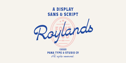 Royland Font Duo is a mathing pair of fonts, inspired by a simple yet elegant vintage graphic design, carefully crafted, and opentype features to support is perfect for graphic design needs.
 - Dans Le Jardin by Latinotype,
$29.00 Dans Le Jardin is a continuation of Dan Le Cuisine dingbat. Their wild and crazy curves give a very special vintage language. Can be used to create patterns or compositions for posters,websites, etc..
 - SP Don Mills by Remote Inc,
$39.00A font family inspired by the twists and turns of North Americas first planned community. - MC Nun Waw by Maulana Creative,
$14.00 Nun Waw is a modern humanist condensed sans display font. Bold stroke, fun character with a bit of ligatures and alternates. To give you an extra creative work. Nun Waw font support multilingual more than 100+ language. This font is good for logo design, Social media, Movie Titles, Books Titles, a short text even a long text letter and good for your secondary text font with script or serif. Make a stunning work with Nun Waw font. Cheers, Maulana Creative
 - Dans Le Noël by Latinotype,
$29.00 Dans Le Noël is a Christmas dingbat. Perfect for use as ornament greeting cards, patterns, posters, websites and visual compositions that need Christmas show in a language full of personality, inspired by vintage illustrations. Dans Le Noël is part of the serie Dans, with Dans Le Cuisine and Dans Le Jardin. You can combine them as you like. Enjoy!
 - Running Board JNL by Jeff Levine,
$29.00 During the early years of the 20th Century, America's fascination with automobiles was just beginning. The cover for a 1916 piece of sheet music for the comedy song "On the Old Back Seat of the Henry Ford" had the title hand lettered by a round nib pen in an Art Nouveau style. This is now available digitally as Running Board JNL.
 - Fun Signs JNL by Jeff Levine,
$29.00 Fun Signs JNL comprises twenty-six humorous signs from a 1930s-era sales list of products manufactured by the Koehler Sign Company of St. Louis, Missouri. Koehler manufactured a large line of stock cardboard "Blue Signs" (presumably blue backgrounds with white lettering) and alongside the many standard phrases used by various businesses was a list of funny sayings. Such placards were bought by merchants to either evoke interest in their services (such as in a bar or restaurant, or jokingly comment on their business policies (as in credit billing). These novelty signs are a fun addition to a flier, ad, web page or announcement and will leave your readers smiling.


