8 search results
(0.055 seconds)
- AltDeutsch by Intellecta Design,
$21.90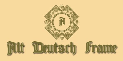
- Englische Schreibschrift by URW Type Foundry,
$89.99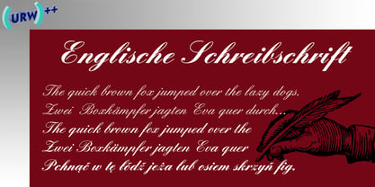
- Deutsch Gothic - Unknown license

- Pedell by profonts,
$41.99 Pedell ist eine neue Schreibschrift, die das Schreiben mit Kreide simuliert. Ein Font mit eben diesem ‚Kreidecharakter’ fehlte bisher noch in der profonts Library. Also wurde der Schriftdesigner Ralph M. Unger beauftragt, eine Kreideschrift zu schreiben und zu digitalisieren. Pedell ist eine gut lesbare, lebendige und nicht kindische Handschrift, die nicht nur für schulische Zwecke hervorragend einsetzbar ist.
 - English 157 by ParaType,
$30.00 The Bitstream version of Englische Schreibschrift by H. Berthold, 1970–72. An unconnected copperplate script of the English nineteenth-century fashion, so-called Spencerian. Based on pressure pointed quill calligraphy. Unlike other copperplate scripts, the letters in this face do not link up. For use in advertising and display typography in relatively small sizes. Cyrillic version was developed at ParaType in 2000 by Vladimir Yefimov.
 - Nifty Script by URW Type Foundry,
$49.99 The “Ultimate Script”? Not yet, but we’re working on it! Just think: Loads of ligatures, contextual variations and stylistic alternates, coupled with easy use…Just what you’ve been looking for all this time? Well, here it is with all of its typographic power. The perfect partner for you: Technically adept, but still good-looking! What more do you want? Die „Ultimative Schreibschrift“? Noch nicht, aber wir arbeiten dran! Man denke nur an: Mengen an Ligaturen, kontextbezogenen Varianten und stilistischen Alternativen, gekoppelt mit leichter Handhabung…Genau das, was Sie die ganze Zeit gesucht haben? Na denn, hier ist es in all seiner typographischen Mächtigkeit. Die perfekte Partnerin für Sie: Technisch versiert, aber auch gut aussehend! Was wollen Sie mehr?
 - Shelley Script Cyrillic by Linotype,
$67.99Matthew Carter designed the Shelley family 1972 for Mergenthaler Linotype to be used as a new script face for the photo typesetting machines. The basic idea was to create one script face that would offer dfferent elegant letterforms. Matthew designed Shelley in three different versions, Allegro which is in the style of Kuenstler Schreibschrift, Andante where the caps are less flowrish and wide and Volante where the letters have its most expressive and wide forms and the lowercase z in this font is in the french anglian double stacked form. All three versions can be easily mixed to give the text a more individual calligraphic look Besides Shelley Linotype Zapfino from Hermann Zapf shows similar basics, but in a totally different letterform. In Linotype Zapfino the individual lowercase letters from the four different versions have different letterforms which gives the text an even more individual touch. - Lux by URW Type Foundry,
$35.99 Many times, when a new creative process is starting, it is triggered by an everyday action or item. In this case, the looks of a lady’s watch inspired Michael Herold to create his new typeface LUX. The sight of the chronograph sparked associations of the 1950s in Mr. Herold: While this decade was predominantly dominated by brush and feather scripts, there was also a bloom of strict and modern architecture. This special mix of strength and retro style is exactly what Michael Herold is trying to capture in his LUX. The result is a typeface which is perfectly suitable for use on book covers, posters and claims – thanks to its striking impression. The name LUX, Latin for light, is inspired by the high bright-dark contrast within the individual characters. Oft sind es alltägliche Gegenstände, die das Bestreben eines neuen kreativen Prozesses auslösen. So entspringt auch die Inspiration zur Erschaffung der LUX von Michael Herold dem Anblick einer Damenuhr. Der Chronograph löste bei Herrn Herold Assoziationen zu den 1950er Jahren aus: Während diese Zeit hauptsächlich von Schreibschriften aus Federn und Pinseln beherrscht wurde, nahm auch die streng und modern anmutende Architektur starken Einfluss auf die Epoche. Diese Mischung aus Strenge und 50er Jahre Retro-Stil soll in der LUX zum Ausdruck kommen. Das Ergebnis ist eine Schrift, die sich mit ihrer plakativen Wirkung perfekt für Buchumschläge, Poster und Claims eignet. Namensgebend war der starke hell-dunkel Kontrast innerhalb der Schrift – festgehalten in dem lateinischen Wort für Licht.
