10,000 search results
(0.096 seconds)
- Sleepy Bear by Missy Meyer,
$12.00 I've been learning to read Cyrillic and Greek letters lately, mainly because I've been playing the game GeoGuessr. (If you haven't played it, I highly recommend! It plops you down somewhere in the world in Google Street View, and you have to figure out where you are.) Cyrillic shows up in so many more places than Russia! You can see it in Bulgaria, Mongolia, Serbia, Montenegro, Kyrgyzstan, and more. Because of that, I made sure to include a fun double-uppercase version of those alphabet sets in Sleepy Bear. They're styled the same way as the Latin characters: all uppercase height, with some lowercase-styled letters thrown in at that same height for a fun look for all ages. I've also made two weights of Sleepy Bear: a plump and smooth regular weight, and a lighter weight that's built to stack on top of the regular (though you can use it on its own). Just type out a word in Sleepy Bear, copy it, and then change the copy to Sleepy Bear Light. You'll get a great outline look in seconds! All characters are extensively cleaned up, with smooth curves and rounded ends. Sleepy Bear is great for all print projects, and also cuts out of all materials like a dream. It's a cute and quirky monoline font family that's great for all of your family's designs. Each font contains over 850 glyphs, and includes: - Latin and extended Latin characters to support over 100 languages; - Cyrillic and Greek double-uppercase alphabet sets; - 18 fractions; - Punctuation galore; - 38 double-letter ligatures for variety (including international pairs like KK and II); - And a half-dozen alternates for even more variety!
 - Pacific Clipper SG by Spiece Graphics,
$39.00 Pacific Clipper has its roots in an old 1930s showcard lettering style. An extra bold version of this sign painter’s relic is shown in Carl Holmes' wonderful book on lettering. It may be described as what happens when Rudolf Koch's Kabel Heavy meets ATF's Novel Gothic. Also known as Sam’s Tune, Pacific Clipper’s noteworthy features include wedged crossbars in the capital A, E, F, and H. Overcurving is present in the capital B, D, P, and R while vertical strokes in the lowercase b, d, h, k, l, and t are chopped off obliquely. Figures in Pacific Clipper are also refreshingly different, particularly the number 4. This lettering favorite turned retro typeface has been extended to include a variety of weights. Pacific Clipper is now available in the OpenType format. Some new characters have been added to this OpenType version as Stylistic Alternates and Historical Forms. These advanced features work in current versions of Adobe Creative Suite InDesign, Creative Suite Illustrator, and Quark XPress. Check for OpenType advanced feature support in other applications as it gradually becomes available with upgrades.
 - Ganges Slab by ROHH,
$40.00 Ganges Slab is a condensed slab serif typeface inspired by Central European advertising typography from late XIX century. It is a perfect match for Ganges Sans. The font has condensed proportions and original letter shapes. Ganges is designed mainly for editorial design, especially for display use, as well as short paragraphs of text. Its narrow proportion makes it very practical to use for posters and magazine covers. Characteristic letter forms fit great for branding, logo and packaging design. It is also a very interesting choice for websites and e-book headlines. Ganges Slab family consist of 27 fonts - 9 weight, 9 italics and 9 obliques. It supports extended set of latin languages, as well as broad number of OpenType features, such as case sensitive forms, standard and dicretionary ligatures, stylistic alternates, contextual alternates, lining, oldstyle and tabular figures, slashed zero, fractions, superscript and subscript, ordinals, currencies and symbols.
 - Plectrum CP by CounterPoint Type Studio,
$29.95 As the first multi-font family designed for the CounterPoint font library, Plectrum offers designers and font lovers an alternative to the usual display style fonts of CounterPoint with a low key yet elegant sans serif family that can serve a variety of functions. Designed as a humanist style sans serif, the letters have variation in stroke weight. The italic faces have some variation in the letter design making them more of a true italic rather than simple oblique faces. The complete family consist of four weights: Regular, Italic, Bold and Bold Italic which can be purchased separately or as a complete package. The typeface has some unique features which add warmth to the design such as a slanted cross bar on the lowercase e and a large x-height. This is a solid, versatile family. Available in OpenType and contains support for Latin based and Eastern European languages.
 - Privilege Sign Two JNL by Jeff Levine,
$29.00 Unique and decorative signage for many drive-ins, motels, food stores and other businesses of the 1940s had what was referred to as “privilege signs” provided by one of the major cola brands. Consisting of the brand’s emblem on a decorative panel, the remainder of the sign would carry the desired message of the storekeeper (such as “Drive-In”) in prismatic, embossed metal letters. Inspired by the Art Deco sans serif style of those vintage signs, Privilege Sign Two JNL recreates the type design in both regular and oblique versions. The typefaces are solid black, but adding a selected color and a prismatic effect from your favorite graphics program can reproduce the look and feel of those old businesses. This is a companion font to Privilege Sign JNL, which recreates the condensed sans serif lettering of other privilege signs from the 1950s and early 1960s.
 - Chanse Fresh by ArtGarbage,
$10.00 Graffiti is all repetition. Style, like brand logos, makes the repetition more recognizable, but style should never keep you from reading the word. Chanse Fresh was a project to make a handstyle font that wasn't self-concious and overworked - the font is clearly readable and fresh AF. Round is the base font with a thin version to create hierarchy or for longer pieces of text. Both round and thin have a "wet" drippy mop tag version best for key text. The font is all caps with alternates, so you can sub in capitals as needed with repetitive letters to change things up. There's a full latin alphabet so you can type all the words with accent marks natively and a ton of discretionary ligatures and accessory glyphs like arrows, stars, and crowns to make your lettering extra fresh.
 - Primitivus by PizzaDude.dk,
$18.00 It all started with making of a simple all-caps font. I drew the whole alphabet, numbers all else needed - but something wasn't quite right...the lettershapes were fine, but quite boring. Then I took a drastic decision: I started all over again ... meaning, I printed the whole thing, messed it up using a wet cloth and wrinkled the paper - then scanned it all again, and imported all the graphics yet again. A lot of work, yes - but personally I think it was worth it! But anyway, that's the story of how Primitivus was made ... well, almost, but not quite ... but that's another story! Use Primitivus for anything that needs that special kind of look were handdrawn letters meets grunge! Play around with the 4 different versions of each letter to make your text look even more random and natural!
 - Dubrove by Dima Pole,
$36.00 Dubrove is a wedge serif typeface inspired by Moravian (Czech) type designs of the 1930-50s. The character font is expressive: free, daring and graceful, delicious and attractive. Here are more than 1100 glyphs, all 102 European languages, all Ancient Slavic Alphabet (49 characters), Latin and Slavic small capitals and OpenType features with many solutions. Dubrove has several stylistic sets, historical forms, localized forms of several languages, interest contextual ligatures and many other delicacies. In the Dubrove typeface several stylistic sets of Slavonic lowercase letters are made. In addition to font basic style (in fact it is close to the natural lowercase character) is a traditional [ss02] set (postpreliminary, the Soviet Union, when most copy lowercase letters are uppercase) and lowercase the natural character [ss03], the style of which, in particular, is often used in the Bulgarian script.
 - Broadway Poster by GroupType,
$15.00 Originally designed by Morris Fuller Benton in 1925, FontHaus's 1995 revival is based on a design named "Novelty Broadway". Characters were referenced from "Commercial Art of Show Card Lettering" by James Eisenberg, published by D. Van Nostrand Company in 1945. This Broadway is classic Broadway but with some charming differences such as a slanted lower case "f" a remarkable lower case "g" and a high-waisted upper case case "R", as only a few examples. It was named "Novelty" because the alphabet incorporated a concave design feature in the tops and bottoms of each letter. These differences allow this version to possess much more personality than that of all other Broadway designs on the market. It looks almost hand brushed, has soft edges and is no where near as sterile looking as all the other digital versions. It feels very 1925!
 - Beware The Neighbors by Intellecta Design,
$23.90 Beware The Neighbors is based on “Personality Script”, a rough alphabet originally drawn by Ross F. George, and published in one of the Speedball series of lettering catalogs that ran from 1935 to 1948. The design is something of a minor classic, and several foundries have recreated digital fonts based on it. However, mostly of these interpretations are very “geometric”, formed using straight lines. Intellecta preferred to create a new interpretation using smoother, curved lines to create a creepy appearance. Also included are several ligatures and OpenType stylistic alternates. This version also has an extended character set for use in Central as well as and West European countries, plus Baltic, Turkish and Romanian. Check out Intellecta’s Clarvoyant for another creepy experience based on lettering from old Speedball catalogs. CLOSE THE DOORS AND WINDOWS AND BEWARE OF YOUR NEIGHBORS!
 - Monkton News by Club Type,
$36.99 This classified version of Monkton, with its expanded proportions and extended serifs can be used at small sizes for classified advertising, newspaper text or larger displays. Its semi-medium weight (heavier than Book weight) makes it robust to be legible when smaller and cope with various printing methods. The inspiration for this typeface family came from my childhood experiences at Monkton, amidst an historic part of the South West of England. Studies of the original incised capitals of the Trajan column in Rome were analysed and polished for this modern version. The lower case letterforms and numerals were then created in sympathy, taking their proportions from the incised letters of local gravestones. Its name honours not only the area where the original alphabet was conceived and drawn, but also the people responsible for fostering my initial interest in letters.
 - Masonic Lodge by Eclectotype,
$20.00 As part of the day job I had to trace an old hand drawn logo of a Masonic Lodge from a very poor scan. When I finally got to the end of it I had almost a whole alphabet and I really liked the hand drawn uneven quality, so I made up the rest of the letters and set about making it into a font. I roughened up all the edges for an even older look, added a host of OpenType features and hey presto, Masonic Lodge was born. There are two versions of each letter and number which automatically alternate when contextual alternates are set, more alternates for O and o characters, a good amount of interlock style L and T ligatures (uppercase) and a square & compass ornament. Use it for pub signs, secret society meetings, monster movie titles and pub menus.
 - Sparkling Sunday by Prestige Artsy Studio,
$19.99 Introducing the newest addition to your font collection — Sparkling Sunday! This font is the perfect combination of vintage and modern, with bold and chunky letters that are sure to make a statement. The font is inspired by the 80s and 90s era, with a touch of modern typography. Each letter is carefully crafted with attention to detail, giving it a unique and eye-catching look. The font is perfect for posters, flyers, logos, and any design that needs a retro touch. It comes in a regular style and an extra including 26 retro graphics to allow versatility in your designs. Simply install the file as a separate and you will get to type them using the alphabets A-to-Z to access them. Get ready to take your designs to the next level with this cute Sparkling Sunday Duo.
 - Police JNL by Jeff Levine,
$29.00Police JNL was modeled from one of the many fonts created by the late Alf Becker exclusively for Signs of the Times magazine during the 1930s through the 1950s. This was a bit of a difficult design to translate into a digital font file, because the individual characters did not follow a formal structure as to the width and length of the cast shadows or the letter shapes—such is the way of the hand-lettered alphabet. Special thanks to Tod Swormstedt of ST Publications (and curator of the American Sign Museum in Cincinnati) for providing the archival material to work from in creating this font. Police JNL has a limited character set. The basic A-Z character is on the upper and lower case keys, along with numbers, some punctuation and the dollar and cents signs. - Cabo Soft by Design A Lot,
$15.00 Cabo Soft is the 2.0 version of our original Cabo Rounded Typeface, created back in 2015. With this new version, Cabo Soft, we have brought multiple upgrades and updates compared with the original version. Some of those consist in the addition of more glyphs and accents, alternate designs for many of the glyphs (including an alternate for @, #, some of the numbers and more), and most importantly, we have done a slight update in the design of the letters, which we'll give more details in the following paragraphs. The main style and thought behind our Cabo fonts has always been the rounded corners and the soft and welcoming vibe that it gives. It's friendly and familiar, but also modern and slightly elegant, especially the Thin and Light styles. With Cabo Soft we have worked on adding an extra touch to the design of the letters by working on the termination edges of each letter. If Cabo Rounded had an exact round termination for each letter, with Cabo Soft we have developed a unique non-equally rounded shape that is applied to all types of terminations for each letter. This new design approach makes it have a more clean style, a more modern and unique look, but it also gives stylish, exclusivist and elegant vibes, while still being friendly and familiar. Thanks to it's variety in weights and styles, you can use Cabo Soft in almost any design project. It works well with headlines and paragraphs, it's a perfect match for logo design and branding, but can also do wonders in videos, signage and many other elements. The typeface covers most likely the entire Latin Alphabet, it comes with multiple design alternates for many of the letters, glyphs and numbers, with accents applied for all of the available alternates. As a finishing note, with the help of our Cabo Soft typeface you can create an friendly and welcoming designs, as well as stylish, elegant and exclusivist. It has all the necessary glyphs and accents for any Latin Alphabet projects, and you can play around with all of the alternates to create unique designs right from the start.
 - Display Dots Two Serif by Gerald Gallo,
$20.00 Display Dots Two Serif is a display font not intended for text use. It, along with its sans counterpart were designed specifically for display, headline, logotype, branding, and similar applications. Display Dots Two Serif has an uppercase alphabet, numbers, and punctuation.
 - Analfabeto by Type-Ø-Tones,
$40.00 The Brazilian illustrator, Flavio Morais, devised this amusing display alphabet to have his own font for his former website. We helped to digitalize it and encouraged him to complete it with a series of “chiringuito” drawings. More about his work here.
 - Ghostly Forest Greek by RodrigoTypo,
$29.00 It is an extension or variant of the "Ghostly Forest" typeface that has been adapted to include the Greek alphabet and also incorporates many alternatives, such as Swash glyphs, for a more fun design suitable for casual or Halloween-related concepts.
 - Hello Rainy by Good Java Studio,
$20.00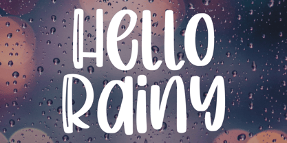 Produly Present Hello Rainy - Quirky Handdrawn Font Hello Rainy - Quirky font make from handlettering ideas in typeface. This font includes full of Alphabetical glyphs, Numerals, and punctuation. This is so perfect for invitations, monograms, wedding, fashion, branding, label, handlettering or logotype.
 - Origami Bats by Lauren Ashpole,
$15.00 The art of paper folding in dingbat form. The uppercase alphabet is made up of origami animals and the lowercase offers those shapes decorated in traditional origami paper patterns. Full patterns, flowers, and partial foldings fill out the symbols and numbers.
 - Meche Pro by RodrigoTypo,
$29.00 Meche Pro it is a geometric typeface family with a semi-formal touch, it contains 12 variants, from the Thin to Black and Stencil Thin to Black versions, plus Cyrillic alphabet with alternatives and different ligatures was added, especially for titles
 - Kaaos Pro by The Type Fetish,
$25.00 Kaaos Pro is based on the logo of the Finnish hardcore band of the same name. It was expanded to include extended Latin, extended Cyrillic and Greek alphabets so it will work with most languages in Europe and the Americas.
 - Tappatarap by Tural Alisoy,
$17.00 Tappatarap font. 559 glyph, 80+ Languages Set. Multilingual support: Latin basic, Latin Extended, Cyrillic, Central Europe, Turkish, Baltic, Romanian, Euro, West European diacritics Please test your alphabet. If you have any issues, please let me know through email turalalisoy@gmail.com.
 - Melindya by Good Java Studio,
$22.00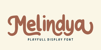 Introducing Melindya | Playfull Display Font Melindya is a playfully display font make from handdrawn ideas in typeface. This font includes full of Alphabetical glyphs, Numerals, and punctuation. This is so perfect for invitations, monograms, wedding, fashion, branding, label, handdrawn or logotype.
 - Space Captain by Patria Ari,
$15.00Space Captain is a modern all caps font with uniquely sharp and geometric shapes. Alternative wing shapes in the left and right in alphabet included in stylistic alternates. This font perfect for logotype such as technology, construction, automotive, heavyweight, etc. - Flox by ParaType,
$30.00 Flox display typeface was designed in 2000 by Vladimir Pavlikov. Cyrillic was developed in 2005. The project was aimed to create a decorative vivid alphabet of geometric shapes. For use in advertising and display typography. Licensed by ParaType in 2005.
 - Calligraffiti Pro by Open Window,
$19.95 Calligraffitti by Open Window owes its credit to mom and all her years of Calligraphic experience. This impromptu rendering of her calligraphic alphabet captures her years or formal practice blended with a rare encounter with the mood altering music of Santana.
 - Popstix JNL by Jeff Levine,
$29.00 Popstix JNL takes the childhood pastime of creating things with ice cream sticks and transferring that premise to a digital alphabet. From classroom displays to ice cream sales, this charming novelty font evokes the simpler pleasures of our younger years.
 - Snappy Patter NF by Nick's Fonts,
$10.00The pattern for this delightful gem was found in Dan X. Solo's "Rustic and Rough-Hewn Alphabets" book under the name "Antique No 14." For this font, the rough-hewn lines have been cleaned up, but the underlying fun remains. - Inkie by Turtle Arts,
$20.00Inkie is a hand drawn pen and ink alphabet with scratchy embellishments, and works great whenever you want a handwritten look to your art, but with a bit of extra flair. Inkie looks great both as text and as headlines. - Display Dots Two Sans by Gerald Gallo,
$20.00 Display Dots Two Sans is a display font not intended for text use. It, along with its serif counterpart were designed specifically for display, headline, logotype, branding, and similar applications. Display Dots Two Sans has an uppercase alphabet, numbers, and punctuation.
 - Ghostly Forest Cyrillic by RodrigoTypo,
$29.00 It is an extension or variant of the "Ghostly Forest" typeface that has been adapted to include the Cyrillic alphabet and also incorporates many alternatives, such as Swash glyphs, for a more fun design suitable for casual or Halloween-related concepts.
 - Doodles by Outside the Line,
$19.00Doodles received honorable mention in U&lc's First Annual Type Design Competition in the Picture Category. Inspiration came from many long hours logged in corporate strategic planning meetings. Check out Doodles the Alphabet designed to compliment the Doodles picture font. - ATC Abernathy by Avondale Type Co.,
$20.00 ATC Abernathy, is a soft serif typeface based on retro package design. With a modern influence, it bridges the gap between old and new. Contains 330+ glyphs, full alphabet, ligatures, numerals, accents and punctuation. ATC Abernathy was released in 2018.
 - Cattlebrand by Holland Fonts,
$30.00Based on sketches of an alphabet from examples of South Western cattle brand marks. I always liked the idea of these brands for a font. A few years later a basic font - just the capitals - was used for some logo designs. - Brogue by The Type Fetish,
$29.00 Brogue was designed to be a display typeface, but it can be used for a small body of text. At its core it is an uncial influenced typeface that has been allowed to stray from its roots. Embracing other alphabets, Brogue mixes in some unexpected letterforms that really give it a quirky and unusual look. Because Brogue is unicase it allows the designer to mix and match the roman, italic, upper and lowercase letters together for a truly unique design. Brogue's character set will support the following languages: Azerbaijani (Latin), Belarusian (Latin), Czech, Danish, Dutch, English, Esperanto, Finnish, French, German, Hungarian, Iclandic, Italian, Polish, Portuguese, Romanian, Slovac, Spanish, Swedish, and Turkish
 - Salas by AdultHumanMale,
$20.00 Salas is a fun, chunky, slab serif omnicase display font. It's blocky and loud, so it can scream from Posters and Headlines. Think of a clown with poor hearing making a Skype call, he's shouting, but you like it. Anyway: it has over 300 glyphs, several variations on the standard alphabet and lots of those extra foreign features for sending international ransom notes. OpenType coded, it has various letter pairings that interlock automatically to create a more randomized, bespoke feel to your copy. It also has some extra characters available directly through your glyphs palette. Play around with it, I hope you like it.
 - Taylor Hand by Mans Greback,
$59.00 Taylor Hand is an elegant signature font. Drawn by hand and created to be a typeface for chic and modern work in a classy setting. Use { } [ ] < > anywhere in a word where you want a swash. Example: Tay[lor The font comes in two styles, Upright and Italic, and also includes a Swash style for decorative additions to your lettering. It is completed with a full alternate alphabet and a big set of ligatures, which together give the handwriting genuine dynamics and a natural flow. It has extensive lingual support, covering all European Latin scripts. The font contains all characters you'll ever need, including all punctuation and numbers.
 - Noodlerz by CozyFonts,
$25.00 Noodlerz is the 3rd font designed for Cozy Fonts Foundry. It is the second 'handwriting style' type fonts designed to have a very casual but organized voice in it's coloring when set in text. You might say Noodlerz is a cross between a sharpie & a vintage typewriter alphabet font. Noodlerz, and it's partner Noodlerz Italic, give off a humorous personality with a flair of sarcasm and cartoon flavor. Great for captions, grocery lists, Dear John letters, recipes, and of course greeting cards. Advertising headlines and supportive body-copy text marry well in various point sizes. 'Hoping this font finds your voice!' Noodlerz from CozyFonts Foundry.
 - QR by T-26,
$29.00QRc is based on a 2-D, space-saving optical code widely used in Japan. The code was originally intended for use in factories but quickly crossed into the consumer sector. With an enabled handset, a QR code -- which can appear on an ad, postcard, or almost anywhere else -- can be instantly interpreted to reveal its underlying message. QR contains 219 images. You can use the QRc font to accurately encode the letters you type, or just use it to create fields of lovely, semi-random pixel texture! The counterpart font, QR Type, is also a celebration of entropic pixelation, but the formations are alphabetic and human-readable.