10,000 search results
(0.217 seconds)
- Nomad by Coniglio Type,
$20.02 NOMAD —Regular is a stand alone font. Nomad -Regular is a clean, interesting revival font. It is a Display font. Nomad, now exclusively in OpenType .oft by Joseph V Coniglio of Coniglio Type. It is a narrow boldfaced font. Its analog source was comprised of an extremely limited die cut, truly generic, craft, peel-and-stick vinyl set of capital letters of ascenders and numbers. It was purchased at a five & dime stores, hardware department from the 1970's. My father owned an original set of characters: Nomad-Regular is nicely expanded to meet the needs of OpenType. The original adhesive labels adhered to the bows of that small boats so fisherman wouldn't get turned away at the Canadian border for not having their vessels tagged and listed with the appropriate license name and numbers, recorded by customs. It was a required serialization of letters and numbers marked on the side of their vessels. On the other hand, most beer and whisky drinking fishers, card players and bait casters would rather not deal with it, but the boat could not cross over the border without them. (Once part of Market LTD from the 1990's, a collection of limited faces, mostly alpha-numeric and some just plain numeric, used primarily in retail and display situations and titling.) Designer: Joseph V Coniglio Author: Coniglio Type
 - Tiger Rag by ITC,
$29.00Tiger Rag is the work of English calligrapher John Viner, who was inspired by Japanese calligraphy when creating this dramatic, informal typeface. The font is extensive and flexible, with many alternate characters. Tiger Rag is an excellent choice for casual display typography which should produce a fresh, random effect. - Churchward Legible by BluHead Studio,
$25.00 Churchward Legible is an extensive typeface family designed by New Zealand type designer Joseph Churchward. A geometric sans serif, it is, as its name boasts, highly legible and readable on screen as well as in print. The family includes five weights from Light to Extra Bold, with companion italics.
 - Yaty by Mans Greback,
$59.00 Yaty is a relaxed and spontaneous script font. With its long descenders, bold capital letters and genuine style, this typeface fits perfectly for a down-to-earth logo or headline, emitting familiarity and friendliness. The font contains ligatures and support for an extensive range of world-wide languages.
 - Demigrunge by Aah Yes,
$9.95Just a hint of grunge in this font, one side fairly clean and one side with subtle grunge. Demigrunge lends itself readily to display, headlines and writing sentences without verbs in them. Just one style in this family. Lots of accented characters and extensive punctuation. Great for goth titles. - Lampion by Hanoded,
$15.00 Lampions are paper lanterns. They are very popular in Asian countries, where they are used at festivals. Lampions are mostly made from rice paper cuttings which are glued to a bamboo frame. Lampion font is a tall, narrow and very legible typeface, which comes with extensive language support.
 - Viareggio by Hanoded,
$15.00 Viareggio is a city in Northern Tuscany, Italy. Viareggio is famous for its carnival and its mascot, the clown Burlamacco (designed by Uberto Bonetti in 1930). Viareggio font was based on the hand lettering found on a 1931 poster, advertising the carnival. Viareggio font comes with extensive language support.
 - Oyukis Ghost by Hanoded,
$10.00 Oyuki's Ghost is a scary typeface made with a steel pen and Chinese Ink. The name comes from a painting by Maruyama Okyo (1733–1795), which depicts his mistress who died young. Maruyama Okyo claimed she haunted him in his sleep. The font comes with extensive language support.
 - VP Pixel by VP Type,
$19.00 VP Pixel is a font family of eight fonts. Eight modern takes on the classic grid, that feel both retro and futurist. The family includes diverse and versatile styles of an extensive character set, with support for advanced OpenType features; making VP Pixel a smart typeface of unique personality.
 - Neroli by Pelavin Fonts,
$25.00 Neroli is an oil distilled from the blossom of the bitter orange tree and used extensively in perfumery. Its scent is sweet, honeyed with green and spicy facets. The eponymous OpenType font is of tidy Art Deco construction and will lend its own unique bouquet to any typographic composition.
 - Cabriolet by JVB Fonts,
$35.50 Cabriolet is a connected geometric script re-interpretation inspired by old chromo emblems of Chevy truck Apache of 1960. With three weight variables, it can be used in logos, games and graphic related to cars, automotive, American, Detroit, Art Deco, 1940, 1950, 1960, vintage, retro, classic and old machines. Can be expandable using underscore for connect words or expanding between letters space.
 - Bourton Hand by Kimmy Design,
$10.00 Bourton Hand is a new typeface by Kimmy Design. It’s the hand drawn version of Bourton and a sans-serif cousin to Burford. In addition to a new look, it boasts more layering options, stylistic alternatives, graphic extras and even comes with its own script font! Okay...so here’s everything you get with Bourton Hand: • 6 Base Layer Fonts (Base, Inline, Marquee, Stripes A, Stripes B, Stripes C, Sketch A, Sketch B) • 6 Top Layer Fonts (Base Drop, Dots, Line Light/Medium/Bold, Outline Light/Medium/Bold) • 6 Extrude Fonts (Extrude, Outline, Shadow, Extrude Outline) • 5 Drop Shadow Fonts + 5 solo styles (Drop Shadow, Drop Extrude, Drop Line, Drop Stripes A, Drop Stripes B) • 2 Line Fonts for secondary text (Line Medium, Line Bold) • Bourton Hand Script Light • Bourton Hand Script Bold • Bourton Hand Extras - Ornaments, banners, frames, borders, flags and line break • Bourton Hand Extras - Flourishes Happy Creating!
 - Engel New by The Northern Block,
$30.36 EngelNewSans is sans serif family of 12 weights and an upgrade of the typeface Engel also published by Die Gestalten Verlag. The project began with an extension to the original Engel character set and freshening up the typeface to suit the OpenType format. EngelNewSerif came about as a sibling to EngelNewSans as a corresponding serif family also of 12 weights, matching those of EngelNewSans. Both families are designed for a wide usage in running text and headlines. EngelNewSans is an evolved version of the original Engel typeface, which undergone improvements to the individual letterforms and the overall look which resulted in this sans serif type family with a more mature confident character and with softer, rounder and more harmonious shapes. The characteristics between the two could perhaps, very fittingly, be compared to a person showing different sides to their personality at different stages in life. With EngelNewSans portraying the more mature role while the original Engel shows traits of a cool teenager with rough edges, not yet fully developed. To make the light weights function with serifs attached for EngelNewSerif, the same low stroke contrast as seen in EngelNewSans was applied. Further discovery found that the serifs and the stem width had to be optically similar for the light weights not to appear too fragile. In the heavy weights however, the stroke contrast was higher than in the Sans versions, this was done to open up the counters and make room for the serifs to breathe. The intention of the families is to motivate an element of play and give the designer a larger selection to work with.
 - Aure Wye by Aure Font Design,
$23.00 Aure Wye wraps a carefree dispassion with the dignity of tradition. The precise engraving and organic finials of these decorative serif forms engage the reader with a subtext of elegance. Wye brings an unpretentious grace to titles and drop-caps and provides dignity to astrological expressions and chartwheels. In Regular, Wye presents a formal presence; in Italic, Wye offers a more romantic feel. Its small-caps add a stately variety to Wye's typographic textures. Wye is an original design developed by Aurora Isaac. After more than a decade in development, 2018 marks the first release of the CJ and KB glyphsets, now available in regular and italic. The CJ glyphset is a full text font supporting a variety of European languages. A matching set of small-caps complements the extended lowercase and uppercase glyphsets. Supporting glyphs include standard ligatures, four variations of the ampersand, and check-mark and happy-face with their companions x-mark and grumpy-face. Numbers are available in lining, oldstyle, and small versions, with numerators and denominators for forming fractions. Companion glyphs include Roman numerals, specialized glyphs for indicating ordinals, and a variety of mathematical symbols and operators. The CJ glyphset also includes an extended set of glyphs for typesetting Western Astrology. These glyphs are also available separately in the KB glyphset: a symbol font re-coded to allow easy keyboard access for the most commonly used glyphs. Aure Wye will stand up as a text font, but for extended text, try pairing Wye with its close cousin, Aure Declare. Used in titles and drop-caps, Wye will provide a striking elegance that will blend well with the serifed forms of Declare. Give Aure Wye a trial run! You may discover a permanent place for this font family in your typographic palette. AureFontDesign.com
 - European Soft Pro Variable by Bülent Yüksel,
$99.00 EUROPEAN SOFT PRO VARIABLE ABOUT FAMILY: What makes "European Soft Pro Variable" elegant, friendly and contemporary is its very rounded curves with very open terminals. "European Soft Pro Variable" has been designed with a higher "x-height" than other fonts in its class to make tiny readability more obvious in any use situation. It will be ideal for use in small sizes such as business cards or mobile applications. This typeface is also equipped with powerful OpenType features to satisfy the most demanding professionals. It has solid features like case sensitivity, small, true capitals, full ligatures, tabular figures for tables, old style figures to elegantly insert numbers into your sentences and more alternative characters to give personality to your projects. The extended, "European Soft Pro Variable" supports around 85 languages in the Latin, Cyrillic and Greek scripts, and its non-Latin components were developed with native consultants. With over 1200+ glyphs per style, "European Soft Pro" cares about localised letterforms and has the OpenType features to match. FEATURE SUMMARY: - 9 weights: Thin, ExtraLight, Light, Book, Regular, Medium, Bold, ExtraBold, and Black. - 4 widths: Normal, Narrow, Condensed, and Extra Condensed. - Matching italics (12º) for all weights and widths . - Matching small caps for all weights and widths. - Lining and old style figures (proportional and tabular). - Alternate characters (A, G, M, N, R, U, a, g, l, m, n, u, y). - Unlimited fractions. - Automatic ordinals (1st, 2nd, 3rd, etc.). - 24 Dingbats + 19 Social Media and Block Chain icons. - Extended language support: Most Latin-based scripts (including Vietnamese), Cyrillic, and Greek. - Extended currency support. You can contact me at buyuksel@hotmail.com, pre-purchase and post-purchase with questions and for technical support. You can enjoy using it.
 - European Sans Pro Variable by Bülent Yüksel,
$99.00 EUROPEAN SANS PRO VARIABLE ABOUT FAMILY: What makes "European Sans Pro Variable" elegant, friendly and contemporary is its very rounded curves with very open terminals. "European Sans Pro Variable" has been designed with a higher "x-height" than other fonts in its class to make tiny readability more obvious in any use situation. It will be ideal for use in small sizes such as business cards or mobile applications. This typeface is also equipped with powerful OpenType features to satisfy the most demanding professionals. It has solid features like case sensitivity, small, true capitals, full ligatures, tabular figures for tables, old style figures to elegantly insert numbers into your sentences and more alternative characters to give personality to your projects. The extended, "European Sans Pro Variable" supports around 85 languages in the Latin, Cyrillic and Greek scripts, and its non-Latin components were developed with native consultants. With over 1200+ glyphs per style, "European Sans Pro" cares about localised letterforms and has the OpenType features to match. FEATURE SUMMARY: - 9 weights: Thin, ExtraLight, Light, Book, Regular, Medium, Bold, ExtraBold, and Black. - 4 widths: Normal, Narrow, Condensed, and Extra Condensed. - Matching italics (12º) for all weights and widths . - Matching small caps for all weights and widths. - Lining and old style figures (proportional and tabular). - Alternate characters (A, G, M, N, R, U, a, g, l, m, n, u, y). - Unlimeted fractions. - Automatic ordinals (1st, 2nd, 3rd, etc.). - 24 Dingbats + 19 Social Media and Block Chain icons. - Extended language support: Most Latin-based scripts (including Vietnamese), Cyrillic, and Greek. - Extended currency support. You can contact me at buyuksel@hotmail.com, pre-purchase and post-purchase with questions and for technical support. You can enjoy using it.
 - Aure Zeritha by Aure Font Design,
$23.00 Aure Zeritha emotes the unassuming charm of fairytale romance. The modestly adorned forms of this decorative serif font engage the reader with a subtext of innocence. Zeritha brings an ingenuous romance to text and titles and a guileless promise of adventure to astrological expressions and chartwheels. The breadth of typographic textures revealed in its bold and italic forms is given depth by the charm of its small-caps and the delight of its curly alternates. Zeritha is an original design developed by Aurora Isaac, first released in the LP glyphset in 2011. After more than a decade in development, 2018 marks the release of the CJ and KB glyphsets, available in regular, italic, bold, and bold-italic. The CJ glyphset is a full text font supporting a variety of European languages. A matching set of small-caps complements the extended lowercase and uppercase glyphsets. Supporting glyphs include standard ligatures, four variations of the ampersand, and check-mark and happy-face with their companions x-mark and grumpy-face. Numbers are available in lining, oldstyle, and small versions, with numerators and denominators for forming fractions. Companion glyphs include Roman numerals, specialized glyphs for indicating ordinals, and a variety of mathematical symbols and operators. The CJ glyphset also includes an extended set of glyphs for typesetting Western Astrology. These glyphs are also available separately in the KB glyphset: a symbol font re-coded to allow easy keyboard access for the most commonly used glyphs. Aure Zeritha stands its own as a text font, but for extended text, try pairing Zeritha with its distant cousin, Aure Declare. Use Zeritha where the fairytale romance is needed; use Declare for tight text and practical contrast. Give Aure Zeritha a trial run! You may discover a permanent place for this font family in your typographic palette. AureFontDesign.com
 - PF DIN Text by Parachute,
$79.00 The purpose of the original DIN 1451 standard was to lay down a style of lettering which is timeless and easily legible. Unfortunately, these early letters lacked elegance and were not properly designed for typographic applications. Ever since its first publication in the 1930’s, several type foundries adopted the original designs for digital photocomposition. By early 2000, it became apparent that the existing DIN-based fonts did not fulfil the ever-increasing demand for a diverse set of weights and additional support for non-Latin languages. Parachute® was set out to fill this gap by introducing the PF DIN series which has become ever since the most comprehensive and sophisticated set of DIN typefaces. It was based on the original standards but was specifically designed to fit typographic requirements. Its letterforms divert from the stiff geometric structure of the original and introduce instead elements which are familiar, softer and easier to read. The first set of fonts was completed in 2002 as a group of 3 families which included condensed and compressed versions. With its vast array of weights, the extended language support, but most of all its meticulous and elaborate design, it has proved itself valuable to numerous design agencies around the world. Ever since its first release, it has been used in diverse editorials, packaging, branding and advertising campaigns as well as a great number of websites. It was quoted by Publish magazine as being “an overkill series for complex corporate identity projects”. The whole PF DIN Text type system (with normal, condensed and compressed styles) includes 45 weights from Hairline to Extra Black including true-italics. Additionally, every font in the Pro series is powered by 270 very useful symbols for packaging, environmental graphics, signage, transportation, computing, fabric care. There are 2 versions to choose from: The PRO version is the most powerful. All weights support Latin, Cyrillic, Greek, Central/Eastern European, Romanian, Baltic and Turkish, with 20 advanced opentype features including small caps. The standard STD version is more economic. All weights support Latin, Central/Eastern European, Romanian, Baltic and Turkish, with 18 advanced opentype features including small caps. In 2010 Parachute® released 4 new families DIN Monospace, DIN Stencil, DIN Text Arabic and DIN Text Universal. All these are complemented by the popular DIN Display version. Altogether the Parachute DIN series is a set of 8 superfamilies with a total of 96 weights.
 - FE Sector by Egor Stremousov,
$50.00 FE Sector is made up of sectors and sticks. it is intended to create various patterns and decorative titles.
 - Alt Mun by ALT,
$- Mun is a experimental script typeface for use on logos, titles, posters, etc. Mun is not intended for text.
 - Lust Pro by Positype,
$50.00 Confident and versatile, Lust Pro™ is an exercise in indulgence—an attempt to create something over the top and vastly useful. If Lust Pro seems both new and familiar, that’s because it is. The series unapologetically channels Herb Lubalin, but produced with a deliberate, contemporary twist. There is an intentional slyness infused in the letterforms—the extreme thick and thin lines flow effortlessly without becoming gratuitous. It’s always just enough, not too much. What makes the type series so appealing? The curves. When asked to describe the letterforms, most people unwittingly allude to the human form, using adjectives usually reserved for describing physical traits… creating all-too-familiar comparisons. Summerour has grown to accept this as unavoidable and reasonable given his acknowledgement of its influences and has provided nuances within the letterforms to accentuate that. Intended to be set large, the typeface boasts 3 widths and 5 weights and matching italics for both the Regular and Didone variants (that’s 60 fonts in total), making it perfect for editorial use and a highly flexible solution for any display need.
 - Lust Pro Didone by Positype,
$50.00 Confident and versatile, Lust Pro™ is an exercise in indulgence—an attempt to create something over the top and vastly useful. If Lust Pro seems both new and familiar, that’s because it is. The series unapologetically channels Herb Lubalin, but produced with a deliberate, contemporary twist. There is an intentional slyness infused in the letterforms—the extreme thick and thin lines flow effortlessly without becoming gratuitous. It’s always just enough, not too much. What makes the type series so appealing? The curves. When asked to describe the letterforms, most people unwittingly allude to the human form, using adjectives usually reserved for describing physical traits… creating all-too-familiar comparisons. Summerour has grown to accept this as unavoidable and reasonable given his acknowledgement of its influences and has provided nuances within the letterforms to accentuate that. Intended to be set large, the typeface boasts 3 widths and 5 weights and matching italics for both the Regular and Didone variants (that’s 60 fonts in total), making it perfect for editorial use and a highly flexible solution for any display need.
 - Shamrock - 100% free

- Yorklyn Stencil by House Industries,
$33.00 Yorklyn Stencil includes three fonts, each optimized for use at different size ranges. Grande has greater contrast and more delicate breaks designed to be used at larger sizes where finer details are more conspicuous. Medium and Petite are intended for smaller sizes where the breaks and contours must be more resilient. We embedded several OpenType layout features, including traditional fractions and nut fractions. We extensively tested Yorklyn Stencil in what might be the broadest range of media and conditions in the annals of Northwestern Delaware typefounding history. From the ceramic kilns of Heath Ceramics to our studio’s stucco facade, Yorklyn Stencil’s robust curves and deceptively delicate breaks will withstand a wide variety of harsh conditions with unprecedented aplomb. Whether you’re hand cutting a stencil to buzz your bespoke restaurant bar stools or simply looking for a practical yet illustrative display font, Yorklyn Stencil’s elegant efficacy will enhance any creative composition. Like all good subversives, House Industries hides in plain sight while amplifying the look, feel and style of the world’s most interesting brands, products and people. Based in Delaware, visually influencing the world.
 - Qalloky by Ardyanatypes,
$10.00 Qalloky is a stunning representation of modern style in the serif font category. Carefully designed, this font exudes a clean and elegant impression, suitable for various graphic design projects. With rich OpenType features, Qalloky showcases versatility in its usage. The sharpness and smoothness of its letterforms give a futuristic impression while maintaining exceptional readability. Each character is crafted with precision, making every word written with Qalloky a work of art in itself. The advantages of OpenType allow limitless variations and creativity in using this font. From elegant ligatures to intriguing alternate characters, every detail is meticulously considered to provide maximum visual beauty. Not only that, the multilingual capability of this font enables its extensive use in various languages, expanding its coverage and flexibility in diverse design projects worldwide. With Qalloky, your designs will be enhanced to become more dynamic, modern, and impressive. A guide to accessing all alternatives can be read at http://adobe.ly/1m1fn4Y Adobe Photoshop go to Window - glyphs Adobe Illustrator go to Type - glyphs Features: A – Z Character Set a – z Characters set Numerals & Punctuations Ligatures & Alternates Multilingual
 - Film Noir JNL by Jeff Levine,
$29.00Film Noir JNL is a classic Art Deco Alphabet from the brush of the late master sign painter Alf R. Becker, and appeared in Signs of the Times Magazine. Thanks to Tod Swormstedt of ST Media and the American Sign Museum for providing the reference material to make this font. - Merchant Trade JNL by Jeff Levine,
$29.00 A precursor to Art Deco headline/display sans serif typefaces with thick and thin strokes is the Matthews Series (circa 1902). It was manufactured and sold through the Inland Type Foundry of St. Louis, MO. Digitally redrawn as Merchant Trade JNL, it’s now available in both regular and oblique versions.
 - Yard Goods JNL by Jeff Levine,
$29.00 Yard Goods JNL is another typeface derived from a sign making outfit consisting of a series of stencils manufactured by the Display Material Company of St. Paul Minnesota. This clean and casual sans design embodies the hand-lettering of 1920s and 30s era show cards, price tickets and display signs.
 - Invertida by Vanarchiv,
$35.00 This display decorative slab-serif typeface, contain reverse contrast which remind the old western style, there are also stencil version available (Invertida St). Invertida font family contain Latin and Cyrillic encoding characters and italic versions are also available too. Open type features can provide more options (stylistic alternates, ligatures, swash, figures).
 - Heroes by Skiiller Studio,
$16.00 HEROES a condensed sans serif font. It has a elegant, classy look and modern. It’s a great font for fashion, Ligature Feature Opentype, apparel projects, signature, album cover, logo, branding, magazine, social media, & advertisements. What's include: Ligature PUA Encoded Characters - Fully accessible without additional design software. Basic Latin Language Support (AÀÁÂÃÄÅCÇDÐEÈÉÊËIÌÍÎÏÑOØÒÓÔÕÖUÙÜÚÛWYÝŸÆß )
 - Really Big Shoe NF by Nick's Fonts,
$10.00This quaint headline typeface is based on an offering from the Cleveland Type Foundry, originally named Oxford. The centered small caps treatment makes for unusual and alluring headlines. All versions of this font include the Unicode 1250 Central European character set in addition to the standard Unicode 1252 Latin set. - Black Orchard by ErlosDesign,
$19.00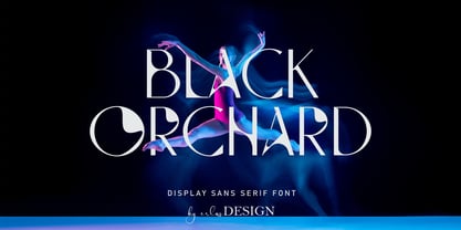 Black Orchard is a sans serif font with modern style. It includes uppercase letters, numeral, a large range of punctuation and also multilingual support. Perfects for poster, web design, magazine cover, album cover , branding and many more. The file you will get is: • Works on PC & Mac • Simple installation Enjoy!
 - Igoe by Linecreative,
$16.00 Igoe is a monospaced font gives the impression of being clean and modern, It's Perfect forlogos, posters, album covers, and website headers. Igoe, A monospaced font, offers you: Igoe - A monospaced font including Upper & Lowercase characters(ALL CAPS), Stylistic alternates Character Supports Multi linguage (Latin Western Europe), Numbers and Punctuation
 - Coming Sans by Typefactory,
$14.00 Coming Sans is playful font which puts a smile on your projects and will inspire you to create something fun and memorable like comic or children storybook. It is perfect for comic book, cartoon theme, headings, flyer, greeting cards, product packaging, book cover, printed quotes, logotype, apparel design, album covers, etc
 - Emily Cute by Fox7,
$12.00 Emily Cute is a cute lettered handwritten font that is easy to read and joyful. You can use it for various projects, such as blog posts, logos, branding, ads, invitations, greeting cards, planners, photo albums, decorations, and much more. Add it to any of your designs, and enjoy the results!
 - Psychoactive by Mysterylab,
$22.00 Psychoactive is a familiar style of pop psychedelic lettering; reinvented, fine-tuned, and balanced to rounded blobs of perfection. This all-caps + small-caps font is a great workhorse for retro t-shirt designs, posters, and album covers. Super-legible and perfectly kerned, it'll get your message out in style.
 - Pink Blue by Rometheme,
$25.00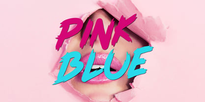 Pink Blue is a modern handdrawn font, this font looks elegant, classy, readable, stylish, catchy and easy to use. Pink Blue Font is the best choice for your professional design projects, including : quotes, album cover, business card, logo, branding, magazines, social media, advertisements, product designs, and many other design project.
 - Manic Mood PB by Pink Broccoli,
$14.00 An offbeat alternate caps typestyle inspired by the cover of a vintage LP titled, Organ Moods by Jerry Thomas. A playful and childish font from a sexy cheesecake album! Go figure. Switching on Contextual Alternates enables automatic alternations between caps and alt caps like AlTeRnAtIoNs to create a more randomized look.
 - Calypso by Studio K,
$45.00 Calypso was inspired by the dance of the same name, and its flowing lines suggest the rhythms of Caribbean / Latin American music. Ideal for tourist literature, album sleeve art, packaged foods or other products with a Caribbean / Latin flavor. See also my other fun fonts Bebopalula, Barrowboy, and Pier Arcade.
 - Afical by Formatype Foundry,
$30.00 Afical update 2.0 version Afical Composed of 3 set families, consists of 35 fonts matching italic: Afical Std, Afical Neue, Afical Stencil. families all with distinctive qualities and features but share the same basic construction and proportions. Afical has been carefully crafted to focus on Text sizes and legibility with a high x-height, we developed it with Manual TrueType Hinting. Afical It's a perfect choice for publication, Packaging, logo, branding, Signage, wayfinding design systems, as well as web and screen design OpenType features: Alternate Characters SS.01, SS.02, SS.03, SS.04, SS.05, Denominators Case-Sensitive Forms, Tabular Lining, Fractions, Ordinal, Ligatures, Discretionary Ligatures, Subscript, Superscript, Language Support: 63+ (Latin based) languages Afrikaans, Albanian, Asu, Basque, Bemba-language, Bena, Danish, Dutch, English, Estonian, Faroese, Filipino, Finnish, French, Friulian, Gaelic (Irish, Scots), German, Gusii-language, Hungarian, Icelandic, Indonesian, Irish, Italian, Kabuverdianu, Kalenjin, Cornish, Luhya, Luo-Language, Machame, Madagascan, Makhuwa-Meetto, Makonde, Malayan, Manx, Morisyen, North-Ndebele-Language, Norwegian, Bokmål, Nynorsk, Nyankore, Oromo, Pare, Portuguese, Rombo, Rwandan, Rukiga, Rundi, Rwa, Samburu, Sango, Sangu, Swedish, Swiss German, Sena, Shambala, Shona, Soga, Somali, Spanish, Swahili, Taita, Teso, Vunjo, Zulu Behance Looking for custom Afical? Please send us an email at hello@formatypefoundry.com Designed 2017 Published 2021 2021 Copyright © Formatype Foundry All rights reserved
