10,000 search results
(0.039 seconds)
- TF Madloud by Teenage Foundry,
$19.00 TF Madcloud - This bold and playful graffiti font is perfect for any project that needs an eye-catching touch. Its thick, rounded letters will grab attention and communicate a fun, carefree vibe. The hand-drawn style of this font gives it a unique, personal touch that sets it apart from more standard typefaces. With both regular and outline versions, you can use this font in a variety of ways to suit your needs. Features: Uppercase, Lowercase, Numeral, Punctuation & Multilingual. For any questions please contact me 🙂 Thanks!
 - Whitehaven by Greater Albion Typefounders,
$8.95 Whitehaven is the spirit of the Art Deco movement made into a very solid and blocky Sans Serif font. The name owes its inspiration to Whitehaven Mansions, a block of flats where that greatest of 1930s detectives, Hercule Poirot lived. Use this to make bold statements, to give posters and designs a taste of thee 30s, and wherever you want to be clear and definitive. Whitehaven is offered in two widths and a range of embossed and engraved styles for flexibility in design work.
 - Vintage Waves by Raditya Type,
$16.00 Introducing Vintage Waves. A retro bold serif which will bring you back to 60s feel. This font perfectly made to be applied especially in logo, and the other various formal forms such as invitations, labels, logos, magazines, books, greeting / wedding cards, packaging, fashion, make up, stationery, novels, labels or any type of advertising purpose. We highly recommend using a program that supports OpenType features and Glyphs panels like many of Adobe apps and Corel Draw, so you can see and access all Glyph variations.
 - Misty by Gaslight,
$20.00 Misty - a two weight wild west style serif with numerous alternatives, swashes and irregular alternatives for numerous characters in SC style. Interchanging regular characters with alternatives and vice versa, it allow you to do slightly strange inscriptions. Plus deco style.
 - TA Film Fiction Sans by Tural Alisoy,
$25.00 We've already updated and revitalized Film Fiction Sans to ensure it perfectly matches your evolving creative vision. The inclusion of tabular figures, old-style figures and alternative glyphs expands your design palette and allows you to adapt the font to your unique style. TA Film Fiction Sans has been updated experience the appeal – this can be your font of choice to enhance your brand identity, cinematic efforts and editorial design. This brilliant typeface is not just a typographic tool, but a creative catalyst for headlines, logos, web elements, signage, posters and fashion apparel, packaging. TA Film Fiction Sans does not follow trends, it defines them, imbuing each project with a true modern essence. Embrace the possibilities with 9 different styles, each boasting a large set of 758 glyphs. Discover additional features of OpenType features such as aalt, dnom, frac, kern, liga, numr, ordn, salt, sin, ss01, ss02, ss03, ss04, ss05, ss06, ss07, tabular figures, old-style figures and alternative glyphs. Not only does this font speak multiple languages, it also covers a variety of design needs – offering seamless language support for Western European, Central/Eastern European, Baltic, Turkish, and Romanian languages. Test your alphabet, explore the nuances and witness the transformation. And if you're at any creative crossroads, I'm here for you. If you want to customize TA Film Fiction Sans, need font files or have any other questions, please reach out to me at t@taft.work. TA Film Fiction Sans be the cornerstone of your creative journey. Elevate your designs, embrace innovation and redefine possibilities with TA Film Fiction Sans, where each character tells a story.
 - Pantoufle by Kitchen Table Type Foundry,
$16.00 Pantoufle is French for slipper. Not the flipflop variety (or thongs if you’re from Australia), but the one you wear indoors when it’s cold. I have some too; Spanish ones, made from recycled PET bottles. Here in Holland, we call them ‘Pantoffels’ and you don’t have to be a language expert to see the resemblance between the French and the Dutch word. That is because the French are probably more savvy when it comes to keeping your feet warm and the Dutch just borrowed the word, pronunciation and all! Pantoufle is a font I made with a big fat marker pen. My kids had used it to decorate some gifts for Sinterklaas (if you want to know what Sinterklaas is, look it up). Pantoufle comes with extensive language support and a full set of alternates for the lower case glyphs. Enjoy!
 - VLNL Duct by VetteLetters,
$35.00 Duct tape is one of the most versatile adhesive materials known today. From fixing the bumper of your car that keeps falling off, to creating a sturdy wallet. From alternative wrapping to sticking a friend to the wall, Duct tape is there. And it will stay there. It will stick to anything and hold for a very darn long time too! The cloth-backed tape was invented some time during World War II, and also proved itself useful as a base material for lettering. VLNL Duct was originally designed by DBXL as a logo for temporary Amsterdam restaurant BAUT. DBXL imagined an owner taping the name on the window of his shop using Duct tape. The font was used for all communication of the restaurant. Duct is a sturdy, rough all-caps typeface that will stick to anything.
 - Messenger by Canada Type,
$29.95 Messenger is a redux of two mid-1970s Markus Low designs: Markus Roman, an upright calligraphic face, and Ingrid, a popular typositor-era script. Through the original film faces were a couple of years apart and carried different names, they essentially had the same kind of Roman/Italic relationship two members of the same typeface family would have. The forms of both faces were reworked and updated to fit in the Ingrid mold, which is the truer-to-calligraphy one. The Messenger package is comprised of two interchangeable fonts that support Western, Eastern and Central European languages, as well as Baltic, Celtic/Welsh and Esperanto. Messenger Pro is a single OpenType font that contains the characters of both Messenger and Messenger Alt, linked by programmed features for stylistic alternates, automatic f-ligatures and class-based kerning.
 - Waypointer by Tarallo Design,
$18.99 Waypointer is a font of arrows. These can be used to indicate direction or emphasis in documents, signage, or websites. The arrow sizes match the standard cap height of most fonts making it simple to use within text. The arrows are accessed with the standard keyboard keys. Make your own arrow of any length with the 1 to 9 keys. Use uppercase (A to Z) and lowercase (a to z) for pre-made arrows that point right, left, up, or down. Those who use OpenType will find useful features, such as stylistic sets for changing arrow directions in 360 degree angles and stylistic alternates for quick changes between pointing right and left. It has a few extras such as a map pin, anchor, and lightning bolt. These are included and accessed with the comma, period, and zero key.
 - Rebrand by Latinotype,
$29.00 Rebrand is all about geometry, a typography that boosts confidence. However, contrary to pure, cold mathematics, this font seeks a more jovial and friendly face. The goal with Rebrand is to offer a Geometric Sans Serif font that can work in various instances, from symbols and titles, to text, and everything in between. It also creates a whole lot of personality, ideal for branding. There are two versions: Display, which is more fluid and dynamic with nine programmed weights for a wide array of intensity. This version also has various alternative characters and swashes. Text, which has the same attitude as Display, but is a little more serious with seven programmed weights to provide distinctive extremes and subtle variations among the mid-tones. Both cover basic Cyrillic and come in small caps. Both create one phenomenal typography: Rebrand.
 - LFT Etica by TypeTogether,
$35.00 LFT Etica, the-moralist-typefamily-project, was born at the end of 2000, but its development is ongoing, overcoming many hurdles and diversions. The starting point for the designers at Leftloft were the common "cold" grotesk sans serifs, ubiquitous and often badly applied in their everyday visual environment. The challenge was to obtain the same force, versatility and color, but with a much warmer feel. The resulting design has soft strokes, open counters and terminals; aesthetically resting somewhere between a grotesque and humanist sans serif. It successfully combines masculine force with female delicacy. LFT Etica’s wide range of styles, together with a large character set and OpenType features, such as 4 sets of numerals, fractions, several stylistic alternates and a set of arrows and dingbats, allows for a vast variety of applications, be they editorial or corporate.
 - Carpenteria by studiocharlie,
$24.00 In Carpenteria each letter is hand-designed based on a geometrical old mechanical style. You can use it for posters or impact graphics.
 - Chinese Herbs JNL by Jeff Levine,
$29.00Chinese Herbs JNL gives an outline and cast shadow treatment to the lettering found in Chinese Menu JNL. Based on some old signage. - XMattsAnimals by Ingrimayne Type,
$9.95 Most of the letter keys are from animal drawings done by a six or eight year old child who has now grown up.
 - Claim Check JNL by Jeff Levine,
$29.00A page from an old manual for sign painters yielded the hand-lettered alphabet that served as a model for Claim Check JNL. - Cabriolet V8 by JVB Fonts,
$35.50 Cabriolet V8 is a vertical version of the Cabriolet family, a geometric script fontface re-interpretation inspired by old chromed emblems of 1950s.
 - Bronc Stomper by FontMesa,
$20.00 Introducing Bronc Stomper; Bronc Stomper got its start from an old logo design used by the New York and Harlem Railroad in 1904.
 - Go West by FontMesa,
$25.00Go West is a spurred version of the FontMesa Red Dog Saloon font which is a revival of an old 1800s woodtype font. - Frankenberg Pro by RMU,
$35.00 A treasure trove of typographic rarity, found in an old print shop in the Saxon town of Frankenberg, now revived and carefully extended.
 - Lonestar by FontMesa,
$25.00 Lonestar is a revival of the old classic slab serif font named Hellenic which was very popular in the middle to late 1800s.
 - Data 70 by ITC,
$29.99Data Seventy is a high-tech style font, with the look of old computer lettering. Data Seventy gives any text a futuristic appearance. - Unique Wood by Solotype,
$19.95Wood type maker W. H. Page designed this in 1870. Caps, figures and points only. A great decorative for old-timey poster work. - Montreal Architect Px by Letradora,
$15.00 Inspired from blueprints of old Montreal buildings, this font is a hand lettered, all caps face with influences from the arts & crafts movement.
 - Decorative Panels JNL by Jeff Levine,
$29.00Decorative Panels JNL is a collection of twenty-six border design panels inspired by old decal and rubber stamp catalogs of the 1940s. - Frayhord Monoline by FallenGraphic,
$25.00 Frayhord Monoline Script is a modern monoline script font. It has a natural feel and is perfect for signatures, branding, and much more! Features : -PUA Encoded 100% Accessibility -Standard Ligatures -Stylistic alternate -Stylistic Set SS01-SSO4 If you don’t have a program that supports OpenType features such as Adobe Illustrator and CorelDraw X Versions, you can access all the alternate glyphs using Font Book (Mac) or Character Map (Windows).To Access Alternate Characters Click The Link Below: How to access alternates in Adobe illustrator CS https://www.youtube.com/watch?v=geL0Ye02Ryk How to access alternates in Adobe illustrator CC https://www.youtube.com/watch?v=V25yiUh8BcE How to access alternates in Ms Wordhttps://www.youtube.com/watch?v=HxkhZiCuwEw How to access alternates in Coreldraw X7 https://www.youtube.com/watch?v=UBVsufJjons How to access alternates in Indesign CS https://www.youtube.com/watch?v=HgZTCxKG14Q How to access alternates in Adobe Photoshop CC https://www.youtube.com/watch?v=BYKXl58AdNY If you have any question, don’t hesitate to contact me by email vavaaryanto666@gmail.com Thanks and happy designing!
 - ABCTech Bodoni Cactus - Unknown license

- Cabrito Semi by insigne,
$24.00 Relax. Deep breath. And step away to font nirvana with Cabrito Semi. Like its Cabrito relatives, Semi’s handwriting-inspired feel is mellow and care-free. But don’t misunderstand us. Even with its fun-loving peculiarities, this free spirit will command whatever party you invite it to. It’s a perfect blend of unique and functional. So what’s the secret of this little one’s strength? It’s pure balance. Cabrito Semi’s energy surges from deep within the relaxed, balanced tones of its humanist structure and calligraphic crafting. The 36 fonts of this well-crafted semi serif originate from the popular Cabrito, an insigne design slab serif developed for the kid’s book, The Clothes Letters Wear. Along with its other amigos, Inverto and Sans, Cabrito Semi rounds out this easy-going household of fonts. The four fonts play well together on anything from meals and candy to toys and cars. With the support of the other three, Semi makes a great choice for titles and moderately long text like you would use for websites, flyers, and packaging. Semi’s complete pack of alternates is accessible in any OpenType-enabled system. This kiddo has loads of alternates, swashes, and alternate titling caps to add a bit of sweetener to the balance. Also bundled are swash alternates, old style figures, and compact caps. Preview any and all of these features in the interactive PDF brochure. This font members of the family also consists of your glyphs for 72 languages. So who says you can’t love quirky? Take a look at Cabrito Semi--and any of the other members of the Cabrito family. You’re bound to find yourself loving fun all over again.
 - Ashemore Softened by insigne,
$32.00 Following the success of the Ashemore family, it became clear that a rounded version of Ashemore would be a great addition to the product line that would allow designers even more design choices. Ashemore Softened’s rounder forms compliment the face well as the original font eschewed straight lines. The rounded terminators give the face a sense of friendliness that is unsurpassed. The distinct and flamboyant style of Art Nouveau and the Arts and Crafts style remain, but the blunted terminators give the face a more technological and contemporary look and feel. The Ashemore Softened family has a full range of six weights from thin to black and includes condensed and extended options for a total of 36 fonts. The typeface also includes some unique OpenType alternates that make the superfamily even more versatile. Ashemore Softened is equipped for complex professional typography, including alternates, small caps and many alternate characters. The face also has a number of numeral sets, including tabular figures, fractions, old-style, lining figures and superiors and inferiors. OpenType-capable applications such as Quark or the Adobe Suite can take full advantage of automatic ligatures and alternates. You can find these features demonstrated in the .pdf brochure. Ashemore Softened also includes the glyphs to support a wide range of languages, including Central, Eastern and Western European languages. In all, Ashemore Softened supports over 40 languages that use the extended Latin script, making the new addition a great choice for multi-lingual publications and packaging. The original Ashemore was designed by Jeremy Dooley with production assistance from Lucas Azevedo and Marcelo Magalhaes. Kerning assistance from iKern.
 - Irish Stout BB by Blambot,
$20.00 Created by Blambot’s Nate Piekos for a party invitation, IRISH STOUT has a deep, dark aroma and a creamy, white head. Serve ice cold with a heaping plate of Shepherd's Pie! Comes with a six-pack of European characters.
 - Aviano Future Variable by insigne,
$99.99 Because you demanded it, the Aviano series is back with a variable version of the futuristic sans serif Aviano Future. Aviano Future’s strong letterforms will make you look like a rock star. Aviano Future Variable is a medium-contrast sans serif titling face that has a bold and futuristic look. It has a bowed square shape which gives it an interesting appearance that is both unique and eye-catching. Given that it has a variable axis any weight can be selected with no loss of clarity or legibility. Aviano Future's expanded forms give the letterforms heft and intensity. Aviano Future is a powerful yet adaptable title face that builds on the award-winning traits of Aviano and elevates them. Aviano Future Variable contains a ton of OpenType capabilities and comes in ten different defined weight instances with "fast" italic forms for emphasis. Want to use more traditional rounded forms? Need swash forms? Art Deco alternates? Aviano Future includes 400 alternate characters. Twelve style sets are available, two sets of art deco inspired alternates, small forms, tough swash, constructivist titling and traditional stylistic alternates. Aviano Future also includes 40 discretionary ligatures for artistic typographic compositions. Additionally, there are glyphs in this family to accommodate a variety of languages, and Cyrillic support was added in 2022. An extensive selection of sans serif typographic systems can be found in the Aviano family. The typefaces can be used alone or in combination to suit the needs of any project. The family's fonts have all been meticulously designed to assist ensure maximum impact and usability at any size. Aviano, Aviano Serif, Aviano Sans, Aviano Didone, Aviano Flare, Aviano Copper, and Aviano Slab are presently part of the Aviano collection. A skilled designer who wishes to create a technological, futuristic, or epic design should consider Aviano Future. Aviano Future Variable will make your design stand out from the competition, regardless of whether you are designing a logo, poster, flyer, website header, or banner ad. Why wait? With the exciting and versatile Aviano Future Variable at your disposal, reach new heights and create a brand that stands out from the rest.
 - Braisetto by Adam Ladd,
$25.00 Braisetto is a handwritten, signature family with five weights, multiple alternates, and natural ligatures. Inky and expressive yet readable and functional, this typeface is designed to look personal and be useful in a variety of applications like branding, packaging, products, cards, and more. Features include multiple stylistic alternates, automatic double-letter ligatures, automatic title-case ligatures, initial stroke alternates, ending flair alternates, five weights, and matching ornaments.
 - Conneqt by Roman Melikhov,
$15.00 Conneqt is a font for design of minimalist logos. The font is suitable for creating wordmarks, titles, taglines. Use alternates to emphasize separate letters in your text. All alternate options of the characters are included in each font. You can use alternates in most major image editors, just find menu item Glyphs (Alternates) there. For any questions about the font please contact: arbuzzu@gmail.com
 - San Louis by Inumocca,
$25.00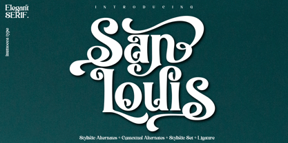 San Louis is an Elegant Serif typeface , Modern , Classy and Glamour Worlds. Awesome Stylictic Set, Beautiful Ligature and unique contecttual alternates, stylistic alternates. Really playful typeface to covering your Project, like Lettering, Website Interface, Magazine, Branding, Poster, wedding invitations, Quotes Lettering, Logos, and more your project design. - Unique glyphs - Multilingual Characters - UPPERCASE - Lowercase - Numeric - Symbol - Punctuation Character - Ligature - Contextual Alternates - Stylistic Alternates - SS01, SS02, SS03, SS04
 - Liebelei Pro by Wannatype,
$29.90 “Liebelei” – dalliance, flirtation, hanky-panky; kind of diminutive of “Liebe” (German for love) The typeface Liebelei has its roots back in 1932, when Vienna-based painter Rudolf Vogl created the poster for a movie called Liebelei after the popular play by Arthur Schnitzler. Only the title letters existed of that typeface. I loved the letters from first sight and proceeded by adventurously interpreting the missing characters. The goal was to create letterforms that fit to the original from the 1930s and represent a modern multi-purpose font. It should be an easy-to-use italic font with warm and friendly details and a huge variety of alternates and languages. The characteristic curled ends of most letters provide a script touch to the Liebelei. The first font entirely designed was the bold one which corresponds to the original poster lettering, although I tweaked the proportions a tiny bit to a more contemporary shape. Liebelei covers Western, Central European, and Central Eastern European Languages and contains also complete Greek and Cyrillic character sets. Liebelei is best for poster design as well as detailed usage, for example handsome tables, since it supports small caps, different kinds of numerals and fractions.
 - Ulga Grid Rounded by ULGA Type,
$19.00 ULGA Grid Rounded is the smooth, rounded sibling of ULGA Grid and ULGA Grid Solid. The typeface consists of three weights, regular, medium and bold, with corresponding oblique styles. Every character in the extended ULGA Grid family shares the same width. ULGA Grid Rounded features a rounded square design, giving this typeface a soft, yet sturdy appearance. A contradictory mix of stiffness and suppleness, characters slide around like lead-filled snakes trying to find their way through a maze. If this typeface were a snack, it would be a smooth, chocolatey treat - too much of it and you’ll feel dizzy and a bit sick. But, hey, I’m not your dad, do what you want. Learn from your mistakes, that’s what I say. A versatile display typeface that can be used for a wide range of purposes including CD covers, posters, packaging, advertising, name badges for robots, brochures and film titles. Mix and match with ULGA Grid and ULGA Grid Solid, use the alternatives, sneak in an oblique style to spice things up, but most of all this is a fun typeface family. The character set supports Western Europe, Vietnamese, Central/Eastern Europe, Baltic, Turkish and Romanian.
 - Elkoga by Prioritype,
$15.00 Introducing Elkoga - Round Serif Typeface A modern serif font with a rounded style that makes this font stylish and eye-catching. Comes with 8 families, from regular to bold and italic. You can apply it to your various design projects such as logos, packaging, covers, posters, social media posts, youtube thumbnails, wedding invitations, quotes and much more you can make with this great item for any design! Features: -Uppercase -Lowercase -Numeral -Punctuation -Multilingual -Opentype Features & PUA Encoded Multilingual contained: Afrikaans, Albanian, Asu, Basque, Bemba, Bena, Breton, Catalan, Chiga, Cornish, Danish, Dutch, English, Estonian, Faroese, Filipino, Finnish, French, Friulian, Galician, German, Gusii, Indonesian, Irish,Italian, Kabuverdianu, Kalenjin, Kinyarwanda, Luo, Luxembourgish, Luyia, Machame, Makhuwa-Meetto, Makonde, Malagasy, Manx, Morisyen, North Ndebele, Norwegian Bokmål, Norwegian Nynorsk, Nyankole, Oromo, Portuguese, Quechua, Romansh, Rombo, Rundi, Rwa, Samburu, Sango, Sangu, Scottish Gaelic, Sena, Shambala, Shona, Soga, Somali, Spanish, Swahili, Swedish, Swiss German, Taita, Teso, Uzbek (Latin), Volapük, Vunjo, Zulu. Note: Use a program that supports the Opentype features and the glyph panel is available, so you can see the various alternative characters available. Examples of programs such as Adobe Illustrator, Corel Draw or Affinity Designer. Thanks.
 - Brohero by Alit Design,
$16.00 Presenting ⚔️The Brohero Typeface⚔️ by alitdesign. The Brohero font is inspired by action movie posters with the theme of war or knights in the Japanese Samurai. The bold character of The Brohero font is perfect for making hero movie titles, game titles, logotypes, t-shirt designs and so on with heroic themes. Apart from the regular font, the Brohero also has an italic style which makes the design more dynamic and cool. The Brohero font has alternatives that you can combine between swashes and symbols that have the theme of heroes and war. Besides that this font is very easy to use both in design and non-design programs because everything changes and glyphs are supported by Unicode (PUA). The Brohero Typeface has a total of 789 glyphs including symbol, multilingual. Language Support : Latin, Basic, Western European, Central European, South European,Vietnamese. In order to use the beautiful swashes, you need a program that supports OpenType features such as Adobe Illustrator CS, Adobe Photoshop CC, Adobe Indesign and Corel Draw. but if your software doesn't have Glyphs panel, you can install additional swashes font files.
 - Runde Wien by Wannatype,
$36.00 Runde Wien Pro, the rounded sans serif by Ekke Wolf. Typeface lovers looking for a modern, well-developed sans serif font with a touch of retro and warm, individual lettering will get excited about a new addition to the font market. The more than complete Runde Wien Pro front comes in three styles and four different weights. In addition to the upright Runde Wien Pro there is the Runde Wien Pro Oblique with a moderate 6° slant and the Runde Wien Pro Superoblique with an 18° slant. Available weights are light, regular, medium, bold and black. These fonts are equipped with extended Latin alphabet for Central and Eastern Europe and also Cyrillic and Greek alphabet. The set of characters includes nine different sets of numbers, plus its own set for the small caps, as well as alternative characters and groovy ligatures. In addition, all Runde Wien Pro styles are also available as unicase with upper case and lower case x-height alignment. The style, metrics and proportions of Runde Wien Pro combine perfectly with the Liebelei Pro and the script fonts of the Calafati Pro.
 - Balkiez Hellenistic by Bykineks,
$15.00 Entered into the bykineks culture typeface edition. This 2nd edition typeface is inspired by the meander curves and waves often found in the culture and art of the Hellenistic era. The specifications for this font are bold typeface script, high contrast slope classification, stress axis, and X height. Comes with various alternatives for each upper and lower case letters. small offer a variety of silicates or optimal shapes for a given placement, having binding and sweeping characteristics. Suitable for coffeeshop branding needs, web design, stickers, apparel, invitation cards, and others. Consists of 503 glyphs support Languages : Afrikaans, Albanian, Asu, Basque, Bemba, Bena, Breton, Chiga, ColognianCornish, Croatian, Danish, Dutch, Embu, English, Esperanto, Estonian, Faroese, Filipino, Finnish, French, Friulian, Galician ,Double,Germany,Gusii,Hungary,Inari Sami,Indonesia,Ireland,Italy,Jola-Fonyi,Kabuverdianu,Kalaallisut,Kalenjin,Kamba,Kikuyu,Kinyarwanda,Lithuania,Lower Sorbia,Luo,Luxembourg,Luyia,Machame, Makhuwa-Meetto , Malagasy, Malt Manx, Meru, Morisyen, North Ndebele, Norwegian Bokmål, Norwegian Nynorsk, Nyankole, Oromo, Polish, Portuguese, Quechua, Romansh, Rombo, Rundi, Rwa, Samburu, Sango, Sangu, Sobia ,Shambala , Somalia, Spain , Swahili, Swedish, Swiss German, Taita, Teso, Turkish, Upper Sorbian, Uzbek (Latin) Volapük, Vunjo, Walser, Zulu.
 - Kereru by Daniel Reeve,
$20.00 Artist and calligrapher Daniel Reeve, well known for the lettering and maps in The Lord of the Rings films, is creating hand-crafted fonts of some of his writing styles - Kereru is the inaugural release, allowing users to emulate some of his much-admired calligraphy. Nominally a half-uncial style, clever arrangements of the stylistic sets allow Kereru to be set as full uncial or standard roman, as well as offering numerous alternates, ligatures, swashes and flourishes, ornaments, unlimited fractions, scientific inferiors and numeric superscript, all accessible via OpenType features. Cyrillic and Greek alphabets are included, in addition to the letters required for all the languages of Western, Central and Eastern Europe, Scandinavia and the Baltic. Kereru is very legible and easy on the eye, without sacrificing calligraphic flair. A pdf description of the Stylistic Sets and their usage is included with the font package, which comprises regular, bold and italic variations. Kereru Italic supercedes and improves upon its previous incarnation, Shire Regular. The name Kereru comes from New Zealand's Maori language - it is our native wood pigeon, a bird of generous and rounded form, like the font itself.
