10,000 search results
(0.041 seconds)
- Arbeka - Unknown license

- Gadzoox - Unknown license

- Perolet - Unknown license

- Woodring - Unknown license

- Floopi - Unknown license

- Omellons - Unknown license

- MunsterMash - Unknown license

- Scrapes - Unknown license

- 1920 - Unknown license

- Steam by Type Forward,
$- Steam combines the spirit of the old-fashioned wood type with modern flavours. Its distinctive reversed high contrast and extremely bold serifs make it impossible to stay unnoticed. It’s a fun and bold unconventional typeface that we’ve designed with great passion and curiosity! The type family consists of 13 weights that are divided into several packs. Each font in the pack can be layered on top of each other to make a funkier look. Steam is multilingual! It speaks more than 130 languages and supports extended Latin, Cyrillic, punctuation, default and small numbers, symbols and signs. It is also familiar with the OpenType features like standard and discretionary ligatures, stylistic sets, localized forms, small numbers and fractions and more. Steam looks best on logos, posters, headlines, and T-shirts and is perfect anytime you need some bold letters with specific flavour and touch. Have fun creating!
 - Amitale by Hackberry Font Foundry,
$24.95 Amitale (A-mi-tah'-lay) is the union of Amitale Book and Amitale Wide into a new 8-font book family in my continuing objective of designing a better font family for readability in booklets. My goal here is for a full range of styles from light, regular, bold, and black without the plugged counters and clunky feel of most bold fonts. In my use, personally. I do not use Amitale Book Bold. I use Wide for the bold and Wide-Bold for the black style. In many ways, Amitale is Brinar with bracketed serifs. Many people find Brinar to be an exceptionally readable and beautiful humanist sans. This new serif font family has many of the same characteristics. This is also the debut of my new OpenType features set for 2009. There are more and more ligatures for your fun and enjoyment: bb gg ff fi fl ffi ffl ffy fj ft tt ty Wh Th and more. Like all of my fonts, there are: caps, lowercase, small caps, proportional lining figures, proportional oldstyle figures, & small cap figures, plus numerators, denominators, superiors, inferiors, and a complete set of ordinals 1st through infinity.
 - JH Flynn by JH Fonts,
$12.00 Jh Flynn is modern tall sans serif typeface; a variable type including eight weights: light / regular / medium / bold and the italics; Ideal for headlines, logo design, signage and short text paragraphs.
 - Geographica by Three Islands Press,
$29.00 Thomas Jefferys (ca. 1710–1771) was the best-known map maker in 18th-century England, chiefly because he won (and hyped) the title “Geographer to King George III.” Jefferys was really more an engraver/publisher than a geographer, since he mostly relied on the cartographic materials of others. Still, his maps of the North American colonies were well known. Geographica is a legible, four-style serif family modeled after the neat hand-lettered place names and peripheral text on Jefferys’s maps. With its long serifs, tall x-height, and robust curves, Geographica somehow combines classic elegance with a whiff of coastline and sea. The italic styles have the slant and warmth of the hand-drawn source materials. And the typeface comes with a slew of distinctive map-based ornaments—including compass wheels and sailing ships. This evocative serif works well in both display situations and long blocks of text, whether on paper or screen. OpenType features include small capitals, numerous ligatures, and two stylistic sets of titling caps. Geographica offers full support for Central and Eastern European languages—more than 1,200 glyphs in all.
 - Ongunkan Linear B Syllabary by Runic World Tamgacı,
$100.00 This font is based on the Latin-based font for Linear B syllable writing. It contains all the characters. To see some full characters, you can use Turkish characters by selecting the font from the add character section of the word program. Linear B was a syllabic script that was used for writing in Mycenaean Greek, the earliest attested form of Greek. The script predates the Greek alphabet by several centuries. The oldest Mycenaean writing dates to about 1400 BC. It is descended from the older Linear A, an undeciphered earlier script used for writing the Minoan language, as is the later Cypriot syllabary, which also recorded Greek. Linear B, found mainly in the palace archives at Knossos, Cydonia, Pylos, Thebes and Mycenae, disappeared with the fall of Mycenaean civilization during the Late Bronze Age collapse. The succeeding period, known as the Greek Dark Ages, provides no evidence of the use of writing. Linear B, deciphered by English architect and self-taught linguist Michael Ventris based on the research of American classicist Alice Kober[5] is the only Bronze Age Aegean script to have thus far been deciphered.
 - Gibson Girl JF by Jukebox Collection,
$32.99 Based on a hand lettered sample from the early 20th Century, Gibson Girl is a heavy script font with a vintage flair. During the end of the 19th Century, the “Gibson Girl” created by illustrator Charles Gibson, was considered the ideal of feminine beauty and poise in that time period. The term has become associated with the Gilded Age in America. The design of the Gibson Girl font reflects both femininity and self confidence.
 - Milk Script by Sudtipos,
$59.00 The hand-lettered signage of 1920s and 1930s America produced many typographic jewels that digital type has yet to manifest. This face is but one of them. Unearthed by Alfredo Graziani and Alejandro Paul from a 1923 Speedball lettering manual, Milk Script is a distinctive upright script that offers well-nourished majuscules and sweet-flowing minuscules. A non-connecting variation of this versatile display script is also offered for additional aesthetic control.
 - Nouveau Auto JNL by Jeff Levine,
$29.00 “The Auto Show” is the title of an early 1900s pieces of sheet music proving that America has had a fascination with cars since the earliest days of the automotive industry. The song sheet’s title was hand lettered in a casual Art Nouveau style which has been re-drawn digitally as Nouveau Auto JNL, and is available in both regular and oblique versions… and what’s better than a nouveau auto (a new car)?
 - Apothecary Serif by Pixel Colours,
$26.00 Apothecary Serif is a font collection inspired in vintage and antique prints. Great for texts or headings and perfect as a pairing font. Design quotes, packaging, wedding invites or labels and branding with a vintage style. Lovingly designed to match my original Apothecary Script (sold separately) Includes: - Apothecary Serif: a serif font with an antique print press texture. - Apothecary Serif Spaced: beautifully spaced for texts or as a pairing font. - Apothecary Serif Caps: rich bold and tall textured capitals font that includes the lowercases as a secondary uppercase font, slightly smaller. Great for headings or as drop caps. - Apothecary Serif Caps Spaced: beautifully spaced for texts or as pairing font.
 - Kamenica by Tour De Force,
$25.00 “Kamenica” - named after a beautiful small mountain river in Serbia - is a font family containing 3 weights: Light, Regular and Bold. The Kamenica river is only a few meters wide. Mostly shallow and cold, clear and green, it was the direct inspiration source for the creation of this condensed typeface. As our other typefaces, “Kamenica” also combines traditional shapes with modern forms, tall x-height and a collection of more than 300 glyphs. Comparing the river with the font, we could say that letters are the fishes that lives in the Kamenica river and that the font weights are the seasons in which this river shows most of its own character.
 - Berndal by Linotype,
$29.99Bo Berndal, the master Swedish typographer, is the eponymous designer of Berndal, a contemporary text family with five different styles. This family represents a new achievement for Bo Berndal, who has spent many years working to optimize text legibility in the printed media. Several small tricks make the Berndal family an interesting milestone in legibility. Berndal's letterforms contain large x-heights. Large x-heights open up the counterforms of letters, making text appear lighter on a page, but their correspondingly shorter ascenders and descenders can hinder legibility. This does not occur in Berndal at all! Coupled with this experiment, Berndal's various font weights display a certain softness and roundness. The letterforms themselves are relatively wide, with an overall consistency in width. The calligraphic nature of the strokes has been minimized, yet a contrast stroke-thickness is still to be noticed within the alphabet. Berndal's five styles offer almost everything that one could want from a good text family. The Regular weight may be paired with Small Caps, Italic, Bold, and Bold Italic. All styles ship in the OpenType format, and include tabular and old style figures. The two italic weights are made up of true italics, not obliques. The Berndal family is a part of the Take Type 5 collection from Linotype GmbH." - Hernández Niu by Latinotype,
$29.00 In the typedesign industry the terms ‘nova’, ‘neue’, ‘next’, ‘new’ are often used to refer to a typeface that has been modified in different ways: redesign, technical readjustments, greater number of characters, etc. At Latinotype we are now starting to use the word ‘niu’ to refer to these kinds of typefaces. Niu is an adaptation of the original word ‘new’, i.e., we have adapted this English word to the phonology and spelling of our own language but keeping the original meaning. Race mixing, diversity, change and adaptation are part of the essence of Latin American culture and, at Latinotype, we are all constantly expressing these elements in everything we do. Latin Power! Hernández Niu was designed by César Araya and Daniel Hernández. The font is based on the design of Hernández Bold: the thickest weight has been adapted to fit small text better. Five new styles have been added, ranging from neutral to more expressive fonts. Hernández Niu is a display slab serif font of thickened serifs, functional expressive ink-traps and true italics. Detailed forms and counterforms allow this typeface to be used in very large sizes. Hernández Niu is well-suited for publishing, small text and headlines. A wide variety of weights make the font a perfect choice for hierarchical type-setting, branding, logotypes, magazines, etc. This font consists of 6 weights, ranging from Extra Light to Heavy, each with matching true italics. Hernández Niu comes with a set of 397 characters, making it possible to use the font in 212 different languages.
 - Guadalupe by Rodrigo Navarro Bolado,
$32.00 Article to appear on the font family page: According to the Catholic faith, a well known náhuatl story called "Nican Mopohua" (translated as "Here it's narrate") about the Marianas apparitions on the Tepeyac's hill, to the north of the actual Mexico City. After four apparitions, La Virgen de Guadalupe (LVG) told Juan Diego (JD) that he must introduce himself to the first Bishop of Mexico. JD took in his "ayate" some roses (that aren't natives to Mexico's barren territories) and when he dropped them in front of the bishop, the image of LVG appeared in front of him with indigenous features. I’ve worked a lot in this font that appears to came out of nowhere, just like the image of LVG itself, the fact is that I started first sketching some flowers, because I wanted to do something related to this mexican story, so, taking some features from this flowers I started sketching some letters, for example “r” and “i” and the counter forms for some letters like “a” and “o” (that I didn’t use by the way) and the punctuation marks, all inspired by this leaf forms. Lighter weight coming soon! Hope you like it. Any comments: rodrigonabo@gmail.com
 - Million Dreams by Sansakerta,
$13.00 Million Dreams is an elegant and bold display font. Unique, playful and versatile serif Fot that you can combine to get curves and beautiful shapes just in seconds. Play with the ornaments to create a more stunning display. This font is suitable for use in many design forms, for example magazines, postcards, logos, vintage look, old classic ,60s, 70s, 80s era, wedding projects and many more. We recommend using Adobe Illustrator or Photoshop. Fall in love with its incredibly versatile style and use it to create gorgeous wedding invitations, beautiful stationary art, eye-catching social media posts, and much more! Cheers! Sansakerta
 - Sign Panels JNL by Jeff Levine,
$29.00Alf R. Becker was a noted sign painter, designer and the creator of hundreds of unique alphabets which were published in the trade magazine Signs of the Times during the 1930s through the 1950s. Thanks to Tod Swormstedt of ST Media [and who is also the curator of the American Sign Museum in Cincinnati], Jeff Levine received some reference material on Becker's work. Becker displayed many of his type styles within decorative panels—a popular trend in the days when signs were hand-lettered. Using the reference material as a guide, Jeff has re-drawn twenty-six sign panels for adaptation to digital print work. While the designs in themselves are not thoroughly unique to Alf Becker, he has left behind some tangible examples of how sign painters embellished their lettering work. With the use of complementary colors and tones, these panels—joined with vintage lettering - classically recreate the warm and attractive advertising of years ago. - Eloise by Wiescher Design,
$39.50 Ever since I first designed Ellida in 2005, that elaborate script in the tradition of the 18th-century English calligrapher George Bickham and the 19th-century American calligrapher Platt Rogers Spencer, I wanted to add a very high contrast cut to the family. I finally did so. But the result looks so much different to Ellida that I had to give it another name, hence "Eloise". Eloise should actually be written with a 'i' that has double dots, but that would be difficult for international use. Eloise is a beautiful first name not only for French girls. Pronounce: Ay-low-eese. If I would have had a daughter, I would have called her "Eloise" (with double dots!). But instead I have two phantastic sons, so I never got the chance to use it. Actually one of my sons discovered it on his little boys sand shovel, it was called Eloise. Your decorative designer with a heart for sand shovels Gert Wiescher
 - Tequendama by JVB Fonts,
$30.00 A display fontface for titles inspired on Latin America, Ethnic, Native, Tribal, Mysthical, Handmade, Aboriginal, Pre-Hispanic, Pre-Columbian, Textured. By mid-1997 I was developed the early type edition was called «Muisca Sans» as my work for the degree in Graphic Design (Universidad Nacional de Colombia), based on the concept of pre-Columbian figures characteristics within some of the very few visual elements recovered from the Muisca culture, ancient pre-Columbian tribe disappeared before the arrival of the Spaniards in what is now central Colombia. In fact, the name of the capital Bogotá (the capital of Colombia) goes back to Bacatá as primary or village downtown of what was once the imperial capital of tribe Muisca. Although this unfinished early typographic project has not yet been published, Tequendama is the evolution of the first one. Tequendama reminds the myth of Muisca culture and religion of this tribe. The god Bochica, a wise old man with a white beard heard the cries of his tribe suffered against flooding of their land losing harvests before the divine punishment resulted by the offended god Chibchacun. However Bochica appeared wearing a white robe sitting on a huge rainbow and he broken the mountain towards the southwest wise old man with a golden staff broke the mountain to drain the flooded savanna. This emblematic and iconic place would later be called as «Salto de Tequendama». Tequendama name also been adopted to a nearby province to Bogotá.
 - Tempest - Unknown license

- Hanya Wilde by madeDeduk,
$16.00 Really excited to introduce Hanya Wilde is a bold brush script! Hanya Wilde will be perfect for all your designs project. Hanya Wilde Included: Uppercase Lowercase Number & Symbol International Glyphs Alternative Ligature If you need anything else just shoot me on email at: dedukvic@gmail.com Hope you enjoy it.
 - Rosacfild by Brithos Type,
$11.00 Rosacfild is a bold script font. This fantastic typeface is best suited for headlines of all sizes, as well as for blocks of text that have both maximum and minimum variations. Use it to create standout headings, promote your online sales, Instagram quotes, business cards, t-shirts, and invitations.
 - Rush Turbo by Letterena Studios,
$9.00 Rush Turbo is a cool and bold display font. This typeface is perfect for an elegant & luxurious logo, book or movie title design, fashion brand, magazine, clothes, lettering, quotes, and so much more. Rush Turbo is PUA encoded which means you can access all glyphs and swashes with ease!
 - MD-Type Rounded by MD-Type,
$25.00 MD-Type Rounded is a modern, stylish font family. The family consists of five fonts (Regular, Bold, Light, Block, Black) which are formed by all capital letters. The strong and accented letters were rounded on the corners and therefore softened. The font family supports Turkish language as well.
 - Harley by Motokiwo,
$5.00 Harley is all caps Sans Family with three weight, thin, regular, bold, and stencil version for regular weight. The design anatomy is simple, only straight shapes with no curves and it's suitable for techno design, poster, headline, products design, print design, etc. Harley also support standard multilingual characters.
 - Ramones by Namistudio,
$15.00 Rebel, Energy, Punk, Power... Ramones, jagged interlock letter with bold line. This font will bring that IN YOUR FACE attitude in your design. No more soft side. It's all about the energy ! Either choosing the auto-generate interlocking letters, or keep it original, Ramones still brings you the power.
 - Filt Pro by Martin Lexelius Core,
$33.00 Filt is based on hand-drawn sketches; no geometry, all visual. At the same time the curves are digitally constructed with extreme accuracy. The result – aggressive, playful, eager and ultra bold. This makes Filt a great headline and display unicase font. Filt Pro comes with a Greek set aswell.
 - Lunar by Etewut,
$20.00 Lunar is a handwritten sans serif typeface that was created for the opera Pierrot Lunaire during Diaghilev festival 2018 in Perm. There are 3 fonts in the family of LUNAR: light, regular and bold. It supports all EUROPEAN languages, basic CYRILLIC and GREECE language. It's enough to make sensation!
 - Ruadson by Letterena Studios,
$10.00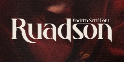 Ruadson is bold and stylish serif font. This typeface is perfect for an elegant & luxury logo, book or movie title design, fashion brand, magazine, clothes, lettering, quotes, and so much more. This font is PUA encoded which means you can access all of the glyphs and swashes with ease.
 - Japoneh by Okaycat,
$29.50 Japoneh is a dynamic font set in all bold heavy brushed characters. It practically jumps off the page with the action of these fluid strokes! Take your design to the next level with Japoneh. Japoneh is extended, containing West European diacritics & ligatures, making it suitable for multilingual environments & publications.
 - Mangana Sega by Differentialtype,
$12.00 Mangana Sega is a bold display serif font with a retro design. Mangana Sega is equipped with alternate and ligature, which will add an elegant and luxurious impression to every project you make. Mangana Sega is PUA encode, which mean you can easily access all required alternates and swashes.
 - SBB Power Grid by Sketchbook B,
$9.00 Powerful and angular. Power Grid comes in four versions: Regular, Stencil, Inline and Rounded. Inspired by 1920s constructivist posters, it's perfect for industrial and bold applications. Power Grid is all caps and includes a handful of alternate glyphs. 8 fonts 4 styles: Regular, Stencil, Inline and Rounded Alternate characters
 - Landepz by Zamjump,
$9.00 Landepz Typefamily includes three normal styles, grunge texture and glitch, Landepz is a family of bold hand-printed types, celebrating the style of the original printing press and all its beautiful imperfections. Its solid, robust shape lends itself to a robust design, while its texture provides an authentic sound.


