10,000 search results
(0.048 seconds)
- Lina sans Arabic by Zaza type,
$24.00 Lina sans is an Arabic typeface from Lina type family, it expresses modern vigor based on simplicity and clarity. It's Strong, Bold, legible, clear, simple, Modern. With a handful set of OpenType features and alternatives. Lina type family consists of Lina soft, Lina sans, Lina round. the design is inspired by the Kufic calligraphic style and influenced by the Naskh style. Lina sans was highly crafted in order to perform well both on screen and in print. The large x-height and open counters make it function well even on small font sizes. It has a wide range of use possibilities headlines, logotypes, branding, books, magazines, motion graphics, and use on the web and Tv. Lina sans consists of 7-weight versions from thin to bold.
 - Lucaria by Jehoo Creative,
$19.00 Lucaria is a modern serif typeface that combines classic design with contemporary details. The most distinctive feature of Lucaria is its strong shape on the edges, which gives the font a bold and commanding presence. This design element is complemented by the wide characters, which provide ample space for legibility and readability. The combination of these features makes Lucaria a great choice for displays and headlines. This versatile font family is available in seven weights, including Light, Regular, Medium, Semibold, Bold, Extrabold, and Black, as well as a variable font for added flexibility. The variable font option allows designers to customize the weight makes Lucaria an ideal choice for a range of design projects, including branding, packaging, and editorial layouts.
 - Vodka by Fenotype,
$19.00 Vodka - a display pack with an edge. Vodka is a display combo pack of four styles and six fonts. Vodka fonts are clean but soft. Vodka's core is two weights of a Brush Script and a Monoline Script with similar characters. Vodka Sans is a bold sans with very soft features. Vodka Sans lowercase letters are a bit condensed version of uppercase. Vodka Slab is a rounded bold display type. Vodka Brush and Pen are equipped with automatic Contextual Alternates and Standard Ligatures that help to keep the flow smooth. For more expressive letters there’s Swash Alternates for every standard letter. Vodka fonts are designed to play together but can easily be used as themselves too. For the best price purchase the whole pack!
 - Dubbo by Factory738,
$15.00 I present to you Dubbo, a new retro serif! Dubbo is a fashionable font that is both retro and bold. Its thick curves give it a 70s groovy vibe, while the serifs bring it back to traditional. Dubbo fits right in with those retro mood boards and vintage logos. It includes a distinct lower and uppercase, as well as numbers, punctuation, and multilingual letters. The Ligature and Alternate fonts are sure to come in handy for whatever your imagination can conjure up! 5 Weights (Light, Regular, Semibold, Bold, Black) Basic Latin A-Z and a-z Numerals & Punctuation Stylistic Alternates & Ligatures Multilingual Support for ä ö ü Ä Ö Ü ... Free updates and feature additions Thanks for looking, and I hope you enjoy it.
 - Bropella by Martype co,
$20.00 Introducing, Bropella. A bold sans with unique alternates and swashes! Comes with classic style and modern design with strong bold feels, of course this font perfect for headline, logotype, apparel, branding, packaging, editorial and etc. --- What's Include ? - Alternates - Ligatures - Swashes - And Many More! --- Support for 66 languages Afrikaans, Albanian, ,Basque, Bemba, Bena, Breton, Catalan, Chiga, Cornish, Danish, Dutch, English, Estonian, Faroese, Filipino, Finnish, French, Friulian, Galician, German, Gusii, Indonesian, Irish, Italian, Kabuverdianu, Kalenjin, Kinyarwanda, Luo, Luxembourgish, Luyia, Machame, Makhuwa, Meetto, Makonde, Malagasy, Manx, Morisyen, North, Ndebele, Norwegian, Bokmål, Norwegian, Nynorsk, Nyankole, Oromo, Portuguese, Quechua, Romansh, Rombo, Rundi, Rwa, Samburu, Sango, Sangu, Scottish, Gaelic, Sena, Shambala, Shona, Soga, Somali, Spanish, Swahili, Swedish, Swiss, ,German, Taita, Teso, Uzbek (Latin), Volapük, VunjoZulu, --- Thanks! Happy Desigining :) Umar
 - Phlebodium by Fat Hamster,
$20.00 Phlebodium - geometric sans serif typeface, 16 fonts Phlebodium is a modern geometric sans serif font family. Nostalgic, soft and playful font in 80s 90s 2000s techno rave style. BONUS: vector cannabis / hemp leaf, sunflower, mushroom / fungus, meat, unicorn, heart, pizza, hot dog, sun, phlebodium, clover, dog, cat, bear, sun character mascot illustrations and t-shirt designs Phlebodium type family available in 16 styles. 8 Italics 4 weights: Thin, Regular, Medium and Bold 2 widths: Normal and Condensed This bold typeface is ideal for use in display sizes. Perfect for headlines and logos, text blocks, any type of graphic design, printing, t-shirts, posters, branding, web and applications, social media and many more Phlebodium typeface contains 4 weights, normal, condensed and italic styles
 - Noland by Flavortype,
$14.00 Noland, A new carefully crafted Variable Geometric Typeface. The Ideas of this fonts are from retro poster, music, movie poster, theater, science fiction from the 70s and early 80s. Adding the elements from the reference above to be represented as Noland. It’s Versatile, Fun, Sharp and Retro-ish feel that you get in Noland Typefaces. Noland Available with 3 Weights: Regular, Semibold and Bold. Also Available in Variable, so the weights are more flexible between Regular and Bold. Just Play with slider weight. Our creation on the display to give you a reference what it looks like on your project. such as Branding, Header, Logotype, Poster, Magazine, Packaging, and etc. It shows that Noland clearly can accommodate Retro Vintage style.
 - Myhota by Ingrimayne Type,
$7.00Myhota is a condensed sans-serif face that has a bit of rawness to it. It is condensed and has a very high x-height, so it more useful for display than text. Myhota-Bold and Myhota-Light were designed in 1990 and the other seven weights were added in 2021 as were the italic and backslanted styles. There is rarely a use for backslanted type, but when it is needed, Myhota provides an option. Myhota-Hatched was an attempt to see if a readable text font could be hatched out of Myhota by lowering the x-height and widening the letters. The result is a face with rather squarish letters. The regular and bold were original styles with the medium and italic styles added in 2021. - Myhota Hatched by Ingrimayne Type,
$7.00 Myhota is a condensed sans-serif face that has a bit of rawness to it. It is condensed and has a very high x-height, so it more useful for display than text. Myhota-Bold and Myhota-Light were designed in 1990 and the other seven weights were added in 2021 as were the italic and backslanted styles. There is rarely a use for backslanted type, but when it is needed, Myhota provides an option. Myhota-Hatched was an attempt to see if a readable text font could be hatched out of Myhota by lowering the x-height and widening the letters. The result is a face with rather squarish letters. The regular and bold were original styles with the medium and italic styles added in 2021.
 - Isle Headline by Mans Greback,
$19.00 Isle Headline is a high-quality serif typeface family, drawn by Måns Grebäck during 2018 and 2019. It is a sharp font with a clear and attentive look, adapted for headlines, titles and large type settings. It comes in four weights, each one as italic, totaling in eight styles: Light and Light Italic, Medium and Medium Italic, Bold and Bold Italic, Black and Black Italic. The font family can be used in a combination with a font of a different style, or together with its sister font Isle Body, also a serif font, which has the same basic structure but with a softer look and adapted for body text and smaller type. Each style contains ligatures and support for a wide range of languages.
 - Caviar Dreams - 100% free

- Smiley by Dear Alison,
$24.00Ever think that supermarkets are becoming less personal and more clinical and cold? What will cost you less than a trip to the supermarket and put a smile on your face? Smiley was inspired by the hand-brush lettered signage at country grocery stores. There's something about the feeling you get when you visit a small town and stroll on over to the corner market. Everyone is pleasant, courteous, and they all have a smile on their face. You can have that local small town grocery store charm for yourself when you buy Smiley today. - Tinkerer by Ingrimayne Type,
$9.00 Tinkerer, TapedUp, and Rumpled are based on the template I used for several letterbat fonts—fonts made of wrenches and bolts, hammers, or paper clips. TapedUp can be thought of as a font made from masking tape, and Rumpled is the same design but the tape pieces are wavy. Tinkerer is the same design but with elements that resemble what might happen if one constructed letters from Tinker Toys. All are caps only, but some of the shapes on the lower-case keys differ from the corresponding shapes on the upper-case keys.
 - Page No. 508 by HiH,
$10.00 Page No. 508 was designed by William Hamilton Page in 1887 as one of a series of designs for die-cut wood types for the firm of Page & Setchell of Norwich, Connecticut. Page & Setchell was the successor to The William H. Page Wood Type Company and was sold to the Hamilton Manufacturing Company of Two Rivers, Wisconsin in 1891. 508 is a heavy all-caps font designed for headline work. It has a strong presence that reverses out well (light-colored type on a dark background). Great for retro style posters.
 - Cherolina by Almarkha Type,
$29.00 Cherolina is a lovely elegant script font that includes a full set of uppercase and lowercase letters, numerals, multi-lingual support, punctuation and ligatures. You also get short lowercase beginning and ending swashes, and lowercase ending swashes which serve to connect two words or letters. Those are so perfect for invitations, monograms. This font also includes long lowercase beginning and ending heart swashes. Cherolina has a smooth texture so would be perfect for all types of printing techniques. You can use it for embroidery, laser cut, gold foil and more.
 - Jasan by Storm Type Foundry,
$49.00 Jasan is the Czech expression for ash tree (Fraxinus Excelsior) which provides great wood for tools and furniture. In a landscape it’s a rather inconspicuous tree which forms beautiful alleys. Jasan typeface represents a synthesis of many famous sans-serifs: despite the concept being strictly rational, it’s not at all cold. Simple shapes & human expression will make your projects nicely colored. It brings excellent clarity for printed and web publishing, visual identity & information systems. The 36-font family contains multi-lingual support including Cyrillics, Small Caps & rich palette of OpenType Features.
 - Austerity by Heyfonts,
$15.00 Austerity Retro Script font is a vintage-inspired typeface that is perfect for creating classic design projects. Its elegant and curvy handwritten style makes it ideal for conveying a sense of nostalgia and timeless sophistication. This font is available in both regular and bold weights and includes uppercase and lowercase letters, numbers and punctuation symbols. Some of its features include: -Vintage Style: Austerity Retro Script font captures the essence of the golden age of typography with its retro-style design. It is perfect for creating vintage posters, product packaging, branding, and more. -Handwritten Appearance: The font has a unique and playful handwritten appearance, with smooth curves and a natural flow. It captures the essence of calligraphy and is perfect for conveying a sense of personal touch. -Bold and Regular Weights: Austerity font is available in both bold and regular weights, giving designers flexibility to mix and match them to achieve a wide range of styles. -Uppercase and Lowercase Letters: The font includes both uppercase and lowercase letters, making it easy to create a variety of typographic combinations for your designs. -Punctuation Symbols and Numbers: Austerity font also includes a range of punctuation symbols and numbers, making it a versatile typeface for a wide range of projects. -Multilingual Support: The font supports multiple languages, including English, French, German, Portuguese, Spanish and more. Overall, Austerity font is a perfect choice for designers who want to create a vintage feel in their design projects. Its handwritten style, bold and regular weights, and range of symbols and numbers make it a versatile and reliable font for any design project.
 - Cross Stitch Formal by Gerald Gallo,
$20.00 Cross Stitch Formal is based on upper case characters 20 stitches tall and contains upper case characters A-Z. All characters are linked by at least one stitch.
 - Burgues Script by Sudtipos,
$99.00 Burgues Script is an ode to the late 19th century American calligrapher Louis Madarasz, whose legendary pen has inspired schools of penmanship for over 100 years. His talent has caused some people to call him “the most skillful penman the world has ever known.” I use the word ‘ode’ in a colloquially ambitious manner. If I was an actual poet, my words would be about things I desire but cannot attain, objects of utter beauty that make me wallow in humility, or people of enormous talent who look down at me from the clouds of genius. But I don’t write poems. My work consists of letters drawn to fit together, that become an element of someone’s visual poetry. I am the poet’s assistant, so to speak. Once in a while, the assistant persists on what the subject of the poem will be. And occasionally, the poet gives in to the persistence. I hope you, visual poet, find my persistence justified in this case. The two main sources for Burgues were the calligraphy examples shown in Zaner Bloser’s The Secret of the Skill of Madarasz: His Philosophy and Penmanship Masterpieces, and C. W. Jones’s Lessons in Advanced Engraver’s Script Penmanship by L. Madarasz. These two references were the cornerstone for the concept I was trying to work with. I did have to change many of the letters in order to be able to produce digital calligraphy that can flow flexibly and offered the user a variety of options, while maintaining its attractive appearance. To this end, many ligatures and swashes were made, as well as full flourished sets of letters for use at the beginnings or endings of words and sentences. All of this has been tied together with OpenType and tested thoroughly within today’s standard design and desktop publishing software. After working with digital scripts for so long, at one point I thought that Burgues Script would become a bit of a chore to complete. I also thought that, like with most other scripts, the process would regularize itself after a while and be reduced to a mechanical habit. Surprisingly, and fortunately for me, this did not happen. The past holds as many surprises as the future. Madarasz’s method of penmanship was fascinating and challenging to translate into the strict, mathematically oriented language of the computer. It seems that the extremely high contrast of the forms, coupled with the required flow and connectivity of such lettering, will always be hard work for any visual artist to produce, even with the aide of a powerful machine. I can only imagine what steady nerves and discipline Madarasz must have had to be able to produce fully flourished and sublimely connected words and sentences on a whim. When I think of Madarasz producing a flourished calligraphic logotype in a few seconds, and try to reconcile that with the timelines of my or my colleagues’ work in identity and packaging design, the mind reels. Such blinding talent from over a hundred years ago. Burgues is the Spanish word for Bourgeois. In the end, I hope Burgues Script will serve you well when a flourished word or sentence is required for a design project. One of the wonders of the computer age is the ability to visually conjure up the past, serving both the present and the future. With Burgues, you have a piece of “the most skillful penman the world has ever known,” at your service. Burgues received important awards such as a Certificate of Excellence TDC2 2008 and a Certificate of Excellence at the Bienal Tipos Latinos 2008.
 - Faculty by Device,
$39.00 Faculty is a robust, warm and rational sans, with a large x-height that lends clarity in text and headline. Functional, clear and authoritative, it still has character. Stroke terminals are cut vertically or horizontally, minimising inter-letter gaps and lending it an even 'colour' in extended settings. Suitable for both headlines and text, the family has extensive language support, alternative characters, lining, tabular and old style numerals, making it a versatile all-purpose type system.
 - Bogart by Zetafonts,
$39.00 All the nine weights of Bogart, as well the matching true italics forms, feature an extended charset of over 1600 glyphs, covering 219 languages using latin, cyrillic and greek alphabets, and sporting a complete set of Open type features. To add flexibility for editorial usage, a text-oriented Bogart Alternate set of nine weights was added to the family keeping the design more similar to its modern old style model and allowing for a heavy readable mid-weight range.
 - New Romantine by Orenari,
$18.00 Hi! It's Orenari here want to introduce a romantic display serif font, New Romantine. This font has lovely curves and almost of all the uppercase and lowercase has stylishtic alternates. The fact of this font is Romantine was my very first font. This New Romantine is the newer version of Romantine. It's bolder than the old version. Just launch the New Romantine in February so this font will bring the Valentine's Vibe to your creative projects.
 - Merisk by Imoodev,
$20.00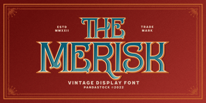 Merisk is old fonts with visual elegance, smooth curves, and beautiful ligatures clear, making your work look true and attractive. A very versatile font that works in both large and small sizes. This font is suitable for a wide variety of projects such as invitations, logos, branding, magazine, photography, card, product packaging, mugs, quotes, poster, labels, signatures, and more. Font which is perfect for all business sectors including personal projects, studio, corporate, creative agency, industrial, company, etc.
 - Romantico by Kustomtype,
$25.00 Kustomtype's "Romantico" font is a sans serif font family with a regular & oblique version. It contains all upper & lower cases. The "Romantico" family is coordinated into letterforms, metrics, and weights to work better together. Why still looking for old school types for your posters, advertising, text, design, artwork, headtext, editoral design, magazines, etc.? "The true genius shudders at incompleteness - imperfection - and usually prefers silence to saying the something which is not everything that should be said." Edgar Allan Poe
 - FF Meta Georgian by FontFont,
$67.99 FF Meta® Georgian is based on the same humanistic shapes and proportions as the original 1991 FF Meta design. The narrow proportions, slight variation in stroke thickness and sheared terminals that are hallmarks of FF Meta are also present in the Georgian design. Each of the two weights in the family contain all the characters needed to set modern Georgian, as well as additional symbols for the Old Georgian, Megrelian, Svan, Abkhazian and Ossetian languages.
 - Salda Soft by Hurufatfont,
$19.00 Salda Soft; It is a modern sans serif family that blends old and new generation sans serif fonts in the same body. It has a wide usage area with its light narrow structure, soft and clean lines, humanist touches. It provides clean and smooth visuals in vertical screens, mobile applications and block texts. It consists of a total of 20 styles. Ideal for all kinds of editorial design, packaging, corporate identity, brand, application, web and desktop.
 - Vinice by Illuminaut Designs,
$15.00 This typeface was created as a personal project. Inspired by places like Chattanooga and Berkley, I wanted to create a bespoke typeface family for the US Virgin Islands. I noticed that the typeface Berlin Sans was in use all over the islands, in signs, logos, even on the side of police cars. So I built this typeface from the ground up with the goal of updating an old tried-and-true font into a family with versatile potential.
 - Armstead by Larin Type Co,
$18.00 Inspired by classic calligraphy, Armstead is an elegant and sophisticated handwritten font with a classic charm. All lowercase have 8 - 9 variants, total of 203 alternates, 7 ligatures, 20 swash of which 10 are final, and there are old roman numerals from 0 to 12. This font is perfect for your wedding invitation, greeting card, certificate, branding, magazine, book cover and much more and the alternates will help you to make your design unique. Thank you!
 - Nagel by ParaType,
$40.00 Nagel is a contemporary uniwidth display sans serif for headlines and short texts. It’s a closed low-contrast typeface with an emphasis on stroke joints. The length of the line set in Nagel remains the same in all weights. Nagel has all the advantages of monospaced typeface graphics, but none of their functional disadvantages. Characters in Nagel are made monospace-like wide, as opposed to traditionally narrow characters of proportional fonts, and often have slab serifs. Letters of monospaced fonts that have to be narrowed down considerably, have the usual width here. The scope of Nagel is branding and identity of IT companies, infographics, scientific and technical documentation — any areas where a technical, modern typeface with distinctive graphics may be required. The typeface includes three upright styles — Regular, Medium, Bold; two sets of 11 and 18 slanting degrees and a variable version with two axes: Weight and Slant. The character set includes extended Cyrillic and Latin alphabets, arrows, triangular bullets, index numbers and fractions. Designed by Alexander Lubovenko.
 - End Crawl by Wing's Art Studio,
$10.00 End Crawl - A Halloween Brush Font Introducing a new creeping terror this Halloween, End Crawl is a hand-drawn brush font inspired by the gore-soaked horror movies and comic books of the 1970s and 80s. This textured all-caps design evokes a nervous energy that will leave your readers frozen in suspense! With a bold painted look surrounded by an anxious outline, it offers the tools to leave your readers stomach in knots! The End Crawl font family includes all-caps uppercase and lowercase characters, along with numerals, punctuation, symbols and language support. Also included are a complete set of alternative characters and additional paint marks, drips and splashes. Wingsart Studio Design Tip! The uppercase and lowercase characters work great when mixed in an alternating fashion, with shapes that combine to create a dynamic, trembling look that's perfect for the Halloween season. Add the alternatives and paint marks into the mix and you'll have yourself a title or header design that looks truly custom-made. I've even included the base font and outlines separately, allowing to overlay your own colour combinations!
 - Kpop Vibes by Ronny Studio,
$19.00 Inspired by the emerging Korean culture that grabbing the worldwide actuation in so many realms of the industry. To bridge the vibes and to make it easier to consume, we found the gap to fill with simple things in life that are useful for it, and yes, it's a new day it's a new font. So without any further ado, please welcome Kpop Vibes. series of Korean vibes typefaces. It's a sans-serif font with bold and strong vibes to catch up with today's graphic design trends. 2 Font Style: - Regular - Italic Kpop Vibes Features: - Uppercase - Lowercase - Numbers & Punctuation - Alternate Style - Multilingual Support - Simple installation All features and special characters of this font are included in one file. So that it is easily accessible by using a program or software that supports opentype such as Adobe Illustrator, Adobe Photoshop, and Adobe Indesign). This font is also very easy to use as it is compatible for all supported software even for non-opentype. Please comment us if you have any questions Thank you and have a nice day. Thank You
 - Odisseia by Plau,
$20.00 Odisseia: Monospaced Typeface Made on Earth by Plau. Plau presents Odisseia, a monospace type family in 8 styles designed with simplicity of shapes and a humanist touch. We’ve ventured into monospace territory, where all letters must occupy the same amount of space. This style is usually associated with typewriters and computer terminal fonts. Like all monospaced fonts, every letter align vertically in a multi-line setting. The rhythm created is peculiar, since large letters such as m and w occupy the same space as narrow ones like i. Because we have 4 different weights: light, regular, bold and black the design of some characters have to be adapted to fit the same width and achieve a constant light/dark value throughout. These features make Odisseia suitable for a specific yet considerable range of uses, from computer coding to systemized communication such as brand identities. This style has been used from high-end brand identity to cutting edge digital applications. Odisseia sets a little shorter in comparison with other monospaced fonts, and bears a large x-height.
 - Fenomen Sans by Signature Type Foundry,
$38.00 Geometrical drawing of Fenomen Sans typeface goes back to the roots of the Bauhaus aesthetics and the entire architectural and design avant-garde of the 20th century. It is still a symbol of functional rationality, clean aesthetics in relation to shape, and of progressive thinking. Its popularity is timeless and permanent. The set contains eight basic alphabets of a square pattern, eight semicondensed, eight condensed and eight extremely condensed alphabets, all in Latin and Cyrillic alphabets. Every font of the family has four types of numerals, small caps and variant letters. The typesetting can fluently use all fonts simultaneously. The typeface originated between the years 2011–2014 and was subjected to a series of tests for the fluent legibility of narrow fonts even in extreme conditions. Narrow fonts provide this set with the maximum use also for newspaper typesetting. The typeface has an elegant, delicate design in thin fonts and sufficient legibility in bold. Mutual contrast produces creative tension. Font name acronyms described: SCN = SemiCondensed CN = Condensed XCN = ExtraCondensed
 - Nuqat by Arabetics,
$39.00 An isolated letters typeface design with a comic feel. All letters start with a prominent circular dot. All final shape letters end with a smaller dot, in addition. The Nuqat (Arabic for dots) font family has four members which include two weights, normal and bold, and comes in regular and left-slanted italic styles. This font family design follows the guidelines of Mutamathil Taqlidi type style with one glyph for every basic Arabic Unicode character or letter, as defined in the latest Unicode Standards, and one additional final form glyph, for the freely-connecting letters in traditional Arabic cursive text. The Nuqat font family employs variable x-height values. Nuqat includes only Lam-Alif ligatures. Soft-vowel diacritic marks, harakat, are selectively positioned. Most of them appear by default on the same level, following a letter, to ensure that they would not interfere visually with letters. Tatweel is a zero-width glyph. Keying the tatweel key before Alif-Lam-Lam-Ha will display the Allah ligature. Nuqat includes both Arabic and Arabic-Indic numerals, in addition to standard punctuations.
 - Bronson by Ronny Studio,
$22.00 Bronson is a sans serif family that comes in 7 weights. The Bronson font has a very bold body, but still has high contrast. This font looks very modern when paired with contrasting design colors. This font is impressive and features a clean and elegant font, professionally shaped, and as a result, it will easily match a variety of creations that require a different touch. Add it with confidence to your projects, and you'll love the results. This typeface is perfect for elegant logos, branding, promotions, book covers, magazine layouts, or simply as a stylish text overlay onto any background image. Bronson Features : Uppercase Lowercase Numbers & Punctuation Multilingual Support Simple installation All of features and special characters of this font are included in one file. So it is easy to accessed by using program or software that support the opentype like Adobe Illustrator, Adobe Photosop, and Adobe Indesign). This font also very easy to use because compatible for all software even for non-opentype supported. Please comment us if you have any questions Thank you and have a nice day. thank you
 - Genial by Scholtz Fonts,
$16.95 Genial is an elegant, contemporary script font in nine styles, specifically designed for maximum versatility. All of the styles, ranging from condensed thin to expanded fat, are clear and legible. The font conveys a feeling of relaxed elegance. The Family: Medium weights - Regular: of medium weight and regular width - Expanded: of medium weight and wide - Condensed: of medium weight and condensed width (narrow characters) - perfect for limited space Black weights (for best readability) - Regular: for bolder statements - Expanded: expanded width for bolder statements Light weights - Regular: regular width, delicate line - Expanded: wide characters and a delicate line - Condensed: condensed width (narrow characters) and a delicate line Fat weight - Expanded: for maximum impact (wide and extra-bold) Use a combination of styles for product branding, book covers, invitations, greeting cards. The Genial combination will enable you to use different styles of the same font for headings, sub-headings and body text. Genial contains over 250 characters - (upper and lower case characters, punctuation, numerals, symbols and accented characters are present). It has all the accented characters used in the major European languages.
 - Rantic Kafis by Product Type,
$17.00 Introducing Rantic Kafis, a classic modern font with a bold and elegant touch. This font features thick strokes and rounded edges, giving it a distinctive and sophisticated look. With its stylistic set options for upper and lowercase letters, Rantic Kafis adds a touch of individuality and creativity to any design. Rantic Kafis is the perfect font to add a classic modern feel to your work. Its thick strokes and rounded edges make it highly legible, ensuring that your designs are easy to read and understand. So if you’re looking for a font that combines the best of classic and modern design, look no further than Rantic Kafis. Download it now and start creating stunning designs that stand out from the crowd! What’s Included : - File font - All glyphs Iso Latin 1 - We highly recommend using a program that supports OpenType features and Glyphs panels like many Adobe apps and Corel Draw, so you can see and access all Glyph variations. - PUA Encoded Characters – Fully accessible without additional design software. - Fonts include Multilingual support
 - Brekgu by Twinletter,
$17.00 Brekgu is ideal for projects that require a futuristic, sci-fi, or high-tech atmosphere. This typeface has a unique, modern appearance and includes features such as ligature, alternative, and multilingual support. Brekgu allows you to give your designs a bold, dynamic, and attractive style. The letters’ unusual and futuristic shape will make your project stand out from the crowd. Brekgu, when combined with ligatures and alternates, will aid in the creation of incredibly unique and eye-catching designs. Brekgu is bilingual and adaptable to different languages, allowing you to utilize it for a wide range of worldwide design projects. Don’t pass up the opportunity to use this powerful and stylish font for your creations! What’s Included : - File font - All glyphs Iso Latin 1 - Alternate, Ligature - Simple installations - We highly recommend using a program that supports OpenType features and Glyphs panels like many Adobe apps and Corel Draw so that you can see and access all Glyph variations. - PUA Encoded Characters – Fully accessible without additional design software. - Fonts include Multilingual support
 - Urge Text by Eclectotype,
$30.00 It started with an italic, or to be more precise, half an italic. The slanted styles of Urge Text exhibit a certain bipolarity, the tops of glyphs having a standard italic form, the bottoms of glyphs being more Roman in their construction. This sturdy footing really locks the italics to the baseline, making them very legible while still being distinct from the uprights. The same bipolar approach didn't work very well in upright styles, so the Romans are more toned down. Ranging from the almost monoline, Egyptian style light weights to higher contrast ‘Modern’ bolds, there is much potential for use in typographically demanding scenarios. The family consists of six weights, normal and condensed widths, all with italics, making a total of 24 fonts; it’s a highly usable text typeface with an array of OpenType features. All styles include small caps, multiple figure styles (proportional- and tabular-, oldstyle and lining, small cap proportional figures, numerators, denominators, superscript and subscript), standard ligatures, alternate forms (stylistic sets), automatic fractions, case sensitive forms, and a handy (perhaps!) ‘percent off’ ligature in the discretionary ligatures feature.
 - Metub by Twinletter,
$17.00 Introducing Metub, the superhero display font with a unique and powerful serif style that’s sure to make your designs stand out. Each letter is meticulously crafted to convey strength and individuality, making this font the perfect choice for bold and impactful projects. With 52 stylish alternate characters and 32 beautifully designed ligatures, Metub offers endless design possibilities that are sure to elevate your work to new heights. Whether you’re designing posters, logos, or branding materials, Metub is the ideal font for any project that demands a strong and unique aesthetic. And with multilingual support, this font is perfect for projects with a global reach. Give your designs a powerful edge with Metub today. What’s Included : - File font - All glyphs Iso Latin 1 - Alternate, Ligature - Simple installations - We highly recommend using a program that supports OpenType features and Glyphs panels like many Adobe apps and Corel Draw so that you can see and access all Glyph variations. - PUA Encoded Characters – Fully accessible without additional design software. - Fonts include Multilingual support
