10,000 search results
(0.041 seconds)
- Variant by Letterara,
$14.00 Variant is a wild style outstanding sans serif font. Urban and incredibly bold, this font will most certainly make your designs stand out. It will add a unique spark to any design project that you wish to create! This font is PUA encoded which means you can access all of the amazing glyphs and ligatures with ease!
 - Daily Bubble by HansCo,
$15.00 Daily Bubble is a modern, bold, clean and decoration retro font style. Yes, you will get two versions of this font, a clean version and a decoration version. Equipped with all complete characters ranging from uppercase letters, lowercase letters, numbers, punctuation marks and multi-lingual support, this font is ready to be used in any project. Enjoy!
 - Cat Fight by Tour De Force,
$25.00 Cat Fight is small decorative font family containing two "weights". They are not weights in actual meaning, as they differ by style but to secure safe OTF usage in all OS, they are named as Regular and Bold. Cat Fight is ideal for lively and cheerful usages on posters, packages, labels, website titles, book covers and other similar situations.
 - World Peace by Letterara,
$14.00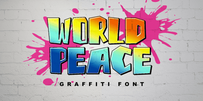 World Peace is a wildstyle outstanding graffiti display font. Urban and incredibly bold, this font will most certainly make your designs stand out. It will add a unique spark to any design project that you wish to create! This font is PUA encoded which means you can access all of the amazing glyphs and ligatures with ease!
 - LTC Hess Monoblack by Lanston Type Co.,
$24.95 A very rare metal face made a brief appearance in Lanston Specimen books and has all but vanished from use. In fact no examples of the font in use seem to exist. It shares some of the hand-rendered casual feel of Nicholas Cochin, but much heavier and well suited for bold headlines and package design.
 - Monzane by Salamahtype,
$19.00 MONZANE is a visually strong and impactful font style consisting only of capital letters. It is characterized by its bold and eye-catching appearance and can be used in a variety of design applications, including advertising, branding, news headlines, and graphic design projects. Features : All caps with 6 styles (clean, rough, outline, and slant) Punctuation and symbols Multilingual support
 - Midfield Stencil by Kreuk Type Foundry,
$12.00 Midfield Stencil Family is All Caps display typeface with solid, masculine, urban, sporty & bold character. 390+ glyphs each style with Multilanguage support, Contextual Alternates - Ready for the game! Each glyph is very well suited to make an interesting quote, headline & striking poster design. This font is perfect for logos, badges, clothing, signage, posters, and much more!
 - Vallino by Stefani Letter,
$12.00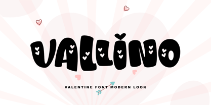 Vallino is a fresh & modern playful font. It has a bold cute style and will add an upscale to all your designs. This Font is perfect for many different projects such as logos & branding, invitations, birthday party, valentine, fashion, stationery, wedding designs, social media posts, advertisements, product packaging, product designs, photography, watermarks, special events, and much more!
 - Etewut Sans by Etewut,
$29.00 Etewut foundry proudly presents Etewut sans family. It includes 20 font styles and each of them supports extended Latin, basic Cyrillic and modern Greece languages. Styles variety is from formal and bold to italic and decorative. More of all there are many ligatures and alternative symbols in each font. And finally the typeface has minuscule letters and numbers!
 - Elite Sport Distressed by Alphabet Agency,
$10.00 Alphabet Agency presents Elite Sport Distressed, a super bold sans serif font design for use in extreme sport, combat sport and fitness themes. The font has a strong character defined by the straight edges and corners and expresses toughness with the harsh distressed effect. Elite Sport Distressed is an all caps font. The font contains Latin Simple characters.
 - Shaman by ITC,
$29.99 Shaman is the work of British designer Phill Grimshaw and you can almost hear the drums beating when you see it. It is a bold display typeface that features a unique, fractured effect and evokes a somehow primitive quality. Shaman is an all caps alphabet which comes complete with spot illustrations, graphic devices and a border system.
 - Belta by Antipixel,
$50.00 Belta is a decorative all-caps handwritten font, perfect for display use. It is available in light, regular and bold, providing a wide range of possibilities and combinations since the glyphs vary from one style to another, allowing a more informal and script look. It's glyph coverage supports languages such as English, Spanish, French, Portuguese, Italian, Swedish, among others.
 - Khinta by FadeLine Studio,
$10.00 Khinta comes in a bold and clean style, this font is firm, luxurious and simple. With a style like this, this font will be very suitable to use for logo's, branding projects, homeware designs, product packaging, mugs, quotes, posters, shopping bags, logo's, t-shirts, book covers, name cards, invitation cards, greeting cards, and all your other lovely projects.
 - Herrmann by driemeyerdesign,
$19.00 Herrmann is a sans serif typeface family. It was especially designed for use in headlines, but it's great legibility also allows for use in longer texts and smaller sizes. The geometrical design gives it a distinct industrial / architectural style. Herrmann comes in 10 styles (thin, light, regular, semibold and bold, all in regular and italic) and has 374 glyphs.
 - Aragon Condensed by Canada Type,
$24.95The condensed version of Hans van Maanen's Aragon is a headline star. The elements that made Aragon a popular "Dutch Garamond" text repeat here, with the slight stress shifts and tapering stems optimized for headline use. Aragon Condensed also comes in bold and italic variations. All three fonts contain extended language support, superiors and inferiors, and class-based kerning. - Cyber Brush by HansCo,
$15.00 Cyber Brush is a handwritten font with a bold and rough style in a dry brush texture. This texture is very detailed. Very suitable for logos, product branding, printable templates, posters, flyers, shirts, or for text overlay to any background image. Acorn Brush font comes in All caps, with punctuation, numerals and also has multilingual support. Enjoy!
 - Medyson by Reyrey Blue Std,
$19.00 Medyson is an elegant and bold serif font. It is defined by smooth curves. It is perfect for branding projects, Logo design, Clothing Branding, packaging, magazine headings, advertising, T-shirts, postcards and much more. Add it confidently to your projects, and you won’t be disappointed. ? Features · All Uppercase and Lowercase · Number & Symbol · Supported Languages · Alternates and Ligatures · PUA Encoded
 - Krone by Lebbad Design,
$27.95 Krone is a clean, bold contemporary semi-serif font characterized by its flared semi-serifs and graceful curves. Well-suited for all graphic design challenges such as dynamic display headlines, logos, posters, cover/titles and much more. Its optimized kerning enables it to work well in a variety of text uses for both web and desktop.
 - Acorn Brush by HansCo,
$15.00 Acorn Brush is a handwritten font with a bold and rough style in a dry brush texture. This texture is very detailed. Very suitable for logos, product branding, printable templates, posters, flyers, shirts, or for text overlay to any background image. Acorn Brush font comes in All caps, with punctuation, numerals and also has multilingual support. Enjoy
 - Chupada by Tipo Pèpel,
$14.00 Chupada is an ultra-condensed font family noted for their exaggerated x-height, which consists of five different weights, accompanied by their italic version. It contains all the central european characters and Cyrillic. Chupada with its bold semi-modular forms make it ideal for use in headlines, posters, titles and anywhere you need for create impact.
 - Linotype Ergo Paneuropean by Linotype,
$103.99Linotype Ergo was designed by American Gary Munch, and was a winner in Linotype's Second International Digital Design Contest in 1997. Conceived as a blend of traditional and modern type concepts, it works as a legible text family as well as a lively display or headline font. The word ergo means consequently," but it also comes from the Greek word "ergon" for "work." Consequently, Munch sees this family as full of energy -- an ideal font for working hard to make a point, and able to get it across with friendly vigor. The strokes of the characters are carefully designed to accommodate the tendency of the eye to enlarge horizontals and perceive verticals as lighter. The lowercase forms have open, friendly counters and are enhanced by small quirks, such as the slightly leaning s and the wide t. The deep branching of curves from main strokes helps this humanist sans to be very readable at smaller sizes. Linotype Ergo has four normal-width weights, five condensed weights, and two compressed weights - all with companion Italics! The family also includes a clever "Sketch" font for use in headlines, bringing the total number of font styles to 23. Ergo is available with Greek and Cyrillic and as W2G fonts with Hebrew." - Linotype Ergo W2G by Linotype,
$124.99Linotype Ergo was designed by American Gary Munch, and was a winner in Linotype's Second International Digital Design Contest in 1997. Conceived as a blend of traditional and modern type concepts, it works as a legible text family as well as a lively display or headline font. The word ergo means consequently," but it also comes from the Greek word "ergon" for "work." Consequently, Munch sees this family as full of energy -- an ideal font for working hard to make a point, and able to get it across with friendly vigor. The strokes of the characters are carefully designed to accommodate the tendency of the eye to enlarge horizontals and perceive verticals as lighter. The lowercase forms have open, friendly counters and are enhanced by small quirks, such as the slightly leaning s and the wide t. The deep branching of curves from main strokes helps this humanist sans to be very readable at smaller sizes. Linotype Ergo has four normal-width weights, five condensed weights, and two compressed weights - all with companion Italics! The family also includes a clever "Sketch" font for use in headlines, bringing the total number of font styles to 23. Ergo is available with Greek and Cyrillic and as W2G fonts with Hebrew." - !Sketchy Times - Unknown license

- ITC Schuss Hand by ITC,
$29.99Designed by German graphic designer Jochen Schuss. ITC Schuss Hand and ITC Schuss Hand Bold can probably best be described as excellent all around scripts useful for a broad spectrum of advertising purposes as well as for those applications that benefit from a refined handwritten appearance. The characters themselves have a soft, almost “liquid” appearance which is enhanced by the subtle swelling at most of the stroke terminals. The slightly condensed nature of the characters plus a relatively large x-height ensures that both weights are ideal for the advertising arena. An additional feature on ITC Schuss Hand and ITC Schuss Hand Bold are the capital letters which can actually be used on their own in word settings whereas most script capitals are designed just for initialing purposes. The designer has also invested a good deal of careful thought to the way in which a high percentage of the lowercase letter combinations overlap to create an authentic hand-scripted appearance. This, together with the italicized letter forms, will make Schuss Hand and Schuss Hand Bold ideal candidates for those occasions when paper correspondence requires an informal style. So, as is claimed, an excellent all around script style. - Aspen by Ludwig Type,
$39.00 Aspen is a refreshing and resilient typeface for text of any kind. Functional but not faceless, Aspen derives a very distinctive character from an unusual pedigree. It is loosely influenced by early American and European grotesques, but with more warmth and improved legibility. And where these historical models were rigid and bulky, Aspen’s curves have a gentle sway that makes for very comfortable reading. Relatively generous ascenders and descenders allow the typeface to feel spacious even when set with tight leading. These amiable qualities are matched with a lively italic based on cursive writing. The family consists of nine weights, and is intended for both text and display usage. Visit this minisite to see Aspen in action.
 - Ellida by Wiescher Design,
$49.50 Ellida is a very elaborate and elegant script in the tradition of the 18th-century English calligrapher George Bickham and the 19th-century American calligrapher Platt Rogers Spencer. I really enjoyed designing this script and maybe one day I will add starting and ending letters. Doing this script was extremely time- and brain-consuming, it is a huge challenge to make calligraphic letters work on computers so that they join perfectly. That's also the reason that this has become my most expensive font so far, but I think the price is fair for the incredible amount of work I put into the script. I really need a break from scripts now! Yours very exhausted Gert Wiescher.
 - Flamouse by Ilhamtaro,
$23.00 FLAMOUSE is a beautiful, retro-style script font, characterized by a fat font and has a halftone texture at the bottom. This font is of course very suitable for supporting retro designs on food or beverage brands, classic American style restaurants, promos at supermarkets and can also be used as a sign for hotels. A font that is quite unique and different from other scripts, as display text on a t-shirt design will also be very good, with the Baseball style I think it will be more suitable. To enable the OpenType Stylistic alternates, you need a program that supports OpenType features such as Adobe Illustrator CS, Adobe Indesign & CorelDraw X6-X7. Cheers!
 - Republica Banana by Hanoded,
$15.00 At home we love bananas: the kids take them to school for ‘snack time’, they’re healthy and they look pretty as well! Republica Banana is a pun on the term Banana Republic, which was coined by American author O. Henry in 1901. In economics, a Banana Republic is a country that is run as a private commercial enterprise for the exclusive profit of the ruling class. Of course I can point out a few countries that fit this description, but let’s not get into that. Republica Banana is a very nice, hand painted brush font. It comes with double letter ligatures for the lower case and a lot of diacritics for you to play with.
 - Italienne by Linotype,
$29.99Inspired by the large American wood type of the Wild West, Richard Yeend created Italienne Std in 2002. Italienne Std is both very condensed and very decorative. It sports heavy, band like serifs, reminiscent of other italienne-style fonts, like Westside. Italienne-style fonts rose in popularity during the early 19th Century, when designers were first beginning to experiment with extreme contrast within letterforms, and across lines of text. Interestingly enough, letterforms with similar designs were just as common during the 1970s as during the 1870s, so you may use Italienne Std for applications ranging from country music concerts to disco parties. Italienne Std is part of the Take Type 5 collection from Liinotype GmbH." - Ministry Script by Sudtipos,
$99.00 Ministry Script was designed to be “A time capsule that marks both the American ad art of the 1920s, and the current new-millennium acrobatics of digital type.” First letters of Ministry comes from a how-to lettering book but immediately turned on a complex and modern new digital typeface design with thousand glyphs. Ministry’s OpenType features include contextual and stylistic alternates, swash characters, and a galaxy of ligatures. A single face with over 1,000 characters to explore. The OpenType palette provides access to four different variants of each letter. For more info about the use of Ministry, its background, ligatures, alternates, please read The Ministry Script Guide in the Gallery section.
 - Bolívar by César Puertas,
$39.95 Bolívar is a contemporary display typeface inspired in the handwriting of one of the most prominent personalities of the Latin American 19th century: Simón Bolívar, “the liberator". The typeface intends to capture the passion of handwritten letterforms and to translate it into type. Among the characteristics that best contribute to its strong personality, are the impressive length of ascenders and descenders as well as the more than 45 degrees of slant. Bolívar mimics certain aspects of handwriting such as the slightly different baseline for each letter and ink clogs in the counters of some letters. Use Bolívar whenever you need to add passion to a piece of text, from logos or single words to sentences and captions.
 - Birdcage by FontMesa,
$30.00Birdcage was designed from a very short lettering sample in Rob Roy Kelly's American Wood Type book, from the image I created a complete font plus a regular version with lowercase. In the past banner style fonts would limit you to a monospaced look, so how do you kern a banner font? Well, with today's OpenType font format the solution is simple, draw the kerning pairs together as one character glyph and place them inside the font then use auto substitution to access those characters when needed. Birdcage (OpenType version) includes 249 auto ligature kerning pairs, to use this feature you will need an application that takes advantage of OpenType features such as Adobe CS products. - FF Unit Rounded by FontFont,
$104.99 German type designer Erik Spiekermann and American type designer Christian Schwartz created this display and sans FontFont in 2008. The family has 6 weights, ranging from Light to Ultra and is ideally suited for advertising and packaging, editorial and publishing, logo, branding and creative industries, poster and billboards as well as wayfinding and signage. FF Unit Rounded provides advanced typographical support with features such as ligatures, small capitals, alternate characters, case-sensitive forms, fractions, and super- and subscript characters. It comes with a complete range of figure set options – oldstyle and lining figures, each in tabular and proportional widths. This FontFont is a member of the FF Unit super family, which also includes FF Unit and FF Unit Slab.
 - Material by Rocket Type,
$20.00 Who made this mess! Material is quintessential paint brush font fun. A little bit grunge, little bit 80s chic. Material is rated R for adult content and violence, violence to the american alphabet. This font soars just like KITT in Knight Rider. Part virtuoso part New Kid On The Block. Feels like you’re painting those letters on yr’ own self! Anytime you need to make a little mess and really express yourself choose Material. This font will really give your designs some distressed authenticity. Material is great for billboards, t shirts or video productions. It’s full of smudgy love, it’s loud and is likely to offend but what better way to give your designs that highly sought after ‘edge’.
 - LTC Kaatskill by Lanston Type Co.,
$24.95LTC Kaatskill was made specifically for use in an edition of Rip Van Winkle for the Limited Editions Club. "I feel that Kaatskill owes nothing in its design to any existing face, and the type therefore is as truly an American type as anything so hidebound by tradition as type can be."- F. Goudy This face was one of the first digital typefaces released by the Lanston Type Co. Ltd. Jim Rimmer took painstaking measures in his faithful revival. Goudy had never designed a specific Italic to accompany this face. The Italic completed by Rimmer is a variation on Deepdene Italic. The font set was re-mastered in 2006 by Colin Kahn. - Art Project JNL by Jeff Levine,
$29.00 A 1930s WPA (Works Projects Administration) poster advertising a play entitled “Abraham Lincoln, The Great Commoner” had the play’s name done in a hand-lettered Art Deco sans. This is the basis for Art Project JNL. According to Wikipedia, “the Works Progress Administration (renamed in 1939 as the Work Projects Administration; WPA) was the largest and most ambitious American New Deal agency, employing millions of unemployed people (mostly unskilled men) to carry out public works projects, including the construction of public buildings and roads. In a much smaller but more famous project, Federal Project Number One, the WPA employed musicians, artists, writers, actors and directors in large arts, drama, media, and literacy projects.”
 - Infamy by Latinotype,
$36.00 Infamy is a display typeface inspired by graffiti and street art, featuring the ‘bubble letter’ style of writing which was very popular among subway and suburban graffiti artists in the early days of American graffiti. This font recovers graffiti horizontal alignment, tight tracking and colourful lettering. The OpenType version includes many different ligatures which provide multiple options when composing a text. Multiple layers make Infamy a bright, shaded and colourful font, allowing you to dress up your writing. This font incorporates a pictorial rendering of character faces (instead of small caps), capturing the essence of the graffiti: the ‘childish’ and the ‘irresponsible’, which is present in the experimental side of the typeface.
 - FF Milo by FontFont,
$83.99 American type designer Michael Abbink created this sans FontFont between 2006 and 2008. The family has 9 weights, ranging from Thin to Black (including italics) and is ideally suited for advertising, packaging, book text, editorial, publishing, logo, branding, small text as well as wayfinding and signage. FF Milo provides advanced typographical support with features such as ligatures, small capitals, alternate characters, case-sensitive forms, fractions, and super- and subscript characters.It comes with a complete range of figure set options – oldstyle and lining figures, each in tabular and proportional widths. In 2011, FF Milo received the Letter.2 award. This FontFont is a member of the FF Milo super family, which also includes FF Milo Serif.
 - Qualitype by Bülent Yüksel,
$19.00 QUALITYPE + VARIABLE FONT FAMILY "QualiTYPE" font extends its use by providing weights from "Thin" to "Black". Natural curves, ridges, and curved bodies grow in character as the font gains weight. "Qualitype" is an exciting serif font with contemporary twists. It has a distinctive sound that preserves the simplicity and elegance of classic "serif" fonts with a fresh, stylish rework. Her personality is bold and fills the space without shouting, she looks elegant and confident. The low X-height provides a great amount of visibility at all weights and is optically corrected for better readability. In the process of working on "Qualitype" we wanted to expand the functionality of the typeface a bit more, so after a few tries two different fonts were born: "Old", "Neo" and "italics" versions. "Qualitype" is perfect for use in magazines, in the fashion industry, in the branding of premium goods and services. "Qualitype" is quite versatile and suitable for use both in headings and in text arrays. In addition, we have done manual hinting in the typeface, and now it can be used with a clear conscience in the web and applications. “Quality” typeface consists of 56 styles: 2 style, 2 Shining, 7 weights and italics. Each typeface style consists of 860+ glyphs (except for the decoratives). “Qualitype” supports over 80+ languages. A variant version of the basic styles has been prepared for the most demanding users. Using the variability slider, you can adjust and select the individual thickness regardless of the current weight distribution. An important clarification - not all programs support variable technologies yet, you can check the support status here: https://v-fonts.com/support/. OPENTYPE FEATURES aalt, dnom, onum, pnum, tnum, lnum, numr, frac, zero, sing, sups, subs, case, c2sc, smack, salt, hist, titl, holing, dig, liga, ss01, ss02, ss03, ss04, ss05, ss06, ss07, ss08, ss09, ss10, kern FEATURE SUMMARY: - 4 Axes: 2 Style: Old and Neo. 7 weights: Thin, Light, Book, Regular, Medium, Bold and Black. 2 Shining: Dark and Lamp. Matching italics (12º) for all weights and style . - Matching small caps for all weights and widths. - Lining and old style figures (proportional and tabular). - Alternate characters (a, d, g, m, n, p, q, r, u, y). - Unlimeted fractions. - 24 Dingbats. - Extended language support. - Extended currency support. You can contact me at buyuksel@hotmail.com, pre-purchase and post-purchase with questions and for technical support. You can enjoy using it.
 - VerzierteSchwabacher - 100% free


