10,000 search results
(0.062 seconds)
- Covered By Your Grace by Kimberly Geswein,
$5.00 Authentic markered handwriting, neat enough to read but fun enough to inject some personality into your project.
 - Majestic Wisteria by Letterhanna Studio,
$19.00 Majestic Wisteria is a a sweet handwritten font that is made with great care in order to produce the expected outcomes. This font can be used for writing various kinds of products according to their respective needs. It will add a luxury spark to any design project that you wish to create! This font is PUA encoded which means you can access all of the amazing glyphs and ligatures with ease!
 - Bartosh by jpFonts,
$19.90 Bartosh is the American short form for Bartholomew. Although I chose this font name because of its sound and its short conciseness, I also liked the fact that Bartholomew had been one of the 12 apostles who had worked in India and Iran and the idea that his spirit could be the inspiration for my work.Bartosh was designed for display on the screen: the large x-height and the clear, open shapes facilitate readability. As a result, it develops a strong expression of character and makes it ideal for headings or highlighting individual text passages – it is ideal for captions of any kind. In each of the six weights, it unfolds its own and special charm. The extra-bold version is particularly noteworthy because fonts in this stroke width are rare and it is precisely these extreme bolds that give them a special graphic appeal.For all fonts there are matching italics in a well-developed set of 677 characters. In addition, it is possible to change the digits and currency characters from proportional to tabular or OldStyle via the OpenType feature, and small caps are also available in all fonts.
 - Woshingtan by Sealoung,
$15.00 Have you ever had a dream to write as a professional calligrapher? Penmanship or spencerian script? Now you have this unique opportunity to try the early American handwriting. Introducing Washington calligraphy scrpt. This font is calligraphy font with a classic style and a touch of elegance, inspired by the handwriting of Italian women and ancient manuscripts. Carefully designed to work together in harmony that makes it very suitable for any design work that requires a classic, formal or luxurious. Try Desirable Calligraphy, enjoy the richness of OpenType features and let her fun and elegant excitement make you happy and enhance your creativity! You can use this font very easily.
 - Texas Hero by Three Islands Press,
$39.00 It occurred to me years ago that the graphic arts community might find useful a digital typeface that mimicked the classic look of nineteenth-century handwriting. Conveniently, my mother then still volunteered at the Center for American History at the University of Texas at Austin, my hometown. She made copies of the letters of a few famous Texans -- Houston, Austin, Travis, Burnet, Rusk. Thomas J. Rusk’s penmanship caught my eye as the most accessible of the bunch. I hadn't realized at the time what a challenge it'd be to render a realistic-looking script face, but the result has, in fact, filled a niche.
 - FF Meta Headline by FontFont,
$75.99German type designer Erik Spiekermann and American type designers Christian Schwartz and Josh Darden created this display and sans FontFont in 2005. The family has 12 weights, ranging from Light to Black in Compressed, Condensed, and Normal and is ideally suited for book text, editorial and publishing as well as poster and billboards. FF Meta Headline provides advanced typographical support with features such as ligatures, alternate characters, case-sensitive forms, fractions, super- and subscript characters, and stylistic alternates. It comes with tabular lining and proportional lining figures. This FontFont is a member of the FF Meta super family, which also includes FF Meta, FF Meta Correspondence, and FF Meta Serif. - Fulmar by CAST,
$45.00Named after a practical seabird, Fulmar is a modern Scotch intended for extended reading. More European than American, it draws on a range of influences from around the North Sea, from Fife’s Alexander Wilson to 17th-century French experiments in modulation and 18th-century Belgian flash, and combines them with contemporary structure and proportions. The result is crisp yet warm, steadfast yet lively, sharp yet robust, rational but humane. It can be appropriate for new translations, new histories and new understanding. With five weights, ten styles, small caps, a clamjamfry of OpenType features and unicorn manicules, Fulmar dispenses with sprawl while retaining range and dexterity. - Sassoon Sans US by Sassoon-Williams,
$48.00 North American version for teaching children’s first letterforms With dots and arrows these print script fonts have no ‘exit stroke’ found in the European version. An upright typeface family developed to meet the demand for letters to produce pupil material for handwriting as well as for reading. Upright letters with extended ascenders and descenders are ideal on screen. They facilitate word recognition. Teachers can print desk strips, charts of letter families and alphabet friezes, as well as consistent material across the curriculum. Together these typefaces provide a valuable resource for special needs teachers. Free to download resources How to access Stylistic Sets of alternative letters in these fonts
 - Patricia Gothic by Midwest Type,
$12.00 Patricia Gothic is a Midwestern take on the traditional American sans serif style. It has been designed as a legible workhorse typeface family with just the right amount of character to add liveliness to your text. A hybrid of the gothic style and contemporary geometrics, its design has also been influenced by everything from vernacular signage, antique hand-lettered ads, early 20th century posters, and type used on mason jars. Its thinner weights can appear elegant, refined, and modern. Its regular weights set nicely legible text. And the heavier weights, especially the small caps, evoke vintage poster lettering. Download the Patricia Gothic PDF specimen
 - Vaudevillian JNL by Jeff Levine,
$29.00 The place for a family to be entertained by comedians, dancers, acrobats, animal acts, singers and just about any other acts that fit the bill at the time was the vaudeville theater. Prior to radio becoming the major source of entertainment for the American public, popular songs were introduced on the stages of these entertainment venues. One such song from 1916 with a World War I patriotic sentiment was "A Yankee Doodle Boy Is Good Enough for Me". The sheet music featured the title hand lettered in Art Nouveau style. This became the design source for Vaudevillian JNL, available in both regular and oblique versions.
 - Motownphilly by IKIIKOWRK,
$19.00 Introducing Motownphilly - Classic Handdrawn Type, created by ikiiko. Motownphilly is a handwritten script typeface inspired by the typography styles of Movie titles and the American Classic Show & Orchestra in 1950s. This typeface is designed to give the appearance of an expressive style. Motownphilly has bold, raw lettering lines, with wild strokes. A style commonly used in print ads, magazine, and sign advertisements of the era. This typeface is perfect for an poster, newspaper, magazine ads, and also good for vintage product, food & beverages, quotes, or simply as a stylish text overlay to any background image. What's included? Uppercase & Lowercase Number & Punctuation Alternates Multilingual Support Works on PC & Mac
 - Broadster by IKIIKOWRK,
$19.00 Introducing Broadster - Classic Brush Type, created by ikiiko. Broadster is a decorative sans serif typeface, inspired by typography from classic 60s American advertising & automotive visual styles of the time. This typeface is designed to give the appearance of a formal yet expressive style. The Broadster has bold, contrasting strokes. A style commonly used in print, magazine, and sign advertisements of the era. This typeface is perfect for an formal layout, poster, newspaper, magazine ads, and also good for vintage product, food & beverages, quotes, or simply as a stylish text overlay to any background image. What's included? Uppercase & Lowercase Number & Punctuation Multilingual Support Works on PC & Mac
 - Santa Fe by ITC,
$29.99Santa Fe was created by British designer David Quay in 1983. Distinguishing are its script characters and the lower case e, which has the form of a capital E. The letters of this font emphasize the base line. Rounded corners pair with elegant forms to give Santa Fe a flowing, cheerful look. The figures are reminiscent of American advertisements of the 1960s with their light, carefree images. Like with most script fonts, the letters of Santa Fe should be set close enough together that they touch. An added bonus are the various alternative forms with which Quay provided Santa Fe and the many design possibilities which they offer. - ITC Roswell by ITC,
$40.99Roswell was designed by Jim Parkinson, who acknowledges the 'spacey' ancestry of its name. Yes, Roswell, New Mexico. There was a big anniversary of 'the incident' in the news while I was designing in Roswell. "The incident" is of course the alleged UFO crash in Roswell. "I thought the name was acceptable as a serious font name, while, on another level, having a strangely humorous edge," says Parkinson. Roswell looks great in large sizes on a poster or in a magazine layout. It started out as "a variation on American gothic forms like Railroad Gothic", says the designer, but Roswell is an original design with eccentricities of its own." - Linotype Finerliner by Linotype,
$29.99Linotype Finerliner is part of the Take Type Library, chosen from the contestants of Linotype’s International Digital Type Design Contest. The American artist Gary Munch, from whom we also have Linotype Ergo and Ergo Sketch, designed Linotype Finerliner as a handwriting font with calligraphic influences. The small, regularly formed lower case letters contrast nicely with the generous, sweeping capitals. The font is available in a light and medium weight and displays no stroke contrast. The lighter weight, micro, is best used for shorter texts in point sizes 18 or larger and the medium weight, macro, is mainly intended for headlines in larger point sizes. - Alamanda by Goodigital13,
$20.00 Alamanda will be great for any projects including : branding, logo, stationery, business card, signage, flyer, brochure, and more. Almost all industries will be fall for this typeface: wedding, events, real estate, architect, law firm, florist, gardening, makeup artist, travel, hotel, musician, and many more .
 - Briosh by Larin Type Co,
$12.00 Briosh - a hand drawn script font. Beautiful and elegant but at the same time unique thanks to its ending letters. It is stretched and not in a hurry , attracts attention and is perfect for creating logos, greeting cards, branding, book covers and many others. Alternative characters will help you create a project that is not repeatable. I decided to reflect this font in two styles, clean and rough, as you can see in the preview image. Enjoy using!
 - Mood Boosters by Bluestudio,
$10.00 Mood Boosters Handwritten Font Duo is a perfectly font duo for all your design project needs. Create your perfect design with Mood Boosters Handwritten Font Duo. Try this font for all kinds of your business projects like: logo design, business card, mood board, greeting card, magazine ,headline, social media design, watermark and more, and it will all look perfect.
 - Mundenge Rock by Holland Fonts,
$30.00Borrowed vernacular from African hair studio signs. manually drawn with drop shadow. Used first as cover and label lettering of a cd with music from Zimbabwe, and completed later as a full character set for the typographic issue 'National Typographica' of I-Juici Magazine, in South Afrika. - Umoya by Scholtz Fonts,
$19.00 Umoya is a modern and fluid African font. Its name means 'spirit' in the Zulu language and it is also the word used for 'air'. It is best used for an ethereal, magical look with tribal undertones. The font is fully professional: carefully letterspaced and kerned.
 - Hylata by Ixipcalli,
$65.00 Hylata is a typeface inspired by the Mexican colonial style of the 50s, especially from the state of Puebla. Its design is very characteristic of the local talavera crafts. The typography presents "blacksmith" type styles, which is ideal to represent the characteristic provincial style of Mexico.
 - Twelkmeyer by Popkern,
$18.00 The multilingual accidental typeface was inspired by the pathos of the late revolutionary asceticism and architectural projects of V.F. Twelkmeyer. All story on twelkmeyer.com This typeface is a spring swallow. This typeface is a dawn and optimism of alumnus of Higher Art and Technical Institute in Leningrad. This typeface is a mirror of the Soviet architecture 30’s. It reflects the impressions from Vesnin brothers and Ginzburg’s works, a curiosity to Bauhaus, and the first test of the waters of socialist reconstructions. This wide, dynamic, angular, drawing typeface will be perfect for serious branding and architectural projects. So, give it a try! From innovative ideas of the 30s to innovative projects of the XXI century.
 - NT Novo by Novo Typo,
$26.00 An unordinary type of family: Novo Alla is part of the Novo Family (together with Novo Alla, Bila, Cela, Dada, Enno, Fika and Gigo). Although all members are also strong individuals, Novo Family is an exclusive selection which allows you to design beautiful typographic combinations. The Novo Family will take typography into a next phase of legibility.
 - Behind The Nineties Sans by Casloop Studio,
$9.00 Introducing Behind The Nineties Sans - the perfect counterpart to our beloved font, "Behind The Nineties." This new sans-serif addition effortlessly captures the classic vibes of the 80’s and 90’s while infusing a contemporary touch for a timeless yet modern aesthetic. Key Features: Sans Serif Sophistication: "Behind The Nineties Sans" exudes sleek and modern elegance, offering a clean alternative to its serif predecessor. Regular and Italic Styles: Whether you prefer a straightforward look or a touch of italicized flair, this font provides versatility for all your design needs. Classic with a Contemporary Twist: Embrace the spirit of the 80’s and 90’s with a font that seamlessly blends classic elements with contemporary sophistication. Editorial Excellence: Elevate your editorial projects with the precision and clarity of "Behind The Nineties Sans," ensuring a polished and professional appearance. Luxury Serif Companion: Pair it with "Behind The Nineties" serif font for a cohesive design that radiates opulence and luxury. Dramatic Impact: Make a statement with the font's dramatic presence, capturing attention and adding a bold touch to your creative endeavors. Multi-language support including Western European, Central European, South Eastern European, South American, Oceanian, and even Esperanto. "Behind The Nineties Sans" is your go-to font for achieving a harmonious blend of nostalgia and modern flair. It's time to redefine classic design with this exquisite sans-serif typeface.
 - S&S Amberosa by Spencer & Sons Co.,
$35.00 Distinctively Americana with a touch of Arts & Crafts, Amberosa is a typographic gem from the late nineteenth century, this undulating and organic typeface is a versatile and refreshing alternative to many of the font designs on the market today. Recapture the elegance of traditional flourished sign writing and make and provide ideal lettering for period inspired design work such as posters, signage, labels and book covers. You’ll find ligatures, 400+ stylistic alternates in keeping with the spirit of this pretty, old-fashioned typeface.
 - 1651 Alchemy by GLC,
$38.00 This family is a compilation created from a Garamond set in use in Paris circa 1651, but similar to those, eroded and tired, that were in use during centuries to print cheap publications, as well as in Europe than in America, and from a large choice of printed symbols—all specially redrawn—used for alchemical, pharmaceutical and astrological books, covering 1550 to late 1800s period. Each alphabet is doubled by a slightly different one, and a special OTF encoding allows to give an irregular effect with never the same twin letters in a single word. The Normal style is enriched by small caps, and the Italic style by Swashes. A lot of symbols, too, are given twice with differences. This font may be used with our calendar specialized 1689 Almanach.
 - Berlinatha Abigaila by Letterena Studios,
$9.00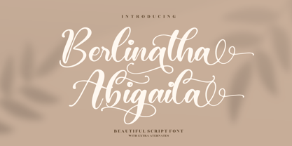 Berlinatha Abigaila is a beautiful script font, suitable for all projects.
 - Chocolate Bar JNL by Jeff Levine,
$29.00 Chocolate Bar JNL emulates hand-lettering on the sheet music for a song selection called "Shoe Shine Boy" from Connie's Hot Chocolates of 1936 (an all-black musical revue). The lettering was not found in the song's title, but rather in the name of the show itself.
 - Silverway by KA Designs,
$14.00 Silverway is a mix of fun and elegance - with a unique take on modern calligraphy. This font has a strong brush texture, making all of your projects looking handwritten! Silverway is perfect for all modern projects, headings, branding, logos, advertisements, bloggers, business cards, social media and more!
 - Kinteland by Bluestudio,
$20.00 Kinteland is a handwritten 2 style font. It’s perfect for creating beautiful font combinations for all your design projects! Kinteland is perfect for all types of your business projects such as: logo design, business cards, greeting cards, magazines, newspapers, social media designs, watermarks and many more.
 - Matamoros NF by Nick's Fonts,
$10.00Another tip of the hat to the halcyon days of woodtype, this cap-small cap typeface takes its name from the bustling Mexican metropolis just across the Rio Grande from Brownsville, Texas. Both versions of the font include 1252 Latin, 1250 CE (with localization for Romanian and Moldovan). - Greyton Script by ITC,
$29.99Greyton Script is the work of South African designer Gerhard Schwekendiek, who is known for his script lettering and logos. This copperplate script face looks almost ribbon-like, a feeling accentuated by the letters' fine inline. Greyton Script is perfect for eye-catching headlines or personal invitations and greetings. - Metroblack #2 by Linotype,
$29.00American graphic designer William Addison Dwiggins' (W.A.D. for short) first typefaces were the Metro family, designed from 1927 onward. The project grew out of Dwiggins' dissatisfaction with the new European sans serif typefaces of the day, such as Futura, Erbar, and Kabel, a feeling he expressed in his seminal book Layout in Advertising. Urged by Mergenthaler Linotype to create a solution for the problem, Dwiggins began a professional relationship that would span over the next few decades. The first Metro family typeface to be released was Metroblack, brought to market by Linotype in 1929 (Metroblack #2™ the only one of the two versions that Mergenthaler Linotype eventually put into production which is available in digital form). With more of a humanist quality than the geometric styles popular in Europe at the time, Dwiggins drew what he believed to be the ideal sans serif for headlines and advertising copy. Metroblack has a warmer character than the Modernists' achievements, and the type is full of mannered curves and angled terminals (Metroblack also has an astoundingly beautiful Q). The weights of the Metro family, Metromedium #2™ and Metrolite #2™, were each designed by Mergenthaler Linotype's design office under Dwiggins' supervision. In 2012 Toshi Omagari reworked the Metro family as "Metro Nova" with many weights into a modern type family that even contains the alternate characters from the origin Metro family from Dwiggins. Despite having been created more than three-quarters of a century ago, the Metro family types have aged well, and remain a popular sans serif family. Although spec'd less often than other bestsellers, like Futura, Metro continues to find many diverse uses. The typeface has appeared throughout Europe and the North America for decades in newspapers and magazines, and can even help create a great brand image when used in logos and corporate identity. Dwiggins ranks among the most influential graphic designers and typeface designers of the 20th Century. He has several other quality fonts in the Linotype portfolio, including the serif text faces Electra™ and New Caledonia™, as well as Caravan™, a font of typographic ornaments. - Ravensara Antiqua Stencil by NaumType,
$19.00 Ravensara Stencil - elegant high contrast classic serif. Ravensara family was born from the idea of taking the Didone concept to weight extremes. In light and medium weights Ravensara transmits a very elegant and high fashion style attitude, but stays readable in small sizes and can even be used as a text font. That makes it an ideal solution for projects, that needs an injection of contemporary sophistication. Heavy weights perfectly complement light and medium ones and also works great by their own in large sizes. It is a part of the Ravensara superfamily, united by the same anatomy, which currently also includes Ravensara Sans and Ravensara Serif. Ravensara Stencil is available in 9 weights, including Thin, Light, Regular, Medium, SemiBold, Bold, ExtraBold, Black and ExtaBlack. Ravensara font family, combining its classic origins and contemporary elegance, is a perfect choice for bold headlines, oversize typography, fashion logos, branding, identity, website design, album art, posters, advertising, etc. Ravensara Stencil extends multilingual support to Basic Latin, Western European, Euro, Catalan, Baltic, Turkish, Central European, Pan African Latin and Afrikaans.
 - ITC Caslon No. 224 by ITC,
$40.99 The Englishman William Caslon (1672-1766) first cut his typeface Caslon in 1725. His major influences were the Dutch designers Christoffel van Dijcks and Dirck Voskens. The Caslon font was long known as the script of kings, although on the other side of the political spectrum, the Americans used it as well for their Declaration of Independence. The characteristics of the earlier Renaissance typefaces are only barely detectable. The serifs are finer and the axis of the curvature is almost or completely vertical. The overall impression which Caslon makes is serious, elegant and linear. Next to Baskerville, Caslon font is known as the embodiment of the English Baroque-Antiqua and has gone through numerous new interpretations, meaning that every Caslon is slightly different. ITC Caslon 224 was designed by Edward Benguiat and appeared with ITC in 1982. It is the text font which expanded upon the title font ITC Caslon 223. The alterations in the proportions of the letters make this Caslon 224 a noticeable departure from the original, but make the font overall more legible.
 - Fiasco Cursive Font by BeckMcCormick,
$14.00 Introducing Fiasco Script, a bouncy modern calligraphy font. Fiasco is a clean cursive font with a feminine aesthetic, making it a perfect choice for designing feminine logos & branding, cute paper products like wedding invitation suites, or for displaying headlines on your website. Fiasco can also be used for other print design like magazines and flyers or printed marketing materials. This font can also be used for digital marketing materials and social media items! Fiasco Script’s clean edge makes it a great candidate for craft projects on your Cricut or Silhouette machine; it cuts beautifully! Fiasco Script includes: - full upper + lowercase characters - numbers + punctuation - 2 ligatures — ox, tt - PUA-encoding Extensive Language Support: Western European, Central European, South Eastern European, South American, Oceanian, Vietnamese, Esperanto Fiasco Script can be used with graphic design programs such as Illustrator or Photoshop, word processing programs like Pages or Word, Design Space for Cricut, Silhouette, Procreate, Canva Pro, Glowforge, GoodNotes, & more. This font is an installable for desktop & laptop machines, as well as iPads or iPhones. See below for links to help with installation.
 - Internacional by Los Andes,
$26.00 Internacional, inspired by the International Style, is a Latin American-flavored neo-grotesque sans serif typeface made with organic ingredients and sweetened with organic sugar and chocolate. Internacional is well-suited for corporate identity, branding, publishing projects, logotypes, magazines and advertising. Its large x-height and small difference between x-height and cap-height make it a high-impact font, ideal for powerful headings, while providing legibility. Internacional was designed for use with short and mid-length paragraphs that require a balanced type color. Internacional is an extended width font with rounded forms and angled terminal ends, in characters such as “c” or “a”, which make it suitable for use in advertising and branding. The proportional relation in height between uppercase and lowercase letters may be useful when composing text in German language. The Internacional font family comes in 7 weights with matching italics and includes an alternative version, with the same number of styles, yet it tastes differently. Special thanks to everyone in the Latinotype Team (especially to Rodrigo Fuenzalida) for their support, help with corrections and digital editing.
 - Forecast by Type Associates,
$30.00 Designed by Russell Bean between December 2020 and August 2023 as a pandemic project, Forecast takes cues from past geometrics notably Futura, Tempo even Avant Garde. ideal for a multitude of uses – text, display, web, wayfinding. The objective of Forecast is to present a practical, swiss-army, use-everywhere design where readability is paramount. Available in 7 weights with italics a total of 14 styles all kerned to perfection. LatPro encoded, supporting 90 languages.
 - Creazy Xeon by SimpleType Studios,
$23.00 Crazy Xeon is stylish graffiti brush inspired from graffiti street project art. This gorgeous font includes all lowercase and uppercase characters, numbers, punctuation, an array of standard ligatures and a selection of international characters as well. Whether you are using it for cartoon-related designs, lable, children’s games, quotes, t-shirts, titles, merchandise, brand names, book covers, posters, or just any creation that requires a touch of beauty, this font is a great choice.
 - Suffragette by muccaTypo,
$33.00 Suffragette, an all-caps typeface introduced for the branding of the Hermitage Hotel in Nashville, is inspired by the Hotel’s Beaux-Arts architecture injected with a healthy 2020’s aesthetic. This unique roman capital design, with its sans serif-medium contrast shapes and slightly pronounced serifs, is the perfect match for luxury packaging and high-end couture. If your brand wants to project elegance with a playful edge, Suffragette is the font for you!