10,000 search results
(0.021 seconds)
- Avenus Type by Stringlabs Creative Studio,
$29.00 Avenus Type is a cute and quirky display font. Its friendly feel makes this font incredibly versatile, fitting a wide range of contexts. Add it to your creative ideas and notice how it makes them stand out!
 - 99 Names of ALLAH Spiral by Islamic Calligraphy75,
$12.00 We have transformed the “99 names of ALLAH” into a font. That means each key on your keyboard represents 1 of the 99 names of ALLAH Aaza Wajal. The fonts work with both the English and Arabic Keyboards. We call this Calligraphy "Spiral" because of the spiral like design. The first "Alef" has a "hamzit wasel", this indicates that you can pronounce the names both ways, "AR-RAHMAAN" or "R-RAHMAN". (in the zip file you will find a pdf file explaining the differences in the "harakat", pronunciation and spelling according to the Holy Quran). The "Ye" doesn't have 2 dots at the end of a name, instead we chose to include a small "ye" on the letter "ye". Also, we used the traditional "soukoun" instead of the Quranic "soukoun". Decorative letters used in this calligraphy: "Mim, Aain, Sin, HHe, He, Kaf, Alef & Ye". Purpose & use: - Writers: Highlight the names in your texts in beautiful Islamic calligraphy. - Editors: Use with kinetic typography templates (AE) & editing software. - Designers: The very small details in the names does not affect the quality. Rest assured it is flawless. The MOST IMPORTANT THING about this list is that all the names are 100% ERROR FREE, and you can USE THEM WITH YOUR EYES CLOSED. All the “Tachkilat” are 100% ERROR FREE, all the "Spelling" is 100% ERROR FREE, and they all have been written in accordance with the Holy Quran. No names are missing and no names are duplicated. The list is complete "99 names +1". The +1 is the name “ALLAH” 'Aza wajal. Another important thing is how we use the decorative letters. In every font you will see small decorative letters, these letters are used only in accordance with their respective letters to indicate pronunciation & we don't include them randomly. That means "mim" on top or below the letter "mim", "sin" on top or below the letter "sin", and so on and so forth. Included: Pdf file telling you which key is associated with which name. In that same file we have included the transliteration and explication of all 99 names. Pdf file explaining the differences in the harakat and pronunciation according to the Holy Quran. --------------------------------------------------------------------------------------------------------------------------- Here is a link to all the extra files you will need: https://drive.google.com/drive/folders/1Xj2Q8hhmfKD7stY6RILhKPiPfePpI9U4?usp=sharing ---------------------------------------------------------------------------------------------------------------------------
 - 99 Names of ALLAH Clear by Islamic Calligraphy75,
$12.00 We have transformed the “99 names of ALLAH” into a font. That means each key on your keyboard represents 1 of the 99 names of ALLAH Aaza Wajal. The fonts work with both the English and Arabic Keyboards. We call this Calligraphy "Clear" because of how clear and easy to read the design is. The first "Alef" has a "hamzit wasel", this indicates that you can pronounce it as both "AR-RAHMAAN" or "R-RAHMAAN" (in the zip file you will find a pdf file explaining the differences in the "harakat", pronunciation and spelling according to the Holy Quran). The "Ye" in this calligraphy doesn't have the two dots, nor does it have a decorative "Ye", just like the Holy Quran. Also, we went for the traditional "soukoun" instead of the Quranic "soukoun" & decorative symbols are at a minimum. Decorative letters used in this calligraphy: "Mim, Aain, Sin, HHe, He, Kaf, Tah & Saad". Purpose & use: - Writers: Highlight the names in your texts in beautiful Islamic calligraphy. - Editors: Use with kinetic typography templates (AE) & editing software. - Designers: The very small details in the names does not affect the quality. Rest assured it is flawless. The MOST IMPORTANT THING about this list is that all the names are 100% ERROR FREE, and you can USED THEM WITH YOUR EYES CLOSED. All the “Tachkilat” are 100% ERROR FREE, all the "Spelling" is 100% ERROR, and they all have been written in accordance with the Holy Quran. No names are missing and no names are duplicated. The list is complete "99 names +1". The +1 is the name “ALLAH” 'Aza wajal. Another important thing is how we use the decorative letters. In every font you will see small decorative letters, these letters are used only in accordance with their respective letters to indicate pronunciation & we don't include them randomly. That means "mim" on top or below the letter "mim", "sin" on top or below the letter "sin", and so on and so forth. Included: Pdf file telling you which key is associated with which name. In that same file we have included the transliteration and explication of all 99 names. Pdf file explaining the differences in the harakat and pronunciation according to the Holy Quran. --------------------------------------------------------------------------------------------------------------------------- Here is a link to all the extra files you will need: https://drive.google.com/drive/folders/1Xj2Q8hhmfKD7stY6RILhKPiPfePpI9U4?usp=sharing ---------------------------------------------------------------------------------------------------------------------------
 - 99 Names of ALLAH Attached by Islamic Calligraphy75,
$12.00 We have transformed the “99 names of ALLAH” into a font. That means each key on your keyboard represents 1 of the 99 names of ALLAH Aaza Wajal. The fonts work with both the English and Arabic Keyboards. We call this Calligraphy "Attached" because the "alef" and "lam" are attached together. The first "Alef" has a "fatha", this indicates to pronounce the first letter. So instead of saying "R-RAHMAAN" you say "AR-RAHMAAN" (in the zip file you will find a pdf file explaining the differences in the "harakat", pronunciation & spelling according to the Holy Quran). You will also notice that the decorative letters in this font are bigger than usual, we also used the traditional "soukoun" instead of the "Quranic soukoun" & we were a little bit more generous than usual with the decorative symbols. Decorative letters used in this calligraphy: "Mim, Aain, Sin, HHe, He, Kaf, Alef, Tah & Saad". Purpose & use: - Writers: Highlight the names in your texts in beautiful Islamic calligraphy. - Editors: Use with kinetic typography templates (AE) & editing software. - Designers: The very small details in the names does not affect the quality. Rest assured it is flawless. The MOST IMPORTANT THING about this list is that all the names are 100% Error Free, and you can use them with your eyes closed. All the “Tachkilat” are 100% Error Free, all the "Spelling" is 100% Error Free, and they all have been written in accordance with the Holy Quran. No names are missing and no names are duplicated. The list is complete "99 names +1". The +1 is the name “ALLAH” 'Aza wajal. Another important thing is how we use the decorative letters. In every font you will see small decorative letters, these letters are used only in accordance with their respective letters to indicate pronunciation & we don't include them randomly. That means "mim" on top or below the letter "mim", "sin" on top or below the letter "sin", and so on and so forth. Included: Pdf file telling you which key is associated with which name. In that same file we have included the transliteration and explication of all 99 names. Pdf file explaining the differences in the harakat and pronunciation according to the Holy Quran. --------------------------------------------------------------------------------------------------------------------------- Here is a link to all the extra files you will need: https://drive.google.com/drive/folders/1Xj2Q8hhmfKD7stY6RILhKPiPfePpI9U4?usp=sharing ---------------------------------------------------------------------------------------------------------------------------
 - The Sabandija ffp font by deFharo is a typographic creature that seems to have scurried out of the imagination of a whimsical artist, finding its way onto the digital canvas. Picture this: if fonts w...
- Roughmarker by 38-lineart,
$16.00 Roughmarker font consists of two handwritten scripts, a slant (regular) version and upright. This Script fonts are manually handwritten with quick and rough strokes. We write them on paper until we find a very proportioned form. Then we scanned and took the selected glyphs to be processed into a font. The biggest challenge in making textures fonts are the very many node points, many node points make the font processing performance a bit slow. At first we tried raising the node parameters to 2000-4000 points in one glyph. This is a big number, but if this number is lowered it will eliminate the impression of brush and natural look. We repeatedly look for gaps to minimize points so that the font capacity is not too large and comfortable when typed. This script font is equipped with ligature as well as several alternate according to handwriting habits, very effective in the sense of not too much but often used. This font is the great choice for contemporary brands, especially for businesses in fashion, urban style, websites, trends in architecture, cosmetics, and energetic lifestyle themes. An attractive typographic layout makes it also looks more premium in writing quotes.
 - HaruNami by PSY/OPS,
$32.00 HaruNami (“spring wave”) fuses Japanese ornamentation with the Roman alphabet. All the motifs in the typeface are based on traditional Japanese wave ornamentation. HaruNami has a unique stylistic system that ranges from Simple to Ornate. The Simple font is a purely functional sanserif that is ready to use as text type. The three other styles, Decorative, Embellished and Ornate, progressively apply the wave ornamentation to the capital letters. HaruNami Complete ships as a unified OpenType font, and as a set of individual fonts. If you're using an application that supports OpenType features, we recommend using the Unified font. The three decorated styles will be accessible as feature sets. Otherwise, you can install the individual fonts and use them in any application. (It is also all right to install the Unified and individual fonts simultaneously.)
 - Streetscript Redux by Eclectotype,
$40.00 Streetscript Redux is an update to the now discontinued Streetscript. In the original version, it seems a lot of users didn't like the s’s in the font, and after seeing them redrawn (not always with the best results!) a few times, I decided to make a new version of the font with less idiosyncratic s’s, and this is the result, Streetscript Redux. (I should have listened to my other half - “those s’s look like fives,” she said) All other features of the original Streetscript are intact (barring a couple of s-ligatures no longer necessary). There’s been a little tweaking of some outlines, and slight changes with spacing too, but for the most part, all I've done is redraw those pesky five-like s’s, so that you don't have to.
 - Marshmallow Hot Chocolate by Nicky Laatz,
$17.00 Say hello to Marshmallow Hot Chocolate Brush - A super-casual, super-versatile all caps brush font. Great at both Small and large sizes : Fine texture details on its edges make it pop at larger sizes, and at smaller sizes its stays crisp, neatly balanced and nicely legible. Perfect for making a statement - use it in quotes, punchy headers, posters, flyer design, packaging, in your illustrations that need legible handwritten captions - and so much more. Although Marshmallow Hot Chocolate is an all caps font, you will find uppercase and lowercase keystrokes have alternate characters. Opentype Ligatures are included to make it look more naturally handwritten in your designs. Four extra swashes are included in the glyphs set - open your glyphs panel to access them. Play with the letter spacing to get different looks and effects.
 - Laquittea by Slex Studio,
$18.00 new modern calligraphy font - Laquittea. This beautiful script is for those who need elegance and style for their designs and is perfect for wedding invitations, logos, save the date cards and branding. The Laquittea script has 2 regular and bold styles covering the full set of Uppercase and Lowercase Characters, Numbers and Punctuation. Also contains ligatures and many alternative styles to perfectly recreate natural calligraphy (check the preview to see them all). All fonts are available for West European, Central European and Southeast European Languages. You can check your language typing characters in the text box below. If you have any questions about my products, feel free to write me a message or contact me by email slexs515@gmail.com. Thank you so much for checking out my shop!
 - LHF Saratoga Panels 4 by Letterhead Fonts,
$53.00The final collection in the series of 4 fonts. Each font contains 37 expertly drawn panels. All you have to do is add your own text and color for a quick and easy design. All 37 of these panels are exclusive to Letterhead Fonts. Typing each letter generates a different panel. Special Note: Due to the large file size of these fonts, they will not convert for use in Gerber Omega. Instead, Omega users may wish to use an alternate program to type the characters and import them into Omega as .eps files. CorelDraw users should use the "Weld" command rather than "Convert to Curves" command to convert these fonts to vector outlines. Otherwise, the program may crash due to the sheer number of points in each panel. - Di Mare by Ksenia Belobrova,
$49.00 Di Mare is a layered script inspired by Italian restaurant and cafe signs. It’s about delicious food and the joyful atmosphere of traveling: freedom, sea, fresh wind and warm sun. This font family has three styles: Regular, Line, Shadow. You can combine and overlay them to get different effects. Di Mare works well for menu, packaging, clothes, signs, magazines, and as a starting point for lettering and logos. Di Mare is designed with hundreds of contextual alternates and ligatures. It makes all connections look natural and harmonious. Di Mare supports most European languages, has small capitals, numbers, fractions, currency and mathematical signs. All contextual alternates are built into the “Liga” feature that is turned on by default. However, when your work with typeface, please make sure that “Liga” is turned on.
 - Mr Palker by Letterhead Studio-YG,
$35.00 A slab serif Mr Palker and grotesque Mr Palkerson build one superfamily together. These are blank types. In a way even the display ones. Typefaces for newspapers, announcements, cheap advertising and police posters. Mr Palker and Mr Palkerson will turn every language into a fence. And due to six types of faces one can choose what material should the fence be made from — from Thin steel rods to the Black stone blocks. In their simplest appearance Mrs P&P are intended for the solid blank composition in victorian or industrial style. They are quite decent, a bit old-fashioned slab serif and grotesque with closed aperture. All my types have layers. Walker and Palkerson also do. Besides the standard set of symbols, they have 4 add-ons. 1. Alternate glyphs, including unicase ones. 2. Ligatures with A letter. 3. Extra tall small caps. 4. Two-storey ligatures. All this options are intended for the complex composition. The additional letters are rather eccentric as their main function here is to imitate the victorian oddities. Imitate, parody, just not repeat. There are lower-case As and Es in the set in height of small caps and uppercases. They can turn every writing into the unicase. The lower-case A (as well as uppercase and small caps version of it) has deliberately by my taste grown a ludicrous tail. To compensate it I’ve built all the possible ligatures - ад, ал, ая. There are 35 of this ligatures all together. Take a closer look at the Russian letters D, L, K, Ya from the main set as well as their alternates. The additional glyphs are one more comic than the other — on purpose to imitate (not to repeat!) the victorian set. This sets have lowercase numbers. And small caps numbers as well. What a modern typeface without them. They also have an У-letter with a generously curvy tail. As if before the WWI. The Latin of course has alternates as well. It has letters to make the perfect French sound more like the russian provincial version of it. The tails of Js and Ts can be made a little bit more open — or a little bit closed. My favorite feature here, an invention of a kind - extra tall small caps. It allows to compose logos with the small caped uppercases directly from the keyboard. The small caps of this typefaces are usually much taller than the customary ones. This is the kind of small caps that Palker and Palkerson have. More to that, the strokes’ weight and the letters width are corresponded to the uppercases. Just a ready set for making a logo a la 1913 style. With a unicase, one has to mind! One more trick with the tall small caps is a possibility to make them work like lower uppercases. Their height is just in between of lower- and uppercases. Isn’t it great to have an additional set of uppercase working ponies in stock for the case of emergency. And finally — the trademark of Palkers family, two-storey ligatures. They are made in the height of uppercases and turn every writing into an ornament or a puzzle of a kind, while at the same time making them much shorter. Each face has 90 of them. Mainly those are twins: CC, BB, DD and so on. ll this things are for the unhasty compositing, even for lettering. Which means that for the things which are not there you always should have Command+Option+O and some patience. Also — among the two storey ligatures one also can find some belvedere villas. All my types are glasses from the one kaleidoscope. The P&Ps family was preliminary part of the victorian set, which already has 1 Cents and Clarendorf - optionally one can add Costro, Gordoni, Handy, Guardy, Surplus, Red Ring, Red Square, Babaev to the list. And also Sklad, Odessa, Dreamland, Romb, Platinum - here, at Letterhead’s, every second one is victorian. All together our typefaces can allow one to set advertisement of any kind, even the trickiest one, and compose everything, from the coffee place’s menu to the antiquarian magazine.
 - Mr Palkerson by Letterhead Studio-YG,
$35.00 A grotesque Mr Palkerson and slab serif Mr Palker build one superfamily together. These are blank types. In a way even the display ones. Typefaces for newspapers, announcements, cheap advertising and police posters. Mr Palker and Mr Palkerson will turn every language into a fence. And due to six types of faces one can choose what material should the fence be made from — from Thin steel rods to the Black stone blocks. In their simplest appearance Mrs P&P are intended for the solid blank composition in victorian or industrial style. They are quite decent, a bit old-fashioned slab serif and grotesque with closed aperture. All my types have layers. Walker and Palkerson also do. Besides the standard set of symbols, they have 4 add-ons. 1. Alternate glyphs, including unicase ones. 2. Ligatures with A letter. 3. Extra tall small caps. 4. Two-storey ligatures. All this options are intended for the complex composition. The additional letters are rather eccentric as their main function here is to imitate the victorian oddities. Imitate, parody, just not repeat. There are lower-case As and Es in the set in height of small caps and uppercases. They can turn every writing into the unicase. The lower-case A (as well as uppercase and small caps version of it) has deliberately by my taste grown a ludicrous tail. To compensate it I’ve built all the possible ligatures - ад, ал, ая. There are 35 of this ligatures all together. Take a closer look at the Russian letters D, L, K, Ya from the main set as well as their alternates. The additional glyphs are one more comic than the other — on purpose to imitate (not to repeat!) the victorian set. This sets have lowercase numbers. And small caps numbers as well. What a modern typeface without them. They also have an У-letter with a generously curvy tail. As if before the WWI. The Latin of course has alternates as well. It has letters to make the perfect French sound more like the russian provincial version of it. The tails of Js and Ts can be made a little bit more open — or a little bit closed. My favorite feature here, an invention of a kind - extra tall small caps. It allows to compose logos with the small caped uppercases directly from the keyboard. The small caps of this typefaces are usually much taller than the customary ones. This is the kind of small caps that Palker and Palkerson have. More to that, the strokes’ weight and the letters width are corresponded to the uppercases. Just a ready set for making a logo a la 1913 style. With a unicase, one has to mind! One more trick with the tall small caps is a possibility to make them work like lower uppercases. Their height is just in between of lower- and uppercases. Isn’t it great to have an additional set of uppercase working ponies in stock for the case of emergency. And finally — the trademark of Palkerson family, two-storey ligatures. They are made in the height of uppercases and turn every writing into an ornament or a puzzle of a kind, while at the same time making them much shorter. Each face has 90 of them. Mainly those are twins: CC, BB, DD and so on. ll this things are for the unhasty compositing, even for lettering. Which means that for the things which are not there you always should have Command+Option+O and some patience. Also — among the two storey ligatures one also can find some belvedere villas. All my types are glasses from the one kaleidoscope. The P&Ps family was preliminary part of the victorian set, which already has 21 Cents and Clarendorf - optionally one can add Costro, Gordoni, Handy, Guardy, Surplus, Red Ring, Red Square, Babaev to the list. And also Sklad, Odessa, Dreamland, Romb, Platinum - here, at Letterhead’s, every second one is victorian. All together our typefaces can allow one to set advertisement of any kind, even the trickiest one, and compose everything, from the coffee place’s menu to the antiquarian magazine.
 - Fresh Anemone by Seemly Fonts,
$14.00 Fresh Anemone is a cute and quirky display font. It will add an incredibly joyful touch to your designs. Add this beautiful display font to each of your creative ideas and notice how it makes them stand out!
 - Best Kids by Awan Senja,
$14.00 Best Kids is a cute and quirky display font. It will add an incredibly joyful touch to your designs. Add this beautiful display font to each of your creative ideas and notice how it makes them stand out!
 - Ben Kidoz by Sipanji21,
$5.00 Ben Kidoz is a sweet and friendly display font, created with an incredible playful touch, with Regular, Bold, Italic and hollow feel. Add this font to your favorite creative ideas and notice how it makes them come alive!
 - Funcy Kids by Stringlabs Creative Studio,
$29.00 Funcy Kids is a cute and quirky display font. It will add an incredibly joyful touch to your designs. Add this beautiful display font to each of your creative ideas and notice how it makes them stand out!
 - Lokal Script by Storm Type Foundry,
$32.00 Handwritten Typefaces are extraordinarily popular for their chattiness and playfulness. Most of them are inspired by local inscriptions and signs. They can imprint a human touch to any cultural, social, product and communication design. So is Lokal Script.
 - Venarotta by Aftertime Studio,
$20.00 Venarotta is a minimal and neat sans serif font. It can easily be matched to an incredibly large set of projects, so add it to your creative ideas and notice how it makes them stand out! Thank you.
 - Milking by WAP Type,
$20.00 Milk is a bouncy and quirky display font. It will add a fresh and contemporary touch to your designs. Add this unique display font to each of your creative ideas and notice how it makes them stand out!
 - Happy Dinosaur by Sipanji21,
$10.00 Happy Dinosaur is a sweet and chunky lettered display font. Its friendly feel makes this font incredibly versatile, fitting a wide range of contexts. Add it to your creative ideas and notice how it makes them stand out!
 - Alfrere Banner by Greater Albion Typefounders,
$12.00 Alfrere Banner is a 1950s inspired masthead typeface, designed to complement our ‘Alfrere Sans’ typeface family. These two Banner faces, offered in regular and incised forms, emphasise horizontal lines and have a distinct ’streamline-era’ feel to them.
 - Spooky Green by Illushvara,
$13.00 Spooky Green is an incredibly unique and quirky display font. Its friendly feel makes this font incredibly versatile, fitting a wide range of contexts. Add it to your creative ideas and notice how it makes them stand out!
 - Creamy Delight by Awan Senja,
$14.00 Creamy Delight is a cute and quirky display font. It will add an incredibly joyful touch to your designs. Add this beautiful display font to each of your creative ideas and notice how it makes them stand out!
 - The King Of Romance by Creativework Studio,
$18.00 The King Of Romance is a classic and elegant handwritten font. It is enriched with alternative characters and ligatures that make this font even more beautiful. Add it to your favorite creative ideas and make them stand out!
 - LTC Garamont by Lanston Type Co.,
$24.95Frederic Goudy joined Lanston as art advisor in 1920. One of his first initiatives was to design a new version of Garamond based on original Garamond designs of 1540. Goudy intended his free-hand drawings to be cut exactly as he had drawn them and fought with the workmen at Lanston to keep them from “correcting” his work. This new type was called Garamont (an acceptable alternate spelling) to distinguish it from other Garamonds on the market. (The other Garamonds on the market at that time were later confirmed to be the work of Jean Jannon.) In 2001, Jim Rimmer digitized Garamont in two weights. The display weight is based on the actual metal outlines to compensate slightly for the ink gain that occurs with letterpress printing. The text weight is a touch heavier and more appropriate for general offset and digital text work. Digital Garamont is available to the public for the first time in 2005. - Gentlemens Script by Piñata,
$15.00 Gentlemen’s Script is a dynamic hand-written script in which the sharpness and speed of writing harmoniously coexist with elegance and a serious attitude. The script allows you to simulate fast inscriptions made by hand while keeping them elegant and classy. Working on the project, we wanted to develop a script that would harmoniously complement serifs or traditional sans-serifs and perfectly match them. Gentlemen’s Script is like an accessory in a gentleman’s wardrobe. It dilutes font traditions and adds brightness and dynamics to them. Despite the fact that the script was designed to be used as a complementary font, it has all the prerequisites to become the main character of your design story. It does not matter how you use it—Gentlemen’s Script easily adapts to reality and always works at the maximum level of efficiency. To make the script more harmonious and natural, we have drawn more than 60 ligatures. In order for the ligatures to be substituted automatically, we recommend always keeping the standard ligatures OpenType feature turned on! In addition, there are several alternative characters in the font that are programmed on the OpenType feature contextual alternates and which are used when the letter meets the service characters. To use the script to its maximum power, we recommend that you always keep the standard ligatures and contextual alternates OpenType features turned on. If you do not have access to applications that support OpenType features, it does not matter—even without these features you can use and enjoy our font!
 - Nimble by Twinletter,
$14.00 Nimble carries a strong, unique, cute, elegant, and formal character theme with a different touch, giving a new impression. beautiful, harmonious, relaxed but still formal. This font is rich in uniqueness in various characters in each letter, especially uppercase letters. you can alternate calls in each uppercase letter to create a new and captivating look in writing a name or trademark or something else. This font is perfect for strong text with displays for a wide variety of branding, advertising, posters, banners, packaging, news headlines, magazines, websites, logo design, and more.
 - Reasont by Genesislab,
$15.00 Reasont is to be perfect for logos, branding, greetings, social media themes and wedding invitation designs. It is also a great typeface for titles due to its smooth design and eye-catching appearance. Available Fonts: . Multilingual. If you have any questions don't hesitate to contact me! Thank you,
 - Rutin Tutin NF by Nick's Fonts,
$10.00Schrifti Alphabeti, a delightful collection of Cyrillic typefaces for posters from the former Soviet Union, strikes again, this time with a way-out West (Vladivostok?) theme. Extrabold, extra wide and delightfully different! Both versions of the font include 1252 Latin, 1250 CE (with localization for Romanian and Moldovan). - Quantica by Gian Studio,
$10.00 Quantica is to be perfect for logos, branding, greetings, social media themes, and wedding invitation designs. It is also a great typeface for titles due to its smooth design and eye-catching appearance. Available Fonts: . Multilingual. . Ligatures. If you have any questions don't hesitate to contact me! Thank you,
 - Summer Love by Komet & Flicker,
$15.00 Good Vibes Only! This hand drawn brush font gives a loose and laid-back feeling to any project. Included with are 10 common connector words like "the" "and" and "with" which can easily be accessed through Illustrator's glyphs panel. Also included are 24 hand drawn sun & surf themed icons.
 - Soda Land by Typefactory,
$14.00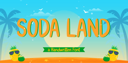 Soda Land is a fancy font that will bring playful feel to your designs. It is inspired by Summer theme typographies and it looks casual and natural. Soda Land is perfect for branding purposes such as logo, label, title, headline, product, social media, business card, quotes, and others
 - Christmas Festival by Doehantz Studio,
$18.00 Christmas Festival. A magnificent curved monoline font with christmas theme. Use it to add vintage and mystique flavor to any design! It’s ready and perfectly fit for your logo designs, headline, music projects & social media posts, event poster, brand imagery, product packaging, quotes, merchandise, gift card, wedding invitation, etc.
 - MBF Dimension Drive by Moonbandit,
$18.00 Dimension drive is a modern wide and quirky sans serif display font. Wavy lines paired with geometric and sharp edge to emphasize dynamic in the design. This typeface design is a perfect for a modern theme. Best usage on logo, poster, display, headline, t-shirt design and many more.
 - Monstora by Blankids,
$18.00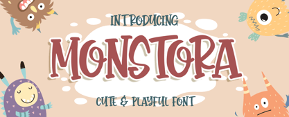 Introducing of our new product the name is Monstora Cute & Playful Font. Monstoray inspired by bouncy quirky this font is a fun theme very good for, book cover, poster, t-shirt, quote, logotype, craft and etc. MULTILINGUAL ACCENT : ØÆøæ¢ÐŒœÁĂÂÀÄĄÅÃǼĆČÇĈĊĎÉĔĚÊËĖÈĘĞĜĢĠĤÍĬÎÏİÌĮĨĴĶĹĽĻĿŃŇŅÑÓŎÔÖÒŐǾÕŔŘŖŚŠŞŜȘŤŢÚŬÛÜÙŰŲŮŨẂŴẄẀÝŶŸỲŹŽŻáăâäàąåãǽćčçĉċďéĕěêëėèęğĝģġĥíîïìįĩĵķĺľļŀńʼnňņñóŏôöòőǿõŕřŗśšşŝșťţŭûüűùųůũẃŵẅẁýŷÿỳźžż FEATURES : Uppercase Lowercase Number Punctuation Multilingual PUA Encode Opentype
 - Hisbullah by ARToni,
$23.00 Hisbullah is a bold, unique and stylish display font with an Arabic look. Designed to give a luxurious and elegant impression by combining modern and classic styles to make it timeless. This font is suitable for any purpose such as industrial, religious, gaming, movie, music themes, and so on
 - Mordie by Gian Studio,
$18.00 Mordie vintage display font is suitable for logos, branding, greetings, themes, screen printing, social media and wedding invitation designs. It is also a great typeface for titles because of its unique design and attractive appearance. If you have any questions please feel free to contact me! Thank You,
 - Trashbone by Arterfak Project,
$18.00 Introducing Trashbone, a playful marker font, designed with an additional rusty effect applied to the strokes. This font represented courage, youth, spirit, freedom, that recommended for many themes such as sports, dark, teen, movement, adventure, etc. Equipped with ligatures, alternates, and multilingual support! Thank you for visiting and enjoy!