10,000 search results
(0.248 seconds)
- Wildcat by K-Type,
$20.00 The starting point for Wildcat was the 3×5 squared grid popular for tiled lettering and American sportswear typefaces. However, Wildcat breaks free of the net whenever necessary. This typeface comes across as tough, it has no soft curves, and evokes strength and confidence. Unlike other collegiate-style fonts, Wildcat includes a real lowercase which makes the face particularly usable and adaptable. Wildcat also contains a full complement of Latin Extended-A characters. Three fonts are included in the download; Regular, College and Outline. The College and Outline fonts share identical spacing and kerning, so can be overlapped to create bicolor artwork.
 - Tokyo Geisha by Kitchen Table Type Foundry,
$15.00 My wife was watching ‘Memoirs Of A Geisha’ the other day, and I am going to take my son Sam to see Japan in May this year, so when I started drawing out the glyphs for this font, the name was already chosen! Tokyo Geisha is a handmade brush font. I made it with Chinese ink and one of the Chinese brushes my late father in law gave me. Tokyo Geisha is a font with speed and a certain flamboyance. It comes with extensive language support and a cool .notdef glyph. I am sure you will put it to good use! Arigato Kozaimasu!
 - Zaloga by Youthlabs,
$12.00 Introducing ZALOGA Display Serif Font. ZALOGA is a serif font that gives modern touch on your design. It looks so good for fashion brand logo. With different style of shape, ZALOGA will make it easier for you to use various design functions, be it for logos, typography, magazine, fashion, branding, advertising, and more. Need to test words in this font? Just type the box below, and see what it looks like For more information on accessing alternative flying machines, you can see this link (http://adobe.ly/1m1fn4Y) Thanks, stay safe and healthy, and have a nice day.
 - Endgame by Hanoded,
$15.00 Endgame font was made using a very, VERY bad brush and Chinese ink. I had bought a bunch of brushes some time ago and I discovered that the hairs had been treated with some goo to keep them from sticking out. The goo didn’t really come off, so when I started to draw the glyphs for this font, the brush strokes were kind of wild. In the end, I really liked it (even though I will never again buy that particular brand of brushes). Endgame is a wild brush font. Comes with the works: diacritics, ligatures and alternates.
 - Quincy by Wiescher Design,
$12.00 »QUINCY« started as an art project. I was stitching roughly cutout letters together on a piece of wooden board, but I didn’t like the result! So I ended up with a font in three cutout styles. I thought it was so unusual and really beautifully ugly, that I finished it, adding flashes here and there. Now I am offering this absolutely unusual font as a packet of three for you to enjoy. Have at least as much fun working with it as I had designing the packet. The font is great for packaging or posters, or whatever comes to your imaginations.
 - Morning News by Wiescher Design,
$39.50 Morning News is the sister font of Evening News which I designed some years ago for use with my local newspaper Abendzeitung. Morning News is an adaption, a little bit rounder, which gives the font a much softer touch. The general design dates back to the pre-Hitler era, the time when Germany had already lost the first World War and was taking a short deadly breath to start the second big war. Lets hope there will be a day when there will never be another war in Europe (or elsewhere!). Another new peaceful font by your pacifistic designer, Gert Wiescher.
 - Metalsmith by Burntilldead,
$13.00 Say hi to “Metalsmith” font family, a stylish custom culture typeface. Started from the enthusiasm of custom motorcycles, artsy looks of hand made typefaces & illustrations, along with the freedom vibes that came with it, become the first motivation in making this Metalsmith typeface. Packed up with three styles font; regular Clean, Ink Paint & Vintage textured. Italic version on each styles are included. There are 655 glyphs on each styles font including Stylistic sets, Discretionary Ligatures, Standard Ligatures, Contextual Alternates etc. Powered with OpenType features that allows you to mix and match pairs of letters to fit into your design.
 - Morgan Sans by Feliciano,
$50.00The Morgan Project can be considered a big type family with ‘many styles’ or a set of different types that match with each other. For me it’s one typeface with different versions with deliberate and visible differences according to the propose to which each version was created. The design started in 2000 as a display type with the design of the Morgan Tower, to which more two display versions were added; Morgan Poster and Morgan Big — all together the make our: FTF Morgan Display Kit 1. All three versions consist only in uppercase with alternate letters in the lowercase and a set of special ligatures. Morgan Tower has four variants that differ in width/weight, Morgan Poster has six variants (often called styles), three weights in upright and oblique and Morgan Big has twelve, six weights in upright and oblique. Lately, the FTF Morgan Tex Kit 1 was added. Apropriate versions to use in text setting. Both versions, FTF Morgan Sans and FTF Morgan Sans Condensed share the same structure and character mapping. Four variants each; regular, bold, oblique and bold oblique with a large character set including: small caps, lining and old style figures (here called Office figures) — both tabular —, small caps lining figures, mathematical symbols and fraction figures, and, a set of foreign characters expanding the possibilities of use for a wider range of languages. Characters are distributed in six different font layouts: Lining, Office, Expert, Caps, Figures & Pi. - Strange Alphabets by Typodermic,
$11.95 Come one, come all, and see the beauty of Strange Alphabets. Inspired by the gilded book covers of the late 1800s and the iconic Siouxsie & the Banshees band logo of the early 1980s, this narrow Arts & Crafts typeface will transport you to another world. In OpenType savvy applications, the first and last letter of a word will receive a small diamond ornament, giving your words a touch of elegance. And if that’s not enough for you, words starting with M will have a single diamond that splits into three, while words starting with O will automatically use a tall O. But, if you want to force a tall O in the middle of a word, simply use a zero. Oolong lovers, rejoice! Words that begin with double O’s will receive a pair of tall O’s, while a pair of O’s in the middle or at the end of a word will be replaced by a linked ring ligature. But that’s not all! Accessing OpenType stylistic alternates allows you to change the A and H crossbars into small rings and remove all the diamonds from the M. And don’t forget about the hyphen, en dash, and em dash, which are replaced with ring ornaments. And if you’re feeling extra fancy, a separate diamond ornament ◆ is included under Unicode 25C6. Don’t let all these fancy features intimidate you. Play with your application’s OpenType features and see what happens. And if you want to disable the automatic OpenType substitutions, simply turn off your application’s standard ligatures feature. Experience the beauty of Strange Alphabets for yourself and let your words take on a life of their own. Most Latin-based European writing systems are supported, including the following languages. Afaan Oromo, Afar, Afrikaans, Albanian, Alsatian, Aromanian, Aymara, Bashkir (Latin), Basque, Belarusian (Latin), Bemba, Bikol, Bosnian, Breton, Cape Verdean, Creole, Catalan, Cebuano, Chamorro, Chavacano, Chichewa, Crimean Tatar (Latin), Croatian, Czech, Danish, Dawan, Dholuo, Dutch, English, Estonian, Faroese, Fijian, Filipino, Finnish, French, Frisian, Friulian, Gagauz (Latin), Galician, Ganda, Genoese, German, Greenlandic, Guadeloupean Creole, Haitian Creole, Hawaiian, Hiligaynon, Hungarian, Icelandic, Ilocano, Indonesian, Irish, Italian, Jamaican, Kaqchikel, Karakalpak (Latin), Kashubian, Kikongo, Kinyarwanda, Kirundi, Kurdish (Latin), Latvian, Lithuanian, Lombard, Low Saxon, Luxembourgish, Maasai, Makhuwa, Malay, Maltese, Māori, Moldovan, Montenegrin, Ndebele, Neapolitan, Norwegian, Novial, Occitan, Ossetian (Latin), Papiamento, Piedmontese, Polish, Portuguese, Quechua, Rarotongan, Romanian, Romansh, Sami, Sango, Saramaccan, Sardinian, Scottish Gaelic, Serbian (Latin), Shona, Sicilian, Silesian, Slovak, Slovenian, Somali, Sorbian, Sotho, Spanish, Swahili, Swazi, Swedish, Tagalog, Tahitian, Tetum, Tongan, Tshiluba, Tsonga, Tswana, Tumbuka, Turkish, Turkmen (Latin), Tuvaluan, Uzbek (Latin), Venetian, Vepsian, Võro, Walloon, Waray-Waray, Wayuu, Welsh, Wolof, Xhosa, Yapese, Zapotec Zulu and Zuni.
 - Kasandra Script by Great Studio,
$15.00 Hello Font Lovers! Introducing my latest font: Kasandra Script Kasandra Script is a modern calligraphy font that features a varying baseline, smooth lines, classic and elegant touch. Can be used for various purposes such as headings, signature, logos, wedding invitation, t-shirt, letterhead, signage, labels, news, posters, badges, and more. Kasandra Script features 460+ glyphs and 244 alternate characters. including initial and terminal letters, alternates, ligatures and multiple language support. To enable the OpenType Stylistic alternates, you need a program that supports OpenType features such as Adobe Illustrator CS, Adobe Indesign & CorelDraw X6-X7, Microsoft Word 2010 or later versions. How to Access Alternate Characters : • https://www.youtube.com/watch?v=xFlMwARHusY • https://www.youtube.com/watch?v=XzwjMkbB-wQ There are additional ways to access alternates/swashes, using Character Map (Windows), Nexus Font (Windows), Font Book (Mac) or a software program such as PopChar (for Windows and Mac). How to access all alternative characters, using Windows Character Map with Photoshop: • https://www.youtube.com/watch?v=Go9vacoYmBw Need help? If you need help or advice, please contact me by e-mail: Greatstudio92@gmail.com
 - Verily Serif Mono - Unknown license

- Bordini (Unregistered) - Unknown license

- TT Chocolates by TypeType,
$39.00 Introducing the third reincarnation of TT Chocolates! The popular typeface was updated to stay up-to-date with the latest requirements and trends in design! TT Chocolates is an elegant Humanist sans serif with a dense typesetting and well-balanced proportions similar to the classical tradition. This font's nice and friendly nature makes it seem like something close and familiar. It has earned a reputation among designers as the perfect font for confectionery, but the application range of the TypeType's "sweetest" typeface goes well beyond that! In 2023, we decided to do a full-scale font update referring to extensive sans-serif market research. We figured out where the trends are headed and what users want—this information helped us enhance TT Chocolates. Specifically, we introduced a new Condensed font version, a narrow font style with the authentic proportions of the standard version. At the same time, TT Chocolates Condensed boasts a more expressive personality than the base subfamily, which allows designers to solve even more creative tasks using only one typeface. The third version of TT Chocolates has become even more modern and advanced. A large number of characters, various OpenType features, and stylistic sets make the font suitable for multiple purposes and tasks. TT Chocolates is a perfect match for both branding and layouts. The font's dynamic shapes make it easy to read in small point sizes, allowing the eye to move effortlessly across the line. This typeface can also be used in web design due to the TrueType manual hinting option. TT Chocolates 3.000 includes: 29 font styles: 14 roman, 14 italic, and one variable font; Condensed version consisting of 14 new font styles; Carefully crafted contours; Optimized font rhythm and completely new kerning; Enhanced italics in basic subfamily; Variable font with three axes of variation: width, weight, and slant; 32 OpenType features, counting in 13 new ones; 901 characters in each font style—the character set has grown compared to the previous version, which had 629 characters in each font style; 230+ languages support, including the new ones: 35 Cyrillic-based and 16 Latin-based. Elevate your design's appeal with TT Chocolates!
 - Hebrewish by JAB,
$18.00I decided to create Hebrewish because the only Hebrew Latino font I have ever seen didn't really live-up to my expectations. Each Roman letter and Arabic numeral in this font is based directly on one or more of the Hebrew characters. Originally I was tempted to create an upper case only - since there is no lower case in Hebrew that I know of. But, as this would have limited it's usefulness, I changed my mind and added a lower case also. Nevertheless, those who want to create very Hebrew looking text, need only use the upper case. I've also added some typical Judaic symbols for the artistic minded, e.g. David's star *, the Menorah ^(Jewish candelabrum) and brackets{ } based on this, as well as brackets [] which, used together, produce a 'Ten commandments' stone-tablet symbol(use this [~] for another version). In short, you can either have some fun with this font or use it for serious work - the choice is yours. - Sancoale Slab Soft by insigne,
$24.75 Ready for the designs of today, the Sancoale superfamily takes a softer turn with a rounded slab serif. Crafted from Sancoale’s simple geometry, new softened slab serifs provide a lively typeface that conveniently enhances its cousins: Sancoale Softened--a sans with blunted terminals; Sancoale Slab; and, certainly, the first Sancoale. The weights of each and every member are balanced diligently to be compatible with one another. When used alongside one another, the combination makes for robust and tight design. With weights starting with the slender thin ranging to the juicy black, Slab Soft opens the doorway to the vary of uses. Its design is legible and neutral enough for bodies of copy--both in print and on your website. The web font also stands out perfectly as a headline or a display face. Slab Soft carefully places a foot ahead, and doesn't overpower like many slabs. This font’s the choice to seize the day and get the job done. All insigne™ fonts are absolutely loaded with OpenType options. Sancoale Slab is geared up for pro typography, together with alternates with stems, compact caps and lots of alts, together with “normalized” capitals and lowercase letters. The font features many numeral sets, with fractions, old-style and lining figures with superiors and inferiors. OpenType-capable programs like Quark or the Adobe suite allow you to quickly change ligatures and alternates. You can see these options shown in the .pdf brochure. Bundled are compact caps, fractions, old-style and lining quantities, scientific superior/inferior figures, entire ordinal and inferior alphabet. The Sancoale superfamily also features the glyphs to aid a variety of languages, together with Central, Eastern and Western European languages. In all, Sancoale Slab supports around forty languages that utilize the Latin script, earning Sancoale the pick for for multi-lingual publications and packaging.
 - Kotadaila by Gatype,
$17.00 Kotadaila is a script font that includes a complete set of uppercase and lowercase letters, multilingual symbols, numbers, punctuation, alternatives and ligatures. This font has a Modern Elegant Style, perfect for branding, logos, invitations, masterheads and more. Kotadaila features OpenType style alternatives, International binders and support for most Western Languages included. To enable the OpenType Stylistic alternative, you need a program that supports OpenType features such as Adobe Illustrator CS, Adobe Indesign & CorelDraw X6-X7, Microsoft Word 2010 or later. Thank you very much for viewing and Enjoying it.
 - Reklame Script by HVD Fonts,
$30.00 Reklame Script is a brush typefamily consisting of four weights. It was designed by Hannes von Döhren in 2010. This family is influenced by the handlettering of printed advertisements of the 1940s and 1950s. You can combine the four weights to gain a better emphasis – perfect for headlines, posters, and other display uses. Reklame Script is equipped for professional typography. The OpenType fonts have an extended character set to support Central and Eastern European as well as Western European languages. The fonts also contain double-letter ligatures to prevent repetition.
 - Hello Sunshine by Romie Creative,
$13.00 Hello Sunshine - elegant Calligraphy font is a romantic and sweet calligraphy typeface with characters that dance along the baseline. It has a casual and yet elegant touch. It can be used for various purposes such as logos, wedding invitations, headings, t-shirts, letterhead, signage, lables, news, posters, badges etc. The fonts include OpenType features with stylistic alternates, ligatures and multiple language support. To enable the OpenType Stylistic alternates, you need a program that supports OpenType features such as Adobe Illustrator CS, Adobe Indesign & CorelDraw X6-X7, Microsoft Word 2010 or later versions
 - Wak by ParaType,
$30.00 Wak is a lively calligraphy-based sans serif. The simplicity and smoothness of its forms is combined with the sharpness and suddenness of the details. There are six weights from light to extra bold, with a variety of alternative signs, additional ligatures and initial and final forms with swashes. Lowercase letters repeat the uppercase pattern. The font is intended for short inscriptions and texts and is adapted for use on the screen. Wak was designed by Viktor Fitzner, character set expanded by Alexander Lubovenko. The font was released by ParaType in 2018.
 - Verlyana by Gatype,
$12.00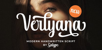 Verlyana is an organic, handwritten font suitable for branding, signatures, wedding invitations, promotions, product packaging, and other needs. This font is modern, simple, but still authentic. You'll get a full set of lowercase and uppercase letters, numbers and punctuation, multilingual symbols, initial and final lowercase swashes, binders, and extra swashes. Verlyana features OpenType style alternatives, International binders and support for most Western Languages included. To enable the OpenType Stylistic alternative, you need a program that supports OpenType features such as Adobe Illustrator CS, Adobe Indesign & CorelDraw X6-X7, Microsoft Word 2010 or a later version.
 - Rondell by Scrowleyfonts,
$12.00 Rondell was originally designed in 2011 as a reasonably priced variable width and weight font. There were a couple of things about it that I didn't like and so I withdrew it from sale. Since then I have found myself using it for many different projects and have realised how useful and versatile it is. Therefore I have fixed the things I didn't like about it and it is now available again. Rondell is a simple, smart, sans serif font. Rounded corners make it slightly informal and friendly.
 - Abigan by IM Studio,
$18.00 Abigan is an elegant new serif font that will add a touch of luxury and sharp diamond points add a slick yet legible Persian style. This versatile font is Perfect for editorial projects, magazine headers, Logo designs, Apparel Branding, product packaging, and displays both masculine and feminine qualities. Abigan comes with full uppercase, lowercase, numbers and punctuation marks + Multi-language support and PUA encoding. To enable the OpenType Stylistic alternative, you need a program that supports OpenType features such as Adobe Illustrator CS, Adobe Indesign & CorelDraw X6-X7, Microsoft Word 2010 or later.
 - Fisionada by Graviton,
$24.00 Fisionada font family has been designed for Graviton Font Foundry by Pablo Balcells in 2023. It is a condensed sans serif typeface with sharp edges and a very technical aesthetics. Its condensed design makes it very effective for space economizing and its geometric features make it a very attractive choice for display usages such as futuristics logos, video games and sci-fi content. It has been conceived to be most suitable for headlines and short length text blocks. Fisionada consists of 8 styles. Each containing small caps and glyph coverage for several languages.
 - 36 Dope by Power Type,
$- 36Dope is a display typeface with an experimental serif design. It draws from the event ’36DaysOfType’ held in 2023. Created as part of the ’36DaysOfPower’ theme, this font showcases unique and unconventional serifs, reflecting the creative and powerful spirit of the event. With its bold and experimental look, 36dope is well-suited for attention-grabbing headlines, titles, or graphic design projects that aim to convey a sense of strength and artistic innovation. This font is intended for eye-catching headlines, titles, or other graphic design projects that require a bold and experimental look.
 - Frontis by Tipo Pèpel,
$24.00 Inspired by the Roman lettershapes that Asensio y Mejorada drew in 1780, Frontis is a text typeface that takes this reference just as a starting point. The delicate appearance of Neoclassical fonts becomes confidence in Frontis. The characters have a solid skeleton, and the text looks classy in the condensed half of the family. A style that shines especially at display sizes. A collection of vegetal motifs and some stylistic uppercase ligatures complete the character set. These extra shapes serve to frame and bring together all the weights and styles in the type family. The lapidary ligatures and the ornaments underline the 18th-century roots of the design. There is a connection between Frontis and those classic letters that were once engraved on stone. And yet, the design is daring enough to make it a perfect choice for contemporary use.
 - Oorrnnoott by sugargliderz,
$44.00 This is a series that takes unfinished typefaces that were either previously ideated but not realized or were close to completion but left incomplete due to dissatisfaction with certain aspects, and brings them to completion. "Oorrnnoott" was originally a project named "Petitgothiquemignon" or "Sangoth". In the process of refining "Kropotokin", several ideas were incorporated into the design. Well, I say "incorporated," but it was designed on a whim, as usual. After all, it was started around 2005, and I don't usually leave notes or anything (which isn't the best habit), so I don't remember the emotions or thoughts behind its creation. Please consider this typeface as a very typical sans-serif font, as that is what I was aiming for when I excavated it this time. Please use it for body text, headlines, eye-catching designs, or whatever you like.
 - SparkPlug by Just Font You,
$15.00 Start from my love to vintage motorcycle culture, i am really glad living in this era when vintage motorcycle is now being such a lifestyle. People can express their self through the motorcycle, completed with the fashion and style itself to make their characters and personal branding appear stronger. It can open the new social circle, the community, to those who have the same passion to it. Based on that situation, i try to contribute to the scene with making a typeface that brings the personality of it. So please welcome, Sparkplugs. A vintage biker style font with the strong serif style and bold body. Comes up with the sans-serif too, just in case you need a pair. Handcrafted carefully for your vintage branding, rebel fashion stuff, clothing brand, as long as they're on it, get ready to rockin' all the way!
 - Diecast by Device,
$39.00 A companion piece to Mulgrave, this font is the intermediary design between the chunky Victorian style that Mulgrave reproduces and the Ministry of Transport sans introduced in 1933 and digitised as Ministry. Although they date from between 1910 and 1933, these signs show the beginnings of several features Ministry later incorporated, notably the thinner strokes and the more modern forms of the G, M, R and S. The letter widths are approaching a monospace - the L, F and E are relatively wide compared to the W and M, a feature that may have something to do to the casting process. These idiosyncracies were all ironed out when the first version of the MOT alphabet was produced. The Device digitization, as with Mulgrave, stays true to the worn and repainted original metal source material and preserves the unusual widths.
 - LTC Italian Old Style by Lanston Type Co.,
$39.95LTC Italian Old Style is not to be confused with the English Monotype font also called Italian Old Style, which is an earlier design from 1911 based on William Morris’s Golden Type that is based on Nicholas Jenson’s Roman face. Goudy went back to Jenson’s original Roman and other Renaissance Roman faces for his inspiration and the result is what many consider to be the best Renaissance face adapted for modern use. Bruce Rogers was one of the biggest admirers of Italian Old Style and designed the original specimen book for Italian Old Style in 1924 using his trademark ornament arrangement. These ornaments are now contained in the pro versions of the Roman styles—Regular Pro and Light Pro. With most digitizations of old metal typefaces, one source size is often used as reference (as was Goudy’s method for his own cuttings of his Village foundry types) so that all sizes refer to one set of original artwork. The original hot metal fonts made by Lanston Monotype (from Goudy’s drawings) and other manufacturers used two or three masters for different size ranges to have optimal relative weights—smaller type sizes would need proportionally thicker lines to not appear thin and larger sizes would require thinner lines to not appear to bulky. The variations in size ranges can also be affected by the size of the cutter head in making the master patterns. The light weights of LTC Italian Old Style were digitized from larger display sizes (14, 18, 24, 30, 36 pt) and the regular weights were digitized from smaller composition sizes (8,10,12 pt). The fitting for the regular weights is noticeably looser to allow for better setting at small sizes. Very few font revivals take this approach. Italian Old Style, originally designed by Frederic Goudy in 1924, was digitized by Paul Hunt in 2007. In 2013, it has been updated by James Grieshaber and is now offered as a Pro font. The newly expanded Pro font includes all of the original ligatures, plus small caps and expanded language coverage in all 4 Pro styles. - Yankee Doodle Boy JNL by Jeff Levine,
$29.00 In the early years of the 20th Century, singer-dancer-actor-composer-playwright George M. Cohan was known as "The Man Who Owned Broadway". In 1904, Cohan was enjoying success with his latest creation, "Little Johnny Jones". Cohan gave America what would become a number of iconic songs, and both he and his compositions were immortalized in the 1942 biographical film "Yankee Doodle Dandy" starring James Cagney. The Art Nouveau-influenced hand lettering of the title on the cover of the sheet music for "The Yankee Doodle Boy" was the model for its namesake digital typeface design and is available in both regular and oblique versions.
 - TT Supermolot by TypeType,
$29.00 You are on the page of the old display version of the TT Supermolot font. In 2019, we released an entirely new, completely redesigned and significantly expanded version of the typeface called TT Supermolot Neue. In addition to 54 styles, TT Supermolot Neue has stylistic alternates, ligatures, old-style figures and many other useful OpenType features. Before you buy the old display version of the font, we suggest that you pay attention to the new superfamily TT Supermolot Neue and study it in more detail. - TT Supermolot Condensed is the narrow version of the TT Supermolot font family. Thanks to its open forms, TT Supermolot Condensed fits perfectly into any contemporary technological design and navigation systems. We've already seen this font family in the sports theme (as the main font for hockey teams branding), we've seen TT Supermolot as the main font inside the gameplay of a popular 3D-shooter. Information transfer in the high-tech areas is the ideal environment for this font family, also TT Supermolot Condensed fits well into army, space, and innovation themes. We've tried to create a maximum number of convenient weights (Thin, Light, Regular, Bold, Black) for you to be able to use this family anywhere, from mobile apps and web pages to big state fairs branding.
 - TT Supermolot Condensed by TypeType,
$29.00 You are on the page of the old display version of the TT Supermolot Condensed font. In 2019, we released an entirely new, completely redesigned, and significantly expanded version of the typeface called TT Supermolot Neue. In addition to 54 styles, TT Supermolot Neue has stylistic alternates, ligatures, old-style figures and many other useful OpenType features. Before you buy the old display version of the font, we suggest that you pay attention to the new superfamily TT Supermolot Neue and study it in more detail. - TT Supermolot Condensed is the narrow version of the TT Supermolot font family. Thanks to its open forms, TT Supermolot Condensed fits perfectly into any contemporary technological design and navigation systems. We've already seen this font family in the sports theme (as the main font for hockey teams branding), we've seen TT Supermolot as the main font inside the gameplay of a popular 3D-shooter. Information transfer in the high-tech areas is the ideal environment for this font family, also TT Supermolot Condensed fits well into army, space, and innovation themes. We've tried to create a maximum number of convenient weights (Thin, Light, Regular, Bold, Black) for you to be able to use this family anywhere, from mobile apps and web pages to big state fairs branding.
 - Earthbound - 100% free

- Ah, the Edo font by Vic Fieger, you say? Imagine if a brush, after a night out drinking with its inky pals, decided to take a stroll across the canvas, leaving behind a trail filled with personality,...
- Kara by Mostardesign,
$19.00 Designed in 2012 by Olivier Gourvat, this font family is inspired by the euskaran (basque language) font. Redesigned with modernism, this new font respects the traditional euskara language with lowercase addition. These nuances give Kara a traditional appearance for both text and headlines, but can be used for many more applications such as titles, decoration, posters, cartoons... Kara Text & Display support a wide range of languages, with more than 500 glyphs and OpenType features like case-sensitive forms, contextual alternatives, stylistic alternates, fractions, proportional and tabular figures. With its 2 fonts, Kara is an ideal font family for text, brand identity, signage, print and web design.
 - Hello Crystal Script by Romie Creative,
$14.00 Hello Font Lovers... Introducing my latest font "Hello Crystal Script"! Hello Crystal Script is a modern calligraphy font that features a varying baseline, smooth line, classic and elegant touch. Can be used for various purposes.such as headings, signature, logos, wedding invitation, t-shirt, letterhead, signage, labels, news, posters, badges etc. To enable the OpenType Stylistic alternates, you need a program that supports OpenType features such as Adobe Illustrator CS, Adobe Indesign & CorelDraw X6-X7, Microsoft Word 2010 or later versions.There are additional ways to access alternates/swashes, using Character Map (Windows), Nexus Font (Windows), Font Book (Mac) or a software program such as PopChar (for Windows and Mac).
 - Original Quality by Hanoded,
$15.00 Original Quality: I often see these words on various objects - from T-shirts to sprinkles and cookies. In fact, I see this term so often that I decided to name a font after it. Original Quality font is an adaptation of an older font of mine called Butterfly Ball. It is a totally different typeface, but I hope it hasn’t lost its original quality… ;-) Comes with all the diacritics you want, plus a handful of cute stylistic alternates.
 - Lust Text by Positype,
$29.00 Yes, finally. This one took the most time and the most restarting. Years went into imagining what Lust Text should look like and how it should structurally behave in order to truly improve upon a setting that includes any of the Lust typefaces. I approached it as much from the side of the type designer, as I did a potential user. The flow, the warmth, the personality needed to be there, but all of the excess had to be removed responsibly. In the process, and in need of inspiration, I looked backward to historical artifacts and precedent. In each early Lust Text approach, the solution was lackluster and/or vanilla and not actually a ‘Lust’ typeface. The exercise was not in vain though. By exploring past examples, I found my footing drawing for media now and how it might be used later—all the while, producing seamless, elegant curves and restrained indulgence (that sounds almost silly to say, but I like it). The Lust Collection is the culmination of 5 years of exploration and development, and I am very excited to share it with everyone. When the original Lust was first conceived in 2010 and released a year and half later, I had planned for a Script and a Sans to accompany it. The Script was released about a year later, but I paused the Sans. The primary reason was the amount of feedback and requests I was receiving for alternate versions, expansions, and ‘hey, have you considered making?’ and so on. I listen to my customers and what they are needing… and besides, I was stalling with the Sans. Like Optima and other earlier high-contrast sans, they are difficult to deliver responsibly without suffering from ill-conceived excess or timidity. The new Lust Collection aggregates all of that past customer feedback and distills it into 6 separate families, each adhering to the original Lust precept of exercises in indulgence and each based in large part on the original 2010 exemplars produced for Lust. I just hate that it took so long to deliver, but better right, than rushed, I imagine.
 - Baby Face - Unknown license

- Bujardet Freres - Unknown license


