10,000 search results
(1.357 seconds)
- Folsom JNL by Jeff Levine,
$29.00Folsom JNL is one of the many stencil fonts Jeff Levine has recreated from original sources. This particular design was modeled from a kit made by the Meyercord Company of Chicago. In the original, some of the letters were solid rather than stencil forms, but Jeff gave all of the letters the traditional treatment for continuity. - Belta by Antipixel,
$50.00 Belta is a decorative all-caps handwritten font, perfect for display use. It is available in light, regular and bold, providing a wide range of possibilities and combinations since the glyphs vary from one style to another, allowing a more informal and script look. It's glyph coverage supports languages such as English, Spanish, French, Portuguese, Italian, Swedish, among others.
 - Mongolia by Goodigital13,
$20.00 It can be used in different purposes: lettering and logotype, labels, t-shirts, product packaging, invitations, advertising, and any classic / vintage typography design projects. will be great for any projects including : branding, logo, stationery, business card, signage, flyer, brochure etc. Almost all industries will be match for this typeface: events, music video, makeup artist, travel, promotions, musician, magician etc
 - Zero Master by Rockboys Studio,
$29.00 Zero Master is a modern and clean technology, Hi Tech font style. This font looks modern, sci-fi, futuristic, future, readable, stylish, catchy and easy to use. This font is PUA encoded which means you can access all of the glyphs and swashes with ease! It features a varying baseline, smooth lines, gorgeous glyphs and stunning alternates.
 - Khinta by FadeLine Studio,
$10.00 Khinta comes in a bold and clean style, this font is firm, luxurious and simple. With a style like this, this font will be very suitable to use for logo's, branding projects, homeware designs, product packaging, mugs, quotes, posters, shopping bags, logo's, t-shirts, book covers, name cards, invitation cards, greeting cards, and all your other lovely projects.
 - Qusta by SimpleType Studios,
$15.00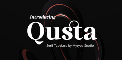 usta is a modern serif font that embodies elegance and charm in every character. It is perfect for luxury logos, branding, classy editorial designs, women’s magazines, cosmetic brand, promotional designs, the fashion industry, and more. This gorgeous font includes all lowercase and uppercase characters, numbers, punctuation, an array of standard ligatures and a selection of international characters as well.
 - Riga Screen by Ludwig Type,
$45.00 Riga Screen is designed to work particularly well on screen. Especially responsive websites or office applications will appreciate its economic proportions. Riga has been specially engineered and optimized for exceptional readability in small sizes on all current computer monitors, including tablets and smartphones. This small family of four weights is the perfect companion for the Riga type family.
 - Rosetica by FadeLine Studio,
$18.00 Introducing Rosetica, a smooth, soft script font in handwriting style which gives the characters of this font a very simple, natural and sweet touch. Rosetica is perfect for logo's, branding projects, homeware designs, product packaging, mugs, quotes, posters, shopping bags, logo's, t-shirts, book covers, name card, invitation cards, greeting cards, and all your other lovely projects.
 - Ladislav by Suitcase Type Foundry,
$39.00 The Ladislav font revitalises Sutnar’s legacy, while not explicitly copying any of his original fonts. It however keeps true to their technicist character and initial principles of character creation - a simple modular system of combined geometrical segments. This approach affects all round shapes of capital and lowercase letters, as well as the shapes of the majority of numbers.
 - Sugaqi by Twinletter,
$17.00 Sugaqi is a visual embodiment of courage in the form of a superhero display font. Tailor-made for projects that require a bold, bold, and punchy look like movies, games, or standout designs. What’s Included : File font All glyphs Iso Latin 1 Alternate, Ligature Simple installations PUA Encoded Characters – Fully accessible without additional design software. Fonts include Multilingual support
 - Kumbaya by Rachel Kick,
$6.00 Kumbaya is a purely hand-drawn, all-caps sans. It's the perfect combo of handmade quirks and clear, legible print. Kumbaya has the ability to hold it's own as a single word headline, or in a paragraph form. It also works well with script compliments. With four different styles, it is the perfect addition to any project!
 - Cielo by Wilton Foundry,
$29.00 Cielo font family consists of Cielo Light, Cielo Light Italic, Cielo Regular, Cielo Italic, Cielo Bold, Cielo Bold Italic, and Cielo Stencil (Regular weight) Cielo is a versatile contemporary typeface family that will serve you well in many design situations like advertising, corporate communications, etc. Buying all seven weights make it an excellent value for money!
 - On The Ground by Fascination Workshop,
$10.00 On the Ground is a picture font made from drawings of found objects. These object were found on the ground while walking around different cities in the United States. The font uses varying drawing styles (from detailed to pictographic) but they all have a similar irregularity, unifying the characters. Perfect for animations, signs, greeting cards, posters, etc.
 - Krone by Lebbad Design,
$27.95 Krone is a clean, bold contemporary semi-serif font characterized by its flared semi-serifs and graceful curves. Well-suited for all graphic design challenges such as dynamic display headlines, logos, posters, cover/titles and much more. Its optimized kerning enables it to work well in a variety of text uses for both web and desktop.
 - Dealoras Font Duo by Attract Studio,
$17.00 Dealoras is a duo font that is all geometric typeface with simplicity and directness that stands out with its modern minimalist style and clean feel. There are also Dealoras Outline and Dealoras Signature to help you mix and match to match your creative work in harmony. perfect for magazine pictures, for wedding invitations, for branding, poster design and more.
 - Chupada by Tipo Pèpel,
$14.00 Chupada is an ultra-condensed font family noted for their exaggerated x-height, which consists of five different weights, accompanied by their italic version. It contains all the central european characters and Cyrillic. Chupada with its bold semi-modular forms make it ideal for use in headlines, posters, titles and anywhere you need for create impact.
 - FF Milo Slab by FontFont,
$68.99 FF Milo Slab is not just the sans with slabs attached. It has undergone a wide range of careful adjustments from increased contrast, longer ascenders and descenders and modified glyphs in the heavier weights. All these changes amount a typeface that feels enough like Milo but also can stand on its own as a new and fresh typeface.
 - Tarquin AT by Akufadhl,
$15.00 Tarquin is a All-Caps sanserif typeface, inspired by the beautiful hand-painted sign. It has a strong personality, high contrast stem, and widely opened counter to improve the readibility as it designed for display purposes. It's available in 3 different style, REGULAR, STENCIL, and SHADOW designed for display purpose design Crafted beautifully and carefully with hand.
 - Sigmund Freud Typeface by Harald Geisler,
$29.00 “For those who regret what keyboards and touch screens have done to their penmanship, typographer Harald Geisler has an answer: Sigmund Freud.” — The Wall Street Journal Sigmund Freud was a neurologist who lived from 1856 to 1939. His research and studies led to the foundation of ‘Psychoanalysis’. When I first saw Freud’s century old letters, I was fascinated by the beauty of these historic manuscripts. It made me smile to imagine a person writing his or her shrink a letter set in Freud’s handwriting. I started to plan creating a font based on his manuscripts. I contacted the Sigmund Freud Museum Vienna and Freud Museum London. To start the creation I selected eight handwritten documents from the archive in Vienna – This selection of specimen was my orientation during the design process. The Samples were created between 1883 to 1938 and are of various character such as handwritten scientific papers, personal letters, notes and a telegram. A successful Kickstarter Campaign "The Sigmund Freud Typeface - A Letter to your Shrink" with over 1400 Backers enabled me to visit the archive in Vienna and study the original manuscripts of Sigmund Freud. After a year of preparation and design work, I finished four alphabets based on Freud’s handwriting. What are the different Versions PRO, Kurrent, #1, #2, #3 and #4 about? “This project gives people the convenience afforded by the computer while maintaining the romantic nostalgia, beauty, and character of letter writing with real handwriting.” — Daniel Vahab, The Huffington Post When you write with your hand, every letter looks a little different. When you write a text on your computer every letter looks exactly the same. In order to make type look like handwriting, I chose four different variations of each letter from Freud’s manuscripts, drew and stored them in the font. The font is then programmed to exchange letters while you are typing. This makes the rendered result on your screen or print look like unique handwriting. PRO While you are typing… the PRO Version actively combines all four alphabets and exchanges them automatically. Through this mechanism never the same two o’s will stand next to each other. With every touch a unique look is generated. This works in certain applications i.e. Word 2010(or newer), Pages, TextEdit, Editor(Pre-installed on Windows 7 or newer), InDesign, Illustrator… →Here you can see an animation of what this effect looks like in action. (Please Note: some applications like LibreOffice, OpenOffice do currently not support this feature. Date: December 2013) #1 #2 #3 and #4 The Sigmund Freud Typeface #1, #2, #3 and #4 each hold one individual lowercase alphabet based on Freud’s handwriting. Kurrent Most of Freud’s correspondence was written in German. Until the 1950′s a different handwriting was taught throughout German speaking countries (Switzerland, Austria, Germany). This style is called Kurrent. The name Kurrent and Cursive derive from the Latin word currere - to run, hurry - both styles were designed to write fast. As you can see in the samples above, Freud practiced both Kurrent and when writing english Cursive (Latin script or Joined-up). Kurrent has three significantly different letters (s,h,e). Use Kurrent to render the authentic look of an historic Sigmund Freud letter in German. Bundle On the Top of this page you can get all six fonts of the Sigmund Freud Typeface Family in a bundle. International Typeface All styles of the Sigmund Freud Typeface feature a wide range of accented letters so you can write to all your friends in Sweden (Bjørn) France (Chloé & Zoë), Ireland (Dáirine), Poland (Łucja), Germany (Jörg) and almost everywhere around the globe (Find a complete list in the tech specs). Usage recommendations I hope that this design will be valuable to you and most of all that you have fun with this typeface! 1. Point Size — To reproduce the size of Sigmund Freud’s handwriting adjust the type size between 18-24 point in your word processor. If you are using an imaging software like Photoshop set the resolution to 300dpi and adjust the point size between 18-24. 2. Line Spacing — Narrow the line hight until swashes of capital letters touch the baseline above. This also happens when you write a letter and gives the document a unique handwritten look. 3. Right Aligned — Freud had the habit to write towards the right edge of the page and start loosely on the left. Set your text alignment to ‘right’ to incorporate this dramatic expression also to your documents. What do other People say about the Sigmund Freud Typeface? “Wouldn’t you love to write a letter to your shrink using the Sigmund Freud typeface?” — Dorothy Tan, Design TAXI ''“JUST DON’T WRITE A LETTER TO YOUR MOTHER WITH IT… …until the reader looks a bit closer, and they see 70+ years of modern science weighing in on turn-of-the-century pop psychology."'' — Mark Willson, Fast Company “Doctor, what does it mean if you dream of creating a font of Freud’s handwriting?” — Ayun Halliday, Open Culture “…geekily romantic, at once artistic and scientific” — Edie Jarolim, Freud’s Butcher “…sympathisch” — Jürgen Siebert, Fontblog !WOW! Thank you for reading the complete font description! You are awesome! If you still have a question please contact me through MyFonts or my website haraldgeisler.com. Credits This project was made possible by the help of 1481 Backers on Kickstarter and the kind support of the Sigmund Freud Museum Vienna and the Freud Museum London. Thank you. All of Freud’s Manuscripts shown are © Sigmund Freud Museum Vienna. Poster Image: IN17 - Sigmund Freud, Germany 1932. © Freud Museum London. Flag Image: IN19 - Sigmund Freud 1930’s. © Freud Museum London.
 - LT Marathon - 100% free

- From Where You Are - Personal use only

- PiS Coffins and Ghosts - Unknown license

- Cone Of Silence - Unknown license

- KG Keep Your Head Up - Personal use only

- WC Rhesus A Bta - Unknown license

- Florentine SwashCaps - Unknown license

- Folk Solid - 100% free

- Highman by Eko Bimantara,
$19.00 Highman is a modern condensed bold font. Its contain all caps letter yet its have a different height between the uppercase and lowercase. Its fit for brand, titling, stacking or grid layout and all kind of display usage.
 - Gandur New by Blackletra,
$50.00 Gandur is a display textura in three weights, split into two families: Alte — the German word for old — and New. Gandur was inspired by other geometric texturas, specially Max Bittrof’s Element (1933). The design began by adhering to a strict hexagonal grid, but during its development, slowly moved from a purely geometric to a more pen-based design (this is especially true in the heaviest weights). The differences between Alte and New are essentially morphological, with reflections in the character set and OpenType features. Gandur New has a more humanistic, contemporary structure and is more ‘romanized’ then Alte. Gandur New also features small capitals. Gandur Alte, on the other hand, remains truer to historical forms, most notably: S s X x Z z. Gandur Alte also features the long-s, which can be accessed via a Stylistic Set or the glyph palette. (As is historically accurate, a short-s will be used at the end of words automatically when the historical Stylistic Set has been activated).
 - Hoofer by Scholtz Fonts,
$15.00 Light and flexible, slightly retro, casual and readable, Hoofer combines 28 brush script, mono line script and sans-serif styles with ornaments into one Mega-Family. The different styles of the Hoofer Mega-family have been chosen to work together and to harmonize in a pleasing way. The Hoofer Mega-Family of fonts can be divided into three sub-families: Hoofer BRUSH subfamily: An eclectic group of five fonts. These are mainly joined scripts. Hoofer LINE subfamily: Seven mono-line scripts with joined letters in a number of weights, widths and styles. Hoofer SANS subfamily: Sixteen casual, Sans-Serif fonts. They are very readable and in a variety of weights & styles The mood of the Hoofer mega-family is light and flexible, slightly retro, casual and readable. It combines script and many sans-serif styles with ornaments into one Mega-Family. The different styles of the Hoofer Mega-family have been chosen to work together and to harmonize in a pleasing way. The Brush Sub-Family is designed for titling, packaging and display purposes, The Line Sub-Family can also be used for titling, packaging and display, however, it is less “showy”, and conveys an air of informality. The Sans Sub-Family is designed to shine as sub-heads and as body text. The wide range of Hoofline styles gives you, the designer, great flexibility in creating just the mood or impression that you want. Most of the fonts can use one or more OpenType Features. These can be accessed in a number of ways. The reason for this is that the major software producers provide different (and often conflicting) ways of accessing OpenType Features. In some cases such software manufacturers provide NO way of accessing certain OpenType Features. We have tried to remedy this by providing a highly flexible family of fonts. OPENTYPE (these OpenType features are only available in the “otf” fonts and not in the “ttf” fonts.) OpenType features that Hoofer makes use of are: Swashes (Word-Begin and Word-End Features); Alternate Numerals; and True Small Caps. ORNAMENTS In addition the Hoofer family has a font containing 94 ornaments. ALTERNATE NUMERALS You can access two sets of figures (numbers) in Hoofer Sans fonts. Both sets are tabular and lining but they differ in the height (but not the width) of the figures. The height of the alternate figures has been chosen so that they are compatible with the small caps. However, these alternate figures are available in ALL Hoofer Sans fonts, whether they feature small cap fonts or not. Hoofer has all the features usually included in a fully professional font. Language support includes all European character sets, Greek symbols and all punctuation. Opentype features include automatic replacement of some characters and discretionary replacement of stylistic alternatives.
 - Classica Pro by URW Type Foundry,
$35.99 Classica Pro by Bernd Möllenstädt A real alternative for letterpress printing A masterpiece It was only after many years, shortly before the end of his life, Bernd Möllenstädt brought out these early drafts of his Classica Light and Light Italic from his drawer, and asked me to produce for him on the computer a Bold and Bold Italic, from which we later wanted to interpolate further cuts like Regular and so on. The boldening of letters with an oblique axis and with hairlines which should not grow to the same extent as the general line widths, is hard to cope with perfectly, even for the smartest computer program, and even more so, when it concerns an as complicated set of data as those conceived by Bernd. The automatically generated result could therefore only be a first step that had to be improved manually later. This was about the stage that we had reached when Bernd died in March 2013, leaving me behind with comprehensive corrections on proofs of this automatically generated Bold. Although I was aware that it would mean a lot of work to complete the project, I did not want to leave it unfinished and decided to finalize and publish the Classica, also in Bernd‘s honor. In the course of the two years that I worked on this font family it somewhat naturally became also my own. New details were added and some of the existing changed. A book typeface requires the supreme and forgives rarely, it represents a true masterpiece. My intention and my ambition were to create a real alternative for letterpress printing, with a font family that contains all the typographic options for an excellent typesetting, and is better readable and has a better appearance than other existing typefaces. Whether this was achieved, the reader may decide. Volker Schnebel, Hamburg, december 2014
 - Punch Tape JNL by Jeff Levine,
$29.00 Punch Tape JNL emulates the old-style pin-punched paper tapes that were used in everything from ticker tapes to moving electronic signage to early digital typesetting equipment. Pin punch characters were also used in the early days of banking as a secure way of canceling a check so that it was rendered useless if re-submitted. In this version, the "dots" are square rather than round.
 - Warhol by Andinistas,
$34.00 Warhol is a font family designed by Carlos Fabian Camargo. Its 3 fonts work in groups or independent. His carefree soul lies in the sensibility, creativity and abstract motivations listening to the album: The Velvet Underground & Nico released in 1967. Preparations for his typographic design were illustrated by imagining extravagant, fascinating and hard-to-resist ideas, That is why his brushstrokes of the alphabet were born of irregularity, with naive character and expressive drawing, notable with the discordance and instability of drawing by Andy Warhol, infiltrated with pop folk art and artisan harmony. Warhol is a font family offers uppercase, lowercase and numbers that work at the beginning, middle or end of words, achieving calligraphic expressiveness. In that order of ideas Warhol font family offers the following vantages: • Warhol Script (694 glyphs): handwritten letters drawn with a thin-thickness tool, simulating interesting imperfections in their contours and connections. * Warhol Script Bold (694 glyphs): Thick letters that appear to be drawn with a brush of inflated and irregular thickness • Warhol Extras (140 glyphs): Words with letters written with pen, highlighting meaningful criteria that function as perfect companions between words designed in Warhol Script and Bold.
 - Selfie Neue Rounded by Lián Types,
$29.00 INTRODUCTION When I started the first Selfie back in 2014 I was aware that I was designing something innovative at some point, because at that time there were not too many, (if any) fonts which rescued so many calligraphy features being at the same time a monolinear sans. I took inspiration from the galerías’ neon signs of my home city, Buenos Aires, and incorporated the logic and ductus of the spencerian style. The result was a very versatile font with many ligatures, swashes and a friendly look. But… I wasn’t cognizant of how successful the font would become! Selfie is maybe the font of my library that I see the most when I finally go out, (type-designers tend to be their entire lives glued to a screen), when I travel, and also the font that I mostly get emails about, asking for little tweaks, new capitals, new swashes. Selfie was used by several renowned clients, became part of many ‘top fonts of the year’ lists and was published in many magazines and books about type-design. These recognitions were, at the same time, cuddles for me and my Selfie and functioned as a driving force in 2020 to start this project which I called Selfie Neue. THE FONT "Selfie for everything" Selfie Neue, because it’s totally new: All its glyphs were re-drawn, all the proportions changed for better, and the old and somehow naive forms of the first Selfie were redesigned. Selfie Neue is now a family of many members (you can choose between a Rounded or a Sharp look), from Thin to Black, and from Short to Tall (because I noticed the feel of the font changed notoriously when altering its proportions). It also includes swashy Caps, which will serve as a perfect match for the lowercase and some incredibly cute icons/dingbats (designed by the talented Melissa Cronenbold) which, as you see in the posters, make the font even more attractive and easy to use. You'll find tons of alternates per glyph. It's impossible to get tired with Selfie! Like it happened with the old Selfie, Selfie Neue Rounded was thought for a really wide range of uses. Magazines, Book-covers, digital media, restaurants, logos, clothing, etc. Hey! The font is also a VF (Variable Font)! So you can have fun with its two axes: x-height and weight, in applications that support them. Let me take a New Selfie! TECHNICAL If you plan to print Selfie Neue VF (Rounded or Sharp), please remember to convert it to outlines first. The majority of the posters above have the "contextual" alternates activated, and this makes the capitals a little smaller. I'd recommend deactivating it if you plan to use Selfie for just one word. Use the font always with the "fi" feature activated so everything ligatures properly. The slant of the font is 24,7 degrees, so if you plan to have its stems vertical, you may use Selfie with that rotation in mind. THANKS FOR READING
 - Bun Chalk by Storictype,
$12.00 Introducing BunChalk Typeface Here is new product, It's called Bun Chalk. BunChalk inspired by many lettering on menuboard chalk cafe and bistro, and it's specially designed for the resto who use chalk concept,menuboard Chalk up your brand with our one-of-a-kind chalk concept! Leave your mark and get noticed with custom branded chalk that makes a statement. Whether you're a hip cafe, a stylish boutique, or a savvy startup, our branding chalk is the perfect way to spread the word about your business. Write inspirational quotes, menu specials, sales announcements, or just your logo all over your windows and sidewalks. Made from handmade quality chalk texture that goes on clean and texture typeface, it's ideal for businesses who want to grab attention and stand out from the crowd. Let potential customers know you're there with playful, eye-catching branded chalk that gets your name seen.
 - Carelia by My Creative Land,
$29.00 Carelia is a modern multilingual (including cyrillic) serif family with classic forms, enhanced by extended OpenType features. It is well suited for all sorts of design - starting from web, to editorial and branding. Its stylistic alternates, swashes and ligatures (more 1200 glyphs in each font) will make your design even more stylized and unique. Carelia comes in two styles Upright and Italic - each has it's own character but both share the same curves and style. Both fonts are fully unicode mapped - can be used in any application of your choice.
 - Fette Deutsche Schrift by Lamatas un Slazdi,
$35.00 Fette Deutsche Schrift also known as Koch-Fraktur or Kochschrift was created by Rudolf Koch for Klingspor foundry between 1908 and 1910. The basis of this font is a publication in the magazine “Das Plakat” of September 1921. The font contains swash capitals to use as dropcaps, contextual alternates, glyphs for line endings, ligatures, discretional ligatures for use in German, ornaments and other OpenType features. It supports all the European languages using Latin alphabets (including slashed S and slashed long s used in Latvian old orthography till 1930s).
 - Phoenica Std Mono by preussTYPE,
$29.00 Phoenica Std Mono expands the already large family of my very successful Phoenica. The motivation to develop a new mono-Phoenica family was that I was not satisfied with monospaced fonts in programming code, or simply in e-mail correspondence. The Mono Phoenica solves the problem of a typical monospaced font, a rigid, fixed width. The design gradations from Condensed monospaced to monospaced from 390em to 600em-square incurred a total of 21 fonts. Packages contain the fonts in CFF-OpenType and TrueType format, so you can use these beautiful fonts on all operating systems.
 - Churchward Design by BluHead Studio,
$25.00 BluHead Studio LLC is pleased to announce the release of 9 fonts from the Churchward Design family designed by New Zealand typeface designer Joseph Churchward. BluHead Studio is in the process of digitizing many of the fonts in Churchward’s extensive library of exciting and unique designs and will be releasing them in OpenType format on a regular basis. Churchward Design Lines is the latest addition to the Churchward Design family. The family now consists of nine unique fonts, all based on a classic, straightforward geometric glyph forms, with the addition of Churchward’s quirky details.
 - Penang by AdultHumanMale,
$20.00 Penang is a modern take on an old piece of Art Deco signage I had discovered in Penang Malaysia. The font is available in four styles: Regular, Bold and Italics of both. It looks great as All Caps but works equally well in standard copy. The font is loaded with plenty of extras and glyphs (256 but who is counting). I have various cuts of certain letters available as alternates to enhance whatever design you’re working on. I’m really happy with how this font finished, so I hope you enjoy using it.


