10,000 search results
(0.026 seconds)
- Classic Trash BRK Pro by CheapProFonts,
$10.00 A typical Art Deco font with high contrast. I have mirrored the uppercase A and M to give the strokes a correct direction, and shortened/widened a few lowercase letters to give the text a more even color. A stylistic 30s-looking font is ready for international text-setting! ALL fonts from CheapProFonts have very extensive language support: They contain some unusual diacritic letters (some of which are contained in the Latin Extended-B Unicode block) supporting: Cornish, Filipino (Tagalog), Guarani, Luxembourgian, Malagasy, Romanian, Ulithian and Welsh. They also contain all glyphs in the Latin Extended-A Unicode block (which among others cover the Central European and Baltic areas) supporting: Afrikaans, Belarusian (Lacinka), Bosnian, Catalan, Chichewa, Croatian, Czech, Dutch, Esperanto, Greenlandic, Hungarian, Kashubian, Kurdish (Kurmanji), Latvian, Lithuanian, Maltese, Maori, Polish, Saami (Inari), Saami (North), Serbian (latin), Slovak(ian), Slovene, Sorbian (Lower), Sorbian (Upper), Turkish and Turkmen. And they of course contain all the usual "western" glyphs supporting: Albanian, Basque, Breton, Chamorro, Danish, Estonian, Faroese, Finnish, French, Frisian, Galican, German, Icelandic, Indonesian, Irish (Gaelic), Italian, Northern Sotho, Norwegian, Occitan, Portuguese, Rhaeto-Romance, Sami (Lule), Sami (South), Scots (Gaelic), Spanish, Swedish, Tswana, Walloon and Yapese.
 - Mimolette by The Ampersand Forest,
$20.00 Every designer has a favorite geometric sans serif. For a century, they've been a staple for text that needs to be clear, strong, architectural, and objective. Mimolette offers a sans serif family that's great for text and display alike—the panache of Neutraface, the readability of Avenir, the sleekness of Avant Garde, the strength of Mark, the architecture of Gotham, and the classic lines of Futura—but she's entirely her own creature, and she's designed to offer maximum versatility and beauty at an affordable price. And she's got some nifty features, too! Her italic is a true italic, not just an oblique. Are the uberpointy diagonals (AMVW) not working in a particular context? Activate Stylistic Set 01, and they become flat-topped! Want more playful cursive alternatives in the italic? Activate Stylistic Set 02, and you've got them in the A, E, K, Q, R, and k. She's got true small caps in all styles! She's got true fractions in all styles, as well as oldstyle (small cap) and lining numerals, in both tabular and proportional widths. Best of all, perhaps, Mimolette was made with love, as always, by yer pals in the Ampersand Forest.
 - Wakcaho by Twinletter,
$17.00 Wakcaho is a traditional serif typeface that is ideal for classic or retro modernist projects. With an exquisite and outstanding personality, this font will provide a memorable traditional touch to your designs. Wakcaho’s particular characteristics, like ligatures and alternatives, provide you the freedom to create unique text display variations. These typographic components can be simply combined to create distinctive and eye-catching compositions. Furthermore, Wakcaho is bilingual, allowing you to display your messages in a variety of languages all across the world. This allows you to reach an international audience while maintaining consistency in your designs regardless of language barriers. By using Wakcaho as the main font for your project, you will achieve an attractive style with a traditional vibe. Use Wakcaho right away to give your ideas a remarkable appeal and a unique visual experience. What’s Included : - File font - All glyphs Iso Latin 1 - Alternate, Ligature - Simple installations - We highly recommend using a program that supports OpenType features and Glyphs panels like many Adobe apps and Corel Draw so that you can see and access all Glyph variations. - PUA Encoded Characters – Fully accessible without additional design software. - Fonts include Multilingual support
 - Augsburger by HiH,
$12.00 The Augsburger Family is a product of the Art Nouveau period in Germany and Austria, reflecting the darker, heavier Jugendstil approach typical of the Secession movement in these two countries. Originally released by H. Berthold AG of Berlin and Bauer & Co. of Stuttgart in 1902, Augsburger has been attributed to the designer Peter Schnorr. This current version represents a year-long revision of the Augsburger Family. All three fonts have been updated to eliminate duel encoding, harmonize metrics, and review all glyphs. In addition, the following features have been included in the individual fonts: Augsburger Schrift: a total of 249 glyphs have been added, for a total of 467 and an increase of 114%. New are Tabular Numbers, Small Caps, a variety of Ligatures and the refinement of all accents. Augsburger Initials: complete redesign of upper case, inclusion of upper case from Schrift instead of lower case, plus inclusion of small caps and a selection of appropriate ligature. Augsburger Ornamente: includes some additional glyphs. Augsburger may be purchased as a complete family or as individual fonts. Each font package includes both TTF and OTF versions to allow you to select what is most useful to you.
 - Sabio by Greater Albion Typefounders,
$11.95 I regard Sabio as an evolutionary face. By this I mean that it merges elements of script and Roman design into one elegant whole. The design was 'evolved' somewhere between these two classic approaches. The resulting family of faces makes an excellent display family, but is also clear and legible at small sizes and can be used as a text face with a distinctive flair. Sabio is a wonderfully flexible face that can sit happily alongside artwork that owes its inspiration to any era from the Art Deco onwards. The regular form is gently and subtly oblique, and the glyphs have a slight hint of swash about them. Alternate and perpendicular forms are also offered. The regular, alternate and perpendicular forms are all in turn offered in regular, and bold weights as well as in a condensed form. All in all Sabio is a humanist face with which almost anything can be done offering flair and elegance for almost any project. Whether it's a distinctive way of setting paragraph text, or poster work that's eye catching yet flowing and clearly legible, Sabio offers the answer.
 - Mistress Benedict Brush by Joanne Marie,
$10.00 Introducing Mistress Benedict Font Duo - a pair of hand brushed fonts attentively designed to work together, helping to produce beautiful typography! This pack of two fonts works so well together and can be used for so many projects, from food packaging to a simple quote that you upload to Instagram. Use them on your t-shirts, mugs, cushions, handmade card designs, anything you like! What do you get? Benedict Font has a neat, handwritten style to it and it's tall ascenders gives that added elegance. With it also being hand brushed Benedict is perfect for all hand lettering typographic designs and works well for short advertising headlines and sub-headers. Benedict has a full set of uppercase and lowercase alternates giving you a different style - it's like two fonts in one! Mistress Benedict Brush includes ligatures, discretionary ligatures and a full set of alternate characters. It also has international character support. Mistress Benedict Caps was hand brushed with the same brush pen and is the perfect companion for Benedict. It's an all caps font where the alternates are actually the lowercase letters. It looks gorgeous on it's own too! Like the brush version, Mistress Benedict also supports international languages. Well, there it is! I really hope that you enjoy using this font duo and please ask if you have any questions. Jo
 - Comenia Sans by Suitcase Type Foundry,
$75.00Comenia Sans was designed in the framework of a unique typographic project for all types of schools. It is a complementary face for Comenia Serif, released by our friends at Storm Type Foundry. Comenia Sans has a lot in common with its serif sister: the height of both upper and lower case, the length of ascenders and descenders, and the general weight. This makes the two perfect partners which work well even when set side by side in a single line of text. Comenia Sans does, however, lack all serifs, ornamental elements and stroke stress variation. All these elements freshen up the feel of long texts, but for shorter texts use, they are not necessary. Despite that, Comenia Sans retains the soft, friendly character of its big sister, as well as a few tiny details which lend it its unique character without compromising legibility or utility. Open counters give all letters an airy feel and permit enough variation in construction. This is why the face works well even in multiple-page texts. All its letters are easily distinguished from each other, so the reader's eyes are not strained. Diacritics and punctuation harmonize with both upper and lower case. As usually, all diacritical marks fully respect conventional shapes of accents and they are perfectly suitable for Czech, Slovak, Polish and other Central European languages, where a lot of diacritics abounds. Similarly to the renaissance italics which refers to the cursive forms, Comenia Sans introduces novel shapes of some characters drawing from the hand-written heritage. This is most apparent in the single-bellied a, the simplified g, and the stem of f which crosses the baseline and ends with a distinct terminal. In the text, emphasized words are thus distinguished not only by the slant of letters, but also by the shapes of the letters themselves. All twelve styles contain set of small caps, suitable for the names, in the indexes or the headlines in longer texts. Legibility in small sizes under 10 points was at the center of designers' attention, too. This is why the counters of a, e and g are large enough to prevent ink spread in small sizes, both on-screen and in print. After all, the font was specifically optimized for screen use: its sober, simple forms are perfectly fit to be displayed on the computer screen and in other low-resolution devices. When used in the context of architecture, the smoothness of all contours stands out, permitting to enlarge the letters almost without limit. A standard at the Suitcase Type Foundry, each style of Comenia Sans boasts a number of ligatures, an automatic replacement of small caps and caps punctuation, a collection of mathematical symbols, and several types of numerals which make it easy to set academic and other texts in an organised, well-arranged way. For the same purpose, fractions may come in handy, too. Apart from the standard emphasis styles, the family also contains six condensed cuts (each set has the same number of characters), designated for situations where space is limited or the need for striking, poster-like effect arises. Comenia Sans is the ideal choice for the setting of magazines, picture books, and navigation systems alike. Its excellent legibility and soft, fine details will be appreciated both in micro-typography and in poster sizes. Although it was designed as a member of a compact system, it will work equally well on its own or in combination with other high-quality typefaces. - Wedding Dress by Letterara,
$14.00 Wedding dress is a beautiful light handwritten font with a unique feel and looks stunning. This gentle font will look gorgeous on a variety of design ideas. This font is PUA encoded which means you can access all of the amazing glyphs and swashes with ease! It also features a wealth of special features including alternate glyphs and ligatures.
 - Atipla ND by Nicolas Deslé,
$20.00 Atipla ND is a contemporary sans serif typeface. It works best at large sizes, with softened ink traps pair legibility with aesthetic, while its strict horizontal and vertical terminals give it a rigid yet friendly appearance. The typeface contains a stylistic set, case sensitive forms, symbols and arrows, and the font covers all Latin Extended-A languages.
 - Bunbury by Monotype,
$15.99 For playfulness and something a little less ordinary, Bunbury is a wonderful script that’s packed with personality. Created using a felt marker and available as an all capitals display font, SC Bunbury’s style is sort of awkward and a lot of fun, with defined outlines and uneven line thicknesses that make for letters packed with hand drawn quirks.
 - Plakat by Scriptorium,
$18.00Plakat is based on lettering by 1920s advertising calligrapher Samuel Welo. It is a complete upper and lower case set with a number of alternate characters, all with a rough, decorative look accented by curls and hooks. If you like the look of our popular Scurlock font, Plakat has a similar aesthetic, though it is even bolder. - Space Majestic by ahweproject,
$10.00 Space Majestic is a retro display font that is a perfect blend of boldness and uniqueness. Its bulky letters are slightly unbalanced, adding an extra layer of charm and personality. It’s perfect for designs that require a vintage touch with a modern twist. This font is PUA encoded which means you can access all glyphs and swashes effortlessly!
 - Mikhaella by Stefani Letter,
$12.00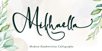 Mikhaella is a beautiful light handwritten font with a unique feel and looks stunning. It will add a luxury spark to any design project! This font is PUA encoded which means you can access all of the amazing glyphs and swashes with ease! It also features a wealth of special features including alternate glyphs and ligatures.
 - Antiphon by Gustav & Brun,
$18.00 Created to illustrate the frustration of a punk band, the fear of a gigantic Blob in a small Michigan town, Kurt Vile, the scariness of a totally awesome party, your local band at your local pub, the awkwardness of Satan, your voice and some other super rough stuff. All caps. At Least every common letter x 2.
 - Drop Dead Gorgeous by Hanoded,
$22.00 Drop Dead Gorgeous is a slightly slanted all caps Brush font. I made it with the last of my Chinese ink (I ordered a new batch, it should arrive tomorrow). Drop Dead Gorgeous is a very legible font, ideal for headlines, posters and book covers. Comes with alternates for lower case letters and a truly breathtaking amount of diacritics.
 - Cyclic Sans by ArtyType,
$25.00 Cyclic Sans is a legible and highly distinctive type family in four weights, running from Light to Heavy. A stoic sans, imbued with strength and charm, the fonts can be paired with their Cyclic Serif counterparts to stunning effect. Cyclic Sans is a stylish modern face and a versatile all-rounder, ideal for both text and headline use.
 - Falheiz by Sign Studio,
$20.00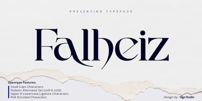 Falheiz is a stylish font that can bring classic memorial nuance. It's a mix between a classic serif and copperplate style. Falheiz comes with a full uppercase, lowercase, numbers, punctuation, ligatures and also some alternates. This font is perfect for poster, fashion magazine, branding or logotype design and displays both masculine and feminine qualities. All character are PUA encoded.
 - Black Spartan by Letterara,
$14.00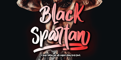 Black Spartan is a cool handwritten font with a personal charm. With quick dry strokes and a signature style, Black Spartan is perfect for branding projects, homeware designs, product packaging - or simply as a stylish text overlay to any background image. This font is PUA encoded which means you can access all of the glyphs and swashes with ease!
 - Shaman by ITC,
$29.99 Shaman is the work of British designer Phill Grimshaw and you can almost hear the drums beating when you see it. It is a bold display typeface that features a unique, fractured effect and evokes a somehow primitive quality. Shaman is an all caps alphabet which comes complete with spot illustrations, graphic devices and a border system.
 - Jossie by Olivetype,
$18.00 Jossie is a cool brush font. The style is a little bit rough, suitable for all of your logos, branding, social media, and crafty DIY projects. Features : Basic Latin A-Z & a-z Numbers Symbols, and punctuations Ligatures and swashes Multilingual support: from Afrikaans Albanian Catalan Danish to Dutch English Spanish Swedish Zulu. Accented Characters : ÀÁÂÃÄÅÆÇÈÉÊËÌÍÎÏÑÒÓÔÕÖØŒŠÙÚÛÜŸÝŽàáâãäåæçèéêëìíîïñòóôõöøœšùúûüýÿžß Thank you
 - Rustic Time by Sakha Design,
$10.00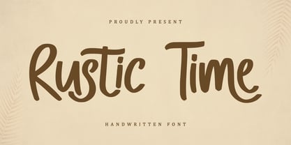 Rustic Time is a modern and casual script font that brings a retro feel to any design. Its imperfect brush strokes and playful curves give off a carefree and effortless vibe. Perfect for advertisements and designs that require a touch of nostalgia and whimsy. This font is PUA encoded which means you can access all glyphs and swashes effortlessly!
 - CA Fourty Open by Cape Arcona Type Foundry,
$29.00 CA Fourty Open is another take on the idea of a double-line font. It reminds us of neon-sings, but lifts the 50s aesthetics to a contemporary level. Although it’s an all-caps font, upper and lower cases differ a little bit. The upper cases are more open. CA Forty Open has a full Central European letterset.
 - Love Miracle by Letterara,
$12.00 Love Miracle is a beautiful light handwritten font with a unique feel and looks stunning. It will add a personal spark to any design project! This font is PUA encoded which means you can access all of the amazing glyphs and swashes with ease! It also features a wealth of special features including alternate glyphs and ligatures.
 - Shamant by Hazztype,
$20.00 Shamant is a cursive handwriting style that gives you a modern vintage vibe. It has a hand-drawn monoline font look, an excellent choice for old-school-inspired designs and modern adaptations with a handwriting look. So for all the vintage-inspired branding, logos, wedding invites, book covers, etc., this authentically flowing font is your one-stop place.
 - Compatil Fact by Linotype,
$50.99Compatil is the first comprehensive type system which enables all typographical elements to be used to full effect in order to reproduce the message conveyed by text information. Four different type styles with a total of 16 weights including italics have been merged into a unique typographical network. There are now no limits to the font user's creativity. The system is a product of technical innovation and constitutes a new design approach which meets the highest aesthetic standards. For almost two years, a team of experts from Linotype has been working with initiator Professor Olaf Leu under the direction of Silja Bilz, Erik Faulhaber and Reinhard Haus to create the Compatil type system. Despite the Internet and TV, it is essential today to be able to absorb information quickly by being able to read it with ease. A fact that is becoming increasingly important both on-screen and on paper. It is the role of the font to increase legibility and to ensure typographically perfect results for text design work. The new Compatil type system meets all these needs. The Compatil is a part of the Platinum Collection. The following four different styles are available: Compatil Exquisit, Compatil Fact, Compatil Letter and Compatil Text. Compatil is available in various font formats: 16 separate OT Pro fonts including the small caps and Adobe Central European character set for OpenType-supporting applications like Adobe InDesign, or as 32 separate OpenType Com fonts for office communication, with the following special features: 1. Optimized display capabilities for computer screens eXcellent Screen Fonts (XSF-quality). 2. An extended, international character set, which supports 48 different languages for Microsoft Office applications like MS Word or as 64 PostScript fonts, which can be used in non-OpenType-supporting applications like Quark XPress. - Compatil Fact Paneuropean by Linotype,
$103.99Compatil is the first comprehensive type system which enables all typographical elements to be used to full effect in order to reproduce the message conveyed by text information. Four different type styles with a total of 16 weights including italics have been merged into a unique typographical network. There are now no limits to the font user's creativity. The system is a product of technical innovation and constitutes a new design approach which meets the highest aesthetic standards. For almost two years, a team of experts from Linotype has been working with initiator Professor Olaf Leu under the direction of Silja Bilz, Erik Faulhaber and Reinhard Haus to create the Compatil type system. Despite the Internet and TV, it is essential today to be able to absorb information quickly by being able to read it with ease. A fact that is becoming increasingly important both on-screen and on paper. It is the role of the font to increase legibility and to ensure typographically perfect results for text design work. The new Compatil type system meets all these needs. The Compatil is a part of the Platinum Collection. The following four different styles are available: Compatil Exquisit, Compatil Fact, Compatil Letter and Compatil Text. Compatil is available in various font formats: 16 separate OT Pro fonts including the small caps and Adobe Central European character set for OpenType-supporting applications like Adobe InDesign, or as 32 separate OpenType Com fonts for office communication, with the following special features: 1. Optimized display capabilities for computer screens eXcellent Screen Fonts (XSF-quality). 2. An extended, international character set, which supports 48 different languages for Microsoft Office applications like MS Word or as 64 PostScript fonts, which can be used in non-OpenType-supporting applications like Quark XPress. - Compatil Letter by Linotype,
$50.99Compatil is the first comprehensive type system which enables all typographical elements to be used to full effect in order to reproduce the message conveyed by text information. Four different type styles with a total of 16 weights including italics have been merged into a unique typographical network. There are now no limits to the font user's creativity. The system is a product of technical innovation and constitutes a new design approach which meets the highest aesthetic standards. For almost two years, a team of experts from Linotype has been working with initiator Professor Olaf Leu under the direction of Silja Bilz, Erik Faulhaber and Reinhard Haus to create the Compatil type system. Despite the Internet and TV, it is essential today to be able to absorb information quickly by being able to read it with ease. A fact that is becoming increasingly important both on-screen and on paper. It is the role of the font to increase legibility and to ensure typographically perfect results for text design work. The new Compatil type system meets all these needs. The Compatil is a part of the Platinum Collection. The following four different styles are available: Compatil Exquisit, Compatil Fact, Compatil Letter and Compatil Text. Compatil is available in various font formats: 16 separate OT Pro fonts including the small caps and Adobe Central European character set for OpenType-supporting applications like Adobe InDesign, or as 32 separate OpenType Com fonts for office communication, with the following special features: 1. Optimized display capabilities for computer screens eXcellent Screen Fonts (XSF-quality). 2. An extended, international character set, which supports 48 different languages for Microsoft Office applications like MS Word or as 64 PostScript fonts, which can be used in non-OpenType-supporting applications like Quark XPress. - Compatil Text by Linotype,
$50.99Compatil is the first comprehensive type system which enables all typographical elements to be used to full effect in order to reproduce the message conveyed by text information. Four different type styles with a total of 16 weights including italics have been merged into a unique typographical network. There are now no limits to the font user's creativity. The system is a product of technical innovation and constitutes a new design approach which meets the highest aesthetic standards. For almost two years, a team of experts from Linotype has been working with initiator Professor Olaf Leu under the direction of Silja Bilz, Erik Faulhaber and Reinhard Haus to create the Compatil type system. Despite the Internet and TV, it is essential today to be able to absorb information quickly by being able to read it with ease. A fact that is becoming increasingly important both on-screen and on paper. It is the role of the font to increase legibility and to ensure typographically perfect results for text design work. The new Compatil type system meets all these needs. The Compatil is a part of the Platinum Collection. The following four different styles are available: Compatil Exquisit, Compatil Fact, Compatil Letter and Compatil Text. Compatil is available in various font formats: 16 separate OT Pro fonts including the small caps and Adobe Central European character set for OpenType-supporting applications like Adobe InDesign, or as 32 separate OpenType Com fonts for office communication, with the following special features: 1. Optimized display capabilities for computer screens eXcellent Screen Fonts (XSF-quality). 2. An extended, international character set, which supports 48 different languages for Microsoft Office applications like MS Word or as 64 PostScript fonts, which can be used in non-OpenType-supporting applications like Quark XPress. - General by Juraj Chrastina,
$29.00 It's all about these subtle nuances that make a neutral sans typeface different. Pure geometry with a human touch is a recipe that works in every generation. Inspired by classical fonts from the early 20th century, General rides the line between traditional and modern styles. With its 5 light weights, the General family is a strong tool for a clean design.
 - Sol Supremo by Prestige Artsy Studio,
$19.00 Introducing "Sol Supremo," a stunning all caps serif font that combines elegance and modernity with a touch of nostalgia. With its clean lines and confident curves, this aesthetic typeface brings a fresh perspective to any design project. Whether it's for a sleek logo, striking headlines, or stylish print materials, Elevate adds a touch of sophistication, elevating your visuals to the next level.
 - Policy Gothic by E-phemera,
$20.00 Policy Gothic is derived from the boilerplate on a vintage insurance policy, and in a former life may have been Engraver's Gothic or something like it. A rough all-caps sans serif, it's great for designing forms and other "official" paperwork with a vintage feel. The font features a full international character set including various currency and other commercial symbols
 - Rosy Lee by Hanoded,
$15.00 Rosy Lee is Cockney slang for a cup of tea - which I drank when it was time to come up with a name for my new font. Rosy Lee (the font) is a 3D typeface with a lot of character. Would look great on posters, packaging (maybe even tea) and book covers. Comes with all the diacritics. So... Fancy a Rosy, luv?
 - Xikas by Twinletter,
$15.00 XIKAS is the newest font in our gothic series, featuring a classic and elegantly designed typeface. With a classic design, this font uses striking details to exude a confident elegance that appeals to all genders, ages, and tastes. It can be used in a variety of projects to create an attractive vintage and elegant style that evokes elegance, luxury, and a strong personality.
 - Plop by Gleb Guralnyk,
$14.00 Presenting a decorative liquid font Plop. It's a splashing funny typeface perfect for authentique lettering composition. To use a bigger splash letter just type a capital letter. Same way the last letter in word will be automatically replaced to correct glyph using OpenType features. Both sides splashes are available for all letters including multilingual characters. Thank you and have a nice day!
 - Merijola by Letterara,
$12.00 Merijola is a fresh and bold script font with a lot of personalities. It’s cute and bold, This will give a beautiful impression that stands out for your designs. Merijola makes a friendly feel to any design project! This font is PUA encoded which means you can access all of the cute glyphs with ease! It also features a wealth of including ligatures.
 - Platipus Script by Areatype,
$15.00 Platipus Script A sweet handlettered font, casual and dynamic with a dancing baseline.. all to add an authentic touch to your designs. perfect for Branding, Logos, Greeting Cards, Wedding Stationery, Quotes etc. It comes with a handy set of Opentype Stylistic Alternates, Ligatures and multiple language support. To enable the OpenType Stylistic alternates, you need a program that supports OpenType features such as Adobe Illustrator CS, Adobe Indesign & CorelDraw X6-X7, Microsoft Word 2010 or later versions. Files included: These coded with PUA Unicode. Mac users can use Font Book and Windows users can use Character Map to view and copy any of the extra characters to paste into your favourite text editor/app. How to access all alternative characters, using Windows Character Map with Photoshop: https://www.youtube.com/watch?v=Go9vacoYmBw How to access all alternative characters using Adobe Illustrator: http://youtu.be/iptSFA7feQ0nn Thanks so much for looking, I really hope you enjoy it and please don't hesitate to drop me a message if you have any issues or queries :)
 - Witch Hazel by Missy Meyer,
$16.00 Witch Hazel has been quite a while in the making; a fun font with slightly flared serifs, lots of ligatures and alternates, and over 1150 glyphs! This font is great for holiday designs, from Valentine's Day to Halloween to Christmas! It also bridges modern and vintage styling, so you can use it for fairy tales and pirates, or for your company's branding and logo! I just couldn't stop adding more and more to this font. Witch Hazel includes: - The usual A-Z, a-z, 0-9, and tons of punctuation; - Greek uppercase letters; - Cyrillic uppercase letters; - Over 430 extended Latin characters; - Small caps; - Decorative alternates for all letters (some letters have up to 8 alternates!); - Numbers and uppercase letters with pointy spurs; - Numbers and uppercase letters with rounded spurs; - 40 two-letter ligatures! All characters are OpenType coded and PUA-encoded, so they can be accessed by all design programs. And I'm including a PDF with the full character list; you can use it for reference, or you can copy/paste directly from the PDF into your project!
 - Campana Script by Mans Greback,
$79.00 Campana Script is your go-to for classical elegance. Picture walking into an old bookstore and discovering a handwritten love letter tucked inside a dusty novel. This font brings that level of intimacy and nostalgia to your designs. Designed with heavy lines and intricate swashes, Campana Script suits formal applications like wedding invitations, certificates, and classic logotypes. Use underscore _ to make a swash. Example: Deco_rative Use multiple underscores to make different underlines. Example: Candy__shop Campana Script is built with advanced OpenType functionality and has a guaranteed top-notch quality, containing stylistic and contextual alternates, ligatures, and more features; all to give you full control and customizability. It has extensive lingual support, covering all Latin-based languages, and includes all the characters and symbols you'll ever need. Behind this exquisite creation is Mans Greback. Known for pushing the boundaries of type design, Greback has ventured into the intricate intricacies of aesthetic diversity with Campana Script. His portfolio is a testament to his versatility and daring, turning simple alphabets into powerful visual narratives.
 - Barcis by insigne,
$24.75 Take your reader far away to a tropical morning, where the inviting aroma of a fresh roast introduces them to a gentle breeze and the first, warm light of day. Take them there with Barcis. This organic face with its tall x-height and neo-humanist attributes shows its free spirit through unique terminals, calligraphy-inspired strokes, and a rich variety of OpenType alternates All insigne fonts are loaded with OpenType options. Barcis is geared up for pro typography. The font features many numeral sets, with fractions, old-style figures, superiors and inferiors. OpenType-capable programs like Quark or the Adobe suite allow you to quickly change ligatures and alternates. You can see these options shown in the .pdf brochure. Barcis also features the glyphs to aid a variety of languages, together with Central, Eastern and Western European languages. In all, Barcis supports around forty languages that utilize the Latin script, earning Barcis the pick for for multi-lingual publications and packaging. Barcis features three different widths and seven weights from exceptional Light-weight to dense Black. Each of these individual fonts offers its own authentic italics and alternate glyphs as well. With its high versatility, Barcis is without a doubt an amazing titling font, a great choice for journals, a solid option for web use, or even for clearly defining your mark in logotype. Bring Barcis into your library, and use it to carry your audience away.
 - Brannboll Fet - Personal use only

