10,000 search results
(1.476 seconds)
- Lecture Hall JNL by Jeff Levine,
$29.00 Lecture Hall JNL is a reworking of Dance Hall JNL. By removing the Art Deco flairs and realigning the horizontal strokes in order to create a more traditional design, the font now takes on the look of a classic headline face.
 - Schmale Anzeigenfraktur by RMU,
$25.00 The idea of creating this font is based on Koch’s Schmale Deutsche Anzeigenschrift which was released in 1923 by Klingspor in Offenbach, Germany. This font was entirely redrawn and completed with the help of a few basic letters and the numerals.
 - Union by Alias Collection,
$60.00 A softer, streamlined and more elegant development of the ideas originally explored in Jude. Incised letterforms are now rounder and more intuitive, less geometric. Union is a modern classic‚ typeface, avoiding quirky idiosyncrasies to produce a useable and highly contemporary type.
 - Revolver by Device,
$39.00 Designed for the seminal comics magazine of the same name, Revolver was one of Rian Hughes’ first typeface designs. Originally published as part of the FontFont range, it has now been remastered and includes full European glyph support and Opentype features.
 - Office Work JNL by Jeff Levine,
$29.00 The 1965 film “Mirage” had its titles and credits hand lettered in a simple, thin sans serif with rounded corners and an overall square design. This is now available digitally as Office Work JNL, in both regular and oblique versions.
 - Wine Vat Stencil JNL by Jeff Levine,
$29.00 An image of a vintage metal stencil for the French wine region Côteaux du Tricastin [now Grignan-Les Adhemar] served as the inspiration for Wine Vat Stencil JNL. This condensed sans serif design is available in both regular and oblique versions.
 - Cattlebrand by Holland Fonts,
$30.00Based on sketches of an alphabet from examples of South Western cattle brand marks. I always liked the idea of these brands for a font. A few years later a basic font - just the capitals - was used for some logo designs. - Evergreen by Sudtipos,
$39.00 Evergreen is Koziupa and Paul going all Zeitgeist after a few Malbec drinks. Two fonts praise nature from when the lights go out to the crack of dawn, and vice versa. That's 24/7/365 of wild leafy Kumbaya. Even butterflies and flowers were mystified so much they had to get in there. Evergreen is local, organic, and certified free trade. At some point we wrote down the name of the jungle where it originated, then lost the parchment in the hot springs a few hours later. But that's immaterial. Crank up your Deep Forest sound, prep your Earthtone and Foliage palettes, and get into the big herbal.
 - Mode by Daggertypo,
$24.00 Mode is a typographic experiment exploring how same sans serif form adapts to different circumstances and what are the possibilities in variations of Thin / Black, Contrast / Negative contrast. Two main groups are Mode 0 (with rounded shapes) and Mode 1 (with angular shapes). Each of them varies from Thin to Black in six cuts, in the same manner it varies from contrast shapes to negative contrast. Mode comes in total of 72 cuts regular and italic, it speaks majority of Latin based languages and is equipped with smcp, c2sc, Old style and all caps numerals. Mode is made by DAGGERtypo during a period of 2019/2020
 - Trade Convention JNL by Jeff Levine,
$29.00 An ad for the annual Variety Club Convention appeared in the March 18, 1940 issue of "The Film Daily. The main headline was hand lettered in a classic Art Deco "solid" style of sans serif - ultra bold and with no counters - but had one additional feature: 'engraved' lines to the left of each character. This has now been expanded into the digital typeface Trade Convention JNL, which is available in both regular and oblique versions. Variety Clubs (now know as Variety - The Children's Charity) was founded in Pittsburgh, Pennsylvania in 1928 by entertainers specifically to aid children. Their history can be found at https://variety.org/who-we-are/history
 - Tournedos by Hanoded,
$10.00 The other day, I was cooking a curry and I suddenly realised that we, as a family, eat a lot of meat. At home we do like meat, but given the state our world is in right now, we cannot continue eating meat like there is no tomorrow. As a result, I am hunting the internet right now for good vegetarian recipes (if you have one you’d like to share, then please contact me!). Tournedos is a beefy font family: a chunky all caps set of fonts - and a leaner set to counter and complement this rather heavy dish. And do eat your greens!
 - Faber Fraktur by Ingo,
$22.00 A modern black-letter, so to speak. Composed of a few basic elements with a wide-quill ductus. Faber Fraktur was based on the idea that it must be possible to create a modern black-letter type. The typeface is ”constructed“ according to the same principles as a script without serifs: as few varied basic forms as possible, omission of frills which make the type difficult to read and repetition of similar forms. The typical contrasting strokes of the original handwritten black-letter script are retained nonetheless. The elements of this typeface were even pre-formed with the quill. All characters are reduced to their basic skeleton. The fanciness and manifold ”breaks“ or fractures typical of black-letter typefaces are considerably reduced to just a few essentials. Faber Fraktur is a very legible type perfectly suitable for long texts. It does not appear nearly as foreign and archaic as the old black-letter fonts. The capital letters especially have a charm of their own radiating a kind of playfulness in spite of their severe form.
 - Diskun - Unknown license

- Pogba by Mr. Typeman,
$14.00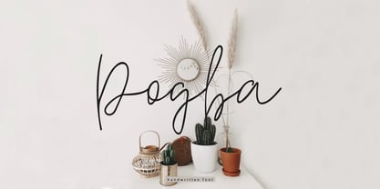 Pogba is a stylish calligraphy font with an amazing and natural style. Pogba is perfect for branding & logo projects, also suitable for packaging, wedding invites and cards and so on.
 - Credititle by Jonahfonts,
$29.95 A condensed tall upright font with lowercase small-caps. Basically designed for movie posters. May also be used for a variety of tight-fitting type designs, from packaging to captions.
 - Hebrew Europa by Samtype,
$125.00 Beautiful font, good for posters, books, and folders. This is a complete font with all diacritic marks (Nikud and Taamim) and also Shevana, Kamatz Katan, Dagesh Chazak and Holam chaser.
 - Not Your Droids by Thomas Käding,
$5.00 A clean and easy to read Aurebesh font, in the style used at the Droid Depot at Disney's Hollywood Studios. This style is also called Droidebesh. Have fun with it.
 - Arvada JNL by Jeff Levine,
$29.00Arvada JNL is Jeff Levine's interpretation of a classic wood type font. Bold, brash and best at large point sizes, this font design also blends well with sports-themed projects. - Gans Radio Lumina by Intellecta Design,
$1.00See also other font families inspired by Gans' original typefaces: Gans Tipo Adorno , Gans Lath Modern , Gans Titular Adornada , Gans Ibarra , Gans Antigua , Gans Antigua Manuscrito and Gans Fulgor . - Island Sans by BA Graphics,
$45.00A beautiful face that really works well for any application a distinguished clean look. Headlines, subheads and text anything goes. Will also work as a bolder version of California Sans. - Turmeric by Atlantic Fonts,
$26.00 Turmeric’s spicy, hand-cut edge is zesty in all-caps, and flavorful in lowercase. It’s also rich with discretionary ligatures for a convincing handmade look. Are there health benefits? Maybe.
 - Audrey Mirages by Sarid Ezra,
$15.00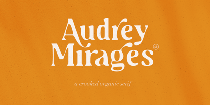 Audrey Mirages is a crooked styled serif that will make your design feels more organic and handmade. This font contains alternates and ligatures. It is also PUA Encoded. Happy Creating!
 - Minty March by Angele Kamp,
$24.00 Minty March is an adorable handwritten font that is perfect for cards, invites, birthday invitations and more. This condensed, serif also works well when combining it with a script font.
 - Moftein Sough by Martype co,
$15.00 Moftein Sough Is a condensed serif font pairing with playful dingbat to make it satisfying, also suitable for minimalist, chic, branding, packaging and merch design to boost your design exploration.
 - Particela by Putracetol,
$20.00 Particela - Display Font. Particela is a display style font. The classic, fun and groovy impression is very visible. But in Particela I combine several variations such as the ligature. Particela is inspired by vintage albums and posters from 1960s music bands. It makes this font even more unique and different. Particela is also great for any kind of display purpose from album, cover,poster, label, tshirt, apparel, signage, quote, logo, greeting card,logotype and many more. Particela is also support multi language. The alternative characters were divided into several Open Type features such as Swash, Stylistic Sets, Stylistic Alternates, Contextual Alternates, and Ligature. The Open Type features can be accessed by using Open Type savvy programs such as Adobe Illustrator, Adobe InDesign, Adobe Photoshop Corel Draw X version, And Microsoft Word. This font is also support multi language.
 - Altaria Miguel by Rillatype,
$15.00 Introducing, my latest font. Altaria Miguel! Altaria Miguel is an elegant and modern sans serif font. altaria miguel can offer a thin font with a modern look that's perfect for your various design needs from headline, branding, logo, advertisement, product design, etc. Altaria Miguel was created with great care and precision with the aim of none other than to make this font perfect as a font that can be used in a variety of needs. The kerning in this font is also done with great care to maintain the perfection of this font. In addition, Altaria Miguel also provides a slanted version which is also re-kerned separately to get maximum kerning results. There it is. We really hope that you enjoy this font, and please feel free to reach me if you have any question. Thank You!
 - Briliond by Ardyanatypes,
$15.00 Briliond has an aesthetic style, and the serif-type tagline is modern and elegant. This font is equipped with ten levels of thickness, from thin to black suits your needs. Briliond is also equipped with the latest professional characteristics that can present an elegant and attractive identity for your company or project for business purposes. It goes well with modern serifs, and scripts depicted or stand firm as a title and brand representative for an elegant look. Briliond also comes with multiple languages, making it easy for any country and language use. It also comes with alternative Ligatures and styles to make your designs more attractive. Briliond is suitable for branding projects and various design purposes such as business cards, name tags, and uniforms as a brand enhancement. Advertisements, posters, invitations, branding, logos, magazines, merchandise, presentations, etc.
 - Yunyun by Jipatype,
$27.00 Yunyun, a bold, rounded, and fun display font that is perfect for about teenagers project, with thick strokes and smooth, curved lines, this font conveys a sense of warmth and approachability. This font is perfect for branding, advertising, and marketing materials targeting teenagers. One of the best features of Yunyun is that it supports multiple languages, making it perfect for use in global projects. It also includes many OpenType features such as Small Caps, this feature will add more variations design to your project. Yunyun's design is also perfect for creating eye-catching and attention-grabbing headlines, posters, flyers, and packaging designs. This font is also suitable for more artistic and creative projects like book covers, album covers, and more. Whether you're a designer, a marketer, or just someone looking for a fun, teenager-friendly font, Yunyun is an excellent choice.
 - Le Rock by URW Type Foundry,
$39.99 Le rock is the newborn sister of my first typeface Jazmo and a relative of my music-inspired font family. Le Rock seems to wiggle and jiggle a little as if it invites you to dance. This is caused by the gaps in the individual characters. The typeface can also be seen as eroded, carved and sculpted by mother nature. But besides, the design of Le Rock can also be associated with the characteristics of stones: Solid and since ever, here, there and everywhere. To walk on, lean against, to be surrounded by, to build with and to shelter in. It cannot be denied, that there are also some comic art influences. The font is outspoken enough to be used in any form of graphic design, like poster and flyers, but at the same time it remains readable enough for longer texts.
 - Aloalla by Putracetol,
$28.00 Aloalla is Decorative Retro Sans Serif Font. This font also goes into a classic style, with a neat and soft shape. There is a rough/texture version too. I strengthen the vintage/retro impression with the character ligatures, there are 118 ligatures in this font. But if you want to use this font with a neater impression, you can disable this ligature feature. This font is perfect for projects with vintage/retro and classic themes. But this font is also suitable for logos, branding, greeting cards, invitation cards, advertisements, titles, healines, book titles, stickers, packaging, quotes, posters, t-shirts/apparel, billboards and others. This font is also support multi language. To access the alternate glyphs, you need a program that supports OpenType features such as Adobe Illustrator CS, Adobe Photoshop CC, Adobe Indesign and Corel Draw.
 - Mamute by PintassilgoPrints,
$18.00 Mamute is a block rockin' family with a cool letterpress look. Its upper- and lower-case slots hold glyphs with slightly different textures for a natural look. Numbers and punctuation marks also have alternate versions. Just trigger the Contextual Alternates feature to easily cycle the alternate glyphs, preventing double letters from displaying the same texture. Mamute is a highly decorative typeface available in 2 widths, regular and condensed, each also offered as a layered font, a handy and playful way for adding shades to your composition. There’s also a generous ornaments font and a catchwords one to spice up your designs. Mamute is based on Aldine wood type spirit (as there were many incarnations of it!), from circa 1870. Please note that this family has a limited character set and doesn't bring diacritics nor accented characters. But yet it does rock, you bet!
 - Hawking by Latinotype,
$39.00 Hawking is a slab typeface with slightly squarish shapes and a rational, modern look. The font has a minimal modulation, generous counterforms and relatively large x-height with lowercase ascenders extending above the cap-height for more legibility. Serifs are composed of curved and straight lines, which give the font a robust appearance and strong personality. Hawking was specially designed for use in scientific publications (hence its name), but it can also be used with other type of continuous text, such as journalistic, technical or literary texts. Its heavier weights make it also well-suited for any display use (e.g. headlines) Hawking comes in 8 styles: 4 weights plus matching true italics. The font also includes ligatures, proportional oldstyle figures, and tabular and lining figures. The family comes with the Latinotype’s standard character set that supports 213 different languages.
 - Kiperman by Harbor Type,
$29.00 🏆 Selected for Tipos Latinos 9. 🏆 Selected for the 13th Biennial of Brazilian Graphic Design. 🏆 Hiii Typography 2018 Merit Award. Kiperman is a text typeface designed in honor of Henrique Leão Kiperman, founder of the publishing house Artmed, now Grupo A. Its forms are simple and straightforward, with no unnecessary embellishments that could disturb the reading. The fonts are slightly narrower than normal, which yields higher efficiency without compromising reading comfort. Besides that, its italics are not just a slanted version of the romans, but rather a separate drawing. With a slope of 8°, its calligraphic structure provides the right amount of emphasis when necessary. The Kiperman typeface works best when setting books, magazines, ebooks and websites. It will also work very well in branding and packaging projects where a sober typeface is needed. The inspiration for the design came from the personality of the honoree. Just as Henrique always wanted to stay away from spotlights, the Kiperman typeface was designed so that it would not call attention to itself or impose any obstacles in the understanding of the text. In this way, the fonts revere Henrique’s legacy by respecting and honoring the published content. Henrique Leão Kiperman began his career in 1958, selling medical books in travels through the interior of the Brazilian states of Paraná and Santa Catarina. In 1973, he opened a bookstore in downtown Porto Alegre, the Artes Médicas Sul, and a few years later edited his first book. Since then, his company has grown to become one of the most important publishers in Brazil in the area of scientific, technical and professional books, with more than 2400 active titles distributed among the McGraw Hill, Bookman, Artmed, Penso and Artes Médicas imprints. Henrique passed away in 2017 at the age of 79. The Kiperman type family has been commissioned by Grupo A and is available for licensing. This was the way found for the fonts to be read by more people, spreading some of his spirit around the world.
 - Amor Serif by Storm Type Foundry,
$55.00Antique monumental incriptional majuscule, originally carved in stone, and sometimes called “Roman Capital”, is the origin of the upper-case part of our latin alphabet. Its narrowed form, derived from handwritten originals used between the first to third century A. D., served as the inspiration for the Mramor typeface, which I drew with ink on paper in 1988 under Jan Solpera’s leadership. After composing negative letters on a strip of film it was possible to use Mramor with the early phototypesetting devices. In 1994 with the help of Macintosh IIvi I added the lowercase letters and bolds, and issued this typeface as 14-font family. After some years of using Mramor for various purposes, I realized a need of modernization and humanizing its very fragile appearance, as well as removing numerous decorative and useless parts. Besides that, type design made a huge technical progress in past few years, so I was able to finish the remaining approximately 9600 glyphs contained in the present font system named Amor. It is already usual to combine sans and serif fonts within one family in order to distinguish (e. g. in a book) historical part from contemporary, a plain chapter from a special one, or, in quotations, to divide speaking persons. Sans-serif typefaces don't arise by simple removal of serifs; they have to be drawn completely separately, when occasionally many declined forms may be made, considered to the serifed original. Nevertheless, both parts of this type system appear consistent as for proportional, aesthetic and emotional atmosphere. Usage of type is often closely linked to its original inspiration, in this particular case with architecture and figurative sculpture. An inner “order” was also text setting in smaller sizes. A smooth scale of weights enriches the possibilities in designing of magazines, brochures, exposition catalogues and corporate identity. Economizing, but opened shape of characters is well legible and antique hint comes into play after longer reading. - Gabriel Bautista by Comicraft,
$29.00 Comix Gorilla GABRIEL BAUTISTA is the artist of John JG Roshell's CHARLEY LOVES ROBOTS series. His incredible watercolors graced the pages of ELEPHANTMEN #50. In some circles he is known as "Galvo" or "Gabo" and he has brought his brofu color skills to the pages THE SPIRIT, ALL STAR WESTERN and also illustrated JESUS CHRIST, IN THE NAME OF THE GUN. He is also the creator of comic battling site ENTERVOID.COM and indy press PULPOPRESS.COM. He loves his girl, his dog lulu and his font.
 - Belladonna by Atharuah Studios,
$18.00 Introducing Belladonna! A stylish hand-drawn script font. Carefully designed to display natural and flawless writing. Belladonna is also supported by the addition of 61 ligatures to display an authentic and elegant quality. With this font, you can beautify your various projects. Such as stylish branding & logos, packaging, handwritten quotes, merchandising, advertising, etc. That's it! I hope you enjoy it. Feel free to comment if there are issues or queries. You can also say hello to me on Instagram: https://www.instagram.com/atharuah_ Thank You!
 - Martabat by Wildan Type,
$13.00 Martabat is an monoline script font wich natural movement. I made this font inspired by the concept of simple signature and made it into a modern yet clean style. I also added some ligatures and alternatives swashes that are very interesting when applied. This font is perfect for creating signature logos or just watermarks for your photography studio or print templates like posters, branding, quotes, or anything else. Alternative and swash characters are also available. Very recommended to use in Adobe Illustrator, Adobe Photoshop, CorelDraw.
 - Scarf Bandana by Putracetol,
$26.00 Scarf Bandana is a Brush Display Font. These fonts can be categorized into brush and display fonts. With a unique character, this font will make your project stand out. Suitable for logos, branding, crafting, svg, book covers, posters, headlines, labels, t-shirts and more. This font also has 92 ligatures, so it will make this font more interesting and unique. This font is also support multi language. This font can be used and supported in various programs and OS, such as procreate, cricut, windows, macOS and others.
 - Flipante by Resistenza,
$39.00 Our condensed to extended font is perfect for multiple uses, from branding to packaging designs. Its extendable and variable design makes it great for all kinds of projects. Its tubular shapes, ink traps and juicy curves make it both aesthetic and functional. Its condensation also allows a great flexibility, allowing you to adapt it to any project's need. Its versatility also makes it great for both print and digital projects. With this font's easy to use features, your designs will look good on any project or medium.
 - Adoria by Sarid Ezra,
$17.00 Adoria is a minimalist logo font with unique edge that will make your logo and design looks more simple and modern. With the unique characteristic lowercase, this font can make your logo even more stunning. You can use this font for any purpose, especially to make logotype. You can mix and match the uppercase and lowercase to make your logo more advanced. Adoria also comes with alternates that's why it's called deluxe logo font. This font also comes with number, symbol, and multilingual support!
