10,000 search results
(0.202 seconds)
- Trump Script by Canada Type,
$29.95 One of the earliest fonts published by Canada Type was Tiger Script, Phil Rutter's digitization of Jaguar, Georg Trump's 1967 wild calligraphic brush face. In 2010, when the font was revisited for an update, it was shown that it too light for applications under 24 pt, and too irregular for applications over 64 pt. So the face was redigitized from scratch. This new digitization brings a more seamless contour and a much steadier stroke, and much better outlines for use at both extremes of scaling. Language support was also greatly expanded, and many alternates and ligatures were added to the redigitized character set. The name was also changed to Trump Script, to better reflect the origins of the design. Trump Script is a master calligrapher's hand producing very uncommon jolts and bursts of sharpness. It showcases some of the most suprising letter forms ever drawn, like the very unique treatments of B, K, W, Y and Z. In the lowercase one can see the cattiest g ever made, and some of the wildest shapes in the f, j, p, y and z. Trump Script comes in all popular formats. The TrueType and PostScript packages are comprised of two fonts. The OpenType version, Trump Script Pro, combines both fonts into one, and includes features for intelligent substitution in software that supports advanced typography. Language support includes Western, Central and Eastern European character sets, as well as Baltic, Esperanto, Maltese, Turkish, and Celtic/Welsh languages.
 - Young RIEHUM by Twinletter,
$17.00 Regards! Say hello to Young Riehum, a superhero-style display font that will bring strength and tension to your projects. If you’re looking for a strong, bold, and bold font, Young Riehum is the perfect choice for creating an electrifying look in the worlds of film, gaming, and design. With a striking presence, Young Riehum grabs attention instantly and delivers an unforgettable message to your audience. Each letter exudes electrifying energy, giving your projects a new dimension and creating an extraordinary experience. In addition to extraordinary styles, Young Riehum is also equipped with features that enrich your creativity. With the available ligatures and alternative characters, you can explore a variety of unique and interesting typography combinations. Apart from that, this font also supports multiple languages, allowing you to reach an international audience with a strong and bold message. Join the forces of Young Riehum and let your every project be an epic adventure. With its stunning superhero style and special features, this font will provide unforgettable strength and tension. Don’t miss the opportunity to own Young Riehum and create extraordinary works that inspire and amaze your audience. What’s Included : File font All glyphs Iso Latin 1 Alternate, Ligature Simple installations We highly recommend using a program that supports OpenType features and Glyphs panels like many Adobe apps and Corel Draw so that you can see and access all Glyph variations. PUA Encoded Characters – Fully accessible without additional design software. Fonts include Multilingual support
 - Mi Negra by Letritas,
$25.00 Mi negra is a funny and hilarious typography designed especially for children, thought and created by Isabel de Gregorio. It could be described as an original combination between a semi-handwright and semi sans-serif font. Thanks to its structure and nice endings "Mi Negra" is recommended for composing short texts (logotypes, packing, posters, etc.). It may similarly be used for illustrations and comics, as well as in printing press works for children from 6 to 13 years old for instance. Mi Negra has been conceived to be a useful support in all kinds of illustrations works (please note that Isabel, the type designer, considers herself primarily an illustrator). The font designer of Mi Negra tells that every time she needed to provide some text data (i.e. in children infographies) and needed to make them more understandable and suitable for children, she used this typography. The former idea was than to create a font who could be a second option to comic sans, but as the project started to reveal its forms, it was clear that it was revealing another connotation and its own character. In this way, Mi Negra went on modifying its forms and the more it developed, the more it was showing its new characteristics and concepts. The family is composed of three weighs: Light, regular and black. It provides also interesting functional ligatures. It also includes a dingbat with nice doggies. It has 434 characters and can work with 208 languages.
 - Awards by Sarid Ezra,
$17.00 Introducing, Awards, a stylish and unique all caps sans! Awards is a modern and styled typeface based on sans. Including unique lowercase that will compliment your branding and logo. The stylish ligature also included in this font that will make your design even more stunning. Also including starry alternates for additional. Awards also support multilingual.
 - JP MultiColour by jpFonts,
$29.90 Multicolored Fonts Many years ago, when Xerox Corporation still had its own font department, I came to Los Angeles in 1985 to train the IKARUS program. One day Bill Kienzel, head of the Xerox font department at the time, said we should go to the Hollywood Hills together; he knew people there who were experimenting with multicolored fonts. After a little wandering through the winding streets of the many hills, we reached a somewhat overgrown, simple family house standing under trees. A group of very inspired designers were waiting for us there. They immediately showed us the works they created using photomechanical tricks. They were fascinating. The American colors and the whole look seemed noble and enchanting. The problem was that this process was very difficult to implement and required a lot of effort on individual letters. They dreamed of a colored font that could be used for normal typesetting. We thought back and forth about how to save the individually colored letters in a common font, but soon gave up because we didn't see a technical option. So this idea and the memory of the time in Hollywood lay dormant in the back of my mind for many years, until at the beginning of this year 2023 I received an order to produce an outline typeface and the story came back to me. Suddenly I knew how to solve the problem from back then: if only the areas that should have the same color in all letters were saved in their own separate fonts, they could be colored independently of each other and later placed on top of each other. I implemented this in the 5 fonts that are now available with the 3 variants “Outside”, “Middle” and “Inside”. Together with the background, 4 colors can be combined with each other. This method works in text programs such as Word or InDesign. In Photoshop or Illustrator, the individual surfaces can also be colored by converting them into paths if the additional “Complete” variants (which contain all 3 contours) are used. There is also a “Basic” variant that can be used to achieve special effects such as overlay, bleed, etc. The first 5 fonts in this series are all based on the principle of contouring. Anyone who claims that you don't need any special fonts because they can be created automatically from any font using common programs is wrong or is only telling only half the truth. Anyone who has ever dealt with this knows that many individual adjustments to the design are necessary after contouring. This has happened in the 5 fonts that are now available and have very different styles. The dream from back then has come true. The user can set any text, long or short, in multiple colors, freely design the color scheme and apply all the usual typographic settings. Volker Schnebel, November 2023
 - Ollie by Eclectotype,
$40.00 Meet Ollie, a casual signage script whose friendly, bouncy exterior belies a heart of sophisticated OpenType programming. This font is designed to make the most of OpenType savvy applications, and as such is recommended for professional design use. Or to put it another way: Make sure that contextual alternates and ligatures are always turned on! Ollie includes about 900 glyphs, many of which are automagical substitutions to keep the text flowing smoothly, and to pseudo-randomly pick different glyphs to avoid repetition. With contextual alternates turned on (as they should be by default), most lowercase letters will alternate between at least two different forms. The powerful OpenType programming makes the font itself ‘look back’ (up to eight characters) on previously used letters; typing “banana” will give you three different a’s and two different n’s (the last a is a special ‘end form’ character). The calt feature controls many other ‘special effects’ which all add together to give a smooth-flowing, hand-lettered look. These effects include start and end forms (and indeed, ‘loner’ forms) of many letters, which are automatically substituted in at beginnings or ends of words, or when the previous or next letter doesn't connect. Another special feature tests to see if there is room for the crossbar of t (or tt ligature) to extend further over the previous or next letter, or both, as is often the case. The last main effect of the calt feature is to substitute certain letters typed before any ‘e’ character, to make for a more natural connection (see the pe combination in ‘Eclectotype’ in the first poster). Ligatures should be on by default, for a much nicer looking tt combination, and a few others besides. The swash feature should be used sparingly (one glyph at a time, really) to apply a more extravagant look to g,j and y in the lower case, and quite a few of the upper case too. Oldstyle figures are included, as well as the lining defaults. Now to delve into the stylistic alternates... These are all included in the salt feature, or for uses of applications that support them, separated into stylistic sets thus: ss01 - (with swash feature on) L and G swashes get even swashier. ss02 - standard s changes to a connected script s form. ss03 - r takes on a script form. ss04 - z also gets a scriptier look. [the previous three sets also change any versions of s, r or z with diacritics] ss05 - a useful underline function. When enabled, typing two or more underscores will extend a cool underline under the previous letters. More underscores = longer underline. ss06 - the Polish script lslash changes to its more standard form. ss07 - E, S and B change to a more top-heavy alternate form. ss08 - An alternate form for A characters. ss09 - Alterative rounder forms of M and N. ss10 - An alternate ampersand. That about wraps up the features. Now all that’s left is for you to license the font and get experimenting!
 - Sweet Square by Sweet,
$39.00The Engraver’s Square Gothic—like its rounder cousin, the engraver’s sans serif, Sweet® Sans,has been one of the more widely used stationer’s lettering styles since about 1900. Its minimal forms, made without curves, were popularized long ago by bankers and others seeking a serious, established feel to their stationery. One might argue that the design is a possible precursor to Morris Fuller Benton’s Bank Gothic® typeface. Sweet® Square is based on antique engraver’s lettering templates called “masterplates.” Professional stationers use a pantograph to manually transfer letters from these masterplates to a piece of copper or steel that is then etched to serve as a plate or die. This demanding technique is rare today given that most engravers now use a photographic process to make plates, where just about any font will do. But the lettering styles engravers popularized during the first half of the twentieth century remain both familiar and appealing. Referencing various masterplates, Mark van Bronkhorst has drawn Sweet Square in nine weights. The sources offered just uppercase, small caps, and figures, yet similar, condensed examples had a lowercase, making it possible to interpret a full character set for Sweet Square. Italics were also added to give the family greater versatility. The fonts are available as basic, “Standard” character sets, and as “Pro” character sets offering special characters, a variety of typographic features, and full support for Western and Central European languages. Sweet Square gives new life to an uncommon class of typeface: an early twentieth-century commercial invention that brings a singular verve to modern design. Its unique style is as useful as it is novel. Bank Gothic is a registered trademark of Grosse Pointe Group LLC. - Univers Next by Linotype,
$53.99 Linotype Univers is a completely reworked version of the original Univers typeface family designed by Adrian Frutiger in 1957. After a long process of painstakingly detailed revision, Frutiger and the design staff at Linotype completed this large joint project in 1997. The result: a brilliant and cohesive font family of 63 weights and styles including the 4 monospaced typewriter weights. All the existing weights were completely redrawn, with careful attention paid to making the proportions more consistent with each other and improving fine details such as curves and thick-to-thin stroke ratios. The family was expanded from 27 to 63 weights, providing a much larger framework to graphic designers for choosing just the right style. The bold and condensed weights were reworked for improved legibility and on-screen application. The stroke weights were revised for consistency within each face as well as in relationship to the other weights. By following Frutiger's original designs, the humanist character of the sans serif Univers now comes through more distinctly. T he systemized numbering system has also been updated. With its sturdy, clean forms Univers can facilitate an expression of cool elegance and rational competence. In fact, the strong familial relationships between all the styles and weights make it a serviceable choice for large graphic design projects that require versatility with consistency. Frutiger was successful in staying true to his initial aims; the new Linotype Univers does indeed work in longer texts as well as for display settings. In 2010 the typeface family was extended and renamed into a more logical naming of "Univers Next" to fit better in the Platinum Collection naming. Univers Next Variable are font files which are featuring two axis and have a preset instance from Light to Heavy and Condensed to Extended. Univers® Next font field guide including best practices, font pairings and alternatives.
 - Neue Helvetica World by Linotype,
$149.00 Corporate design and branding across global markets requires a universal typographic identity. The timeless, world-famous classic Neue Helvetica® typeface is now available as World fonts in the six most important styles. With support for a total of 181 languages, Monotype’s Neue Helvetica® World typeface family is suitable to meet the typographic and linguistic demands of large international brands, corporations, publishing houses, and software and hardware developers. Neue Helvetica World’s language support covers the pan-European area (extended Latin alphabet, Cyrillic and Greek) as well as Arabic, Hebrew, Armenian, Georgian, Thai and Vietnamese. The Cyrillic alphabet contains not only the standard options, but also the complete Unicode block u+0400. In addition, a large number of new global currency symbols have been included such as the Russian ruble, Turkish lira, Indian rupee and Azerbaijani manat. Neue Helvetica World is offered as OpenType font with TrueType (.ttf) or PostScript CFF (.otf) outlines. The files size are reasonably small, ranging from 140 to 270 KB depending on format and style. The uprights each include 1708 glyphs and the italics have 1285 glyphs (some scripts, such as Arabic, do not have an italic design). Typeface pairings for further global support Should the language support of Neue Helvetica World still not be sufficient for your markets, there are numerous other typefaces available which perfectly complement Neue Helvetica World. These are our recommendations for South and East Asia languages: - Devanagari: Saral Devanagari - Japanese: Tazugane Gothic or Yu Gothic - Korean: YD Gothic 100 or YD Gothic 700 - Simplified Chinese: M Ying Hei PRC or M Hei PRC - Traditional Chinese: M Ying Hei HK or M Hei HK Please contact a Monotype representative for other pairing recommendations or typographic consultations.
 - Mirantz by insigne,
$32.00 Y’all ready for this? Now starting for Insigne: the new serif Mirantz. This rookie all-star plays a precise game every game, cutting at all the right angles to leave your reader impressed and ready to see more. You can always count on Mirantz to lead with solid mechanics and a clean style, but don’t be surprised when the face keeps it real with a little individual flare and creativity. This personal touch is nothing short of elegance in every appearance. So what makes us love this rookie above the other great players in the field? Contrast, for one. Mirantz brings more contrast to the game than most serifs out there. The serifs on this face have a crisp, sharp wedge that naturally draws the reader’s eye. You can’t help but fall in love with its clean, natural style. Mirantz also features a tall x-height and regular proportions that can play a number of positions on the page and still stay strong through the last half of the copy or even the final period. Mirantz is a solid powerhouse player, containing a complete set of small capitals and nine weights from thin to bold. It can play well both down low and up top with its subscripts and superscripts and can move your reader’s eye easily across the copy with its titling capitals, condensed and extended variants, and open style figures. With its options covering more than 72 Latin-based languages, look for this newcomer to have international success in the near future. It you haven’t set your draft picks for this next round of projects, think hard before passing up Mirantz. A capable serif like this one is a guaranteed asset to any team of fonts. Production assistance from Lucas Azevedo.
 - Sweet Square Pro by Sweet,
$59.00 The Engraver’s Square Gothic—like its rounder cousin, the engraver’s sans serif, Sweet® Sans,has been one of the more widely used stationer’s lettering styles since about 1900. Its minimal forms, made without curves, were popularized long ago by bankers and others seeking a serious, established feel to their stationery. One might argue that the design is a possible precursor to Morris Fuller Benton’s Bank Gothic® typeface. Sweet® Square is based on antique engraver’s lettering templates called “masterplates.” Professional stationers use a pantograph to manually transfer letters from these masterplates to a piece of copper or steel that is then etched to serve as a plate or die. This demanding technique is rare today given that most engravers now use a photographic process to make plates, where just about any font will do. But the lettering styles engravers popularized during the first half of the twentieth century remain both familiar and appealing. Referencing various masterplates, Mark van Bronkhorst has drawn Sweet Square in nine weights. The sources offered just uppercase, small caps, and figures, yet similar, condensed examples had a lowercase, making it possible to interpret a full character set for Sweet Square. Italics were also added to give the family greater versatility. The fonts are available as basic, “/fonts/sweet/square/” character sets, and as “Pro” character sets offering special characters, a variety of typographic features, and full support for Western and Central European languages. Sweet Square gives new life to an uncommon class of typeface: an early twentieth-century commercial invention that brings a singular verve to modern design. Its unique style is as useful as it is novel. Bank Gothic is a registered trademark of Grosse Pointe Group LLC.
 - Adelle by TypeTogether,
$52.00 While Adelle is a slab serif typeface conceived by Veronika Burian and José Scaglione specifically for intensive editorial use, mainly in newspapers, magazines, and online, its personality and flexibility make it a true multipurpose typeface. Adelle’s superior screen rendering and cross-platform consistency has also made it one of our most popular webfonts. The intermediate weights deliver a neutral look when used in text sizes, providing the usual robustness expected in a newspaper font. The unobtrusive appearance, excellent texture, and slightly dark colour allow it to behave flawlessly in continuous text, even in the most unforgiving editorial applications. As it becomes larger in print, Adelle shows its personality through a series of measured particularities which make it easy to remember and identify. Its energetic character, so inherent to slab serif fonts, becomes evident when used for subheadings and headlines. A condensed series of seven weights with matching italics expand Adelle’s possibilities. This extension provides flexible solutions in situations where saving space is vital but losing legibility is not an option. The new condensed series shares the same personality, proportions, and skeleton of the Adelle family, creating an harmonious texture when combined. Be sure to check out the companion to Adelle, Adelle Sans, to complete the look of your design with the intended personality and flexibility. Awards – Third prize for Latin text typeface in the 2009 Granshan Type Design Competition – Won Gold for Original Typeface in the 2010 European Design Awards – Selected in the first Ukrainian typeface competition in 2010 – Exhibited at the Rutenia Calligraphy & Typography Festival (http://rutenia.org.ua/en/index_u.html) in Kyiv, 2010 – Selected in the 2011 Type Directors Club Tokyo Exhibition – Selected in Communication Arts 2011 Typography Annual – Selected in Yearbook of Type I, 2013 – Part of the exhibition «Call for Type» and subsequent book Neue Schriften (New Typefaces)
 - PF Bodoni Script Pro by Parachute,
$79.00 Always intrigued by Bodoni's original work, I was set out—back in 2000—to examine his work and study Manuale Tipografico, one of the greatest specimen books ever printed. Issued in 1818 at Parma, Italy by Bodoni's widow, the two-volume work shows an impressive array of 142 roman alphabets and some foreign ones such as Greek and Cyrillic. After a careful examination of all characters, I decided to create a typeface based on the distinct script capitals presented in the book. Matching lowercase italics were later selected and designed to complete the series. Since my intention was not to create simply a digital version of Bodoni's work, this typeface was designed with connected characters and capitals with extra calligraphic elements. The result was released in 2002 and published in our award-winning catalog/book IDEA/Trendsetting Typography vol.1. Later in 2005 we revived a large number of ornaments and borders (credit goes to designer George Lygas). All this work was left behind till recently when it was revisited to create a complete 'Pro' family. Several new uppercase and lowercase glyphs were designed in order to create a distinct typeface, which is based on Bodoni but yet it stands out on its own. The new version also takes care of conflicts between neigbouring letters, something that was not included in the first version. Bodoni Script Pro is a 3-weight superfamily. It supports 10 special opentype features including 'contextual alternates' as well as support for both Latin and Greek. Each font comes with 725 glyphs including a large number of alternates as well as 144 ornaments. Furthermore, when you purchase the whole package you get a bonus font which contains 120 frame parts. These parts, when put together, create some truly amazing borders. -Panos Vassiliou
 - Brag Pro by Eclectotype,
$36.00 The now discontinued Brag & Brag Stencil are hereby available as Pro fonts, with an extended character set (Latin Extended A) and Oldstyle figures. All features of the original fonts are still there, but now you can talk with Brag's signature bold look in many more European languages.
 - Modula Round and Ribbed by Emigre,
$49.00 See also Modula.
 - Ma Braille by Echopraxium,
$5.00 The "Ma" in "Ma Braille" is used as a minimalist way to say "Negative Space". "Ma" in japanese arts is an "esthetical usage of emptiness". Thus this font explicits the negative space around visible braille dots in each glyph. A. Font user guide a.1. Lowercase glyphs { A..Z } In these glyphs, dots are represented as "black squares" while the negative space is displayed as 1 or 2 white filled polygons. a.2. Uppercase glyphs { a..z } In these glyphs, dots are represented as "white squares" while the negative space is displayed as 1 or 2 black filled polygons. a.3. Digits: they are just the same than a..j, but the "North US version" is also provided in ascii codes 0xE0..0xE4 (1..5) and 0xE7..0xEB (6..0). a.5. "Dashed Border": a.5.1. "Black dashed" border glyphs; { £, ¥, µ, Â, Ä, Ê, Ë, Î, Ï, Ô } a.5.2. "White dashed" border glyphs; { Ö, Õ, °, ô, ö, î, ï, û, u, õ } B. Posters Poster 1: "Font Logo" version 1, it displays "Ma Braille" text surrounded by the "black dashed border" glyphs. Poster 2: "Font Logo" version 2, it displays "MA" glyphs in big size and smaller "Braille" glyphs within "M" and within "A" as well. Poster 3: the classical pangram to test a font "The Quick Brown Fox jumps over the Lazy dog". Poster 4: Article 1 of the Human Rights: All human beings are born free and equal in dignity and rights. They are endowed with reason and conscience and should act towards one another in a spirit of brotherhood. Poster 5: the "Glyph set" (Border glyphs not included) with A..Z, a..z, digits and special characters.
 - Agmena Paneuropean by Linotype,
$103.99Agmena™ has no historical precursor; it was designed from scratch by Jovica Veljovi? whose aim was to create a new book typeface. Although it generally has certain similarities with the group of Renaissance Antiqua fonts, it is not clearly derived from any of these. Clear and open forms, large counters and a relatively generous x-height ensure that the characters that make up Agmena are readily legible even in small point sizes. The slightly tapering serifs with their curved attachments to letter stems soften the rigidity of the typeface, bringing Agmena to life. This non-formal quality is further enhanced by numerous tiny variations to the letter shapes. For example, there are slight differences to the terminals of the b", the "d" and the "h" and minor dissimilarities in the forms and lengths of serifs of many of the letters. The tittles over the "i" and "j" and those of the German umlauts are almost circular, while the diamond shape that is more characteristic of a calligraphic script is used for the punctuation marks. Although many of these variations are only apparent on closer inspection, they are enough to give Agmena the feeling of a hand-made typeface. It is in the larger point sizes that this feature of Agmena comes particularly into play, and individual characters gain an almost sculptural quality. The italic variants of Agmena are actually real cursives. The narrower and thus markedly dynamically formed lowercase letters have a wider range of contrast in terms of line thickness and have the appearance of having been manually produced with a quill thanks to the variations in their terminals. The lowercase "a" assumes a closed form and the "f" has a descender. The italic capitals, on the other hand, have been consciously conceived to act as a stabilising element, although the way they have been inclined does not produce a simply mechanical effect. This visual convergence with the upright characters actually means that it is possible to use letters from both styles in combination. Agmena is available in four weights: Book, Regular, Semibold and Bold, and each has its matching italic variant. Veljovi? designed Book and Regular not only to provide an optical balance between various point sizes, such as between that used for the text and that used in footnotes, but also to take account of different paper forms: Regular for lined paper and Book for publishing paper. Agmena's range of characters leaves nothing to be desired. All variants include small caps and various numeral sets with oldstyle and lining figures for setting proportional text and table columns. Thanks to its pan-European language support, Agmena can be used to set texts not only in languages that use the Latin alphabet as it also features Cyrillic and Greek characters. The set of standard ligatures has been extended to include special combinations for setting Greek and Serbian. Agmena also has some initial letters, alternative glyphs and ornaments. Agmena is a poetic text font with forms and spacing that have been optimised over years of work to provide a typeface that is ideal for setting books. But its letters also cut a good figure in the larger font sizes thanks to their individual, vibrant and, in some cases, sculptural effects. Its robust forms are not merely suited to a printed environment, but are also at home among the complex conditions on terminal screens. You can thus also use Agmena as a web font when designing your internet page."Agmena has received the Certificate of Excellence in Type Design at the Type Directors Club of New York TDC2 competition in 2013. - Heathen by Canada Type,
$24.95A few emails sent to Canada Type have asked for more “bad scripts”. A few others asked for "more Mascara-like treatments". And some asked for more fonts of “distressed elegance”. Whatever you like to call this style of doubled-script font, sightings of designs using it have become common within the last few years. Such fonts have become the standard in expressing elegant confusion, old chaos in modern settings, recycled histories, and rebellious ideas. This style is quite often seen on chic clothing, music packaging, some sports paraphernalia, surfer and skateboarder gear, even book covers. That said, the Heathen font was made to include an advantageous feature that other distressed scripts do not normally have: More intertwined over-swashing in the majuscules. This over-swashing is quite useful in settings where the stroke and fill colors differ, or complement each other. It is also quite the point of emphasis where the idea is to show elegance gone ancient, old thoughts in a modern wrapper, rust never sleeping, or the very basic limits of the world’s nature. The original Heathen was made by redrawing Phil Martin’s Polonaise majuscules and superposing them over the majuscules of Scroll, another Canada Type font. The lowercase is a superposition of Scroll’s lowercase atop a pre-release version of Sterling Script, yet another Canada Type font. Heathen Two was made in a similar way, by combining two pre-release Canada Type scripts. - Southmore by Ergibi Studio,
$18.00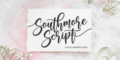 Southmore Script - Lovely Modern Script, Southmore that contain lowercase, uppercase, symbol and also support multi-language in this font. Southmore also comes with Swash and doodle font, is perfect for logos & branding, photography, invitation, watermark, advertisements, product designs, stationery, wedding designs, label ,product packaging, special events or anything that need special taste. or handwritten quote. Also already PUA
 - Cut Cut Cut by Green Type,
$19.00 Cut Cut Cut is a decorative font family. Designed for use in outdoor advertisements, branding, packaging. Cut Cut Cut is also perfect for children's books and cartoon, greeting cards and posters. It is also suitable for use in online activities. Cut Cut Cut contains latin, cyrillic and greek gliphs. There is also a free symbols style.
 - Aurelie Smith by Sarid Ezra,
$13.00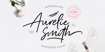 Aurelie Smith is fashion signature that contain lowercase, uppercase, symbol, and also support multi language. There's a lot ligatures in this font. Aurelie Smith also comes with doodle illustration that you can use to make a logo for branding, beautiful fashion design, suitable for wedding invitation, or handwritten quote. Also already PUA Encoded. Foreign Languages Support: ÀÁÂÃÄÅÇÈÉÊËÌÍÎÏÐÑÒÓÔÕÖØÙÚÛÜÝßàáâãäåæçèéêëìíîïðñòóôõöøùúûüýÿ
 - STALKER2 - Unknown license

- STALKER1 - Unknown license

- Neurock by Almarkha Type,
$25.00 Hello Everyone, Introduce our new collection, Neurock - Futuristic Font Sans With 2 Style, Inspired from famous logos of Futuristic Style and brands that have very strong characteristics, very suitable for posters, packaging, branding, logotype and more. Neurock font with strong and challenging nuances. very suitable for the title, typography, Poster, magazines, brochures, packaging,Websites and much more for your design needs, making your designs more modern and professional.
 - Feliks Handwriting by SoftMaker,
$7.99 Digitized handwriting fonts are a perfect way to give documents the “very special touch”. Invitations look simply better when handwritten than when printed in bland Arial or Times New Roman. Short handwritten notes look authentic and appealing. There are numerous occasions where handwritten text makes a better impression. Feliks Handwriting is a beautiful typeface that mimics true handwriting closely. Use Feliks Handwriting to create stunningly beautiful designs easily.
 - Savattera by Prioritype,
$18.00 Introducing a new script font with a beautiful, uniquely elegant and very charming look, you can click it and can be used in your projects such as wedding invitations, quotes, creative posts, clothing product packaging, promotions, video preview images, logos and much more to explore. because it has many cool variations. As a picture you can see the preview above. Features: -Uppercase -Lowercase -Numeral -Punctuation -Multilingual -Alternate -Ligature -Swash Thanks.
 - Roxborough CF by Connary Fagen,
$35.00 Roxborough CF is a dramatic serif, influenced by calligraphy and hand lettering. Built around a distinctive single-storey 'a' and full of rich detail, Roxborough pairs well with its expressive italics, lending an artful touch to text across print and digital. Roxborough CF pairs nicely with simple, bold headline typefaces, like Greycliff CF and Articulat CF. All typefaces from Connary Fagen include free updates, including new features, and free technical support.
 - constructor by Fontop,
$11.00 Introducing a new bold CONSTRUCTOR font family. Perfect combination of 2 fonts (Light and Shadow) to create your own layered 3D headlines, eye-catching texts, logotypes, design, posters for sports, music, street culture, modern arts, industries and many more other themes. 2 more fonts (Emboss and Regular) have bold 3D effects thanks to their design and shapes. Fonts have extensive Latin multilingual support, uppercase, small-caps, numbers and basic punctuations.
 - Sign Sans JNL by Jeff Levine,
$29.00 The original source of design for Sign Sans JNL was an image online of an old New York drinking establishment called the Lenox Lounge. The metal channels encasing the neon had an unusual "feel" to some of the letters. While the original E,G and U of the sign looked "interesting", they didn't quite fit the font's layout. Those letters were scrapped for more traditional versions of them.
 - Olympian by Linotype,
$29.99 After the Second World War, the Ionic style replaced Modern Face as the favored typeface for newsprint. A couple decades later, it was in turn replaced by the next generation of newspaper fonts, a mix of Old Face, Transitional and Modern Face forms. Olympian itself tends toward the Old Face style but is nevertheless an example of this new generation, a result of a time of change and experimentation.
 - Tea Dance by Studio K,
$45.00 If you think nostalgia isn't what it used to be, this will change your mind. A ritzy new font family from Studio K that will transport you back to the era of afternoon tea dances performed to the strains of the Palm Court Orchestra or the Bath Pump Room Quartet: a celebration of the golden age of dance from Busby Berkeley to Fred Astaire and Ginger Rogers. Enjoy!
 - Keawneta by Almarkha Type,
$25.00 Hello Everyone, Introduce our new collection, Keawneta - Authentic Display - Bold Display With 15 Ligatures, Inspired from Modern logos of brands that have very strong characteristics, very suitable for posters, t-shirt, packaging, branding, logotype and more. Keawneta font with strong and challenging nuances. very suitable for the title, typography, Poster, magazines, brochures, packaging,Websites and much more for your design needs, making your designs more modern and professional.
 - Gritalina Script by Soft Creative,
$18.00 Gritalina Modern Calligraphy is a new modern script font with an irregular baseline. Trendy and feminine style. Gritalina looks lovely on wedding invitations, thank you cards, quotes, greeting cards, logos, business cards and more. Perfect for using in ink or watercolour. Including initial and terminal letters, alternates and multiple language support. This font is available in several modern swirls that can make your work look elegant, sweet and perfect.
 - Jay Handwriting Pro by SoftMaker,
$15.99 Digitized handwriting fonts are a perfect way to give documents the “very special touch”. Invitations look simply better when handwritten than when printed in bland Arial or Times New Roman. Short handwritten notes look authentic and appealing. There are numerous occasions where handwritten text makes a better impression. “Jay Handwriting Pro” is a beautiful typeface that mimics true handwriting closely. Use Jay Handwriting Pro to create stunningly beautiful designs easily.
 - Pascal Handwriting by SoftMaker,
$15.99 Digitized handwriting fonts are a perfect way to give documents the “very special touch”. Invitations look simply better when handwritten than when printed in bland Arial or Times New Roman. Short handwritten notes look authentic and appealing. There are numerous occasions where handwritten text makes a better impression. “Pascal Handwriting” is a beautiful typeface that mimics true handwriting closely. Use Pascal Handwriting to create stunningly beautiful designs easily.
 - Brian Handwriting by SoftMaker,
$7.99 Digitized handwriting fonts are a perfect way to give documents the “very special touch”. Invitations look simply better when handwritten than when printed in bland Arial or Times New Roman. Short handwritten notes look authentic and appealing. There are numerous occasions where handwritten text makes a better impression. Brian Handwriting is a beautiful typeface that mimics true handwriting closely. Use Brian Handwriting to create stunningly beautiful designs easily.
 - Claycozoa by Zealab Fonts Division,
$10.00 Claycozoa is a versatile, bold and unique display font. Was inspired by Psychedelic and Art Nouveau style, Claycozoa has a unique style with stylistic, alternates, ligatures and supports multilingual languages. The organic feel of Claycozoa evokes a psychedelic vibe which you can use to take your designs to a new level. The font is great for posters, flyers, apparel, quotes, greeting cards, product packaging, album covers, movies, and more.
 - Thery Handwriting by SoftMaker,
$15.99 Digitized handwriting fonts are a perfect way to give documents the “very special touch”. Invitations look simply better when handwritten than when printed in bland Arial or Times New Roman. Short handwritten notes look authentic and appealing. There are numerous occasions where handwritten text makes a better impression. Thery Handwriting is a beautiful typeface that mimics true handwriting closely. Use Thery Handwriting to create stunningly beautiful designs easily.
 - Larissa Handwriting by SoftMaker,
$15.99 Digitized handwriting fonts are a perfect way to give documents the “very special touch”. Invitations look simply better when handwritten than when printed in bland Arial or Times New Roman. Short handwritten notes look authentic and appealing. There are numerous occasions where handwritten text makes a better impression. Larissa Handwriting is a beautiful typeface that mimics true handwriting closely. Use Larissa Handwriting to create stunningly beautiful designs easily.
 - Neon LED V2 by Qaratype,
$16.00 Neon LED V2 is a New Version of Neon LED Light font, It is a bold, chunky lettered and retro display font. Perfect for quotes, retro style design, logo, logotype, badges, packaging, branding, sign, craft needs, mockup, merchandise, and many more. Add this neon font to your creative ideas and notice how it makes them stand out! Main Features: Uppercase & Lowercase letters Punctuation and special characters Multilingual support OTF

