10,000 search results
(0.025 seconds)
- Sarcastic by Barnbrook Fonts,
$30.00 Sarcastic is a monoline display typeface. It draws influence from a visual language of mid-twentieth century consumerism: 1950s script typography and the rhythmic forms of interconnected neon lettering. Sarcastic is perfect for contemptuous quips, disparaging proclamations, and castigating commentary.
 - Pasture by Ryan Keightley,
$19.00 Pasture is a display serif in a range of weights. Rounded interior and exterior corners, curvaceous details, and rotund terminals give it a warm, handmade quality. Classic style that is, at the same time, right at home in modern spaces.
 - FF Mulinex by FontFont,
$41.99 Italian type designer Alessio Leonardi created this display FontFont in 1994. The font is ideally suited for music and nightlife. FF Mulinex provides advanced typographical support with features such as ligatures and case-sensitive forms. It comes with proportional lining figures.
 - Cantoria by Monotype,
$29.99Cantoria was designed by Ron Carpenter in 1986. It is a serif font with characteristics of stone cut letters. Distinguished by its open forms and large capitals and available in 10 weights, Cantoria offers a wide range of possible applications. - Christmas Bright by Sakha Design,
$14.00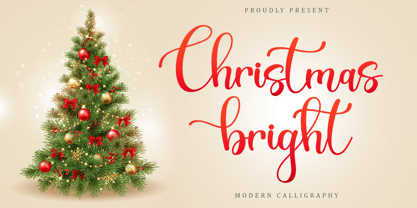 Christmas Bright is a warm, elegant and cozy handwritten font. it will look gorgeous on each of your festive designs or Christmas letters. This font is PUA encoded which means you can access all of the glyphs and swashes with ease!
 - Bricoleur NF by Nick's Fonts,
$10.00 This naïve script was discovered in a French printers' magazine from 1927. Its total lack of pretension makes it warm and inviting. Both versions of this font support the Latin 1252, Central European 1250, Turkish 1254 and Baltic 1257 codepages.
 - Chieftain NF by Nick's Fonts,
$10.00 The American Typefounders 1893 specimen book included the pattern for this face, originally called Pontiac. Its subtle idiosyncrasies make it warm and inviting. Both versions of this font support the Latin 1252, Central European 1250, Turkish 1254 and Baltic 1257 codepages.
 - Blowfish Inline by Robert Petrick,
$19.95 Blowfish Inline is a new addition to my Blowfish Family. Based on my original Blowfish design I have created a more illustrative form. I think it adds to the feeling of "Classic" and extends it's functionality and novelty.- Robert W. Petrick
 - Moho Condensed by John Moore Type Foundry,
$40.00 Moho is inspired by the Victorian sans shapes, movements and expressions of modernism art deco and constructivism, conceiving a decorative and elegant font, modern and readable display. This provides a retro look style of elegance of the 30s. Moho Condensed font family is straight, vertical, with joints and links or curvilinear or angular. Moho provides an innovation in the form of letters, to replace traditional forms of curves by straight or vice versa. Condensed Moho is a category of square letter, has an efficient OpenType programming for Moho OT Condensed, and basic for Moho Std families to compose texts in European languages of East and West, having wide set of over 610 glyphs. Designed to hold and typesetting over 14 pts or less increasing readability depending on the tracking. Moho Condensed is ideal for publishing newspaper and magazine design, convenient for the design covers and labels due to its space saving. Moho Condensed typefaces are closely related to the arts and fashion are very useful in creating logos and brands.
 - Moho Style by John Moore Type Foundry,
$45.00 Moho is inspired by the Victorian sans shapes, movements and expressions of modernism art deco and constructivism, conceiving a decorative and elegant font, modern and readable display. This provides a retro look style of elegance of the 30s. Moho Condensed font family is straight, vertical, with joints and links or curvilinear or angular. Moho provides an innovation in the form of letters, to replace traditional forms of curves by straight or vice versa. Condensed Moho is a category of inline square letter, has an efficient OpenType programming for all Moho family, and basic for Moho Std Style family to compose texts in European languages of East and West, having im Pro a wide set up to 610 glyphs. Designed to hold and typesetting over 14 pts or less increasing readability depending on the tracking. Moho Condensed is ideal for publishing newspaper and magazine design, convenient for the design covers and labels due to its space saving. Moho Condensed typefaces are closely related to the arts and fashion are very useful in creating logos and brands.
 - Alfredo by Pedro Mello Type Foundry,
$24.00 Alfredo is a neo-humanist family with a contemporary touch, presenting a subtlety in forms, in which it’s simu- lates calligraphic fluidity. With rectangular serifs, Alfredo was designed exclusively for publishing projects and texts.
 - Splinters JNL by Jeff Levine,
$29.00Splinters JNL is a fun, hand-drawn font emulating letters formed from pieces of wood. Use at larger point sizes for best results. Please note: There is no kerning and a limited character set. - Punta Negra by Volcano Type,
$19.00A prolific lava producer, Volcan Puntas Negras is a collection of flows and domes forming a distinct large edifice. There is no current activity known unless you will activate the font on your computer ;) - Triple Condensed Gothic by BA Graphics,
$45.00A triple condensed gothic based on the letter form of Franklin Gothic. Great for fitting a lot into a small space. With its condensed and extra bold appearance it makes a great headline face. - Mina Chic by Resistenza,
$49.00 Mina Chic is fresh, elegant and sexy. She was raised by the french riviera sun, loves watching Nouvelle Vague films and adores french pop divas from the 60´s. She wants to be a star! Mina Chicis a new version of one of our most popular scripts,Mina. We added some expansion on the strokes reminding of a pointed nib pen writing and kept the long connections and smooth swashes to preserve the elegance and simplicity of that classic style. This typeface contains 515 glyphs, swashes, ligatures, alternates, final forms and initial forms and offers a wide range of flexibility with its many Opentype features! Mina Chic Extra has an extra thicker strokes who gives more weight to Mina.
 - American Uncial by Linotype,
$40.99American Uncial™ was designed by Victor Hammer in 1943. Uncial typefaces consist of letter forms of the Capitalis Monumentalis and the majescule cursive. The origins of Uncial faces date back to the 5th century. In 1953, American Uncial was expanded to include some new figures, also designed by Hammer, and was rereleased by Klingspor with the name Neue Hammer Unziale. The forms are based on old scripts in books of antiquity and the early Middle Ages and the font is a new variation of a classic. Neue Hammer Unziale font has been a favorite for certificates and diplomas and is recommended for headlines and shorter texts in a point size of 12 or larger. - Gimbel Script by Stiggy & Sands,
$39.00 Monolinear Vintage Elegance The Gimbel Script typeface was inspired by a monoline, semi-connected script from a 1930's holiday greeting card. From its ascenders and descenders that stretch high and low to its gentle curviness Gimbel Script exudes the elegance of a bygone era while standing on a thin line between formal and casual lettering styles. See the 5th graphic for a comprehensive character map preview. Gimbel Script Opentype features include: - Swash Alternates for an alternate M and N. - Stylistic Alternates & SS01-SS06 Stylesets for 151 varying forms. - 219 Ligatures for a smoother typesetting experience, along with 181 initial, middle and final forms. - Full set of Inferiors and Superiors for Limitless Fractions. - Proportional, Tabular and Oldstyle figure sets.
 - Aloe by ROHH,
$29.00 Aloe is a characterful and friendly display font family inspired by headlines from 1930’s newspapers and calligraphy. The family consists of 9 weights, ranging from Thin to Heavy, with matching ornament fonts. It features a variable font with weight axis. Each weight has over 900 glyphs including advanced typographic features, such as vast number of stylistic alternates, swashes, titling and terminal forms, case sensitive forms, ligatures, symbols, ornaments as well as lining and old style figures, fractions, subscripts and superscripts. This original mixture of display typeface with calligraphy gives a versatile family great for all sorts of uses - from advertising, packaging, branding, wedding invitations, menu cards and other editorial uses to screen and web projects.
 - APF Lagoon Regular by Pomegranate,
$30.00 In 2007-8, Carolyn Puzzovio developed this OpenType typeface: Lagoon which is based on an Armenian model from the Mechitarist monastery, Venice, 1810. This project was supported by a grant from the AHRC (Arts & Humanities Research Council, UK) and won a first prize in the Granshan 08 type design competition. Oſten, Armenian digital types are designed to match the forms of Latin type characters and ‘Latinized’, by uprighting the forms; truncating ascenders and descenders and raising the x-height – but in this case the Latin characters in the OpenType font have been designed to blend in with the traditional Armenian proportions which are based on cursive forms – also incorporating some of the quirky shapes from the original model. Faithfully following the original created difficulties of ‘clashing’ characters, particularly those with long descenders, so the font contains over 100 alternative characters in the Armenian part, which will normally substitute automatically where necessary. The sloping lower case characters and upright capitals are traditional in Armenian – capitals are used less in the Armenian language. Three new characters for the Armenian unicode range are included: the Armenian dram (currency) symbol; the eternity symbol; and the index number symbol. This font which will be one of the first OpenType fonts to incorporate these newly unicoded characters.
 - Posterizer KG Rounded by Posterizer KG,
$40.00 Posterizer Kg Rounded, is basically rounded version of Egyptian, Slab Serif font Posterizer Kg. By adding rounded corners on serifs, the strict form disappears, in that way, the font gets softer form. Posterizer Kg Rounded is useful for sweet themes like cookies, puppies, love, joy, or some other similar things.
 - Aviano Contrast by insigne,
$22.00 The Aviano series returns, refined and sophisticated with an extended, high-contrast sans-serif family. Aviano Contrast is a contemporary typeface radiating with luxury. It's classic elegance makes it perfect for high-end applications such as cosmetic, jewelry or fashion brands. Aviano Contrast's extended forms give the face a smart look, and the curves are carefully honed to be sinuous and seductive. This high-contrast face is in a class of its own, composed in the style of a classic Didone but lacking the typical serifs. Aviano Contrast comes in six different weights and is packed with OpenType features. Need swash forms? Ball terminals? Art Deco alternates inspired by the inscriptions and signage of the '20s and '30s? Aviano Contrast includes 230 alternate characters. Twelve style sets are available, including four complete sets of art deco-inspired alternates, small forms, swash, titling and a wide array of other alternates to make your designs unique. As a complement to these characters, Aviano Contrast also includes 40 discretionary ligatures for artistic typographic compositions. Please see the informative .pdf brochure to see these features in action. OpenType capable applications such as Quark or the Adobe Creative suite can take full advantage of the automatically replacing ligatures and alternates. This family also includes the glyphs to support a wide range of languages. The rest of the Aviano series pairs very well with this face. These include Aviano, Aviano Serif, Aviano Sans, Aviano Didone, Aviano Flare, Aviano Future and Aviano Slab.
 - Blue Goblet Emblems by insigne,
$32.99 The designer-favorite Blue Goblet family has grown with Blue Goblet Emblems. Blue Goblet Emblems are unique and abstract symbols that are rendered in Cory Godbey's unique illustration style. These creative and dynamic ornaments can be resized easily without any loss of quality, and can easily be converted to outlines and modified. These ornaments can be combined to form unique compositions or inserted directly into layouts. Combine them to form unique patterns and motifs. Please see the sample .pdf to see all 58 ornaments in action, and be sure to check out the original Blue Goblet brush script and Blue Goblet ornaments, frames and vignettes and florals. Blue Goblet Emblems is a collaboration between insigne Design and Portland Studios. Use this sample .pdf as a guide to quickly refer to your favorite emblems. All the ornaments in this guide are sized at 75pt, and the copy and headers are set in Blue Goblet.
 - Toma Sans by JAM Type Design,
$- Toma Sans is a sans serif type family of seven weights plus matching italics. Influenced by the geometric-style sans serif faces that were popular during the 1920s and 30s, the fonts are based on geometric forms that have been optically corrected for better legibility. Toma Sans has a functional look with a friendly open touch. While the ExtraLight and the black weights are great performers in display sizes the light, regular and medium weights are well suited to longer texts. The small x-height and the restrained forms lend it a distinctive elegance. The typeface has an extended character set to support most European languages.
 - Geometry Circle by Vjeko Sumic,
$39.00 Geometry circle is a heading/display type, built with the intent to illustrate and attract the viewer, not to be used for long text. The inspiration comes from the Futurist movement typefaces, especially from Marinetti’s own workshop on new age typography of that time (Italy 1920). The typeface is composed of only capital letters. The letters are of an unique geometric design taking the basic 64 grid system and subtracting the shape of a circle form each glyph in a unique way to form a letter. There is a full complement of typography symbols as well as a support for Central and Eastern European symbols and characters.
 - HoneyBee by Laura Worthington,
$27.00 HoneyBee is an all-caps display face in a delightfully hand-lettered style for irresistibly sweet layouts on food packaging, fantasy games, or children’s products. This versatile font includes three sets of full-size capitals, two sets of smaller capitals. Mix and match swash forms with titling forms to create headlines, titles, and wordmarks. 20 charming ornaments are included to complement your designs. See what’s included! http://bit.ly/2bGYin7 *NOTE* Basic versions DO NOT include swashes, alternates or ornaments This font has been specially coded for access of all the swashes, alternates and ornaments without the need for professional design software! Info and instructions here: http://lauraworthingtontype.com/faqs/
 - Abrade by J Foundry,
$25.00 Abrade is a geometric sans serif with rational design choices for contemporary functionality. The family is designed with a medium x-height to provided great legibility in both display and text sizes. The forms are refined to work well in print and on screen. The italics maintain the rational forms, with only the essential structural changes. With 12 weights, the family is ideal for publications, digital media, corporate systems, branding, as well as your band’s gig poster. Abrade is equipped with extended language support, including Extended Latin, Greek, and Cyrillic. Features include: stylistic alternates, small caps, figure sets, and lots of OpenType features to keep designers happy.
 - Roberts Script by Roland Hüse Design,
$28.00 Robert's Script is a fresh brush calligraphy typeface with a smooth flow. The Family consists of two weights, Light and Regular. Its stylistic character is based on an elegant brush style. It can be used in various forms of communications. It contains OpenType Features such as Stylistic Alternates, Contextual Alternates, Standard Ligatures, Terminal Forms, Old Style Figures for numbers and Fractions. All European latin languages are covered with diacritics and special characters. For more details on the features and how to make the most out of this font, please refer to the OpenType guide at https://drive.google.com/file/d/1exEp9VcLM1rmrF9ptO2OWlQKKA-uyb4r/view?usp=sharing Cheers & Enjoy!
 - 1672 Isaac Newton by GLC,
$42.00 Isaac Newton, father of the theory of gravity, used several forms of handwriting in his life, in numerous texts about numerous scientific subjects. Here, we propose a handwritten font, using a particularly legible script form, coming from texts written in 1672, the year he presented a new reflecting telescope to the Royal Society. It is a Pro font containing Western, Eastern, Central and Northern European, Icelandic, Baltic, and Turkish diacritics. The alternates and ligatures allow the font to look as closely as possible to the real thing. The features allow OTF software to vary the characters of a word automatically, with no more work than selecting contextual alternates and standard ligatures.
 - LP Saturnia by URW Type Foundry,
$39.99 After designing two script fonts (lp Pinselschrift, lp Bambus), Peter Langpeter has now drawn an elegant Antiqua font, namely lp Saturnia, derived and conceived from his work in developing headlines and logos. The aim was to create a modern interpretation of the classical Roman letters (Capitalis Monumentalis or Trajan by Carol Twombly), avoiding the archaic look of these letter forms. Also, the difficulty of spacing characters with excessive forms, such as the long tails of 'K' and 'R', are avoided. Additionally, lp Saturnia also comes with lower case characters. The result is a contemporary and elegant typeface that is more suitable for practical use, without renouncing the classical Roman character.
 - Dequindre by Alex Jacque,
$30.00 Dequindre is a monolinear blackletter typeface, and was drawn as if grade school handwriting practice sheets came in a blackletter variety. Dropping the thin/thick calligraphic contrast of traditional blackletter glyph construction and instead sticking to the bare skeleton of the typeface, Dequindre manages to bring forth a delicate, contemporary aesthetic that plays off of a core blackletter form. Overall portrayed with a softer, more friendly take on the angular, severe forms of 16th century blackletter style, and through pulling some of the curvier, smoother stroke qualities of Antiqua while still maintaining the overall construction and flourish of Fraktur, Dequindre sits in a unique space in the pantheon of blackletter typefaces.
 - MFC Hills Medieval by Monogram Fonts Co.,
$24.95 MFC Hills Medieval was developed from a unique historical Blackletter type specimen in the 1882 Hills Manual of Social and Business Forms. While you could use its ornate capitals to construct a monogram, this is not a monogram font, but a fully functional typeface for invitations and period lettering. From stylish and ornate capitals to a soft lowercase resembling bled ink, this period lettering style is a true eye-catcher. Because of some of the unique medieval letterforms, standardized letterforms were created as the default typeable letters while the true historical forms were setup as Stylistic Alternates. A sophisticated Blackletter for manuscripts and invitations alike.
 - DT Augustina Slab by Deveze Type,
$29.00 DT Augustina Slab is an original Clarendon's style slab serif font family of 98 styles including 7 weights, 7 widths plus Italics. There is no such a big choice of Clarendons with a wide range of styles on a market. Super wide range family will satisfy almost any request. Ultra Lights and Light styles will add elegance and lightness to your headlines, especially with using Italic swashes. Regulars, Mediums and Semi Bold will make your text blocks readable and stylish. Combine with Italics and Small Caps for sub-headers and highlights to get an incredible result. And finally Bold and Extra Bold for massive and heavy text headers. Strong, stable and reliable. The whole family has been working well in almost any type of a project: Websites, Apps, E-Books, Books, Magazines, TV broadcasting, Packaging. The family has an Open Type Features like a Ligatures, Italic Swashes, Small Capitals, Case Sensitive Forms, Tabular Figures, Old Style Figures, Tabular Old Style Figures, Circled Figures, Black Circled Figures, Fractions, Superscripts, Subscripts, Stylistic Sets, Localisation forms for Moldavian / Romanian, Catalonian and Turkish.
 - Neo Sans Arabic by Monotype,
$114.99The futuristic forms of Neo® Sans are captured beautifully in this fine Arabic accompaniment from Patrick Giasson. The subtly futuristic forms of Neo Sans are carried through to the Arabic with aplomb, making these fonts an ideal companion to the Latin in both text and display settings.Neo Sans Arabic is available in six weights, from the airy Light, through to the heavy-hitting Ultra – all with companion italics. Ideal for multilingual projects, but just as accomplished on its own. - Linotype Mega by Linotype,
$29.00Linotype Mega is part of the Take Type Library, chosen from the entries of the Linotype-sponsored International Digital Type Design Contests of 1994 and 1997. The fun schrift of German designer Till F. Teenck is available in three weights whose names are word plays in themselves. Mega in (which we hope the font will be) contains relatively light, somewhat irregularly-drawn characters which look as though they were printed by hand and the characters are set rather far apart from each other. This weight is good for short and middle length texts in point sizes of 10 and larger. Mega normal is anything but. The characters are the outline forms of Mega in and their larger width reduces the distance between them. This weight is generally a headline font. Mega out is a very heavy weight and is the filled-in version of Mega normal. The characters flow into each other and look almost like silhouettes. The reduced legibility makes this font suitable exclusively for headlines in larger point sizes. - Funky Nouveau JNL by Jeff Levine,
$29.00 The free-form Art Nouveau hand lettering for the 1905 song "Will You Love Me in December as You Do in May" was the design model for Funky Nouveau JNL, which is available in both regular and oblique versions. Since the 1960s hippie counterculture embraced elements of the Art Nouveau period in their art and design, it seemed only fitting to use the term "Funky Nouveau" in the fontís name as an homage to both eras.
 - Stenka by Katatrad,
$39.00 Stenka is a sans-serif stencil typeface that stand for display typeface to use in any typographic situation. It has his own unique style in expressed perfect condensed forms. Stenka is an ideal font family for display, print, corporate identity, mobile devices, magazine cover, signage, and web design creation, with a set of ligatures and alternative characters for your design in any layout. The family has 4 weights ranging from Light to Black and their italic.
 - Drawlers by Letterhend,
$14.00 Drawlers is a organic sans with stencil versionthat effortlessly infuses your designs with a touch casual and a dash of classic. Its unique type- maekt it perfect choice for any projects especially in logo, and the other various formal forms such as invitations, labels, logos, magazines, books, greeting / wedding cards, packaging, fashion, make up, stationery, novels, labels or any type of advertising purpose. Features : Regular & Stencil Version Uppercase & lowercase Numbers and punctuation Alternates & Ligatures Multilingual PUA encoded
 - RF Takt by Russian Fonts,
$34.00 RF Takt is a condensed geometric grotesque with closed forms of signs. 14 fonts from Ultralight to Black. 878 glyphs and 3738 kerning pairs. 16 opentype features. Multilingual support: Latin, latin extended, cyrillic and cyrillic extended (more than 91+ languages) We have tried to make RF Takt feel as good as possible in the field of graphic design and became a versatile tool for solving a wide range of graphic tasks. The specific feature of the font is that having condensed forms of characters allows you to place a large amount of information in a limited space. RF Takt will be a bright accent in a large size and will keep the readability in a small size. A large amount of opentype features opens up a wide range of options for experiments and original solutions. RF Takt is ideal for poster design, web design, newspaper design, magazine layout and covers, video titles, infographics, logos and branding, packaging, navigation solutions. Opentype features: ligatures, alternative symbols, ordinary and tabular numbers, old-style and old-style tabular numbers, tabular currency signs, fractions and automatic fraction, arrows and alternative arrows, case sensitive forms, upper and lower case numbers, small capitals.
 - FF Scratch by FontFont,
$41.99 Dutch type designer Max Kisman created this display FontFont in 1990. The family contains 2 weights and is ideally suited for poster and billboards and sports. FF Scratch provides advanced typographical support with features such as ligatures and case-sensitive forms. It comes with proportional lining figures.
 - Glossily Enigmatic by Ali Hamidi,
$12.00 Glossily Enigmatic is a modern and natural handwritten font. It has has a elegant expression, with a charming and chic impression. Glossily Enigmatic brings a warm feeling and cozy style to your design such as wedding, stationery, logos, social media quotes, branding identity, and many more.