10,000 search results
(0.047 seconds)
- HUBlueocean by Heummdesign,
$15.00 HU Blueocean is a headline typeface created by imagining waves in a square glass tube. It iis designed to be used in various environments by adding decorative elements, the swaying form of waves, to the Gothic style of a full square module. There is 1 weight of HU Blueocean : Black Features : Uppercase & lowercase Numbers and punctuation Multilanguage (Basic Latin, Western European, Euro, Catalan, Baltic, Turkish, Central European, Romanian, Pan African Latin, Dutch, Afrikaans, Basic Greek, Basic Cyrillic, Mathematical Operators) 882 Glyphs
 - Type Uncommon JNL by Jeff Levine,
$29.00 Never let it be said that a good pun and a good font name can't work well together. The vintage sheet music for a 1920s-era song called "King Tut" (not to be confused with the novelty tune by comedian Steve Martin) presented an oddly-interesting block font which is now available in digital form as Type Uncommon JNL. The pun derives from the font's name of "Type Uncommon", which is similar in sound to King Tut's full name (which is Tutankhaten).
 - Rostra by Tail Spin Studio,
$20.00It was during a visit to the Roman Forum that we were inspired by a seemingly unique style of lettering on a tablet among the ruins. The Latin message was chiseled in a condensed, free-style manner, almost as if it were intended as a personal note. While the stone showed only the capital letter forms of the period, we felt the creation of a lowercase would help extend the fonts usability and also add a whimsical feel to the design. - Fingerz by Sergejs Kolecenko,
$19.95 This typeface was started as assignment in Academy, then the idea grew to develop into a font family with different styles for interesting combinations. Inspiration came from my own hands -- it is amazing how fingers can form letters, so each letter has it’s own personality. Fingerz font family is perfect to use in posters, booklets and other typographic elements also in all other media that needs to catch attention. This font comes in 5 different styles to combine in various color combinations.
 - Palatino by Linotype,
$47.99 Palatino is the work of Hermann Zapf and became available in the late 1950s from D. Stempel AG in Frankfurt am Main. Zapf optimized Palatino’s design for legibility, producing a typeface which remained legible even on the inferior paper of the post World War II period. Zapf named the font after Giambattista Palatino, a master of scripts from the time of Leonardo da Vinci. Palatino is an Old Face font which proves that classic forms can still be used to create new typefaces.
 - Werdet Script by Tipo Pèpel,
$26.00 Werdet Script is a calligraphic typeface, inspired by the samples of the calligraphy “Batarde” created the first half of the 19th century by the French calligrapher Père Werdet. It has expanded on the original samples, creating a complete typographic family with five weights. The typeface explores the power of Opentype to simulate a manual writing. Thanks to the "contextual alternates” function, ligatures, alternate figures, initials and final forms, are automatically configured to offer an aspect with human decisions to mechanically written texts.
 - Linotype Bariton Paneuropean by Linotype,
$92.99Linotype Bariton is part of the Take Type Library, chosen from contestants of Linotype's International Digital Type Design Contests of 1994 and 1997. Designer Alexei Chekulayev designed his font in one weight to mirror the Zeitgeist of the early 1930s. The characters of this extremely bold font are based on the form of a rectangle though its rounded edges soften its look a bit. Linotype Bariton should be used only in larger point sizes in headlines which should really catch the eye. - Sugar Pie by Sudtipos,
$79.00 When Candy Script was officially released and in the hands of a few designers, I was in the middle of a three-week trip in North America. After returning to Buenos Aires, I found a few reactions to the font in my inbox. Alongside the congratulatory notes, flattering samples of the face in use, and the inevitable three or four “How do I use it?” emails, one interesting note asked me to consider an italic counterpart. I had experimented with a few different angles during the initial brainstorming of the concept but never really thought of Candy Script as an upright italic character set. A few trials confirmed to me that an italic Candy Script would be a bad idea. However, some of these trials showed conceptual promise of their own, so I decided to pursue them and see where they would go. Initially, it seemed a few changes to the Candy Script forms would work well at angles ranging from 18 to 24 degrees, but as the typeface evolved, I realized all the forms had to be modified considerably for a typeface of this style to work as both a digital font and a true emulation of real hand-lettering. Those were the pre-birth contractions of the idea for this font. I called it Sugar Pie because it has a sweet taste similar to Candy Script, mostly due to its round-to-sharp terminal concept. This in turn echoes the concept of the clean brush scripts found in the different film type processes of late 1960s and early 1970s. While Candy Script’s main visual appeal counts on the loops, swashes, and stroke extensions working within a concept of casual form variation, Sugar Pie is artistically a straightforward packaging typeface. Its many ligatures and alternates are just as visually effective as Candy Script’s but in a subtler and less pronounced fashion. The alternates and ligatures in Sugar Pie offer many nice variations on the main character set. Use them to achieve the right degree of softness you desire for your design. Take a look of the How to use PDF file in our gallery section for inspiration.
 - Univers by Linotype,
$42.99 The font family Univers? is one of the greatest typographic achievements of the second half of the 20th century. The family has the advantage of having a variety of weights and styles, which, even when combined, give an impression of steadiness and homogeneity. The clear, objective forms of Univers make this a legible font suitable for almost any typographic need. In 1954 the French type foundry Deberny & Peignot wanted to add a linear sans serif type in several weights to the range of the Lumitype fonts. Adrian Frutiger, the foundry's art director, suggested refraining from adapting an existing alphabet. He wanted to instead make a new font that would, above all, be suitable for the typesetting of longer texts - quite an exciting challenge for a sans-serif font at that time. Starting with his old sketches from his student days at the School for the Applied Arts in Zurich, he created the Univers type family. In 1957, the family was released by Deberny & Piegnot, and afterwards, it was produced by Linotype. The Deberny & Peignot type library was acquired in 1972 by Haas, and the Haas'sche Schriftgiesserei (Haas Type Foundry) was folded into the D. Stempel AG/Linotype collection in 1985/1989. Adrian Frutiger continues to do design work with Linotype right up to the present day. In 1997, Frutiger and the design staff at Linotype completed a large joint project of completely re-designing and updating the Univers family. The result: Univers Next - available with 59 weights and 4 Linotype Univers Typewriter weights. With its sturdy, clean forms Univers can facilitate an expression of cool elegance and rational competence. Univers has the uncanny ability to combine well with fonts of many different styles and origins: Old style fonts such as: Janson Text, Meridien, Sabon, Wilke. Modern-stressed fonts such as: Linotype Centennial, Walbaum. Slab serif fonts such as Egyptienne F, Serifa. Script and brush fonts such as: Brush Script, Mistral, Ruling Script. Blackletter fonts such as: Duc De Berry, Grace, San Marco. Even fun fonts such as F2F OCRAlexczyk, Linotype Red Babe, Linotype Seven."
 - Laima by TypeTogether,
$39.00 Laima is the brush-formed stencil from Bogidar Mascareñas that will create an ovation for branding, album art, upscale venues, and packaging. If wide appeal, attention to detail, or international reach is necessary for your brand, consider Laima’s high-calibre design as your personal ambassador. The general font user is accustomed to stencil typefaces that have a brute look to them — industrial, mechanical, restrictive, or even militarised. Stencils are commonly used because they serve a function, like spray-painting over template letters, giving the reader a warning that must be heeded for safety, or a command to follow immediately. Wooden crates and grunge art are the medium and black or red paint are the norm. Laima, instead, creates a stencil from the world of calligraphy to turn all this on its head. Laima’s 12 stencil styles (six roman and six italic) use the junctures of calligraphic strokes as an opportunity to achieve an uncommon stencil effect, shifting to create unexpected shapes and the illusion of twisted, disconnected overlaps. Inspired by “Arte Nueva de Escribir”, an engravings book published by Francisco Palomares in 1776, Laima progressed well beyond its beginning as a Type and Media Master’s project at KABK, The Hague (NL). It sometimes required completely new character shapes to accommodate the space needed for clear diacritic marks, and was further enhanced with flourishes and alternates for liveliness and variety in individual or branded work. Laima’s italic begins with swashes and uses OpenType features to automatically turn them off with more than two successive capital letters. Use one swashed character for a drop cap, two for ligatured fun, turn them on or off at your discretion, or change the ascender length and swash shape to suit your creative need. With two styles of numerals and stylistic sets for final forms, Laima’s 12 styles and hundreds of Latin-based languages can turn simple words into an occasion that would immediately benefit high-class brands and special uses. Set that article title, release that new product, code your best-looking UI yet, letterpress that business card, and print that gourmet label. Whatever is next, Laima is the unexpected stencil partner to introduce it to an expectant world.
 - Hattori by Zane Studio,
$15.00 Elegant, graceful and timeless. Hattori is a versatile font with timeless classic appeal, over 50 alternatives & ligatures, multilingual support, (And we think this is our best work so far!) Each letter has been hand-drawn and made with great care. The variety of weights provides a variety of options that will help you find the best typographic character for your project. All 3 weights are perfect for big screen use and high impact headlines. The available binding and style alternatives offer a number of different options that give your logo or business card a unique look. This high-contrast serif typeface has a glyph and offers comprehensive language support. If you have any questions, just send us a message and we'll be happy to help! Stay sweet, Sweetest Stuff
 - ITC Styleboy by ITC,
$29.99 Although ITC Styleboy has a retro feel, it isn't based on any earlier typeface. As far as inspiration goes," says designer Chester Wajda, "I'd have to say comic strips of the '20s and '30s, and silent-film marquee lettering from the '20s - with a hint of a Chinese brush?" He originally created the typeface for a children's book he was working on. "I wanted it to be fun, but still somewhat formal in its underlying structure," he says. "It's largely based on right and 45-degree angles, with slight tucks inward on the stems and bowls, and a few flourishes here and there." Styleboy's top-heavy look is most noticeable in the caps, but it's exaggerated too in the "8" and the lowercase "g." Styleboy is Wajda's first typeface design."
 - Morris Sans by Linotype,
$40.99 Morris Sans is a newly revised and extended version of a small geometric family of typefaces originally produced by Morris Fuller Benton in 1930 for ATF. His initial design consisted of an alphabet of squared capital letters with a unique twist that characterized its appearance: corners with rounded exteriors and right-angle interiors. The types were intended for use in the fine print found on business cards, banking or financial forms, and contracts. But over the ensuing decades, this design became a popular element in all sorts of design environments, and several foundries revived the typeface in digital form. Since digital fonts are bicameral, with slots for both upper and lowercase letters, new cuts of the type opted filled the lowercase slots with small caps. In 2006, Linotype commissioned its own version of the typeface-an extension for 21st century use. Under the advisement of Linotype's type director Akira Kobayashi, Dan Reynolds redrew the uppercase and added an original lowercase for the first time. Additionally, a number of extras were brought into the fonts, including six figure styles (tabular and proportional lining figures, tabular and proportional oldstyle figures, and special tabular and proportional small cap" figures). Small caps, which have become an iconic element over time, are accessible in each font as an OpenType feature. To differentiate this version from the original, Linotype's new family is named Morris Sans, in honor of Morris Fuller Benton. All fonts in the Morris Sans family are OpenType Com fonts; they include a character set capable of setting 48 European languages that employ the Roman alphabet, including all Central and Eastern Europe languages, those from the Baltics, and Turkish. This glyph coverage extends to the small caps as well. Morris Sans is a wide typeface, especially in its regular widths; the condensed faces set a more conventional line of text. The new lowercase letters are less geometric than the uppercase, except for those that share the same basic forms (e.g., c, o, and s). Instead of following this geometric trend, the new lowercase tends to strengthen the humanist elements that were present in several characters from the original type, including the uppercase D and the figures 5, 6, and 9. Morris Sans also sports a number of glyphic flares, like the stroke found on the original uppercase Q. Morris Sans is a clean, modern design best suited for headlines, advertising, posters, expressive signage (especially on storefronts), and corporate identity work."
 - Schnebel Slab Pro by URW Type Foundry,
$35.99 The refreshingly clear Antiqua Schnebel Slab is a refreshingly clear and strong interpretation of a contemporary Antiqua with subtle contrast and firm serifs, which offer excellent readability at very small size, and, at the same time, provide a lot of expression for use in headlines. The italics, drawn specifically for this purpose, contribute to a harmonious picture, which never loses creative tension, thanks to its aesthetics. The careful addition of ligatures, small caps, and proportional and old-style figures allows for well-proportioned typesetting. The condensed and expanded variants, which also come in 6 weights each, offer plenty of freedom to design with numerous combinations. Schnebel Slab Pro combines especially well with Schnebel Sans Pro.
 - Aziga by Eclectotype,
$40.00 In a typeface category that has been sorely under-represented until now, Aziga is a high (occasionally reversed) contrast, postmodern, deconstructed-reconstructed, serifless (mostly), fashion didone! Aziga lends itself to being set loud and proud, and the consistent angles throughout the glyphs make it a good candidate for more abstract typographic compositions. For the really graphically inclined (excuse the pun) a rotation of 66° will make the main diagonals in the font horizontal and vertical. Cool right? Features include stylistic and contextual alternates, ligatures and case sensitive forms. This is an unusual font, that’s for sure, but give it a try and you'll be rewarded with layouts that really stand out from the crowd.
 - Bozon by ROHH,
$39.00 Bozon™ is a modern, minimalist geometric grotesk typeface. Letter shapes are crafted with the highest care for proportions and legibility. This clean, sharp sans serif is a great choice for all kinds of modern projects including branding, logo design and display use. Bozon™ family consists of 10 weights with corresponding italic styles, that give total of 20 styles. Italic styles were hand drawn to get sharp and fine letter shapes. The family has extended language support, as well as broad number of OpenType features, such as small caps, case sensitive forms, ligatures, stylistic sets, contextual alternates, lining, oldstyle, tabular, circled and small cap figures, slashed zero, fractions, superscript and subscript, ordinals, currencies and symbols.
 - Sertona by Sarid Ezra,
$17.00 Introducing, Sertona, a trendy bold font with italic alternates! Sertona is a modern and trendy font based sans that have unique looks. This font contains uppercase and lowercase that have different form. You can use the lowercase and uppercase in the same word that will make your text more stand out! And the best of this font is the italic version as the alternates which mean you can combine it all without worrying about the kerning! You can use this font for the magazine, poster, and suitable for headline. This font also support multi language. What you will get: All Caps Font with different uppercase and lowercase Italic version as the alternates. Well Kerned.
 - 1525 Durer Initials by GLC,
$28.00 In 1525, Albrecht Dürer, the well known German great artist, was publishing the so-called “Underweysung der Messung mit dem Zirckel und Richtscheyt”, printed in Nuremberg. This handbook explained with numeral figures how to draw with a compass and ruler. A large part is devoted to the drawing of Roman characters, which can be used as decorative initials. We are offering two complete historical initial sets and also have entirely redrawn the missing letters: J, U and W, Eth, Lslash, Thorn and Oslash in the two forms, using the Dürer style. The font may be used with all our Humane and Garalde fonts, like 1543 Humane Jenson or 1592 GLC Garamond and others from the GLC foundry catalog.
 - Silentium by Adobe,
$35.00Based on 10th century Carolingian scripts, Silentium Pro sparkles with a quiet but ebullient sense of the human hand. As a multi-featured Adobe Originals OpenType family, Silentium includes myriad alternate forms, ligatures, and titling characters that add an air of tasteful liveliness to contemporary graphic design and typography. Designed by Yugoslavian calligrapher and type designer Jovica Veljović, Silentium works well in both display sizes and text setting as small as 8 points. Silentium is the Latin word for silence, a discipline commonly practiced in the medieval European monasteries and court scriptoria where the Carolingian script flourished. Now, more than ten centuries later, Silentium Pro brings the fluid energy of their work to contemporary design and typography. - Sica Condensed by dooType,
$30.00 The Sica Family was designed in order to address issues related to technology, while maintaining humanistic forms. Thus, a font with square shapes emerged, but with smooth curves and slightly rounded terminals making it friendly. The family has three widths – condensed, normal and expanded – each of them with six weights and their respective italics, resulting in 36 fonts. With particular details and open shapes that increase legibility, it can be used for both text compositions as well for display sizes. It has 774 glyphs, covering more than 50 languages, as well as ligatures, lining, oldstyle, tabular and proportional figures, fractions, superiors, inferiors, and small caps, all of them accessible through OpenType features.
 - Rival by Mostardesign,
$25.00 Rival – A serif font family with contemporary distinctive signs Rival is a modern serif font family inspired by characters drawn with a round nib, it has many distinctive signs such as broken curves, slightly curved downstrokes, curved diagonals, and curved, slanted axes. All these typographic tokens gives Rival a modern and contemporary aspect for all kinds of graphic projects. It comes in 7 weights with corresponding italics and it’s suited for multiple purposes including display and editorial use, especially for advertising, long text, packaging and branding. Rival provides advanced typographical support with OpenType features such as small caps, ligatures, discretionary ligatures, old style figures, case-sensitive forms, slashed zero, fractions, and pro kerning.
 - Alana by Laura Worthington,
$49.00 Alana is a connected script that glows with casual elegance. Its inviting letterforms work well in settings such as letter-writing and menu details; even at small sizes. Set at display sizes, Alana’s strokes reveal rough edges evocative of ink on textured paper. Alana includes over 300 alternates, including swash capitals and ornamented forms to customize titles, headlines, packaging, and wordmarks. Alana includes 62 matching ornaments: botanical fleurons, birds, and cute lil’ bugs. See what’s included! http://bit.ly/2bXTLvP *NOTE* Basic versions DO NOT include swashes, alternates or ornaments These fonts have been specially coded for access of all the swashes, alternates and ornaments without the need for professional design software! Info and instructions here: http://lauraworthingtontype.com/faqs/
 - Barnet Sans by The Northern Block,
$29.95 Barnet Sans is a humanist typeface with a grotesque-inspired personality. Lively stroke-endings of several characters give this design its distinctive style, as well as a friendly and approachable presence. Created for use in both print and screen settings, Barnet Sans delivers a hint of flavour in large sizes, while being subdued enough to work in smaller text-driven settings. Details include; seven weights ranging from thin to black with matching italics, 665 characters per font, and support for all Western and Central European languages. Barnet Sans also comes equipped with many opentype features including; small caps, case-sensitive forms, arbitrary fractions, numerators and denominators, slashed zero, stylistic alternates and ligatures.
 - Chet by East end,
$22.00 Chet was inspired by the lettering on the signs of American diners and gas stations in the 1950s and 60s. It is not a mere reprint of nostalgic signage letters, however. This typeface retains the boldness, uniqueness, and strength of this era, while adding a modern touch that makes it feel comfortable to use today. It is highly readable even from a distance, making it perfect for signs, posters, and website headers. Chet can also be used as a base for creating logotypes because of the unique forms of the a, n, and r. The typeface is named after Chet Baker, the jazz trumpeter who was active between the 1950s and 1970s.
 - P22 Eaglefeather by P22 Type Foundry,
$29.95 This font family is based on the alphabet designed by Frank Lloyd Wright for the "Eaglerock" project in 1922. The Eaglefeather Pro family features expanded OpenType font options. It contains 15 pro styles and 20 basic styles in 5 weights- Hairline, Light, Regular, Bold, and Black. In addition to small caps, italics, and a unique "informal" version (an upright italic.) There is coverage for Cyrllic, Greek and European Latin languages. Opentype features include automatic fractions, optimized kerning, and localized language features. Alternate forms of capitals A,H,N, & S are also included for added flexibility. The full range of weights and styles allows for expanded typographic possibilities in a wide variety of uses.
 - Devils Haircut by PintassilgoPrints,
$24.00 Devils Haircut is an explosive font duo, consisting of two completely different styles, creative and expressive in their own way, with a touch of punk and counter-culture aesthetic. Together they make a decidedly eye-catching pair and a rad option for numerous display moods, from album covers to food packaging, from title screens to editorial pages. Both fonts are all caps with different designs stored on upper- and lower-case slots, so you can reach the alternate forms easily through the keyboard. Or use the Contextual Alternates OpenType feature to instantly cycle the alternate glyphs and get an even more uneven look. Make Devils Haircut yours and fire up your designs, hell yes!
 - Lumend by Craft Supply Co,
$20.00 Lumend Modern Sans Serif Font Sleek and Contemporary Design Introducing Lumend, a modern sans serif font with a unique grotesque twist. Its minimalist aesthetic is defined by clean lines and unadorned forms, offering a fresh, contemporary look. Versatility in Application Remarkably versatile, Lumend Modern Sans Serif Font is adept in both text and title settings. Its legibility in lengthy paragraphs is impressive, while its boldness in headlines commands attention, making it ideal for a variety of design projects. Optimized for All Mediums Crafted for both digital and print use, Lumend’s clarity excels on screens and maintains crispness in print. This adaptability makes it suitable for web design, printed materials, and everything in between.
 - Lila Pro Heavy by Eurotypo,
$27.00 The Lilac (or Syringa vulgaris), a slightly vigorous plant, gives a nice colour to the place where its located, well maintained from one season to another and even when not in flower, the colour of its foliage and compact form makes it attractive enough. Lila Pro was created on the coast of Andalucía, inspired by its vibrant colour’s contrasts, and lush climate. This new script has all the advantages of OpenType technology that allows a variety of combinations: standard ligatures, contextual alternates, discretional ligatures, word ending and tails. Specially designed for creating logos for products and packaging, this font can also be used as body text for its good legibility and accurate kerning.
 - Nimbus Sans Arabic by URW Type Foundry,
$35.99 Nimbus Sans ME is the expansion within the Nimbus Sans family for the Middle East range: Arabic (incl. Farsi) and Hebrew. Volker Schnebel has designed both scripts, which each include five upright and five cursive styles. The design is contemporary and fits the Latin Nimbus Sans. Besides the basis characters, the Arabic also includes the presentation forms: the variations for initial, medial and final letters. The correspondent OTF features are included in the fonts. All three scripts are perfectly combinable. Nimbus Sans is one of the best supported and most favored URW fonts ever. It is available as a Global Font in 4 weights and contains up to 65.000 characters per font.
 - Twentieth Century by Monotype,
$29.99 Twentieth Century was designed and drawn by Sol Hess in the Lanston Monotype drawing office between 1936 and 1947. The first weights were added to the Monotype typeface library in 1959. Twentieth Century is based on geometric shapes which originated in Germany in the early 1920's and became an integral part of the Bauhaus movement of that time. Form and function became the key words, unnecessary decoration was scorned. This clean cut, sans serif with geometric shapes was most appropriate. The lighter weights of the Twentieth Century font family can be used for text setting; the Twentieth Century bold and condensed fonts are suitable for display in headlines and advertising. Commonly spelled 20th Century.
 - Zagore by NoCommenType,
$30.00 Zagore (zɑːgɔːrɛ) is the name of a beautiful place in Bulgaria. There is no contrast between horizontal and vertical stems, typical for geometric fonts. The typeface is built under strict rules and logic, by using the stroke as skeleton for each glyph. Although the structure of the font remains the same, there is a noticeable visual diversity throughout different styles. Middle weights suggest paragraph use, while the ones at the extremes are more suited for display text. The typeface offers support for Basic Latin, Latin-1 Supplement, Latin Extended-A, Greek and Coptic, Cyrillic, and Cyrillic Supplement Unicode ranges. Included OpenType features are localized forms, to suit multi-language designs, tabular and proportional lining, basic ligatures, and extra symbols.
 - Santorio by Skinny Type,
$15.00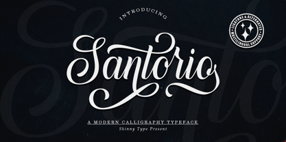 Please welcome our newest script typeface, Santorio Script, a beautiful script typeface with unique alternatives and strokes. This font is very suitable to be applied especially to logos, and various other formal forms such as invitations, labels, logos, magazines, books, greeting / wedding cards, packaging, fashion, make up, stationery, novels, labels or other types of fonts. advertising purposes. Feature : uppercase & lowercase numbers and punctuation multilingual ligature alternative PUA encoded We highly recommend using a program that supports the OpenType feature and the Glyphs panel like many Adobe and Corel Draw applications, so that you can view and access all variations of Glyphs. Email us to skinnyart871@gmail.com if you need anything! Happy Designing! Thank you
 - Abygaer by Sealoung,
$25.00 Abygaer - a stylish OpenType rich serif with letters that seem to dance and twist harmoniously together - to form unique & elegant typography designs. A large selection of interwoven Opentype ligatures and alternates, means ample selection and variety in your finished look. To access these OpenType features, you will need Opentype capable software such as : Word, Textedit, Photoshop, Sketch, Pages, Keynote, Numbers, iBooks Author, QuarkXPress, Indesign and Illustrator. A wide range of useful glyphs are included - see preview image of all glyphs. Abygaer is also included full set of: -uppercase and lowercase letters -multilingual symbols -numerals -punctuation -stylish alternates -ligature Wish you enjoy our font and if you have a question, don't hesitate to drop message & I'm happy to help :)
 - Megabyte by Type Atelier,
$29.00 Megabyte is a modern sans serif typeface built with minimal tapering and a geometric foundation in mind. The family contains 10 weights from light to black with matching italics that slant at 9°. Working on Megabyte, we’ve aimed to create a reliable workhorse typeface with the widest possible range of implementation. With its quirky curves and sharp edges Megabyte functions equally well in bulk text and in headings. Designed with an extensive collection of OpenType features and alternative forms, each weight includes extended language support + Cyrillic, ligatures, arrows, symbols and much more. Megabyte is ready to be put to work. Designed by Thomas Gillett, metrics and engineering with the help of Erin McLaughlin (Hindi Rinny).
 - Sica Expanded by dooType,
$30.00The Sica Family was designed in order to address issues related to technology, while maintaining humanistic forms. Thus, a font with square shapes emerged, but with smooth curves and slightly rounded terminals making it friendly. The family has three widths – condensed, normal and expanded – each of them with six weights and their respective italics, resulting in 36 fonts. With particular details and open shapes that increase legibility, it can be used for both text compositions as well for display sizes. It has 774 glyphs, covering more than 50 languages, as well as ligatures, lining, oldstyle, tabular and proportional figures, fractions, superiors, inferiors, and small caps, all of them accessible through OpenType features. - Hopeless Diamond by Barnbrook Fonts,
$50.00 Hopeless Diamond is a contemporary display typeface inspired by the sculptural muscle of 19th century carved lettering and the radical forms of the B-2 Spirit stealth bomber and the F-117 Nighthawk stealth strike aircraft. The typeface itself contains three different styles, each with an italic and an alternate character set that can be used to generate a number of interesting permutations. The name was taken from the derisive term that test pilots used for Have Blue, a late '70s stealth demonstration aircraft –and early prototype for the F-117— designed and built by Lockheed's Skunkworks division. Due to its unusual shape and departure from received aerodynamic wisdom, Have Blue was referred to as the ‘Hopeless Diamond’.
 - Pontina by KaiserType,
$30.00 Pontina is the name of a multilingual didone typeface. Its elegant character is built up of playful and lively strokes combined with high ascenders and high capital letters, that gives the classical forms a modern individual touch. It combines both: legibility and an ornamental curvy look for display purposes. The typeface provides true italic fonts for each weight, which fit harmoniously to the regular fonts. Pontina can be used for headlines and also works well in smaller text sizes. The text styles have slightly lower capitals and ascenders for better legibility. Also the font comes along with a set of different ligatures as well as swash letters and all necessary open-type features.
 - Istoria by Hooper Type,
$12.00 New foundry on the block, Hooper Type, kicks off it's catalogue with a versatile, story-telling serif font. With a love of the magical and a yearning for adventure, Istoria pushes away from the static, drawing in whisps and whirls that entice and excite, without distracting. Unassuming in it's long form, with delicate strokes that draw the eye, it commands attention when used in short punchy titles, or set in caps. Istoria (meaing both history and story in Greek) delights in having unusual curves, curvy straights and twisty feet which emulate those adventures and myths from days gone by. Type shouldn't interfere with the content, but it absolutely can enhance it. Hope you enjoy it!
 - Sica by dooType,
$30.00The Sica Family was designed in order to address issues related to technology, while maintaining humanistic forms. Thus, a font with square shapes emerged, but with smooth curves and slightly rounded terminals making it friendly. The family has three widths – condensed, normal and expanded – each of them with six weights and their respective italics, resulting in 36 fonts. With particular details and open shapes that increase legibility, it can be used for both text compositions as well for display sizes. It has 774 glyphs, covering more than 50 languages, as well as ligatures, lining, oldstyle, tabular and proportional figures, fractions, superiors, inferiors, and small caps, all of them accessible through OpenType features. - Gazzetta by TipoType,
$24.00 Gazzetta is a condensed font family with a display character and neo-grotesque nature, friendly and energetic. It exhibits softened features and curves, very sharp joins between some strokes, and a slight reverse contrast in its thicker weight. Characteristics that give it a lot of personality and display capacity.The family is made up of 8 weight variables and their respective slanted versions, with substitutions in some glyphs that seek to maintain an italic flavor. It has a repertoire of OpenType features, including Stylistic Alternates, Case Sensitive Forms and Old Style Figures. In addition to decorative resources such as circled numbers, arrows and quotation marks. Its aesthetic and technical attributes can be used in the design of book covers, newspapers, magazines, posters, large format materials, websites and apps.