10,000 search results
(0.031 seconds)
- Olney by Philatype,
$20.00 A square sans stripped down to basic, neutral shapes. Olney is primarily a display family with lighter weights that will remain legible at text sizes. The letterforms of Olney are designed to appear consistent, sturdy, and technical. Careful attention was given to the pure, almost modular forms, to ensure that the family looks timeless, rather than resorting to a contemporary or futuristic aesthetic. Each weight includes a thorough set of diacritics for Western and Central European languages.
 - Metricor by Hotam,
$40.00 Metrica circle is a sans-serif type family of five weights. It was designed by Hotam Mahmadiev. The fonts are based on simple and clean geometric forms. The font contains more than 1700 glyphs. Supported languages: Afrikaans, Albanian, Belarusian, Bosnian, Bulgarian, Catalan, Croatian, Czech, Danish, Dutch, English, Estonian, Finnish, French, German, Greek, Hungarian, Icelandic, Italian, Latvian, Lithuanian, Macedonian, Maltese, Norwegian, Polish, Portuguese, Romanian, Russian, Serbian, Slovak, Slovenian, Spanish, Swedish, Turkish, Ukrainian, Tajik, Uzbek, Vietnamese, Zulu, and other.
 - ITC Korigan by ITC,
$40.99ITC Korigan is a work of French designer Thierry Puyfoulhoux, an uncial typeface which he wanted to offer as an alternative to Victor Hammer's American Uncial, which remains for him the uncial character of reference." The roundness of an uncial gives it the look of pearls on a string, as Hammer said, and ITC Korigan is true to its heritage in this respect. Despite the roundness, however, the forms remain familiar and legible to the modern eye." - SYN Nova by Borutta Group,
$- SYN NOVA is a digitisation project of SYN – futuristic typeface designed by Wojeciech Freudenreich, famous polish graphic designer. Our concept, besides giving it a digital form, was to expand the character set, design minuscule and opentype features for the typeface. Together with Wojciech Freudenreich we created 4 new weights. The complete family (5 styles & Variable Font Version) is distributed under open and free font license. Subsidised by the National Centre for Culture under the programme Kultura w sieci
 - Horndon by ITC,
$29.99Horndon is a decorative revival of late art nouveau style typefaces. The robust, high waist forms of these letters lend a unique, early 20th Century feeling of optimism to text designed with them. The letterforms themselves have adapted a three dimensional appearance: they each sport an individual drop shadow. Horndon is an all caps typeface, which was originally designed in 1984 by Martin Wait for Letraset. A similar art nouveau typeface, Galadriel, is also available from Linotype." - Clone Rounded PE by Rosetta,
$70.00 Clone Rounded is a retrofuturist typeface by Lasko Džurovski from Macedonia, fusing the vintage look of CRT monospaced forms with the organic mutability of a multi-weight, proportional family fit for reading. This lovechild of cyber-culture and genetic font modification takes inspiration from coding, technology, and architecture. Its quasi-monospaced design gives a nod to the quirkiness of engineered fonts but bends enough to never sacrifice a natural reading experience. Biomechanical morphology augmenting a laboratory-built frame.
 - Loktherns by Maulana Creative,
$11.00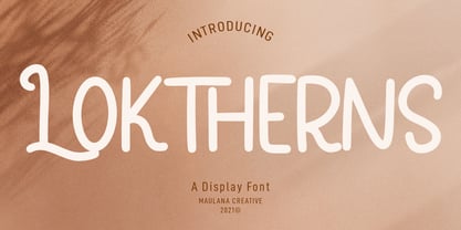 Loktherns is a handwritten display font. With mono-line stroke, upright, fun character. with a bit of ligatures and Small capital letter form. To give you an extra creative work. Loktherns font support multilingual more than 100+ language. This font is good for logo design, Social media, Movie Titles, Books Titles, a short text even a long text letter and good for your secondary text font with sans or serif. Make a stunning work with Loktherns font. Cheers, MaulanaCreative
 - Mandarin by Linotype,
$29.99Mandarin font first appeared with the Type Founders of Chicago and is an interpretation of artistically drawn Asian brush calligraphy. The stylized Asian atmosphere is not created only by the forms of the figures but also by the very name of the typeface. A mandarin was a high official of the ancient Chinese empire. Alphabets like Mandarin font are often used for the menus, signs and advertisements of Asian restaurants as well as for businesses with Asian products. - Virtuosa Classic by Linotype,
$29.99 Virtuosa Classicis the 21st century OpenType re-release of a classic Hermann Zapf design, his very first script typeface, Virtuosa. Based on the same sketches that would inspire Zapfino 50 years later, Hermann Zapf developed Virtuosa in 1948-49. It was originally released in metal in 1952. Virtuosa nova is an English copperplate script with character. The font includes two form variants for each capital letter, and there are a number of lowercase alternates and ligatures, too.
 - Genit by Motokiwo,
$15.00 Genit is a classy, elegant, modern and natural handwritten script font. Genit was made to handle every minimalist design project. Minimalist design is recommended for professional business, just like Leonardo da Vinci said: "Simplicity is the ultimate form of sophistication" With its signature style, Genit is ideal for business cards, magazines, book covers, blogs, branding, posters, headlines, wedding, quotes and also GREAT for logos. You can use this font for various design projects that need an elegant feel.
 - Glimp by OneSevenPointFive,
$15.00 Glimp, is a new versatile modern geometric font family, offering 3 widths, 9 weights and corresponding italics. It features rich set of opentype features such as stylist sets, contextual alternates, case sensitive forms, superscripts, subscripts, fractions, and more. Glimp is expertly crafted to be your top choice across a diverse array of projects, be it branding, web design, print materials, or presentations. It seamlessly enhances your designs, embracing your unique creative vision. Note: Also available in Variable version
 - Winooski by Oddsorts,
$29.00 A little goofy, a little nerdy, Winooski mixes loose pen-drawn gestures with legible forms to deliver a playful workhorse. It’s packed with goodies like small caps, ligatures, case-sensitive alternates, and broad linguistic support. It also sports extras like two styles of catchwords that can be fired up by flanking the desired word with either asterisks or underscores and discretionary ligatures for pricing. There are even easter eggs in the OpenType features for the scavenger hunters among us.
 - Maryam by Outras Fontes,
$24.00 Maryam is an Outras Fontes type family designed by Ricardo Esteves Gomes. With moderate contrast, these fonts have elegant and very legible forms even in small x-height sizes. There are more then 70 ligatures in each font, providing a lot of letterform variations that make this type family looks like a real handwriting on a page. It is currently available in two versions (Regular and Alternate) that you can combine with each other as you wish.
 - Sweet Girls by Haksen,
$12.00 Hello all, I will introduce my new font with the name “Sweet Girls” “Sweet Girls” is the form of letters that many variation and look very beautiful. available over than 50 glyphs for alternative letters that will make this font look so cute, funny, beautiful and fascinating. What's Included : Sweet Girls OTF Sweet Girls Slant OTF Sweet Girls Icons OTF Thanks so much for checking out my shop! Hope You enjoy it so much All the best, Haksen
 - Lalalo by Cuda Wianki,
$25.00 Lalalo is a casual, modern sans-serif font family based on hand-lettering. It's oval letter shapes provide soft and friendly appearance. Lalalo font is very legible with a warm touch perfectly suited for children books. Lalalo family consists of 6 weights ( Extra Light, Light, Regular, Semibold, Bold, ExtraBold). You can use it with normal fill or outlined. You can mix various colors and stroke widths to gain interesting results. There is also a set of nice frames available.
 - Gandur New by Blackletra,
$50.00 Gandur is a display textura in three weights, split into two families: Alte — the German word for old — and New. Gandur was inspired by other geometric texturas, specially Max Bittrof’s Element (1933). The design began by adhering to a strict hexagonal grid, but during its development, slowly moved from a purely geometric to a more pen-based design (this is especially true in the heaviest weights). The differences between Alte and New are essentially morphological, with reflections in the character set and OpenType features. Gandur New has a more humanistic, contemporary structure and is more ‘romanized’ then Alte. Gandur New also features small capitals. Gandur Alte, on the other hand, remains truer to historical forms, most notably: S s X x Z z. Gandur Alte also features the long-s, which can be accessed via a Stylistic Set or the glyph palette. (As is historically accurate, a short-s will be used at the end of words automatically when the historical Stylistic Set has been activated).
 - Pani Sans by Alessio Laiso Type,
$19.99 Pani Sans is a contemporary type family in 18 styles designed by Alessio Laiso. It takes inspiration from Italian rationalist and art deco typefaces, bringing them into the present with the mix of its reliable geometric structure and distinctive warm personality. The italics add to the unique character of the family by featuring distinguishing calligraphic touches. Pani Sans is fully equipped for intense professional use for both print and digital applications. It supports 219 languages, covering 100% of the Latin Plus character set, and it ships with powerful OpenType features including beautiful small caps, ligatures, stylistic alternates, fractions, tabular figures, old-style figures, and more. The variable fonts included in the family package allow you to pick the perfect weight, for unlimited design freedom.
 - Cutmark by J Foundry,
$25.00 INDUSTRIAL-STRENGTH UTILITY. Designed for function. Cutmark fonts features common 45˚ chamfered corners, flattened ink traps and wide apex forms. Customize the look with alternates including an Angled Set, Straight Set, Beam I, single-story a, and hooked l. The OpenType version includes 10 weights in 3 widths with matching italics. Variable Font Cutmark Variable contains the full family of styles in a single file! Select variations along width, weight and slant axes. Test and explore at jfoundry.com. Cutmark Variable is included in the complete package at no additional cost. Use which ever font format you prefer! Please email hello@jfoundry.com for any questions. Variable Fonts require MacOS 10.14 or higher. For browser and software support visit: v-fonts.com/support
 - TwentyFourNinetyOne by steve mehallo,
$19.91 TwentyFourNinetyOne [2491] is a reinterpretation of the alphabet of 1919 by Theo van Doesburg; the original a true rendering of the thinking of the Dutch-based art movement “de Stijl.” Jump forward to 1980 and prop lettering used on the Buck Rogers in the 25th Century television series; a vernacular typeface that was a utilitarian mix of geometry and pixel-based forms, used to symbolize the futuristic universe of 2491. At times it would appear on spaceships, laser guns, signage at space ports or in one episode, a Spandex tapestry. It only seemed logical to combine and rethink the letterforms, add ligatures + other extras, and see what the results would be. Futuristic, fun and bold to read! 2491: In the future, all type will look like this.
 - Praktika by Fenotype,
$25.00 Praktika Modern grotesk super family Praktika is a multifunctional super family of 40 fonts. It consists of three distinct widths and weights from extra light to extra bold. Conceptually, it is a rendition of the familiar early 20th century European grotesque styles, used in road signage – reimagined to meet the needs of contemporary world. Its design language, however, has been kept decidedly rough and bulky, to achieve a unique-yet-familiar look and feel. Praktika comes with more than a few features, accessible in any open type savvy program. • Built-in small capitals • Both lining and old style numerals, in tabular or proportional form • Superscript and subscript numerals • Many alternate characters For the best experience, purchase the whole family which is available for a good bargain price.
 - Chiefland by Letterhend,
$17.00 Garetra Serif s a sophisticated variable serif font with with many weight you can choose. It has 12 weight styles which you can play around to match your project, whether for a standout headline, or for a tagline, you name it. Perfect to be applied to the other various formal forms such as invitations, labels, logos, magazines, books, greeting / wedding cards, packaging, fashion, make up, stationery, novels, labels or any type of advertising purpose. Features : variable font with 6 weight style regular and slant uppercase & lowercase numbers and punctuation multilingual alternates & ligatures PUA encoded We highly recommend using a program that supports OpenType features and Glyphs panels like many of Adobe apps and Corel Draw, so you can see and access all Glyph variations.
 - Taca by Rúben R Dias,
$42.00 Taca is a typeface built around a shape that Portuguese designer Rúben R Dias calls a “squircle” — neither square nor circle. We usually associate the rounded, convex box with the television screens of the 1960s and Aldo Novarese’s classic typeface, Eurostile. But whereas Eurostile is cold and machined, Taca is warm and rugged, as if it was molded from clay or carved from stone. Taca’s organic nature is also derived from another unique feature: rounded crotches at the right angles where perpendicular strokes meet. This subtle finish, along with blunt stroke endings, softens the otherwise rigid skeleton. With such a strong conceptual vision, Taca could be relegated to the bin of experimental designs, severely limited in their application. But that fate is usually born of a less experienced maker. As a teacher, designer, and letterpress printer, Dias is a type user, keenly aware of the functional requirements of good type. Taca is therefore not a slave to its concept, but a working font family, effective in various sizes and environments. Its lettershapes break away from the base shape whenever it makes sense for legibility, while still maintaining the flavor of the design as a whole. That said, a set of squircle-shaped alternates give the user the flexibility to get more stylized if the situation calls for it. Fitting to its functional aims, Taca has many of the features one expects of a proper text font: upper and lowercase figures, case-sensitive punctuation, and Extended Latin language support. The simplicity, openness, and squareness of Taca’s forms also make it an ideal design for the pixel grid of screen displays.
 - P22 Muschamp Pro by IHOF,
$29.95 Prolific illustrator and veteran typographer Tracy Sabin draws on more than 40 years of multi-disciplinary design experience to bring us Muschamp Pro, a loopy, bouncy, free-form alphabet adaptable for many uses. It embodies the spirit of the massive art nouveau wave that broke out in the late 1950s and ingrained itself in popular culture for about three decades on both sides of the pond. Carefree, playful, rhythmic and versatile, this font evokes plenty of album jackets, children book covers, and cartoon titling from the times that really defined those design expressions and enshrined them as essential pop art. Muschamp Pro comes with plenty of alternates, ligatures of both standard and discretionary varieties, and extended Latin language support, all contained in a glyphset of more than 500 characters. Use this font if you want your design to transmit a message of crafty and joyful activity.
 - Bench Grinder by Typodermic,
$11.95 Step onto the farm and experience the essence of Bench Grinder, a unique display typeface crafted with the inspiration of 19th century metal headline type. With its serifs stripped away, Bench Grinder is a font that embodies rustic charm and familiar comfort, evoking a feeling of being at home in the country. This one-of-a-kind typeface is the perfect tool to help you express your message in an unpredictable way. Whether you’re a farmer or a designer, Bench Grinder can convey your words with unhinged creativity and unbridled passion. Let it take you on a journey through the rolling hills and green fields of the countryside, where life is simpler and beauty is found in the most unexpected places. So embrace the unique and make your words stand out with Bench Grinder. Let it be your tool of choice to bring your message to life, and let it capture the essence of the rustic charm of the farm. Experience the beauty and unpredictability of this font and let your creativity soar! Most Latin-based European writing systems are supported, including the following languages. Afaan Oromo, Afar, Afrikaans, Albanian, Alsatian, Aromanian, Aymara, Bashkir (Latin), Basque, Belarusian (Latin), Bemba, Bikol, Bosnian, Breton, Cape Verdean, Creole, Catalan, Cebuano, Chamorro, Chavacano, Chichewa, Crimean Tatar (Latin), Croatian, Czech, Danish, Dawan, Dholuo, Dutch, English, Estonian, Faroese, Fijian, Filipino, Finnish, French, Frisian, Friulian, Gagauz (Latin), Galician, Ganda, Genoese, German, Greenlandic, Guadeloupean Creole, Haitian Creole, Hawaiian, Hiligaynon, Hungarian, Icelandic, Ilocano, Indonesian, Irish, Italian, Jamaican, Kaqchikel, Karakalpak (Latin), Kashubian, Kikongo, Kinyarwanda, Kirundi, Kurdish (Latin), Latvian, Lithuanian, Lombard, Low Saxon, Luxembourgish, Maasai, Makhuwa, Malay, Maltese, Māori, Moldovan, Montenegrin, Ndebele, Neapolitan, Norwegian, Novial, Occitan, Ossetian (Latin), Papiamento, Piedmontese, Polish, Portuguese, Quechua, Rarotongan, Romanian, Romansh, Sami, Sango, Saramaccan, Sardinian, Scottish Gaelic, Serbian (Latin), Shona, Sicilian, Silesian, Slovak, Slovenian, Somali, Sorbian, Sotho, Spanish, Swahili, Swazi, Swedish, Tagalog, Tahitian, Tetum, Tongan, Tshiluba, Tsonga, Tswana, Tumbuka, Turkish, Turkmen (Latin), Tuvaluan, Uzbek (Latin), Venetian, Vepsian, Võro, Walloon, Waray-Waray, Wayuu, Welsh, Wolof, Xhosa, Yapese, Zapotec Zulu and Zuni.
 - Refillia Calligraphy by Aldedesign,
$18.00 Refillia Calligraphy is a stylish calligraphy font that features a varying baseline, smooth line, modern and with a depth love. For those of you who are need a touch of love and modernity for your designs or branding, it can be used for various purposes such as headings, wedding, invitation, signature, logos, branding, t-shirt, letterhead, signage, label, news, posters, badges etc. Just imagine that your customers love to see something beautiful, elegant, and warm, right? You don’t need to get confused to find an interesting font to attract their attention. We have a special font namely Refillia. The font design looks simple without losing its elegance and warmness. The function of the font is to show that you have a modern spirit to serve high-quality products and services. We design this font with OpenType features to give an artistic touch on it. This font is also applicable for numbers, punctuation, and other languages. It is also a multifunction font where you can use for a business logo, branding, wedding invitation, and anything you want. We'll have more great and artistic fonts. Just check our font collection by visiting Our Profile. Then, pick your most favorite font and use it to reach your goals.
 - Hydrargyrum by Type Minds,
$15.00 Hydrargyrum is the Latin form of a Greek word meaning "liquid silver" - mercury. The Hydrargyrum typefaces are designed with characteristics both of a metal and a liquid. The basic shapes of the letters are generally rigid and rectangular (particularly in style C), but the forms are enhanced by fluid curves and gently rounded corners. Hydrargyrum is not recommended for use at small sizes or in lengthy passages of text. It performs best in display-sized settings. Hydrargyrum consists of three styles, each in medium and semibold weights with matching obliques. The A style features solid, standard letterforms including the two-story a and g. Style B substitutes the a, g, M, and N (and related glyphs including numero and trademark symbols) for alternate shapes. The third subfamily takes the rectangular theme to an extreme, eliminating as many slanted strokes as possible from the letterforms. This makes some C-style letters ambiguous with one another, such as the U's and V's. As such, the C style is best used carefully even at larger sizes. The Hydrargyrum fonts are style linked within each style subfamily with, for example, Hydrargyrum A Medium as the regular style, Hydrargyrum A Medium Oblique as the italic, Hydrargyrum A SemiBold as the bold option, etc.
 - Stern Pro by Canada Type,
$49.95 Originally released in 2008, Stern is the only typeface to be produced and marketed simultaneously in digital and metal. In the twenty-first century, no less. It is also the last typeface Jim Rimmer ever completed. The process he used for its design and manufacture is the stuff of legend, and can be seen in the Richard Kegler documentary, Making Faces: Metal Type in the 21st Century. The design is a delicate upright italic named in memory of Chris Stern, the late artist and printer from Washington State. In 2013, Canada Type remastered and expanded the design's offerings to a glyphset of over 1200 characters, updated programming. Now Stern Pro includes the following features: - Small caps. - Caps-to-small-caps functionality, useful for setting mid-height caps alongside lowercase. - Tall caps. - Historical forms. - A wide variety of alternates for both uppercase and lowercase letters. - Plenty of ligatures. - Seven types of numerals, enclosers, cojoiners and currency symbols. - Automatic fractions. - A complete set of lowercase ordinals, from a to z. - Case-sensitive forms. - Language support for Greek and over 50 Latin languages. 20% of this font's revenues will be donated to the Canada Type Scholarship Fund, supporting higher typography education in Canada.
 - Linotype Notec by Linotype,
$29.99Franciszek Otto of Poland designed Linotype Notec in 1999. Linotype Notec is a low-tech" (or even "no tech!") typeface. By embracing handwriting's spontaneity, it has gotten as far away from technology as it can. Classified as an "inky"-style script face, for lack of a better term, Linotype Notec's informal design seems immediately artful and full of expression. Its irregularity and unexpectedness enlivens any composition, similar to how jazz or modern dance animate a room. Quite full of "ink," Linotype Notec's "strokes" are written in a sort of short-note-handwriting-style, which a slow-writing, thoughtful humanist might theoretically scribble to himself late at night. Yet Linotype Notec's character still maintains a jolt of energy; try Linotype Notec in small applications, in any size from 12-point on up." - Body Copy Sans Pro by Hackberry Font Foundry,
$24.95This new OpenType pro family has four members so far with 473 characters and glyphs each. It is a redrawing of Albe Sans, which has been found to be very readable, elegant, and extremely useful for books, newsletters, or anything you need. It is a humanist sans that works well for body copy or headlines. A black version is in the works. - Garden Marker by Yumna Type,
$12.00 Do you want to maximize your design project? Garden Marker is a beautifully designed font duo to add distinctive touch wherever they are used. This duo projects warm, friendly energy, elegant, as well as slightly cuteness feel. It is versatile enough to be used as title, body or button text. Furthermore, this font duo also offers a special extras i.e. 15 illustrations in total. Features: Stylistic Sets Ligatures Multilingual Supports Numerals and Punctuation It is suitable for branding, logos, social media quotes, stickers, posters, vintage designs, wall art, merchandise, social media, and many more. Get more inspiration by seeing the preview. Thank you for purchasing our premium fonts! Happy Designing!
 - Soutumi by MYSTERIAN,
$9.00 SOUTUMI Features: 6 Ampersand options per weight Extended Latin characters 2 Pi symbols Capital and lowercase 'sharp S' Loathing the time it took me to complete the family for my personal freelance identity, Multipolar (& the first font I ever authored myself), I vowed to take the challenge of working within considerable record time. Soutumi was conceived of this challenge; it's vain purpose as such is more meaningful than the forms or any other semiotics that make up itself. Whereas Multipolar took me 9 months to complete, Soutumi was finished within the span of 3, and also sports three times more ampersand alternatives (as that theme was a running joke in Multipolar).
 - Mortice by ArtyType,
$24.00 I set out to create a solid, bold, strong, rugged font, one that would lend itself to any industrial type of use, and by that I mean industry in general, but probably sectors that would still be considered male preserves such as carpentry or metalwork. I thought specifically of mortice & tenon joints, whilst toying with shape and form for this self imposed challenge. I was also visualizing a router tool used for producing most wood joints nowadays. I think the general premise worked out well; in the end I settled on the name Mortice, referring to the slots or negative spaces that the matching part, or tenon would fit into.
 - Stripes by profonts,
$41.99 Stripes is a caps only font and does not contain additional ligatures, because there is an easy way to create as many of them as you like. To form a ligature, convert your word or word string into vectors. Activate the corner points of the straight lines (not the round ones) of a letter and drag them over the next or the previous letter. This way you can create any ligature of your own. Beware of overkilling, it could decrease the legibility of your text. Besides the normal J, Stripes contains a stylistic alternate which should be used to avoid ugly gaps between critical letter pairs (see pdf document).
 - Botanical Scribe by Three Islands Press,
$39.00 The Raphael of Flowers is what they called Pierre-Joseph Redouté a couple hundred years ago. The Belgian native became famous in France, where he painted floral watercolors for both Marie Antoinnette and Empress Josephine. But what cemented his legacy was his perfection of a stipple engraving technique that brought his art to the masses. Botanical Scribe is modeled after the neat, cursive hand-inscribed legends on these antique prints. Because it simulates handlettering, the font retains a warm, organic quality not seen in fancy modern scripts while remaining both elegant and legible. (Its many ligatures lends to this authenticity.) Good for formal invitations or historical simulations.
 - SIAS Gramma by SIAS,
$29.90 The Gramma font family provides about 240 very basic graphic structures. Compilation of of this set has been inspired not by symblic but by graphical-morphological concerns. Therefore the three fonts (A, B, C) represent the entirety of all possible and simple graphic forms. Glyphs of this kind are likely to be found anywhere: in scripts, in signage, in branding marks – and so on. So, the Gramma font package is applicable to a great variety of usage. Whenever a free choice of elemental graphic motifs is desired – be it ideographical, pictographical or for brand design, this package provides you with nearly any graphic shape imaginable.
 - Sunny Dream by Letterhend,
$17.00 Sunny Dream is a font duo package contain a bold sans serif with rough script which looks great to be paired especially for vintage and adventure theme! This font duo is purposely made for headline, display or logotype, and signature which need a standout appearing. This font is also suitable to be applied especially in logo, and the other various formal forms such as invitations, labels, logos, magazines, books, greeting / wedding cards, packaging, fashion, make up, stationery, novels, labels or any type of advertising purpose. Features : Bold and Script uppercase & lowercase numbers and punctuation multilingual alternates & ligatures PUA encoded We highly recommend using a program that supports OpenType features and Glyphs panels like many of Adobe apps and Corel Draw, so you can see and access all Glyph variations.
 - Natalya Swashes by insigne,
$21.99 Natalya Swashes provides a diverse set of flowing swashes and ornaments originally designed to complement the popular insigne script Natalya. The basis point for Natalya's ornate swirls is the golden ratio, and this makes for especially harmonious swashes with timeless appeal. These poised and graceful flourishes can be easily adapted to many design situations, even in situations that don't call for Natalya Swashes' script companion. Natalya swashes can be resized and rotated easily without any loss of quality and converted to outlines and modified. Combine them to form unique compositions or insert them into your copy to create interest. Please see the sample .pdf to see all 56 ornaments in action. The Natalya Swash package comes with an inDesign sample file to quickly reference ornaments and copy and paste them into your layouts.
 - Keslie by Pixesia Studio,
$23.00 Introducing Keslie - Elegant Stylish Serif Keslie is a modern and stylish serif font that effortlessly combines trendy aesthetics with elegant charm. With its eye-catching appeal and fancy, charming characteristics, Keslie is the perfect choice for captivating designs. Its clean letterforms exude sophistication, making it ideal for high-end branding and editorial layouts. Keslie's unique character forms and balanced proportions ensure that your text stands out, adding a touch of modern elegance to any project. Unleash your creativity with Keslie and let its aesthetic, stylish, trendy, and elegant features elevate your designs to new heights. FEATURES - Stylistic Alternates - Ligatures - PUA Encoded - Uppercase and Lowercase letters - Numbering and Punctuations - Multilingual Support - Works on PC or Mac - Simple Installation - Support Adobe Illustrator, Adobe Photoshop, Adobe InDesign, also works on Microsoft Word Hope you Like it. Thanks.
 - Alurea by Storictype,
$19.00 Alurea is a feminine and girly font with delicate serifs that add a touch of elegance . Unique ligatures the graceful lines and curves evoke a sense of beauty and romance. This is a font for love letters, cover novel, magazine, coffee shop, wedding invitations, and feminine branding. It whispers sweet nothings in your ear with its delicate and intimate forms. The sensual contours beckon with a coy wink and a bashful smile. Like a graceful ballerina effortlessly dancing across the page, this font brings a soft, romantic air to any design. Use it to make a statement with its delicate femininity and inner poise. This is a font that celebrates the beauty, charm, and tenderness Features : Character Set A-Z Numerals & Punctuations (OpenType Standard) Disrectionary Ligatures Accents (Multilingual characters) Thank You
 - Soda Fountain JNL by Jeff Levine,
$29.00 In most cities during the 1950s and 1960s the corner pharmacy or soda shop was a mainstay of teenage life. It was a place to hang out with friends, hear the latest hits on the jukebox and indulge in everything sugary from malted milkshakes to banana splits. During this time, a popular form of window advertising was supplied by the Coca-Cola Company to promote its product being served by these locations. Specialty window decals designed to emulate drawn (raised) Venetian blinds "bookmarked" by the soda's logo were adhered to the shop's windows, with a space provided to add in customized lettering. The store's name or its specialties were applied to each window pane, and this formed a consistent border at the top of all of the shop's windows. Although few visual images exist of this specific bit of advertising nostalgia, an old record album by a late-1950s singer named Chip Fisher called "Chipper at the Sugar Bowl" provided a somewhat usable sample for what is now Soda Fountain JNL.