4,110 search results
(0.11 seconds)
- Stay ALive by Storictype,
$17.00 Stay Alive Typeface is Inspired by victorian style, poster, sign painter, 1800s bring classic touch on this decade, which is combining modern and classic typography with some awesome features that have a strong shapes so it will create more attention for people to look more closely. You can use this font for various purposes.such as logo, t-shirt, posters, lable, letterhead, book cover, and many more.
 - Alec Handwriting by SoftMaker,
$15.99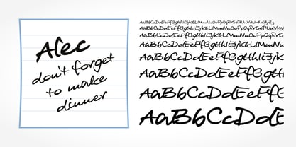 Digitized handwriting fonts are a perfect way to give documents the “very special touch”. Invitations look simply better when handwritten than when printed in bland Arial or Times New Roman. Short handwritten notes look authentic and appealing. There are numerous occasions where handwritten text makes a better impression. Alec Handwriting is a beautiful typeface that mimics true handwriting closely. Use Alec Handwriting to create stunningly beautiful designs easily.
 - ND Alias by NeueDeutsche,
$9.00 ND Alias is a monolinear sans serif coming in 8 weights and 3 widths, so a total of 24 styles. The design is an exploration of abnormal, minimalist, or hyper-reduced glyph shapes, which create a rather interesting degree of ambiguity while retaining legibility at the same time. Alias supports multiple scripts including a full set of Latin, Cyrillic, Greek, and Hebrew glyphs. Its aesthetics are rather serious and hyper futuristic and would be a perfect choice for a blockbuster sci-fi title sequence set over images of a nuclear wasteland or printing out the manifest of a vessel in orbit of a dark planet, the choice is yours. If you are adventurous try the regular style for copy even – you will be surprised. The wide options are great for titles and branding. Mix and match as you please!
 - Alipe Script by TeGeType,
$29.00 Alipe Script is a new script typefaces family. Alipe Script family has light, medium and bold fonts, all with ligatures, alternates and a set of ornaments. It can be used for text as well as for titling applications.
 - Alio Text by R9 Type+Design,
$35.00 Alio™ Text is the workhorse of the Alio family . It works beautifully as display type, body copy and anything in between. We redesigned Alio Text with taller x-height, more pronounced accents, and wider letter spacing than its siblings, Alio Pro. We also cut down from 6 weights/12 styles to 4 weights/8 styles. All of these is to ensure the legibility and readability and to maximize the weight contrast at small sizes. Whether your designs call for all caps, title case, sentence case or all lowercase, Alio Text has got you covered with the case-sensitive punctuations. No more baseline shift all your punctuations. Alio Text supports most Latin-based languages and even the Chinese Pin-Yin. This typeface also packs with Open-Type features similar to Alio Pro. For examples, both recognize fractions vs. dates; Both features several alternate positions for the legal symbols (3 in Alio Text; 5 in Alio Pro). If you’re looking for a go-to, versatile typeface for most occasions, Alio Text is for you. (4 weights/8 font styles, 500+ glyphs each).
 - Giant Head OT - Unknown license

- Spin Cycle OT - 100% free

- Print Clearly OT - Unknown license

- Sport OT Regular by T-26,
$19.00
- Titan Text OT by DSType,
$19.00Originally designed in 2003, TitanText now becomes TitanTextOT and it's available in Regular, Italic, Bold and Bold Italic. Includes plenty of OpenType features, like SmallCaps, Alternates, Ligatures and Swashes. - Pintor OT Regular by T-26,
$19.00 - Star 5 Five - Unknown license

- LD Underwood 5 by Illustration Ink,
$3.00This font represents the type style created by this very famous classic typewriter. - Ionic No 5 by Monotype,
$51.99 Ionic No5 is a refresh of a classic Linotype Clarendon-style serif, another restored classic from the Monotype library, much like the recent updates to Walbaum and Helvetica Now. The original typeface was designed to be printed and read at small sizes, popular with newspapers in the 20th Century at its birth. The restoration and refinement of this typeface has bestowed a greater sense of clarity and directness, smartly stylish, and an utterly captivating appeal. Because these styles were so popular for books and newspapers for so long we associate them with being editorial or bookish, not dull, but thoughtful. Designers today can use that association to their advantage as a visual shortcut to convey similar meaning and tone. More attention was given on modernising the typeface with precious use and the introduction of sharp edges & finishes. The thinnest weights can give a dancing typewriter aesthetic, being low stroke contrast. The heavy weights have an unquestionable presence on the page. Overall, the typeface has a richness and almost illustrative quality about it. The true depth of Ionic No.5 could enable each weight to be a poster by itself. Ionic N°5™ font field guide including best practices, font pairings and alternatives.
 - FE 5 Cent by Egor Stremousov,
$50.00 5 pixel font for games, display and web. 748 glyphs support for over 89 languages. The 5 Cent font is designed for extremely small font size. To be precise, usual height of capital letters in this font is just 5 pixels and height of lowercase chars equals to 4 pixels.
 - Deco Experiment 5 by Intellecta Design,
$9.00a naive typeface from Art Deco ages - Ornaments 5 AR by ARTypes,
$30.00Ornaments 5 are based on the Amsterdam Primula ornaments designed by Imre Reiner, 1949. - Lao UI by Microsoft Corporation,
$49.00 - HS Ali by Hiba Studio,
$59.00 HS Ali was designed in memoriam of my brother - Ali Abu Afash who was martyred during the last aggression on Gaza in summer 2014. HS Ali introduced a modern OpenType Arabic typeface, which had the characterstic, features of Kufi style with noticeable both curvy and sharp segments; beside the refinements of its letters that made it more readable. HS Ali is a display font that has been designed to be used in titles in modern graphic and publication projects. It supports Arabic, Persian, Urdu and Kurdish languages and contains four weights: Light, regular, medium and bold which can be condsiderd as and elaboration to the library of Arabic fonts contemporary models that meet the variant purposes of designs for all tastes.
 - Ali SRF by Stella Roberts Fonts,
$25.00 Ali SRF is named for Stella's son, and was designed for Stella Roberts by Ray Larabie of Typodermic Fonts. The net profits from my font sales help defer medical expenses for my siblings, who both suffer with Cystic Fibrosis and diabetes. Thank you.
 - Ali Ana by IbeyDesign,
$18.00 Ali Ana- Heart Font feels equally charming and elegant. It looks stunning on wedding invitations, thank you cards, quotes, greeting cards, logos, business cards, and every other design which needs a handwritten touch.
 - Lagos by Device,
$29.00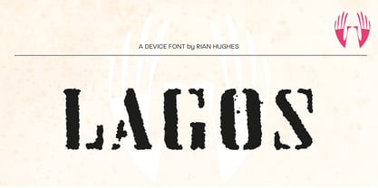
- Lam by Produce,
$29.00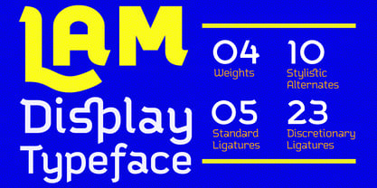
- Laro by Larin Type Co,
$15.00 Laro this is a modern sans-serif font that includes nine weights from thin to black and nine weights in Italic style. This multi-purpose font captures a huge range for the design and creation of your project. Laro will perfectly cope with a variety of tasks and he will always look stylish and modern. With it, you can create logos, labels, use in advertising, packaging, branding, book covers and magazines, cosmetics, banners, posters, headings, descriptions and much more. This font is easy to use has OpenType features.
 - Leo by Canada Type,
$29.95 Leo is an economic magazine and book face meant for use in sizes suitable for immersive reading, with different cuts optimized for different body copy size ranges, like footnotes and legal text. Designed with the explicit intent of relaying information without calling attention to itself, this typeface places itself squarely on the "function" side of the eternal debate about form versus content. The roman Leo fonts were built with as little ornamentation as possible, with wedge serifs, a high x-height and a skeleton somehwat rooted in the designers' reflections on the modern, post-war Dutch archetype. Rather than follow traditional models with entirely different forms, contracted widths and steep slants, the Leo italics deliver naturally subtle emphasis in reading by closely relating to the forms, stance and rhythm of their roman counterparts. The 12 Leo fonts contain over 700 glyphs each, and include support for the vast majority of Latin languages. Included OpenType features are built-in small caps, lining and oldstyle figures in both proportional and tabular sets, superiors, numerators, denominators inferiors, ordinals, automatic fractions, ligatures, and optional long descenders for optimal counterspace management in book and magazine text layout. For more information on Leo's character set, features and some print tests, please consult the PDF in the gallery section of this page.
 - Lagos by Scholtz Fonts,
$19.00 Lagos was created because of the lack of African-inspired fonts that are truly modern without being partly art-deco in origin. I wanted to make a vigorous, sharp-edged font that reflects the energy and dynamism of modern Africa. The lines of the font combine the sharp angularity of African rocks and mountains with the smooth fluidity of Africa's snake-black rivers. The font is supplied in two styles, Lagos Regular and Lagos Light. Lagos Light is not a simple, mechanical modification of Lagos Regular. The outlines and proportions have been subtly modified to accommodate the lighter weight. Lagos contains a full 256 character set (upper and lower case, punctuation, diacritical characters, special symbols and numerals), in which all characters have been fully kerned and letter-spaced.
 - Aloe by ROHH,
$29.00 Aloe is a characterful and friendly display font family inspired by headlines from 1930’s newspapers and calligraphy. The family consists of 9 weights, ranging from Thin to Heavy, with matching ornament fonts. It features a variable font with weight axis. Each weight has over 900 glyphs including advanced typographic features, such as vast number of stylistic alternates, swashes, titling and terminal forms, case sensitive forms, ligatures, symbols, ornaments as well as lining and old style figures, fractions, subscripts and superscripts. This original mixture of display typeface with calligraphy gives a versatile family great for all sorts of uses - from advertising, packaging, branding, wedding invitations, menu cards and other editorial uses to screen and web projects.
 - Kaos by Wiescher Design,
$39.50 On a huge garbage bin in Lisbon I saw the sentence, “Perdidos no kaos”, which means lost in chaos and I really liked the rough stenciled lettering. Back home I designed a typeface that wasn't quite as chaotic as the lettering on the garbage container. Yours – always on the lookout for great typefaces – Gert Wiescher
 - Spin Cycle 3D OT - Unknown license

- Preto Serif OT Std by DizajnDesign,
$50.00 Preto is an extensive type family, which explores the function of serifs on readability and legibility. Preto consist of three subfamilies: Sans, Semi and Serif. Preto is designed for multilingual typesetting. All of the subfamilies have equal gray value but different texture which can be use to differentiate languages. Preto sub-families have two text weights and two bold styles (Regular -> Bold, Medium -> Black). Every weight has a companion Italic style as well. The serif version has been designed to work best at small point sizes (around 8, 9 points). You will not achieve calm, boring or invisible look of your text with Preto Serif. Its long, spiky and sharp serifs contribute to give the typeface a distinct and energetic character. It is very suitable for magazines, corporate identity, brochures or other print materials where a typeface for continuous reading is required. The ligatures in Preto Serif are very special. You can set them in different tracking values and spacing will increase/decrease consistently in the ligatures as well. Alternative characters in the font files allow you to change the feeling of the text from typical to more special (J, Q, g , &). Each font contains a full set of small caps and many alternative characters for complex typesetting.
 - Preto Sans OT Std by DizajnDesign,
$50.00 Preto is an extensive type family, which explores the function of serifs on readability and legibility. Preto consist of three subfamilies: Sans, Semi and Serif. Preto is designed for multilingual typesetting. All of the subfamilies have equal gray value but different texture which can be use to differentiate languages. Preto subfamilies have two text weights and two bold styles (Regular --> Bold, Medium --> Black). Every weight has a companion Italic style as well. Preto Sans OT Std The Sans version of Preto forms the basic skeleton of the family, it is decidedly simpler than the other styles (Semi and Serif). Although you can find many distinctive and unique elements in the details. The most visible elements are the tapered upper part of the letters. The capital letters have uniform widths achieving very different texture than traditional roman proportions. There are two different options for ligatures and alternative characters (J, Q, g, &) gives more variability for different languages.
 - Preto Semi OT Std by DizajnDesign,
$- Preto Semi is an experiment. It is an attempt to create a readable type for text point sizes (other than sans-serif and serif). Preto Semi is not a Sans with added serifs or Serif with serifs removed. The use of the serifs is redefined and used for other purpose(s). The serifs became the extension of the stroke, they help to solve the spacing problem of sans-serif types and they use the primary function of serifs – keeping the eye on the baseline and emphasize the horizontal rhythm of the lines of text. Preto Semi is intended for magazines and editorial design, as other members of Preto family. Preto is an extensive type family, which explores the function of serifs on readability and legibility. Preto consist of three subfamilies: Sans, Semi and Serif. Preto is designed for multilingual typesetting. All of the subfamilies have equal gray value but different texture which can be use to differentiate languages. Preto sub-families have two text weights and two bold styles (Regular -> Bold, Medium -> Black). Every weight has a companion Italic style as well.
 - 5 Fingered Goth SWTrial - Unknown license

- 5 Finger Death Punch - 100% free

- KR Irish Kat 5 - Unknown license

- Nimbus Sans No. 5 by URW Type Foundry,
$89.99 - Garamond No. 5 EF by Elsner+Flake,
$35.00 - Calligraphia Latina Soft 5 by Intellecta Design,
$20.90 One of the most successful ornament fonts is CalligraphiaLatina. It is part of a trend that’s been quite popular lately: messed-up calligraphy. CalligraphiaLatina is a worldwide best-seller from IntellectaDesign. Besides the original CalligraphiaLatina, its family of fonts (13 different sets) represents a complete solution of intricate fleurons and ornaments for use with various styles of artworks.
 - EF Mao Mao by Elsner+Flake,
$35.00 - Sevil alias Esra Lite - Unknown license


