10,000 search results (0.044 seconds)
  1. Art Nouveau BA by Bannigan Artworks, $19.95
    This is an original font designed in the Art Nouveau style with strong influences by Arnold Boecklin.
  2. Butterfish by Bogstav, $17.00
    Art Deco inspired font in 4 different versions with multi language support as well as contextual alternates!
  3. Semantica MF by Masterfont, $59.00
    Formal, yet with very high legibility even in small point sizes. Many weights gives you design alternatives
  4. Celtic-BA by Bannigan Artworks, $19.95
    This is my interpretation of the writing in ancient Celtic manuscripts such as the Book of Kells.
  5. Hamasa by Arendxstudio, $15.00
    Hamasa is a very cute font with lots of variation in it that make the atmosphere happy .
  6. Liana by ParaType, $25.00
    The typeface was created for TypeMarket in 1998 by Natalia Vasilyeva. Based on Lainie of Soft Horizons.
  7. Balshan MF by Masterfont, $59.00
    Derived from old signage, this serif font is unique and readable in titles and text as well.
  8. Tough Guy JNL by Jeff Levine, $29.00
    Tough Guy JNL gets right to the point of your headline in a strong and charismatic way.
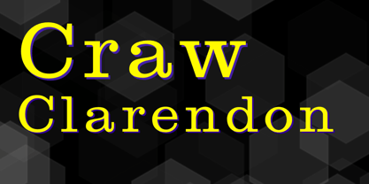
  9. Craw Clarendon by Wooden Type Fonts, $15.00
    One of the many Clarendon font designs, this one based in part on the Craw Clarendon design.
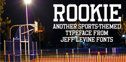
  10. Rookie JNL by Jeff Levine, $29.00
    Rookie JNL is derived from the lettering style found in Directory Board JNL, but with serifs added.
  11. Grandeur by BA Graphics, $45.00
    A contemporary design can be used in all applications from text to Headlines. Very clean and readable.
  12. Thunderbird by Bitstream, $29.99
    A typical set of American Tuscan capitals cast by ATF in the middle of the nineteenth century.
  13. Gothic by Wooden Type Fonts, $15.00
    Gothic Bold Condensed, first shown in 1889 by Hamilton wooden type founders. With lowercase. Gothic Bold Expanded.
  14. Gothic Ritual by Geo Dim Creations, $9.99
    Gothic Ritual is inspired by well known franchise Diablo that made its initial release back in 1996.
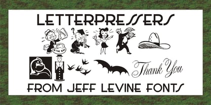
  15. Letterpressers JNL by Jeff Levine, $29.00
    Another wonderful collection of vintage cartoons, sales helpers, decorations and embellishments comes to you in Letterpressers JNL.
  16. Gargoyle by Red Rooster Collection, $45.00
    Based on an Adrian Williams design, circa 1976 and Brook Type in 1903 designed by Lucien Pissaro.
  17. Range Gothic by BA Graphics, $45.00
    A new gothic with the look for today. Available in 3 weights, universal, works for all applications.
  18. Enochian Writing by Deniart Systems, $10.00
    Based on the magical writing system originated by Dr. John Dee and Edward Kelly in Elizabethan England.
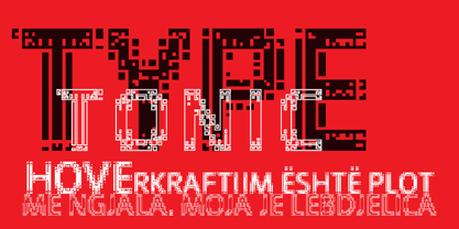
  19. Typetonic by Wilton Foundry, $21.00
    Typetonic is great display face for anything related to design, art or technology. Available in Crossplatform Opentype.
  20. Ger by ParaType, $25.00
    A set of historical Ossetic ornaments was designed by Lev Alborov in 1998 and licensed by ParaType.
  21. Pixo by Cubo Fonts, $29.00
    Pixo is a Brazilian graffiti seen in Sao Paulo. Pixo draws its inspiration from that original style.
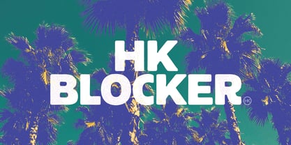
  22. HK Blocker by Hanken Design Co., $40.00
    HK Blocker™ is a display typeface inspired by the paste-up typography back in the 50s.
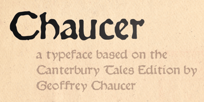
  23. Chaucer by Volcano Type, $19.00
    Geoffrey Chaucer (1340-1400) was a English poet, one of the most important figures in English literature.
  24. DB Circles - Christmas by Illustration Ink, $3.00
    DoodleBat Circles - Christmas is a collection of Christmas themed words and clipart thrown together in classic circles.
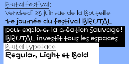
  25. Brutal by bb-bureau, $65.00
    Brutal is a not stencil calligraphic typeface designed in light, regular and bold. language: all latin glyphs
  26. Home Field JNL by Jeff Levine, $29.00
    Home Field JNL is a sports-oriented font based on the lettering found in Directory Board JNL.
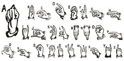
  27. ABC Hand by Intellecta Design, $15.90
    A source of hand signals. This alphabet is presented in two forms with one and two hands.
  28. DB Girly Soccer by Illustration Ink, $3.00
    Whoever said that girls can't play sports was wrong! DoodleBat Girly Soccer highlights the fun in soccer.
  29. Alexander by Monotype, $29.99
    The Alexander font family was designed by Adam Roe for Lunchbox design. Alexander was released in 1993.
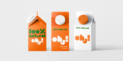
  30. Soul by VisualizeUnited Fonts, $65.00
    Soul, is a display typeface in lower characters. It is suggested for posters, product labels and titles.
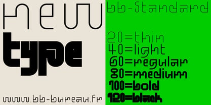
  31. BB Standard by bb-bureau, $60.00
    Grid inspired typefaces in 6 weights: 20, 40, 60, 80, 100 and 120 language: all latin glyphs
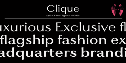
  32. Clique by Device, $29.00
    A clean elegant subtly flared serif in three weights suitable for high-fashion and luxury brand use.
  33. Roller Poster by HiH, $12.00
    Roller Poster is named after Alfred Roller. In 1902, Roller created a poster to advertise the 16th exhibit of Austrian Artists and Sculptures Association, representing the Vienna Secession movement. The exhibit was to take place in Vienna during January & February 1903. The location is not mentioned because everyone in Vienna knew it would be held at the exhibit hall in the Secession Building at Friedrichstraþe 12, a few blocks south of the Opernring, near the Naschmarkt. Designed by Joseph Maria Olbrich in 1897, the buiilding has been restored and stands today as one finest of the many fine examples of Art Nouveau architecture in Vienna (see vienna_secession_bldg.jpg). Because of its dome, it is called “the golden cabbage.” The poster itself is unique. The word “secession” is in one type style and takes up two-thirds of the elongated poster. At the bottom of the poster are the details in a different lettering style. It is this second style at the bottom that is the basis for the font Roller Poster. In keeping with our regular naming conventions, we were going to call it Roller Gezeichnete (hand-drawn), but the wonderful play on both words and the shape of the three S’s in secession was too compelling. In November 1965 there was an exhibit of Jugendstil and Expressionist art at the University of California. Alfred Roller’s Secession Poster was part of that exhibit. Wes Wilson was designing promotional material at Contact Printing in San Francisco. Among their clients was a rock promoter named Bill Graham, staging dance-concerts at Fillmore Auditorium. Wilson saw the catalog from the UC exhibit and Roller’s lettering. Wilson adapted Roller’s letter forms to his own fluid style. The result was the poster for the August 12-13, 1966 Jefferson Airplane/Grateful Dead concert at Fillmore put on by Graham (BG23-1). Wilson continued to use Roller’s letter forms on most of the posters he did for Graham through May 1967, when he stopped working for Graham. The posters were extremely successful and the lettering style along with Roller’s letter forms were picked up by other artists, including Bonnie MacLean, Clifford Charles Seeley, James Gardner, and others. The Secession poster and the Fillmore posters have inspired a number of fonts in addition to ours. Among them are JONAH BLACK (& WHITE) by Rececca Alaccari, LOVE SOLID by Leslie Carbarga and MOJO by Jim Parkinson. Each is different and yet each clearly shows its bloodlines. Our font differs in two ways: 1) the general differences in the interpretation of the letter forms and 2) the modification of the basic letter form to incorporate the diacriticals within the implied frame of the letter, after the manner of the original design by Roller. We borrowed Carbarga’s solution to the slashed O and used it, in a modified form, for other characters as well to accomplish the same purpose. We recommend that you buy ours and at least one of the other three. According to Alaccari, a version called URBAN was released by Franklin Lettering in the 70’s (and is shown on page 51 of The Solotype Catalog). For comparison of our font to original design, see image files roller_poster_2s.jpg of original poster and roller_poster_2sx.jpg showing reconstruction using our font for the lower portion (recontructed area indicated by blue bar). Please note the consistency of character width. In the lower case, 23 of the basic 26 letters are 1/2 EM Square wide. The ‘i’ is an eighth narrower, while the ‘m’& ‘w’ are one quarter wider. All the Upper Case letters are 1/8 EM wider than the lower case. This is to make it easier to fill a geometrical shape like a rectangle, allowing you to capture a little of the flavor of Wes Wilson’s Fillmore West poster using only a word processor. We have also included a number of shapes for use as spacers and endcaps. If you have a drawing program that allows you to edit an ‘envelope’ around the letters to distort their shape, you can really get creative. I used Corel Draw for the gallary images, but there are other programs that can accomplish the same thing. The image file “roller_poster_keys.jpg” shows the complete character set with the keystrokes required for each character (see “HiH_Font_readme.txt” for instruction on inserting the non-keyboard characters). The file “roller_poster_widths.jpg” shows the exact width of each character in EM units (based on 1000 units per EM square). You will notice that the font is set wide for readability. However, most programs will allow you to tighten up on the character spacing after the manner of Roller & Wilson. In MS Word, for example, go to the FORMAT menu > FONT > CHARACTER SPACING. Go to the second Drop-Down Menu, labeled ‘Spacing’ and select "condensed' and then set the amount that you want to condense ‘by’ (key on the little arrows); two points (2.0) is a godd place to start. Let your motto be EXPLORE & EXPERIMENT. Art Nouveau has always been one of my favorite movements in art -- I grew up in a home with a couple of Mucha prints hanging on the living room wall. Perhaps because of that and because I lived through the sixties, I have enjoyed researching and designing this font more than any other I have worked on. Let’s face it (pardon the pun), Roller Poster is a FUN font. You owe it to yourself to have fun using it.
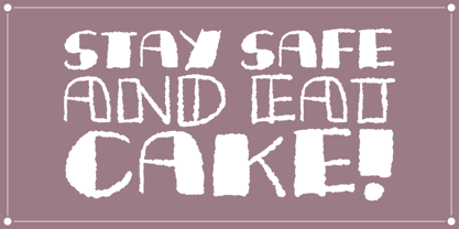
  34. Zombie Food Demo by NihStudio is a font that, as its name suggests, captures the essence of horror and survival themes, wrapping them in a quirky and distinctive style. This font appears as if it has...
  35. The "Narnia BLL" font, as its name evokes, brings to mind the magic and adventure of the fantastical world created by C.S. Lewis. This typeface, though not officially recognized as a part of the Narn...
  36. Lady Starlight by Ray Larabie is a distinctive font that captures the essence of whimsicality and enchantment. Ray Larabie, known for his diverse and prolific contributions to the world of typography...
  37. Fiolex Mephisto is a distinctive and visually captivating font that effortlessly captures the essence of classic artistry with a touch of diabolical charm. This typeface is designed to evoke an atmos...
  38. ATROX is a distinctive font that boasts a characterful design, making it stand out from the crowd. Its name, which invokes a sense of something formidable and bold, is a perfect representation of the...
  39. The Hello Ween font by Billy Argel is a captivating typeface that exudes an eerie charm, making it perfect for projects that require a touch of mystery or spookiness. This font stands out with its un...
  40. Forever Black is an evocative and potent typeface that has a magnetic pull, thanks to its bold and confident strokes. Designed to make a statement, it carries an air of unwavering assurance, making i...
Looking for more fonts? Check out our New, Sans, Script, Handwriting fonts or Categories
abstract fontscontact usprivacy policyweb font generator
Processing