10,000 search results
(0.035 seconds)
- Glorious Song by Stiggy & Sands,
$24.00 A type from vintage Hollywood to your computer screen. Glorious Song is a display serif typestyle that was inspired by the poster lettering for the 1948 movie "Words and Music". It's an all capitals typeface that has alternate caps in the lowercase slots to convey all of the spunk and visual dance of the original inspiration. See the 5th graphic for a comprehensive character map preview. Glorious Song comes with features for customisation options: - An all capitals typeface with alternate capitals in the lowercase slots - A Ligatures feature that alternates between Capital and Alt Capitals characters. - A SmallCaps feature just to mix things up a little. - A Full set of Inferiors and Superiors for Limitless Fractions - Tabular and Proportional figure sets Approx. 546 Character Glyph Set: Glorious Song comes with a glyphset that includes standard & punctuation, international language support, basic ligatures, alternate numeral styles, subscript and superscript, and Small Cap letters.
 - Cabrito Inverto by insigne,
$- Life’s always more fun when you reverse the stress. The same goes for the new member of the Cabrito family. Cabrito itself is a recently developed slab serif made for the kid’s book The Clothes Letters Wear. Cabrito proved to be more popular than I thought, and I promised I would create an inverted style for this new addition to the font world--a variant that would pair well with the original or even stand well on its own. And so now, here it is. Cabrito Inverto, which features the reversed stress of the strokes from a font’s “normal” traits. Inverted stress fonts are most often associated with cowboys and the Old West. The inverted stress gives it a happy-go-lucky appearance, not to be taken too seriously. It’s a pleasantly rounded, not-so-strictly geometric typeface with handwriting-inspired forms. Whew, that’s a mouthful! Inverto’s bundle of alternates is accessible in any OpenType-enabled program. It contains a workforce of alternates, swashes, and alternate titling caps to embellish the font. Also bundled are swash alternates, aged design and style figures, and compact caps. Peruse the PDF brochure to examine out these solutions in action. OpenType-enabled purposes such as Adobe suite or Quark will allow ligatures and alternates. This font family also includes the glyphs for 72 different languages. Cabrito Inverto does pair well with Cabrito. There is even an extra font weight, Black, for when you want to punch it up a bit. Jeremy Dooley designed Inverto to be a welcoming, day-to-day font family. Use it to express friendliness on just about anything, from candy to food to children’s toys. Cabrito Inverto’s one-of-a-kind visual appearance brings a bundle of fun to the party. Buy Cabrito Inverto to give a boost to your designs every day of the week.
 - Art Galleria SS by Sensatype Studio,
$15.00 Art Galleria is a Modern Display Sans Serif A new Modern Display Sans serif that we created special for branding needs, with extra ligature in unique shape add value of your brand. It so nice to leverage designer or product owner that need solutions to make their design look more unique and modern. And specially for Art Galleria font, We prepared any ligatures, and any alternate characters to help you create unlimited variations for your creative needs. Art Galleria Modern Display font ready with: Any options to get creative variations (combination of Alternate and Ligatures) Preview as a inspirations that you can do with Art Galleria font Ready with All Uppercase characters Wish you enjoy our font. :)
 - Jazm by Arabetics,
$34.00 Jazm is an Arabetic typeface design with connected glyphs. Jazm was the earliest, pre-Islamic, script style of the modern Arabic script, before branching into Kufi and Naskh styles. The initial script had a lot less, position-dependent shapes and ligatures, and was not strictly connected. It occasionally included minuscule dots to distinguish identical shapes. This font family design is a modern visualization by the designer of the historical Jazm letter shapes following the guidelines of the Mutamathil Taqlidi type style with one glyph for every basic Arabic Unicode character or letter, as defined in Unicode Standards, and one additional final form glyph for each Arabic letter that can connect with other letters from both sides in traditional cursive Arabic strings. Jazm employs variable x-height values. It includes all required Lam-Alif ligatures and selected marks. Tatweel (or Kashida) glyph is a zero width space. Keying it before any glyph will display that glyph isolated form, if desired. Keying Tatweel before Alif Lam Lam Ha will display the Allah ligature. Jazm typeface family includes both Arabic and Arabic-Indic numerals; all required diacritic marks, in addition to Standard English keyboard punctuations and major currency symbols. Jazm is available in regular, bold, black, and corresponding italic (slated to the left) styles.
 - ALS Script - Unknown license

- Marker Makers by Colllab Studio,
$19.00 "Hi there, thank you for passing by. Colllab Studio is here. We crafted best collection of typefaces in a variety of styles to keep you covered for any project that comes your way! Making your brand visible, interesting and recognizable without having to get in the way of your customer’s experience is hard. It takes a lot of time, money and effort to make a clear brand. And maintaining it through all your customer touchpoints is even harder. Introducing, Marker Makers is a versatile marker font that takes inspiration from the boldness of graffiti and the playfulness of primary colors. It's a joy to use for any design project where you want your audience to pay attention, this is your go-to font and take your next project from good to WOW! Marker Makers comes with more than 400 glyphs, including punctuation, numbers and upper and lower-case letters you’ll have all the tools you need to create invigoratingly unique content. Whether it’s included on posters at trade shows or on the walls of any room in your office, no one will ever think it was boring! A Million Thanks Colllab Studio www.colllabstudio.com
 - Starkey by Mans Greback,
$59.00 Starkey is a bold, handwritten script typeface. It is modern, quirky and clean, with a natural brush style that can be used for all your projects and needs. Each glyph is carefully drawn, and all of them have their own uniqueness. When connecting with each other, they will provide dynamic and pleasing proximity and a beautiful flow. The high-quality logotype lettering works perfectly for branding and in any joyful context, such as product designs, labels, invitations and much more. Use characters { } < > _ to create swashes. Write multiple characters to get longer swashes. Example: Eter{{{nal The font is full of ligatures, alternates and other OpenType functions. It has extensive language support, allowing you to write in all European Latin based scripts, as well as containing numbers and all characters and symbols you'll ever need.
 - Airium by Mans Greback,
$49.00 Airium is a decorative serif typeface. Classy and clear, but with original display features, Airium assures any graphic project a characteristic appearance and unique personality. It is lightweight and bright, with cut-out parts and hollow vertical strokes. Use the parenthesis characters ( [ { } ] ) to make decorative swashes. Example: [Wonderful] The Airium family consists of four high-quality styles: Regular, Bold, Italic and Bold Italic. The font is built with advanced OpenType functionality and has a guaranteed top-notch quality, containing stylistic and contextual alternates, ligatures and more features; all to give you full control and customizability. It has extensive lingual support, covering all Latin-based languages, from North Europe to South Africa, from America to South-East Asia. It contains all characters and symbols you'll ever need, including all punctuation and numbers.
 - Eleganto Sans by Ardyanatypes,
$10.00 A Fashionable Modern Sans Serif with special alternative letters and multilingual support for elegant, upscale, chic, and classy branding designs Look at that curve shape as a sexy hip and legs walk out! This character set makes your designs more brave, eccentric, and fascinating Comes out with 6 weight as your wish for any needs. y es tan perfecto! Superfit with your design moods as beauty care, boutique, fashion sale promotion, villas, restaurants, and much more where your design style goes by Of course, the ligatures will make it all double perfects, be ready! this is the time to have all that ELEGANTO style nos vemos, mi amor A guide to accessing all alternatives can be read at: http://adobe.ly/1m1fn4Y Features: A – Z Character Set a – z Characters set Numerals & Punctuations (OpenType Standard) Multilingual Thank you and have a nice day
 - Lacosta by Mans Greback,
$59.00 Lacosta is a decorative script typeface, drawn and created by Måns Grebäck during 2020. Perfect for company or product logotypes, or any typographic art that requires that classic custom look. Included in the family is the Lacosta Line typeface, a swash underlined variation of the original font. In addition to being a beautiful, ornamental lettering, it also has a lot of decorative and swash options: Use the symbols [ ] { } _ to create connections, swashes and decorations. Example: Extra[ Sweet] The font contains multiple OpenType functions, and is filled with alternates; stylistic alternates to give extra personality, and contextual alternates to make the letters flow with one another smoothly -- just as a custom logo. Lacosta has a very extensive lingual support, covering all European Latin scripts. The font contains all characters you'll ever need, including all punctuation and numbers.
 - VTC-Bad Tattoo Hand One - Personal use only

- Moneymachine by Mans Greback,
$49.00 Moneymachine is a sans and serif combined display typeface. Inspired by the art of money printing, the typography used for certificate production and classic letterforms, Moneymachine uses a traditional and perfected serif font and blends it together with a modern and clean sans-serif. The result is an original and confident work, which fits perfectly as a logotype or headline in any context that requires that extra touch of coolness. The Moneymachine family consists of six fonts: The Regular that combines sans and serif. Inverted for a white-on-black version. The Serif and Sans for more basic writing. White and Black for a lettering with a banner. The font is built with advanced OpenType functionality and has a guaranteed top-notch quality, containing stylistic and contextual alternates, ligatures and more features; all to give you full control and customizability. It has extensive lingual support, covering all Latin-based languages, from North Europe to South Africa, from America to South-East Asia. It contains all characters and symbols you'll ever need, including all punctuation and numbers.
 - Masthiya Script by madjack.font,
$16.00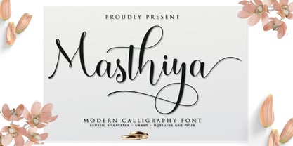 Masthiya Script is a modern calligraphy design including Regular. This font is casual and pretty with swashes. Can be used for various purposes. such as logos, product packaging, wedding invitations, branding, headlines, signage, labels, signatures, book covers, posters, quotes, and others. Masthiya Script includes changes in OpenType style, binding and international support for most Western languages. To activate the OpenType Stylistic alternative, you need a program that supports OpenType features such as Adobe Illustrator CS, Adobe Indesign & CorelDraw X6-X7, Microsoft Word 2010 or a later version. How to access all alternative characters using Adobe Illustrator: https://www.youtube.com/watch?v=XzwjMkbB-wQ The Masthiya Script is coded with PUA Unicode, which allows full access to all additional characters without having to design any special software. Mac users can use Font Book, and Windows users can use Character Map to view and copy any of the additional characters to paste into your favorite text editor / application. How to access all alternative characters, using the Windows Character Map with Photoshop: https://www.youtube.com/watch?v=Go9vacoYmBw If you need help or have any questions, let me know. I'm happy to help :) Thanks & Congratulations on Design!
 - Riquet by Lipton Letter Design,
$20.00 In the nineteen-twenties and early thirties, all display typography flourished in Europe. This was especially true in Germany, where poster design set a high creative standard, stimulating the design of a fantastic group of dramatic display letterforms. Richard Lipton designed Riquet after being inspired by a handful of freehand capital and lowercase letters on posters designed by lettering and poster artist Ludwig Hohlwein. He expanded this small group of display letterforms into a variable family with a weight axis. Riquet is a low contrast, delightfully casual typeface with 6 weights and the perfect selection of alternates. All of which gives an expressive look of precisely inked letters perfect for any packaging or branding project.
 - Hello Dark by Andrey Font Design,
$9.00 Hello Dark is a thick-lettered and spooky decorative font. It is perfectly suitable for any Halloween-related project or crafty idea! The only limit is your imagination. Hello Dark is PUA encoded which means you can access all of the amazing glyphs and ligatures with ease!
 - Callicotez by Sesa Grafika,
$10.00 Callicotez is a retro styled and unique with Reverse Contrast display font. It embodies playfulness and authenticity and is the perfect choice for any children activity or school project. This font is PUA encoded which means you can access all of the glyphs and swashes with ease!
 - Heavy Black by Panritype Studio,
$17.00 Heavy Black is all capital brush font, made from real brush pen with original texture. it can work with any design project, such as clothing or street wear logos, headlines, social media, quotes, and more. The original texture will give a strong impression on your design.
 - Shocked Up by Typefactory,
$14.00 Shocked Up is a cute and fancy display font. It embodies playfulness and authenticity and is the perfect choice for any children activity, game font, party invitation, or school project. Add this chunky lettered font to your designs and notice how it makes them come alive!
 - Rajin black by Sulthan Studio,
$10.00 A cool black font combined with bold letters that have lines inside is very suitable for any logo and also for all titles, both books and crafts and also used on T-shirts. comes with complete upper and lower case letters, numbers, punctuation, and language support
 - Kora Vibes by Jehansyah,
$15.00 Kora Vibes is an elegant and modern serif font with a luxurious feel. Perfect for any title or large font, emails, magazines, book titles, movies, notes, brands, logos and more. This font is PUA coded, which means you can easily access all the glyphs and swashes!
 - Road Rage by Vozzy,
$10.00 Introducing a vintage look label font family named "Road Rage". All available characters you can see at the screenshot. This font have 4 styles - Regular, Shadow, Rough and Rough Shadow. This font will good viewed on any retro design like poster, t-shirt, label, logo etc.
 - Brew House by Vozzy,
$15.00 Introducing a vintage look label font named "Brew House". All available characters you can see at the screenshot. This font have 5 basic styles - Regular, Full, Shadow, Light and Aged. This font will good viewed on any retro design like poster, t-shirt, label, logo etc.
 - Sportesia by ahweproject,
$14.00 Sportesia is a modern and techno-looking display font. It is the perfect font for any sport or racing-themed projects, such as logos, posters, games, product designs, and much more. Sportesia is PUA encoded, which means you can access all the glyphs and swashes with ease!
 - Anachrony by Cerulean Stimuli,
$24.00 Reminiscent of circuitry and wrought iron, Anachrony constructs the forms of an Old English Blackletter with the strokes of a Modern Geometric Sans, and lands in the vicinity of Art Deco. For such an unusual chimera, the Anachrony family is legible and versatile. Its glyphs cover pan-European Latin, Greek, and a wealth of symbols including arrows, zodiac, planets, chess, suits, and circled numbers. It is also packed with Opentype features: Small Capitals: Of similar proportions to the default numerals, tall enough to be a suitable choice in place of regular capitals. All Caps Forms: In addition to the four usual types of numerals, there are numerals and currency symbols that match the capitals. Swash: A leading curly swash on capitals, and fancy looped ascenders in the lowercase that are handled by over a hundred standard ligatures where they would collide. Style Set 01: Romanized forms. Especially recommended for all caps. Plainer A/M/T/V/W/Y, J/Q reined in to the baseline, and alternate g. Style Set 02: Masthead forms. Old-fashioned capitals with descenders and that lower left dealy. Also f/x/z/ß in a more traditional fraktur mode. Style Set 03: Mild embellishments. Tall bifurcated ascenders and descenders. Style Set 04: Extravagant swash descenders. Style Set 05: Final swashes for the end of a word. Style Set 06: Converts capital letters into the corresponding connected Roman numerals. Seemed like it could be useful sometime. Easy swooshes: Standard ligatures allow you to type two to seven commas in a row to append an assortment of sweeping or ending swashes. Catchwords: In Anachrony Royale, turn on Discretionary Ligatures for a variety of decorative articles and prepositions.
 - Lubaline by Lián Types,
$39.00 Who haven't heard the phrase that ‘any past time was better’?. Although I sometimes find this phrase a little too pessimistic (because I try to think that the best is yet to come), it may be true regarding my passion, typography. I'm too young (29) unfortunately, and this means I did not have the pleasure of being contemporary with maybe the man who has influenced my work the most (1). The man that showed that letters are more than just letters to be read. Herb Lubalin (1918-1981), also called sometimes as ‘the rule basher’ (2), smashed the taboos and sacred rules of type design and gave it personality. He rejected the functionalist philosophy of europeans in favor of an eclectic and exuberant style. To him, letters were not merely vessels of form, they were objects of meaning. (3). Nowadays, when looking at his portfolio, who dares to deny that the term ‘typography’ and ‘beauty’ may go hand-in-hand without any problem? Ed Benguiat, one of Herb’s partners, still likes making jokes with the phrase “screw legibility, type should be beautiful” and what I understand of this is not to forget the rules, but to know and break them carefully. In an era of pure eclecticism, we, the lovers of flourishes and swashes, can't do nothing but admire all the legacy that Lubalin, this wonderful type-guru, left. My font Lubaline read as “the line of Lubalin” is my humble tribute to him. Those who know his work, may see the influences easily like in his ‘Beards’ (1976) and ‘The Sound of Music’ (1965) posters; the art-deco forms in many of his amazing logos and practically in all his creations where letters seem to be alive just like you and me. I really hope that the future finds me still learning more and more about type-design and letterforms, and like him, always willing to make innovations in my field: Because letters are not just letters to be read. NOTES (1) These are some of my fonts in which some of Lubalin’s influences can be seen (in order of creation): Reina, Aire, Erotica, String, Beatle, Heroe, Selfie, Model, Seventies, and many others that are still in progress. (2) (3) Steven Heller. Herb Lubalin: Rule Basher. U&lc (1998) http://www.printmag.com/imprint/my-favorite-lubalin/
 - DearJoe 6 by JOEBOB graphics,
$29.00 The dearJoe series of fonts had it’s origin somewhere around 1999, the year I created dearJoe 1, which was a first (and half-assed) attempt at converting my own handwriting into a working font. Being able to type in my own handwriting had always been a childhood fantasy, and even though I only partly understood the software, a working font was generated and I decided to put it on the internet for people to use. And that’s what they did: at this moment the dearJoe 1 font has been downloaded millions of times and can be found on just about anything, ranging from Vietnamese riksjas, a Tasmanian gym to a fancy chocolate store on 5th Avenue. The font is not something I am particularly proud of, but it started me of in building what later became the JOEBOB graphics font foundry. Inbetween creating other fonts, the dearJoe series has become a theme I revisit every once in a while, trying to create an update on how my handwriting evolved, along with my abilities in creating fonts that mimic actual handwriting. In the last decade or so I started implementing ligatures and alternate characters, which helped a lot in making something that can almost pass for actual handwriting.
 - Tupelo by Canada Type,
$39.95 Philip Bouwsma’s offbeat mind, always working in mysterious ways, brings us one of the unlikeliest syntheses of historical influences in a perfectly fluid, organic, and highly expressive connected script. Tupelo takes its inspirational roots from the handwritings of two of the most influential men in world history: Elvis Presley and Abraham Lincoln. It took a little research and analysis on Bouwsma’s part to reveal that The King’s and Honest Abe’s methods of writing shared a common ancestor: a writing system they had both learned as youths during their early school years. While Tupelo’s lowercase maintains the slant, color, texture, and flourish of Elvis’s handwriting, its uppercase is the embodiment of Lincoln’s well-versed originality. This is the closest a typeface has ever come, in its timeliness and historic relevance, to making a statement about these modern days' fusion of politics and popular culture. Tupelo comes in two main fonts, plus a set of beginning lowercase, a set of ending lowercase, and plenty of alternates and extras. The non-Pro set consists of five fonts, while Tupelo Pro combines the lot in a single font of over 840 characters, which includes programming for push-button swash caps, stylistic alternates, oldstyle figures, beginning and ending letters. Elvis and Abe would be proud!
 - Toybox - Unknown license

- Zanky by Product Type,
$18.00 Introducing Zanky, the perfect solution for any project that requires a touch of retro, vintage, and classic display. With its unique condensed shape and stylistic set alternate, this font is the perfect addition to any design project. Zanky’s unique condensed shape ensures that it stands out in any design project, making it the perfect choice for anything from logos to posters. Additionally, its stylistic set alternate feature provides even more design flexibility, allowing you to create unique and eye-catching designs with ease. Whether you’re working on a vintage-inspired project or simply looking to add a touch of classic display to your design, Zanky is the perfect font for the job. Try it out today and see the difference it can make in your designs. What’s Included : - File font WOFF, WOFF2, CSS, HTML - All glyphs Iso Latin 1 - We highly recommend using a program that supports OpenType features and Glyphs panels like many Adobe apps and Corel Draw, so you can see and access all Glyph variations. - PUA Encoded Characters – Fully accessible without additional design software. - Fonts include Multilingual support
 - Martinail by Picatype,
$12.00 Martinail Script is a contemporary romantic calligraphic typeface, a mixture of retro script and modern sans serif. get a classic and elegant touch. Can be used for various purposes.such as logos, wedding invitation, t-shirt, letterhead, signage, lables, news, posters, badges etc. To enable the OpenType Stylistic alternates, you need a program that supports OpenType features such as Adobe Illustrator CS, Adobe Indesign & CorelDraw X6-X7, Microsoft Word 2010 or later versions. How to access all alternative characters, using Windows Character Map with Photoshop: https://www.youtube.com/watch?v=Go9vacoYmBw How to access all alternative characters using Adobe Illustrator: https://www.youtube.com/watch?v=XzwjMkbB-wQ Martinail Script is coded with PUA Unicode, which allows full access to all the extra characters without having special designing software. Mac users can use Font Book , and Windows users can use Character Map to view and copy any of the extra characters to paste into your favourite text editor/app. Thanks so much for looking and please let me know if you have any questions.
 - Caligraf by Mans Greback,
$29.00 Caligraf is a classical calligraphy script. It was drawn and created by Måns Grebäck during 2019 and 2020. The character design blends traditional soft flowing handwriting with a modern, sharp look, and its angle and weight balance gives it a determined and progressive pace. Caligraf is a multistyle font family, composed of Thin, Light, Regular, Bold and Black. Its range ensures usability in any context, while also giving the ability to emphasize phrases or words. Use it in an invitation, a diploma, a logotype or in a decorative body text. Being a font with over 850 glyphs, it is guaranteed to contain all characters you'll ever need, including all punctuation and numbers. It has an extensive lingual support, covering European and Asian Latin scripts.
 - Rahere Sans by ULGA Type,
$18.98 Rahere is a humanist sans with subtle features that give the typeface a distinctive, warm appearance without distracting the reader. Legible at large and small sizes, Rahere is a versatile family suitable for a wide range of applications such as annual reports, advertising, brochures, catalogues, information signage, screen text and visual identities. For projects that need to convey a sense of authority or credibility, this is the ideal sans serif to use. The family consists of six weights ranging from light to extra bold with corresponding italics and the character set covers most of the major European languages. Each weight contains lining & non-aligning numerals in both proportional & tabular spacing. The tabular numerals share the same width across all weights and styles – a must for financial tables in annual reports. Spirited and lively, the italic lowercase is more cursive and calligraphic than the roman, although it harmonises perfectly, displaying enough character to create emphasis without looking out of place. When used on its own, for pull-out quotes or poetry, the italic exudes a charm that draws attention to the text. The typeface is named after Rahere, a 12th-century Anglo-Norman priest, who founded St Bartholomew's Hospital, London in 1123. I will always be indebted to Barts (as it is now commonly known) because in 2007 I was successfully treated for relapsed testicular cancer. Way back in 1992 I designed my first sans serif, Charlotte Sans, and although it was relatively successful, I was never really satisfied with the end result: not enough weights & italics, a small character set, lack of accented characters, and my design skills were still in their infancy. Whilst Rahere shares many common elements with Charlotte Sans, it is much more than just a reworking; it represents over 20 years of accumulated knowledge and experience as a designer.
 - dearJoe 7 by JOEBOB graphics,
$39.00 The dearJoe series of fonts came to life around the year 1999, when I created dearJoe 1, which was a first (and half-assed) attempt to convert my own handwriting into a working font. Being able to type in my own hand had always been a childhood fantasy, and even though I only partly understood the software, a working font was generated and I decided to put it on the internet for people to use in their own personal projects. Which they did: at this moment the dearJoe 1 font has been downloaded millions of times and can be found on Vietnamese riksjas, Tasmanian gyms and chocolate stores on 5th Avenue for instance. The font is not something I am particularly proud of, but it started me of in building what's now the JOEBOB graphics foundry. Inbetween creating other fonts, the dearJoe series has become a theme I revisit every once in a while, trying to create an update on how my handwriting has evolved, along with my abilities in creating fonts that mimic actual handwriting. In the last decade or so I started implementing ligatures and alternate characters, which helped a lot in coming to a result that can almost pass for actual handwriting. The 2019 dearJoe 7 font is the latest addition to this font family. All characters were scanned from handwritten notes, cherrypicking the characters and letter-combinations I liked best. They were written with a Lamy M66 B pen and only minor adjustments were made to the original scans, leaving most little flaws and rough edges as they were for a convincing ball-point on paper result. The font comes with over 150 ligatures, making sure the font has a variated and credible overall look and feel.
 - FS Pimlico by Fontsmith,
$80.00 Born in the 70s Personal influences are unavoidable in type design and usually find their way through into finished fonts. At Fontsmith, one period in particular provides inspiration, according to FS Pimlico designer, Fernando Mello. “Jason and Phil have always known that I’m very into the visual language of the 70s. I know that Jason shares my love of the 70s and Phil will sometimes admit to being a fan, too. I think that’s the reason they were both so supportive in the development of this font. “And, of course, we all share an interest in good-humoured and intelligent design. We like to think it’s a Fontsmith characteristic.” Back from black FS Pimlico started in an unusual place: with a tubby, penguin-like lowercase “a” that Fernando Mello had been sketching. From “a” grew the rest of the alphabet – a bubbly, fat, friendly family with a brush-written quality that became FS Pimlico Black. The black weight certainly isn’t the normal starting point for creating a regular and bold weight, but Fernando pressed on, driven by a glut of influences: brush-writing; Letraset and early digital systems catalogues; the type of Herb Lubalin and Tony di Spigna; 70s clothes and vinyl; and 70s revival disco nights in London’s Pimlico and Vauxhall. Natural or flourished Not often do fonts come along that seem to span the ages. FS Pimlico is at home in an office environment providing a fresh clear identity in communications or providing text that’s clear and easy to read. But it likes to party, too, 70s style. With the OpenType features switched on, a designer can totally change the look of their work, and create point-of-sale, headlines and titles that stand out and get noticed.
 - FS Pimlico Variable by Fontsmith,
$249.99Born in the 70s Personal influences are unavoidable in type design and usually find their way through into finished fonts. At Fontsmith, one period in particular provides inspiration, according to FS Pimlico designer, Fernando Mello. “Jason and Phil have always known that I’m very into the visual language of the 70s. I know that Jason shares my love of the 70s and Phil will sometimes admit to being a fan, too. I think that’s the reason they were both so supportive in the development of this font. “And, of course, we all share an interest in good-humoured and intelligent design. We like to think it’s a Fontsmith characteristic.” Back from black FS Pimlico started in an unusual place: with a tubby, penguin-like lowercase “a” that Fernando Mello had been sketching. From “a” grew the rest of the alphabet – a bubbly, fat, friendly family with a brush-written quality that became FS Pimlico Black. The black weight certainly isn’t the normal starting point for creating a regular and bold weight, but Fernando pressed on, driven by a glut of influences: brush-writing; Letraset and early digital systems catalogues; the type of Herb Lubalin and Tony di Spigna; 70s clothes and vinyl; and 70s revival disco nights in London’s Pimlico and Vauxhall. Natural or flourished Not often do fonts come along that seem to span the ages. FS Pimlico is at home in an office environment providing a fresh clear identity in communications or providing text that’s clear and easy to read. But it likes to party, too, 70s style. With the OpenType features switched on, a designer can totally change the look of their work, and create point-of-sale, headlines and titles that stand out and get noticed. - FS Untitled Variable by Fontsmith,
$319.99Developer-friendly The studio has developed a wide array of weights for FS Untitled – 12 in all, in roman and italic – with the intention of meeting every on-screen need. All recognisably part of a family, each weight brings a different edge or personality to headline or body copy. There’s more. Type on screen has a tendency to fill in or blow so for each weight, there’s the choice of two marginally different versions, allowing designers and developers to go up or down a touch in weight. They’re free to use the font at any size on any background colour without fear of causing optical obstacles. And to make life even easier for developers, the 12 weight pairs have each been designated with a number from 100 (Thin) to 750 (Bold), corresponding to the system used to denote font weight in CSS code. Selecting a weight is always light work. Easy on the pixels ‘It’s a digital-first world,’ says Jason Smith, ‘and I wanted to make something that was really functional for digital brands’. FS Untitled was made for modern screens. Its shapes and proportions, x-height and cap height were modelled around the pixel grids of even low-resolution displays. So there are no angles in the A, V and W, just gently curving strokes that fit, not fight, with the pixels, and reduce the dependency on font hinting. Forms are simplified and modular – there are no spurs on the r or d, for example – and the space between the dot of the i and its stem is larger than usual. The result is a clearer, more legible typeface – functional but with bags of character. Screen beginnings FS Untitled got its start on the box. Its roots lie in Fontsmith’s creation of the typeface for Channel 4’s rebrand in 2005: the classic, quirky, edgy C4 headline font, with its rounded square shapes (inspired by the classic cartoon TV shape of a squidgy rectangle), and a toned-down version for use in text, captions and content graphics. The studio has built on the characteristics that made the original face so pixel-friendly: its blend of almost-flat horizontals and verticals with just enough openness and curve at the corners to keep the font looking friendly. The curves of the o, c and e are classic Fontsmith – typical of the dedication its designers puts into sculpting letterforms. Look out for… FS Untitled wouldn’t be a Fontsmith typeface if it didn’t have its quirks, some warranted, some wanton. There’s the rounded junction at the base of the E, for example, and the strong, solid contours of the punctuation marks and numerals. Notice, too, the distinctive, open shape of the A, V, W, X and Y, created by strokes that start off straight before curving into their diagonal path. Some would call the look bow-legged; we’d call it big-hearted. - FS Untitled by Fontsmith,
$80.00 Developer-friendly The studio has developed a wide array of weights for FS Untitled – 12 in all, in roman and italic – with the intention of meeting every on-screen need. All recognisably part of a family, each weight brings a different edge or personality to headline or body copy. There’s more. Type on screen has a tendency to fill in or blow so for each weight, there’s the choice of two marginally different versions, allowing designers and developers to go up or down a touch in weight. They’re free to use the font at any size on any background colour without fear of causing optical obstacles. And to make life even easier for developers, the 12 weight pairs have each been designated with a number from 100 (Thin) to 750 (Bold), corresponding to the system used to denote font weight in CSS code. Selecting a weight is always light work. Easy on the pixels ‘It’s a digital-first world,’ says Jason Smith, ‘and I wanted to make something that was really functional for digital brands’. FS Untitled was made for modern screens. Its shapes and proportions, x-height and cap height were modelled around the pixel grids of even low-resolution displays. So there are no angles in the A, V and W, just gently curving strokes that fit, not fight, with the pixels, and reduce the dependency on font hinting. Forms are simplified and modular – there are no spurs on the r or d, for example – and the space between the dot of the i and its stem is larger than usual. The result is a clearer, more legible typeface – functional but with bags of character. Screen beginnings FS Untitled got its start on the box. Its roots lie in Fontsmith’s creation of the typeface for Channel 4’s rebrand in 2005: the classic, quirky, edgy C4 headline font, with its rounded square shapes (inspired by the classic cartoon TV shape of a squidgy rectangle), and a toned-down version for use in text, captions and content graphics. The studio has built on the characteristics that made the original face so pixel-friendly: its blend of almost-flat horizontals and verticals with just enough openness and curve at the corners to keep the font looking friendly. The curves of the o, c and e are classic Fontsmith – typical of the dedication its designers puts into sculpting letterforms. Look out for… FS Untitled wouldn’t be a Fontsmith typeface if it didn’t have its quirks, some warranted, some wanton. There’s the rounded junction at the base of the E, for example, and the strong, solid contours of the punctuation marks and numerals. Notice, too, the distinctive, open shape of the A, V, W, X and Y, created by strokes that start off straight before curving into their diagonal path. Some would call the look bow-legged; we’d call it big-hearted.
 - mzw teaparty - Unknown license

- Average Issues by Gassstype,
$23.00 Average Issues - Modern Handmade Font with a natural style and dramatic movement. Crafted manually with love and passion, This font is great for your next creative project such as logos, printed quotes, invitations, cards, product packaging, headers, Logotype, Letterhead, Poster, Label, and etc. This handmade font will make your design has a beautiful natural touch for each details. It is perfect for any design project as Invitation, book cover, craft or any design purposes. This font is PUA encoded which means you can access all of ligatures.
 - Radish & Garlick by Jehansyah,
$9.00 This font is inspired by clean handwriting that is a bit simple, but still maintains elegance and creates a luxurious feel in the design, Radish and garlick This handcrafted font, so cute and so cute for any design you want to look simple yet aesthetically pleasing, use this design for all your design needs, it will potentially be your best font choice use it for all your design needs, print media, brochures, social media, social media status, letters, invitations, and much more. Thank you very Much


