10,000 search results
(0.041 seconds)
- Southside Fizz by Hanoded,
$15.00 Southside Fizz is a cocktail (made with gin, lime, mint and soda). Southside Fizz font was based on a single word in a 1930’s advertisement and my Palembang font. I did not have that many glyphs to work with, so I made most of them up. Southside Fizz became a very elegant all caps Art Deco font, quite useful for wedding invitations, books and posters. It comes with a roaring amount of diacritics as well.
 - Heaven Scent by Flawlessandco,
$9.00 Introducing "Heaven Scent" - A Modern Display Font. Dive into the captivating world of "Heaven Scent," a modern display font that adds a delightful twist to your design projects. There's some connected letters and some alternates that suitable for any graphic designs. This font support for some multilingual. Also contains uppercase A-Z and lowercase a-z, alternate character, numbers 0-9, and some punctuation. If you need help, just write me! Thanks so much for checking out my shop!
 - Blizes by Negara Studio,
$19.00 Introducing BLAZES Typeface is a solid brush font written with a brush and slightly thick ink. written slowly so that it produces a solid brush. Then they are scanned and drawn one by one until they become vector format. BLAZES are perfect for branding project designs, Logo designs, product packaging, Quotes - or simply as a stylish text overlay on any background image BLAZES Features: -Uppercase -Lowercase -Numeral -Multilingual Support -Punctuation Thanks a lot regards, Anugerah Negara
 - Professor by Three Islands Press,
$39.00 My father is retired from teaching after a distinguished career as a professor at the University of Texas (and other colleges). He's also retired from writing in longhand, ever since I digitized his script several years ago. Professor is a slightly modified version of my ol' dad's cursive hand -- a good, strong, helpful, friendly, personable hand, much like the man. Use Professor for all your casual handwriting needs: my father doesn't mind. Comes in a single, medium-weight style.
 - White Capel by Putracetol,
$24.00 White Capel - Modern Display Font is a bold, distinctive, and thoroughly contemporary typeface that exudes a trendy and up-to-the-minute vibe. Its soft, rounded letterforms lend it a unique and easily recognizable appearance, ensuring it stands out in any design. This font is perfectly suited for a wide range of applications, including logos, quotes, posters, branding, business names, and more. With its modern, sleek aesthetics, White Capel brings a touch of current style to your creative projects.
 - Gresida by Imoodev,
$20.00 Gresida is elegant serif fonts, this typeface has smooth curves and a visual style a can embodies charm and elegance in every lettering, making your work look stunning and attractive. A versatile font that works in both large and small sizes, suitable for a wide variety of projects such as a display for headings, logos, invitations, branding, magazine, photography, card, product packaging, product mockup, mugs, posters, labels, signatures, editorials, art deco, any type of advertising purpose.
 - Lazar by Discourse Type,
$5.00 Lazar takes its inspiration from the designs of early Russian designers like El Lissitzky. Designed initially as a custom font for a trainers collecting website it was expanded into a full family including a stencil, rounded and distressed styles. Lazar has a fresh and vibrant feel and is very flexible with its alternates lowercase characters, small caps and discretionary ligatures. It works well on posters, flyers and magazine. Mix all four styles to achieve unique typographic designs.
 - Secombe by Greater Albion Typefounders,
$14.50 Secombe is a lively fun family of typefaces in the spirit of the turn of the last century. It's a boisterous fun design, named in honor of the late Harry Secombe (or if you prefer, Neddy Seagoon). Secome is a family of two 'small capitals' display faces, offered in a regular solid form and the 'Grande' form, engraved and shadowed. Ideal for posters, book covers and any other design work where a feel of the 1900s is needed.
 - Greenwich Village JNL by Jeff Levine,
$29.00 For decades, the Greenwich Village area of New York was a home for artists, poets, writers and free-thinkers of their time who were labeled "Bohemians" because of their non-conformist approach to life and the arts. Greenwich Village JNL is an Art Nouveau-influenced typeface with a Bohemian approach in its double crossbars on the A and H; all the while being a nice example of hand lettering found on a vintage piece of sheet music.
 - Sarabande by Three Islands Press,
$24.00Sarabande is a painstaking reproduction of Jean Jannon's famous "Garamond" of 1621 -- also known as "Caracteres de l'universite." Whereas the original was intended for setting French and Latin text only, Sarabande has all standard international characters and diacritics, along with a Euro symbol. (There are however no characters for higher mathematics or logic, and the number of other unhistorical characters has also been kept to a practical minimum.) Sarabande comes with two styles: a roman and a true italic. - Whitley by Arendxstudio,
$18.00 Whitley is a handwritten signature font package with a personal charm. With a style that I feel is the first time being blended with a different brush so it has a natural hand. It includes Whitley Alt weights which have alternative characters, both with capital letters and small that is completely new. Ligatures are available for some lowercase letters (more natural double letters). This can be accessed through software with different devices or glyph panels, e.g. Photoshop / Illustrator.
 - Dopestar by 38-lineart,
$15.00 Street art has become so inspiring that it's been featured on a range of mediums from advertising to album art. Thanks to the emergence of street art in the mainstream media. Dopestar is a heavy font that has a bold grafitti feel whilst being super clear to read, Dopestar is certainly versatile. Dopestar is a great typeface for display and it comes with a full set of characters with loads of variants and all the punctuation you'll need.
 - Upside by Little Fonts,
$15.00 Upside is an all caps font. The design of the font is tied to historic golden ages gone by, but with a modern flair giving it a contemporary edge. It is a tall and condensed geometric sans serif, with four unique styles and appearances. Upside is a distinctive display font, perfect for headlines and headings across a range of formats such as graphic design posters, editorial pieces, or anything that needs that extra eye-catching touch.
 - Sanford by Flawlessandco,
$9.00 Introducing "Sanford" - A Modern Display Sport Font. Sanford is the ultimate choice for designers seeking a bold and contemporary display font to make a lasting impact. There's some connected letters and some alternates that suitable for any graphic designs. This font support for some multilingual. Also contains uppercase A-Z and lowercase a-z, alternate character, numbers 0-9, and some punctuation. If you need help, just write me! Thanks so much for checking out my shop!
 - MC Groben by Maulana Creative,
$15.00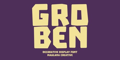 Groben is a All Caps Bouncy Sans Display font. Bold stroke, fun character with a bit of ligatures and alternates. To give you an extra creative work. Groben font support multilingual more than 100+ language. This font is good for logo design, Social media, Movie Titles, Books Titles, a short text even a long text letter and good for your secondary text font with script or serif. Make a stunning work with Groben font. Cheers, Maulana Creative
 - Sofimaria by Qaratype,
$18.00 Sofimaria is a super unique ligature font that you wont forget! It’s a high contrast serif that has loads of style. A modern take on a Caslon style typeface, this font is ideal for those bold headings or wedding invitations. It’s got hundreds of characters and ligatures plus all those European letters! Sofimaria pairs perfectly with a light scripts font or minimal sans serif. Main Features: Uppercase & Lowercase letters Punctuation and special characters Multilingual support Ligatures & Alternate glyphs
 - Bakewell by Kimmy Design,
$25.00 Bakewell is the 4th typeface of the Winslow Type System. It's a low contrast sans-serif with ball terminals and a sweet disposition. The typeface includes a wide range of styles, widths and weights that make it a great addition to any type collection. From Narrow to Wide and Hairline to Bold, the font family offers extended optionality. Packed with Opentype Features, users can create one-of-a-kind designs perfectly tailored to their specific needs!
 - Distinct Style by Set Sail Studios,
$14.00 Get stylish with Distinct Style, a fashionable and contemporary pair of signature & sans fonts designed to perfectly compliment one another. With a fast-flowing script font and a two-weight modern sans serif, the Distinct Style duo offers typographic harmony for your professional design projects, including; logos, branding, magazines, blog posts, social media, advertisements & product designs. Distinct Style includes 4 font files, designed to work as perfect companions or simply as strong standalone typefaces; 1. Distinct Style Script • A classy fast-flowing signature font containing upper & lowercase characters, numerals and a large range of punctuation. 2. Distinct Style Script Alt • This is a second version of Distinct Style Script, with a completely new set of upper & lowercase characters. If you wanted to avoid letters looking the same each time to recreate a custom-made style, or try a different word shape, simply switch to this font for an additional layout option. 3. Distinct Style Sans Light • A stylish, modern sans-serif font containing uppercase only characters, numerals and a large range of punctuation. Creates a perfect pairing contrast with the Disticnt Style Script fonts. 3. Distinct Style Sans Bold • A bolder version of the Distinct Style Sans font. Add some contrast to your text by pairing this with the Sans Light version, or use at smaller sizes. Distinct Style Script contains 64 Ligatures, accessible by turning on 'Discretionary Ligatures' with any software supporting OpenType features. Fonts include multilingual support for; English, French, Italian, Spanish, Portuguese, German, Swedish, Norweigen, Danish, Dutch, Finnish, Indonesian, Filipino, Malay.
 - Bex Script by The Ampersand Forest,
$35.00 Bex Script is a riff on traditional French script forms: the Bâtarde, the Ronde, and the Coulée. It has two versions: First, there’s La Belle, a straightforward, lovely interpretation of the script form, suitable for things like invitations, poetry and branding. La Belle’s evil twin is La Bête, a more whimsical (and considerably more hairy) version, great for anything that requires an elegant-but-beastly feel. Bex is surprisingly versatile! With three optional capital forms (Swash, Caps, and Small Caps) all taller than the x-height, Bex has a variety of voices. A full small cap set and a full set of Swash Caps, plus a large complement of alternates, initial forms, terminal forms, and ligatures makes it customizable and… well, FANCY! Additionally, both versions of Bex Script have a set of ten ornament glyphs. La Belle has a combination of fleurons on a culinary theme and symbols of France. La Bête has ten pseudoheraldic beasts that would feel at home at the top center of any whimsical letterhead. NOTE: A few years ago in Paris, I was lucky enough to stop at the Librairie Paul Jammes in St Germain-des-Prés, where I bought a turn-of-the-19th-century signature from a Type Specimen of the printer Joseph Gaspard Gillé. The irregularity of his script types — particularly the ones at smaller sizes, like the Cicéro — was very intriguing. They seemed to blend the Ronde with some elements of the Bâtarde and Coulée. And they, along with the work of French master penman Louis Rossignol, gave Bex Script its initial form.
 - Lens Grotesk by Typedepot,
$39.99 Lens Grotesk is a Neo-grotesque type family of 16 fonts born as a result of a very conscious research in the field of the neutral Swiss aesthetic. There's a reason for all the prominent examples of this design like Helvetica and Univers to be used on a daily basis for more than 70 years and it's a simple one - they just work. The closed terminals, the low contrast, uniform widths and proportions makes the Neo-grotesques feel just right. Although very often branded as stiff, the neutral Neo grotesques are here to stay and Lens Grotesk is our own reading of the popular style. Lens Grotesk takes the Neo-grotesk model one step further adding a pinch of Geometric sans-serif to the mix thus creating a way more modern and contemporary looking design. Characterized with more generous oval proportions and slightly more open terminals, Lens Grotesk keeps the modulation and rhythm needed for a slightly longer texts while visibly keeping everything in order. Zooming in you'll find traces of the Geometric aesthetic - the robust almost right angled approach of the arches and tails (look t, f, j, y) and the way more circular rounded shapes. Like all our fonts, Lens Grotesk is equipped with a range of OpenType features, stylistic alternatives and of course Cyrillic support. It comes in a pack of 16 fonts with 8 styles and their matching italics or one variable font file available with all full family purchases. Live Tester | Download Demo Fonts | Subscribe
 - Sealt by Michael Rafailyk,
$9.00 Sealt Typeface is inspired by the oldest saltworks in Eastern Europe, founded in 1390 in Drohobych. Sealt means salt in Old English, so most letters are rough and sharp like salt crystals and seem to be carved out of the rock. View PDF Specimen: https://michaelrafailyk.com/typeface/specimen/Sealt.pdf Variable font: Sealt VF has weight axis and includes hundreds of weights ranging from Light (300) to Bold (700), so feel free to choose the most accurate weight that you need, using a slider. Localized Forms: 47 character substitutions for Azeri, Bulgarian, Catalan, Dutch, German, Kazakh, Moldavian, Polish, Romanian, Tatar, Turkish. Glyph Composition/Decomposition (Diacritics): Full Latin and based Vietnamese set of diacritics (561 characters). Precomposed. Ordinals: adehnorst. Superscript, Subscript, Numerator, Denominator: 0123456789. Fractions: ¼½¾⅐⅑⅒⅓⅔⅕⅖⅗⅘⅙⅚⅛⅜⅝⅞⅟ (precomposed). Any other fractions (even those typed through a slash) will also be displayed correctly, with the automatic replacement to Numerator + fraction + Denominator. Slashed Zero: All 0 figures, including Lining, Superscript, Subscript, Numerator, Denominator, and Fractions. Contextual Alternates: ΆΈΉΊΌΎΏ. Greek uppercase accented characters lose their tonos accent and retain only dieresis in All Caps mode. Turned on by default. If you need tonos accents in All Caps then turn off Contextual Alternates (calt) feature. Standard Ligatures: OO TT tt fi. Turned on by default. Language count: 480+. Kerning Class pairs: 4295. The promo images used photos of Albin Berlin, Hervé Piglowski, Karolina Grabowska, Scott Webb from Pexels and Dollar Gill from Unsplash.
 - Mellisa Hella by Rastype Studio,
$12.00 Melissa Hella is a beautiful, modern script font that's perfect for wedding invitations, t-shirts, branding, and other romantic projects. The font includes OpenType features with alternative styles, ligatures, and multiple language support. To activate the OpenType Stylistic alternative, you need a program that supports OpenType features such as Adobe Illustrator CS, Adobe Indesign & CorelDraw X6-X7, Microsoft Word 2010 or a later version. There are additional ways to alternate / swash, using the Character Map (Windows), Nexus Font (Windows), Font Book (Mac) or a software program like PopChar (for Windows and Mac). How to access all alternative characters, using Windows Character Map with Photoshop: https://www.youtube.com/watch?v=Go9vacoYmBw How to access all alternative characters using Adobe Illustrator: http://youtu.be/iptSFA7feQ0 How to use a style font set in Microsoft Word 2010 or later versions: https://youtu.be/x1A_ilsBsGs
 - Maister by Dora Typefoundry,
$19.00 Maister is a contemporary look serif typeface with sharp and dynamic strokes, strong contrasts that are subtle. Giving traditional serif design elements a modern feel, this is a graceful and confident set of timeless simple, easy-to-read typefaces that can easily become a staple in your font library perfect for branding, logos, invitations, magazines, product packaging, and more. Features: All Caps Font with different uppercase and lowercase Number & Symbol Supported Languages Alternates and Ligatures PUA Encoded We highly recommend using a program that supports OpenType features and Glyphs panels like Adobe apps and Corel Draw, so you can see and access all Glyph variations. This type of family has become the work of true love, making it as easy and fun as possible.I really hope you enjoy it! Thank you Enjoy the font and go get creative :)
 - Paradox Runa by Dawnland,
$13.00 Paradox Runa is based on the futhark, norse elder runes. “Missing” characters has been replaced with either other “real” runes, or “new” ones have been “invented” so that the font hold all characters for the latin alphabet (A-Z + swedish Å Ä & Ö) + “Numbers” 0-9. I do not claim that this rune alphabet is totally authentic nor correct! All upper and lower-case letters are the same except for the letter S. “Ligatures” have been created for the th, ng and eo sounds. These are accessed by writing TH, NG and EO (in upper case letters). Space is automatically replaced by a ‘colon’ (':') - if you want a “real” space, write an underscore! (open type version of the font and open type compatible layout application required). Paradox Runa goes perfect with the font Paradox X (regular yet enigmatic hand drawn latin letters)!
 - American Auto by Miller Type Foundry,
$26.99 Hot Dogs, Apple Pie, Baseball and great TYPOGRAPHY are deeply rooted in American culture. American Auto is a Type Family that embodies that culture visually. It joins a robust workhorse sans with a playful script that brings you back to 70+ years ago, while at the same time remaining as contemporary as any new 2019 design. This unique pair work together in harmony to create wonderful designs for a variety of uses. From book covers to posters, web sites to apps, American Auto is an excellent choice to create striking designs that stand out from the crowd! American Auto also features many Opentype Features such as: Alternate Characters, Initial & Final Forms, Contextual Alternates, Old Style Figures, Lining Figures, Numerators & Denominators, Fractions, and more! This typeface has really been designed to meet any challenge that a designer can throw at it!
 - Geogrotesque by Emtype Foundry,
$69.00 Geogrotesque is a semi modular with a subtle rounded finish typeface. All the characters are based in the same formal principle with its corresponding optical adjustments in order to adapt the system to an alphabet for texts. Although the type family has a geometric or “technological” construction, the rounded finish provides it a warm appearance, making the typefaces nicer and nearby. Geogrotesque has been conceived to be used as a display typeface in publications or intermediate length texts, most of all the Thin and Ultralight weights which were meant to be used in big sizes. The type family consists of 14 styles, 7 weights (Thin, UltraLight, Light, Regular, Medium, SemiBold and Bold) plus italics and it’s available in Open Type format. For more details see the PDF. Related: Geogrotesque Stencil, Geogrotesque Condensed, Geogrotesque Expanded, Geogrotesque Slab and Geogrotesque Sharp.
 - Banjax by Monotype,
$25.99 Banjax is a humanist sans serif typeface, designed to be highly versatile and efficient in both print and digital environments. The extreme weights are perfect for display purposes, with the central core weights ideal for body copy. While Banjax has a branding focus, it would be suitable for pretty much any text application in any Latin language. See more detailed examples here. Distinguishing features include a large x-height, short descenders, distinctive asymmetrical contrast, angled terminals, squared dots and punctuation, and maybe a little flair here and there to enhance this typeface’s personality. Overall, Banjax makes for a pleasant reading experience with enough nuances to make it an ideal choice for branding purposes. Key features: 9 weights in Roman and Italic Small Caps, Petite Caps and 3 Alternates Latin Extended and Basic Greek glyphs 1100 glyphs per font.
 - Feltro by Ndiscover,
$24.99 Feltro is a Handmade Brush Script full of personality. Because of its fast brush strokes the design looks really fresh and full of identity. It has a total of 9 variants that will give you a lot of customisation options. Outline, Shadow, 4 Textures, and also Textured Outline and Shadow. You can combine the 9 styles in different manners and create colourful typographic expressions. Feltro is loaded with features, like terminal forms, ligatures and contextual alternates, so that you have even more stylistic options. It has a large latin language support across all the 9 styles so you can use it with confidence in all styles. You can use Feltro in advertising, branding, merchandise, web headlines, and more. Make sure you buy the full family and benefit of a massive discount. You can see feltro in action on this short video.
 - Mostyn by Artisan Studio,
$20.00 Description Mostyn Variantions is the font family, Mostyn Variantions is a font family that has 8 variations plus extrude in every variety, it is a model of modern calligraphy typefaces, in combination with a calligraphy writing style. Can be used for various purposes.such as headings, logos, wedding invitation, t-shirt, letterhead, lable, news, posters, badges etc. Multilingual support for various languages including: French, German, Spanish, Portuguese, Italian, Dutch, Finnish, Swedish, and more. Mostyn Variantions works great in any branding, logos, magazines, films. The different weights give you a full range of whole hosts of applications, while the outlined fonts give a real modern feel to any project. OpenType features can be accessed by using OpenType smart programs such as Adobe Photo Shop, Adobe Illustrator, Adobe Indesign, Corel Draw and Microsoft Office. can also be accessed through the character map.
 - Mandan by Sabrcreative,
$25.00 Elevate your designs with Mandan, a bold sans serif display font that exudes power and impact. With its strong and commanding presence, Mandan is perfect for headlines, logos, posters, and any design that requires a bold statement. Featuring both uppercase and lowercase letters, Mandan offers versatility in crafting captivating compositions. The inclusion of numbers and punctuations ensures seamless integration into your design projects, whether it's for digital or print media. Additionally, the font's multilingual support allows you to reach a diverse global audience and communicate your message effectively. Mandan is designed with precision and attention to detail, providing a clean and modern aesthetic. Its PUA encoding enables easy access to special characters and symbols, expanding your creative possibilities. The font's bold strokes and distinct letterforms make it stand out in any design, capturing attention and leaving a lasting impression.
 - The Romantic Absolute Duo by Lettersams,
$12.00 The Romantic Absolute Script and Sans are a beautiful and romantic combination of two fonts that have a lot of lovely characters that are very interesting. This font has a beautiful and balanced character, making it suitable for a variety of purposes. such as posters, wedding invitations, logos, product packaging, branding, titles, signs, labels, mugs, book covers, quotes, and others. The Romantic Absolute Script Script features 700+ glyphs covering characters, alternatives and ligatures, including start and end letters, alternates, binders and multiple language support. The Romantic Absolute Sans features 190+ glyphs including binding characters and multiple language support. To access all OpenType Stylistic alternates, you need a program that supports OpenType features such as Adobe Illustrator, Adobe Photoshop, CorelDraw and Microsoft word. This font is PUA encoded which means you can access all glyphs and swashes with ease! Happy designing!
 - Tuna by Ligature Inc,
$49.00 Tuna is simply a contemporary body text font. It is contemporary, meaning the merge of charming broad-nibbed calligraphic style with optimized readability on screen – showing that the roots of writing and typesetting are still in charge when reading “Anna Karenina” on your Kindle till 4 o’clock in the morning. Tuna has a natural fit for cross-media use because the design is based on forms characterized by different conditions of constancy, stability and good readability. Well-defined shapes and distinctive details only become apparent when used in larger sizes, making Tuna a true all-rounder. With more than 700 glyphs in 10 styles created with a maximum of consideration, it has all the qualities of a modern OpenType font serving the needs of today's communication. If you would like to read more about the Typeface please visit our promo site.
 - Paradise Lost by Hanoded,
$15.00 Paradise Lost is a 1667 poem by John Milton which mostly concerns the Biblical story of the Fall of Man, Eve's temptation by the devil and the expulsion of Adam and Eve from Eden. It's quite a hefty read, as the poem consists of ten books with over 10.000 lines of verse. Needless to say, I didn't read it all. But, it did give me inspiration for a font, which I called Paradise Lost. It's a good name, even though there is nothing Biblical about this font. Paradise Lost was created (pun intended) using a broken bamboo satay skewer and Chinese ink. It is all caps, but upper and lower case differ and like to mingle. I also included several ligatures for double lower case letters (aa, ee, jj, kk, etc.). Paradise Lost comes with an eternity of diacritics.
 - Larks Tongues by Hanoded,
$15.00 Larks' Tongues in Aspic is the fifth studio album (released in 1973) by the English progressive rock group King Crimson. I have always liked this name, as it reminded me of old stories in which witches threw all kinds of weird ingredients (larks’ tongues, bat wings and petrified dragon dung) into a big cauldron. When I created this font, it looked like the writing in an old book of spells, so I just had to call it Larks’ Tongues. Larks’ Tongues is a very lively headline font which would look good on (children’s) book covers, posters and product packaging. So, if you are about to write a book about witches, want to throw a halloween party or want to market your Larks’ Tongues in Aspic, then by all means, use this font! Comes with a magical amount of diacritics.
 - Break Parquet by Gassstype,
$22.00 Here comes our new font Break Parquet this is a Unique Display Font that is written casually and quickly.this a Authentic Style and classy style This font are handmade with unique font . Then crafted carefully drawn into vector format.this font is great for your creative projects such as watermar.k on photography, and perfect for logos & branding, photography, invitation, watermark,advertisements,product designs, stationery, wedding designs,label ,product packaging, special events or anything that need handwritting taste. That is a natural handwritten feel. This handmade font will make your design has a beautiful natural touch for each details. It is perfect for any design project as Invitation,logo, book cover, craft or any design purposes. That is why Break Parquet is strong characteristic more natural look to your text with a more modern look to your text.
 - Mr Palker by Letterhead Studio-YG,
$35.00 A slab serif Mr Palker and grotesque Mr Palkerson build one superfamily together. These are blank types. In a way even the display ones. Typefaces for newspapers, announcements, cheap advertising and police posters. Mr Palker and Mr Palkerson will turn every language into a fence. And due to six types of faces one can choose what material should the fence be made from — from Thin steel rods to the Black stone blocks. In their simplest appearance Mrs P&P are intended for the solid blank composition in victorian or industrial style. They are quite decent, a bit old-fashioned slab serif and grotesque with closed aperture. All my types have layers. Walker and Palkerson also do. Besides the standard set of symbols, they have 4 add-ons. 1. Alternate glyphs, including unicase ones. 2. Ligatures with A letter. 3. Extra tall small caps. 4. Two-storey ligatures. All this options are intended for the complex composition. The additional letters are rather eccentric as their main function here is to imitate the victorian oddities. Imitate, parody, just not repeat. There are lower-case As and Es in the set in height of small caps and uppercases. They can turn every writing into the unicase. The lower-case A (as well as uppercase and small caps version of it) has deliberately by my taste grown a ludicrous tail. To compensate it I’ve built all the possible ligatures - ад, ал, ая. There are 35 of this ligatures all together. Take a closer look at the Russian letters D, L, K, Ya from the main set as well as their alternates. The additional glyphs are one more comic than the other — on purpose to imitate (not to repeat!) the victorian set. This sets have lowercase numbers. And small caps numbers as well. What a modern typeface without them. They also have an У-letter with a generously curvy tail. As if before the WWI. The Latin of course has alternates as well. It has letters to make the perfect French sound more like the russian provincial version of it. The tails of Js and Ts can be made a little bit more open — or a little bit closed. My favorite feature here, an invention of a kind - extra tall small caps. It allows to compose logos with the small caped uppercases directly from the keyboard. The small caps of this typefaces are usually much taller than the customary ones. This is the kind of small caps that Palker and Palkerson have. More to that, the strokes’ weight and the letters width are corresponded to the uppercases. Just a ready set for making a logo a la 1913 style. With a unicase, one has to mind! One more trick with the tall small caps is a possibility to make them work like lower uppercases. Their height is just in between of lower- and uppercases. Isn’t it great to have an additional set of uppercase working ponies in stock for the case of emergency. And finally — the trademark of Palkers family, two-storey ligatures. They are made in the height of uppercases and turn every writing into an ornament or a puzzle of a kind, while at the same time making them much shorter. Each face has 90 of them. Mainly those are twins: CC, BB, DD and so on. ll this things are for the unhasty compositing, even for lettering. Which means that for the things which are not there you always should have Command+Option+O and some patience. Also — among the two storey ligatures one also can find some belvedere villas. All my types are glasses from the one kaleidoscope. The P&Ps family was preliminary part of the victorian set, which already has 1 Cents and Clarendorf - optionally one can add Costro, Gordoni, Handy, Guardy, Surplus, Red Ring, Red Square, Babaev to the list. And also Sklad, Odessa, Dreamland, Romb, Platinum - here, at Letterhead’s, every second one is victorian. All together our typefaces can allow one to set advertisement of any kind, even the trickiest one, and compose everything, from the coffee place’s menu to the antiquarian magazine.
 - Mr Palkerson by Letterhead Studio-YG,
$35.00 A grotesque Mr Palkerson and slab serif Mr Palker build one superfamily together. These are blank types. In a way even the display ones. Typefaces for newspapers, announcements, cheap advertising and police posters. Mr Palker and Mr Palkerson will turn every language into a fence. And due to six types of faces one can choose what material should the fence be made from — from Thin steel rods to the Black stone blocks. In their simplest appearance Mrs P&P are intended for the solid blank composition in victorian or industrial style. They are quite decent, a bit old-fashioned slab serif and grotesque with closed aperture. All my types have layers. Walker and Palkerson also do. Besides the standard set of symbols, they have 4 add-ons. 1. Alternate glyphs, including unicase ones. 2. Ligatures with A letter. 3. Extra tall small caps. 4. Two-storey ligatures. All this options are intended for the complex composition. The additional letters are rather eccentric as their main function here is to imitate the victorian oddities. Imitate, parody, just not repeat. There are lower-case As and Es in the set in height of small caps and uppercases. They can turn every writing into the unicase. The lower-case A (as well as uppercase and small caps version of it) has deliberately by my taste grown a ludicrous tail. To compensate it I’ve built all the possible ligatures - ад, ал, ая. There are 35 of this ligatures all together. Take a closer look at the Russian letters D, L, K, Ya from the main set as well as their alternates. The additional glyphs are one more comic than the other — on purpose to imitate (not to repeat!) the victorian set. This sets have lowercase numbers. And small caps numbers as well. What a modern typeface without them. They also have an У-letter with a generously curvy tail. As if before the WWI. The Latin of course has alternates as well. It has letters to make the perfect French sound more like the russian provincial version of it. The tails of Js and Ts can be made a little bit more open — or a little bit closed. My favorite feature here, an invention of a kind - extra tall small caps. It allows to compose logos with the small caped uppercases directly from the keyboard. The small caps of this typefaces are usually much taller than the customary ones. This is the kind of small caps that Palker and Palkerson have. More to that, the strokes’ weight and the letters width are corresponded to the uppercases. Just a ready set for making a logo a la 1913 style. With a unicase, one has to mind! One more trick with the tall small caps is a possibility to make them work like lower uppercases. Their height is just in between of lower- and uppercases. Isn’t it great to have an additional set of uppercase working ponies in stock for the case of emergency. And finally — the trademark of Palkerson family, two-storey ligatures. They are made in the height of uppercases and turn every writing into an ornament or a puzzle of a kind, while at the same time making them much shorter. Each face has 90 of them. Mainly those are twins: CC, BB, DD and so on. ll this things are for the unhasty compositing, even for lettering. Which means that for the things which are not there you always should have Command+Option+O and some patience. Also — among the two storey ligatures one also can find some belvedere villas. All my types are glasses from the one kaleidoscope. The P&Ps family was preliminary part of the victorian set, which already has 21 Cents and Clarendorf - optionally one can add Costro, Gordoni, Handy, Guardy, Surplus, Red Ring, Red Square, Babaev to the list. And also Sklad, Odessa, Dreamland, Romb, Platinum - here, at Letterhead’s, every second one is victorian. All together our typefaces can allow one to set advertisement of any kind, even the trickiest one, and compose everything, from the coffee place’s menu to the antiquarian magazine.
 - Sancoale Narrow by insigne,
$22.00 Sancoale Narrow is a carefully honed and meticulously crafted new family member for the Sancoale series. Sancoale Narrow has been specially designed to allow for even more versatility for the Sancoale Family. Sancoale Narrow continues with Sancoale's successful simple, geometric and legible structure. It is a contemporary design that is distinctive and unique. This new narrow addition can be used in conjunction with the original Sancoale, but it can also stand on its own. Narrow type comes in a handy in a myriad of situations, from poster design to book covers, web pages to editorial layouts. Sancoale Narrow's six weights make for a typeface family that is very useful for many applications, and also includes a set of true italics. The design is simplified without stems or spurs in the default character set. OpenType alternates do include alternates with stems, Small Caps, Fractions, Tabular Figures, and plenty of alts, including "normal" capitals and lowercase letters. Please see the informative .pdf brochure to see these features in action. Sancoale Narrow also includes a full array of Latin diacritics for multilingual support. OpenType capable applications such as Quark or the Adobe suite can take full advantage of the automatically replacing ligatures and alternates. This family also includes the glyphs to support a wide range of languages. The Sancoale superfamily is suitable for a wide range of uses and is a very economical and versatile addition to any designer's font collection.
 - Peach Crush by Fenotype,
$25.00 Peach Crush is a bold vintage style serif font with a soft charm and smooth features. Peach Crush delivers a reminiscence of a familiar and warm nostalgic feeling. Peach Crush is equipped with Contextual, Swash, Stylistic and Titling alternates as well as Discretionary Ligatures and even more extra alternates. All these features can be accessed by OpenType controls or straight from Character or Glyphs window. Contextual Alternates and Standard Ligatures are automatically on and they simply do small changes to prevent certain character collisions. Other features are optional and can be used for bolder design solutions. Peach Crush has a total number of 115 alternate characters, even Swash Alternates for certain Standard and Discretionary Ligatures such as ch, ck, sh, sk, ff, fl and fi. Peach Crush is a great typeface for contemporary graphic design with that certain feeling of familiarity. It works well on logos, packaging, restaurant graphics, or any display use, as well as in headlines or shorter texts. Try Peach Crush with reduced tracking for tighter word images, or if you want to use it in really small sizes add some tracking. Peach Crush is based on another Fenotype font, Tomato Ketchup but has more contrast and sharper serifs.
 - Scholz Secession by HiH,
$8.00 We named this font Scholz Secession. Fin-de-siecle Vienna, Austria is the source of this Jugendstil design from Schriftgiesserei Eduard Scholz. The original release was under the name Reklameschrift Secession. Most of the curve strokes look like commas to me. The letters are as soft and plump as the comforter on the bed I slept on in a Salzburg B&B many years ago. I was traveling with a college buddy and our next stop was Vienna. There a kind, young student named Hanna and her boyfriend took us under their wing. One of the places Hanna proudly showed us was Otto Wagner’s Majolika Haus, built in 1898, and only about 8 blocks from Secession Hall. Hanna explained to us that the style was called Jugendstil and represented Art Nouveau as interpreted within the framework of their culture. I even took a picture. After all, memories are part of who we are. Figures are old-style for text use. This font would not be my first choice for a spread sheet. Included are German ligatures ch (alt-0123) & ck (125), two period ornaments (135, 175) and lower case o and u with Hungarian long umlaut (215, 247)). A very likeable and easy-to-use font.