10,000 search results
(0.035 seconds)
- KRYPTOSCRIPTO - Personal use only

- Indentia by Garisman Studio,
$19.00 Indentia is a very interesting font, which has been inspired by Art Deco art. It is formed from very careful lines with stylistic sets and ligature features. Indentia has 200+ glyphs consisting of two styles: Indentia Regular and Indentia Black. Suitable for any graphic design projects, prints, logos, posters, t-shirts, packaging and applicable for some types of graphic design. Indentia is compatible with any software without any pain.
 - Backbone by 38-lineart,
$17.00 Backbone is a unique blackletter font. It’s suitable for use in various projects such as gothic letters, tattoos, headlines, posters, magazines, newspapers, t-shirts, labels, and any other designs that you wish to create. Get inspired by Black metal and It will add an edgy feel to any crafting project! Bold and spooky, Ideal for any October project or Halloween party, this font will become your top choice in no time!
 - Lightyears by Match & Kerosene,
$25.00 Lightyears is a geometric typeface that features a highly stylized lowercase and variations of alternates to create titling results on the fly. You can set the typeface to all-caps for a simple look, or you can alternate uppercase and lowercase letters for a highly stylized title. Uppercase stylistic alternates have a “stereo” look as the crossbars and some stems are doubled in a non-traditional way.
 - Cupcake by Sudtipos,
$49.00 Cupcake is a font for those with a sweet tooth. It flares the taste buds with its creamy construct and makes them drool over a sandwich, a pasta, a cupcake, or a sweet beverage in your favourite café. Another packaging accomplishment by Koziupa and Paul, Cupcake was designed specifically to appeal to the masses of the food and service industries. It covers all Latin-based languages.
 - Stars by Librito.de,
$15.00Stars is a decorative font, that consists of 52 ornamental stars, placed on the letters a-z and A-Z. The building principle is based on the segment of a circle. All the individual stars have the same width and are aligned to the same center. Therefore layering different stars on top of each other in a design program that allows transparencies is a interesting possibility. - delizioso - Personal use only

- Aerovias Brasil NF - 100% free

- Sesquipedalian NF - Unknown license

- Vergian by Krafted,
$10.00 Looking for a striking font that’s easy on the eyes? Whether you need a font for your magazine, website, or book, we’ve got a solution. Introducing Vergian – a Modern Serif Font. Clean and easily legible, Vergian is the perfect choice for any text that needs to stand out. Check it out and see the difference that a great font can make. What you’ll get: Multilingual & Ligature Support Full sets of Punctuation and Numerals Compatible with: Adobe Suite Microsoft Office KeyNote Pages Software Requirements: The fonts that you’ll receive in the pack are widely supported by most software. In order to get the full functionality of the selection of standard ligatures (custom created letters) in the script font, any software that can read OpenType fonts will work. We hope you enjoy this font and that it makes your branding sparkle! Feel free to reach out to us if you’d like more information or if you have any concerns.
 - Dufour by Scholtz Fonts,
$19.00 Dufour was named in honor of an art deco font called "Independent" designed in the 1930s by Collette and Dufour. "Dufour" is influenced by the original font, however, there are substantial differences: instead of small caps, a true lower case was created, the upper case character proportions and shapes have been greatly modified, and all missing characters have been created to make a truly modern font which nevertheless has all of the panache of the original. A related font is Collette, designed by Anton Scholtz, however, Dufour has a softer feel that is more true to the original art deco period. Dufour comes in four styles: Dufour Regular, Dufour Regular Outline, Dufour Condensed, and Dufour Condensed Outline. The font has been carefully kerned and best results are obtained if kerning is switched on. (All-caps passages work well.) It is best used to create a retro feel and in headings, subheads and in short passages of text. Very effective in marketing for products for children.
 - Ithalia script by Rotterlab Studio,
$12.00 Ithalia Script - a new fresh & modern script with a handmade calligraphy style, decorative characters and a dancing baseline! So beautiful on invitation like greeting cards, branding materials, business cards, quotes, posters, and more design concept! The alternative characters were divided into several OpenType features such as Swash, Stylistic Sets, Stylistic Alternates, and Ligature. The OpenType features can be accessed by using OpenType savvy programs such as Adobe Illustrator, Adobe Photoshop , Corel Draw X version, And Microsoft Word. And this Font has given PUA code (specially coded fonts). so that all the alternate characters can easily be accessed in full by a craftsman or designer. How to access all alternative characters using Adobe Illustrator: https://www.youtube.com/watch?v=XzwjMkbB-wQ There are additional ways to access alternates/swashes, using Character Map (Windows), Nexus Font (Windows), Font Book (Mac) or a software program such as PopChar (for Windows and Mac). How to access all alternative characters, using Windows Character Map with Photoshop: https://www.youtube.com/watch?v=Go9vacoYmBw
 - Bix Bats by Linotype,
$29.99The Bix Bats symbol family was developed in 2003 by Argentinean designer Victor Garcia to complement his display text font Bix Plain. Bix Bats contains four different symbol fonts. Most of the characters in these fonts have their lower halves reversed out. Typing a line of text in these symbol fonts, or mixing these symbol fonts with Bix Plain, will create a very interesting text effect: the bottom half of your lines of text will be reversed out, on top of a colored bar. Bix Bats Arrows contains numerous possible arrow combinations, from archery references to the American recycling symbol. Bix Bats Funny includes all of the symbols needed for a party, from beer steins to bunny rabbits! Bix Bats Shiny has enough starbursts to light up a night sky, and in Bix Bats Wired you will find all of the technological accessories needed to be in the now. All four fonts are included in the Take Type 5 collection from Linotype GmbH." - Frozen Tree by Epiclinez,
$18.00 Frozen Tree is a thick lettered yet friendly display font. Whether you are using it for cartoon-related designs, children's games, quotes, titles, brand names, book covers, posters, or just any creation that requires a touch of joy, this font is a great choice. So what's included : Basic Latin A-Z & a-z Numbers, symbols, and punctuations Accented Characters : ÀÁÂÃÄÅÆÇÈÉÊËÌÍÎÏÑÒÓÔÕÖØŒŠÙÚÛÜŸÝŽàáâãäåæçèéêëìíîïñòóôõöøœšùúûüýÿžß Thank you
 - General by Juraj Chrastina,
$29.00 It's all about these subtle nuances that make a neutral sans typeface different. Pure geometry with a human touch is a recipe that works in every generation. Inspired by classical fonts from the early 20th century, General rides the line between traditional and modern styles. With its 5 light weights, the General family is a strong tool for a clean design.
 - Policy Gothic by E-phemera,
$20.00 Policy Gothic is derived from the boilerplate on a vintage insurance policy, and in a former life may have been Engraver's Gothic or something like it. A rough all-caps sans serif, it's great for designing forms and other "official" paperwork with a vintage feel. The font features a full international character set including various currency and other commercial symbols
 - Rosy Lee by Hanoded,
$15.00 Rosy Lee is Cockney slang for a cup of tea - which I drank when it was time to come up with a name for my new font. Rosy Lee (the font) is a 3D typeface with a lot of character. Would look great on posters, packaging (maybe even tea) and book covers. Comes with all the diacritics. So... Fancy a Rosy, luv?
 - Xikas by Twinletter,
$15.00 XIKAS is the newest font in our gothic series, featuring a classic and elegantly designed typeface. With a classic design, this font uses striking details to exude a confident elegance that appeals to all genders, ages, and tastes. It can be used in a variety of projects to create an attractive vintage and elegant style that evokes elegance, luxury, and a strong personality.
 - Royale & Caikes by Hishand Studio,
$16.00 Royale & Caikes, a captivating new serif font, exudes timeless elegance with its graceful curves and refined serif, making it a sophisticated choice for any design project. Combines classical elements with a modern twist, resulting in a font that is both beautiful and distinctive, perfect for creating a sense of luxury and elegant. Complete with ligatures alternates regular italic hollow icon kerning multilingual support
 - Plop by Gleb Guralnyk,
$14.00 Presenting a decorative liquid font Plop. It's a splashing funny typeface perfect for authentique lettering composition. To use a bigger splash letter just type a capital letter. Same way the last letter in word will be automatically replaced to correct glyph using OpenType features. Both sides splashes are available for all letters including multilingual characters. Thank you and have a nice day!
 - Restoration by Surplus Type Co,
$12.00 Restoration is a two style sans serif font with a rustic vintage aesthetic. It’s angled bars give it a unique appearance and sets it apart from other vintage fonts. You’ll get a textured version and a clean version, so you’ll be ready for any project. This vintage font is great for logos & branding, titles, web design, marketing, advertising & much more!
 - Hexa - Personal use only

- Firstland by Matra Creative,
$15.00 Firstland-Handwritten Fonts have many alternatives that give you the possibility to make your text almost handwritten with all the imperfections and captivating variations that the original handwriting has. Firstland will work perfectly for fashion, brand e-commerce, blog trends, boutiques, store brands, logos, weddings or any business that wants to look luxurious.
 - Spooky Christmas by Stefani Letter,
$12.00 Spooky Christmas is an incredibly unique and spooky display font. Add this font to your favorite Halloween-themed ideas: invitations, banner, logo, app game scary or horror, and notice how it makes them come alive! Spooky Christmas is PUA encoded which means you can access all of the glyphs and swashes with ease!
 - Fino by TypeTogether,
$35.00 Tall, stately, and refined, with a showy contrast between thick and thin, a certain kind of titling Didone has become synonymous with fashion. Ermin Međedović’s latest type system amplifies the most theatrical aspects of this genre while bringing an uncommon flexibility of style and variation to any type palette — particularly those required for editorial design. Fino is a Rational (or Modern) display serif with sharp details. Its fairly Title proportions produce a regular beat of bold stems at frequent intervals. One can add an unexpected twist to this plot line by introducing the alternate ‘C, D, G, O, and Q’ (found in the uppercase); these replace the standard, Title oval shapes with big, full, show-stopping round ones. Other alternate forms, along with a grand ensemble cast of ligatures, lets the director continually flip the script. This stage is set in three acts: Fino, Fino, and Fino Stencil. Each of these offer six weights and italics, and each actor is comfortable speaking any Latin-based language, from standard Hollywood English to the many accents of Eastern Europe. Finally, every style comes in two optical sizes, with Title having the finest hairlines for the biggest parts. This lets you put Fino to work in a variety of productions, from short texts (24pt–48pt settings) to epic titles. The complete Fino family, along with our entire catalogue, has been optimised for today’s varied screen uses. All these talents let Fino perform a range of roles far broader than your typical Bodoni or Didot.
 - Gladista Script by Attract Studio,
$10.00 Gladista is a calligraphy script font that comes with lovely alternates character. a mixture of from copperplate calligraphy with handlettering style. Designed to convey style elegance. Gladista is attractive like a smooth, clean, feminine, sensual, glamorous, simple and highly legible typeface. Its classic style is perfect to be applied in any type of formal pieces such invitations, labels, menus, Logos, fashion, make up, stationery, letterpress, romantic novels, magazines, books, greeting / wedding cards, packaging, labels. Gladista features 360+ glyphs and 155 alternative characters. including multiple language support. With OpenType features with stylistic alternates, ligatures and swash characters, that allows you to mix and match pairs of letters to fit your design, and also a touch of ornament makes this font look elegant. To enable the OpenType Stylistic alternates, you need a program that supports OpenType features such as Adobe Illustrator CS, Adobe Indesign & CorelDraw X6-X7, Microsoft Word 2010 or later versions. (Windows), Font Book (Mac) or a software program such as PopChar (for Windows and Mac). How to access all alternative characters using Adobe Illustrator: https://www.youtube.com/watch?v=XzwjMkbB-wQ How to use stylistic sets fonts in Microsoft Word 2010 or later versions: https://www.youtube.com/watch?v=NVJlZQ3EZU0 There are additional ways to access alternates / swashes, using the Character Map (Windows), Nexus Font (Windows) Font Book (Mac) or a software program such as PopChar (for Windows and Mac). How to access all the alternative characters, using the Windows Character Map with Photoshop: https://www.youtube.com/watch?v=Go9vacoYmBw If you need help or advice, please contact me by e-mail.
 - Fino Sans by TypeTogether,
$35.00 Tall, stately, and refined, with a showy contrast between thick and thin, a certain kind of titling Didone has become synonymous with fashion. Ermin Međedović’s latest type system amplifies the most theatrical aspects of this genre while bringing an uncommon flexibility of style and variation to any type palette — particularly those required for editorial design. Fino Sans is a Rational (or Modern) display serif with sharp details. Its fairly Title proportions produce a regular beat of bold stems at frequent intervals. One can add an unexpected twist to this plot line by introducing the alternate ‘C, D, G, O, and Q’ (found in the uppercase); these replace the standard, Title oval shapes with big, full, show-stopping round ones. Other alternate forms, along with a grand ensemble cast of ligatures, lets the director continually flip the script. This stage is set in three acts: Fino Sans, Fino Sans, and Fino Sans Stencil. Each of these offer six weights and italics, and each actor is comfortable speaking any Latin-based language, from standard Hollywood English to the many accents of Eastern Europe. Finally, every style comes in two optical sizes, with Title having the finest hairlines for the biggest parts. This lets you put Fino Sans to work in a variety of productions, from short texts (24pt–48pt settings) to epic titles. The complete Fino Sans family, along with our entire catalogue, has been optimised for today’s varied screen uses. All these talents let Fino Sans perform a range of roles far broader than your typical Bodoni or Didot.
 - Fino Stencil by TypeTogether,
$35.00 Tall, stately, and refined, with a showy contrast between thick and thin, a certain kind of titling Didone has become synonymous with fashion. Ermin Međedović’s latest type system amplifies the most theatrical aspects of this genre while bringing an uncommon flexibility of style and variation to any type palette — particularly those required for editorial design. Fino Stencil is a Rational (or Modern) display serif with sharp details. Its fairly Title proportions produce a regular beat of bold stems at frequent intervals. One can add an unexpected twist to this plot line by introducing the alternate ‘C, D, G, O, and Q’ (found in the uppercase); these replace the standard, Title oval shapes with big, full, show-stopping round ones. Other alternate forms, along with a grand ensemble cast of ligatures, lets the director continually flip the script. This stage is set in three acts: Fino Stencil, Fino Stencil, and Fino Stencil Stencil. Each of these offer six weights and italics, and each actor is comfortable speaking any Latin-based language, from standard Hollywood English to the many accents of Eastern Europe. Finally, every style comes in two optical sizes, with Title having the finest hairlines for the biggest parts. This lets you put Fino Stencil to work in a variety of productions, from short texts (24pt–48pt settings) to epic titles. The complete Fino Stencil family, along with our entire catalogue, has been optimized for today’s varied screen uses. All these talents let Fino Stencil perform a range of roles far broader than your typical Bodoni or Didot.
 - Cisalpin by Linotype,
$29.99 The ideal typeface for cartography The Swiss designer/typographer Felix Arnold designed Cisalpin during the late 1990s, after he had challenged himself to create a contemporary typeface that could be used for cartographic uses. Arnold came to the subject of cartographic typefaces after analyzing many maps and atlases, and discovering that there was no standard typeface for these types of documents. Like any good cartographic type, Cisalpin is very legible at small sizes. While he was drawing this typeface on his computer, Arnold used a reduction glass to refine his design, making it work in these situations. Cisalpin is a linear sans serif face, with slight resemblance to renaissance serif types. The various weights are all clearly differentiated from one another. And because space is often a premium on maps, Cisalpin runs narrow. Words close in around themselves to help them become more identifiable. The letterforms in Cisalpin are durable, and can maintain their readability when placed over complex backgrounds. They have open interior forms, flattened curves, tall x-heights, and a capital height that almost reaches the tops of the ascenders. Cisalpin also has pronounced Italics, with a very clear angle of inclination. Each letterform in the family has been optimized so that they cannot be easily mistaken for another. This again helps minimize the misunderstandings that often occur because of illegibility. Although Cisalpin was developed for use in cartography, it may be used for countless other purposes; any font that can work well in small sizes on a map could be used almost anywhere else!
 - Camera Obscura by IKIIKOWRK,
$17.00 Introducing Camera Obscura - ClassyType, created by ikiiko. Camera Obscura was inspired by typography from a vintage New York City newspaper. In particular, this typeface is designed to give a formal yet old style look Camera Obscura has a serif typeface with bold to light contrast. A style commonly used in magazines and mass media in his era. This typeface is perfect for an formal layout, newspaper, magazine cover, and also good for vintage product, food & beverages, quotes, or simply as a stylish text overlay to any background image. What's included? Uppercase & Lowercase Number & Punctuation Alternates Multilingual Support Get also a good offer & FREEBIE at our site : www.ikiiko.com Enjoy our font and if you have any questions, you can contact us by email : ikiikowrk@gmail.com
 - Authorscript by Trim Studio,
$19.00 **Authortscript** is a versatile handwritten font with an easy flow movement that captures the essence of classic calligraphy. This elegant and professional-grade font is perfect for a variety of projects, including book covers, invitations, and branding materials. Its effortless strokes and natural curves create a unique and authentic feel, adding a touch of personality and charm to any design. AuthorScript is designed to be both stylish and legible, making it suitable for both digital and print applications. With its modern twist on traditional calligraphy, AuthorScript is sure to make your designs stand out and leave a lasting impression --- Thank you for let us be your design partner, If you have any questions please don't hesitate to drop me a message
 - Highpath Signature by Nathatype,
$29.00 Are you looking for a signature font? Wanna make your branding spark? Do you sometimes have an appetite for a bit more wholesome typography? We give you the best solution. Highpath Signature- A Signature Font Highpath Signature is a lovely signature font designed with classic vibes. This font support multi languages to make your brand globally acceptable. It's a font with simple shapes, making it very suitable to be used on any purposes. A real head-turner for your presentation, designs, branding, quotes, invitation, website illustrations, and much more. Features: Ligatures Stylistic Sets PUA Encoded Numerals and Punctuation Thank you for purchasing premium fonts from Natha Studio. Happy Designing! If you have any questions, please feel free to contact us.
 - Walking Broadway by IKIIKOWRK,
$17.00 Introducing Walking Broadway - Bold Type, created by ikiiko. Walking Broadway is a serif bold type, that inspired by typography from a vintage movie & newspaper at that era. This typeface is designed to give a formal yet old style look. Walking Broadway has a distinctive bold to light contrast shape. A style commonly used in movie, magazines, and signage in that era. This typeface is perfect for an formal layout, old movie poster, newspaper, magazine cover, and also good for vintage product, food & beverages, quotes, or simply as a stylish text overlay to any background image. What's included? Uppercase & Lowercase Number & Punctuation Alternates & Swashes Multilingual Support Works on PC & Mac Enjoy our font and if you have any questions, you can contact us by email : ikiikowrk@gmail.com
 - Be Cool by Ana's Fonts,
$12.00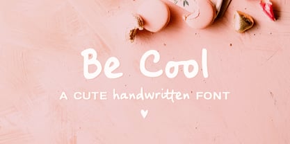 Be Cool is a cute handwritten font with an alternate character set (A-Z, a-z) and an extra set of swashes and ornaments to help decorate your text. This font includes: - A-Z, a-z, numbers and punctuation - Multilingual support - Dozens of ligatures that give it a true handwritten feel Use Be Cool in any design that needs a handwritten feel, such as signatures, notes and quotes, logos and branding.
 - Whistleberry by 10four,
$25.00 Originally given life as a wordmark for the Alt-Country band Woodshed Supply Company, the Whistleberry typeface evolved from a few simple letterforms inspired by early 20th Century signage, into a surprisingly functional typeface. With plenty of rustic charm, a robust glyph set, and a variety of alternate characters, Whistleberry will add flare and appeal to your work. Whistleberry comes in two weights; a modest Regular and a beefy Bold
 - Soul Leo by Otto Maurer,
$16.00 Soul Leo ist a special Version of my font „Soul“ (soul ultra black). For a long Time i want to make a Font like this. Before FL6 that was impossible. I know it is a big File Size for a Font with all the Graphics but i need a Font like this for a LadyProjekt. And so i did it myself. I hope you like it as i do!
 - Corinth by Albatross,
$19.00 Do you need that perfectly-imperfect yet highly legible font to pair with a script or supplement a logo? Corinth is a hand drawn geo sans with 4 styles plus ornaments that pairs well with scripts, is readable at small sizes and still achieves the retro, or hand made feel. The classic geometric letterforms in combination with the imperfections of being hand drawn give Corinth a unique personality without sacrificing legibility. Corinth is a small caps family with comprehensive language support, uppercase and lowercase alternates, double-letter ligatures for added realism, and over 100 ornaments and symbols. Corinth's legibility and classic style makes it very handy for any designer's arsenal and comes in useful for almost any subject matter.
 - Quinie SS by Sensatype Studio,
$15.00 Quinie is Modern Retro Fancy Font is a well-balanced contemporary font with a fancy, unique, and versatile vintage serif, font that you can combine to get any variations and unique shapes easily just in seconds with choose alternates of them. It is a serif display font with moderate contrast that perfect for branding projects, logo, wedding designs, social media posts, advertisements, product packaging, product designs, label, photography, watermark, invitation, stationery, and any projects, it makes with a high level of legibility. What's Included: Character set A-Z Normal & Italic Style Numerals & Punctuation Accented Characters (West Europe) Stylistic alternates Works on PC & Mac Recommended using Adobe Illustrator or Adobe Photoshop. Wish you enjoy our font. :)
 - Turbo Modul by PizzaDude.dk,
$15.00 The future is square! Well, at least according to Turbo Modul! Maybe the future is square, but it is also funky - just like Turbo Modul ... and its pretty unpredictable! Turbo Modul is loaded with alternative letters with arrows pointing in all directions, all made to pimp your designs! I've also added ligatures to substitute double letters, and there's a slight difference from caps and lowercase. Wow! That's a lot of different combinations! I tell you what ... I take a look at the posters I've made, and hopefully it will make you want to try out the font. I had a lot of fun doing the font, and maybe you will have a lot of fun using it! ;)
 - Lihataja by Khaiuns,
$10.00 Lihataja Handbrush is designed to show a strong charm. With quick, dry strokes and a signature style, Lihataja is perfect for branding projects, homeware designs, product packaging - or simply as a stylish text overlay to any background image. Ligatures • Are also available for several lowercase characters (double-letters which flow more naturally). These are only accessible via software with opentype capability or a glyphs panel, e.g. Photoshop/Illustrator. That's it! I really hope you enjoy it - please do let me know what you think, comments & likes are always hugely welcomed and appreciated. More importantly, please don't hesitate to drop me a message if you have any issues or queries. Come and say hello over on Instagram! Khaiuns


