10,000 search results
(0.038 seconds)
- Scarfish by Epiclinez,
$19.00 Scarfish is an urban-style handwritten brush font, with a unique brush texture. It is the best choice for creating eye-catching logos, branding, and quotes. The name scarfish was inspired by the legendary movie, scarface. The font Scarfish contains 198 glyphs. Supporting more than 66 languages, from English to Zulu. It is also PUA encoded, multilingual, and has open-type features such as ligatures. Scarfish is casual, carefree, and authentic. Handcrafted with passion and love for your awesome projects.
 - Miau by Cuchi, qué tipo,
$5.95 “Miau” is a display typeface designed by “Cuchi, ¡qué Tipo”! (Hey, what a type!”). Its name comes from the onomatopoeia of "Meow" in Spanish, and it is only to be used for letters or single words. It is built from the basic skeleton of cursive script letters, and its origin and main concept is based on experimenting with shapes that play the limit of readability. Being a variable format typeface, we have from the thinnest and lightest version ("Hiss"), to the thickest, dense and compact ("Purr"), passing through the average ("meow"). The final result of this experimentation is defined into a very contemporary typeface with a geometric, modular and “no-terrestrial” flavour. It aims to be a representation of the times we live about typographic design, a whole explosion of implausible experiments and formals researches.
 - Mirabel by Canada Type,
$24.95 Mirabel is based on the handwriting of Beverly Bouwsma (Philip's mother), which she developed in the 1930s in, as she puts it, an act of teenage rebellion. In the 1960s, Philip gave her a broad-edged Osmiroid fountain pen which she took to immediately and has used ever since, along with the computer fonts he made from her script. Since Beverly Bouwsma mixed loops and straight ascenders, two interchangeable fonts have emerged, a formal package that sacrifices some flamboyance for classical balance and legibility, but retains the quality of the writing and celebrates the personality of its creator. The Mirabel fonts are available in all popular font formats, and the character sets cover a wide range of codepages, including Central and Eastern European languages, Esperanto, Turkish, Baltic, Celtic/Welsh.
 - Chicory by Ascender,
$29.99 Chicory is a beautiful new calligraphic typeface with a touch of elegance. The narrow chancery style is perfect for formal invitations, newsletter mastheads, menus and greeting cards.
 - ItalicHand by Grummedia,
$24.00Inspired by 11th 12th century Carolingian hand drawn cursive. Elegant and clearly legible this italic looks well in large or small sizes for formal or informal use. - Beast Energy by Ditatype,
$29.00 Beast Energy is a brush-copying-script font in letter designs having uneven edges as its artistic and organic characteristics. This brush script font can express dramatic, fun impressions through its capital letters making the brush wipe details clearer. The edges will look wider and thicker on certain parts of the letters. The color applications in this brush script font will also give amazing, artistic effects. For example, brighter colors will live up the letters, while darker ones will have dramatic and mysterious effects. Above all, you need to make sure the letters remain legible even in bigger text sizes. Furthermore, you can enjoy the available features here. Features: Multilingual Supports PUA Encoded Numerals and Punctuations Beast Energy fits best for various design projects, such as brandings, quotes, printed products, merchandise, social media, etc. Find out more ways to use this font by taking a look at the font preview. Thanks for purchasing our fonts. Hopefully, you have a great time using our font. Feel free to contact us anytime for further information or when you have trouble with the font. Thanks a lot and happy designing.
 - Rough Love by Positype,
$27.50 Rough Love, it’s fair to say, came before Love Script. The brushed letter specimens that would ultimately serve as the template for the much ‘cleaner’ Love Script have now been turned into a typeface. As I packed these up, I just kept coming back to them and staring at the texture and movement caught on the page. On a lark, I decided it would be fun to let people see an almost a before and after scenario of how one led to the other and decided to produce a typeface from these specimens… Rough Love. For the most part, in typical fashion for me when I brush out a typeface idea, I try to brush the entire character set along with each of the planned variants for swashes, titling, and other alternates—the reason for that is simple -- each letter looks and acts a bit differently when the same movements are imposed on them. With Rough Love, I tried to adhere to that and made very few modifications to the originals, and only had to ‘borrow’ in a few occasions when I happened to forget to brush a variant.
 - Kang Meatball by Midvel,
$15.00 Kang meatball inspired by brush pen calligraphy. Characters shape based on brush pen stroke. Start by making words with brush pen on paper. Some words that have suitable shape are selected to be the initial inspiration for the font design. We draw calligraphy for uppercase, lowercase and number character. After drew Calligraphy character, next process is design digital lettering. We design Uppercase, lowercase, and number character in digital. Add puctuation and ligature characte. There are some style set, endswash and underline swash character that make lettering design more unique. We encoded unique character in Private Use Area (PUA). Kang meatball has 305 characters including uppercase, lowercase, numbers, punctuation, set style, and underscore swash. Kang meatball is suitable for many design. This brush font is suitable for logos, posters, advertising, gift cards, name cards, and T-shirt design. The font is suitable for logos, name cards, and gift cards. Fonts can be combined with visual elements to create posters, advertising, t-shirt designs or book cover designs. Feature : · Uppercase · Lowercase · Number · Punctuation · Multilingual (Accented Letters) · Ligature · Swash · Style set (01-04) · PUA Encoded Characters If you have question or request for any languange glyph, please contact us.
 - VVDS Organum by Vintage Voyage Design Supply,
$10.00 Elegant and easy to use serif font family with contrast in vertical and horizontal strokes. Its variety of weights provides a range of choices that will help you to find the best typographic look. Use all caps to get the classic serif look, like Didones, or use it normally for a playful serif look. Normal and Medium widths are good for text blocks and Thin and Light, or Bold and Black are perfect for Headliners. Every letter in a word looks like as if written specially next to each other, as in hand lettering. You can use it in gentle and minimal projects, and also in projects with bold and heavy typographic base. Also, for more individuality, Organum comes with discretionary ligatures and few stylistic alternates for every caps and some lowercase letters.
 - 1756 Dutch by GLC,
$42.00 This family is inspired from the set of two styles, Roman normal and Italic, and the ornaments used by an unknown printer working around East Switzerland, circa 1750's. It is a Dutch style font, slightly bolder than usual Fournier's or Caslon's Roman fonts, with some emphasized serifs and finals parts and special letters as capital "U" for example. A set of initials, fleurons, ornaments and frame elements is joined to the family as a supplement. The two styles, Normal and Italic, are containing standard ligatures, a few alternative characters and titlings (who are more preferable than enlarged capitals). They are "small eye" or "Small x-eight" fonts. The standard characters set is completed with accented or specific characters for Western (Including Celtic) and Central Europe, Baltic, Eastern Europe and Turkish.
 - 1689 GLC Garamond Pro by GLC,
$42.00 This typeface family was inspired by a set of fonts, designed in the Garamond style, used for an edition of Remarques critiques sur les œuvres d’Horace by “D.A.E.P.”, published in Paris in 1689 by two different booksellers: Deny Thierry and Claude Barbin. We can see some differences in comparison with our “pure” Garamond (see our 1592 GLC Garamond), particularly in the lowercase of the Normal style and the uppercase of the Italic. Unfortunately, we know neither the name of the punchcutter, nor that of the printer. This complete font set contains small caps, fractions all the way up to 1999/1999, historical and standard ligatures, and all of the fleurons contained in the edition (Normal style only). The alphabet covers all Western, Eastern and Central European languages (including Celtic diacritics) and Turkish.
 - Japanette by SoftMaker,
$9.99 Japanette is a vaguely oriental typeface published by SoftMaker.
 - Noyh by Typesketchbook,
$55.00 Noyh is a modern geometric font family that is based on research of similar typefaces of the 1990s and 2000s. Based on that research, font designer Chatnarong Jingsuphatada created a design whose main purpose is to perform equally well in as many environments as possible. Noyh offers a geometric structure with smooth corners, giving it great legibility and making it clean and friendly. As a result, Noyh works well both in print and on screen; it can be used freely for e-books and mobile applications and is perfect for headlines, banners, posters, web-sites, magazines, etc. Perhaps the greatest advantage of Noyh is the stunning number of fonts it includes. There are no less than 72 fonts, each containing over 350 glyphs. The family has 4 formats – Normal, Rounded, Slim and Slim Rounded. Each format is supplied in 9 weights – from Hairline to Black with their respective italics. The individual fonts work very harmoniously with one another, giving the potential user a variety of options. The Noyh font family was created by Thai designer Chatnarong Jingsuphatada and is released by the Typesketchbook type foundry. Chatnarong intends to add an additional member to the family – Noyh A – that will include ornaments, undoubtedly making the Noyh family even more versatile and multi-functional. In the meantime, please take a look at his other typographical projects: Delm, Mairy, Tolyer, Abula.
 - Rightside by FHFont,
$18.00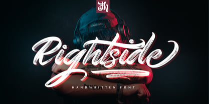 Rightside is a script font designed with a dry brush. The font includes OpenType features. Suitable for element design, events, t-shirts, logos, badges, stickers, awesome artwork, and more.
 - Relaxation JNL by Jeff Levine,
$29.00 Amongst the pages of a 1946 foreign publication entitled "100 Alphabets Publicitaires" ("100 Advertising Alphabets") is the casual brush stroke sans that was the design basis for Relaxation JNL.
 - Sumi Strokes by James J. Connell,
$9.00Sumi Strokes was created as a set of simple abstract brush stokes that could be used on their own or in conjunction with one another to form a painting. - Messcara by SparkyType,
$19.00Drawn very small with a brush-tipped felt pen, Messcara has qualities of freedom, toughness, with a few girly loops thrown in for good measure. A true handwriting workhorse. - Everett Mill by Aboutype,
$24.99Outline brush script originally designed for embroidery application. Everett was designed for all media and works best at 24 point and above. Everett requires subjective display kerning and compensation. - Leco 1988 by CarnokyType,
$18.00 The typeface LECO 1988 is another font family which belongs to LECO set. It is a display typeface, which is inspired by the title written on the bottle of lečo from 1988. Its typical features are embedded diacritics and significant black look with low contrast. Lower case is united with upper case and has several identical glyphs in both forms. Font contains alternative set of glyphs for letter „E“. Tabular numerals, superiors and inferiors and the full set of (glyphs - symbols) for languages using the Latin alphabet are also included in this font. LECO 1988 font family includes six specific styles: Regular, Blind, Gradient, Outline, Shadow and Stencil style. Those styles extend typographic options by mutual combination or overlapping, whilst every style share the identical metrics and kerning. Font format is Open Type with the support of several open type features. This typeface is suitable for creating logotypes, powerful posters or can be used as a headline display typeface.
 - Aeroko Variable by Monotype,
$279.99 Meet Aeroko, a slick variable typeface that evokes grit and speed, a dynamic play, a future–present competitive edge that evokes motorsport and all progressive brand design. This is a robust type system that creates memorable brand headlines. Powered by four display weights and three widths. Turbo-charged by a two-axes variable font. High performance brands can expect Aeroko to out-pace in every graphic condition. Aeroko is bold and assertive, it moves fast in headlines, it flexes when and where you need it. The forms are boxed and solid from Condensed to Wide, and they provide a distinct contrast when paired with rounder text fonts. Aeroko’s secondary power unit is harnessed from the ever adaptable variable font format. Variable font technology enables vast levels of typographic scale and expression, furthermore it allows Aeroko to react instantly in any digital space to maximize results. Aeroko evokes confidence, this is a typeface that actively encourages you to be courageous and daring with type in your own way. Brands demand distinct and robust typography, much in the same way that drivers demand pace. Aeroko meets these demands with ease, delivering assurance and weight across a valiant aesthetic. Aeroko is designed by Krista Radoeva and the Monotype Studio.
 - Aeroko by Monotype,
$49.99 Meet Aeroko, a slick variable typeface that evokes grit and speed, a dynamic play, a future–present competitive edge that evokes motorsport and all progressive brand design. This is a robust type system that creates memorable brand headlines. Powered by four display weights and three widths. Turbo-charged by a two-axes variable font. High performance brands can expect Aeroko to out-pace in every graphic condition. Aeroko is bold and assertive, it moves fast in headlines, it flexes when and where you need it. The forms are boxed and solid from Condensed to Wide, and they provide a distinct contrast when paired with rounder text fonts. Aeroko’s secondary power unit is harnessed from the ever adaptable variable font format. Variable font technology enables vast levels of typographic scale and expression, furthermore it allows Aeroko to react instantly in any digital space to maximize results. Aeroko evokes confidence, this is a typeface that actively encourages you to be courageous and daring with type in your own way. Brands demand distinct and robust typography, much in the same way that drivers demand pace. Aeroko meets these demands with ease, delivering assurance and weight across a valiant aesthetic. Aeroko is designed by Krista Radoeva and the Monotype Studio.
 - Nori by Positype,
$49.00 First, the important information…Nori is a hand-lettered typeface that contains over 1100 glyphs, 250 ligatures, 487 alternate characters, 125+ swash and titling alternates, lining and old style numerals. To make sure it is perfectly clear—Nori is the result of brush and ink on paper. The textures produced in each glyph are real and the imperfections are intentional and add to the sincerity of the letters. I say this to be as blunt as possible in order to avoid confusion and to frame what this typeface represents—calligraphic, handwritten letters captured digitally for their warmth and poetic variation for print and screen. Like my handwritten, calligraphic or brush-driven faces before it (the Baka series and the TDC2 2010 winning typeface, Fugu), Nori is a product of my analog and digital hand. To view the words and sentences formed by this typeface is to look at how my hands, yes hands, make letters. The fluidity, as well as the irregularity, is human, honest and intentional—to do so lets the brush I am holding breathe life into each letter. Once digital, any number of points and repetitive processes can’t mask its influences—and I like that. The brush, a simple instrument, my tool, my friend designed to emulate traditional Japanese sumi-e brushes... the Pilot Japan Kanji Fude brush pen. Each letter, each variation was written over and over again until I found the right combination. From there, each was scanned, digitized and optimized. Points were removed in order to ‘clean’ the glyphs up some but I did not want to compromise the integrity of the actual brush stroke. Once this base set of characters (about 350) were completed, the thoughtful manipulation of the glyphs, their gestures and forms were further expanded to solidify the embellishments used within the ligatures, alternates, swashes and additional features. This process was admittedly self-indulgent to an extent. I wanted the words created with this typeface to have the flexibility of variation and cohesiveness of movement that someone fluidly producing these letters by hand might have. I hope you enjoy this typeface as much as I did during the six months working on it. A specimen and style guide is included with the purchased of Nori.
 - Augustus - Unknown license

- Persimmon by Typadelic,
$19.00 Persimmon is elegant and semi-formal with some very unusual letter shapes. Calligraphic in nature, Persimmon can be used where you want a distinctive and unique lettering style.
 - Melcheburn by Scriptorium,
$18.00Melcheburn is a classic late-medieval gothic font based on original lettering by Samuel Welo. It has strong, formal lower case letters and extremely ornate and decorative capitals. - Agnia by Phoenix Group,
$9.00 Agnia is a formal font that combines serif and sans-serif fonts into one, Agnia has a modern minimalist style that is suitable for luxury and classy needs.
 - Kaila by ArimaType,
$18.00 Kaila is a bold but elegant serif font. Its elegance and simplicity make this font look absolutely stunning on a variety of design ideas, both formal and informal.
 - Hua by YXType,
$14.99 Hua type family is a sans-serif with very humanist details to represent the essence of nature. It features 14 weights from the very thin to the very bold, generously covering a wide range of the natural spectrum. Aiming to represent the soft and elegant side of nature, Hua features very unique italics that have their own take on the identity. The letterforms of the italic fonts are inspired by the lineage of both traditional calligraphic approaches for serifs and much simpler forms for sans-serifs. Hua provides very crisp performances on screens and its large x-height combined with fine-tuned proportions help it retain legibility very well on smaller sizes. Features: • Support for 200+ Latin languages • Double & single storie “a” & “g” • Unique italic letterforms • Low contrast with unique details • Small caps with symbols • Arbitrary and defined fractions • Support for superscript & subscript in normal & scientific alignments • Proportional lining, proportional old-style, tabular lining, tabular old-style
 - Normatica by CarnokyType,
$42.00 Normatica is a neutral typeface inspired by advertising letters used as letterings on shop windows during period of Normalization (the 60s–90s) in former Czechoslovakia. The complete font family consist of 24 styles in 6 weights (Thin–Black) with matching Italics where every style is followed by his Display counterpart. The difference between default and display styles is tighter spacing in Display fonts and different design of punctuation and diacritics accents. Beside the complete set of Latin, Normatica includes Cyrillic characters as well. Each font contains of alternative variation of some characters (j, t, y, Q) and includes a wide range of the Opentype features (for more details see pdf Specimen in Gallery section). Mixture of Normatica and Normatica Display can be effectively used for both text and display usage. It can be used in advertising, signage, corporate identities and various situations of editorial design. You can try two Demo styles in Medium weight fully for free.
 - Buddies by Sudtipos,
$59.00 Buddies, designed by Guille Vizzari, is a script font that was initially born as a piece of lettering. It is the result of an experiment between brush pen and pencil, and in this way, Buddies takes the imprint of the brush, the freshness of sign painting, and some (or a lot) of quirks by the author. The font at times enjoys dancing in titles and short lines of text, pouring rhythm and movements through its lowercase various x-height sets. Buddies also has a vast uppercase set with daring and atypical shapes that surprisingly function beautifully for composing short all-caps texts; messages are brought to life with awesome personality, ideal for packaging, fashion or even editorial. Buddies is a friendly font, a humble invitation to the brush letters universe, but from an unpredictable point of view.
 - Breathing by Din Studio,
$25.00 Hello, awesome people! This time, we have a new font called Breathing, a beautiful brush font created by Din Studio. Breathing, a beautiful brush signature font, is made for any professional project brandings, such as, signature logos, watermarks, wedding invitations, brandings, promotions, product packagings, etc. Every letter has a unique and beautiful touch. This font comes with rough and solid version. Breathing brush font includes a full set of hand-writing uppercase and lowercase letters, numerals, punctuations, and ligatures. This font gives a realistic hand-writing style. See the previews above to get some inspiration on how to use them. Happy designing! Features: 52 Stylistic sets 37 Ligatures Multilingual Supports PUA encoded We really hope you enjoy it. Thank you for downloading our premium fonts. For further details, please feel free to leave us your messages.
 - Trailmade by Adam Ladd,
$18.00 Trailmade is a rugged and stylish brush font with regular, italic, and extras styles. Explore an adventurous path with this typeface that ventures a little outside the typical brush script genre but still carries echoes of it. The upright design of the regular style has a confident appearance, while the italic style gives a little more of a signature look. Hand-lettered with a brush pen on paper, Trailmade includes swash characters, automatic double-letter ligatures, and a complete second set of lowercase stylistic alternates to switch in and out for a more authentic feel. There is also a matching Extras font featuring a variety of lines and dingbats that will complement your typography. All alternates, swashes, and ligatures are PUA-encoded for more accessibility in a variety of programs. This font has extensive Latin language support for Western, Central, and Eastern European.
 - Softly Bright by Ditatype,
$29.00 Introducing Softly Bright, a dynamic font duo that effortlessly combines the contrasting styles of sans-serif and brush fonts. The sans-serif component of this font is a testament to clean lines and modern minimalism. Its characters are created with precision and defined strokes, offering a sharp and sleek appearance that exudes professionalism and readability. On the other hand, the brush font in Softly Bright adds an expressive touch to your designs. It embodies the authenticity of hand-lettered strokes, with each character bearing the organic irregularities of brushwork. This brush font retains the proportions of the sans-serif, ensuring that the two styles harmoniously coexist. Softly Bright fits in headlines, logos, posters, flyers, branding materials, print media, editorial layouts, and many more designs. Find out more ways to use this font by taking a look at the font preview.
 - Sidestroke by Ramen,
$9.00 The typeface is inspired by our love of old hand-painted signs in butchers, and based on some very quick sketches using a brush pen to find what shapes worked. There is quite a quirky element to the type, as we tried to create the original sketches by rotating the brush pen to reflect the strokes of a paint brush. This lead to a horizontal stressing, which is most noticeable in letters like C, G, S and J. Sidestroke comes in 2 styles, both a standard solid version, and a pre-shadowed outline version. This can be outlined and divided in Illustrator to quickly create an alternate coloured fill for your letters. The lowercase letters have been designed to automatically horizontally align with any uppercase letters, which is a great shortcut when creating logos or other unique type layouts.
 - Mixed Tape by Ksenia Belobrova,
$35.00 Mixed Tape is a brush typefamily inspired by music and based on calligraphy. It has 3 different styles so that you can choose which you need or combine them as you like. Mixed Tape Regular is a casual neutral brush script, Mixed Tape Small is a more elegant variation and Mixed Tape Capitals is an energetic, probably even brutal brush script. You can freely play with the three of them creating your typographic compositions. You can use Mixed Tape for posters, prints, menus, packaging, book covers and headlines, cards and as a starting point for logotypes. Mixed Tape has a lot of alternates and ligatures which are built into the ‘Liga’ feature that is turned on by default. It also has swashes, titles, fractions, ordinals and case sensitive forms. Let’s all enjoy good music and typography!
 - Ukiyo Mind by Kitchen Table Type Foundry,
$15.00 By chance I stumbled upon an unfinished font in my fonts folder (while looking for something else). It had a stupid working name, but when I opened it, the font looked really nice! I have no idea why I never finished it. I renamed it Ukiyo Mind, because the font looked a bit like Japanese brush strokes. Ukiyo is a Japanese term which roughly translates as ‘the fleeting/transient world’. In mediaval Japan, the word was associated with Buddhism, but later it was used to describe the urban lifestyle and the pleasure seeking aspects of it. Nowadays it refers to a ‘living in the moment’ state of mind. Ukiyo Mind is a really nice brush font, which I probably made using Chinese ink and a brush. It comes with extensive language support and a set of alternates for the lower case glyphs.
 - Zest by Scholtz Fonts,
$22.00 Zest is an informal brush script drawn with quick, thick brush strokes. While it is based on everyday handwriting, the expansive and easy flow of the script hides the care that has been given to the crafting of each character. In style it harks back to the hey-day of American lettering and calligraphy, yet it has a looseness that is thoroughly modern. Zest comes in three styles: -- Zest-Medium, which is medium-weighted and appropriate to a wide range of applications; -- Zest-Drama, in which the contrast between the the thicker and thinner parts of a brushstroke has been dramatically enhanced; and -- Zest Bezel, in which the brush strokes have been given a contemporary, square-cut appearance. Zest is ideal for invitations to stylish but relaxed events, for advertisements that are intended to create a special ambiance, for posters and for announcements.
 - Autosmash by Rockboys Studio,
$15.00 Autosmash is a lovely and brushed script font that exudes elegance and class. This font was particularly crafted for those who need a beautiful and refreshing look to their designs.
 - Brusttine by Rockboys Studio,
$23.00 Austtone is a unique brush font, perfect for use in modern design projects. This font has a slightly aggressive edge, and works well in displays for use in digital media.
 - Reskova by Rockboys Studio,
$24.00 Reskova is a unique brush font, perfect for use in modern design projects. This font has a slightly aggressive edge, and works well in displays for use in digital media.
