10,000 search results
(0.18 seconds)
- Bell Martellus by Chank,
$99.00 Full of texture and regal personality, Bell Martellus was derived from a book published in 1475 by Henricus Martellus entitled “Liber Insularum.” The writing style is based on the Carolingian Script created by the Emperor Charlemagne and his scribe, Alquin of York, in the 9th century A.D. This old world lettering comes with new world OpenType capabilities, including swash caps and small caps. The James Ford Bell Library at the University of Minnesota commissioned Bill Moran to develop this font as a means of introducing their amazing collection of rare books, maps and manuscripts to a wider audience. Once the historic script was fontified by Bill, it was forwarded to Chank Co, where we added some snazzy baubles for the discriminating typographer. Everybody can enjoy the antique genuine nature of Bell Martellus, but advanced OpenType users also get extra features in Adobe CS applications.
 - Sabon Georgian by Linotype,
$67.99The Sabon® Georgian design translates the original Sabon typeface into Georgian language. Its old style Latin-based design traits and proportions have been carefully and beautifully interpreted as Georgian script characters. In the early 1960s, a group of German master printers wanted a typeface family which would provide them with consistent and predictable results, whether it was used as machine or hand-set composition. They approached one of Germany’s most distinguished type designers, Jan Tschichold, to undertake the design task. The end result of the design commission is a typographic tour de force, and the face that establishes Tschichold’s reputation as a type designer. The completed design, released in 1966, not only solved the imposed design problem of the early 1960s, it is also an exceptionally beautiful and useful digital design. The Sabon® Georgian design further extends the range of this remarkable typeface - Schuss Serif Pro by typic schuss,
$42.56 I was working about 10 years exclusively for a type company. Based on my experiences, I built this superfamily. Schuss™ Sans PCG is a humanistic sans-serif with a little contrast. Small Caps, greek and cyrillic are included. Also tab, prop, lining, old style and small cap figures. It's a typeface with clear and open characters. All complicated shapes are cleaned and simplified with a bit elegance. Schuss™ Slab Pro is a slab serif, based on the Schuss™ Sans. Schuss™ News Pro is the modeled style between Schuss™ Slab Pro and Schuss™ Serif Pro. Schuss™ Serif Pro is the antiqua shape. Additionally all serifs are cleaned up. There is just one-side-serif in the "n" for example. Tab figures (except small caps), mathematical signs and currency symbols have a width system accross all styles and weights.
 - Chamberí by Extratype,
$40.00 Chamberí is designed to be Vogue España's bestpoke typeface. An ambitious typographic branding project made for one of the most iconic magazine headers of the world, it defines the Spanish edition’s personality through a blending of the functionality of XIX Century Modern Romans (also known as “Scotch" typefaces) and the gestural expressiveness of typographic Baroque. Chamberí is a peculiar combination of the rational and the delicate, the sturdy and the feminine. The family is organised in a broad spectrum of 56 variants in which the transition from the restrained text version to the flamboyant, elegant display is modulated by contrast. The family is organised in seven weights: from Extra Light to Black, plus four optical sizes : Text, Headline, Display and Superdisplay. All this with its own Italics, Small Caps and Old Style Figures, besides the due refinement to resolve any editorial and communicative requirement.
 - Replay by Ahmad Jamaludin,
$17.00 Replay - Inspired by more than a hundred years from Cooper Black, Replay has a soft and rounded old-style serif typeface from the sixties era. Replay give a clean and versatile letterform that fits not only for display but also for reading purposes. Replay - equipped with several OpenType. Have 84 unique alternates and ligatures which consist of 3 stylistic sets. Comes with alternatives and ligatures, and helps to create stunning logos, quotes, posts, blog posts, branding projects, magazine imagery, wedding invitations, and much more. What you get Instructions Letters, numbers, symbols, and punctuation 84 unique alternates and ligatures Use in many programs even in Canva Multilingual Support Language Support: Danish, English, Estonian, Filipino, Finnish, French, Friulian, Galician, German, Gusii, Indonesian, Irish, Italian, Luxembourgish, Norwegian Bokmål, Norwegian Nynorsk, Nyankole, Oromo, Portuguese, Romansh, Rombo, Spanish, Swedish, Swiss-German, Uzbek (Latin) Come and say hello over on Instagram! https://www.instagram.com/dharmas.studio/ Dharmas Studio
 - ABC Basisschrift by Elsner+Flake,
$35.00 During the last ten years of his life, Hans Eduard Meier (dec. July 17, 2014), together with Max Schläpfer, developed an innovative concept of a new Swiss Schulschrift (handwriting script for schools) called ABC Basisschrift®. His life’s work is crowned by the fact that now, since the fall of 2014, and beginning in Lucerne, this new didactic will replace the old Schnürlischrift in Switzerland. In contrast with the Schnürlischrift, the idea is to guide a child in three steps to learning a personal handwriting. ABC Schule 1 is for the first grade, ABC 2 starts to introduce the first connections and ABC 4 Ligaturen is designed with many ligatures to serve as a good example for handwriting. ABC Schule is also available with ruling and for visually impaired students.This version of the Basisschrift®, available from here, is the original version by Hans Meier.
 - Dignus by Eurotypo,
$28.00 Dignus was inspired in two clever and famous typefaces: Bank Gothic and Microgramma. Bank Gothic designed by Morris Fuller Benton for ATF in 1930. Microgramma typeface designed by Alessandro Butti and Aldo Novarese for Nebiolo in 1952. Those typefaces were based on a stable rectangular shape with rounded corners, denoting the constructivist heritage and technological spirit of '50. We'd intended to review that typographic scenery with our contemporary point of view, aiming to obtain the formal synthesis of the signs and increase its legibility. Dignus fonts support Central, Eastern and Western European languages. Each font comes with full OpenType features like: standard and discretional ligatures, swashes, stylistic alternates, old style numerals, Tabular figures, numerators, denominators, scientific superior - inferiors, Case sensitive forms and vectors. The Dignus fonts include 7 weights, from Thin to ExtraBlack. The family is completed with condensed and expanded version all with their corresponding italics.
 - MIR Next by Juliasys,
$22.00 MIR Next is a growing multi-script type family best described by the terms “humanist–semi–slab-serif”. Its character set contains Latin and Cyrillic, both extended, as well as Greek, covering more than 100 languages. Strong personality along with consistency between language systems were a basic aim when designing the family. As a result MIR has become a great tool for branding and international identities. A wide choice of symbols and numbers makes it also very useful for statistics, texts about mathematics and the sciences. Serious things are best be said in an unpretentious, relaxed way. MIR gives typography exactly that kind of appearance. Its texts emit a sense of authority but stay easily accessible at the same time. MIR’s name comes from the old Russian word Мир meaning both “world” and “peace” – a unity we will hopefully take for granted sometime in the future.
 - New Kakuji by Edomoji Type,
$15.00 New Kakuji is designed from the Kakuji style of characters originating during the Edo period of Japan. New Kakuji has expanded the historical character set to include the surnames from the ancient Chinese text: Hundred Family Surnames, as well as the most common surnames in Japan, in addition to many other historically and culturally significant words, going well beyond the scope of characters that were used in the Edo period. No other font has expanded the character set of the Kakuji Style to the same extent as New Kakuji. A Latin alphabet expansion inspired by the old Kakuji style has also been included for western audiences and designers. New Kakuji contains over 500 Chinese/Japanese characters along with over 200 additional Latin characters or symbols. The solid and blocky style of New Kakuji is ideal for seal designs or other branding designs and should be used at larger point sizes.
 - Versina by Latinotype,
$39.00 Versina is a display typeface with a unique and expressive yet moderate personality resulted from its organic elegant shapes which are inspired by Spanish transitional typefaces from the 18th century. This font is perfectly suitable for both titles and short text. Versina features a flowing organic stroke and asymmetric bracketed serifs, and its shapes convey rhythm and dynamism. The font has a large x-height and its ascenders are shorter than the cap height, making it look more slender and modern. Calligraphic and crescent-like terminals give the design great formal richness. Versina comes in 5 weights with matching italics plus a set of ornaments, in Regular and Black styles, and also includes old style/lining/tabular figures, fractions, superscripts and subscripts as well as a set of small caps, standard ligatures, historical ligatures, symbols and frames. Versina contains a set of 694 characters that support over 200 Latin-based languages.
 - Aviator SG by Spiece Graphics,
$39.00 Aviator, also known as Ventura Slim, is based on an old 1930s lettering style popularized by Carl Holmes in his wonderful book on the subject. Angular and at the same time aerodynamic, this low-waisted typeface is great for tight-fitting headlines and other condensed titling situations. You may find it equally useful in developing company logos with a truly retro look. This resurrected digital version of Aviator comes with a convenient and stylish set of alternate characters and small figures. Now enjoy your flight! Aviator is now available in the OpenType Std format. Some new characters have been added to this OpenType version including stylistic alternates and historical forms. These advanced features work in current versions of Adobe Creative Suite InDesign, Creative Suite Illustrator, and Quark XPress. Check for OpenType advanced feature support in other applications as it gradually becomes available with upgrades.
 - Ritts Cursive by Eurotypo,
$59.00 The most notable characteristic of this typeface is that it has a compact and regular shape that is slightly condensed but fluidly connected. Its glyphs emulate the look of handwritten, inked characters. Their exuberant graphic strokes and sharp edges maintain the influences of printed types produced by mechanical processes. Unlike most of the italic type of today, the capital letters are as high as the ascending lower-case letters. The brush script style (Originally designed in 1942 by Robert E. Smith for the ATF) inspired many contemporary and beautiful typefaces, such as Wisdom Script, Mission Script, Marketing Script, Motion Picture, Thirsty Script, Lauren Script, Deftone Stylus and many others. This font has more than 700 glyphs, Central European languages support, including Open Type features, swashes, and contextual stylistic alternates. It also includes old-style figures, discretional and standard ligatures, is case-sensitive and has a set of tails and ornaments.
 - Bilokos Pro by AukimVisuel,
$14.00 Bilokos Pro is a cool and modern display font. Designed by experts to make your design look out of this world, this font has the potential to take your creative ideas far. This is a condensed sans serif display font. On the one hand, it has rounded curves with very open terminals that make this font family elegant, user-friendly and contemporary and on the other hand very useful for writing titles in any medium. It also comes with stylistic variations of 0-9, A-Z and a-z to satisfy the most demanding professionals. It has OpenType features like full ligatures, tabular figures for tables, old style figures to elegantly insert numbers into your sentences. With its large character set, it meets the needs of professionals because it will support several languages of Western Europe, Eastern Europe, Central Europe, Greek and Cyrillic for international communication.
 - Palatino Sans by Linotype,
$29.99 Palatino Sans was designed as part of a group of three font families: Palatino nova, Palatino Sans, and Palatino Sans Informal. Together these three families act as the fulfilment of Herman Zapf’s original Palatino idea. Palatino, which was born as a metal typeface in 1950, proved to be one of the 20th Century’s most popular designs. Not only is Palatino Sans a completely new typeface, it is also a completely new interpretation of the entire sans serif genre. Its letterforms are curved, rounded, and soft, not hard and industrial. The fonts in the Palatino Sans family include several OpenType features, such as an extended character set covering all Latin-based European languages, old style figures, small caps, fractions, ordinals, ligatures, alternates, and ornaments. Palatino Sans can be mixed well with Palatino and Palatino Sans Informal. Palatino® Sans font field guide including best practices, font pairings and alternatives.
 - Schuss News Pro by typic schuss,
$42.56 I was working about 10 years exclusively for a type company. Based on my experiences, I built this superfamily. Schuss™ Sans PCG is a humanistic sans-serif with a little contrast. Small Caps, greek and cyrillic are included. Also tab, prop, lining, old style and small cap figures. It's a typeface with clear and open characters. All complicated shapes are cleaned and simplified with a bit elegance. Schuss™ Slab Pro is a slab serif, based on the Schuss™ Sans. Schuss™ News Pro is the modeled style between Schuss™ Slab Pro and Schuss™ Serif Pro. Schuss™ Serif Pro is the antiqua shape. Additionally all serifs are cleaned up. There is just one-side-serif in the "n" for example. Tab figures (except small caps), mathematical signs and currency symbols have a width system accross all styles and weights.
 - Schuss Sans PCG by typic schuss,
$- I was working about 10 years exclusively for a type company. Based on my experiences, I built this superfamily. Schuss™ Sans PCG is a humanistic sans-serif with a little contrast. Small Caps, greek and cyrillic are included. Also tab, prop, lining, old style and small cap figures. It's a typeface with clear and open characters. All complicated shapes are cleaned and simplified with a bit elegance. Schuss™ Slab Pro is a slab serif, based on the Schuss™ Sans. Schuss™ News Pro is the modeled style between Schuss™ Slab Pro and Schuss™ Serif Pro. Schuss™ Serif Pro is the antiqua shape. Additionally all serifs are cleaned up. There is just one-side-serif in the "n" for example. Tab figures (except small caps), mathematical signs and currency symbols have a width system accross all styles and weights.
 - Pixelboy - Unknown license

- Night Blazer by Epiclinez,
$18.00 Night Blazer is a cute and lovable handwritten font. It is suitable for your crafting projects, but also for apparels, quotes and so much more.
 - Ruina Inline by RodrigoTypo,
$25.00 Ruina inline is an alternate version of Ruina, containing inline and also oblique, a very expressive font that can be seen in any casual design
 - American Advertise Square Series by Intellecta Design,
$17.90 See also other font families related: American Advertise 013, American Advertise 014, American Advertise 015, American Advertise 016, American Advertise 017, and American Advertise 019.
 - Jr High by BA Graphics,
$45.00A heavy contoured all cap font, great for poster, school and sports, will also work in many other applications where a strong statement is needed. - Megot by Brainware Graphic,
$12.00 Megot is a modern fancy display font with playful feel. Comes with opentype features, Megot also supports multilingual covering Latin based language (Latin Extended Additional)
 - Aldogizio by TeGeType,
$29.00 The ALDOGIZIO family is a new slab-serifs typefaces family inspired by Aldo Novarese' Egizio. It can be use for text as for titling applications.
 - Macaron by Akufadhl,
$15.00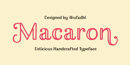 Macaron is a lovely, playful handcrafted typeface with inconsistency. It's designed to suit your homemade products and crafts and is also best for display purposes.
 - Allnoob by Skiiller Studio,
$20.00 Allnoob Typeface is one of the elegant decorative fonts neatly arranged and cool, you can also use it for business, clothing, movie titles, and more
 - That by Suomi,
$30.00 This is That: a family of four weights with roman and true italics, and also with chiselled medium weight, and Irregular variant for, well, variety.
 - Caslon Manuscript by BA Graphics,
$45.00An antiqued looking Caslon type letter, very retro but works well for many of today's applications. This font also works very well for text settings. - Happy Wednesday by Epiclinez,
$18.00 Happy Wednesday is a cute and lovable handwritten font. It is suitable for your crafting projects, but also for logos, quotes and so much more.
 - South Louisville by Sarid Ezra,
$15.00 South Louisville is an applicable handwritten font that contains uppercase, lowercase, number and symbol, also comes with ligatures and underline. This font support multi language!
 - Cantika by RahagitaType,
$14.00 Cantika is a beautiful font suitable for wedding invitations or souvenirs. Cantika is also suitable to use for other purposes that require an attractive appearance.
 - Chorettan by OCSstudio,
$12.00 Chorettan is a hand-written script. This is perfect for branding, wedding invitations, cards, social media, or maybe for your logo products, and also websites.
 - Runsten by Fontron,
$35.00Adapted from Ronsten to make an acceptable chunky, more normal serif font retaining the serif alignment with the letter curves. An Italic is also available. - Net Hunt by Putracetol,
$28.00 NetHunt - Spider Display Sans Font Introducing NetHunt, a spider display sans font that is perfect for any design that requires a horror or scary look. The font is inspired by an old embossed nameplate with cobwebs in it, and the designer made it into a display font. NetHunt features both uppercase and lowercase versions, with the lowercase version not having the cobweb design. The font also includes a sans ligature feature that makes the cobwebs of each word even cooler. If you are looking for a font that will give your designs a spooky and eerie vibe, NetHunt is the perfect choice. Use it for logos, titles, logotypes, covers, headlines, apparel, comics, cover books, cards, posters, or anything else that requires a horror or scary look. NetHunt comes with a variety of features that make it a versatile font. The font includes uppercase and lowercase letters, opentype alternates and ligatures, and multilingual support for a wide range of languages. The font also includes number, punctuation, and symbol glyphs. The font can be used on both Windows and Mac operating systems and is compatible with most design software, including Adobe Photoshop, Illustrator, InDesign, and more. If you want to add a spooky and horror touch to your designs, NetHunt is the font for you. It is perfect for Halloween designs, horror movie posters, or any design project that requires a unique and scary font. Use it for your next project and see the difference it makes! In summary, NetHunt is a spider display sans font that is perfect for horror and scary designs. It is inspired by an old embossed nameplate with cobwebs and features both uppercase and lowercase versions. The font includes opentype alternates and ligatures, multilingual support, and number, punctuation, and symbol glyphs. Use NetHunt for your next design project and add a spooky and eerie vibe to your designs. Tags: spider, display, sans, horror, scary, Halloween, movie poster, logo, title, logotype, cover, headline, apparel, comic, books, cards, posters, opentype, ligatures, multilingual, glyphs.
 - Mantika Book by Linotype,
$50.99 Mantika Book was originally conceived and drawn parallel to the first Agilita drawings. *[images: pencil drawings] It took several years before having a chance looking at these designs again. But then, my first impulse was to turn this alphabet into a new sanserif, which was to become Mantika Sans. This was the starting point to conceive a super family consisting of different design styles and corresponding weights. The initial drawings of Mantika Book were refined and an Italic was developed to go with it. The aim was to create a modern serif typeface which is reminiscent of humanistic Renaissance typefaces, yet without following a particular historic model. Its large x-height for one is far away from original Renaissance models. Mantika Book was designed as a companion serif typeface to Mantika Sans that can be set for lengthy texts as in books, hence its name. It shares the same x-height with Mantika Sans but has longer ascenders and descenders, making for better word shapes in long, continuous reading. The approach of an ›old-style‹ looking typeface with large minuscules makes Mantika Book also a choice for magazine text settings where one often needs smaller point sizes to fit in a multiple columns layout. The unique details of Mantika Book are the asymetric bracketed serifs in the upright font and its higher stroke contrast than usual in a Renaissance style. The stems are slightly curved inwards. Also, the Italics have a low degree of inclination, which makes longer passages of text set in Italic rather pleasing to read. Another feature Mantika Book shares with Mantika Sans is that all four weights take up the same line length. It covers all European languages plus Cyrillic and Greek, is equipped with lots of useful scientific symbols [double square brackets, angle brackets, empty set, arrows] and the regular weight has small caps. There is a kind of an old-style feeling to Mantika Book, yet these citations were turned into a contemporary serif typeface with a soft but sturdy character.
 - Hamlet by Canada Type,
$24.95Based on a specimen of an obscure and uncredited old face called Kitterland, Hamlet is one of those curiosities hardly ever noticed in the world of modern fonts, the kind that infuses a variety of historic Blackletter and calligraphy traits in an otherwise Roman alphabet. Such typefaces, what few of them exist, are almost always classified by typophiles as traditional decorative Roman alphabets. We beg to differ. We think such hybrids are fascinating enough to deserve a classification of their own. And we think today's aspiring letterers and type designers would benefit from paying special attention to this kind of hybrid alphabet, not only because it has much more hand than machine in it, but also because it is a prime example of how to succeed in mixing different lettering techniques into one self-contained and distinctly functional alphabet. As in any efficient mixture of lettering methods, Hamlet ended up with characters that are uniquely its own, such as the cupped A, M, V, W and Y, the very luscious and inviting curves on the arms of E, F, L and T, both single- and double-story forms of the a, and the humblest, friendliest g and y ever. A dozen alternate characters are sprinkled throughout the character set, so check out the map for a few pleasant surprises. We also made the Handtooled and Headstone styles because we thought these friendly forms were just crying out for such treatments. The Handtooled version turned out quite lovely, if we may say so ourselves, perhaps even better than the main font. The Headstone version is available as a free bonus to those who purchase the complete Hamlet package. All Hamlet styles come with lining figures as well as old style ones. Hamlet comes in all popular font formats. The OpenType fonts contain push-button swapping alternates and figures, which come in handy in software programs that support this kind of thing. - Marusya - Unknown license

- Sales Book JNL by Jeff Levine,
$29.00 Sales Book JNL was recreated from sample letters found in the wood type section of an old printer's supply catalog.
 - KG Shake It Off by Kimberly Geswein,
$5.00 Hand-drawn by my 10-year-old daughter, this font comes in 4 whimsical styles- chunky, 3D, regular, and outline.
 - Timbro by Font&Co.,
$19.00 Timbro – Italian for ’rubber stamp’ – is an all-caps, decorative display typeface based on lettering from old Land Registry records.
 - American West by FontMesa,
$20.00 Inspired by an old document from the New York and Western Railroad, American West brings the olden days to mind.

