10,000 search results
(0.738 seconds)
- Avenir Next Thai by Linotype,
$79.00 Avenir Next Pro is a new take on a classic face—it’s the result of a project whose goal was to take a beautifully designed sans and update it so that its technical standards surpass the status quo, leaving us with a truly superior sans family. This family is not only an update though; in fact it is the expansion of the original concept that takes the Avenir Next design to the next level. In addition to the standard styles ranging from ultralight to heavy, this 32-font collection offers condensed faces that rival any other sans on the market in on and off—screen readability at any size alongside heavy weights that would make excellent display faces in their own right and have the ability to pair well with so many contemporary serif body types. Overall, the family’s design is clean, straightforward and works brilliantly for blocks of copy and headlines alike. Akira Kobayashi worked alongside Avenir’s esteemed creator Adrian Frutiger to bring Avenir Next Pro to life. It was Akira’s ability to bring his own finesse and ideas for expansion into the project while remaining true to Frutiger’s original intent, that makes this not just a modern typeface, but one ahead of its time. Avenir Next Variables are font files which are featuring two axis, weight and width. They have a preset instance from UltraLight to Heavy and Condensed to Roman width. The preset instances are: Condensed UltraLight, Condensed UltraLight Italic, Condensed Thin, Condensed Thin Italic, Condensed Light, Condensed Light Italic, Condensed, Condensed Italic, Condensed Demi, Condensed Demi Italic, Condensed Medium, Condensed Medium Italic, Condensed Bold, Condensed Bold Italic, Condensed Heavy, Condensed Heavy Italic, UltraLight, UltraLight Italic, Thin, Thin Italic, Light, Light Italic, Regular, Italic, Demi, Demi Italic, Medium, Medium Italic, Bold, Bold Italic, Heavy, Heavy Italic.
 - Avenir Next Rounded by Linotype,
$42.99Avenir Next Pro is a new take on a classic face—it’s the result of a project whose goal was to take a beautifully designed sans and update it so that its technical standards surpass the status quo, leaving us with a truly superior sans family. This family is not only an update though; in fact it is the expansion of the original concept that takes the Avenir Next design to the next level. In addition to the standard styles ranging from ultralight to heavy, this 32-font collection offers condensed faces that rival any other sans on the market in on and off—screen readability at any size alongside heavy weights that would make excellent display faces in their own right and have the ability to pair well with so many contemporary serif body types. Overall, the family’s design is clean, straightforward and works brilliantly for blocks of copy and headlines alike. Akira Kobayashi worked alongside Avenir’s esteemed creator Adrian Frutiger to bring Avenir Next Pro to life. It was Akira’s ability to bring his own finesse and ideas for expansion into the project while remaining true to Frutiger’s original intent, that makes this not just a modern typeface, but one ahead of its time. Avenir Next Variables are font files which are featuring two axis, weight and width. They have a preset instance from UltraLight to Heavy and Condensed to Roman width. The preset instances are: Condensed UltraLight, Condensed UltraLight Italic, Condensed Thin, Condensed Thin Italic, Condensed Light, Condensed Light Italic, Condensed, Condensed Italic, Condensed Demi, Condensed Demi Italic, Condensed Medium, Condensed Medium Italic, Condensed Bold, Condensed Bold Italic, Condensed Heavy, Condensed Heavy Italic, UltraLight, UltraLight Italic, Thin, Thin Italic, Light, Light Italic, Regular, Italic, Demi, Demi Italic, Medium, Medium Italic, Bold, Bold Italic, Heavy, Heavy Italic. - LOVE-BOX - Personal use only

- WetPaint - Unknown license

- Gabardina - Personal use only

- bowellberalta - Personal use only

- Bionic Comic Condensed - Unknown license

- Fh_Ink - Personal use only

- OXIDISASTER - Personal use only

- They Killed Kenny! - Unknown license

- LD Harry by Illustration Ink,
$3.00This fun font has a lightning bolt on many of the uppercase letters. It's magical! - Hiatus by Stephen Rapp,
$59.00 Hiatus bridges the gap between formal scripts used for invitations and more classic settings and casual scripts that exude a warmer tone. Like many formal scripts, Hiatus is fully connecting. Its low body height combined with generous letterspacing adds an elegant profile to lines of text. Like casual scripts, Hiatus has a warm, hand-lettered appearance with great rhythm. Solid in structure; Hiatus also sets well at smaller sizes. Type enthusiasts will enjoy the variety of options. For optimal text flow, both letters and ligatures have alternate versions programmed to come in at the appropriate place for both beginnings and endings as well as in various contextual settings. In addition, there are variations and flourished versions of almost every letter and ligature. Some ligatures have as many as 12 variations. Also included are fractions, a set of old-style numbers, and a set of ornamental flourishes. Hiatus is a unique contemporary script with the strength of a time-tested classic. Please note that this version supports a wider range of languages compared with the lower-priced version available through other channels.
 - Instance by preussTYPE,
$55.00 German type designer Ingo Preuss created this family between 2014 and 2016. Instance is a new classic built on the foundation of over two centuries of history. Fresh and contemporary, while feeling familiar. This typeface is a high contrast sans serif typeface family and was designed for contemporary typography, especially for use in headlines and on posters, but also for reading purposes. A flexible, medium to high contrast, sans serif less about designing a stylish decorative design and more about applying contrast onto a neo-grotesk skeleton. Instance is more than just chopping off the serifs. The classical proportions of the capitals and x-heights were maintained, but the letterforms were rebalanced for use without serifs. Contemporary modifications were made to some widths, as well as an all new Light weight was created. Please note: Instance STD Office Packages is only as TrueType (* .ttf) and Standard-Version. Also, the character set has been reduced to Standard (without OpenType-Features, SmallCaps, old style figures, etc.). Ideal for testing and for Microsoft Office applications.
 - Manufaktur by Great Scott,
$12.00 MANUFAKTUR is a gas-pipe sans. A typeface influenced by an cast iron sign on an old Swedish industrial machine. The simple curves of the characters suited well for an 21st century update and the new and modern MANUFAKTUR is now a variable typeface with thousands of combinations of width and weight. MANUFAKTUR comes with stylistic alternates (smaller glyphs with underline) and small caps. The small caps also works as lowercase glyphs by default. With an OpenType-enabled app - or your website - you can control the width and weight of the typeface via a slider or with code. VARIABLE FONT SUPPORT: Currently Adobe only supports variable fonts in Photoshop and Illustrator. InDesign are still waiting on variable font support. This hardworking sans serif is perfect for display use, signage, poster, prints, editorial use, branding, logos, magazines, films and lots more. The variable weight and width makes MANUFAKTUR very versatile and flexible. If variable fonts isn't your bag MANUFAKTUR also comes predetermined weights and widths as a traditional font.
 - Eurotypo BKL by Eurotypo,
$28.00 Eurotypo BKL is a family of fonts inspired in on one of the most beautiful British Typography ever done. This version of Baskerville tries to reflect the taste of his fine style, compatible with the bluntness of the digital present. As many other designers and foundries, our intention has been to represent the atmosphere of Baskerville's style, than simply relive the shapes of its letters. Actually, capitals fits almost to a square proportions, lowercases are more open, ascenders and descenders are shorter, offering more space for enlarge the "x" high. The beauty of his letterforms can enrich headlines; this font can also be used as body text for its good legibility and accurate kerning. John Baskerville (1706-1775) was born 1706 in Wolverley, England. He was a great typographer and printer who published a remarkable edition of Virgil in 1757. His typefaces were greatly admired by Benjamin Franklin; He also has improved and developed many innovations in printing, paper and ink production. Baskerville’s typefaces are regarded as transitional types that represents the link between Old Roman Style and Modern Roman typography.
 - Juvenis by Storm Type Foundry,
$32.00Designs of characters that are almost forty years old can be already restored like a historical alphabet – by transferring them exactly into the computer with all their details. But, of course, it would not be Josef Tyfa, if he did not redesign the entire alphabet, and to such an extent that all that has remained from the original was practically the name. Tyfa published a sans-serif alphabet under the title Juvenis already in the second half of the past century. The type face had a large x-height of lower-case letters, a rather economizing design and one-sided serifs which were very daring for their time. In 1979 Tyfa returned to the idea of Juvenis, modified the letter “g” into a one-storey form, narrowed the design of the characters even further and added a bold and an inclined variant. This type face also shows the influence of Jaroslav Benda, evident in the open forms of the crotches of the diagonal strokes. Towards the end of 2001 the author presented a pile of tracing paper with dozens of variants of letter forms, but mainly with a new, more contemporary approach: the design is more open, the details softer, the figures and non-alphabetical characters in the entire set are more integral. The original intention to create a type face for printing children’s books thus became even more emphasized. Nevertheless, Juvenis with its new proportions far exceeds its original purpose. In the summer of 2002 we inserted all of this “into the machine” and designed new italics. The final computer form was completed in November 2002. All the twelve designs are divided into six variants of differing boldness with the corresponding italics. The darkness of the individual sizes does not increase linearly, but follows a curve which rises more steeply towards the boldest extreme. The human eye, on the contrary, perceives the darkening as a more fluent process, and the neighbouring designs are better graded. The x-height of lower-case letters is extraordinarily large, so that the printed type face in the size of nine points is perceived rather as “ten points” and at the same time the line spacing is not too dense. A further ingenious optical trick of Josef Tyfa is the figures, which are designed as moderately non-aligning ones. Thus an imaginary third horizontal is created in the proportional scheme of the entire type face family, which supports legibility and suitably supplements the original intention to create a children’s type face with elements of playfulness. The same applies to the overall soft expression of the alphabet. The serifs are varied; their balancing, however, is well-considered: the ascender of the lower-case “d” has no serif and the letter appears poor, while, for example, the letter “y”, or “x”, looks complicated. The only serif to be found in upper-case letters is in “J”, where it is used exclusively for the purpose of balancing the rounded descender. These anomalies, however, fit perfectly into the structure of any smoothly running text and shift Juvenis towards an original, contemporary expression. Tyfa also offers three alternative lower-case letters *. In the case of the letter “g” the designer follows the one-storey form he had contemplated in the eighties, while in “k” he returns to the Benda inspiration and in “u” adds a lower serif as a reminder of the calligraphic principle. It is above all the italics that are faithful to the tradition of handwritten lettering. The fairly complicated “k” is probably the strongest characteristic feature of Juvenis; all the diagonals in “z”, “v”, “w”, “y” are slightly flamboyant, and this also applies to the upper-case letters A, V, W, Y. Juvenis blends excellently with drawn illustrations, for it itself is modelled in a very creative way. Due to its unmistakable optical effect, however, it will find application not only in children’s literature, but also in orientation systems, on posters, in magazines and long short-stories. - Jushley Shine by Ergibi Studio,
$19.00 Jushley Shine is a brush font made from handwriting. It contains lowercase, uppercase, symbols, and also support for multiple languages. Jushley Shine also works well on posters, branding, packaging, beautiful fashion design, wedding invitations and handwritten quotes.
 - Hebrew Stam by Samtype,
$34.00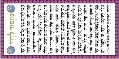 Beautiful Caligraphic font and also readable font.
 - Grenale Slab by insigne,
$- Grenale Slab adds to the new standard of elegance within the Grenale family. Not your typical slab, Grenale has some unique forms that give it a look all its own. This glamourous slab still draws much inspiration from Grenale’s Didone sans and its haute couture influence. Independently attractive, it’s balanced and poised, with well formed strokes. Grenale Slab’s thin weights are simple but vibrant--elegant forms that naturally lend themselves to designer journals and high-end branding along with upscale applications. With added energy and power, the thicker weights give your work a firmer, statlier look. Grenale Slab’s upright versions are also matched by optically adjusted italics. The fashionable typeface includes a multitude of alternates that may be accessed in any OpenType-enabled application. The stylish features include a large group of alternates, swashes, and meticulously refined details with ball terminals and alternate titling caps to accessorize the font. Also included are capital swash alternates, old style figures, and small caps. Peruse the PDF brochure to see these features in action. OpenType enabled applications such as the Adobe suite or Quark can take full advantage of the automatic replacing ligatures and alternates. This family also offers the glyphs to support a wide range of languages. Any of Slab’s weights also provide a well-matched companion to its original counterparts, Grenale #2 and the original Grenale. It’s time to think high-class. Graceful and assured, the carefully crafted forms of Grenale Slab step pleasantly onto each page with elegant charm. Include its range of alternate glyphs, and this chic font is a superb choice for bringing a far more refined look to your copy.
 - Grenale #2 by insigne,
$24.00 Grenale #2 shapes the new standard of elegance within the Grenale family. Not your typical sans, this pure, geometric structure with its glamorous sensitivity draws much inspiration still from Grenale's didone sans and the haute couture influence. Independently attractive, though, the form abandons the original's high contrast for its own minimal stroke variation, achieving proper balance through its graceful strokes. Grenale's thin weights are simple but vibrant--elegant forms that naturally lend themselves to designer journals and high-end branding along with upscale applications. With added energy and power, the thicker weights give your work a firmer, statlier look. Grenale #2's upright versions are also matched by optically adjusted italics. While unique in appearance, any of #2's weight also provide a well-matched companion to its original counterpart. The fashionable typeface includes a multitude of alternates that may be accessed in any OpenType-enabled application. The stylish features include a large group of alternates, swashes, and meticulously refined details with ball terminals and alternate titling caps to accessorize the font. Also included are capital swash alternates, old style figures, and small caps. Peruse the PDF brochure to see these features in action. OpenType enabled applications such as the Adobe suite or Quark can take full advantage of the automatic replacing ligatures and alternates. This family also offers the glyphs to support a wide range of languages. It's time to think high-class. Graceful and assured, the carefully crafted forms of Grenale #2 step pleasantly onto each page with elegant charm. Include its range of alternate glyphs, and this chic font is a superb choice for bringing a far more refined look to your projects.
 - OldHaroldRee by Ingrimayne Type,
$12.95 OldHaroldRee is a modification of PhederFrack, a calligraphic fraktur face. It keeps the lower case letters and inserts a completely different set of upper-case letters, which is in the “Old English” rather than the “Old German” or fraktur style. It comes in two weights, a bit unusual for an Old-English style typeface.
 - Stencil Label JNL by Jeff Levine,
$29.00 In the 1943 Three Stooges comedy short “Higher than a Kite”, Curly reaches into a box with the label “hand grenades” painted on its side and pulls out one of the devices. The bold, squared stencil hand lettering on that prop inspired Stencil Label JNL, which is available in both regular and oblique versions.
 - Rabert Conan by Muksal Creatives,
$10.00 Rabert Conan Modern Bold serif Font typeface with beautiful alternate and Ligature, special glyphs, ornament and multilingual support. It's a very versatile font that works great in large and small sizes. Perfect for editorial projects, Logo design, Clothing Branding, product packaging, magazine headers, or simply as a stylish text overlay to any background image.
 - Rachert by ahweproject,
$9.00 Rachert is a retro bold font that will bring you back to the 70s. Fall in love with its unique character and use it to create gorgeous wedding invitations, beautiful stationery art, eye-catching social media posts, and much more! Rachert is PUA encoded which means you can access all glyphs and swashes with ease!
 - Iamblock by wearecolt,
$- Free Font Iamblock is a super heavy display font that makes a statement. In the family, you get a monospace and a naturally spaced version of Iamblock. Iamblock was developed with the rave and party scene in mind, with lots of bright, bold colors mixed with blacks and whites... it's about the heavy contrast.
 - Galaxy Placebo by Adante Creative,
$23.00 Introducing by Adante.Creative Proudly Presenting Galaxy Placebo Galaxy Placebo is a bold Display font Galaxy Placebo is perfect for product packaging, branding projects, megazine, social media, wedding, or just used to express words above the background. Galaxy Placebo has multilingual support. Enjoy the font, feel free to comment or feedback, send me PM or email.
 - FF Layout by FontFont,
$41.99 German type designer Gerd Wippich created this script FontFont in 1996. The family has 7 weights, ranging from Regular to Bold (including italics) and is ideally suited for festive occasions and editorial and publishing. FF Layout provides advanced typographical support with features such as ligatures and case-sensitive forms. It comes with tabular lining figures.
 - Ellis Greatter by madjack.font,
$16.00 Ellis Greatter is an easy to read script that is designed with a vintage look making it bold, classic and fun. It includes OpenType features and alternative styles. It can be used for various purposes such as posters, t-shirts, signage, logos, news, badges and more. International support for most Western languages is included.
 - Noir et Blanc by Pelavin Fonts,
$25.00 Noir et Blanc began as a proposed logo for a new Broadway production of Moulin Rouge and ended up as a challenge to find how bold a stroke weight could still be beautifully legible. Now that it is complete, we hope it will have the chance to become noir et blanc et rouge partout.
 - Dear Pony by Eko Bimantara,
$16.00 DearPony is a sweet, warm, quirky, yet classy serif and signature script font duo. This charming combination offer a unique and elegant look that make it useful for various creative project. The serif's contain 240 glyphs with eight weight; Regular, Medium, Bold and Oblique with each matching oblique. It's contain language standard latin multilingual support.
 - Maple Street by Okaycat,
$29.00 Maple Street is a great looking traditional serif font composed by the Okaycat design team, Luke Turvey & Natsuko Hayashida, in 2014. Bold didone forms with structural seriffed detail combine at Maple Street to offer a cozy familiar style, without looking dated. This nicely balanced serif is designed to look outstanding for display or printed publication.
 - Music Festival JNL by Jeff Levine,
$29.00 The Federal Music Project was part of Franklin D. Roosevelt's WPA (Works Progress Administration), putting many people back to work in the Depression years of the 1930s. A hand-lettered poster advertising an "American Music Festival" featuring the Bridgeport Symphony Orchestra offered up the extra bold Art Deco inspiration which became Music Festival JNL
 - Madisonian by Présence Typo,
$36.00Madisonian has been found in a catalogue of the New York Bruce type-foundry, dated 1859. The lower cases have the feeling of a Bodoni Italic and the initials have a "spencerian" touch. This font did exist originaly in a single weight. The family has been extended with a bold and an engraved version. - Baochi by Letterara,
$14.00 Baochi is a stylish and elegant bold serif font. It is suitable for a wide variety of designs due to its unique, and cool style. this font is great for headlines, logos, magazines, Packaging, covers, posters and other creative designs. This font is PUA encoded which means you can access all of the glyphs.
 - Political Trend JNL by Jeff Levine,
$29.00 An ad in the May 27, 1939 issue of "Motion Picture Herald" for the film "Young Mr. Lincoln" featured the film's title hand lettered in a squared, bold pen lettering with rounded terminals along with an incised 'engraving' line. This formed the basis for Political Trend JNL, which available in both regular and oblique versions.
 - Makeba by RagamKata,
$14.00 Makeba - Psychedelic Typeface This is a writing style that might suit what you need, strong and bold, psychedelic style. Add just the right amount of vintage flair to your retro graphics with this original psychedelic-style design. Suitable for music posters, album graphics, book titles, etc. Get powerful but still funky with Makeba - Psychedelic Typeface.
 - PAG Tekov by Prop-a-ganda,
$19.99Prop-a-ganda offers retro-flavored fonts inspired by lettering on retro propaganda posters, retro advertising posters, retro packages all the world over. This is perfect font for your retrospective project. PAG Tekov is designed by extreme bold line, extreme thin line, circle, and triangle. It is so decorative, but with light and cute touch. - Umpire Serif by Mans Greback,
$59.00 Umpire Serif is a heavy sans-serif immersed in Victorian grandeur, exuding a kingly confidence that commands respect. Every letter carved is a testament to its solid and heavy foundation, echoing the decorative prowess of a bygone era. With its bold demeanor, the typeface effortlessly portrays nobility and pride. It's not merely decorative; it's regal.
 - Hypherin by ahweproject,
$9.00 Hypherin is a gorgeous and bold handwritten font, crafted to give your headlines and logotype projects a stylish touch. This font reads as strong, confident, and dynamic and can add tons of nostalgic character to your designs. Hypherin is PUA encoded which means you can access all of the beautiful glyphs and swashes with ease!
 - Jazzy B by Oleg Stepanov,
$12.00 If you are looking for a simple, twisted and funny font with lack of readability, you should take a look at Jazzy B typeface. The family contains 2 styles: Thin and Bold. Jazzy B Regular combines these two style, so you can easily create catchy captions for music posters, children books and video games.


