10,000 search results
(0.03 seconds)
- Batistar by Allouse Studio,
$16.00 Batistar is perfect for any tittles, logo, product packaging, branding project, magazine, social media, wedding, or just used to express words above the background. Batistar also come with Multi-Lingual Support. Enjoy the font, feel free to comment or feedback, send me PM or email.
 - FT Moonshine Script by Fenotype,
$19.95 An inky script font written by a madman from the cabin deep in the forest. Moonshine Script has a regular set of uppercase and lowercase script letters but also condensed capital letters that you can access by switching SmallCaps on and writing with CAPS.
 - Dreamy Notes Script by Subectype,
$15.00 The Dreamy Notes Duo is a stunning and comprehensive duo font (script and sans serif), ideal for giving your projects a branded but friendly feel. The two included styles can be combined together perfectly but are also beautiful on their own. Thank You, Subectype
 - Valencia Nature by Timurtype,
$14.00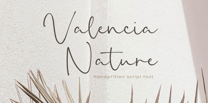 Introducing by Timur type Proudly Present, Valencia Nature Valencia Nature A Handwritten Font Valencia Nature is perfect for product packaging, branding project, megazine, social media, wedding, or just used to express words above the background. Valencia Nature also multilingual support. Enjoy the font.Thank you!
 - Admire Camelia by Timurtype,
$14.00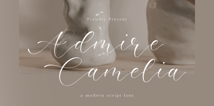 Introducing by Timur type Proudly Present, Admire Camelia Admire Camelia A Handwritten Font Admire Camelia is perfect for product packaging, branding project, megazine, social media, wedding, or just used to express words above the background. Admire Camelia also multilingual support. Enjoy the font.Thank you!
 - Creamy Baked by Timurtype,
$14.00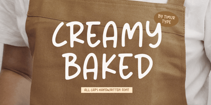 Introducing by Timur type Proudly Present, Creamy Baked Creamy Baked A Handwritten Font Creamy Baked is perfect for product packaging, branding project, megazine, social media, wedding, or just used to express words above the background. Creamy Baked also multilingual support. Enjoy the font.Thank you!
 - Simptown Boutique by Timurtype,
$14.00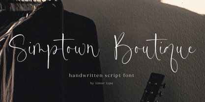 Introducing by Timur type Proudly Present, Simptown Boutique Simptown Boutique A Handwritten Font Simptown Boutique is perfect for product packaging, branding project, megazine, social media, wedding, or just used to express words above the background. Simptown Boutique also multilingual support. Enjoy the font.Thank you!
 - Crumble Bakery by Timurtype,
$14.00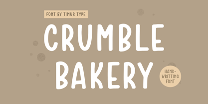 Introducing by Timur type Proudly Present, Crumble Bakery Crumble Bakery A Handwritten Font Crumble Bakery is perfect for product packaging, branding project, megazine, social media, wedding, or just used to express words above the background. Crumble Bakery also multilingual support. Enjoy the font.Thank you!
 - Simple Games by Timurtype,
$14.00 Introducing by Timur type Proudly Present, Simple Games Simple Games A Handwritten Script Font Simple Games is perfect for product packaging, branding project, megazine, social media, wedding, or just used to express words above the background. Aesthetica also multilingual support. Enjoy the font.Thank you!
 - Almond Hunter by Timurtype,
$14.00 Introducing by Timur type Proudly Present, Almond Hunter Almond Hunter A Handwritten Font Almond Hunter is perfect for product packaging, branding project, megazine, social media, wedding, or just used to express words above the background. Almond Hunter also multilingual support. Enjoy the font.Thank you!
 - Dusty Hands by Bogstav,
$18.00 Dusty Hands - my crunchy legible comic font, originally with a fat marker and then digitally manipulated. I've made 3 versions for you, and they all fit like a glove - use them as they are, or do some layered effects. All versions have the "contextual alternates magic" - and in this case it means 4 slightly different versions of each lowercase letter.
 - Jojo by Canada Type,
$24.95 A little more flower and a little less power, please. Fun, friendly, fashionable, and feminine to a fault, Jojo takes display typography to a whole new level, where eyes can’t help but appreciate the day and the design at hand. It takes a graphic designer very little imagination to see these letters on posters, book covers, clothes, and craft paraphernalia. Or how about a sign over a bakery? A music sleeve? A romantic comedy titling? Cosmetics products? Pretty much anywhere! Jojo takes its name from a Beatles song about getting back to where we once belonged. It also takes most of its shapes from vintage photo-setting days, when an art nouveau typeface called Spring, by B. Jacquet, was putting happy times back where they belonged, which was everywhere. The original photo-setting face came in just 26 letters and 10 numerals. This digital retooling optimizes the original forms and expands on them, for a full character set of over 430 glyphs, including ligatures and stylistic alternates, and support for the majority of Latin languages.
 - Boxy by Hackberry Font Foundry,
$24.95 In my on-going quest for display fonts to be used with my books and on my book covers, I decided I need a squared sans serif. I started the build off of Fiscal, a font I designed back in 2006. I never liked the font, plus my tastes have changed. So, I opened it, made it narrower, increased the x-height, and various stuff like that. I made it much heavier—an ended up with Boxy. Then my brain slapped me and said, "Why don't you make a sorta modern version?" So, I did and decided to call that style Chic. But then I wanted a thin version also. Fiscal was always too heavy and ponderous for me. So, I made the Thin style. Finally, I felt I needed an italic of Chic. OpenType features didn't seem to work well with the family, so all I added was oldstyle figures. So, I ended up with another of my unique families—with two unmodulated fonts: Thin and Medium, and two modulated fonts: Chic and Chic Italic. But, I'm pleased with it. My hope is that you will like it also.
 - Heirloom Artcraft by Baseline Fonts,
$29.00 Presenting Heirloom Artcraft-- by Baseline Fonts within the Grit History B series. Like an auntie who insists on baking cookies from scratch every time you visit, Heirloom Artcraft is a beacon of tradition and consistent delight with every letterform. Gentleness and subtlety keep this font far away from kitsch. This font sincerely says "ma'am" and "sir" and is perfect for business cards, custom stamps, coffeetable books, letterhead, invitations and anywhere you or your client wish to make an extremely well mannered and charming statement. There are many alternate ligatures available within the font including capital alternates for T, A, P, B, D, and N. It also boasts a full symbol set and the most darling little swashes scattered tastefully throughout the character map you ever did key. Heirloom Artcraft is available in Thin, Thin Italic, Book, Book Italic, Demi Italic, Black, and Black Italic. It also features Metrics and Optical kerning - metrics displays characters with letterpress-traditional spacing that is pleasantly askew, or more rigid optical kerning which displays characters at identical distances for times when the importance of readability exceeds that of stylistic merit.
 - Mondia by Nasir Udin,
$19.00 Mondia is a modern serif font family with 18 fonts inspired by transitional and contemporary typefaces. Mondia has been designed with high-contrast character ratio to give an elegant touch, and high x-height to give sentences more legibility. Ranging from thin to fat with its matching italics, Mondia offers many possibilities to be applied in many graphic or editorial projects. Also thanks to the extended latin character set so that Mondia supports 200+ latin-based languages. Mondia also has a complete set of true small caps that integrate beautifully with lowercase letters to give more emphasis to the highlighted texts. Mondia has OpenType features built in, such as stylistic alternates, standard ligatures, special ligatures, oldstyle figures, localized letters, automatic fractions, sub/superscripts, and ordinals. Mondia also has a complete set of proportional and tabular numbers. With those features, Mondia is a great choice for headline, branding, titles, but can also perfectly be used in small articles. For full presentation please visit me Behance post.
 - Structural Glass JNL by Jeff Levine,
$29.00 A page from the 1931 Vitrolite catalog showing illustrations of store fronts and building exteriors utilizing the material provided a classically Art Deco type example. The business name “Sylvin” did not offer many characters to work with, so completion of the digital type design was simply left to imagination. The end result is Structural Glass JNL, which is available in both regular and oblique versions According to Wikipedia: “Pigmented structural glass, also known generically as structural glass and as vitreous marble, and marketed under the names Carrara glass, Sani Onyx, and Vitrolite, among others, is a high-strength, colored glass. Developed in the United States in 1900, it was widely used around the world in the first half of the 20th century in Art Deco and Streamline Moderne buildings. It also found use as a material for signs, tables, and areas requiring a hygienic surface. Over time, the trademarked name “vitrolite” became a generic term for the glass.”
 - Frisco Antique Display SG by Spiece Graphics,
$39.00 Here is a decorative condensed antique design that is sure to fit a variety of contemporary situations. The Bruce Type Foundry (later acquired by V. B. Munson) developed this wonderfully shaded Tuscan in the 1880s - or possibly earlier. It was known back then as Style No. 1050 and carried a pronounced three-dimensional look with a thin hairline at the bottom and right of each stroke. It is best to use Frisco Antique in large display sizes because it is easy to lose these delicate hairlines. A lowercase and several alternate characters have been provided for your convenience. Frisco Antique Display is also available in the OpenType Std format. Some new characters have been added to this OpenType version. Advanced features currently work in Adobe Creative Suite InDesign, Creative Suite Illustrator, and Quark XPress. Check for OpenType advanced feature support in other applications as it gradually becomes available with upgrades.
 - Jesper by Linotype,
$29.993 robbers is not a typeface family, only a collective name for three typefaces with the looks of handtexted characters: Kasper, Jesper and Jonatan. There are some common traits between them, but they are three individuals. As the three terrible" robbers in the Swedish writer Lennart Hellsing's Kamomillastad - the ones who borrowed their names to the typefaces - are three individuals. They always appear in the same order: first Kasper, then Jesper and last Jonatan. Swedish children love to sing about them and are not at all scared of them. All three robbers were released in 1995. - Jonatan by Linotype,
$29.993 robbers is not a typeface family, only a collective name for three typefaces with the looks of handtexted characters: Kasper, Jesper and Jonatan. There are some common traits between them, but they are three individuals. As the three terrible" robbers in the Swedish writer Lennart Hellsing's Kamomillastad - the ones who borrowed their names to the typefaces - are three individuals. They always appear in the same order: first Kasper, then Jesper and last Jonatan. Swedish children love to sing about them and are not at all scared of them. All three robbers were released in 1995. - Engel New by The Northern Block,
$30.36 EngelNewSans is sans serif family of 12 weights and an upgrade of the typeface Engel also published by Die Gestalten Verlag. The project began with an extension to the original Engel character set and freshening up the typeface to suit the OpenType format. EngelNewSerif came about as a sibling to EngelNewSans as a corresponding serif family also of 12 weights, matching those of EngelNewSans. Both families are designed for a wide usage in running text and headlines. EngelNewSans is an evolved version of the original Engel typeface, which undergone improvements to the individual letterforms and the overall look which resulted in this sans serif type family with a more mature confident character and with softer, rounder and more harmonious shapes. The characteristics between the two could perhaps, very fittingly, be compared to a person showing different sides to their personality at different stages in life. With EngelNewSans portraying the more mature role while the original Engel shows traits of a cool teenager with rough edges, not yet fully developed. To make the light weights function with serifs attached for EngelNewSerif, the same low stroke contrast as seen in EngelNewSans was applied. Further discovery found that the serifs and the stem width had to be optically similar for the light weights not to appear too fragile. In the heavy weights however, the stroke contrast was higher than in the Sans versions, this was done to open up the counters and make room for the serifs to breathe. The intention of the families is to motivate an element of play and give the designer a larger selection to work with.
 - Sathseed by Zamjump,
$17.00 Sathseed is a fun, lively, handwritten brush script created with the utmost care, love, and attention to detail. It's ideal for logos, titles, product packaging, merchandise, quotes... Try it for yourself in the preview section - what you see is what you get! To achieve an authentic handwritten feel, Sathseed comes with a full set of lowercase substitutions and ligatures to play with, giving you lots of variety. If you use software that supports OpenType, they are included in the main font that will be active as you type. If not, I've also included Alternate and Ligature as separate fonts for you to use. Your download will include the following files in TTF & OTF format. Litagure as well as alternate and extra swash. For web font use, a web font kit consisting of Awesomespill Regular fonts in WOFF, WOFF2 formats is also provided. Any question? Drop me a line and I'll be happy to answer!
 - PiS Coalfield by PiS,
$26.00 Written with a blunt graphite pen, PiS Coalfield features a scruffy scribbled look, loosely inspired by the expressive handwriting on various posters by Sister Corita Kent, an influential pop artist experimenting with serigraphs in the '60s. There is one set of regular and 4 sets of alternate glyphs for each basic letter programmed to cycle through automatically with the contextual alternate feature (which makes 5 possible versions of each letter). You can also hand-pick the 4 alternate sets if you prefer that of course! A super-lively handwritten look is guaranteed, readability is given in display but also in smaller sizes too! Use it for your organic tofu brand, children’s books or that hip sweet coffee shop around the corner!
 - Wooden Bridge by Putracetol,
$22.00 Wooden Bridge - Vintage Display Font. The line of Wooden Bridge is also very unique, so it makes seem irregular, What makes Wooden Bridges unique is vintage touch in the character. Wooden Bridge is inspired by display of the 1970s posters but made flexible enough for everyday use. Wooden Bridge best uses for title, invitation, heading, cover, poster, logos, quotes, product packaging, merchandise, social media & greeting cards and many more The alternative characters were divided into several Open Type features such as Swash, Stylistic Sets, Stylistic Alternates, Contextual Alternates, and Ligature. The Open Type features can be accessed by using Open Type savvy programs such as Adobe Illustrator, Adobe InDesign, Adobe Photoshop Corel Draw X version, And Microsoft Word. Wooden Bridge is also support multi language.
 - Cell by Type Minds,
$7.50 Cell is a sturdy, geometric typeface with many potential applications. Though it is best suited to display sizes, its construction is simple enough for use in smaller settings. Its octagonal, almost mechanical design is softened by rounded corners. The face is characterized by a single thick stroke in each letter, lending it a unique appearance. It also features an oblique counterpart with several italic-style glyphs. Both members of the family also include small capitals mapped to the Private Use Area. Cell was designed to be at once simple and unique. Its grid-based structure is enhanced by slight adjustments for optical consistency. Glyphs which are normally round instead have 45-degree angles at the corners, sticking to the grid system without losing legibility.
 - Irpin Type by Aronetiv,
$- Irpin Type is an original font dedicated to the city of Irpin. Intended for everyday use, for books, logos, corporate style. It can also be used in posters and presentations where a confident character is needed. This font suits a large size, but it has good readability even in a small one. This is a modern slab serif with geometric shapes, inspired by the Ukrainian avant-garde of the 20th century. It has characteristic alternates for "G", "a", "u", and "&". Irpin is a city of Ukraine in the suburbs of Kyiv. On March 24, 2022, by the Decree of the President of Ukraine in order to celebrate the feat, mass heroism and resilience of citizens, shown in the defense of their cities during the repulsion of the armed aggression of the Russian Federation against Ukraine, the city was awarded the honorary title "Hero City of Ukraine"
 - Fragua Pro by deFharo,
$14.00 Fragua Pro is a family of 14 fonts (Latin Extended-A and the Cyrillic alphabet) Condensed Sans Serif of geometric construction inspired by the Russian constructivism of the mid-20th century; the typography has a rounded finish in all corners to avoid the coldness of the rectilinear fonts and providing warmth and docility, the ascending and descending short and a high height of the x make it very compact, all this results in a unique typeface with maximum readability due to the careful configuration of metrics and Kerning. The cursive styles have an inclination of 8 degrees and a narrower proportion than the regular ones, they also have their own letters and meticulous optical corrections to compensate for the deformations produced by the inclination. Fragua Sans has Advanced Open Type functions, several alternative letters, full support for numbers, monetary symbols and crypto currencies and more. 681 glyphs. This typography is specially designed for advertising and editorial composition, behaving correctly in both short and medium texts and headlines where horizontal space saving is needed, being an ideal typographic system for signage, editorial or corporate design. This typography is dedicated to the memory of my grandfather C·ndido (Pa), the blacksmith of my town. THE COMPLETE 14 FONTS PACKAGE INCLUDES THE REGULAR VERSION IN "VARIABLE FONT" FORMAT, compatible with Adobe CC 2018.
 - Mauritius by Canada Type,
$29.95 Ten years or so after his unique treatment of Garalde design with Trump Mediaeval, Georg Trump took on the transitional genre with Mauritius, which was to be his last typeface. He started working on it in 1965. The Stuttgart-based Weber foundry published a pamphlet previewing it under the name Barock-Antiqua in 1967, then announced the availability of the metal types (a roman, a bold and an italic) a year later. The global printing industry was already in third gear with cold type technology, so there weren't that many takers, and Weber closed its doors after more than 140 years in business. Subsequently, Trump’s swan song was unfairly overlooked by typography historians and practitioners. It never made it to film technology or scalable fonts. Thus, one of the most original text faces ever made, done by one of the most influential German type designers of the 20th century, was buried under decades of multiple technology shifts and fading records. The metal cuts of Mauritius seem to have been rushed in Weber’s desperation to stay afloat. So the only impressions left of the metal type, the sole records remaining of this design, show substantial problems. Some can be attributed to technological limitations, but some issues in colour, precision and fitting are also quite apparent, particularly in Mauritius Kursiv, the italic metal cut. This digital version is the result of obsessing over a great designer’s final type design effort, and trying to understand the reasons behind its vanishing from typography’s collective mind. While that understanding remains for the most part elusive, the creative and technical work done on these fonts produced very concrete results. All the apparent issues in the metal types were resolved, the design was expanded into a larger family of three weights and two widths, and plenty of 21st century bells and whistles were added. For the full background story, design analysis, details, features, specimens and print tests, consult the PDF available in the Gallery section of this page.
 - Selfie Neue Sharp by Lián Types,
$29.00 INTRODUCTION When I started the first Selfie back in 2014 I was aware that I was designing something innovative at some point, because at that time there were not too many, (if any) fonts which rescued so many calligraphy features being at the same time a monolinear sans. I took inspiration from the galerías’ neon signs of my home city, Buenos Aires, and incorporated the logic and ductus of the spencerian style. The result was a very versatile font with many ligatures, swashes and a friendly look. But… I wasn’t cognizant of how successful the font would become! Selfie is maybe the font of my library that I see the most when I finally go out, (type-designers tend to be their entire lives glued to a screen), when I travel, and also the font that I mostly get emails about, asking for little tweaks, new capitals, new swashes. Selfie was used by several renowned clients, became part of many ‘top fonts of the year’ lists and was published in many magazines and books about type-design. These recognitions were, at the same time, cuddles for me and my Selfie and functioned as a driving force in 2020 to start this project which I called Selfie Neue. THE FONT "Selfie for everything" Selfie Neue, because it’s totally new: All its glyphs were re-drawn, all the proportions changed for better, and the old and somehow naive forms of the first Selfie were redesigned. Selfie Neue is now a family of many members (you can choose between a Rounded or a Sharp look), from Thin to Black, and from Short to Tall (because I noticed the feel of the font changed notoriously when altering its proportions). It also includes swashy Caps, which will serve as a perfect match for the lowercase and some incredibly cute icons/dingbats (designed by the talented Melissa Cronenbold, see also Selfie Neue Rounded for more!) which, as you see in the posters, make the font even more attractive and easy to use. You'll find tons of alternates per glyph. It's impossible to get tired with Selfie! Like it happened with the old Selfie, Selfie Neue Sharp was thought for a really wide range of uses. Magazines, Book-covers, digital media, restaurants, logos, clothing, etc. Hey! The font is also a VF (Variable Font)! So you can have fun with its two axes: x-height and weight, in applications that support them. Let me take a New Sharp Selfie! TECHNICAL If you plan to print Selfie Neue VF (Rounded or Sharp), please remember to convert it to outlines first. The majority of the posters above have the "contextual" alternates activated, and this makes the capitals a little smaller. I'd recommend deactivating it if you plan to use Selfie for just one word. Use the font always with the "fi" feature activated so everything ligatures properly. The slant of the font is 24,7 degrees, so if you plan to have its stems vertical, you may use Selfie with that rotation in mind. THANKS FOR READING
 - Surfbars by Creative Toucan,
$13.90 Surfbars is a handmade multi-language Latin / Cyrillic font that was inspired by surfing, sand, and playful style. Comes in Regular, Italic, Underlines, and Splashes This font includes a full set of fun and unique uppercase and lowercase letters, numerals, and a large range of punctuation. Overall it contains more than 760 glyphs with 220 alternatives and +10 interesting ligatures, swashes, and underlines. With this font, you have complete freedom to use and combine various different letters, alternatives, and ligatures, by that you can be sure that your design or any kind of project will be a unique masterpiece. Also, the combination and usage of different letters and ligatures gives you the opportunity to have fun and at the same time create your own unique style. THE PRODUCT CONTAINS: • More than 760 glyphs, 220 alternatives, 60 ligatures which are unique and playful • This font includes Latin Plus diacritics. • Surfbars support Latin Plus languages (Latin Multilingual language support) • Surfbars support the Cyrillic alphabet. Ideal for loud messages. Made with flat marker adding realistic moves in it. Very interesting to use for logos, name tags, handwritten quotes, product packaging, merchandise, social media & greeting cards. Also, ideal to make t-shirts designs and other clothing products.
 - Voltexa by Ardyanatypes,
$10.00 Voltexa is a sans-serif font that offers 10 thickness levels, ranging from thin to extra black. Designed with a bold and firm style, it aims to provide a broad range of options for every designer. What sets Voltexa apart are its sharp curves in each letter, creating an elegant and modern yet strong impression. Tailored to meet diverse design needs, Voltexa can adapt to various contexts. With 10 available thickness levels, designers have the freedom to express their creativity limitlessly. This font also comes with OpenType features for ease of use and flexibility. Voltexa also supports multilingual use, allowing it to be utilized in various languages. Let's bring forth inspiring and powerful designs using the Voltexa font. With its 10 available thickness levels, this font offers designers the opportunity to create unique and standout works. The distinctiveness of each letter will enhance the aesthetic value of every design project. Use Voltexa to add an elegant, modern, and assertive touch to your creative works. With its comprehensive features and multilingual capabilities, this font will be a loyal partner in expressing your design ideas and visions into extraordinary works. Features: A – Z Character Set a – z Characters set Numerals & Punctuations Ligatures & Alternates Multilingual
 - Caupako by Trustha,
$17.00 Caupako is a display font. Inspired by the shape of the axe. Nostalgia on the legendary old action film. A young man armed with a deadly axe. Comes in two font styles, regular and oblique. Caupako comes with 400+ glyphs, which also include multilingual languages. It's perfect for headlines, branding, and many more.
 - Alpha by URW Type Foundry,
$39.99 Alpha is a modern Sans Serif design, very elegant and readable but still also economic. Alpha is offered in regular, bold and italic, with the bold italic still in the works. Alpha is strikingly clear and without any flourishes. Its pretty large x-height guarantees excellent readability, and the design is easily recognized.
 - Jilkyway by PizzaDude.dk,
$20.00Jilkyway is a truly weird font. Here and there you might spot some sanity in the weird font curves. But as you type, your text becomes more and more weird! The font is also suitable for text written in ALL CAPS! You will need to use OpenType supporting applications to use the autoligatures. - Maest by Omine Type,
$24.00Constructed only with straight lines, Maest is an unusual script typeface. The straight lines give the letters a striking visual effect, specially in small sizes. Maest also features four styles of figures, plus swash capitals, a few ending forms and the f-ligatures. It is available in three weights, from regular to black. - Girder Poster by GroupType,
$15.00 Girder Poster, also named Spurred Gothic, was inspired by showcard lettering samples featured in the book, Commercial Art Of Show Card Lettering, published in 1945. Although similar to Cooper Bold, Girder Poster's serifs are spurred and the design's inception came out of theatrical poster studios of the mid 1900's in New York.
 - Fontazia Chateaux Deux by Deniart Systems,
$15.00 for all your royal invitations: The Fontazia Chateaux series features a unique assortment of characters inspired by some of the great castles and chateaus of Europe and beyond. These simple yet elegant symbols are delivered to you in both silhouette and outline format. For more in the Chateaux series, see also Fontazia Chateaux.
 - Minotaur by CastleType,
$59.00 Minotaur is an original monoline design based on an Oscan (http://en.wikipedia.org/wiki/Oscan_language ) votive inscription from the second century B.C.E. The letterforms immediately caught my eye in the wonderful book, Lettering by Hermann Degering, and I decided to create a typeface based on them with only enough compromises to make it usable as a modern alphabet. Not quite as straightforward as I had hoped. For example, the Oscan language (the predominant language in the Italian peninsula before the ascendance of Latin), has no letter "O", so the distinctive curve of the "D" was used as the model for the rounded letters "C" and "G" and more subtly for "O" and "Q"; this shape is also echoed in the original design of "B", "P" and "R". Also, the Oscan letterforms for A, K, L, M, N, S, and U are rather quaint, so I've included modern forms as alternates. Minotaur offers the best of both worlds: Just as the mythical Minotaur is half man and half bull, the font Minotaur is half modern and half ancient. Thanks to OpenType features (stylistic sets), you can easily switch from ancient letterforms to modern (if you have an OpenType-savvy application such as Adobe InDesign) for Latin, Greek, and Cyrillic alphabets. Minotaur supports all modern European languages, including Modern (monotonic) Greek and those that use the Cyrillic alphabet. And, yes, it supports Oscan, both right-facing and left-facing. Minotaur includes 3 OpenType Stylistic Sets: 1 - converts ancient (default) letterforms (A, K, L, M, N, S, and U) to modern alternates; 2 - converts Latin letterforms to equivalent left-facing (standard) Oscan letterforms; 3 - converts Latin letterforms to equivalent right-facing Oscan letterforms.
 - FF Prater Block by FontFont,
$62.99 German type designers Henning Wagenbreth and Steffen Sauerteig created this display FontFont in 2000. The family contains 3 weights and is ideally suited for advertising and packaging, festive occasions, film and tv, editorial and publishing as well as poster and billboards. FF Prater Block provides advanced typographical support with features such as ligatures, alternate characters, and case-sensitive forms. It comes with tabular lining and proportional lining figures. This FontFont is a member of the FF Prater super family, which also includes FF Prater Sans, FF Prater Script, and FF Prater Serif.
 - AZ College Brushed by Artist of Design,
$25.00 AZ College Brushed font was inspired from a combination of typical collegiate t-shirts designs and also the current wave of A&F t-shirt designs (rough painted look). This font utilizes an "old look" to the line work which is designed to have a "worn feel" to it. It is designed to compliment it's sister font; AZ College. Ideal for use as headline or sub-head text in you design. Note: This font is somewhat detailed and is memory intensive. It is not recommended to use, unless you have a powerful computer.
 - FF Prater Script by FontFont,
$62.99 German type designers Henning Wagenbreth and Steffen Sauerteig created this display and script FontFont in 2000. The font is ideally suited for advertising and packaging, festive occasions, film and tv, editorial and publishing as well as poster and billboards. FF Prater Script provides advanced typographical support with features such as ligatures, alternate characters, and case-sensitive forms. It comes with proportional lining and tabular lining figures. This FontFont is a member of the FF Prater super family, which also includes FF Prater Block, FF Prater Sans, and FF Prater Serif.