10,000 search results
(0.043 seconds)
- Rufina STD by TipoType,
$13.00 Rufina was as tall and thin as a reed. Elegant but with that distance that well-defined forms seem to impose. Her voice, however, was sweeter, closer, and when she spoke her name, like a slow whisper, one felt like what she had come to say could be read in her image. Rufina's story can only be told through a detour because her origin does not coincide with her birth. Rufina was born on a Sunday afternoon while her father was drawing black letters on a white background, and her mother was trying to join those same letters to form words that could tell a story. But her origin goes much further back, and that is why she is pierced by a story that precedes her, even though it is not her own. Maybe her origin can be traced back to that autumn night in which that tall man with that distant demeanor ran into that woman with that sweet smile and elegant aspect. He looked at her in such a way that he was trapped by that gaze, even though they found no words to say to each other, and they stayed in silence. Somehow, some words leaked into that gaze because since that moment they were never apart again. Later, after they started talking, projects started coming up and then coexistence and arguments, routines and mismatches. But in that chaos of crossed words in their life together, something was stable through the silence of the gazes. In those gazes, the silent words sustained that indescribable love that they didn't even try to understand. And in one of those silences, Rufina appeared, when that man told that woman that he needed a text to try out his new font, and she saw him look at her with that same fascination of the first time, and she started to write something with those forms that he was giving her as a gift. Rufina was as tall and thin as a reed, wrote her mother when Rufina was born.
 - Broking by Alit Design,
$19.00 Presenting the ✨The Broking Typeface✨ by alitdesign. The Broking Typeface is inspired by stylish designs from the 80s to 90s. At that time the font style like "The Broking Typeface" had a firm and trendy impression. The Broking Typeface has a wide selection of alternative characters and swashes that make it easy to create bold retro-style designs. The Broking Typeface is very suitable for making designs with retro concepts, simple and playful designs, for example making magazine cover designs, music covers, YouTube thumbs, text headers, logotypes and so on with an elegant retort theme. Besides that this font is very easy to use both in design and non-design programs because everything changes and glyphs are supported by Unicode (PUA). The Broking Typeface has a total of 806 glyphs including symbol, multilingual and alternative glyphs. We really enjoyed the process of making The Broking Typeface, we hope you are also happy when using The Broking Typeface. Language Support : Latin, Basic, Western European, Central European, South European,Vietnamese. In order to use the beautiful swashes, you need a program that supports OpenType features such as Adobe Illustrator CS, Adobe Photoshop CC, Adobe Indesign and Corel Draw. but if your software doesn't have Glyphs panel, you can install additional swashes font files.
 - Bulland by Alit Design,
$19.00 Presenting the ✨The Bulland Typeface✨ by alitdesign. The Bulland Typeface is inspired by stylish designs from the 80s to 90s. At that time the font style like "The Bulland Typeface" had a firm and trendy impression. The Bulland Typeface has a wide selection of alternative characters and swashes that make it easy to create bold retro-style designs. The Bulland Typeface is very suitable for making designs with retro concepts, simple and playful designs, for example making magazine cover designs, music covers, YouTube thumbs, text headers, logotypes and so on with an elegant retort theme. Besides that this font is very easy to use both in design and non-design programs because everything changes and glyphs are supported by Unicode (PUA). The Bulland Typeface has a total of 1065 glyphs including symbol, multilingual and alternative glyphs. We really enjoyed the process of making The Bulland Typeface, we hope you are also happy when using The Bulland Typeface. Language Support : Latin, Basic, Western European, Central European, South European,Vietnamese. In order to use the beautiful swashes, you need a program that supports OpenType features such as Adobe Illustrator CS, Adobe Photoshop CC, Adobe Indesign and Corel Draw. but if your software doesn't have Glyphs panel, you can install additional swashes font files.
 - Matolha by Alit Design,
$17.00 Presenting the ✨The Matolha Typeface✨ by alitdesign. The Matolha Typeface is inspired by stylish designs from the 80s to 90s. At that time the font style like "The Matolha Typeface" had a firm and trendy impression. The Matolha Typeface has a wide selection of alternative characters and swashes that make it easy to create bold retro-style designs. The Matolha Typeface is very suitable for making designs with retro concepts, simple and playful designs, for example making magazine cover designs, music covers, YouTube thumbs, text headers, logotypes and so on with an elegant retort theme. Besides that this font is very easy to use both in design and non-design programs because everything changes and glyphs are supported by Unicode (PUA). The Matolha Typeface has a total of 843 glyphs including symbol, multilingual and alternative glyphs. We really enjoyed the process of making The Matolha Typeface, we hope you are also happy when using The Matolha Typeface. Language Support : Latin, Basic, Western European, Central European, South European,Vietnamese. In order to use the beautiful swashes, you need a program that supports OpenType features such as Adobe Illustrator CS, Adobe Photoshop CC, Adobe Indesign and Corel Draw. but if your software doesn't have Glyphs panel, you can install additional swashes font files.
 - Brodille by Alit Design,
$18.00 Presenting the ✨The Brodille Typeface✨ by alitdesign. The Brodille Typeface is inspired by stylish designs from the 80s to 90s. At that time the font style like "The Brodille Typeface" had a firm and trendy impression. The Brodille Typeface has a wide selection of alternative characters and swashes that make it easy to create bold retro-style designs. The Brodille Typeface is very suitable for making designs with retro concepts, simple and playful designs, for example making magazine cover designs, music covers, YouTube thumbs, text headers, logotypes and so on with an elegant retort theme. Besides that this font is very easy to use both in design and non-design programs because everything changes and glyphs are supported by Unicode (PUA). The Brodille Typeface has a total of 705 glyphs including symbol, multilingual and alternative glyphs. We really enjoyed the process of making The Brodille Typeface, we hope you are also happy when using The Brodille Typeface. Language Support : Latin, Basic, Western European, Central European, South European,Vietnamese. In order to use the beautiful swashes, you need a program that supports OpenType features such as Adobe Illustrator CS, Adobe Photoshop CC, Adobe Indesign and Corel Draw. but if your software doesn't have Glyphs panel, you can install additional swashes font files.
 - Minatur by Alit Design,
$19.00 Presenting the ✨The Minatur Typeface✨ by alitdesign. The Minatur Typeface is inspired by stylish designs from the 80s to 90s. At that time the font style like “The Minatur Typeface” had a firm and trendy impression. The Minatur Typeface has a wide selection of alternative characters and swashes that make it easy to create bold retro-style designs. The Minatur Typeface is very suitable for making designs with retro concepts, simple and playful designs, for example making magazine cover designs, music covers, YouTube thumbs, text headers, logotypes and so on with an elegant retort theme. Besides that this font is very easy to use both in design and non-design programs because everything changes and glyphs are supported by Unicode (PUA). The Minatur Typeface has a total of 702 glyphs including symbol, multilingual. We really enjoyed the process of making The Minatur Typeface, we hope you are also happy when using The Minatur Typeface. Language Support : Latin, Basic, Western European, Central European, South European,Vietnamese. In order to use the beautiful swashes, you need a program that supports OpenType features such as Adobe Illustrator CS, Adobe Photoshop CC, Adobe Indesign and Corel Draw. but if your software doesn’t have Glyphs panel, you can install additional swashes font files.
 - Neacademia by Rosetta,
$70.00 Neacademia is a Latin and Cyrillic type family inspired by the types cut by 15th century punchcutter Francesco Griffo for Venetian printer Aldus Manutius. Beyond the letterforms themselves, however, the digital fonts themselves are based on the techniques and methods Griffo employed. The family comprises four distinct variants optimised for specific point sizes, as was traditional in metal type. While the display sizes maintain a visual link to calligraphic roots, text sizes exhibit more typographic qualities, following the hand of the carver. Likewise, Neacademia maintains its even colour on the page by carefully employing alternative letterforms, rather than leaning on a multitude of kerning pairs. A geeky little detail you’ll likely need to point out with a magnifying glass to your type friends, but creating a neat texture that works in readers favour nonetheless. Neacademia’s historically sensitive eye is put to work for modern typographers’ needs. It incorporates Griffo’s italic capitals and harmonizes them with the lowercase and the romans — where the original Aldine italics had no capitals of their own and simply re-used the uprights. It was designed with specific allowances for letterpress photopolymer printing. Printed digitally, it can tolerate – and even benefit from – low resolution, rough paper, and low-grade presswork. In many ways, it feels like using metal type again!
 - Malibre by Alit Design,
$19.00 Presenting the ✨The Malibre Typeface✨ by alitdesign. The Malibre Typeface is inspired by stylish designs from the 80s to 90s. At that time the font style like "The Malibre Typeface" had a firm and trendy impression. The Malibre Typeface has a wide selection of alternative characters and swashes that make it easy to create bold retro-style designs. The Malibre Typeface is very suitable for making designs with retro concepts, simple and playful designs, for example making magazine cover designs, music covers, YouTube thumbs, text headers, logotypes and so on with an elegant retort theme. Besides that this font is very easy to use both in design and non-design programs because everything changes and glyphs are supported by Unicode (PUA). The Malibre Typeface has a total of 721 glyphs including symbol, multilingual and alternative glyphs. We really enjoyed the process of making The Malibre Typeface, we hope you are also happy when using The Malibre Typeface. Language Support : Latin, Basic, Western European, Central European, South European,Vietnamese. In order to use the beautiful swashes, you need a program that supports OpenType features such as Adobe Illustrator CS, Adobe Photoshop CC, Adobe Indesign and Corel Draw. but if your software doesn't have Glyphs panel, you can install additional swashes font files.
 - Routhers by Sarid Ezra,
$13.00 Routhers Retro is a retro bold font that contain Uppercase, Lowercase, Numerals, Accents, Punctuation, 4 set alternates, Ligatures, Swash, and also Underline. You can use to make a logo for branding, best for apparel design, and quotes. This font also already PUA Encoded. What Will You Get: OpenType feature, including 5 Set Alternates, Ligatures, End Swash, and Underlines. PUA Encoded Foreign Languages Support: ÀÁÂÃÄÅÇÈÉÊËÌÍÎÏÐÑÒÓÔÕÖØÙÚÛÜÝßàáâãäåæçèéêëìíîïðñòóôõöøùúûüýÿ PS: Type underscore + number (from 1 to 5). Or copy Rout_5hers in preview bellow.. For another questions, please send a mail to saridezra@gmail.com. Thank You!
 - Momentic Yesterday by Flawlessandco,
$9.00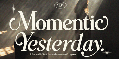 Momentic Yesterday is a Modern Font Duo that contains Serif and Italic Typeface also gives a feel of Elegant font type. There's some connected letters and some alternates that suitable for any graphic designs such as branding materials, t-shirt, print, business cards, logo, poster, t-shirt, photography, quotes .etc This font support for some multilingual. Also contains uppercase A-Z and lowercase a-z, alternate character, numbers 0-9, and some punctuation. If you need help, just write me! Thanks so much for checking out my shop!
 - Vonder Hills by Letterhend,
$17.00 Vonder Hills Layered Font Introducing, Vonder Hills . A layered typeface which is inspired by vintage lettering sign and art. While this font has a victorian touch, it still looks bold and solid. Very suitable for for headline, logotype, apparel, invitation, branding, packaging, advertising etc. It also comes in uppercase, lowercase, punctuations, symbols & numerals, stylistic set alternate, ligatures, etc also support multilingual and already PUA encoded. We highly recommend using a program that supports OpenType features and Glyphs panels like many of Adobe apps and Corel Draw, so you can see and access all Glyph variations.
 - Magnolia Cora Script by Get Studio,
$10.00 Introducing Magnolia Cora Script, a handwritten font with a casual and strong character crafted with real brush textures, giving you a custom-made feel to your design work. Magnolia Cora Script also comes with a smooth version it can be used for various types of design needs such as branding materials, Invitation, social media templates, t-shirts, business cards, logos, promotional flyers, posters, and more. With multilingual support, this font is also suitable to be combined with san-serif to get an extraordinary result for your design projects.
 - Cherolina by Almarkha Type,
$29.00 Cherolina is a lovely elegant script font that includes a full set of uppercase and lowercase letters, numerals, multi-lingual support, punctuation and ligatures. You also get short lowercase beginning and ending swashes, and lowercase ending swashes which serve to connect two words or letters. Those are so perfect for invitations, monograms. This font also includes long lowercase beginning and ending heart swashes. Cherolina has a smooth texture so would be perfect for all types of printing techniques. You can use it for embroidery, laser cut, gold foil and more.
 - Retiro Std by Typofonderie,
$59.00 Full of life Hispanic Didot in 2 optical sizes Retiro is a daring interpretation of Spanish typography. Severe, austere and yet, full of life, Retiro is a vernacular version of Castilian and Andalusian in a typical Didot. Named after a lovely park in Madrid, Retiro started life as a a bespoke typeface designed to give a unique voice to the magazine Madriz. In 2006, the founder of Madriz was looking for a Didot for his new magazine. The Didot is the archetypal typeface used in high-end magazines. Retiro is a synthesis of these high contrast styles mixed with an Hispanic mind. Result is then, after 2-3 years of work, a typeface with countless variations to establish typographic shades adapted to different sections and pages of the Madriz. In 2014, it was necessary to further revise the typeface before its launch at Typofonderie. In order to keep its originality, the unique weight was retained, but complemented with optical size variants to set highly contrasted headlines into various sizes, visually balanced. How to use Retiro optical sizes? Each font provided in Retiro family is named according to the scale of body size: 24 pt and 64 pt. Of course, these names are referring to the body sizes used in typographic design. In the “glorious old days,” the letterpress period, it was customary to cut punches directly to the size at which typefaces would be used. The punchcutter had to visually adapt his design to the engraving size. The aim was to optimize the best contrast and general weight, but also to respect both design’s and reader’s needs. In Retiro’s case, intended for large titling sizes, it’s an adaptation of this ancient practice for our contemporary uses. Although each font is named by a typographic point size, do not feel obliged to use this font at this precise size, but why not, in larger or smaller. It’s rather the concept of gradients that must be preserved in layouts, rather than strictly size numbers. It’s up to the designer to select the right font size for his own designs. Granshan Awards 2012 Creative Review Type Annual 2011 Designpreis 2011 Club des directeurs artistiques, 41e palmarès Type Directors Club 2010 Certificate of Type design Excellence
 - Roloi by Mayfield Type Foundry,
$15.00 Originally inspired by the numerals on a vintage clock face, Roloi is a layered numbers font in the deco lettering style, and includes a full set of automatic clock symbols. Its geometric forms are typical of the deco style, but stop well-short of pure geometry. The irregular stroke and character widths work together to give the forms a warm and energetic, yet cohesive, feel. Roloi offers two layering styles—the personable Fill and the more dynamic Inline. Designed to be layered over the background Regular style, they both lend the forms an added level of interest. Roloi also includes a clock symbol for any and every time of day, rounded to the nearest five-minutes. The regular weight provides the circular clock background, while the Fill and Inline styles produce the clock hands. If ligatures are activated in your text-editing program, type out any time—such as 9:32, 12:05, etc.—and the proper clock symbol will be automatically substituted. Go ahead, type any time out below! To stop the automatic clock symbol substitution, simply deactivate ligatures. Because the clock symbols are standard ligatures, every major modern browser will support their use on the web. With some programing they could even be used to make a lightweight, text-only clock. In addition to the clock symbols and basic numerals, Roloi’s glyph range covers numeric superiors and inferiors, standard and arbitrary fractions, currency symbols, all of the punctuation and symbols commonly associated with currency, unicode clock Face symbols, the A M P / a m p letters, and alternates of the 1, 2, and 4, accessible by selecting Stylistic Set 1.
 - EG Dragon Caps - 100% free

- Schuss Slab Pro by typic schuss,
$42.56 I was working about 10 years exclusively for a type company. Based on my experiences, I built this superfamily. Schuss™ Sans PCG is a humanistic sans-serif with a little contrast. Small Caps, greek and cyrillic are included. Also tab, prop, lining, old style and small cap figures. It's a typeface with clear and open characters. All complicated shapes are cleaned and simplified with a bit elegance. Schuss™ Slab Pro is a slab serif, based on the Schuss™ Sans. Schuss™ News Pro is the modeled style between Schuss™ Slab Pro and Schuss™ Serif Pro. Schuss™ Serif Pro is the antiqua shape. Additionally all serifs are cleaned up. There is just one-side-serif in the "n" for example. Tab figures (except small caps), mathematical signs and currency symbols have a width system accross all styles and weights.
 - Beriot by Boyanurd,
$19.00 Beriot is a sans serif whose basics are condensed in Regular (Normal) weight, getting a lot of form inspiration from the topic also known as Steile Futura which is a letterform that Paul Renner himself explored in the mid-1950s, where shapes are constructed with little stress on modular squares but there are changes in certain parts so they become less modular. The Beriot family is available in 42 weights with matching slanted cuts, divided into 3 subfamilies: Condensed, Normal and Expanded. Each has been designed for a range of text sizes each, and already variable, allowing you to choose and make your own type of weight you like. OpenType Features are available in each of these font styles, including alternative characters, different numbers set and case-sensitive and there are additional symbols that make it the perfect choice for professional types of branding, digital design and editorial.
 - Chella Lyfe by Chella Lyfe,
$25.00 Features: Chella Lyfe Print: Uppercase letters, numbers, & extended punctuation We Offer Non-English support for the international designer as well Same stroke thickness with each font, so you don't need to make any time-consuming adjustments to get it looking right! This is such a fun new display font, perfect for creating quotes, logos, or just adding a hand-written touch to any project! While other fonts usually take some size adjusting to look just right, The ChellaLyfe variations in stroke thickness for upper and lower case fonts, so you can so it can display creativity and life in every stroke! Each font also has alternates for each letter, so when you type uppercase or lowercase for each font, the letters will change slightly. For example, tying in all caps with the Script font will connect each letter, whereas typing all lowercase will disconnect each letter.
 - Betterman by Scratch Design,
$10.00 Betterman is a realistic signature font, that is perfect for you to create a realistic signature logo, so easy to use and you can combine it with the swashes and 20 ligatures to make your signature more natural. Betterman font is also perfect for different projects such as invitations, quote text, stationery, wedding invitation designs, social media posts, advertisements, website & landing pages, product packaging, product designs, label, photography, watermark, and more like special events. How to use this font: Just open your Opentype features ( Minimum Compatible with Adobe Photoshop CS 6 and Adobe Illustrator CS 6 ) in Adobe Photoshop go to Window - Glyphs and all the alternates will appear while using the script font to use the ligatures and swashes. As you type, your text will look like a natural signature or handwriting. What are you waiting for? Download now Betterman font and make your own Signature logo!
 - Schuss Serif Pro by typic schuss,
$42.56 I was working about 10 years exclusively for a type company. Based on my experiences, I built this superfamily. Schuss™ Sans PCG is a humanistic sans-serif with a little contrast. Small Caps, greek and cyrillic are included. Also tab, prop, lining, old style and small cap figures. It's a typeface with clear and open characters. All complicated shapes are cleaned and simplified with a bit elegance. Schuss™ Slab Pro is a slab serif, based on the Schuss™ Sans. Schuss™ News Pro is the modeled style between Schuss™ Slab Pro and Schuss™ Serif Pro. Schuss™ Serif Pro is the antiqua shape. Additionally all serifs are cleaned up. There is just one-side-serif in the "n" for example. Tab figures (except small caps), mathematical signs and currency symbols have a width system accross all styles and weights.
 - Nourishe by Arterfak Project,
$12.00 Nourishe is our our brand new minimalist font, made with the combination of duo-line. A sans serif font which is suitable for branding and editorial design. As we know, sans-serif nowadays becomes a part of the new trending of graphic design in typography. Nourishe is a great choice to make your design more elegant with minimalist strokes and feminine curves. This font family has OpenType features like some alternates to gives you an option. Also complete with some swashes that you can apply to get more beautiful looks. Nourishe has 2 styles : - Inline: Suitable for headline in a poster, flyer or label. the empty space in every stroke give the attractive-typographic taste - Normal: Recommended for an editorial like sub-headline, quotes, and body text. Nourishe includes : - Uppercase - Lowercase - Symbols - Numerals - Punctuation - Multilingual accents - Stylistic Alternates - Swashes Well, thank you for visiting and hope you like it!
 - Letric by Mans Greback,
$59.00 Letric is a high-energy capital typeface. With traits of a brush comic title, it has rough and cut edges, electric in nature but with smooth curves. The strokes are reminiscent of a tiger's skin, making for a great jungle or wildlife font. Used in the right context, with the right wording, it fits perfectly as a vintage thriller/splatter/horror movie header typography. This cartoon sans-serif is slanted/italic as default but also comes with a professional upright style. The font is built with advanced OpenType functionality and has a guaranteed top-notch quality, containing stylistic and contextual alternates, ligatures and more features; all to give you full control and customizability. It has extensive lingual support, covering all Latin-based languages, from North Europe to South Africa, from America to South-East Asia. It contains all characters and symbols you'll ever need, including all punctuation and numbers.
 - Adoquin by Huy!Fonts,
$20.00 Adoquin is a clean and friendly semi serif family. It comes in seven weights with small caps, wich makes it a versatile typeface. The design is based on geometric sans serif typefaces and the calligraphic features of old school models, making Adoquin a functional and warm font family. Its informal but elegant look makes it the perfect display type fitted for logotypes, book design, packaging or magazines. Its wide range of weights and discreet alternates makes it very enjoyable to read, so its also perfectly fitted for longer texts. Adoquin has an extended character set for Central and Eastern European languages, and shows all its potential wit OpenType-savvy applications. Every font includes small caps, ligatures, old style figures, fractions, numerators and denominators and alternative characters without some calligraphic features suited for smaller or longer texts (in this case, the alternative charecters are less ornamented).
 - Aroxima by Prestige Artsy Studio,
$12.00 Introducing the stunning modern serif font family, Aroxima Serif. This font family takes the traditional serif design and puts a fresh, contemporary spin on it. Avenir Serif features clean, crisp lines and sharp edges that give it a sleek and sophisticated look. Its high contrast between thick and thin strokes create a beautiful visual rhythm that draws the eye in and makes for easy reading. Aroxima Serif comes in a variety of weights, from Regular to Black, making it a versatile option for any design project. Its elegant and refined appearance makes it the perfect choice for branding materials, editorial layouts, and websites. Avenir Serif also includes a range of special characters and ligatures for added flair and customization. Overall, Aroxima Serif is a modern serif font family that combines classic design elements with a contemporary twist, making it a timeless choice for any design project.
 - Versina by Latinotype,
$39.00 Versina is a display typeface with a unique and expressive yet moderate personality resulted from its organic elegant shapes which are inspired by Spanish transitional typefaces from the 18th century. This font is perfectly suitable for both titles and short text. Versina features a flowing organic stroke and asymmetric bracketed serifs, and its shapes convey rhythm and dynamism. The font has a large x-height and its ascenders are shorter than the cap height, making it look more slender and modern. Calligraphic and crescent-like terminals give the design great formal richness. Versina comes in 5 weights with matching italics plus a set of ornaments, in Regular and Black styles, and also includes old style/lining/tabular figures, fractions, superscripts and subscripts as well as a set of small caps, standard ligatures, historical ligatures, symbols and frames. Versina contains a set of 694 characters that support over 200 Latin-based languages.
 - 5th Avenue by 50Fox,
$20.00 5th Avenue is a brand new fancy font with tons of alternative characters, ornaments, multilingual support and unique ligatures. This family is inspired by some of the edgiest looks from the modern luxury fashion. 5th Avenue can impress us with its Classical Style by accessing tons of alternative letters in OpenType Features. You can also enhance its elegance simply by adjusting the spacing between the letters. 5th Avenue is very versatile and perfect for branding projects, logos, magazine imagery, wedding invitations, posters, clothing, packaging, website headers, or simply as a stylish text overlays to any background image. Language support for 27 languages: Afrikaans, Albanian, Catalan, Croatian, Czech, Danish, Dutch, English, Estonian, Finnish, French, German, Hungarian, Icelandic, Italian, Latvian, Lithuanian, Maltese, Norwegian, Polish, Portugese, Slovak, Slovenian, Spanisch, Swedish, Turkish, Zulu Follow my shop for upcoming updates & freebies. Any questions? feel free to send me a message.
 - Psychofun by Alit Design,
$15.00 Introducing Psychofun Typeface Psychofun Typeface is designed with a retro style concept that has a unique and cool shape. It is suitable for header text fonts, book covers and designs that have a retro and groovy concept, besides that Psychofun Typeface is also very good when used for body text. Psychofun Typeface has 5 families from Regular to Heavy. Display Serif typefaces such as “Psychofun Typeface” are very easy to apply to any design, especially those with an retro, groovy and classic concept, besides that this font is very easy to use both in design and non-design programs because everything changes and glyphs are supported by Unicode (PUA). The Psychofun Typeface contains 530 glyphs with many unique and interesting alternative options. Plus, there's a cool display serif font family for header and description text from regular to heavy. In the poster preview all the letters are in the Psychofun Typeface.
 - Schuss News Pro by typic schuss,
$42.56 I was working about 10 years exclusively for a type company. Based on my experiences, I built this superfamily. Schuss™ Sans PCG is a humanistic sans-serif with a little contrast. Small Caps, greek and cyrillic are included. Also tab, prop, lining, old style and small cap figures. It's a typeface with clear and open characters. All complicated shapes are cleaned and simplified with a bit elegance. Schuss™ Slab Pro is a slab serif, based on the Schuss™ Sans. Schuss™ News Pro is the modeled style between Schuss™ Slab Pro and Schuss™ Serif Pro. Schuss™ Serif Pro is the antiqua shape. Additionally all serifs are cleaned up. There is just one-side-serif in the "n" for example. Tab figures (except small caps), mathematical signs and currency symbols have a width system accross all styles and weights.
 - Schuss Sans PCG by typic schuss,
$- I was working about 10 years exclusively for a type company. Based on my experiences, I built this superfamily. Schuss™ Sans PCG is a humanistic sans-serif with a little contrast. Small Caps, greek and cyrillic are included. Also tab, prop, lining, old style and small cap figures. It's a typeface with clear and open characters. All complicated shapes are cleaned and simplified with a bit elegance. Schuss™ Slab Pro is a slab serif, based on the Schuss™ Sans. Schuss™ News Pro is the modeled style between Schuss™ Slab Pro and Schuss™ Serif Pro. Schuss™ Serif Pro is the antiqua shape. Additionally all serifs are cleaned up. There is just one-side-serif in the "n" for example. Tab figures (except small caps), mathematical signs and currency symbols have a width system accross all styles and weights.
 - Neela by Bykineks,
$10.00 Neela is an Art Nouveau serif typeface designed for a variety of design needs. With 27 font families consisting of thin, extralight, light, regular, medium, semibold, bold, extrabold, and black, as well as condensed and expanded types, Neela can be used for various sizes and design needs. Neela is characterized by sleek and elegant letters, with typical Art Nouveau elements, such as subtle and elegant decorative flourishes. This font is suitable for various design needs, such as: Book covers, wine labels, wedding invitations, exhibitions, packaging, merchandise, event billboards, posters and many others. Neela also supports 65 Latin alphabet languages, so it can be used for various design needs throughout the world. Characteristics The letters are sleek and elegant Distinctive Art Nouveau elements Suitable for a variety of design needs Neela is the perfect typeface for designers looking for an elegant and versatile Art Nouveau serif typeface. This font can be used for various design needs, from book design, labels, invitations, to graphic design.
 - Core Escher by S-Core,
$30.00 Core Escher is an optical illusion type family which has two sub-families: Core Escher A and B. Core Escher A has impossible shapes inspired by the optical illusion works of artist M.C. Escher. The letterforms in this type family are structurally twisted and complicated but it looks simple because of its simple strokes. And for easy color variations, it split into two fonts, Core Escher A Left and Right. Core Escher B has a different kind of optical illusion. The letters of Core Escher B look like three dimentions by just putting thin lines on bold letters. Also B has two sub-families that have different viewpoints. Core Escher Family supports complete Basic Latin, Cyrillic, Central European, Turkish, Baltic character sets. Each font includes proportional figures, tabular figures, numerators, denominators, superscript, scientific inferiors, subscript, fractions and case features. This family is really nice for book titles, headlines, logotypes and any artworks.
 - Chokellate by Alfaraby Studio,
$15.00 INTRODUCING Chokellate font family a fonts of Chokellate font family duo stylish calligraphy that have a varied base line, fine lines, classic and elegant touches. Can be used for various purposes. Such as title, signature, logo, wedding invitation, t-shirt, letterhead, nameplate, label, news, poster, badge etc. Chokellate font family displays stylish calligraphy alternate characters. Includes initial letters and terminals, alternatives, ligatures and multiple language support. The Features of this fonts is: * Standart ligatures * Stylistic Alternates * PUA Unicode (Private Use Areas) * Swash Programs that support in this font is a Adobe Photo Shop, Adobe Illustrator, Adobe Indesign, Corel Draw and Microsoft Office. OpenType features can be accessed by using OpenType smart programs such as Adobe Photo Shop, Adobe Illustrator, Adobe Indesign, Corel Draw and Microsoft Office. can also be accessed through the character map. Special greetings for all, all of us all smoothly in running the routine. Thank you for your purchase!.
 - Lady Suettaya by Sulthan Studio,
$12.00 Hi Font Lover! Lady Suettaya is a classic font, I build it with my relaxed hands. designing a classic font but having a modern element in it, which makes it particularly suitable for wedding media, book covers, greeting cards, logos, branding, business cards and certificates, in fact for any design work that requires a clasik, formal or luxury look. Try Lady Suettaya in your hands, enjoy the richness of OpenType features and let her fun and elegant excitement make you happy and enhance your creativity! You can use this font very easily. There are so lovely features in it. Contains the full set of lowercase and capital letters, punctuation, numbers, and multilingual support. This font also includes some ligatures and alternative styles Stylistic Set For those of you who have software that is able to work OpenType (Corel Draw / Photoshop / Illustrator / InDesign). About Multilingual? Don't worry, I Have added the characters in International Language.
 - Bayshore by Set Sail Studios,
$18.00 Perm your hair, squeeze into your lycra, and retro-fy your text with Bayshore! A totally tubular mono-line script font straight out of the 80's. This hand-drawn font is perfect for creating slick & stylish lettering. Whether it’s for logos, product packaging or merchandise, Bayshore is guaranteed to give your text an unmistakeable retro quality. Bayshore comes as a single font file with added features allowing you to customise your text; End Swashes • Each lower-case character has a separate ‘end-swash’ version, use this for the last letter in a word to give it a custom-feel styling. These end-swashes are accessible via any software with Opentype capabilities, simply by turning on ‘Stylistic Alternates’. Underline Swashes • Four swashes of varying lengths are also available, simply by typing any of the square brackets [ ] { }. These can be used to underline your text and give it a real eye-catching quality.
 - San Remo Casual SG by Spiece Graphics,
$39.00 Now is a great time to dust off your old motor scooter and take a ride along the Italian Riviera. Let’s head to the flower city of San Remo, Italy - the namesake for this versatile, 1950s style script. Try San Remo on your next brochure or flyer project. You may want to consider using it to create a special logo or icon for your personal stationery. It’s perfect for any job that requires linked or connected letters. And for your convenience, this dashing design sports a variety of alternate characters plus lining and old style figures. San Remo Casual is also available as an OpenType font. It contains lining and oldstyle figures, prebuilt fractions, stylistic alternates, and a wide assortment of f-ligatures, plus more. These advanced features currently work in Adobe Creative Suite InDesign and Illustrator. Check for OpenType advanced feature support in other applications as it gradually becomes available with upgrades. Ciao!
 - Polias by Esintype,
$23.00 Polias is an all-caps uniwidth typeface inspired by an ancient inscription carved on a monoblock stone in hybrid characters — between no-contrast linear sans to low-contrast flared serif. The inspiring inscription is the dedication by Alexander the Great, discovered in the Temple of Athena Polias in the ancient Ionian city of Priene. Stanley Morison mentioned this inscription in one of his lectures: “The distinctive feature of this inscription consists of a consistent thickening towards the ends of perpendiculars and horizontals.” … “We have not the right to say that the serif was invented for Alexander the Great's inscription, only that this is its first datable appearance.” The letter proportions are almost identical to the original, but the stroke features have been reinterpreted and characterized. Serif-like nodes at the end of the strokes are subtle extensions that serve to accentuate rather than break its monoline elegance. With an analogy, they are not flowers, but like blooming buds. Polias is a flared sans typeface which is closer to sans-serif forms on the spectrum between sans and serif. It’s especially light looking by design to convey rather thin and white typographic color of its original monumental look. It comes in eight weights and a variable font, scaled from Thin to Bold. It is multiplexed, so the weights do not affect text lengths. Light weights are closely based on the actual carving of the inscription. Thicker weights can be used on smaller typesettings to compensate for the weight difference of larger letters’ strokes, and to keeping the monoline appearance of the entire text block intact. This method can be used for any purpose, such as setting a hierarchy between the lines or to justify their lengths. Some of the original letterforms have been preserved and stylistic alternatives such as Ionic four-bar Sigma, dotted Theta, palm Y are provided as open type feature. Some of the other ancient forms, such as the three-bar Sigma (S), the pointed U, were also added for both the Greek and Latin scripts. Polias is preferable for big type settings such as logos and headlines as a modern representation of perennial classical forms. Its a fine fit for product branding, movie posters, book covers, packaging materials, and more, which require an epic look to attracting attention with a distinctive elegance. Polias can be considered for distinctiveness wherever Roman Capitals work. As a noun, Polias is one of the epithets of Athena / Minerva, and in this case referring to her role as the protector of the city of Priene. Polias is one of the seven typeface designs in Esintype's ancient scripts of Anatolia project, Tituli Anatolian series.
 - Polias Varia by Esintype,
$140.00 Polias Varia is an all-caps uniwidth variable weight typeface inspired by an ancient inscription carved on a monoblock stone in hybrid characters — between no-contrast linear sans to low-contrast flared serif. The inspiring inscription is the dedication by Alexander the Great, discovered in the Temple of Athena Polias in the ancient Ionian city of Priene. Stanley Morison mentioned this inscription in one of his lectures: “The distinctive feature of this inscription consists of a consistent thickening towards the ends of perpendiculars and horizontals.” … “We have not the right to say that the serif was invented for Alexander the Great’s inscription, only that this is its first datable appearance.” In Polias Varia, the letter proportions are almost identical to the original, but the stroke features have been reinterpreted and characterized. Serif-like nodes at the end of the strokes are subtle extensions that serve to accentuate rather than break its monoline elegance. With an analogy, they are not flowers, but like blooming buds. Polias Varia is a flared sans typeface which is closer to sans-serif forms on the spectrum between sans and serif. It’s especially light looking by design to convey rather thin and white typographic color of its original monumental look. It comes in eight weights and a variable font, scaled from Thin to Bold. It is multiplexed, so the weights do not affect text lengths. Light weights are closely based on the actual carving of the inscription. Thicker weights can be used on smaller typesettings to compensate for the weight difference of larger letters’ strokes, and to keeping the monoline appearance of the entire text block intact. This method can be used for any purpose, such as setting a hierarchy between the lines or to justify their lengths. Some of the original letterforms have been preserved and stylistic alternatives such as Ionic four-bar Sigma, dotted Theta, palm Y are provided as open type feature. Some of the other ancient forms, such as the three-bar Sigma (S), the pointed U, were also added for both the Greek and Latin scripts. Polias Varia is preferable for big type settings such as logos and headlines as a modern representation of perennial classical forms. Its a fine fit for product branding, movie posters, book covers, packaging materials, and more, which require an epic look to attracting attention with a distinctive elegance. Polias Varia can be considered for distinctiveness wherever Roman Capitals work. As a noun, Polias is one of the epithets of Athena / Minerva, and in this case referring to her role as the protector of the city of Priene. Polias (family) is one of the seven typeface designs in Esintype’s ancient scripts of Anatolia project, Tituli Anatolian series.
 - Stagehand JNL by Jeff Levine,
$29.00 Too often, familiarity in type design can fool us into mislabeling similar styles of lettering. The Art Deco years provided many variations of the thick-and-thin alphabet, and we tend to lump all of them together as being "a version of Broadway", as this is the most popular of the genre. However, if one looks closely at each design, they will see variations of line thickness, angles and even individual character design. One such variation is Stagehand JNL, based on a set of wood type and now presented in digital form.
 - KG Chasing Cars by Kimberly Geswein,
$5.00 This cute bunting style font includes extras like a cupcake, anchor, and a fleur de lis. Use the ( ) { } [ ] to make end pieces and join them with the underscore __.
