10,000 search results
(0.041 seconds)
- BachelorScript by Fontforecast,
$39.00 BachelorScript is the preliminary design for GraduateScript, released in june 2013. You can clearly see the resemblance between the two, but while Bachelor is frisky and authentic, Graduate is more polished and staged. GraduateOrnaments was originally designed to complement GraduateScript, but it can be used just as well in combination with BachelorScript. BachelorScript has a casual look and feel and comes in two weights: regular and bold. It offers multiple language support, five numeral styles, real fractions and ligatures for double letters. Various glyphs to mark, underline, circle or cross-out words are also included.
 - Chula by Colmena,
$2.00 Colmena studio presents Chula, a geometric typeface 100% original, traced in the beginning by hand, chula is not based in any other typeface, each glyph was drawn in base of circles and rectangles, the tail of certain glyphs gives to the typeface and designs fluency and movement. Chula is fresh and modern but with a little touch of vintage, ideal for big texts and formats, but also legible in small size. You can use it in 3 versions, regular, medium full and full. It works perfectly in logos, monograms and patterns.
 - Philliper by Gatype,
$14.00 Philliper is a signature bold script font, masterfully designed to become a true favorite. It maintains its modern classy influences while feeling contemporary and fresh. Fall in love with it and bring your projects to the highest levels! Philliper is perfect for product packaging, branding project, megazine, social media, wedding, or just used to express words above the background. Fonts featured : Uppercase, Lowercase, Numbers, Symbols, Accents, Stylistic, Swash, and Ligatures also Multilingual Support Enjoy the font, feel free to comment or feedback, send me PM or email. Thank you!
 - Quant Text by Hoftype,
$49.00 Quant Text is the optimized text version of the Quant family. It comes with a slightly greater width, stronger hairlines and stronger serifs which make it very stable for small text, but also gives it a forceful appearance when used for headlines. Quant is well-equipped for ambitious typography. The Quant family consists of 8 styles, comes in OpenType format with extended language support for more than 40 languages. All weights contain small caps, proportional lining figures, tabular lining figures, proportional old style figures, lining old style figures, matching currency symbols, fraction- and scientific numerals.
 - Rincon by Rachel Kick,
$14.00 Rincon is a serif font with 201 glyphs including ligatures and alternatives. It was designed by Rachel Kick in Los Angeles, California. Inspired by beautiful serif while maintaining a friendly and approachable feel, Rincon is perfect for branding, display, or marketing. Rincon has the ability to hold it's own as a single word headline, or in a paragraph form. It also works well with simple sans serif or script font compliments. The ligatures increase its legibility and adjust each character to work perfectly with the character next to it.
 - Colatin by Get Studio,
$14.00 Colatin is handmade signature style font with stunning characters. Ideal for logos, name tags, handwritten quotes, product packaging, merchandise, social media & greeting cards. It contains a full set of lower & uppercase letters, a large range of punctuation, numerals, and multilingual support. The font also contains several ligatures and contextual alternates for lower case characters, accessible in the Adobe Illustrator Glyphs panel, or under Stylistic Alternates in the Adobe Photoshop OpenType menu. But If you don't have any OpenType specific software, you can still use Collatin as is with its standard lowercase and uppercase letters.
 - Darjeeling by FaceType,
$30.00 Darjeeling combines British Elegance and Indian Flavor. It is flared like Optima, with a scent of Bodoni. By layering “Regular” and “Ornaments” over each other you will create astounding pieces of colorful typography. Additionally there is “Regnaments” which combines the two other styles. Darjeeling is great as a display font, but also perfectly legible at text sizes. Use the ornaments only to add spice to Your design. Make sure to use applications supporting all these lavish OpenType features like small caps, various sets of figures, fractions and the 102 discretionary ligatures.
 - Smashing by PintassilgoPrints,
$26.00 Smashing is a stout typeface, with a twist. It’s a massive all-caps font with bouncing glyphs, positively bold yet quite good-humored. Its upper and lower case slots stores different lettershapes, providing handy options to choose from. When working with OpenType savvy applications you can turn on the contextual alternates feature to instantly get alternating glyphs, which add spontaneity to your artwork and prevent neighbor double letters from using the same glyph. Also try the discretionary ligatures feature to get some cool interlocking pairs. A smashing font for truly smashing designs!
 - Hodgepodge by Outside the Line,
$19.00 Hodgepodge is a confused mixture of letters that somehow work together. While I know this has been done before I create fonts that I need. And I occasionally have found a need for this. And it was not there, so now it is. There is a mixture of light and dark, bold and regular, caps and lower case but not where you would expect them to be. Since this is a headline font you can set the headline and then easily go back and change a letter here or there to get the best-looking combination. Hodgepodge was in the 2011 Typodarium Page-A-Day Calendar on 7-17-2011.
 - Totally Terrific by Set Sail Studios,
$12.00 I love Tea. Do you love Tea? Good. Because there's a whole load of T's in the Totally Terrific Typeface! Bursting with fun and bouncy brush-strokes, this typeface will undoubtedly add a dash of cheeky playfulness to your text - ideal for greeting cards, branding, merchandise, invitations & hand-made quotes. The awesome thing about this typeface is that it's so easy to mix up the various font styles and create totally unique, hand-made looking words each time. The lowercase characters can be connected (Totally Terrific Regular) or un-connected (Totally Terrific Two), and will work in any combination of these two versions. Not only does it also look great in all-caps, but the uppercase letters will fit in with the lowercase at any location - I'm serious! Just throw one in the middle of a word, I dare you ;). Your download will contain 2 font files: Totally Terrific Regular • Contains a full set of connected lowercase letters, uppercase letters, a large range of punctuation, numerals, and multilingual support. Totally Terrific Two • A second version of the Totally Terrific Typeface, with a completely new set of un-connected lowercase characters. These are designed to work in perfect harmony with the connected set from the other font file. Just keep switching between the two fonts to create unique word layouts!
 - Engria by Eclectotype,
$40.00 Engria is a type family of four weights with corresponding italics that treads the fine line between sans and serif. There are serifs, of a sort, inspired by the brush. Not the marks made by a brush, but the actual splayed shape the bristles make when clamped together. Wedge-like chunks that resemble engraved forms, as the name Engria hints at. But it also has the appearance of a stressed, flared sans. This mixed approach lends a unique voice. Highly legible at text sizes, as indeed it is optimized for, Engria does however shine at display sizes thanks to its characteristic details – flared stems, angular counterforms, rugged ink traps and fluid curves. (I would recommend tracking it a little tighter at larger sizes.) Engria started life way back in 2014, and has been worked and reworked tirelessly to get to this finished product. My intent was to really push the idea of the white shapes being as important, if not more so, than the black. Engria is equipped for typographically demanding applications, boasting as it does an array of OpenType features, including small caps, automatic fractions, stylistic sets, various figure styles, arrows, case sensitive forms and more. It will make a very useful addition to your typographic arsenal, with a flare (ahem) for editorial work, but the individuality for packaging, branding, and logo work.
 - P22 Kilkenny by IHOF,
$69.95Kilkenny is a decorative, Victorian-style font based on the metal type named Nymphic that was designed by Hermann Ihlenberg. Ihlenburg was born in Germany in 1843 where he studied art and worked for several German type foundries. He moved to the USA in 1866 and worked for the L. Johnson & Co. foundry, later MacKellar, Smiths & Jordan. American Type Founders acquired this typeface when they took over the MacKellar, Smiths & Jordan foundry and Nymphic appears in the ATF catalog of 1896. For this digital version, the character set has been expanded to include accented characters, punctuation, and currency symbols—and most everything you would expect to find in a digital font. The original metal font consisted of swash caps, upper case characters, and a “morticed” lower case, which was raised off the baseline. This mortcied form was designed to nestle inside the ornate swash caps as well as to work with the upper case. The five digital versions contained in this set are basically different configurations of these different alphabet sets, they differ as follows: Kilkenny—the original upper case version with a modified lower case that has been enlarged, shifted to align along the baseline, and given taller ascenders to give it a more “regular” appearance. Kilkenny Eureka—true to the original design with the “morticed” or superior lowercase forms. Kilkenny Swash—original swash caps with the modified lower case. Kilkenny Swash Caps—original swash caps with the original caps as the lower case. Kilkenny Swash Eureka—swash caps that have been adjusted to match the weight of the original lower case forms. The OpenType version contains all of the above, plus additional Central European and Cyrillic characters for a total of almost 1000 glyphs. - Srostky by Nikita Kanarev,
$25.00 The Srostky font is willful and stubborn. It is rude, but it is as natural as a country boy. The characters of this font were inspired by an image of the Russian countryside. The letters look as if they were felled with an ax. It is named after the village in Altai region. This font is suitable for short sayings and titles.
 - Cal Uncial Rough by Posterizer KG,
$19.00 Cal Uncial Rough is a calligraphic font based on sketches written with cane calligraphy pen and ink on coarse-textured paper. Because of the fact that the Uncial don't have lowercase letters, there are small capitals instead of the lowercase. As the Latin version of the Uncial was created from the Greek Uncial script (translating the Bible from Greek into Latin), in addition to the standard Latin graphemes, the font contains the Greek alphabet (and also the Cyrillic letters (Ustav), derived from the Greek Uncial too). Regardless of the stylistic connection, there is a difference between the morphology of related Greek, Latin and Cyrillic letters. Most of the graphemes are based on traditional roman and insular uncial calligraphy. Cal Uncial Rough is suitable for the preparation of calligraphic sketches as well as an application in typography that should bring us closer to historical topics (European literature, quotes, history, film ...).
 - Linotype Mega by Linotype,
$29.00Linotype Mega is part of the Take Type Library, chosen from the entries of the Linotype-sponsored International Digital Type Design Contests of 1994 and 1997. The fun schrift of German designer Till F. Teenck is available in three weights whose names are word plays in themselves. Mega in (which we hope the font will be) contains relatively light, somewhat irregularly-drawn characters which look as though they were printed by hand and the characters are set rather far apart from each other. This weight is good for short and middle length texts in point sizes of 10 and larger. Mega normal is anything but. The characters are the outline forms of Mega in and their larger width reduces the distance between them. This weight is generally a headline font. Mega out is a very heavy weight and is the filled-in version of Mega normal. The characters flow into each other and look almost like silhouettes. The reduced legibility makes this font suitable exclusively for headlines in larger point sizes. - Winner by sportsfonts,
$19.00 Winner™ and Winner Sans™—Classic athletic aesthetics, finally as a versatile contemporary super family. Just when you thought there was nothing left to add to the classic sports design, we lifted it to a whole new level. Whatever you want to set in whatever space, with seven weights in seven widths both with or without serifs, you’ll definitely find the right proportions for it! Winner supports not only most Latin-based languages but also Greek. Its extensive character set also contains currency signs, arrows, as well as a wide range of numerals from small figures to Roman numerals. Furthermore, its sophisticated OpenType layout features give you access to alternative letter shapes, fractions, tabular figures, and contextual alternates. With more than 24,000 glyphs in 49 fonts, Winner leaves nothing to be desired. Grab Condensed Regular for free and give it a spin!
 - Trinidad Neue by Sudaca Type Design Studio,
$40.00 Trinidad Neue™️ is a geohumanistic typeface developed by the Chilean Type Design Studio Sudaca. The origin of this work lies in an exercise of comparing classic Roman proportions (Trajan Columns) with the capital letter set of Futura by Paul Renner. I wanted to create my own Sans Serif interpretation of classic proportions. I started working with letters A, H, N, O, R and S. When I finished the uppercase set, this exercise transformed itself into a project. I started to develop a set of lowercase letters choosing as direct references Futura and Kabel by Rudolph Koch; always having in mind that the objective was to find a balance between the humanist and the rational or geometric. Here is when this group is formed, giving its name and identity to this family: Paul, Rudolph & Alexis. The result is a typeface with an elegant, modern and versatile aspect. Its seven stylistic sets make Trinidad Neue™️ into a Swiss army knife to compose short and medium texts for editorial design, branding, exhibitions, motion graphics, etc. The family consists of nine weight variants and its corresponding oblique versions. It counts with many OpenType characteristics in each variant, including small caps, seven stylistic sets that can be combined, standard ligatures and discretionals ligatures, proportional numerals, tabular numbers, fractions, superscript, subscript, normal punctuation and also aligned to small caps and capital letters, arrows, emojis and more. With more than 1000 glyphs, this typeface has a wide idiomatic range that includes more than 190 Latin languages. Trinidad Neue™ is the new and alternative version of LC Trinidad™.
 - Aranjuez Pro by Sudtipos,
$59.00 Aranjuez is the latest Koziupa and Paul adventure. This time, they max out on calligraphic art deco, then add a healthy dose of the thick-and-thin mantra that's been so trendy for quite a few years now. The result is neo-psychedelia in an upright cross-breed of pseudo-wood deco and ornamental calligraphy, complete with alternates, swashes, endings, playful contrast treatments, and even background possibilities. This font is quite expressive, and its elegance is meant to be shown prominently. So use it for packaging, book covers, or wherever the message needs to be delivered clearly and with a precisely controlled touch of class.
 - Preissig Antikva Pro by Storm Type Foundry,
$39.00 This vintage, iconic typeface of original Czech letter-founding has been faithfully revised, extended and newly rendered in 2012. The majority of Vojtěch Preissig’s type faces have been, from their very creation, subject to controversial evaluations which might perhaps fill more pages than have been set in these type faces so far. The considerable technological backwardness of Czech typography between the world wars intensified the author’s creative effort even more. He had been devoting thought to his Antikva type face from 1912 onwards and dozens of hardly perceptible nuances of the same design have been preserved in his drawings. It was his only book type face, but it shows no signs of any hard struggle in creating it. Its extraordinary vividness and elegance are really surprising. It may be still indebted to the forms of Art Nouveau, which was withering away at that time, but its proportions, colour and expression inspire other Czech type designers. Preissig’s Antikva, Menhart’s Figural (and also Růžička’s Fairfield) and Týfa’s Antikva represent a clear line of development, very far away from the soft aesthetics of Tusar, Dyrynk or Brunner. The co-author of the modification for computer composition is Otakar Karlas. Without his experience the work would remain only a shadow of Preissig’s design. Our aim was to produce a large family of type faces for the setting of both books and jobbing works. The digital transcription of Preissig’s Antikva came into existence from summer till winter 1998. The direct model for this type face is the most successful, two-cicero (24 pt.) design dating from 1925. The designs of other sizes (12 pt., 14 pt., 16 pt. and then 36 pt. and 49 pt.) lack vividness and are the source of the widespread mistaken belief that Preissig’s Antikva consists of straight lines. That is, unfortunately, how even Muzika and Menhart describe it. Neither is it a Cubist type face as many of the semi-educated think today. Special attention had to be paid to italics. It is apparent that their design is not as perfect as that of Preissig’s Antikva. In contradistinction to the original we have deleted almost all lower serifs in the lower-case letters, enlarged the angle of inclination and completely redesigned the letters a, e, g, s, k, x, ... All crotches have been lightened by marked incisions. In other words, none of the italic letters corresponds to Preissig’s model. The signs which were missing have been supplemented with regard to the overall character of the alphabet. Preissig did not deal with bold designs, but the crystal-clear logic of his “chopping-off” of the round strokes enabled us to complete the type face family without any greater doubts. An excessively fragile type face, however, cannot be used for setting in smaller sizes; that is why we have prepared a separate family of text designs which has shortened ascenders, normal accents, slightly thickened strokes, and is, in general, optically more quiet and robust. We recommend it for sizes under 12 points. By contrast, the elegance of the basic design will be appreciated most in the sizes used for headlines and posters. Preissig’s Antikva is suitable not only for art books and festive prints, but also for poetry and shorter texts.
 - Classification JNL by Jeff Levine,
$29.00 Sometimes it's easy to find a name to fit a font design, other times it's a struggle because of the sheer number of digital fonts available and the number of names already taken. Classification JNL stretches a point to arrive at its name. The attractive sans design was found as a hand-lettered title on a piece of vintage sheet music called "My Hawaiian Souvenirs". During the 1940s, the popular mode of travel to other countries was by steamship. Steamship passengers were assigned their accommodations by the type of passage they booked (such as First Class and Tourist), thus they were in various levels of classification. This aside, Classification JNL is a nice alternative to "standard" condensed fonts for design projects.
 - Change Serif by Borutta Group,
$39.00 Change Serif is a typeface family designed as a part of Mateusz Machalski's PhD project, carried out in 2015-2021. The main goal was to create a typeface allowing for the typesetting of complex humanistic texts, containing many historical letterforms. The starting point was the preparation of most of the glyphs provided in unicode for Latin, Cyrillic and Greek. From the formal point of view, the Change family is based on Renaissance proportions with contemporary details. Classic upright version is paired with expressive and calligraphic italics, inspired by the works of Robert Granjon. Each of the styles contains about 4,000 characters, allowing for a broad range of typesetting capabilities – multiscript publications, historical translations, and texts transcription. The crucial aspect was to treat all scripts equally. All OpenType features, such as swashes, final forms, decorative ligatures, can be found in Latin, Cyrillic and also Greek. The name of the typeface refers to the design process in which there are constant changes and corrections. On the other hand, it means to convey how this project influenced my perception of typography and allowed me to embrace it as a medium of artistic expression. Due to its similar proportions, Change works perfectly with the Gaultier typeface.
 - Leather by Canada Type,
$24.95 Over the past few years, every designer has seen the surprising outbreak of blackletter types in marketing campaigns for major sports clothing manufacturers, a few phone companies, soft drink makers, and more recently on entertainment and music products. In such campaigns, blackletter type combined with photos of usual daily activity simply adds a level of strength and mystique to things we see and do on a regular basis. But we couldn't help noticing that the typography was very odd in such campaigns, where the type overpowers all the other design elements. This is because almost all blackletter fonts ever made express too much strength and time-stamp themselves in a definite manner, thereby eliminating themselves as possible type choices for a variety of common contemporary design approaches, such as minimal, geometric, modular, etc. So extending the idea of using blackletter in modern design was a bit of a wild goose chase for us. But we finally found the face that completes the equation no other blackletter could fit into: Leather is a digitization and major expansion of Imre Reiner's forgotten but excellent 1933 Gotika design, which was very much ahead of its time. In its own time this design saw very little use because it caused problems to printers, where the thin serifs and inner bars were too fragile and broke off too easily when used in metal. But now, more than seventy years later, it seems like it was made for current technologies, and it is nothing short of being the perfect candidate for using blackletter in grid-based settings. Leather has three features usually not found in other blackletter fonts: - Grid-based geometric strokes and curves: In the early 1930s, blackletter design had already begun interacting back with the modern sans serif it birthed at the turn of the century. This design is one of the very few manifestations of such interaction. - Fragile, Boboni-like serifs, sprout from mostly expected places in the minuscules, but are sprinkled very aesthetically on some of the majuscules. The overall result is magnificently modern. - The usual complexity of blackletter uppercase's inner bars is rendered simple, geometric and very visually appealing. The contrast between the inner bars and thick outer strokes creates a surprising circuitry-like effect on some of the letters (D, O, Q), wonderfully plays with the idea of fragile balances on some others (M, N and P), and boldly introduces new concepts on others (B, F, K, L, R). Our research seems to suggest that the original numerals used with this design in the 1930s were adopted from a previous Imre Reiner typeface. They didn't really fit with the idea of this font, so we created brand new numerals for Leather. We also expanded the character set to cover all Western Latin-based languages, and scattered plenty of alternates and ligatures throughout the map. The name, Leather, was derived from a humorous attempt at naming a font. Initially we wanted to call it Black Leather (blackletter...blackleather), but the closer we came to finishing it, the more respect we developed for its attempt to introduce a plausible convergence between two entirely different type categories. Sadly for the art, this idea of convergence didn't go much further back then, due to technological limitations and the eventual war a few years later. We're hoping this revival would encourage people to look at blackletter under a new light in these modern times of multiple design influences.
 - FF Scuba by FontFont,
$62.99 German type designer Felix Braden created this sans FontFont in 2012. The family has 16 weights, ranging from Thin to Black (including italics) and is ideally suited for advertising and packaging, editorial and publishing, logo, branding and creative industries, poster and billboards, wayfinding and signage as well as web and screen design. FF Scuba provides advanced typographical support with features such as ligatures, alternate characters, case-sensitive forms, fractions, super- and subscript characters, and stylistic alternates. It comes with a complete range of figure set options – oldstyle and lining figures, each in tabular and proportional widths.In 2013, FF Scuba received the CommArts award and was also selected as one of Typographica’s favorite typefaces of 2012.
 - Monsante by Arterfak Project,
$18.00 Introducing Monsante, a modern Art Deco-style font. Inspired by typography from the 1920s, it exudes elegance, luxury, and a touch of modernism. Carefully crafted with distinctive geometric elements and crisp letterforms, this font creates a sense of luxury and sophistication. Monsante is available in two styles: Regular and Inline. These styles are ideal for displays, headlines, film titles, awards, certificates, books, weddings, cards, signage, menus, and more. It also includes special characters that you can mix and match to add characteristics and beauty to your designs. Fonts featured : Uppercase Lowercase Numbers & punctuations Symbols Stylistic alternates Custom ligatures. Transform your projects with Monsante, the font that effortlessly combines timeless charm with a contemporary flair.
 - Viva Beautiful by Cultivated Mind,
$19.00 Viva Beautiful is a lovely hand painted brush script. Viva Beautiful includes two script styles (Regular or B) and an all caps font. Both scripts come in a basic or pro version. Viva Beautiful Pro and Viva Beautiful Pro B include opentype alternates and common ligatures. Try the alternates and ligatures to give your designs a realistic hand painted look. Viva Beautiful and Viva Beautiful B include opentype ligatures. The all caps font is a basic version and pairs beautifully with any Viva script. This brush script family works best for fashion, beauty products, food, apparel and magazines. Viva Beautiful could also be used for film, television, marketing, advertising and websites. Bring beauty to your designs with Viva Beautiful!
 - Spadoya by Youngtype,
$18.00 Spadoya is a hand brushed font made with brush and ink. This typeface is ideal for use in bold watercolor designs or handwritten styles, such as blog titles, posters, wedding elements, t-shirts, clothing, book covers, business cards, greeting cards, branding, merchandise, etc. Contains full set: - Uppercase - Lowercase - alternative - Ligature - Punctuation - number - multilingual support. And also Spadoya Alternates and Swash, working in tandem with Spadoya Regular to create extraordinary typographic creations. Get inspired by the preview above. How to access all alternative characters, using the Windows Character Map with Photoshop: - https://www.youtube.com/watch?v=Go9vacoYmBw How to access all alternative characters using Adobe Illustrator: - https://www.youtube.com/watch?v=XzwjMkbB-wQ Thank you!
 - Richello Same by Silverdav,
$10.00 Richello Same is a decorative sans font with a mix of vintage styles, carefully crafted and clean, with neatly arranged node dots, Richello Same is a great vintage inspired font. This font consists of 2 types with lines and without lines, so that it adds to the impression of luxury in designing your product, plus some alternative uppercase and lowercase letters to add to the luxurious impression, we also include very attractive ornaments for you to use for your design. Richello Same is perfect for branding, quotes, greeting cards, invitation cards, t-shirts, signatures, and many others, you can try it. whats include: – Richello Same Clean – Richello Same Line – Richello Same Ornament Multilingual support
 - Allotropic by The Flying Type,
$24.00 Allotropic is a pretty decorative face with a remarkable art nouveau flair. It loosely draws inspiration from a 1914 untitled alphabet by J.M. Bergling, a then "Modern Alphabet", and from its interpretation by Photo-Lettering, from the sixties. Allotropic comes in two styles, regular and bold, both with extended language coverage, as well as stylistic alternates and a couple of ornaments. It's decidedly a fab choice not only for vintage and retro designs (ça va sans dire!), but also for creative contemporary uses in print and on screen. Play it on book covers, packaging, branding, editorial, web, advertising, apparel, uses are endless. Just give Allotropic a go, let the inspiration flow, and keep on creating!
 - Vintage Queens by Putracetol,
$22.00 Introducing a new vintage bold script called Vintage Queens. It is inspired from retro typography and lettering in the 70's and 80's combine with bold typography style. With a total of 534 glyphs with 359 alternate, you can make letter combinations for lettering with a lot of options. Includes OpenType feature with many alternates and swashes, helping you to make great lettering. Vintage Queens best uses for Logotype, heading, cover, poster, logos, quotes, product packaging, header, merchandise, social media & greeting cards and many more. This font is also support multi-language. To access the alternate glyphs, you need a program that supports OpenType features such as Adobe Illustrator CS, Adobe Photoshop CC, Adobe Indesign and Corel Draw.
 - Glowy by Redy Studio,
$17.00 Glowy modern serif font is an exceptional font choice. This font effortlessly blends contemporary aesthetics with a touch of elegance, resulting in a visually captivating and professional typeface. Glowy Modern Serif font unique attribute lies in its luminous and bold quality. The letters seem to emit a soft glow, which sets it apart from traditional serif fonts and adds a modern twist. Glowy modern serif font also includes ligatures and alternate character, it's easy to achieve custom typography for stunning logos, headlines, and quotes. Feel free to give me a message if you have a problem or question. Thank you so much for taking the time to look at one of our products. ~Redy
 - Melting Dessert by Putracetol,
$22.00 Melting Dessert - Display Font. Melting Dessert is a playful and quirky display font. Melting Dessert will easily add a fun touch to any craft Melting Dessert perfect for any fun quirky design work! Melting Dessert can be used for anything such as story books, illustrations, comic books, t-shirts, posters, greeting cards, logos, branding, stickers, svg, crafting and all for display purposes. The alternative characters were divided into several Open Type features such as Swash, Stylistic Sets, Stylistic Alternates, Contextual Alternates, and Ligature. The Open Type features can be accessed by using Open Type savvy programs such as Adobe Illustrator, Adobe InDesign, Adobe Photoshop Corel Draw X version, And Microsoft Word. This font is also support multi language.
 - Core Circus Rough by S-Core,
$20.00 Core Circus Rough is a textured version of Core Circus which is a layered type family consisting of seven 3D effect layers, eight 2D effect layers and one shadow effect layer. Uppercase and lowercase letters are separated by such features that counters are opened or closed. Core Circus provides other closed counter styles such as numbers with opentype feature (Stylistic Alternatives). Also available Core Magic Rough (Slab-Serif version of Core Circus Rough) The shape of Core Circus is simple but the combinations of effect fonts are impressive. Core Circus makes your works charming and special with endless combinations (at least 262,551 kinds). This family is really nice for book titles, headlines, logotypes and any artworks.
 - Marson by Flawlessandco,
$9.00 Introducing "Marson" - A Groovy Retro Typeface. Unleash the nostalgic charm of the past with Marson, a captivating groovy retro typeface designed to transport your designs back in time. With its sleek lines, bold curves, and distinct 70s-inspired aesthetic, Marson brings an essence of vintage coolness to any project. There's some connected letters and some alternates that suitable for any graphic designs such as branding materials, t-shirt, print, business cards, logo, poster, t-shirt, photography, quotes .etc This font support for some multilingual. Also contains uppercase A-Z and lowercase a-z, alternate character, numbers 0-9, and some punctuation. If you need help, just write me! Thanks so much for checking out my shop!
 - Monstain by Letterhend,
$19.00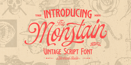 Introducing, The Monstain - a script with a touch of vintage look and feel. You will also get several detailed hand drawn objects ready to use. This type of font perfectly made to be applied especially in logo, headline, signage and the other various formal forms such as invitations, labels, logos, magazines, books, greeting / wedding cards, packaging, fashion, make up, stationery, novels, labels or any type of advertising purpose. Features : uppercase & lowercase numbers and punctuation multilingual alternates / swashes and ligatures PUA encoded hand drawn objects We highly recommend using a program that supports OpenType features and Glyphs panels like many of Adobe apps and Corel Draw, so you can see and access all Glyph variations.
 - Oksana Sans Compressed by AndrijType,
$33.00 Oksana Sans Compressed is the most skinny part of Oksana Sans font family, but still it retains most features of this humanist sans serif. The Compressed version is designed to get most of your page and fill a minimum space with maximum information. It can be useful in multiple columns typesetting — like magazines, newspapers or business documentation. Oksana Sans Compressed could be a good minor companion for other Oksana fonts as well. It has six weights from Thin to Heavy plus free and funny Fat Compressed Italic face, supports Western, Central European, Baltic Latin and Slavic Cyrillic codepages. Old-style digits, some ligatures, alternative characters and modern currency signs are also included.
 - Duktus by Eurotypo,
$49.00 Duktus is a script typeface with a 1940’s flavour. It is a delicate script with letters not quite connected, having large, flourished capitals and small lowercase with long ascenders and descenders. It has a crisp, precise appearance, but is not rigidly formal. The design was inspired by the typeface Donatello by Wagner & Schmidt in 1935 and published by Società Nebiolo, Torino. Some other Influences: 1927 Trobadour by Wagner & Schmidt 1927 Liberty Script by Willard T. Sniffin 1933 Trafton Script by Howard Allen Trafton, 1937 Coronet designed by Robert Hunter Middleton Duktus fonts come with plenty of alternates small caps, old style numerals, ornaments and swashes. They include also CE language support.
 - Amedina by Bungletter,
$12.00 Amedina is a modern script font that features a classic and elegant touch. Amedina are attractive because they are sleek, clean, feminine, sensual, glamorous, simple and very easy to read, thanks to their many fancy letter joints. I also offer a decent number of stylistic alternatives for some of the letters. Classic style is very suitable to be applied in various formal forms such as invitations, labels, restaurant menus, logos, fashion, make up, stationery, novels, magazines, books, greeting/wedding cards, packaging, labels or all kinds of advertising purposes . . . . . . . . Files include: • Amedina Contains full set: -Uppercase -Lowercase -Alternative -Ligatures -Punctuation -Number -Multilingual support. need help or have questions let me know. I'm happy to help. Thanks & Congratulations on the Design!
 - Gerolinda by RM&WD,
$95.00 Gerolinda has almost 1900 glyphs per weight; with its OpenType features it recreates the feeling of a mid-19th century Italian gentlewoman's handwriting. There are more than 1900 glyphs each weight with 250 variants covering all European accents and a broad choice of numbers: lined, tabular, ordinal, old style, etc. Also ligatures, discretional ligatures, contextual and stylistic alternates, smashes, contestual swashes, stylistic sets and ornaments. (la terminologia la do per buona!) This is a complete font for both editorial and graphic design. Gerolinda font is complemented by Gerolinda Design, dedicated exclusively to upper case letters: around 1,600 glyphs with all the accents. For best results, use of OpenType features is strongly recommend.
 - Mars Model by Kustomtype,
$25.00 Mars Model is a font that's originated from a concept for a rock band. With its 5 fun styles, Mars Model gives your graphic work a futuristic look that is reminiscent of the warm look and touch of Arts & Crafts. This style of type is instantly associated with advertising and design for high-end products. Mars Model is an entirely hand-drawn font, perfectly vectorized and meticulously digitized for quality and readability. Also, the font can be used for a refined vintage feeling or an industrial and futuristic atmosphere. Mars Model is great for display, logos, branding, packaging, advertising, food, sports, titles, film, TV, and much more. Doesn't that sound perfect to you?
 - Solar Vesta by Anthony James,
$15.00 Solar Vesta Collection houses both Script & Serif fonts that compliment each other perfectly. Solar Vesta Script includes 127 ligatures, along with a full set of Alternates/Contextuals for a completely versatile and natural aesthetic. Solar Vesta Serif is a sharp robust fashion-based typeface, incorporating that beautiful contrast between thick and thin. To access the built-in Opentype features within the script font, make sure to turn on Standard Ligatures and Contextual Alternates in your Softwares Opentype Panel. This activates all neccessary features and enables optimum accessibility, to allow for natural handwriting. Solar Vesta Script also includes swashes, these are easily accessible as Stylistic Alternates, when typing in basic Numerals...123 etc.