10,000 search results
(0.033 seconds)
- Lorelei by insigne,
$21.99 Lorelei is an exuberant and bouncy script. The ink seems to be slathered onto the surface in a casual and spontaneous manner, making for a flowing and feminine script that is perfect for invitations or greeting cards. The script also contains a large number of OpenType alternates and ligatures to extend the impulsive nature of the lettering. Lorelei is named for a young German maiden that supposedly threw herself into the Rhine.
 - PF Adamant Pro by Parachute,
$59.00 The Adamant family is a serif typeface that comes in six weights, from Light to ExtraBold, each with italic and small caps versions. It has received an original typeface award from Granshan Awards 2010. Every font in this family includes ligatures, lining and oldstyle figures in proportional and tabular widths, fractions, alternate characters, and other typographic features. The weights are finely balanced so that they can be easily combined, depending on type of paper and print conditions. Its proportions, sturdy serifs, high x-height and wide apertures make it very readable at small sizes. It is suitable for setting books, magazines and newspapers, but is also appropriate for use in large sizes like in poster design.
 - AL Nevrada by Aluyeah Studio,
$95.00 Introducing Al Nevrada Font. It's a display typeface with sharp serif forms. If you want to stand out then this is the font for you. It’s a chic and luxurious serif font with a contemporary feel. Use it to add a bold flavor to any design! It’s ready and perfectly fit for your logo designs, headlines, music projects & social media posts, event posters, brand imagery, product packaging, quotes, merchandising, etc. Features : OpenType features ( ligature, alternate ) Easy to use, you can use combination like a.2 e.2 etc Accessible in the Adobe Illustrator, Adobe Photoshop, Adobe InDesign, also works in Microsoft Word. PUA Encoded Characters - Fully accessible without additional design software. Multilingual support
 - Fontanella by Latinotype,
$29.00 Fontanella is a typeface designed by Coto Mendoza, which emerged from calligraphy and manual drawing exploring the skeleton and classic proportions of Roman capital letters. This initial process later gave rise to a sans serif family composed of 8 pesos and its italic variants. It also includes small caps, old numbers and width variants in the set of alternates. The slightly enlarged x-height makes it perfect for composing short texts in editorial, fashion, branding, magazine, television, window display and other media projects. Fontanella a classic spirit reinterpreted in a contemporary language. We especially thank Alfonso García for his impeccable work on the digital edition and Nicolás Tobar for the art direction on the specimens.
 - Great Copper by Pixesia Studio,
$19.00 Introducing Great Copper - An Old Handcraft Display Font With a perfect combination of its unique yet classic shapes, Great Copper greatly portrays the familiar feeling that you are looking for. This typeface suits the nostalgic feeling you want to evoke through words. It comes as if Great Copper is written personally as letters to deliver good news. As splendid it curves in delivering the sweet vibe, Great Copper comes also with its firm shape to emphasize how valuable the messages and stories that it brings. Enchanting yet emphatic, Great Copper typeface will be perfect to depict the great story about the past you'd be delighted to tell and share. Hope you Like it. Thanks.
 - Machin by Hanoded,
$15.00 Machin is a French word meaning 'thing'. Apparently, it is also a species of macaque from the Philippines, but I named this font after the French word! Machin is based on a really old font I made back in the day. It was called Whynot and (because I didn't know a thing about making fonts at the time) I could not get it to work properly, so it had its 15 minutes of fame before it was pulled off of the internet. Machin was made using the recycled glyphs from Whynot and it does work. It comes with extensive language support (yes, Vietnamese and Sami too), some handy ligatures and a lot of scribbly panache.
 - Dry Erase by Zap Studio,
$20.00 This font is my first attempt at typeface design. It is based on my own handwriting and I tried to maintain the natural quality, where the letters are quite loose, some going in different directions, thickness and position. It has Open Type features including contextual alternatives, stylistic sets and ligatures. Trying to maintain natural quality of handwriting each glyph has four styles which randomly appear when you type. For example, when there are double letters, the two letters are slightly different. You may also switch off the random feature and use the four styles on their own. The many alternates are best activated in OpenType-aware programs, such as Word 2010, Illustrator CS4+, InDesign CS4+ and QuarkXpress 7+.
 - Bonhomme Richard by Three Islands Press,
$39.00 Bonhomme Richard evokes the cursive penmanship of Chevalier John Paul Jones (1747–1792), celebrated Continental Navy commander during the American Revolution, in letters from the late 18th century. The font’s name comes from Jones’s famous frigate, lost during his victorious engagement with the British in the Battle of Flamborough Head in 1779. During this battle Jones is said to have exclaimed, when urged to surrender, “I have not yet begun to fight!” (In fact, his likely words were, “I may sink, but I’ll be damned if I strike!” – i.e., surrender.) A legible script, Bonhomme Richard has an elegance about it while also conjuring the colonial era of its source material. Use to simulate historical handwriting in film props, games, formal invitations, product labels, and the like.
 - Figgins Brute by Intellecta Design,
$14.90"A capital titling face with numerals, erroneously labelled in Figgins specimen book of 1817 as an 'antique' or roman. With a very bold, nearly monoline construction and squared serifs as thick as the main stroke, this type surpassed even the fat face style in blackness, it was popularised by the advent of handbills and early advertising posters, which needed bold type styles to project commercial messages from a distance. A sign-writer friend of mine theorises that the Egyptian style originated with the North African campaigns (hence Egyptian) of Napoleon Bonaparte, and the type historian Ruari McLean also suggests that the Egyptian style originated with signwriters 'block' letters, just like the prototypical (and contemporary) sans serif of Caslon IV." (Ben Archer) - Hobo Symbols Chaulk by SymbolMinded,
$29.99 During the period of the Great American Depression, “hobos” created a system of symbols to communicate and assist fellow travelers. These symbols would mark a home, farm, fence or other structure to indicate what to expect in the area. They would tip off travelers on how to find food, stay safe and what to avoid and more. In some areas of the USA, these symbols are still visible and have also become part of the American popular culture. These 96 symbols are accompanied by a pdf describing what the symbol was used to indicate. The meanings and symbols are by no means the complete list and there may be additional or alternative meanings. These are for casual use and not historical or anthropologically completely accurate.
 - Callistera Script by Sarid Ezra,
$15.00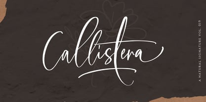 Callistera Script is a natural also expressive font that contain lowercase, uppercase, symbol, and also mult- language support. It comes with ligatures, contextual alternates, stylistic alternates, swashes, and also underline. Callistera Script also suitable for logo branding, beautiful fashion design, suitable for wedding invitations, or handwritten quotes. Also with PUA encoding. For another questions, please send a mail to saridezra@gmail.com. Thank You!
 - Getho Semi Sans by deFharo,
$12.00 Getho is a Semi Sans family of geometric construction with 6 weights plus the italic versions all include small letters, the symbol of Bitcoin and other monetary symbols. It is an exclusive typography with neo-grotesque modulations and maximum readability in any size. The typeface has alternative letters and numbers, small caps and advanced OpenType functions. The complete Pack includes versions of the Variable Fonts type. The drawn of the vectors is meticulous to obtain smooth curves of elegant aspect to which also contributes the subtle rounding of the corners, the thicker versions have of traps of ink in the knots of the unions to be able to use them in small sizes. The Metric and the Kerning of all the versions I have reviewed individually to obtain a fluent reading in any type of text and size.
 - Samaritan Tall Lower by Comicraft,
$49.00 Fifteen hundred years from now, a man will be selected to go back in time to prevent a catastrophic event which turned his world into a dystopia. Sent back in time, he was enveloped in empyrean fire, the strands of energy that make up time itself. Crash-landing near Astro City in late 1985, he learned how to master and channel the empyrean forces that had suffused his body -- finally learning to control his powers in time to prevent the destruction of the Space Shuttle Challenger, the event he had been sent to avert. He described himself to journalists as nothing more than "a Good Samaritan", and has continued to help his fellow man in Astro City ever since. John JG Roshell has also been struggling with the empyrean challenge of fitting all of Kurt Busiek's ASTRO CITY dialogue into balloons with the regular Samaritan font, so he created the Samaritan Tall font to help his fellow comic book letterers! It's kinda the same thing, really.
 - Sharp End by Asritype,
$18.00 Sharp End fonts support Latin Based Languages only (see Tech Specs). Sharp End's creation is inspired by Gothic sharpness shape but only applied to the ends of normal letters. Make the font look beautiful and elegant, look as semi-serif, as calligraphic touch or others. The base of the Capital Characters is set a little bit lower than the small cases/lowercases. On small/normal size typing, the difference is less visible (obscure), but will be more visible/more clear as the typing set larger. Thus, Sharp End fonts will work well for both text and display. The fonts has also character variants. The character variations (in PUA) set in 5 stylistic sets ss01 ... ss05 (see Sharp End opentype features poster). So, these character variations will be easier accessible in more common application such as MS Words, Text Edit or the others. The glyphs may also be accessed via Character Map, Character viewer, insert character, insert symbol or other similar tools. You can use Sharp End for most of typing and design means such as: greeting, invitation, wedding and other cards; books, magazines, news, banners, logos, Pamphlets, advertising etc., for printing or digital/web display. As addition, with 3 weight variants, the regular will fit for longer text for normal use, while the bold and semi-bold is more suited for the covers, impressions, titling, Logos, design or other usage. With its smoothness curve and sharp ends, Sharp End will pairs well to most fonts of various kinds: Sans Serif, Serif, Handwritten, Scripts and others. As the example in one poster, Sharp End is paired with Astonice and Apresia Script (ornamented script font, one of the richest letter variations and ornaments). Thank you for visiting. Again, thank you very much for downloading this awesome fonts.
 - Antique Unique JNL by Jeff Levine,
$29.00 A page from an 1880s type specimen book presented a unique "Barnum"-like design with top horizontal lines much thinner than the bottom ones. Titled "Ten Line Antique Compressed No. 7", the design transcends the years; for it's not only an antique wood type font, but is also reminiscent of the 1960s hippie counterculture movement. Antique Unique JNL is available in both regular and oblique versions.
 - Kodama Forest by Hanoded,
$15.00 Kodama are spirits in Japanese folklore that inhabit trees. The term is also used for trees in which a kodama houses. Kodama Forest is a rough, spikey and inky font, in the style of the great Ralph Steadman. Kodama Forest comes with a bunch of alternates, some interesting ligatures and a lot of splatter. And, of course, all the diacritics you can throw a tree spirit at.
 - Pulchella V2 by Mevstory Studio,
$25.00 We are introducing an advanced version of the Pulchella font released and received great exposure from users and worldwide font enthusiasts. The massive development puts forward experimentation on the alternate letters. We redesign each shape to make it more functional and comfortable when text size escalation occurs. In addition to rejuvenating the letterform, we also apply an oblique style to provide diverse style choices.
 - BMF Brohan Black by BuyMyFonts,
$25.00Brohan Black is a monospaced font: each character has the width of the piece of paper from which it was cut with a pair of scissors. The loss is minimal, as the counters are as small as possible while still retaining maximum legibilty. To save ink, print negative. Recommended for cement companies, post-industrial record sleeves and heavy poetry. Also great for temporary signage. - Pulchella Pro by Mevstory Studio,
$20.00 Greetings! We are introducing an advanced version of the Pulchella font released and received great exposure from users and worldwide font enthusiasts. The massive development puts forward experimentation on the alternate letters. We redesign each shape to make it more functional and comfortable when text size escalation occurs. In addition to rejuvenating the letterform, we also apply an oblique style to provide diverse style choices.
 - Squeezed by MAC Rhino Fonts,
$59.00 Squeezed is the result of exploring mid 20th Century sans serif typefaces. As the name suggest, the typeface is indeed condensed which is also a solid part of its personal and friendly charactar. It was first designed to fit for custom book cover projects, but now released for the public. Squeezed is best suited for display solutions, but could sometimes work in minor sizes.
 - Mikratos by Just Font You,
$19.00 Mikratos is a digital futuristic font inspired by the interfaces in sci-fi movies and retro games visual. Developed to be the solid time-jumper between vintage retro-futurism and also the futuristic nowadays trend in the graphic design and visual industry. Perfectly fit for logo, branding, gaming, esport design, poster, music video, album artwork, cover, book, packaging, merchandise, apparel, fashion, and many more.
 - Futura Next by Neufville Digital,
$45.25 Our most up-to-date Futura adapted to the new times. Its peculiarity lies in the curved endings of three of its letters (“j”, “l” and “t”), which gives the typeface a more dynamic and modern look, making it easier to visualize on small and low-resolution screens. The original designs of these characters are also included. Futura is a Trademark of BauerTypes SL
 - Mergansers by Tyler Jamieson Moulton,
$11.00 Merganser is a Typeface intended for text and copy and was inspired to serve the avid community of Birders. Birders and birding material historically have a lot to say. Merganser serves that tendency because its designed legible at small scales. The Natural world also inspires the slightly humanist strokes of Merganser. Merganser was created as part of the Type@Cooper winter certificate in Type Design.
 - Dederon Serif by Suitcase Type Foundry,
$75.00Dederon Serif has been specifically designed for book setting. Preliminary sketches were drawn in 2004. Its inspiration – particularly its weight and width proportions – can be traced to the Liberta typeface from the TypoArt type foundry in former Eastern Germany. After a careful study of the model, the design of Dederon branched off into its own direction, finding its distinctive voice and becoming a wholly original type family. Dederon Serif kept most of the elements typical for the Old Style Roman lettering, such as the angle of the stress, the medium x-height, and lower contrast. In large sizes, the typical shapes of the letters stand out – the calligraphic feel characteristic for the Czech typefaces by Oldrich Menhart, the unusual serifs hinting at the angle of the pen, the shapes of the stems, or the terminals of dots and ears. Upon finishing the serif version, a Serif-serif variant called Dederon Serif was added. The construction principles are also derived from the Old Style Roman model, which lends the lettering its open, humanist feel. Yet the design also conforms to the rules of the modern Serif serif. Most characteristics of Dederon Serif match the serif version – the weight of individual cuts, the width proportions, x-height, ascenders' and descenders' length, and the slope of the italics. Each version of Dederon Open Type Std contains the standard Western Latin character set and the Central European characters; a number of basic and accented ligatures, small caps; old style, small caps and caps, table, fraction and superscript numerals; expert glyphs and alternative characters. This brings the total to a comfortable 820 glyphs per weight, permitting truly professional use in the most demanding projects. - Quarter Braille by Echopraxium,
$20.00 Presentation QuarterBraille (Abbreviated as "QB" thereafter) is a decorative, steganographic and lattice font. Its core design concept is that Braille dots are represented as "quarters of a square"[1]. This is illustrated by posters 1 and 2 (NB: these glyph parts will be called "QB dots" thereafter). The other glyph parts (see poster 3) are purely decorative and meaningless in terms of Braille dots encoding[2]. All glyph parts are meant to generate a wide variety of patterns from horizontal and vertical combinations of glyphs. There is also a graphic convention to differentiate uppercase from lowercase letters with the presence or absence of shape subparts (in the "endings", "quarter of a circle with a ring" and "quarter of a diamond with a small square in the middle") like shown by poster 4. This font is suitable for very short texts (e.g. logos, acronyms, quotes, ambigrams, pangrams, palindromes, etc...) but on the other hand it may be used for steganographic purpose like geocaching as well as fictive alphabets (e.g. Alien/SciFi/Fantasy/Antique civilizations). Posters 1. Font Logo: the displayed text is " Quarter " followed by " Braille". There's a rainbow layer above the text to highlight the "QB dots", this is achieved by A..Z glyphs with "only QB dots" (codes 230..255) 2. Anatomy of a Glyph (L) and "QB Dots" (quarters of a square) 3. Glyphs Parts: Square and Cross (Inverted square), Circle and Inverted Circle (with or without the small circle in the middle), Diamond (with or without the small square in the middle), Inverted Square and Circle, Shape combos, Ending 4. Uppercase vs Lowercase (tiny shape subparts are shown in red) 5. Sample 1: Bathroom sink with QB tiles on the credence 6. Sample 2: Hands knuckle tatoos: "LOVE/HATE"[4] 7. Sample 3: Poker Hand: pocket Aces. It's an Ace of Hearts (Ah) on the left and an Ace of Spades (As) on the right. Like in regular cards, the card value (e.g. Ah) is displayed twice: at the top and rotated by 180 degrees at the bottom. This poster also illustrates that QB could be used to print embossed playing cards with tactile and visual display of card values. 8. Sample 4: Pangram: "Adept quick jog over frozen blue whisky mix" 9. Sample 5: Latin Magic Square: "SATOR AREPO TENET OPERA ROTAS" (NB: for compensation of the 2/3 glyph ratio, letters on each line are separated by a space: "S A T O R", ...). 10. Sample 6: Quote of Mahatma Gandhi: "Learn as if you will live forever, live like you will die tomorrow.". This is also a demonstration of border glyphs combinations. 11. Sample 7: Steganography use case: the text is a sequence of 64 aminoacids (1 Letter notation), this protein was described in a research paper "The complete Aminoacid sequence of an amyloid fibril protein AA of unusual size (64 residues) 1975". 12. Sample 8: Border Glyphs with the provided styles and mixed styles. The words are the same than in poster 9 ("SATOR AREPO TENET OPERA ROTAS"). Despite the 2/3 glyph ratio, the "TENET cross" was achieved by both inserting spaces in horizontally ("T ENE T") and by using the "thin borders glyphs". Notes a. Border glyphs[3] are meant to enhance the esthetics of text samples displayed with QB b. Special characters (e.g. *$()[].,;:&@# ...) are provided and follow the NABCC (North American Braille Computer Code) convention. c. A..Z Glyphs with only the "QB dots" are provided as demonstrated by posters 1 and 2 (A/N: this was very useful to create them). d. Glyph Map: 32..64: Special characters - 161..187: "Thin variant" of Border glyphs, 192..229: Border glyphs, 230..255: A..Z with only the "QB dots" - Codes 176 an 181 are "regular SPACE" (empty glyph). Footnotes 1. There is indeed two shapes which represent the braille dot: the "quarter of a square" and the "quarter of a cross". It's because a cross may be considered as an "inverted square" because the square corners are merged in the center. 2. That's why the SPACE glyph is only made of decorative/meaningless glyph parts (i.e. no "QB dots"). 3. For other fonts with border glyphs, please take a look at my other "decorative Braille fonts" (GoBraille, HexBraille, KernigBraille, StackBraille, MaBraille, DiamondBraille, LorraineBraille). 4. LOVE/HATE knuckle tatoos are inspired by the anthology scene from "The Night of the Hunter" movie (Charles Laughton 1955), it also appearead in "Do The Right Thing" movie (Spike Lee 1989). Disclaimer This font is not appropriate and not meant to print text documents in Braille for the blind readers audience.
 - Madurai Slab by insigne,
$24.00 Chennai’s market-tested type styles have taken new form once again. The geometric forms of Chennai and its derivant Madurai, both successful in web-based applications and logotypes, have now been adapted for the superfamily Madurai Slab, a potent, square slab serif ideal for headlines and posters. Under the surface of Madurai Slab’s straightforward geometric structure, the font’s exaggerated vertical serifs provide the face with an extra chunk that commands the reader’s attention and gives the font more impact in its heavier styles. The extra-fortified forms are anything but monotonous, though. The bolder structure of the slab is instead rational, diligently thought-out, with minimally contrasting strokes, making the sturdier look particularly legible in shorter textual content blocks. This child of Madurai contains a comprehensive range of nine weights--slender to black--and features condensed and extender selections for a complete set of fifty-four fonts. All users of the Madurai Slab collection can access numerous OpenType alternates. Madurai Slab is furnished for experienced typographers, together with alternates, compact caps and many alts like “normalized” capitals and lowercase letters that come with stems. The typeface also contains a range of numeral sets, together with fractions, old-style and lining figures with superiors and inferiors. OpenType-capable programs including Quark or the Adobe suite allow quick changes to ligatures and alternates. Previews of these options can be found in the .pdf brochure. Madurai Slab also features the glyphs to enable all Central, Eastern and Western European languages. In all, Madurai Slab supports around forty languages that utilize the prolonged Latin script, making it an excellent option for multi-lingual publications and packaging. This richness of options makes this the best slab serif family for websites as well as for print, motion graphics, logos, t-shirts and the like. Madurai Slab is a great choice when looking for a Neo-Grotesque slab serif font. In the hands of a learned designer, this new slab offers the potential for beautiful and well-blended layouts. With its widths adjusting to compact and extended content blocks, this typeface is perfect for the headings, captions and other brief, immediate messages that you need to drive your message home.
 - Busther by Putracetol,
$12.00 Introducing Busther - A Hand Brush Typeface. This font was made from my original handwriting, using a brush pen then making it digital. You can create stunning and natural hand lettering quickly and easily. You can use this font for making an awesome lettering, apparel projects, signature, album cover, logo, branding, magazine, social media, & advertisements, but Busther also works great for other projects.
 - Creaty by Dilbadil,
$14.00 Hi, introduce my new font Creaty. This is a simple and sweet script font. Suitable for various designs such as t-shirt designs, quotes, weddings, business cards and more. This font supports multiple languages and also alternates. For alternates y, g, j, z you can use them easily, by typing: y2, g2, j2, z2 Hope you enjoy it Thank you
 - Repetition by PizzaDude.dk,
$15.00 Authentic and handmade brush font. Comes with a great variety because of the contextual alternates (7 different versions of each letter that cycles as you type!) Also, a wide range of accented glyphs for your pleasure!
 - More Blocks by Beware of the moose,
$9.99 It is not really a font, the are more icons. Based on a grid op seven squares al 127 possibilities – filled and unfilled. Use it decorative or just for fun. There is also a dotted version.
 - Sagata Normal by Lemonthe,
$10.00 Sagata Normal Font Duo, perfect for product packaging, branding project, magazine, social media, and much more. Explore the best your side. FEATURES Sans Serif & Script Ligatures Uppercase and Lowercase letters Numbering and Punctuations Also Multilingual Support
 - Aviano Silk by insigne,
$22.00 A premier product from insigne, the powerful Aviano redefines its classic lines for the contemporary elegance of Aviano Silk. This modern development of a timeless font, part of insigne's annual tradition in adding to the Aviano family, was elected the clear leader in a poll of insigne design's social media followers. Aviano Silk refers to the smooth flowing feel that the negative space gives the font. This particular example is sort of a hybrid between the stencil and a centerline. It has a certain amount of velocity to it. Extended characters lend formality and a sense of wealth and power. Due to the modifications required for the new look, the Silk family cannot work as an overlay for Aviano, though it pairs nicely with it. There are also 12 Aviano families that work well with Silk. Aviano Silk is particularly suited to high-end luxury applications and especially branding projects. Use Aviano Silk to lend refinement and luxurious elegance to your design.
 - Bilcase by Ilham Herry,
$20.00 The Bilcase font family is a layered condensed font family that comes from vintage logos, labels, packages, and signage. This collection of styles has 5 type layers and vintage scrolls, panels, and ornaments. Combine these to create label designs, headlines, logotypes, signage, posters, greeting cards, letterheads, T-shirts... the applications are endless. This font family is available in 2 styles. Bilcase has font layers with contextual, stylistic alternates and ligatures. You will get special capital letters when you activate the contextual alternate feature. Bilcase Extras is the expanded version of the main font with panels, ribbons, and ornaments. You can access the ornaments by activating the ligature feature. Type the letter “p” for the panel, “r” for ribbon and “o” for ornament and add numbers to each code, e.g. “p1, p2, p11, r2, o2”. Complete information is in the pdf file. http://bit.ly/2OClGjY. You can also try it in the font tester below.
 - Rostra by Tail Spin Studio,
$20.00It was during a visit to the Roman Forum that we were inspired by a seemingly unique style of lettering on a tablet among the ruins. The Latin message was chiseled in a condensed, free-style manner, almost as if it were intended as a personal note. While the stone showed only the capital letter forms of the period, we felt the creation of a lowercase would help extend the fonts usability and also add a whimsical feel to the design. - Ricardo by Bureau Roffa,
$19.00 Rather than confining itself to a single style, Ricardo combines the best of two worlds: the conceptual clarity of a geometric design with the legibility and warmth of a humanist design. Its open counters, crisp joints, and even texture allow for effective use in long-form text settings, while its simple geometric shapes combined with some unexpected details make it highly suitable for display settings such as branding and marketing. Ricardo contains seven carefully chosen weights, ranging from ExtraLight to ExtraBold. The Medium weight functions as a slightly darker alternative to the Regular. Ricardo’s 812 glyphs per style support over a hundred languages, and also include arrows and case-sensitive punctuation. The Ricardo family consists of three subfamilies: Ricardo, Ricardo ALT, and Ricardo ITA. Ricardo contains the most conventional forms, and is the most suitable option for long-form text. Ricardo ALT contains simplified shapes for the a, j, u, and t, which are also accessible through Stylistic Set 2 within Ricardo (in opentype-savvy applications). The cursive-like italics of Ricardo ITA provide a slightly more eccentric alternative to the standard italics. Furthermore, all styles contain stylistic alternates that swap the blunt apexes in A, M, N, V, W, v, w, y, and 1 for pointier ones. These are also accessible through Stylistic Set 1. Other opentype goodness includes: (discretionary) ligatures, smallcaps, case-sensitive forms, fractions, nine sets of numerals, and more. David Ricardo (1772-1823) is considered the first of the classical economists, and combined ground-breaking mathematical abstractions with an understandable down-to-earth way of explaining his ideas.
 - Aure Nox by Aure Font Design,
$23.00 Aure Nox inspires the chill whimsy of a haunted forest. The roughhewn forms of this decorative, sans-serif font engage the reader with a subtext of rakish charm. Surprisingly legible, Nox adds a bit of rebelious sass to text and titles, and a daring stance to astrological expressions and chartwheels. Nox is an original design developed by Aurora Isaac. After more than a decade in development, 2018 marks the first release of the CJ and KB glyphsets in regular, italic, bold, and bold-italic. The CJ glyphset is a full text font supporting a variety of European languages. A matching set of small-caps complements the extended lowercase and uppercase glyphsets. Supporting glyphs include standard ligatures, four variations of the ampersand, and check-mark and happy-face with their companions x-mark and grumpy-face. Numbers are available in lining, oldstyle, and small versions with numerators and denominators for forming fractions. Companion glyphs include Roman numerals, specialized glyphs for indicating ordinals, and a variety of mathematical symbols and operators. The CJ glyphset also includes an extended set of glyphs for typesetting Western Astrology. These glyphs are also available separately in the KB glyphset: a symbol font re-coded to allow easy keyboard access for the most commonly used glyphs. Though Nox stands well on its own as a text font, the more traditional sans-serif forms of Aure Jane pair well as an innocuous foil to Nox's brazen presence. Give Aure Nox a trial run! You may discover a permanent place for this font family in your typographic palette. AureFontDesign.com
 - Slatz by CozyFonts,
$20.00 The Slatz Font Family is Vertical. It has a slender, consistent weight that is best used in limited, left to Right, space limitations as to maximize font height. Slatz font variations all have extremely clean edges and even the serif versions are crisply defined with a flat-pointed serif for an added unique character. The designed intent was for a tight kern, however evenly letterspacing these family members give a distinct personality and continues to command the negative space just as in tight kerned examples. The compatible relationship of these font family members, serif to sans serif, and regular to italic is seamless and the overall design coloring of words as sentences is well balanced and extremely legible. The Slatz Family fonts are matching members glyph to glyph yet there is a noticeable difference between the serif and sans serif members. The sans serif works in contemporary and vintage settings. The serif members work particularly well in vintage, period applications. The Bold and Drop versions of Slatz also fit the above descriptions and also work on their own.
 - Wien Pro by Wannatype,
$36.00 Wien Pro, the sans serif by Ekke Wolf. Typeface lovers looking for a modern, well-developed sans serif font with a touch of retro and warm, individual lettering will get excited about a new addition to the font market. The more than complete Wien Pro front comes in three styles and four different weights. In addition to the upright Wien Pro there is the Wien Pro Oblique with a moderate 6° slant and the Wien Pro Superoblique with an 18° slant. Available weights are light, regular, medium, bold and black. These fonts are equipped with extended Latin alphabet for Central and Eastern Europe and also Cyrillic and Greek alphabet. The set of characters includes nine different sets of numbers, plus its own set for the small caps, as well as alternative characters and groovy ligatures. In addition, all Wien Pro styles are also available as unicase with upper case and lower case x-height alignment. The style, metrics and proportions of Wien Pro combine perfectly with the Liebelei Pro and the script fonts of the Calafati Pro.
 - Tequendama by JVB Fonts,
$30.00 A display fontface for titles inspired on Latin America, Ethnic, Native, Tribal, Mysthical, Handmade, Aboriginal, Pre-Hispanic, Pre-Columbian, Textured. By mid-1997 I was developed the early type edition was called «Muisca Sans» as my work for the degree in Graphic Design (Universidad Nacional de Colombia), based on the concept of pre-Columbian figures characteristics within some of the very few visual elements recovered from the Muisca culture, ancient pre-Columbian tribe disappeared before the arrival of the Spaniards in what is now central Colombia. In fact, the name of the capital Bogotá (the capital of Colombia) goes back to Bacatá as primary or village downtown of what was once the imperial capital of tribe Muisca. Although this unfinished early typographic project has not yet been published, Tequendama is the evolution of the first one. Tequendama reminds the myth of Muisca culture and religion of this tribe. The god Bochica, a wise old man with a white beard heard the cries of his tribe suffered against flooding of their land losing harvests before the divine punishment resulted by the offended god Chibchacun. However Bochica appeared wearing a white robe sitting on a huge rainbow and he broken the mountain towards the southwest wise old man with a golden staff broke the mountain to drain the flooded savanna. This emblematic and iconic place would later be called as «Salto de Tequendama». Tequendama name also been adopted to a nearby province to Bogotá.
 - Julietrose by Monotype,
$29.99Julietrose debuted in May of 2006 and was quickly embraced by members of the graphic design community, who found it as charming as its name. The playful, full-bodied script began to show up in all forms of graphic communication. However, it soon became apparent that a bold weight would add more versatility to the design. Martin Wait, Julietrose’s designer, happily obliged by drawing a new and more forceful weight of the typeface. Where Julietrose is vivacious and lighthearted, Julietrose Bold is assertive and speaks with authority. They are clearly sisters, though – both weights feature flamboyant swashes and elegantly long ascenders and descenders. Both designs also offer a suite of swash and alternate characters, and are available in OpenType format The Julietrose family is small but irresistible. This pair can easily charm their way into such diverse uses as posters, restaurant menus, social announcements and even product brochures.