10,000 search results (0.02 seconds)
  1. Edangu by Twinletter, $15.00
    Edangu Arabic display font is a new typeface inspired by the oriental fonts used in Arabic calligraphy and other Middle Eastern architectural features. This font features a Kufic version that has beautiful and neatly arranged shapes. This font will make your design elegant, especially designs that carry the middle eastern theme.
  2. Dangerline by Aminmario Studio, $50.00
    This is a supercharged font, with natural brush, quick strokes and sharp details. Perfect for challenging jobs, titles, movie,logos, apparel, t-shirts, hoodies, quotes, product packaging, or anything that needs a typographic turbo-boost and a typographic unique style. Thanks for checking out this font. I hope you enjoy it!
  3. Iron Ranger by Aminmario Studio, $30.00
    This is a supercharged font, with natural brush, quick strokes and sharp details. Perfect for challenging jobs, titles, movie,logos, apparel, t-shirts, hoodies, quotes, product packaging, or anything that needs a typographic turbo-boost and a typographic unique style. Thanks for checking out this font. I hope you enjoy it!
  4. Drakalligro Slab by G3 Typefaces, $2.70
    This variation of "Drakalligro" is its best look, the slab serifs in its characters give a good look and make this font something special. I added short slab serifs taking into account that the font is thick. Half slab serifs and some variations in their position are the special feature.
  5. Space Journey by Vozzy, $10.00
    Introducing retro sci-fi label font duo named Space Journey. This display font is inspired by movie posters from the 60s and 70s. Font family has two styles: Regular and Rough. This font will look good on any retro sci-fi styled designs like a poster, T-shirt, label, logo, etc.
  6. FS Irwin by Fontsmith, $80.00
    New York vibes FS Irwin was born in New York while Senior Designer, Fernando Mello, was studying an intensive 5 week typeface design course at the Cooper Union. His brief was to design a perfectly clear typeface that could communicate well, without loud or overtly mannered design features. Fernando was influenced by the subway font in New York: ‘It is very in your face and clear, always in bold. It doesn’t shout much but at the same time is very present and unique. The design is completely different but it was this spirit I wanted to capture for FS Irwin.’ And the vibe of the city: ‘In a similar way to London, New York is so mixed and so cosmopolitan. I was amazed by the different styles and identities I saw there, and tried to encapsulate this essence to create something new, relevant and very now.’ Incisive quality Rather than focusing on quirks or distinctive characteristics, the key to FS Irwin is the quality of its design and spirit of simplicity. The design, proportions and details are usable and authentic and it is suitable for countless situations, without running the risk of being instantaneously noticeable. Families like this can be used on nearly anything, from more playful designs to serious corporate IDs. ‘Extensively tested and precisely drawn text-oriented typefaces are what I enjoy designing the most. There is a beauty and a different approach, a different way of making them interesting, sellable and usable rather than adding flicks or unexpected details.’ Inscriptions and calligraphy FS Irwin’s origin lies in Fernando’s studies in inscriptional lettering and writing-calligraphic exercises at the Cooper Union. Mello started the process by digitising his explorations and adapting them into a more workable sans serif structure. The traditional forms of writing which gave the basis to Latin type as we know it today were the perfect place to start. This influence can be seen in the proportion of the capitals and in slight writing-calligraphic details in the lowercase, such as the slightly angled, chiselled spurs and their open terminals.
  7. Fairplex by Emigre, $49.00
    Zuzana Licko's goal for Fairplex was to create a text face which would achieve legibility by avoiding contrast, especially in the Book weight. As a result of its low contrast, the Fairplex Book weight is somewhat reminiscent of a sans serif, yet the slight serifs preserve the recognition of serif letterforms. When creating the accompanying weights, the challenge was to balance the contrast and stem weight with the serifs. To provide a comprehensive family, Licko wanted the boldest weight to be quite heavy. This meant that the "Black" weight would need more contrast than the Book weight in order to avoid clogging up. But harmonizing the serifs proved difficult. The initial serif treatments she tried didn't stand up to the robust character of the Black weight. Several months passed without much progress, and then one evening she attended a talk by Alastair Johnston on his book "Alphabets to Order," a survey of nineteenth century type specimens. Johnston pointed out that slab serifs (also known as "Egyptians") are really more of a variation on sans serifs than on serif designs. In other words, slab serif type is more akin to sans-serif type with serifs added on than it is to a version of serif type. This sparked the idea that the solution to her serif problem for Fairplex Black might be a slab serif treatment. After all, the Book weight already shared features of sans-serif types. Shortly after this came the idea to angle the serifs. This was suggested by her husband, and was probably conjured up from his years of subconscious assimilation of the S. F. Giants logo while watching baseball, and reinforced by a similar serif treatment in John Downer's recent Council typeface design. The angled serifs added visual interest to the otherwise austere slab serifs. The intermediate weights were then derived by interpolating the Book and Black, with the exception of several characters, such as the "n," which required specially designed features to avoid collisions of serifs, and to yield a pleasing weight balance. A range of weights was interpolated before deciding on the Medium and Bold weights.
  8. YoungStar - Unknown license
  9. Prima - Unknown license
  10. Casper Comics Solid - Unknown license
  11. Gibberish - Unknown license
  12. KG First Time In Forever by Kimberly Geswein, $5.00
    This handwritten font was designed with Ashley Sanderson at Flying High In First Grade.
  13. Oo-la-la by Emboss, $26.95
    Inspired by old French poster art. This typeface was cut from an old rubylith.
  14. Hagedi MF by Masterfont, $59.00
    Tattoo? Crazy look? this naughty, works best for wild and crazy headlines or signage.
  15. KG Party On The Rooftop by Kimberly Geswein, $5.00
    In both chunky and tilted/3D versions, this font gives a dose of fun!
  16. AM Consist by Alexey Markin, $50.00
    This font I had, had only to wake up, sit down and draw it.
  17. LDJ Elf Note by Illustration Ink, $3.00
    This font will have you feeling elfish! It's great for writing your Christmas invitation!
  18. Hebrew Frank Tanach by Samtype, $189.00
    This is The Classic font of XX century. Based in a typeface created by
  19. KG Keep Your Head Up by Kimberly Geswein, $5.00
    This is based on the handwriting of a teen girl- bubbly, round, optimistic handwriting.
  20. Hebrew Rinat Kids by Samtype, $34.00
    This is font to help children read. The Diacritic Marks (Nikud) are 25% bigger.
  21. Jaguarundi by Dharma Type, $9.99
    This extremely scratched and decadent font is suitable for posters of rock or grunge.
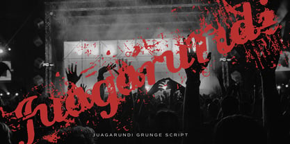
  22. Set Fire To The Rain by Kimberly Geswein, $5.00
    This font was drawn with a round marker and is very bubbly and girly.
  23. Hebrew Rose Pro by Samtype, $39.00
    This beautiful hebrew swash font is for book covers, poster, titles and small texts.
  24. Christmas by DNC, $22.00
    This font enables users to spice up their seasonal greeting cards with Christmas symbols.
  25. LDJ Tickled Tourist by Illustration Ink, $3.00
    This font is a lot of fun and will definitely tickle your funny bone!
  26. Birana MF by Masterfont, $59.00
    The beauty is in the subtle curves of this font. So clear so elegant.
  27. LeeorPasta MF by Masterfont, $59.00
    This is what happens when you try to write with a bottle of sauce...
  28. Ungap Blocks by Pedro Teixeira, $10.00
    Ungap Blocks This font was designed by blocks, square glyphs, by Pedro Teixeira Foundry
  29. CalligraPhillip by JOEBOB graphics, $19.00
    This font was written with a calligraphic pen, loosely based on old-school calligraphy.
  30. Arts And Crafts Sans BA by Bannigan Artworks, $19.95
    This is the sans serif version of my Arts and Crafts family of typefaces.
  31. Jaipur by Vic Fieger, $7.99
    This font was designed to resemble the Indo-Aryan scripts of the Indian subcontinent.
  32. Hoyts German Cologne by Coffee Bin Fonts, $20.00
    This font was inspired by lettering found on old tradecards from the 19th century.
  33. Yuma by Otto Maurer, $19.00
    This Font is made for a Capture Function on an Web template. For Security.
  34. Caslon 540 by Bitstream, $29.99
    William Caslon’s design as made regular by ATF at the beginning of this century.
  35. LD Unique by Illustration Ink, $3.00
    Download this "Unique" font…it'll add a whole new twist to your scrapbook journaling.
  36. Kartisiot MF by Masterfont, $59.00
    This rough and dirty font is just perfect for your next horror movie poster.
  37. Birac DT by DTP Types, $49.00
    This design is based on custom design work by DTP Types Limited in 1990.
  38. Delargo DT Rounded by DTP Types, $49.00
    This design is based on DelargoDT, the popular humanist sans from DTP Types Limited.
  39. BrandLaw by Hanifarifinsyah, $20.00
    Brand Law is a Serif Font Family. This font is designed by Hanif Arifinsyah.
  40. AleKoteret MF by Masterfont, $59.00
    This high readable font family is highly suitable for headlines as well as text.
Looking for more fonts? Check out our New, Sans, Script, Handwriting fonts or Categories
abstract fontscontact usprivacy policyweb font generator
Processing