10,000 search results
(0.042 seconds)
- Corporate A WGL by URW Type Foundry,
$210.99 The Corporate ASE typeface trilogy was designed by Prof. Kurt Weidemann, a well-known German designer and typographer, from 1985 until 1990. This superb trilogy consisting of the Corporate A (Antiqua), Corporte S (Sans Serif), and Corporate E (Egyptian) is a design program of classical quality, perfectly in tune with each other. Weidemann says: "My ASE trilogy, quite like triplets, is in perfect harmony and covers all needs of modern typography!" Initially exclusively designed for DaimlerChrysler as a corporate font, the ASE trilogy may be now licensed and used without restriction. URW++ digitized the ASE for DaimlerChrysler and Prof. Weidemann and is the exclusive licencing agent for this outstanding and extremely popular typeface program. Meanwhile, URW++ enhanced the Corporate ASE family in regular, bold, italic, and bold italic by Greek, Cyrillic, and all additional Latin characters to cover Eastern Europe including the Baltic Rim, Romania and Turkey. Corporate ASE in regular, bold, italic, and bold italic is now available in the WGL 4 character complement.
 - Prussian Brew - Unknown license

- Kandide Upper Wide - Unknown license

- Kandide Unicase Wide - Unknown license

- Futurex Transmaat - Unknown license

- Sanderyna by Sealoung,
$15.00 Sanderyna is a simple and dainty handwritten font. It looks beautiful on a variety of designs requiring a personalized style, such as wedding invitations, thank you cards, weddings, greeting cards, logos and so on.
 - Lady Ice - SC - Unknown license

- Lady Ice - Light - Unknown license

- Lady Ice - Extra Light - Unknown license

- Lady Ice Revisited - Unknown license

- Luteous Aublikus - Unknown license

- Futurex Aurelius - Unknown license

- Trustee by Look Minus Today,
$14.00 Trustee Modern Retro Bold Serif . That has a unique style & luxurious look. is great for logos, editorial, web design, craft projects, shirts, decoration, wedding invitations, packaging, stickers, social media, quotes, magazines and more!. The unique sharp serifs mixed with thin strokes give off a bold mid century architectural vibe. Trustee features: · Alternates And Ligatures · Uppercase And Lowercase · Numerals & Punctuation · Accented characters · Format File: OTF,TTF,WOFF,WOFF2 · Multilingual Support · Unicode PUA Encoded While using this product, if you encounter any problem or spot something we may have missed, please don't hesitate to drop us a message. We'd love to hear your feedbacks in order to further fine-tune our products. Thanks and have a wonderful day
 - Concrete Thick by Sohel Studio,
$16.00 Concrete Thick Modern Retro Bold Serif . That has a unique style & luxurious look. is great for logos, editorial, web design, craft projects, shirts, decor, wedding invitations, packaging, stickers, social media, quotes, magazines and more!. The unique sharp serifs mixed with thin strokes give off a bold mid century architectural vibe. Concrete Thick features: · 4 Weights font (Regular,Oblique,Bold,Thin) · Uppercase And Lowercase · Numerals & Punctuation · Accented characters · Multilingual Support · Unicode PUA Encoded While using this product, if you encounter any problem or spot something we may have missed, please don't hesitate to drop us a message. We'd love to hear your feedbacks in order to further fine-tune our products. Thanks and have a wonderful day
 - The Thief Bird by Lemur,
$14.00 The Thief Bird is an informal grotesque font. Although informal and grotesque may seem to be two quite different ideas, we have to dig into the origin of this typeface in order to understand the matter. The concept behind The Thief Bird was inspired by the adaptation that the vintage sign painters made when they took the grotesque style characters they saw in newspapers and magazines and reproduced them using a brush, aiming to make the prices of the products displayed on wooden boards stand out, as opposed to highlighting large headlines (such as the idea behind fonts like Franklin Gothic). The Thief Bird takes the language from sign painters and turns it into a font --this time around not aiming to set prices but to bring children stories to life. Thus, some legibility features from grotesque fonts were mixed with the brush calligraphy to add grace and zest to a font intended for children. The Thief Bird is a playful display font, with cheerful ligatures and alternate characters. It is really attractive for setting short paragraphs that tell stories for little people. The Thief Bird has one single weight and it’s ideal to be used in storybooks, candy packaging, films, toys, logos, labels, etc. The font has an extended set of 643 characters supporting 219 Latin languages. It has a complete set of small caps, sensitive cases, more than 30 pairs of ligatures, alternate characters and much more. This cool, informal and laid back typeface will be the perfect match for illustrations of fairy tales, comics for children and any product or publishing for the little ones. The Thief Bird supports this languages: Abenaki, Afaan Oromo, Afar, Afrikaans, Albanian, Alsatian, Amis, Anuta, Aragonese, Aranese, Aromanian, Arrernte, Arvanitic (Latin), Asturian, Atayal, Aymara, Bashkir (Latin), Basque, Bemba, Bikol, Bislama, Bosnian, Breton, Cape Verdean Creole, Catalan, Cebuano, Chamorro, Chavacano, Chichewa, Chickasaw, Cimbrian, Cofán, Corsican Creek,Crimean Tatar (Latin),Croatian, Czech, Dawan, Delaware, Dholuo, Drehu, Dutch, English, Estonian, Faroese, Fijian Filipino, Finnish, Folkspraak, French, Frisian, Friulian, Gagauz (Latin), Galician, Ganda, Genoese, German, Gikuyu, Gooniyandi, Greenlandic (Kalaallisut)Guadeloupean, Creole, Gwich’in, Haitian, Creole, Hän, Hawaiian, Hiligaynon, Hopi, Hotcąk (Latin), Hungarian, Icelandic, Ido, IgboI, locano, Indonesian, Interglossa, Interlingua, Irish, Istro-Romanian, Italian, Jamaican, Javanese (Latin), Jèrriais, Kala Lagaw Ya, Kapampangan (Latin), Kaqchikel, Karakalpak (Latin), Karelian (Latin), Kashubian, Kikongo, Kinyarwanda, Kiribati, Kirundi, Klingon, Ladin, Latin, Latino sine Flexione, Latvian, Lithuanian, Lojban, Lombard, Low Saxon, Luxembourgish, Maasai, Makhuwa, Malay, Maltese, Manx, Māori, Marquesan, Megleno-Romanian, Meriam Mir, Mirandese, Mohawk, Moldovan, Montagnais, Montenegrin, Murrinh-Patha, Nagamese Creole, Ndebele, Neapolitan, Ngiyambaa, Niuean, Noongar, Norwegian, Novial, Occidental, Occitan, Old Icelandic, Old Norse, Oshiwambo, Ossetian (Latin), Palauan, Papiamento, Piedmontese, Polish, Portuguese, Potawatomi, Q’eqchi’, Quechua, Rarotongan, Romanian, Romansh, Rotokas, Sami (Inari Sami), Sami (Lule Sami), Sami (Northern Sami), Sami (Southern Sami), Samoan, Sango, Saramaccan, Sardinian, Scottish Gaelic, Serbian (Latin), Seri, Seychellois Creole, Shawnee, Shona, Sicilian, Silesian, Slovak, Slovenian, Slovio (Latin), Somali, Sorbian (Lower Sorbian), Sorbian (Upper Sorbian), Sotho (Northern), Sotho (Southern), Spanish, Sranan, Sundanese (Latin), Swahili, Swazi, Swedish, Tagalog, Tahitian, Tetum, Tok Pisin, Tokelauan, Tongan, Tshiluba, Tsonga, Tswana, Tumbuka, Turkish, Turkmen (Latin), Tuvaluan, Tzotzil, Uzbek (Latin), Venetian, Vepsian, Volapük, Võro, Wallisian, Walloon, Waray-Waray, Warlpiri, Wayuu, Welsh, Wik-Mungkan, Wiradjuri, Wolof, Xavante, Xhosa, Yapese, Yindjibarndi, Zapotec, Zulu, Zuni.
 - Luteous Industrious - Unknown license

- Luteous Maximus - Unknown license

- Luteous Viscous - Unknown license

- Luteous Exodus - Unknown license

- Salting by Goodigital13,
$20.00 Suitable for design, element design, wedding, event, t-shirt, logo, badges, sticker, and awesome work, etc…This font is suitable for use on business cards, weddings, t-shirt designs, logos, magazines, quotes, fashion, watermarks, invitations, signatures.
 - Erotica by Lián Types,
$49.00 “A picture is worth a thousand words” and here, that’s more than true. Take a look at Erotica’s Booklet; Erotica’s Poster Design and Erotica’s User’s Guide before reading below. THE STYLES The difference between Pro and Std styles is the quantity of glyphs. Therefore, Pro styles include all the decorative alternates and ligatures while Std styles are a reduced version of Pro ones. Big and Small styles were thought for better printing results. While Big is recommended to be printed in big sizes, Small may be printed in tiny sizes and will still show its hairlines well. INTRODUCTION I have always wondered if the circle could ever be considered as an imperfect shape. Thousands of years have passed and we still consider circles as synonyms of infinite beauty. Some believe that there is something intrinsically “divine” that could be found in them. Sensuality is many times related to perfectly shaped strong curves, exuberant forms and a big contrasts. Erotica is a font created with this in mind. THE PROCESS This story begins one fine day of March in 2012. I was looking for something new. Something which would express the deep love I feel regarding calligraphy in a new way. At that time, I was practicing a lot of roundhand, testing and feeling different kinds of nibs; hearing the sometimes sharp, sometimes soft, sound of them sliding on the paper. This kind of calligraphy has some really strict rules: An even pattern of repetition is required, so you have to be absolutely aware of the pressure of the flexible pen; and of the distance between characters. Also, learning copperplate can be really useful to understand about proportion in letters and how a minimum change of it can drastically affect the look of the word and text. Many times I would forget about type-design and I would let myself go(1): Nothing like making the pen dance when adding some accolades above and below the written word. Once something is mastered, you are able to break some rules. At least, that’s my philosophy. (2) After some research, I found that the world was in need of a really sexy yet formal copperplate. (3) I started Erotica with the idea of taking some rules of this style to the extreme. Some characters were drawn with a pencil first because what I had in mind was impossible to be made with a pen. (4) Finding a graceful way to combine really thick thicks with really thin hairlines with satisfactory results demanded months of tough work: The embryo of Erotica was a lot more bolder than now and had a shorter x-height. Changing proportions of Erotica was crucial for its final look. The taller it became the sexier it looked. Like women again? The result is a font filled with tons of alternates which can make the user think he/she is the actual designer of the word/phrase due to the huge amount of possibilities when choosing glyphs. To make Erotica work well in small sizes too, I designed Erotica Small which can be printed in tiny sizes without any problems. For a more elegant purpose, I designed Erotica Inline, with exactly the same features you can find in the other styles. After finishing these styles, I needed a partner for Erotica. Inspired again in some old calligraphic books I found that Bickham used to accompany his wonderful scripts with some ornated roman caps. Erotica Capitals follows the essentials of those capitals and can be used with or without its alternates to accompany Erotica. In 2013, Erotica received a Certificate of Excellence in Type Design in the 59th TDC Type Directors Club Typeface Design Competition. Meet Erotica, beauty and elegance guaranteed. Notes (1) It is supossed that I'm a typographer rather than a calligrapher, but the truth is that I'm in the middle. Being a graphic designer makes me a little stubborn sometimes. But, I found that the more you don't think of type rules, the more graceful and lively pieces of calligraphy can be done. (2) “Know the forms well before you attempt to make them” used to say E. A. Lupfer, a master of this kind of script a century ago. And I would add “And once you know them, it’s time to fly...” (3) Some script fonts by my compatriots Sabrina Lopez, Ramiro Espinoza and Alejandro Paul deserve a mention here because of their undeniable beauty. The fact that many great copperplate fonts come from Argentina makes me feel really proud. Take a look at: Parfumerie, Medusa, Burgues, Poem and Bellisima. (4) Some calligraphers, graphic and type designer experimented in this field in the mid-to-late 20th century and made a really playful style out of it: Letters show a lot of personality and sometimes they seem drawn rather than written. I want to express my sincere admiration to the fantastic Herb Lubalin, and his friends Tony DiSpigna, Tom Carnase, and of course my fellow countryman Ricardo Rousselot. All of them, amazing.
 - Path 101 - Unknown license

- Pecot - Unknown license

- JT Collect by OGJ Type Design,
$35.00 JT Collect is a hybrid sans-serif typeface for the 21st century that takes a playful approach to the type design heritages of Germany and Switzerland. Confidently built on a geometric structure and infused with elements from traditional grotesque typefaces, it hits the sweet spot between geo and grot. I developed JT Collect purely digitally, drawing from years of experience with analog type design. The letters aren’t based on one particular source but seek to merge different type genres from the first half of the 20th century and lift them to a contemporary quality level. JT Collect is less reserved than strictly geometric designs and brings some industrial workmanship and honesty into the game. The six weights plus three optical sizes of JT Collect offer what you need to make an impact. While cool and elegant in the Light weight, the fonts show more presence on the page as they grow bolder. To this end, I drew the letterforms with a slightly unrefined, brawny air in the bolder weights. This sets them apart from the perceived purity of more geometric designs. The Book weight is ideal for short texts and medium-length copy, and the forceful Bold makes wordmarks look crisp and lets headlines radiate cosmopolitan self-confidence. JT Collect is suitable as a primary typeface for branding, advertising, packaging, stationery, posters, documents, and websites from trades and industries as diverse as food & fashion, media & makers, culture & creators, games & gems, sports & startups. Use JT Collect for film titles or watch faces, for leaflets or store signs, for business cards or billboards: this font family is as adaptable as a chameleon (and like a chameleon, it’s never boring). Try it in different contexts. You won’t be disappointed. Its adaptability also makes JT Collect a great starting point for poised and persuasive font combinations. Even a sans/sans pairing is possible due to hybrid nature of JT Collect—something that’d be hard to achieve with most other sans-serif typefaces on the market. You can add to it a heavy slab from the OGJ library, like Temper Wide. You might go for a geometric or a grotesque typeface as secondary (text) typeface. Or you could set your body copy in a classic serif typeface such as Caslon, Sabon, or Plantin. That’s right: JT Collect is a true team player. Whether you need a grotesque or a geometric sans: try JT Collect. You can get the best of both worlds.
 - Tipo Metro CDMX by Ixipcalli,
$- La tipografía “Tipo Metro CDMX” fue desarrollada por Lance Wyman como parte del proyecto “Metro” desde los años setenta, y es uno de los elementos clave de la cultura visual del transporte del Sistema de Transporte Colectivo Metro (STC Metro). Este estilo se ha convertido en el icónico fundamental del trasporte público para los residentes de la Ciudad de México. En esta edición, los tipos minúsculas son una adaptación “no oficial” para el Tipo Metro CDMX, enriqueciendo la tipografía a un estilo visual de altas y bajas, por lo que se prescinde del diseño base como trabajo propio para enfatizar los tipos minúsculas exclusivamente, además de que se han añadido algunos caracteres de acentuación extendiendo su uso a otros lenguajes. Los tipos son una nueva propuesta por Ixipcalli en el presente año 2023. The “Tipo Metro CDMX” typeface was developed by Lance Wyman as part of the “Metro” project since the 1970s, and is one of the key elements of the visual culture of transportation of the Metro Collective Transportation System (STC Metro). This style has become the iconic fundamental of public transportation for the residents of Mexico City. In this edition, the lowercase types are an “unofficial” adaptation for the Tipo Metro CDMX, enriching the typography with a visual style of highs and lows, so the base design is dispensed with as my own work to emphasize the lowercase types exclusively, In addition, some accentuation characters have been added, extending their use to other languages. The types are a new proposal by Ixipcalli in the current year 2023.
 - Lady Ice - 3D - Unknown license

- Solantha by Attype Studio,
$14.00 Solantha is handwritting font with ligatures. This font perfect for wedding theme design. Combine it with Solantha ligatures to make perfect design for yor projects. Solantha perfect for wedding invitation, promotion, wedding invitation, branding, logo, invitation, stationery, social media post, product packaging, merchandise, blog design, game titles, cute style design, Book/Cover Title and more. What's Included : - Solantha - Ligature - Multilingual Support --- Hope you enjoy with our font! Attype Studio
 - Amarithe by Putracetol,
$21.00 Amirithe is a beautiful modern calligraphy wedding font. This font is feminime, elegant, messy and modern. Amirithe perfect for wedding event, anniversary, birthday,greeting cards, logotype, branding, wedding invite and card, elegant logo, poster, packaging, stationery, website, and any other projects requiring a handwritten and luxurious touch. Come with open type feature with a lot of alternates, its help you to make great lettering. This font is also support multi language.
 - Halau Serif by Vintage Voyage Design Supply,
$10.00 Introducing mid-century modern font family – Halau Serif. Classic mid-century serif with characteristic cartoon look. Straight for your summer projects. More fun, more sun and more retro-modern! Play with it and get really cool retro-lettering style. Also, you can use some alternates (A, E, K, R, Y, a, g, l, k). Also, you get Mid-Century Modern style graphic objects set as letters and numerals alternates (36 Total).
 - Futurex Transmaat - Unknown license

- Butter Tropical by Allouse Studio,
$14.00 Proudly Presenting, Butter Tropical a Handwritten Font Duo Original and Script. Both Fonts come with Multi-Lingual Support to fulfill your need. We highly recommend using a program that supports OpenType features and Glyphs panels like many of Adobe apps and Corel Draw, so you can see and access all Glyph variations. Butter Tropical is perfect for any tittle, logo, product packaging, branding project, megazine, social media, wedding, or just used to express words above the background. Enjoy the font, feel free to comment or feedback, send me PM or email. Thank You!
 - Hello Kartina by madjack.font,
$14.00 Hello Kartina Script is a beautiful, organic, and fun hand-painted script with different basics and handkerchiefs that can be applied at the beginning and end of all lowercase letters. International support for most Western languages is included. For separate font swash, type lowercase a-z for initial swash and final swash. This font can be used for various purposes. Such as titles, signatures, , wedding invitations, t-shirts, letterhead, signage, labels, news, posters, badges etc. Thank you very much for searching and letting me know if you have questions.
 - Galih Ratna by Allouse Studio,
$16.00 Galih Ratna A Lovely Calligraphy Font Galih Ratna is perfect for any titles, logo, product packaging, branding project, megazine, social media, wedding, or just used to express words above the background. Galih Ratna also come with beginning and ending swash, stylistic set and Multi-Lingual Support. We highly recommend using a program that supports OpenType features and Glyphs panels like many of Adobe apps and Corel Draw, so you can see and access all Glyph variations. Enjoy the font, feel free to comment or feedback, send me PM or email. Thank You!
 - Happiness Machine by Allouse Studio,
$16.00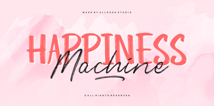 Proudly Presenting, Happiness Machine a cool Font Duo. Happiness Machine is perfect for any titles, logo, product packaging, branding project, megazine, social media, wedding, or just used to express words above the background. Happiness Machine come with alternates, underline style and also Multi-Lingual Support. We highly recommend using a program that supports OpenType features and Glyphs panels like many of Adobe apps and Corel Draw, so you can see and access all Glyph variations. Enjoy the font, feel free to comment or feedback, send me PM or email. Thank You!
 - Dioksiany by sizimon,
$20.00 Introducing our new font the Dioksiany! Inspired by Sophisticated Fashion Style. Classy, contemporary paired font. It is free-flowing, fashionable, feminine, and friendly. Use the fonts for: logos, branding, wedding invitations, farmhouse decor, farmhouse signs, mugs, shirts, pantry labels, stickers, business cards, greeting cards, posters, social media, planner prints and websites. Dioksiany Includes: Uppercase, lowercase, numeral, punctuation & Symbol Multilingual support Stylistic alternates 55 Discretionary ligatures 10 swash (numeral keys) PUA Encoded Characters Fully accessible without additional design software. If you have any question please do not hesitate to contact me: sizimon.id@gmail.com
 - Tokyosign by Allouse Studio,
$16.00 Tokyosign come with Multi-Lingual Support. Enjoy the font and feel the natural impression like the handwritten style itself! We highly recommend using a program that supports OpenType features and Glyphs panels like many of Adobe apps and Corel Draw, so you can see and access all Glyph variations. Tokyosign is perfect for any tittle, logo, stationery, product packaging, branding project, megazine, social media, wedding, or just used to express words above the background. Enjoy the font, feel free to comment or feedback, send me PM or email. Thank You!
 - Bramz by Ergibi Studio,
$19.00 BRAMS Display Serif Font. This font has unique and sleek letterform, make it great to be used for modern and minimalistic design theme. The unique ligatures on serif makes this typeface cool and stands out rather than the regular serif font, perfectly for headlines, logos, posters, packaging, T-shirts,coffee shops, restaurants, magazine’s headers, signs or gift/post cards,cafe’s and weddings or any type of advertising purpose. BRAMS only comes with an uppercase, Numeral, Punctuation, Ligature, and also Support Multi Language. if you have any Question please Message Me. Thank you ERGIBI STUDIO
 - Grindline by Allouse Studio,
$16.00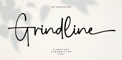 Proudly Present, Grindline a Signature Handwritten Font. Grindline is perfect for any titles, logo, product packaging, branding project, megazine, social media, wedding, or just used to express words above the background. Grindline come with ligatures, stylistic alternates, beginning and ending swash, also Multi-Lingual Support. We highly recommend using a program that supports OpenType features and Glyphs panels like many of Adobe apps and Corel Draw, so you can see and access all Glyph variations. Enjoy the font, feel free to comment or feedback, send me PM or email. Thank You!
 - Alafyou Swirly by Allouse Studio,
$16.00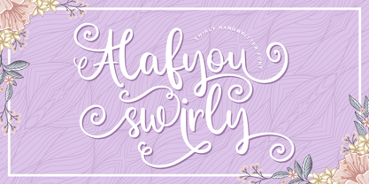 Proudly Present, Alafyou Swirly a Handwritten Font with swirly swashes. Alafyou Swirly is perfect for any titles, logo, product packaging, branding project, megazine, social media, wedding, or just used to express words above the background. Alafyou Swirly come with many alternates and swashes, also Multi-Lingual Support. We highly recommend using a program that supports OpenType features and Glyphs panels like many of Adobe apps and Corel Draw, so you can see and access all Glyph variations. Enjoy the font, feel free to comment or feedback, send me PM or email. Thank You!
 - AggressIan by Hackberry Font Foundry,
$13.95 AggressIan is the release of the first font I ever drew. It was done by hand with triangle and parallel rule back in the mid-1980s. I originally called it Aggressor, but I never liked it. My local type designer friend, Ian Roberts, really likes this type of drawing and told me I had to release it. So I named it after him. The small caps should work well if you need a bolder version. It has oldstyle and lining figures, plus the small cap figures. I hope you like it.


