10,000 search results
(0.078 seconds)
- Southern Nights by Breauhare,
$35.00 Based on the hit album by Glen Campbell, Southern Nights is the font with a style that’s “free as a breeze,” as the song says. It’s fun and casual, yet it has a flair for fashion and elegance. It also has an art nouveau look which lends itself to greeting cards as well as the branding of perfume, clothing, retailing, dining, and other luxury/high-end uses. This font includes alternate characters for the upper R, S, and T, the lower g and z, plus ligatures that include a double lower t and double lower l (L). As the song might say, I apologize to anyone who can truly say that they have found a better font! Digitized by John Bomparte.
 - Familytalk by Ditatype,
$29.00 Familytalk is a script font that exudes confidence and elegance in every character. With its thick and sturdy strokes, this font commands attention. The swinging endings on certain letters provide a delightful sense of rhythm and flow to the text. These unique design elements create a sense of movement within the text, making it visually captivating and engaging. Despite its thick weight, Familytalk maintains excellent legibility. Its ability to strike a balance between boldness and grace makes it a versatile choice for projects that demand a stylish script font. Familytalk fits in headlines, logos, posters, flyers, branding materials, print media, editorial layouts, and many more designs. Find out more ways to use this font by taking a look at the font preview.
 - Fracture by Scholtz Fonts,
$21.00 Fracture is a broken font -- broken into many pieces -- yet it still conveys a powerful and modern message. It is a funky, in-your-face font that has strong overtones of modern rap and hip-hop culture. Its fragmented look brings to mind graffiti, contemporary youth culture, kids-on-the-move. Fracture is a must for movie posters, event posters, CD & DVD covers, clothing ads & swing tags, funky magazines, in fact, any product aimed at the young, trendy market. The font is letterspaced and kerned and has a complete character set (all upper and lower case, numerals and mathematical symbols and a complete set of accented and special characters).
 - DT Lythmore by Dragon Tongue Foundry,
$9.00 Lythmore This font is called Lythmore and is inspired by Lithos. Lithos was originally designed for Adobe by Carol Twombly in 1990, based it on the lettering from ancient Greek inscriptions. The Capitals are similar in feel and design, but is totally original and built from scratch. It is designed to be similar intentionally, but it is not a clone or rip off. Lithos is an example of a simple blocky san serif font style, with subtly concave sides, angled ends, and off centred curves. Lythmore is also an example of that same style. But is also different in places where I felt it could be improved. And it has a complete lower case set, which Lithos doesn't. I built Lythmore with 8 different weights. Lythmore can be very effective when used in advertising and general display work, but it can also be used for much more. Although it was never designed to be body copy, when used as such, it is still perfectly readable and adds its own version of sans serif style and flavour. I have included two versions of the Lythmore family. Lythmore A and Lythmore B. In the Lythmore A family, the lighter 4 weights all vary in weight in both the horizontal and vertical axis. The heavier 4 weights all vary in the horizontal axis only. In the Lythmore B family, the transition is even in both directions across the entire family. The result of this difference is that the A and B versions difference is most noticeable between the Regular and Medium weights. While the extreme ends of each family version are virtually identical.
 - Bali Script by Eclectotype,
$40.00 Inspired by the Indonesian island’s laid back feel and easy going culture, Bali Script is a tribute to the hand-lettered signage on beach bars, surf shacks and cafes. The swell of the stroke endings and the bolder-than-your-average gooey look convey a cool, contemporary take on baseball scripts. Overlay Bali Script Highlight for a cartoonish, glossy finish. Perfect for logos. This font is jam-packed with OpenType features that make smooth flowing text a doddle. Contextual alternates and ligatures are best left on by default. The alternates especially work a subtle magic that helps letters connect with an even rhythm, and automatically substitutes letters with the best fit alternatives based on their context, such as at the end of words, or adjacent to certain other letters. There are four stylistic sets (or all grouped together in the stylistic alternates feature for those without easy access to them) which do the following: SS01 - changes the r to a script form SS02 - makes certain caps more ‘scripty’ SS03 - capital I (and accented versions of it) get serifs SS04 - underline function. typing two or more underscores extends on underline beneath the previous word. Also included for your pleasure - oldstyle figures, automatic fractions, superior and inferior numbers, ordinals, some discretionary ligatures, swash alternates and extended language support.
 - Rogsant Crisp by Mans Greback,
$69.00 Rogsant Crisp is a luxurious sans serif typeface that combines contrasting letterforms with delicate and fine features, creating a beautiful and tasteful appearance. Designed by Mans Greback & Delaga, this clean and clear font exudes professionalism and style, making it perfect for fashion, art, and high-end branding projects. The elegance of Rogsant Crisp lies in its attention to detail and carefully crafted letterforms, which allow for a harmonious balance between sophistication and readability. With its refined appearance, Rogsant Crisp is an ideal choice for both print and digital designs that require a touch of luxury and delicacy. The font is built with advanced OpenType functionality and has a guaranteed top-notch quality, containing stylistic and contextual alternates, ligatures, and more features; all to give you full control and customizability. It has extensive lingual support, covering all Latin-based languages, from Northern Europe to South Africa, from America to South-East Asia. It contains all characters and symbols you'll ever need, including all punctuation and numbers. Mans Greback is a dedicated typeface designer from Sweden, who continually strives to create innovative and unique fonts. His passion for design and typography shines through in his work, earning him recognition from designers around the globe.
 - Habita Scenic by Mans Greback,
$59.00 Habita Scenic is the heavy and beautiful serif font that adds a touch of femininity and class to any project. Designed by Mans Greback in 2023, this font features high contrast and retro style, making it the perfect choice for designers looking to add a touch of cool to their work. With its beautiful swash letters, Habita Scenic is perfect for logos, headlines, and other creative projects. This font's classic and elegant design makes it an ideal choice for high-end brands and premium products. If you're looking for a font that exudes sophistication and timeless style, look no further than Habita Scenic. Use underscore _ anywhere to make a swash. Example: Love_Passion The Habita Scenic family consists of four high-quality fonts: Regular, Italic, Bold and Bold Italic The font is built with advanced OpenType functionality and has a guaranteed top-notch quality, containing stylistic and contextual alternates, ligatures and more features; all to give you full control and customizability. It has extensive lingual support, covering all Latin-based languages, from Northern Europe to South Africa, from America to South-East Asia. It contains all characters and symbols you'll ever need, including all punctuation and numbers.
 - FS Brabo Paneuropean by Fontsmith,
$90.00Worldly Even though it’s a new arrival, FS Brabo has seen the world. Designed by a Brazilian working in London and studying in Belgium under a Dutchman, it’s certainly well-travelled. And it was inspired by the extraordinary archive of early book typefaces at the world-renowned Plantin-Moretus Museum in Antwerp, while Fernando Mello was attending Frank Blokland’s Expert class Type Design course at the Plantin Institute of Typography. It was there that Fernando became engrossed in the collection of early metal type, matrices, punches and type samples by figures such as Garamond and Granjon. So much so that he took on the mighty task of developing ‘a beautiful, functional, serifed text font’ of his own. Heroic FS Brabo’s journey from sketch to font family took an epic three years, starting in Antwerp, continuing at Fontsmith in London, and reaching its conclusion back in Fernando’s home city of São Paulo. No wonder Fernando was reminded of another titanic face-off: that of Antwerp’s Roman hero of legend, Silvius Brabo, and the evil ogre, Antigoon. Brabo came to the town’s rescue after the tyrannical giant had been charging ships’ captains extortionate taxes and chopping off the hands of those who refused to pay up. Having finally downed Antigoon after a long and terrible duel, Brabo cut off the giant’s own hand and threw it into the river Scheldt, unwittingly giving the town its name: the Dutch for ‘hand-throw’ is hand werpen. What better way for Fernando to name his literary typeface than after the hero of Antwerp’s oldest tale? The garalde factor FS Brabo is not a revival, but a very much a contemporary, personal interpretation of a garalde – a class of typeface originating in the 16th century that includes Bembo, Garamond and Plantin, with characteristically rounded serifs and moderate contrast between strokes. Brabo’s ‘ct’ and ‘st’ ligatures, upper-case italic swashes and contextual ending ligatures – ‘as’, ‘is’, ‘us’ – all preserve the beauty and character of traditional typefaces, but its serifs are chunkier than a garalde. Their sharp cuts and squared edges give them a crispness at text sizes, helping to bring a beautifully bookish personality to hardworking modern applications. A workhorse with pedigree It may give the appearance of a simple, four-weight typeface, but FS Brabo has hidden depths beneath its simplicity and beauty. OpenType features such as cap italic swashes, contextual ending swashes – programmed only to appear at the end of words – and stylistic alternatives make this a complete and well-equipped typeface. Comprehensive testing was carried out at text and display sizes, too, to prevent counters from filling in. All of which makes FS Brabo a very modern take on a traditional workhorse serif typeface: colourful and versatile enough to adorn not just editorial projects but also signage, advertising and logotypes. - FS Brabo by Fontsmith,
$80.00 Worldly Even though it’s a new arrival, FS Brabo has seen the world. Designed by a Brazilian working in London and studying in Belgium under a Dutchman, it’s certainly well-travelled. And it was inspired by the extraordinary archive of early book typefaces at the world-renowned Plantin-Moretus Museum in Antwerp, while Fernando Mello was attending Frank Blokland’s Expert class Type Design course at the Plantin Institute of Typography. It was there that Fernando became engrossed in the collection of early metal type, matrices, punches and type samples by figures such as Garamond and Granjon. So much so that he took on the mighty task of developing ‘a beautiful, functional, serifed text font’ of his own. Heroic FS Brabo’s journey from sketch to font family took an epic three years, starting in Antwerp, continuing at Fontsmith in London, and reaching its conclusion back in Fernando’s home city of São Paulo. No wonder Fernando was reminded of another titanic face-off: that of Antwerp’s Roman hero of legend, Silvius Brabo, and the evil ogre, Antigoon. Brabo came to the town’s rescue after the tyrannical giant had been charging ships’ captains extortionate taxes and chopping off the hands of those who refused to pay up. Having finally downed Antigoon after a long and terrible duel, Brabo cut off the giant’s own hand and threw it into the river Scheldt, unwittingly giving the town its name: the Dutch for ‘hand-throw’ is hand werpen. What better way for Fernando to name his literary typeface than after the hero of Antwerp’s oldest tale? The garalde factor FS Brabo is not a revival, but a very much a contemporary, personal interpretation of a garalde – a class of typeface originating in the 16th century that includes Bembo, Garamond and Plantin, with characteristically rounded serifs and moderate contrast between strokes. Brabo’s ‘ct’ and ‘st’ ligatures, upper-case italic swashes and contextual ending ligatures – ‘as’, ‘is’, ‘us’ – all preserve the beauty and character of traditional typefaces, but its serifs are chunkier than a garalde. Their sharp cuts and squared edges give them a crispness at text sizes, helping to bring a beautifully bookish personality to hardworking modern applications. A workhorse with pedigree It may give the appearance of a simple, four-weight typeface, but FS Brabo has hidden depths beneath its simplicity and beauty. OpenType features such as cap italic swashes, contextual ending swashes – programmed only to appear at the end of words – and stylistic alternatives make this a complete and well-equipped typeface. Comprehensive testing was carried out at text and display sizes, too, to prevent counters from filling in. All of which makes FS Brabo a very modern take on a traditional workhorse serif typeface: colourful and versatile enough to adorn not just editorial projects but also signage, advertising and logotypes.
 - FM Kaantaa by FontMeister,
$19.95 Kaantaa is a bold typeface that draws inspiration from stencil and technical typfaces. It has been thought as a display typeface. You can use it to create posters, greeting cards, scrapbooks, CD labels, T-shirts, coffee mugs, digital videos websites and banners.
 - Rediviva - Unknown license

- Fathir Script by Abo Daniel,
$15.00 Fathir is made with a true real handwritten style. The font comes with three style of titling and ending swash. It is very easy to access the swash characters even if you don't use pro software. The sample images show you the possibilities. Fathir is perfect for branding, quotes, logo, invitation, packaging, business card, and more. I hope you love this lovely font. Regards, Abo Daniel
 - Halaman by Attype Studio,
$15.00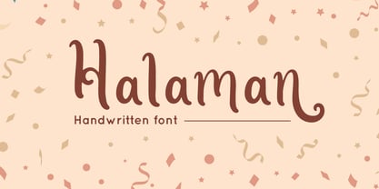 Halaman is Handwritten font with swash style, perfect for wedding design Combine it with Halaman - ending Swash to make an amazing effect on your letter! Halaman perfect for display promotion, branding, logo, invitation, stationery, social media post, product packaging, merchandise, blog design, game titles, cute style design, Book/Cover Title and more. **What's Included :** - Halaman.otf - Ending Swash - Multilingual Support --- Hope you enjoy with our font! Attype Studio
 - Skyline by Font Bureau,
$40.00 Skyline was commissioned from Font Bureau by Condé Nast specifically as a headline typeface for Traveler magazine. This strongly personal work by Imre Reiner from 1929 and 1934 was known in Europe as Corvinus. Skyline Black and Bold Condensed offer immediate headline recognition through Reiner’s variations on the themes found in the classical Modern structure. Both styles were adapted by Jane Patterson; FB 1992
 - Film Crew JNL by Jeff Levine,
$29.00It's not a new idea, but it's always a fun one... a typeface comprised of 35mm film frames. Film Crew JNL is Jeff Levine's version, utilizing his Koehler Sans JNL as the lettering inside the frames. The lesser and greater keys have solid black frames for end caps or word spacing, and there's an alternate pair of frames with clear centers on the brace keys. - BlinkHead by DePlictis Types,
$26.00 BlinkHead is a powerfull block typeface inspired by industrial revolution and machineries. It comes in three styles for the moment with possibility to be added more later. It has a dynamic, curved letter ending that makes it perfect for some modern logo designs purpose and even powerful headlines. The folded style comes as an option to change some letters in plain text for more dynamic appeal.
 - Mistery Heart by Sronstudio,
$18.00 Mistery Heart - A lovely Calligraphy Font perfect for crafting, branding, invitation, stationery, wedding designs, social media posts, advertisements, product packaging, product designs, label, photography, watermark, special events, or anything. Features: Uppercase and lowercase letters Swash alternates ( Beginning, Middle, Ending ) Multilingual symbols, numerals, and punctuation. How To Access Alternate Swashes? You can read this article: https://helpx.adobe.com/illustrator/using/special-characters.html Follow Instagram: @sronstudio Thank You!
 - Hot Ruby by Attype Studio,
$12.00 Hot Ruby is a Hand written font duo. Regular & Outline Version. Perfect for any business logo, brand and use it to create spectacular designs! Hot Ruby is perfect for branding, logo, invitation, stationery, social media post, product packaging, merchandise, blog design, game titles, cute style design, Book/Cover Title and more. What's Included : - Ending Swash - Ligatures - Multilingual Support Hope you enjoy with our font! Attype Studio
 - Century Old Style by Linotype,
$29.99In 1894, Linn Boyd Benton finished a commission for a new text typeface with the American periodical, Century magazine. Century is typical of the neorenaissance movement in typography at the end of the 19th century. Morris Fuller Benton drew a number of versions of the font for the font foundry, American Typefounders, and Century was later taken up by the firms Linotype, Intertype and Monotype. - Cuisine by Sudtipos,
$45.00 Cuisine originated from a how-to lettering book from the 1950s. It suggests the script style found on food and beverage labels in the early 20th century. This creamy font does for food advertising what Bodoni does for haute couture. Its simmering, hand-scribed charm captures the complexity of wine and the robust energy of coffee. It shines on luxe food packaging or high-end menus
 - Deco Roundpoint JNL by Jeff Levine,
$29.00 On the sheet music cover of the 1931 song "When the Autumn Leaves of Life Begin to Fall", the title is hand-lettered using a round tipped nib pen. The combination of both an Art Deco lettering style and the rounded ends of the characters creates an exquisite, yet simple type design digitally preserved as Deco Roundpoint JNL; available in both regular and oblique versions.
 - Flavium by Flanker,
$11.00 Flavium is the reconstruction of the typographic character used in the engravings of the marble street name sign of Rome from about 1970 until the end of the eighties. It is an uniquely uppercase Roman font whose letters are confined within the space between the baseline and the caps line. Its style is severe but elegant, very useful for expressing authority and officialdom with simplicity.
 - Squadzone by DePlictis Types,
$29.00 SQUADZONE it’s a young & sportive unicase style font, having both uppercase and a few smallcase alternating letters that gives it a unique look. It’s geometric anathomy of the letters may have two different types of endings or detail: straight and sharp cut out angles at 45 degrees. This offers a few alternatives in headlines or even logotype purposes that are realy encouraged to use for.
 - Piano Music JNL by Jeff Levine,
$29.00 A 1910 collection of piano sheet music called “Presser’s Economy Group” had that name hand lettered in a fancy serif lettering style that could fall somewhere between Art Nouveau and semi-calligraphic. No matter the label you attach to the style, it makes for a wonderful digital type revival. The end result is Piano Music JNL, which is available in both regular and oblique versions.
 - Quida by LetterMaker,
$25.00 Quida is a display family with three styles; Regular, Italic and script. The personality of the design comes from concave vertical shapes, which are consistent through all styles. This makes them work together seamlessly. Quida Script is packed with opentype goodness such as swash caps, stylistic alternates, ligatures and ending forms for lowercase letters. All styles have an extended language support for most European languages.
 - Flox Rounded by ParaType,
$30.00 Flex Rounded display typeface was designed in 2000 by Vladimir Pavlikov as alternative 'soft' variant to the original Flox face. In contrast to Flox there are rounded stroke ends and curved shapes in most of Flex characters. The project was aimed to create a decorative vivid alphabet of geometric shapes. Cyrillic was developed in 2005. For use in advertising and display typography. Licensed by ParaType in 2005.
 - SK Brushwood by Shriftovik,
$10.00 SK Brushwood is an experimental geometric font based on chaotic lines. It is inspired by the Greek stone script, but nevertheless it is modern. The main component of the letter shape is straight and sloping lines ending in straight corners, which makes it look like brushwood. This is why the font gets its name. SK Brushwood is perfect for headlines, posters, print work, and the Internet.
 - Century Expanded LT by Linotype,
$29.99In 1894, Linn Boyd Benton finished a commission for a new text typeface with the American periodical, Century magazine. Century is typical of the neorenaissance movement in typography at the end of the 19th century. Morris Fuller Benton drew a number of versions of the font for the font foundry, American Typefounders, and Century was later taken up by the firms Linotype, Intertype and Monotype. - Yasashii by Dharma Type,
$14.99 Yasashii is an art deco font based on Japanese designs for cosmetic packaging and posters used from the end of the 19th century to the early 20th. When you prefer more geometric letter form, please try our Diamond Ring.
 - Jelly Bean by Typadelic,
$19.00I attempted to emulate children's handwriting with this typeface. As a kid, I remember trying to create "fancy" handwriting and I ended up with something like Jelly Bean. Ideal for all designs where a happy uplifting look is desired. - Holiday by alphArt,
$13.00 Introducing our UPDATE "Holiday - Script Handwritten Font" Two years ago we created a script handwritten font that we named Holiday, we didn't expect, hundreds of designers have use the Holiday font, this is really cool font. And today, we've been working hard to make this Holiday font even better, it's the best script handwritten font we've ever made, we've named it Holiday2. Holiday2 - Script Handwritten Font is a handwritten script font with a simple and classy style, this font is great for your next creative projects such as branding, watermark on photography, signature or signature logo design, quotes, album cover, business card, and many other design project. From business cards to photo watermarks, Holiday2 is here to elevate your work to the highest level. However, we still included our old Holiday font, we created Holiday2 to be easier to read and of course with a better design and clean. Holiday comes with uppercase letters, lowercase letters, lowercase alternative letters, numbers, punctuation, ligature and multi lingual support To use alternative end text is just block end letters and select alternative letters on glyphs option. it may be used in almost any program by using your Operating System’s utilities (CharacterMap for Windows and Font Book for Mac.), as well as Illustrator, Photoshop CC 2017 and several other applications. we hope you enjoy this font. If you have any questions please don't hesitate to drop me a message :) Thank you, Best regards alphArt
 - ITC Astro by ITC,
$29.99ITC Astro is the typeface that proves you can get your work done while watching cartoons. “It all started as a series of doodles while I was watching The Jetsons,” recalls Sasa Petricic. “The show's impossibly simplistic vision of the twenty-first century cried out for a font that fit into that world -- a world where everyday objects can carry far more fun and personality than they should.” ITC Astro is the first commercial typeface design from Petricic, whose “day job” is working as a reporter for the Canadian Broadcasting Corporation. Petricic has filed stories from across Canada and around the world for CBC's flagship evening newscast, The National. His reports have also appeared on CNN and BBC Television. Petricic's work as a correspondent and video journalist have taken him to six continents, covering everything from famine and genocide in Africa to the war in Iraq. With such serious matters filling the hours of Petricic's day as a journalist, it's not hard to see why he conceived Astro as a welcome blast of whimsy. “As I began to draw the design,” he says, “I decided that every part of Astro should be a cartoon character unto itself.” Each character has its own baseline shadow (or coaster, or circular antigravity generator, depending on how you look at things). The angular caps dance jauntily, rocking from left to right, while a suite of companion small caps provide backup. The end result is a design quite unlike any other, with surprising charm and versatility. ITC Astro comes in a two-weight family of White and Black. - Sales Pitch JNL by Jeff Levine,
$29.00 Have you ever wanted to set a headline within a burst, but found the drawing of all of those angles was a bit too tedious? Sales Pitch JNL solves that problem by setting letters, numbers and punctuation inside individual sections which, when typed out, generates an extended burst pattern. For a flat sided pair of end caps, use the left or right bracket keys. For burst ends, use the left or right brace keys. A blank space is located on the equal sign keystroke, and a wider blank space is on the plus sign. Keep in mind the optical illusion in some program that shows line gaps between characters on the screen. All characters have equal sidebar settings, and are flush with each other. Sales Pitch JNL contains the basic A-Z and 0-9 characters as well as numerous punctuation. For a companion font with a more complete character set, use Prankster JNL, the same type design, but without the burst pattern.
 - Simplified by Redy Studio,
$19.00 Simplified – Casual Chic Font Simplified is a casual and natural font, with a spirit of clean-cut modern and classic. This typeface has been specially designed to give a feeling of casual luxury. This is not easy typography! We have done a lot of effort to build this font. In the past, we have experimented with a ton of fonts that are similar to Simplified, and Simplified is better in every aspect that I have found, including some OpenType features and ligatures, lowercase beginning & ending swashes that you can use to make your own style. In short, it’s a typeface that you must have! Simplified features: A full set of upper & lowercase characters Numbers & punctuation 63 Gorgeous ligatures Lowercase beginning swashes Lowercase ending swashes Multilingual symbols PUA Encoded Characters – Fully accessible without additional design software. Feel free to give me a message if you have a problem or question. Thank you so much for taking the time to look at one of our products.
 - Burner by Graffiti Fonts,
$29.99 Burner is an advanced, connecting, wildstyle graffiti font family including over 200 unique letters, numbers & symbols. The family includes outlines, fills, details and more. Mix and match glyphs from 3 alphabets, add end pieces and more. Repeating flames, arrows & flourishes & other embellishments are included. The Burner family includes 3 full alphabets in each of the 4 styles as well as numbers, punctuation and a wide array of arrows, bars , begining & end pieces. Like some of our earlier wildstyle typefaces such as RaseOne or WildStyle, the Burner font family is a layered type system made to work as a team. In nearly any application 2 or more styles can be easily layered to create advanced, multicolor, wildstyle pieces. This layering system provides a shortcut to time consuming effects such as sharp corners & variable widths on outlines, fills & details. The original glyphs were all drawn by hand taking inspiration from actual painted & drawn wildstyles from RaseOne spanning the late 90's to about 2006.
 - Rosewood by Adobe,
$29.00Rosewood font, like its relatives Zebrawood, Pepperwood and Ponderosa, was created by the designer trio K.B. Chansler, C. Crossgrove and C. Twombly, and has its roots in the slab serif style. The first weight displays the simplicity typical of display typefaces at the end of the 18th century. The other weights are playful variations on this theme. The tendency toward display and ornametal typefaces began with the English Industrial Revolution. The introduction of new machines made mass production possible in the print industry, a technique meant to constantly produce new and unusual products to sell to more and more consumers. Many of the typefaces created in this time were meant simply to catch attention and to advertise products. The two ornamental weights of Rosewood reflect this tendency and never fail to catch the reader's eye. Rosewood, like Zebrawood and Schwennel, is a bicolor font, meaning that the weight Rosewood fill can be used as a decoration for the inner spaces of Rosewood regular. - Mantika News by Linotype,
$67.99 Mantika News™, from German designer Jürgen Weltin, was designed to expand the Mantika super family with text and display typefaces for setting newspapers and periodicals. The suite of typefaces is comprised of regular and bold designs, with italic counterparts, for setting continuous text, and light and extra bold versions for setting larger sizes in headlines, sub heads, pull quotes and decks. The typefaces intended for text copy were designed with shared character widths, so that changes can be made in typeface choice without disrupting line endings or column length. The display designs have a slightly smaller x-height and shorter ascenders creating a more elegant demeanor while ensuring compact multi-line display copy. In addition, fonts of Mantika News have a large Monotype W1G (World Glyph Set 1) character set enabling the setting of Greek, Cyrillic and over 20 Eastern and Western European Latin-based languages. Proportional figures are available, in the OpenType® fonts, as an alternative to the tabular designs.
 - Guess by DearType,
$59.00 Guess is a versatile, connecting script, designed to convey elegance and style. It is slender, feminine and friendly, let alone sexy. Guess will work perfectly for fashion, e-commerce brands, trend blogs, or any business that wants to appear classy and chic. The font is ideal for high-end logotypes and magazine headlines, but let’s not forget greeting cards, invitations, posters, ads and the various web usages. When it comes to the glyph set, well, Guess Pro has quite a lot of that (2500+ glyphs) - think multiple languages and tons of swashes and stylistic alternates to unleash your creativity. For all pragmatists out there, there is also a basic version of the font with an extended latin glyph set (no swashes, contextual alternates or stylistic sets). Last, but not least, Guess comes with a neat geometric sans in capital letters, which makes a great addition to the script, and a set of beautiful ornaments and borders that complete the whole look with a bang.
 - Bodoni by Linotype,
$29.99 Giambattista Bodoni (1740–1813) was called the King of Printers and the Bodoni font owes its creation in 1767 to his masterful cutting techniques. Predecessors in a similar style were the typefaces of Pierre Simon Fournier (1712–1768) and the Didot family (1689-1836). The Bodoni font distinguishes itself through the strength of its characters and embodies the rational thinking of the Enlightenment. The new typefaces displaced the Old Face and Transitional styles and was the most popular typeface until the mid-19th century. Bodoni’s influence on typography was dominant until the end of the 19th century and, even today, inspires new creations. Working with this font requires care, as the strong emphasis of the vertical strokes and the marked contrast between the fine and thick lines lessens Bodoni’s legibility, and the font is therefore better in larger print with generous spacing. The Bodoni of Morris F. Benton appeared in 1911 with American Type Founders.
 - Kapture by Stiggy & Sands,
$39.00 There are script typefaces that embody sensuality, and our Kapture typeface is now amongst that collection. From its thin weighting to its effortlessly flowing strokes, and a visual rhythm between quick and slow movements, Kapture truly captures a romance in letterforms. Stylistic Alternates offer a change-up set of Capitals, while the Contextual Alternates feature plays with intro and final lowercase letterforms to visually mix things up a bit. Elegant, fashionable, sophisticated, sensual, and celebratory all at once. Kapture is a typestyle that finds itself at home in any design where a refined yet modern script is required. Kapture is loaded with features to give you plenty of customization options: - Stylistic Alternates for a collection of alternate Capitals - Contextual Alternates for alternate starting and ending lowercase letters - 110 Ligatures to make typesetting more dynamic - Ornaments to place before and after words or phrases for even more flair - A Full set of Inferiors and Superiors for Limitless Fractions - Proportional and Oldstyle numeral sets
