3,997 search results
(0.045 seconds)
- Namaste by Latinotype,
$49.00 With open palms, place your hands together at the center of your chest, close your eyes and bow the head slightly. Namaste! Welcome to a beautiful spiritual journey. Namaste is a font collection, designed by Coto Mendoza, consisting of two variants: a capital sans and a script font (based on watercolor calligraphy strokes). Each variant comes in 5 weights—Thin, Light, Regular, Bold and Black—and 2 versions: Essential and Pro. The script font, in its Pro version, provides a wide range of OpenType features such as swashes, alternates, ligatures and different stylistic sets. The Namaste family also includes a set of ornaments inspired by Hindu and Buddhist symbols—that Coto Mendoza saw virtually everywhere on her trip to India—like Mandalas and Yantras, and others found in textiles and monuments. Namaste is the perfect choice for wellness, healing and therapy oriented products. Its smooth shape and soft curves allow the user to create beautiful designs for essential oils, bath salts, quartz crystals, mindfoodness, candles, incense and aromatherapy products packaging. The font is well-suited for publishing design (short text); self-help and healing handbooks; tarot and divination cards; and women’s empowerment and spirituality publications. Namaste is an ideal typeface for yoga (and other body disciplines) center branding; holistic centers; and group meditation, womb blessing and circle of women invitations. Namaste is a beautiful journey full of love and inspiration. Namaste: a spiritual journey.
 - Sancoale Narrow by insigne,
$22.00 Sancoale Narrow is a carefully honed and meticulously crafted new family member for the Sancoale series. Sancoale Narrow has been specially designed to allow for even more versatility for the Sancoale Family. Sancoale Narrow continues with Sancoale's successful simple, geometric and legible structure. It is a contemporary design that is distinctive and unique. This new narrow addition can be used in conjunction with the original Sancoale, but it can also stand on its own. Narrow type comes in a handy in a myriad of situations, from poster design to book covers, web pages to editorial layouts. Sancoale Narrow's six weights make for a typeface family that is very useful for many applications, and also includes a set of true italics. The design is simplified without stems or spurs in the default character set. OpenType alternates do include alternates with stems, Small Caps, Fractions, Tabular Figures, and plenty of alts, including "normal" capitals and lowercase letters. Please see the informative .pdf brochure to see these features in action. Sancoale Narrow also includes a full array of Latin diacritics for multilingual support. OpenType capable applications such as Quark or the Adobe suite can take full advantage of the automatically replacing ligatures and alternates. This family also includes the glyphs to support a wide range of languages. The Sancoale superfamily is suitable for a wide range of uses and is a very economical and versatile addition to any designer's font collection.
 - Berimbau by PintassilgoPrints,
$29.00 Berimbau is a whimsical narrow hand-drawn typeface. It’s stylish, versatile and loaded with amazing OpenType features that do their magic in OpenType savvy applications. Its sprightly swashes and twisting stylistic alternates (say that 3 times fast!) play together to deliver a really cool contextual feature that, in a push-button way, substitutes the first letter in a word with its left swash version and the last letter with its right swash version (please type a space before and after the words).The feature also applies stylistic variants to some of the intermediate letters. Which button to push? The Contextual Alternates one! If you're not a one-click-way-person you can pick your preferred glyphs through the glyphs palette. There you’ll find at least 4 variations for each letter: left swash, right swash and 2 regular forms that correspond to the upper and lower case keys. Some letters also have a 5th variation that acts as stylistic alternate. This font is conveniently packed with the ‘access all alternates’ functionality, so when you click on a glyph at the glyphs palette you’ll see all variations available for it, making it easier to choose the one that will fit better. A bold weight was made to provide that extra-strength when a bit of… boldness is needed. Please note that it doesn’t have the advanced OpenType features (but is still very charming!). Yet, both weights have a handy set of ornaments for added yumminess.
 - Gibon by Juraj Chrastina,
$29.00 Gibon draws inspiration from the fascinating comic book universe, inhabited not only by many legendary superheroes, monsters and superbadass antiheroes, but also by its own legendary typefaces. Every cartoonist and hand letterer needs a pencil, a T-square and on and on. For digital lettering, books Gibon is an option. This handy toolkit helps you easily letter your comic strips, but even if you have nothing to do with cartooning, this bundle can simply add some comic book feel to your design or make some noise with layered sound effects. The basic font for speech balloon inking is Gibon Lettering, while Gibon Bold and Heavy let you emphasize certain text. Gibon Bold is further developed as a multilayer type where different styles are designed to be overlaid on top of each other, letting you work with built-in shadows, 3D effects and outlines to create striking SFX. Gibon Balloons offers different types of layered speech balloons and a few halftone patterns. The OpenType contextual alternate feature is set to automatically apply the random effect using two sets of glyphs. Traditionally, comic books are lettered in caps only, which explains why Gibon is an all caps font. To easily access alternate characters they are encoded as lowercase letters. For example, type the uppercase “I” to access the crossbar “I” and the lowercase “i” to access the crossbar-less “I”. Turn on stylistic set number one to use only crossbar-less “I”.
 - Zira by Artcity,
$10.00 Zira is a playful hand-drawn font family designed by Daniel Bak (Artcity). It is available in three handy weights: regular, bold and screaming. It contains international language accent marks and diacriticals, including Greek and Cyrillic. Zira can be considered as smoothed serif version of Cornelius font. Zira as Cornelius as well is a chimpanzee character in the novel and movie series Planet of the Apes. Dr. Zira is a chimpanzee psychologist and veterinarian, who specializes in the study of humans, in the novel and subsequent movie series Planet of the Apes. Zira was played in the first three Apes movies by actress Kim Hunter. Unique among the Apes characters, Zira has blue eyes. Zira is the fiancée (later wife) of Cornelius, and both are ultimately responsible to the Minister of Science, Dr. Zaius. Zira's character and role are essentially the same in both the novel and the movies, though some story details differ. Her work in each involves both working with humans under laboratory conditions (e.g. learning and behavioural experiments), and working on them physically (lobotomy and other brain surgeries, vivisection, physical endurance and tolerance experiments, and subsequent autopsies). Zira is an outspoken liberal by nature, deploring war and militancy (and despising the gorillas, who seem to make both a way of life), and eager to seek and develop intelligence anywhere it can be found. Zira literally stands for her principles - or refuses to stand, as the case may be.
 - ITC Oldbook by ITC,
$29.99For some time, Eric de Berranger had wanted to create a distressed typeface design - one that gave the appearance of antique printing and showed signs of wear, yet was still highly readable. He was busy designing a new face called Maxime, when an idea struck: I realized that I could use these lettershapes as the basis for my antique typeface," he says. The two faces ended up being designed in tandem. While ITC Oldbook clearly captures the flavor of aged, uneven and imperfect printing, it also meets de Berranger's goal of being exceptionally readable in text sizes. Beginning with well-drawn characters was the key, and these were carefully modeled into the distressed forms. "The process was more difficult than I originally thought," says de Berranger. "The antique letters had to be tested and modified several times to work correctly." ITC Oldbook elegantly simulates antique printing in both text and display sizes. And while stroke weights are uneven and curves are irregular, the design has remarkably even color when set in blocks of text copy. Add to this the design's inherent legibility, and ITC Oldbook acquires a range far beyond replication of things old; it's suitable for any project that calls for warm and weathered typography. ITC Oldbook is available in roman and bold weights with complementary italic designs. Small caps, old style figures and a suite of alternate characters and ornaments provide additional flexibility and personality to the design." - Atomicaboy by CoastalType,
$20.00 Atomicaboy is a geometric script font. Re-interpretation inspired by atomic age power tool lettering and chromed emblems of 50's. The Atomicaboy script make full use of modern technology. Just turn on automatic ligatures and watch how each letter pair always connect perfectly.
 - Magnolica by Essentials Studio,
$16.00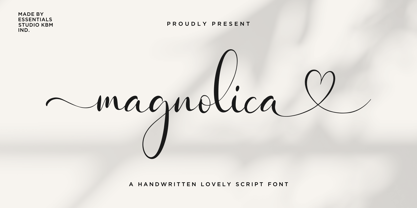 Introducing by Essentials Studio Proudly Present, Magnolina Magnolina Is a Lovely Script Font With Swash and Ligature More Than 50 Stylish love Alternate Magnolina is perfect for product packaging, branding project, megazine, social media, wedding, or just used to express words above the background.
 - Newlook by QUADRAAT,
$25.00 Newlook is a display font drawn with geometric shapes and high contrast. The stylistic set 01 shows capital letters using heights from descenders to ascenders and x height which gives a crazy dancing look. Perfect for display, poster, magazine etc… Support all latin languages.
 - Country Charm by Okaycat,
$28.50 Country Charm is a picture font. A cute collection of vectored sketches brought to life by designer Natsuko Hayashida. More than 50 unique illustrations. Her depictions of fruits, vegetables & herbs are beautiful organic shapes, perfect for you to use on signs, posters, invitations, and more.
 - Sandcastle JNL by Jeff Levine,
$29.00 Based on a popular design of the 50s-60s, Sandcastle JNL has the retro-casual charm of many prints ads of that era. It lends itself well to headlines, price tags, announcements, name plates and just about anything that recreates the mid-century panache.
 - Noad Sans by Groteskly Yours,
$60.00 Noad Sans is an experimental sans serif typeface with a strong character and some very unique visual features. At the core of Noad Sans is a sturdy sans serif with closed apertures and fairly simple letterforms. The defining feature of Noad Sans, however, is its visualised nodes: all control points of Bézier curves in each of the fonts in the family are intentionally visualised. The effect of this feature is largely defined by the usage: in titles and larger bodies of text, the visualised nodes stand out and create a rhythmic pattern of their own. In smaller sizes, the sans serif base of the font becomes more prominent and the nodes create a visual fuzz. Noad Sans comes in 6 styles and as a Variable Font with two axes–Optical Size and Slant. The size of each node can be changed from the smallest (Mini and Mini Italic) to the largest (Extra and Extra Italic). Variable Font technology allows you to fine tune the size of the nodes and the slant angle, so that your version of Noad Sans can be truly unique. Noad Sans has a large character set of 570+ glyphs, covering the vast majority of Latin based languages. In addition to that there are dozens of special characters, punctuation, numbers, and symbols. Noad Sans is equipped with a number of useful OpenType features, such as Case-Sensitive Punctuation, Stylistic Alternates, Ligatures, Fractions and many more. Noad Sans began as an experimental project, and during its development the spirit of experimentation was at the heart of the project. Thanks to the unique nature of the typeface, it can feel at home in a variety of settings: from web development, graphic and product design to more novel uses like 3D and NFTs. Noad Sans type family includes 6 static fonts (Mini, Mini Italic, Regular, Regular Italic, Extra and Extra Italic) and one variable font. Each style can be purchased separately. There is a free trial version of Noad Sans that can be downloaded free of charge on MyFonts. For more information on the typeface, feel free to download Noad Sans PDF Specimen.
 - As of my last update in April 2023, the font named "Jumbo" by dustBUSt Fonts has not been widely documented in mainstream font directories or collections. Therefore, the following description is a ge...
- Hello Paris by Sans And Sons,
$19.00 Hello Paris is Modern Serif Family with Luxury and Elegant Style consisting of a sophisticated signature-style script and an elegant, luxury all-caps serif font. This family is designed to pair harmoniously, and lend themselves to high end branding, logo designs, product packaging & invitation designs. Creates a perfect pairing contrast with combining Hello Paris Serif and Script font. A modern and elegant hand-drawn script font containing upper & lowercase characters, all punctuation and numerals. Also contains over 50+ ligatures and 50+ alternates characters to help the text flow naturally and add a custom-made feel. Language Support: All fonts support English, French, Italian, Spanish, Portuguese, German, Swedish, Norwegian, Danish, Dutch, Finnish, Indonesian, Malay, Hungarian, Polish, Turkish, Slovenian.
 - Hadnich by Arterfak Project,
$28.00 Inspired by the vintage brush typography, we proudly present Hadnich. the versatile script font. Carefully designed with the taste of old school sign painting which has the neat letterforms, attractive move and combined in modern form. Complete your font library with this cool brush font. Works perfectly for logo, signage, apparel, labels, poster, and many more! Make sure you get more variants of typographic design with a ton of alternates characters that you can access easily! There are stylistic sets 01-14, ligatures, swashes also accented characters, packed in a total of 350++ glyphs! Worth every penny. Uppercase Lowercase Numbers & symbols Stylistic sets 01-14 Ligatures Multilingual characters Thank you for watching. Keep it real!
 - Rare Bird Specimen VI by Rare Bird Font Foundry,
$200.00 Specimen VI is a refined hand by artist Aileen Fretz of Plume Calligraphy: thoroughly modern yet absolutely timeless. We have our sights set on this one becoming an instant classic. OBSERVATIONS Specimen VI takes its inspiration from the old world, while remaining thoroughly contemporary. It is unique while maintaining legibility. DEFINING CHARACTERISTICS At 2,580 characters, we dare say it is one of the most robust script fonts on the market today. The font includes extensive Opentype programming that authentically replicates Aileen’s unique handwriting pattern. As you type, watch the letters automatically adjust between connected and disconnected forms. Specimen VI also features formal titles, prepositions, social media wordart, and web navigation wordart, serif and sans serif Roman numerals, in and out-stroked letterforms at beginning and end of words, multiple alternate lowercase t cross-strokes, realistic double-letter ligatures, seamlessly connecting calligraphic letters, multiple styles of alternate capital letters, including swashes, and basic Latin encoding. Specimen VI is a typesetters’ dream. POTENTIAL SIGHTINGS In the pages of your favorite wedding tome; the signage, robe embroidery, and dinner menus of that coveted boutique hotel on the Italian Riviera, the labels of an artisanal hand-poured candle line, your new favorite Rosé, hand-crafted Belgium chocolate truffles, the indie cosmetic line fit for royalty, in any instance that you may be in need of a refined modern script.
 - Lizie Slab by Poul Allan Studio,
$26.00 Lizie Slab is a slab serif, where the geometric construction is inspired by the 1930s design icons De Stijl, Gerrit Rietveld and others. Lizie Slab is designed for both print and digital use, and you will find it ideal for packaging, poster design, catalogs and exhibition design. The font supports a wide range of languages. This OpenType contains features such as fractions, proportional and tabular shapes.
 - Century Expanded by Bitstream,
$29.99Shortly after the preparation of the original Century, the two Bentons (father Linn Boyd and son Morris Fuller) prepared a wider version for De Vinne’s press and called it Century Broadface. In 1900 ATF released the design for general use as Century Expanded, one of the most popular and effective of typefaces, to this day the text face of the New York Daily News. - Olaus by Monotype,
$29.99The Olaus Magnus and Olaus Bandus alphabets are inspired by the letterforms cut in the pictures and wood-cuts of Olaus Magnus great book Historia de Gentibus Septentrionalibus. This great history of the Nordic Peoples was printed in Rome in 1555 in his own printing shop there. Olaus Magnus, Catholic priest and appointed archbishop by the Pope, never returned to the now Lutheran Sweden. - Spur Wide JNL by Jeff Levine,
$29.00 Spur Wide JNL was modeled from an example of hand lettering from the antique French alphabet book L'Art du Tracé Rationnel de la Lettre. Heavy Roman style letters with spurs (often referred to as Latin) were most popular with sign painters and show card writers in the early part of the 20th century. Spur Wide JNL is available in both regular and oblique versions.
 - Tme by bb-bureau,
$65.00 Tme, new lineal — Tme is an update of Sl (T = S + 1, m = l + 1 and e for natural logarithm), drawn in 2006 for the University of Arts Saint-Luc de Tournai. Its geometrical drawing is based on the directions of the hexagon, a scrupulously followed constraint which confers on some glyphs a very particular drawing. in light, regular and bold language: all latin glyphs
 - Bodoni FB by Font Bureau,
$40.00 Working at American Type Founders from a Bruce Foundry recutting, Morris Fuller Benton worked out the dramatics of the English Fat Face, and in 1928 produced Ultra Bodoni, a headline spectacular. Using Benton’s 1933 Ultra Bodoni Extra Condensed, Richard Lipton digitized Bodoni FB Bold Condensed, then took compression even further and designed Bodoni FB Bold Compressed, a real technical tour de force; FB 1992
 - Gemini Type Fontpack by Chank,
$49.00 INTRODUCING THE GEMINI TYPE FONTPACK, an industrial-strength OpenType font bundle inspired by and optimized for dimensional type. Chank Co is proud to introduce the new “Gemini Type Fontpack,” a collection of ten fonts available for use on your desktop computer or web pages, but also optimized for use as exterior cast-metal signage in bronze or aluminum in collaboration with Gemini, a family-owned industry leader in the wholesale manufacture of dimensional letters, logo and plaques based in Cannon Falls, MN. Gemini collaborated with Chank Co to assemble a line of fonts that would work well as dimensional, cast-letter signage for use on the sides of buildings, in stores, and other public spaces. The fonts included in the “Gemini Type Fontpack” are reinterpretations of previous Chank Fonts, now optimized for dimensional signage display, but then also repackaged and presented for your use as an OpenType desktop computer font collection: GT-Adrianna DemiBold GT-Adrianna Bold GT-Adrianna ExtraBold GT-Fairbanks GT-Forward Thinking GT-Hydropower ExtraCondensed GT-Kegger GT-Shopaganda GT-Shopaganda Condensed GT-Timeless Geometric. This is a multi-purpose collection of heavy-lifting fonts to convey your message strong and clearly, full of legibility and clarity, but also displaying personality and distinction. You can purchase and download these fonts in OpenType format for your desktop computer right now via MyFonts. Get it today and you'll also get a great introductory special sale price. These exclusive typefaces are also available as dimensional letters, manufactured by Gemini in bronze or aluminum, from 6" tall up to 18" tall, with a variety of finish options, for use in public signage and wayfinding systems. Gemini manufacture their products in 20 plants through out the US, Canada and Mexico, and all their products are backed by a lifetime guarantee. Chank Co is excited to offer these ten strong, industrial font designs in durable cast metal format via Gemini. ----- More about the fonts in the Gemini Type Fontpack: GT-Adrianna DemiBold, Bold, and Adrianna ExtraBold Clear, invisible, no-nonsense, multi-purpose. A versatile sans-serif heavy-lifting font family. GT-Fairbanks Vintage, silent film, speedball, old-timey, old-fashioned, retro. Based upon the lettering in the 1914 silent film, “The Good Bad Man.” GT-Forward Thinking Futuristic, semi-serif, clean, distinctive, contemporary, idiosyncratic. A font for tomorrow and the future. GT-Hydropower ExtraCondensed Extra-condensed, compressed, strong, rigid and concise. GT-Kegger Strong, sporty, collegiate, athletic. Nothing says “GO TEAM” quite like a big, bold slab-serif font. GT-Shopaganda and GT-Shopaganda Condensed Industrial, geometric, constructivist, propaganda, oh there’s so much to love about the strength and clarity of these two fonts. Based on Chank’s Liquorstore and Nicotine fonts, which have been married and unified here, with a few new twists and turns to their letterforms. GT-Timeless Geometric Bauhaus, anyone? The geometric and minimalist alphabet here is about as clean and straight-forward as a semi-condensed sans can get. ----- All of the fonts in this package are available individually, or save money when you purchase all ten of them as a collection. Download this digital font package from MyFonts today and you'll receive both OpenType and TrueType formats in your download for your desktop computer. Webfont format is also available. (If you'd like to use these fonts as cast-metal letters for exterior, architectural purposes, visit the Gemini website to learn more about how you can find a signage retailer near you.)
 - Tita Script by Latinotype,
$59.00 Tita is dedicated to my grandmother Hebe, witty and arrabalera 1. The font is inspired by Milonga 2 music and the fileteado porteño 3. I picture it at The Moulin Rouge, sparkling, provocative, loving. It evokes Tita Merello and my grandmum singing her music. Tita is Argentinean to its very core. A font to shout goal and dulce de leche 4 with passion! Its curves originate from polirhythmic calligraphy, which I learnt from my mentor Silvia Cordero Vega. Tita is a pedigree script that is based on hand lettering and Sandra Biondi’s calligraphy works. Font digitalisation by Daniel Hernández. Edited by Javier Quintana / Programmed by Manuel Corradine. 1. A person from the arrabal (a working class neighborhood on the outskirts of the city of Buenos Aires) 2. Musical genre originated in the Río de la Plata areas of Argentina and Uruguay 3. Decorative hand lettering and artistic style that is frequently spotted in Buenos Aires 4. Sweet milk sauce
 - Roos ST by Canada Type,
$39.95 Roos ST is a special version of the Roos family, engineered specifically for science writing. It is equipped with SciType, a combination of additional characters and OpenType programming included in the fonts to help with typesetting science text. For more information about SciType, please consult the SciType FAQ available in the Gallery section of this page. The Roos design is the Dutch classic made by S. H. de Roos during the years of the second World War, and subsequently used for a special edition of the Dutch Constitution on which Juliana took the oath during her inauguration as the Queen of the Netherlands. This design is widely regarded as de Roos's finest, and has one of the most beautiful italics ever drawn. Aside from the SciType additions, all the Roos ST fonts contain OpenType features for ligatures, ordinals, automatic fractions, and seven kinds of figures. For details about the functionality of Roos ST, please consult its Access Chart PDF available in the Gallery section of this page.
 - 1543 Humane Petreius by GLC,
$42.00 The regular style of this family was inspired from the typeface used in Nuremberg, Germany, by Johannes Petreius in 1543 to print the famous “De Revolutionibus Orbium Coelestium,” the well-known mathematical and astronomical essay by Nicolaus Copernicus. Petreius was also using an original italic style, as he did for the “De Sculptura” by Gaurico Pomponio, in 1542. Unfortunately, nobody seems to know who was the punchcutter of this Jenson-style font. Also included is a title file, containing initials (without diacritics) and small caps (with diacritics). In our three styles (Regular & Italic + Titling), font faces, kerning and spacing are as closely as possible identical to the original. This Pro font is covering Western, Eastern and Central European, Baltic and Turkish languages, with standard and long-s ligatures in regular and italic styles. Both have twin-letter ligatures, but the italic style has extra (genuine) ligatures for f and t with vowels.
 - Hightide by Atlantic Fonts,
$26.00 Hightide is a rough, hand-lettered script font inspired by brush calligraphy of the 50’s and 60’s. It’s a cinch to use, and adds a welcome splash of salty vintage charm wherever it goes. Shown in posters with other Atlantic Fonts including Began and Reading.
 - Book& by Holland Fonts,
$30.00A design reminiscent to school script and handwriting, yet slightly off beat, with a gracious and elegant motion. Originally designed for invitations for a book store, the typeface likes to think it refers refers to book typography of the 40s and 50s of the last century. - Raspail by Eurotypo,
$48.00 Raspail is a contemporary calligraphic font inspired by copperplate. Raspail has a great inclination with extensions of ascending and descenders strokes, widely ornate, and a special emphasis on the connection of the letters. It includes more than 350 alternates, 50 ligatures and a great set of ornaments.
 - Hylata by Ixipcalli,
$65.00 Hylata is a typeface inspired by the Mexican colonial style of the 50s, especially from the state of Puebla. Its design is very characteristic of the local talavera crafts. The typography presents "blacksmith" type styles, which is ideal to represent the characteristic provincial style of Mexico.
 - Recreation JNL by Jeff Levine,
$29.00 Recreation JNL is Jeff Levine's own take on a popular vintage typeface from the late 50s or early 60s that's seen a resurgence in recent years. While the basic alphabet is somewhat modeled from the classic design, all the other characters in the font are original.
 - Dormitory Decals JNL by Jeff Levine,
$29.00Dormitory Decals JNL is a set of Greek letters placed on the standard keyboard positions of A-X and a-x. The design (based on Jeff Levine's Juneway JNL) emulates the gold and black water-applied decals used by college kids in the 50s and 60s. - Zany Route by Putracetol,
$22.00 Zany Route is a delightful and rounded typeface designed to rev up the fun in transportation-themed projects. With its playful and engaging style, it's the perfect addition to any creative project. Whether used on its own or combined with any of its eleven thematic variations, Zany Route is sure to transport your designs to a world of joy and adventure. This font offers eleven distinct variations inspired by transportation, including planes, cars, gears, motorcycles, trucks, and more. It's the ideal choice for designs related to transportation, catering to children and crafters alike. Zany Route is your ticket to logos, children's themes, crafting, invitations, packaging, posters, titles, businesses, greeting cards, stickers, children's books, magazines, and any designs connected to the world of transportation.
 - Giallo Rossa by Remedy667,
$18.00 Step into the chilling world of 70s Italian horror with Giallo Rossa, a giallo inspired typeface. This macabre creation captures the essence of classic Italian giallo films, evoking a sense of foreboding and terror in every letter. With its sharp edges and jagged lines, Giallo Rossa has an unsettling energy that will leave you mesmerized. Immerse yourself in a typographic nightmare as you unleash the power of Giallo Rossa. Its letters embody the twisted beauty of giallo cinema – every curve reminiscent of a shadowy figure lurking in the dark corners. No matter what you’re designing, Giallo Rossa is your perfect accomplice. This horrifying typeface will set your creations apart from the mundane. Beware though: once you delve into Giallo Rossa‘s sinister embrace, there’s no turning back!
 - Deutsche Schrift by Alter Littera,
$25.00 A comprehensive and faithful rendition of Rudolf Koch’s first release, usually referred to as “Fette Deutsche Schrift” or "Koch-Schrift". In addition to the regular character set, the font includes a large number of alternates and ligatures, plus two sets of ornamental initials (Initialen mit Zierstrichen und Punkten zur Koch-Schrift, and Initialen zur halbfetten deutschen Schrift von Rudolf Koch). The main sources used during the font design process were a sample page from Hendlmeier, W. (1994), Kunstwerke der Schrift, Hannover: Bund für Deutsche Schrift und Sprache (p. 164), and several specimen sheets from the Gebrüder Klingspor Type Foundry for Koch’s “Deutsche Schrift” type family. Specimen, detailed character map, OpenType features, and font samples available at Alter Littera’s The Oldtype “Deutsche Schrift” Font Page.
 - Capital Love by Harald Geisler,
$68.34 Capital Love just contains capital letters decorated with hearts. By pressing a lowercase button a alternative to the uppercase letter will appear. All shapes are drawn individually and do not oblige a geometrical system. The lighthearted vivid ductus remind me of a quality that can be found in the dynamics of Keith Haring drawings. Capital Love is a part of the Light Hearted Font Collection that is inspired by a recording of Jean Baudrillard with the title, "Die Macht der Verführung" (The Power of Seduction) from 2006. Further inspiration came from the article, "The shape of the heart: I'm all yours". The heart represents sacred and secular love: a bloodless sacrifice. by British writer Louisa Young printed in EYE magazine (#43) London, 2002.
 - America Line by Kustomtype,
$30.00 Since its foundation in 1901, the iconic building in the Rotterdam neighborhood Kop van Zuid, is shining. Where previously the Holland America Line was housed, you will now find Hotel New York. A building with a tremendous history. We’re glad to take you back in time with captivating memories. In 1991, catering entrepreneurs Daan van der Have, Hans Loos and Dorine de Vos refurbished the at the time vacant property into a hotel/restaurant. To honor its 25 years existence, we celebrate this happening with a brand-new font, ‘America Line’. A tribute to Wim ten Broek, the multi-talented Dutch Graphic Designer. As early as the 1930’s before the Second World War, Wim ten Broek made the famous posters for the Holland-America Line. The influence of A.M. Cassandre here in, is clearly recognizable. Wim ten Broek also worked for HAL with large surfaces and fixed lines in which primary colors dominate, accentuated with shadows acquired by spraying technique. He also made graphic works for, among others, the World Exhibition in New York, the Dutch railway company ‘Werkspoor’ and the royal Dutch steel factory ‘Hoogovens’. His drawings and lettering gave me a love for the trade and naturally gave me a completely different view on fonts. That’s how I slowly but surely made my way to the trade. Based on the letters I had at my disposal from the Holland – America Line poster, I started to complete the alphabet in the same style as the original text. I digitized everything in order to acquire a usable and modern font. The Holland America Line Font comes with uppercase and lowercase with all the needs of modern times to create a good digital font and to be able to use it for all graphic purposes. The font is ideal for headtext, posters, logos, etc... Don't hesitate and use this unique historical font! It will give your work that glamour that you will find in few fonts. Enjoy the Holland America Line. The Holland America Line Font comes with uppercase, lowercase, numerals, punctuations so you can use the Holland America Line font to customize all your designs. The Holland America Line font is designed by Coert De Decker in 2018 and published by Kustomtype Font Foundry. The Holland America Line Font can be used for all graphic purposes. It is ideal for headtext, posters, logos, logos, letterhead, apparel design, package design, label design etc... Don't hesitate any longer and enjoy this unique historical font! It will give your work the glamour that you will only find in a few fonts. Enjoy your journey with the Holland America Line!
 - Blomma by Up Up Creative,
$16.00 Blomma is a hand-lettered all-caps display font with intricate botanical details. It includes full support for 201 languages, plus a full set of punctuation, numerals, and more, all drawn in the same botanical style. The uppercase and lowercase versions of each letter were drawn independently of one another, so that means you get two versions of each letter to play with. This is so helpful if you want to give a more authentic hand-lettered look to type with repeating letters. Blomma is perfect for monograms, logos, headlines, editorial design, branding, poster design, and more. Blomma includes approximately 390 glyphs.
 - Arigola by Hashtag Type,
$27.97 Arigola is a beautiful slab serif defined by its Art Nouveau spirit that gives it a particular charm; one that is eye pleasing and helps distinguish products against its competitors. Naturally highlighting words to give a striking title and create an extra visual weight, Arigola embraces natural forms inspired by the living world with great rhythm. Arigola offers an excellent range of alternative characters to add personality to projects and stand out from the crowd with its own voice. Full details include 4 weights with over 500 characters, manually edited kerning and a range of OpenType features.
 - Grafista by Scannerlicker,
$44.00 Grafista is an extrapolation on what fonts are used for: in spite of the possibility to use it for setting text, Grafista strives when used as a texture library, the same way that one would set up tiles. Thus, Grafista was built as two different things compiled in the same font: the letterforms (for setting text) and the texture library. Both of the sets are monospaced (with every glyph having the same width), but the letterforms are half of the texture tiles' width. On the tech side, the letterforms are 500/1000 UPMs, while the tiles are 1000/1000 UPMs.