1,504 search results
(0.067 seconds)
- Chocolate Pro by Sudtipos,
$79.00Most everyone agrees that chocolate is irresistible. Now the Koziupa & Paul tag team is offering you a choice of three irresistible flavors, from the bittersweet Amargo, to the mouth-watering Dulce, you now have three different possibilities for the pleasure of your taste buds. The OpenType versions includes de 3 flavors all in one. - Modular Deco JNL by Jeff Levine,
$29.00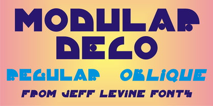 The 1939 French publication “Modèles de lettres modernes par Georges Léculier” ( “Models of Modern Letters by Léculier”) presented some unique and stylized type designs with Art Deco influence. One such example is an abstract modular alphabet constructed of rectangles and circles. This is now available as Modular Deco JNL, in both regular and oblique versions.
 - French Slab Serif JNL by Jeff Levine,
$29.00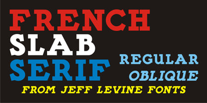 Another example of 1930s French Art Deco lettering from the 1934 publication L'Art du Tracé Rationnel de la Lettre (which roughly translates to “The Rational Path Art of the Letter”) resulted in the digital typeface French Slab Serif JNL. This bold and slightly eccentric slab serif design is available in both regular and oblique versions.
 - Balburdia by Matosrs,
$19.00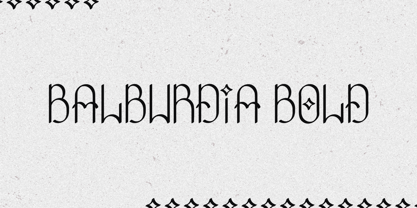 Balburdia is a font based in the street art letters of Brazil. Inspired by "pixação" from the brazilian cities of Rio de Janeiro and São Paulo, Balburdia can translate the street culture and add a little extra to your designs. Balburdia can be used for art, branding or fashion itens that contain this theme.
 - kaufhalle - 100% free

- Belco by Tour De Force,
$25.00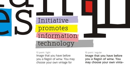 Belco, designed by Slobodan Jelesijevic, was the first font family released by Tour De Force Font Foundry. Belco is elegant and useful for all kinds of publications such as books, magazines, catalogs and brochures. With a wide range of possibility and smooth personal touch, the Belco font family is ideal for longer texts, titles and typography exercises.
 - Departe by TEKNIKE,
$45.00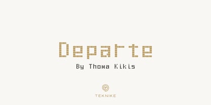 Departe is a geometric monospace display font. The typeface is made from groups of single basic rectangular geometric units. Departe is inspired by structured and organic geometry. The name is derived from the Spanish departe, "de" (of) and "parte" (part). Departe is great for display work, logos, structures, architecture, technology, biology, sports, monograms, quotes, headings and posters.
 - Sorvettero by Just in Type,
$30.00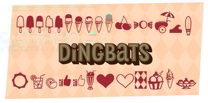 Sorvettero is a sans, layered and unicase typeface inspired by some wood signs at Descansópolis, a neighborhood on Campos do Jordão, a city of Brazil. A fun and cute display project with different use purposes, like packaging, logos, signs, and whatever your creativity brings on. Designed by Diego Maldonado, with contribution of Tony de Marco on the Diamond style.
 - Amelline by Yoga Letter,
$13.00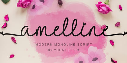 "Amelline" is a modern monoline script font that is very pretty and classy. This font can be used for all your purposes. The embellishments in this font are very easy to use. This font is perfect for spring, summer, holiday, traveling, wedding, invitations, greeting, birthday, mother day, father day, cinco de mayo, logos, branding, banner, poster, print, and others.
 - Breathless by Wiescher Design,
$39.50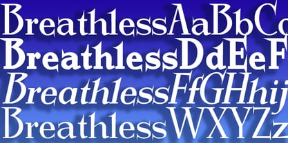 Breathless was inspired by movie posters of the Nouvelle Vague era when Jean Seberg and Jean-Paul Belmondo were young and films where in black and white. So I named this very spiky affair after that phantastic movie of my youth A bout des souffle or like it was called in English, Breathless. -Your breathless type designer, Gert Wiescher
 - Cuba by Design is Culture,
$39.00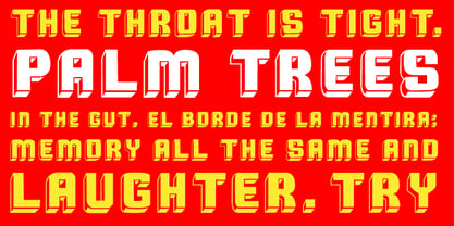 The inspiration for Cuba comes from a sign for the restaurant "La Flor de Cuba" on Bergenline Avenue in Union City, New Jersey. Its blocky, dimensional forms are reminiscent of letterforms seen in signs throughout Latin America from, Colombia, to Mexico, to Spain, to Union City. Its quirky forms are meant to evoke a sense of hand painted signage.
 - Huruvida by Cercurius,
$19.95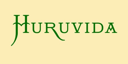 A decorative font with descending tails on the capital letters. The design is based on a popular typeface from the 1880s, mainly used for personal names on title-pages, advertisements and stationery. Today, you can use it e.g. on book and album covers, invitation cards, restaurant menus and concert programs to give a fin-de-siècle impression.
 - Andreis by Tipo Pèpel,
$28.00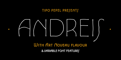 Andreis is a typeface inspired by the art nouveau shapes that appear in the letters of a metal box, made at the beginning of the 20th century by the company G. De Adréis from Badalona in Spain. Its organic and feminine forms evoke the aesthetics of those years and add elegance to the projects where it is used.
 - AW Conqueror Std Inline by Typofonderie,
$59.00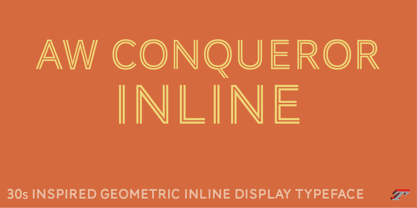 30s inspired geometric inline display typeface Several titling typefaces made their appearance at the start of the 20th century, notably Acier and Bifur, both created by French poster artist Cassandre. Later, in the Netherlands, S.H. de Roos designed a version of Inline for its Nobel family called, naturally, Nobel Inline. AW Conqueror Inline pays homage to this beautiful version. AW Conqueror superfamily AW Conqueror Didot is part of a larger family, who include 4 others subfamilies with great potential: They’re but based on same structure, with some connection between them (width for example), to offer a great & easy titling toolbox to any designers, from skillful to beginner. Each of the members try their best to be different from the others because of their features. They should work harmoniously in contrast. Club des directeurs artistiques Prix 2010 European Design Awards 2011
 - Romana by Bitstream,
$29.99The French interest in the revival of suitably edited Oldstyle romans as an alternative to a world of Modern typefaces started in 1846 when Louis Perrin cut the Lyons capitals. About 1860, as Phemister was cutting the Miller & Richard Old Style in Edinburgh, Theophile Beaudoire turned the idea of the Lyons capitals into a complete Oldstyle typeface, with similar overwhelming success; it was generally known as Elzevir in France and Roemisch, Romanisch, Romaans or Romana in Germany, Holland and Switzerland. In 1892, Gustav Schroeder, at the Central Division of ATF, expanded the series, adding a boldface under the name De Vinne. It was promptly copied, initially in Europe by Ludwig & Mayer, and spread rapidly throughout the US and Europe, becoming the best known member of the series. ATF made popular an ornamental form under the name De Vinne Ornamental. - Nanami Handmade by Thinkdust,
$10.00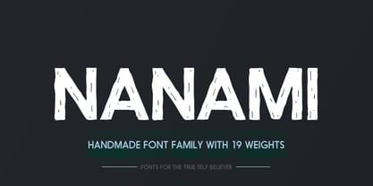 Can we get a drum roll please? It’s not every day that a new link in a best selling chain is forged. First, there was Nanami, a font which took the world of type by force, storming to the top of MyFonts Hot New Fonts list; then there was Nanami Rounded, the most successful follow-up since Terminator 2. Well, say Hasta La Vista to boring design because now, there’s Nanami Handmade. With all the geometric, Japanese inspiration and style of the first two iterations, Nanami Handmade carries a quirky, mischievous charm. The font has a charisma matched by roguish anti-heroes; bad guys you love to love and good guys the other good guys hate, but everyone knows they’re what the audience turns up to see. Nanami Handmade comes in two styles, a solid and a hand-drawn, each of which has eight weights. Mix and match between these options to create a balanced piece which makes good use of the tactile, warm, earthy nature of the font. With these sans-serif styles working well in small and large sizes, both on and off screen, Nanami Handmade’s applications are virtually endless. Get your own piece of typography’s elite now, with Nanami Handmade, by Thinkdust.
 - Goodbye Crewel World NF - Unknown license

- Castelan Hispane by Ixipcalli,
$35.00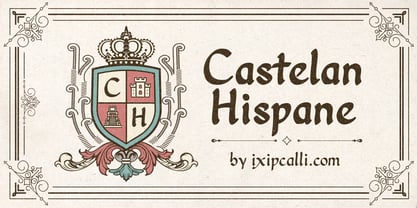 La tipografía Castelan Hispane es una tipografía inspirada en documentos y textos antiguos históricos españoles del siglo XVI. Los trazos semi-medievales - cursivos, le dan una apariencia antigua pero también moderna para los proyectos en los que se desee utilizar la tipografía. Cuenta con seis estilos y tres pesos, ligera, regular y negrita. Cada peso contiene también su forma “itálica”. The Castelan Hispane typeface is a typeface inspired by ancient Spanish historical documents and texts from the 16th century. The semi-medieval - cursive strokes give it an ancient but also modern appearance for projects in which you want to use typography. It has six styles and three weights, light, regular and bold. Each weight also contains its “italic” form.
 - Ganz Grobe Gotisch by URW Type Foundry,
$39.99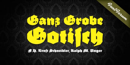 It is not only coarse but extremly black, and it is quite right to name it Black Letter in English. Ernst Schneidler, the designer, created the smallest possible counters. Still, this very coarse black letter is sensitive in detail and drawn with a high level of aesthetics. By the way, it was said in Schneidler's design class in Stuttgart that his number one student Walter Brudi had cut some of the characters with �silhoutte scissors� from black paper. Sharing his ideas and work with his students does not at all decrease or lower his copyright.Ganz Grobe Gotisch is not only a distinguised but also a very catchy design.(Albert Kapr in Fraktur -- �Form und Geschichte der gebrochenen Schrift�.)
 - HGBGalaxo Dot by HGB fonts,
$23.00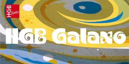 Galaxo Dot is a sister to Galaxo Line. HGB Galaxo is a tribute to Othmar Motter (1927–2010), the Vorarlberg graphic artist and typeface designer, who designed very individual and perfectly crafted typefaces in the 1970's and later. (Motter Ombra, Motter Tectura ...) From a Motter sketch of 5 letters for a logogram, I derived a simplified letterform and developed all the necessary characters. Working on these glyphs and delving deeper into Motter's letterforms, the respect for the accuracy with which he drew his letters (in ink) grew more and more. The spiral resembles the shape of a galaxy, hence the name Galaxo. The font is suitable for retro, poster and logo design.
 - Journal by ParaType,
$25.00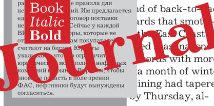 Journal type family is a low-contrast text face of the Ionic-Legibility group. It was designed at the Polygraphmash Type Design Bureau in 3 styles in 1951–53 by Lev Malanov and Elena Tsaregorodtseva. The fonts were based on Cyrillic version of Excelsior that was developed in 1936 in Moscow by professor Michael Shchelkunov, Nikolay Kudryashev et al., that in its turn was based on Excelcior by Chauncey H. Griffith, 1931, Mergenthaler Linotype. Digital version was developed in ParaGraph (ParaType) in 1991. In 2012–13 designer Natalia Vasilyeva made some corrections in original digital data, extended character set and add bold italic style. The family was rereleased in ParaType in 2013.
 - dT Jakob by dooType,
$30.00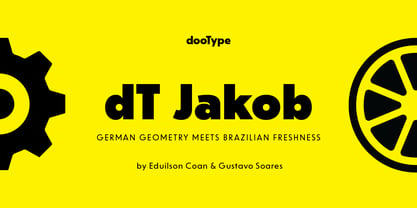 dT Jakob started as a revival by Gustavo Soares for Paul van der Laan’s class at the Type and Media Masters, in The Hague, NL – back in 2007. There are quite a few excellent geometric sans typefaces available, but we did want to make our contribution and have a fine geometric face to offer. dT Jakob was born out of Erbar, by Jakob Erbar, one of the very first geometric sans, released in metal around 1926. Our goal was to make a versatile typeface, that handles display and text typography beautifully. To achieve that we designed a complete range of weights, matching italics and lots of OpenType Features. Hope you enjoy it :D
 - Hug Shack by Yumna Type,
$12.00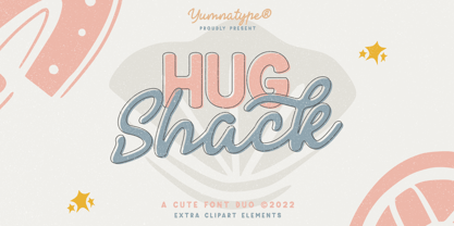 A beautiful and easy-to-style font duo to elevate your design. Hug Shack expresses a feeling of joy and cute overall. Through the script font, Hug Shack brings your design to delve deep into the world of cuteness, while the display font creates modern look. You can mix and match this harmonious font duo to make gorgeous result in your design. This font become more special with awesome clipart as bonus. Features: Stylistic Sets Ligatures Multilingual Supports Numerals and Punctuation It can be used for branding, logos, social media quotes, stickers, posters, vintage designs, wall art, merchandise, social media, and many more. Get more inspiration by seeing the preview. Thank you for purchasing our premium fonts! Happy Designing!
 - Louisiana by Borges Lettering,
$29.95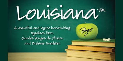 Louisiana originated from the lovely handwriting style of Melanie Snedeker. Lettering Artist Charles Borges de Oliveira then refined the letter forms to produce this one of a kind handwriting script. When you need a legible handwriting font, Louisiana is the perfect choice. Louisiana Grab Bag is a fun little add-on to Louisiana. Chockfull of arrows, smiley faces and other little goodies.
 - Deco Spot Initials JNL by Jeff Levine,
$29.00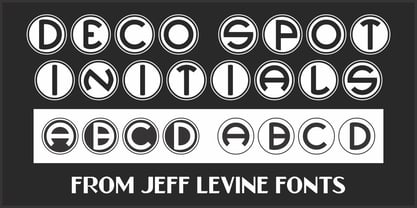 A set of rounded Art Deco initials set inside circular borders was found amongst the pages of the vintage French lettering book "Modèles de Lettres Modernes par Georges Léculier”. Now made into a digital font called Deco Spot Initials JNL, these classic letter forms are available in both the original white-on-black version and as a black-on-white alternate design.
 - Kinkajou Stew NF by Nick's Fonts,
$10.00This exuberant face was suggested by a piece of French sheet music from the 1930s for the song Sur un Air de Shimmy, The name comes from an Australian song from the 1950s about a noncompliant boomerang. Both versions of this font contain the Unicode 1252 (Latin) and Unicode 1250 (Central European) character sets, with localization for Romanian and Moldovan. - Society Column JNL by Jeff Levine,
$29.00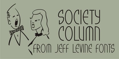 The title card for the 1938 screwball comedy "Four's a Crowd" (starring Errol Flynn, Olivia de Havilland and Rosalind Russell) offered a classic, thin Art Deco type design with stylized letter forms. This is the basis for Society Column JNL; which derives its name from the newspaper columns popularized in that era detailing the whereabouts of the "upper crust" of society.
 - Stgotic by Latinotype,
$10.00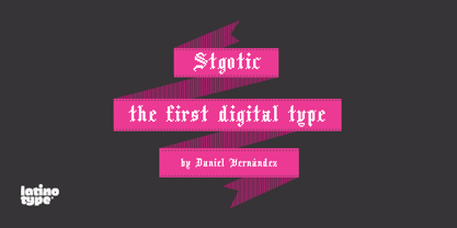 Stgotic, designed in 2006, was the first digital font designed by Daniel Hernández. It is a blackletter typeface designed for low resolution screen devices. Stgotic was designed to be seen at 8 pts (and multiples of 8). In the year 2006, it was recognized as the best screen font by the TipoGráfica magazine in the context of the Bienal de Letras Latinas.
 - Maas by Mike Zuidgeest,
$15.00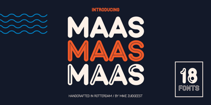 Introducing Maas, a new font collection designed by the passionate designer Mike Zuidgeest in Rotterdam. Each letter of the font was created in Illustrator and handcrafted to perfection. The font is named after the river de Maas, and it's perfect for advertising and branding. As the designer, I'm thrilled with the result and can't wait for you to try it out!
 - 1557 Civilité Granjon by GLC,
$42.00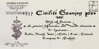 Living from 1545 in Lyon, France, the famous punchcutter Robert Granjon created a typeface that looked like his own handwriting. The first book printed with this font, in 1557, was probably Dialogues de la vie et de la mort by Innocent Ringhier. We offer the complete typeface. It is a charming font with historical forms (long s, final s and others) and many ligatures, enriched with accented letters and other characters that did not exist in the original (thorn, eth, lslash and others), and a lot of alternates that permit rich and varying typography. Warning: all characters appear with the 1500s manual blackletter old style, especially letters “e” “r” or “h” alternate and some ending forms, and may be difficult to read at first, but it quickly becomes very easy. The font contains all characters for Baltic, Western European (Including Celtic), Eastern European, Northern European, and Turkish languages.
 - 1785 GLC Baskerville by GLC,
$42.00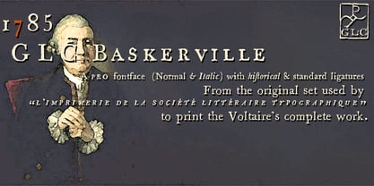 This family was created/inspired from the well-known Baskerville Roman and Italic typefaces created by John Baskerville, the English font designer. We were inspired by the original family sent by Baskerville’s wife after his death. The full Baskerville collection was bought by the French editor and author Pierre-Augustin Caron de Beaumarchais who used it to print - in Switzerland - for the first time the complete works of Voltaire (known as the “Kehl edition” from the "Imprimerie de la société littéraire typographique"). We have used this edition, with copies from 1785, to reconstruct these two genuine historical styles. The font faces, kerning, and spacing are scrupulously identical to the original. This Pro font includes characters for Western, Eastern and Central European languages (including Celtic) and Turkish, with a complete set of small caps, standard and “long s” ligatures in each of the two styles.
 - PF Champion Script Pro by Parachute,
$125.00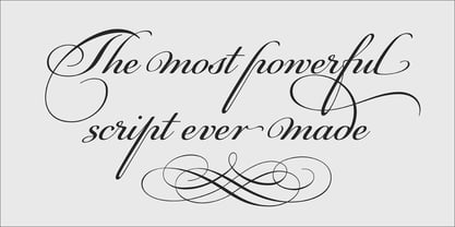 PF Champion Script Pro is perhaps the most advanced and powerful calligraphic family ever made. It received an award for Excellence in Type Design from the International Type Design Competition ‘Modern Cyrillic 2009’ which was held in Moscow. Most recently, it received another award from the 3rd International Eastern Type Design Competition - Granshan Awards 2010. This typeface was first presented in June 2007 at the 3rd International Conference on Typography and Visual Communication (ICTVC) and was met with rave reviews. It is based mainly on the manuscripts of the 18th century English calligrapher Joseph Champion. Developed over a period of two and a half years, each one of the 2 weights is loaded with 4300 glyphs(!), offering simultaneous support for all European languages based on the Latin, Greek and Cyrillic scripts. Furthermore, a wide selection of alternate forms and ligatures is included for all languages, in order to accommodate diverse design aesthetics. These alternates are either applied automatically through an advanced programming scheme, or manually through several OpenType features. An attempt was made to design a contemporary script typeface with classic roots, by following certain guidelines, i.e. lowercase characters were designed so they are less inclined, have a higher x-height and are less condensed than the original. Several characters were stripped-off their connecting lines in order to enhance legibility. Four sets of alternate swashed capitals as well as a plethora of ornaments and frames (117) was included. Small caps and their alternate forms were designed to replace the capitals which disrupt the flow of text within a sentence with their extravagant swashes. All characters were carefully designed with the proper weight in order to sustain harsh printing conditions (on special papers), a situation which affects mainly the light connecting parts of calligraphic typefaces. Finally, it was programmed in such a way as to preserve handwriting qualities, by designing an extensive array of ligatures and alternate glyphs in all languages, never before released or incorporated within the same font.
 - Zolasixx by Typodermic,
$11.95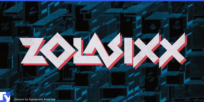 Welcome to the world of Zolasixx, an angular techno typeface inspired by the diagonal strokes and sharp angles of the iconic Zaxxon logo, bringing a retro, arcade-style aesthetic to your designs. With Zolasixx, you can unlock a whole new level of customization thanks to our interlocking letter combinations, which can be switched up using OpenType-savvy programs. This feature allows you to personalize the font and make it truly your own, creating a look that is both unique and professional. Zolasixx’s high-tech, harsh angularity will lend your message an aggressive technological voice that is sure to stand out from the crowd. But there’s also a whimsical sense of creativity to our font, giving you the perfect balance between playfulness and professionalism. Whether you’re designing a video game, a website, or a marketing campaign, Zolasixx is the perfect choice for anyone looking to make a bold statement. So why settle for boring, cliché fonts when you can take your designs to the next level with Zolasixx? Download it today and start creating! Most Latin-based European writing systems are supported, including the following languages. Afaan Oromo, Afar, Afrikaans, Albanian, Alsatian, Aromanian, Aymara, Bashkir (Latin), Basque, Belarusian (Latin), Bemba, Bikol, Bosnian, Breton, Cape Verdean, Creole, Catalan, Cebuano, Chamorro, Chavacano, Chichewa, Crimean Tatar (Latin), Croatian, Czech, Danish, Dawan, Dholuo, Dutch, English, Estonian, Faroese, Fijian, Filipino, Finnish, French, Frisian, Friulian, Gagauz (Latin), Galician, Ganda, Genoese, German, Greenlandic, Guadeloupean Creole, Haitian Creole, Hawaiian, Hiligaynon, Hungarian, Icelandic, Ilocano, Indonesian, Irish, Italian, Jamaican, Kaqchikel, Karakalpak (Latin), Kashubian, Kikongo, Kinyarwanda, Kirundi, Kurdish (Latin), Latvian, Lithuanian, Lombard, Low Saxon, Luxembourgish, Maasai, Makhuwa, Malay, Maltese, Māori, Moldovan, Montenegrin, Ndebele, Neapolitan, Norwegian, Novial, Occitan, Ossetian (Latin), Papiamento, Piedmontese, Polish, Portuguese, Quechua, Rarotongan, Romanian, Romansh, Sami, Sango, Saramaccan, Sardinian, Scottish Gaelic, Serbian (Latin), Shona, Sicilian, Silesian, Slovak, Slovenian, Somali, Sorbian, Sotho, Spanish, Swahili, Swazi, Swedish, Tagalog, Tahitian, Tetum, Tongan, Tshiluba, Tsonga, Tswana, Tumbuka, Turkish, Turkmen (Latin), Tuvaluan, Uzbek (Latin), Venetian, Vepsian, Võro, Walloon, Waray-Waray, Wayuu, Welsh, Wolof, Xhosa, Yapese, Zapotec Zulu and Zuni.
 - ITC Oldbook by ITC,
$29.99For some time, Eric de Berranger had wanted to create a distressed typeface design - one that gave the appearance of antique printing and showed signs of wear, yet was still highly readable. He was busy designing a new face called Maxime, when an idea struck: I realized that I could use these lettershapes as the basis for my antique typeface," he says. The two faces ended up being designed in tandem. While ITC Oldbook clearly captures the flavor of aged, uneven and imperfect printing, it also meets de Berranger's goal of being exceptionally readable in text sizes. Beginning with well-drawn characters was the key, and these were carefully modeled into the distressed forms. "The process was more difficult than I originally thought," says de Berranger. "The antique letters had to be tested and modified several times to work correctly." ITC Oldbook elegantly simulates antique printing in both text and display sizes. And while stroke weights are uneven and curves are irregular, the design has remarkably even color when set in blocks of text copy. Add to this the design's inherent legibility, and ITC Oldbook acquires a range far beyond replication of things old; it's suitable for any project that calls for warm and weathered typography. ITC Oldbook is available in roman and bold weights with complementary italic designs. Small caps, old style figures and a suite of alternate characters and ornaments provide additional flexibility and personality to the design." - Lizie Slab by Poul Allan Studio,
$26.00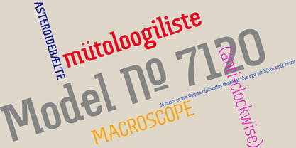 Lizie Slab is a slab serif, where the geometric construction is inspired by the 1930s design icons De Stijl, Gerrit Rietveld and others. Lizie Slab is designed for both print and digital use, and you will find it ideal for packaging, poster design, catalogs and exhibition design. The font supports a wide range of languages. This OpenType contains features such as fractions, proportional and tabular shapes.
 - Century Expanded by Bitstream,
$29.99Shortly after the preparation of the original Century, the two Bentons (father Linn Boyd and son Morris Fuller) prepared a wider version for De Vinne’s press and called it Century Broadface. In 1900 ATF released the design for general use as Century Expanded, one of the most popular and effective of typefaces, to this day the text face of the New York Daily News. - Olaus by Monotype,
$29.99The Olaus Magnus and Olaus Bandus alphabets are inspired by the letterforms cut in the pictures and wood-cuts of Olaus Magnus great book Historia de Gentibus Septentrionalibus. This great history of the Nordic Peoples was printed in Rome in 1555 in his own printing shop there. Olaus Magnus, Catholic priest and appointed archbishop by the Pope, never returned to the now Lutheran Sweden. - Spur Wide JNL by Jeff Levine,
$29.00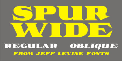 Spur Wide JNL was modeled from an example of hand lettering from the antique French alphabet book L'Art du Tracé Rationnel de la Lettre. Heavy Roman style letters with spurs (often referred to as Latin) were most popular with sign painters and show card writers in the early part of the 20th century. Spur Wide JNL is available in both regular and oblique versions.
 - Tme by bb-bureau,
$65.00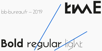 Tme, new lineal — Tme is an update of Sl (T = S + 1, m = l + 1 and e for natural logarithm), drawn in 2006 for the University of Arts Saint-Luc de Tournai. Its geometrical drawing is based on the directions of the hexagon, a scrupulously followed constraint which confers on some glyphs a very particular drawing. in light, regular and bold language: all latin glyphs
 - Bodoni FB by Font Bureau,
$40.00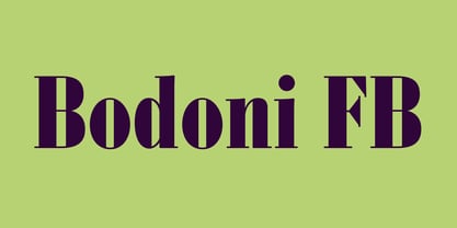 Working at American Type Founders from a Bruce Foundry recutting, Morris Fuller Benton worked out the dramatics of the English Fat Face, and in 1928 produced Ultra Bodoni, a headline spectacular. Using Benton’s 1933 Ultra Bodoni Extra Condensed, Richard Lipton digitized Bodoni FB Bold Condensed, then took compression even further and designed Bodoni FB Bold Compressed, a real technical tour de force; FB 1992

