8,825 search results
(0.09 seconds)
- Posh by Lián Types,
$49.00 I've always been in love with fat didones. That’s the reason of Posh. In search of something unique, I started this family back in 2013 with the aim of creating the fattest yet readable bodonian typeface in the market: It was a challenge, because roman fonts need generous counters (or what some call white spaces) and taking them to the extreme of inexistence attempted against the construction of many glyphs. Ears, dots, terminals and serifs always need some extra space so I had to find the exact point of boldness to make characters which have those attributes work well in the middle of those which haven't. (1) After a while, I felt I was again ‘in my element’: Big contrasted letters, sexy and elegant curves, and that Lubalinesque feeling that characterise my fonts. (2) Words written with Posh are a explosion of elegance and sensuality due to the fact that its didone attributes were exaggerated. Since it’s full of alternate glyphs, one can change and choose them until a nice block of ‘‘black’’ is achieved. (3) To accompany the regular style, I designed Posh Inline, a font with the same quantity of glyphs than the regular one; an all caps style called Posh Capitals, and also a really playful Italic version. I hope you find this one delicious like I do! This font is dedicated to all who understand letters are not just meant to be read, but also to be appreciated in group and individually. Enjoy it. NOTES (1) In example, it can be easy to design a fat letter ‘n’ with almost no counter, but really tough to make a satisfactory letter ‘s’ with serifs to match that ‘n’. (2) Also, it wasn't my first attempt in fat didones. Take a look at my font Reina, made in 2012. (3) Posters above show many words with ball terminals that seem to dance above and below the words in order to fill those “undesired” blank spaces.
 - Bougainville by Type Associates,
$29.95 Bougainville was inspired by many of my favorites and has been on the drawing board in excess of ten years. Only this year I decided to expand the original 1994 design to include other weight variants. The quirky Binner Gothic-inspired high axis and its funky g, rounded e, angled stroke endings together with the influence of contemporary designs such as Officina Sans, Din Mittelschrift and MetaPlus, Bougainville exhibits a similar flavor and compactness to Bodega Sans. This typeface family has been named in honor of the renowned eighteen-century French mathematician and explorer Louis-Antoine de Bougainville to whom we owe the naming of South Sea Islands and colorful tropical flora he discovered along his journey. Bougainville makes for effective headings at any size and is equally readable at semi-display sizes.
 - Selfie Neue Sharp by Lián Types,
$29.00 INTRODUCTION When I started the first Selfie back in 2014 I was aware that I was designing something innovative at some point, because at that time there were not too many, (if any) fonts which rescued so many calligraphy features being at the same time a monolinear sans. I took inspiration from the galerías’ neon signs of my home city, Buenos Aires, and incorporated the logic and ductus of the spencerian style. The result was a very versatile font with many ligatures, swashes and a friendly look. But… I wasn’t cognizant of how successful the font would become! Selfie is maybe the font of my library that I see the most when I finally go out, (type-designers tend to be their entire lives glued to a screen), when I travel, and also the font that I mostly get emails about, asking for little tweaks, new capitals, new swashes. Selfie was used by several renowned clients, became part of many ‘top fonts of the year’ lists and was published in many magazines and books about type-design. These recognitions were, at the same time, cuddles for me and my Selfie and functioned as a driving force in 2020 to start this project which I called Selfie Neue. THE FONT "Selfie for everything" Selfie Neue, because it’s totally new: All its glyphs were re-drawn, all the proportions changed for better, and the old and somehow naive forms of the first Selfie were redesigned. Selfie Neue is now a family of many members (you can choose between a Rounded or a Sharp look), from Thin to Black, and from Short to Tall (because I noticed the feel of the font changed notoriously when altering its proportions). It also includes swashy Caps, which will serve as a perfect match for the lowercase and some incredibly cute icons/dingbats (designed by the talented Melissa Cronenbold, see also Selfie Neue Rounded for more!) which, as you see in the posters, make the font even more attractive and easy to use. You'll find tons of alternates per glyph. It's impossible to get tired with Selfie! Like it happened with the old Selfie, Selfie Neue Sharp was thought for a really wide range of uses. Magazines, Book-covers, digital media, restaurants, logos, clothing, etc. Hey! The font is also a VF (Variable Font)! So you can have fun with its two axes: x-height and weight, in applications that support them. Let me take a New Sharp Selfie! TECHNICAL If you plan to print Selfie Neue VF (Rounded or Sharp), please remember to convert it to outlines first. The majority of the posters above have the "contextual" alternates activated, and this makes the capitals a little smaller. I'd recommend deactivating it if you plan to use Selfie for just one word. Use the font always with the "fi" feature activated so everything ligatures properly. The slant of the font is 24,7 degrees, so if you plan to have its stems vertical, you may use Selfie with that rotation in mind. THANKS FOR READING
 - Mati by Sudtipos,
$19.00 Father's Day, or June 17 of this year, is in the middle of Argentinian winter. And like people do on wintery Sunday mornings, I was bundled up in bed with too many covers, pillows and comforters. Feeling good and not thinking about anything in particular, Father's Day was nowhere in the vicinity of my mind. My eleven year old son, Matías, came into the room with a handmade present for me. Up to this point, my Father's Day gift history was nothing unusual. Books, socks, hand-painted wooden spoons, the kind of thing any father would expect from his pre-teen son. So you can understand when I say I was bracing myself to fake excitement at my son's present. But this Father's Day was special. I didn't have to fake excitement. I was in fact excited beyond my own belief. Matí's handmade present was a complete alphabet drawn on an A4 paper. Grungy, childish, and sweeter than a ton of honey. He'd spent days making it, three-dimensioning the letters, wiggle-shadowing them. Incredible. A common annoyance for graphic designers is explaining to people, even those close to them, what they do for a living. You have to somehow make it understandable that you are a visual communicator, not an artist. Part of the problem is the fact that "graphic designer" and "visual communicator" are just not in the dictionary of standard professions out there. If you're a plumber, you can wrap all the duties of your job with 3.5 words: I'm a plumber. If you're a graphic designer, no wrapper, 3.5 or 300 words, will ever cover it. I've spent many hours throughout the years explaining to my own family and friends what I do for a living, but most of them still come back and ask what it is exactly that I do for dough. When you're a type designer, that problem magnifies itself considerably. When someone asks you what you do for a living, you start looking for the nearest exit, but none of the ones you can find is any good. All the one-line descriptions are vague, and every single one of them queues a long, one-sided conversation that usually ends with someone getting too drunk listening, or too tired of talking. Now imagine being a type designer, with a curious eleven year old son. The kid is curious as to why daddy keeps writing huge letters on the computer screen. Let's go play some ball, dad. As soon as I finish working, son. He looks over my shoulder and sees a big twirly H on the screen. To him it looks like a game, like I'm not working. And I have to explain it to him again. This Father's Day, my son gave me the one present that tells me he finally understands what I do for a living. Perhaps he is even comfortable with it, or curious enough about that he wants to try it out himself. Either way, it was the happiest Father's Day I've ever had, and I'm prouder of my son than of everything else I've done in my life. This is Matí's font. I hope you find it useful.
 - Mischstab Opium River - Unknown license

- KillerStumps - Unknown license

- Tailor by Suomi,
$25.00 Tailor was a study of slab serif style with round and comfortable feel. I wanted to merge round shapes with exaggerated ink traps for legibility.
 - CoalhandLuke by JOEBOB graphics,
$39.00 CoalhandLuke is a handwritten font I made by using a piece of charcoal. The Pro version contains an additional set of Cyrillic and Greek characters.
 - FG Rakel by YOFF,
$13.95FG Rakel is a small old looking handwriting connected script font. I have found it useful on greeting cards and scrapbook journaling among other things. - Hearts And Swirls Too by Outside the Line,
$19.00 48 whimsical hearts and swirls, some solid, some line but lots of little graphics for your Valentine needs. Many ways to say "I Love You".
 - Nouveau Eccentrique JNL by Jeff Levine,
$29.00 Nouveau Eccentrique JNL is a novelty Art Nouveau lettering style found on some 1920s sheet music cheerfully entitled "I'm Glad I Can Make You Cry".
 - Dynatron by Studio K,
$45.00 Dynatron is a bold condensed retro-style font inspired by the old sci-fi comic covers, an example of which I have mocked up here.
 - ALT Deville by ALT,
$- DEVILE is a gothic medieval font; its something new for me I never tried to create a font like this before so check it out –
 - Fairybook by Wundes,
$16.00An unnamed historical font, scanned and patched. Originally upper and lower case only. I have extended it to include numbers, symbols and extended ascii characters. - Seductive Height by Wildan Type,
$15.00 Seductive Height has been realised Seductive Height is sans serif font. It is unic font. all Character have hight stem. That make this font look simple but elegant. Seductive Family has 10 font style with different wieght. you also will get lowercase, uppercase, number, function, multilingual, and some alternate. Suitable for many project (formal or informal). Features Lowercase/Uppercase/ Numbers & Punctuation / Extensive Language Support/Alternate
 - Project Soft by TypeUnion,
$40.00 Project Soft is the more playful version of our 2017 release, Project Sans. The font features the same 10 weights and matching italics but while the Sans version was more structured, the Soft version shows a cheeky side that creates a vast array of potential. The font still features substantial language support as well as specifically designed italics that feature a unique look for certain characters.
 - Qanelas by Radomir Tinkov,
$29.00 Qanelas is a modern sans serif with a geometric touch. It comes in 20 weights, 10 uprights and its matching italics. Designed with powerful opentype features in mind. Each weight includes alternate characters, fractions, extended language support (+ Cyrillic), arrows, ligatures and more. Perfectly suited for graphic design and any display use. It could easily work for web, signage, corporate as well as for editorial design.
 - Monique Sans BF by Bomparte's Fonts,
$40.00 Monique Sans features an unconventional thick/thin stroke weight pattern, that creates a fresh, unique appearance throughout. Aside from being a superb choice for a diverse variety of applications in headline and display, Monique Sans is remarkably legible and distinctive in short passages of mid-range text (10 pt to 14 pt). Wherever your design project requires a stylish, sophisticated look, Monique Sans is sure to shine!
 - Adhipati by Midvel,
$20.00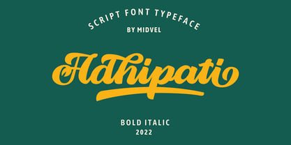 This modern script font based from brush lettering with unique flow that make outstanding. Adhipati come with 139 alternate glyphs and 10 swash glyphs. Active opentype features and try Stylistic set, ligature, swash to custom your design, with PUA included. This fonts are perfect to design such us logotype, quote, apparel design, Poster design, greeting card, invitation design and other design that you need.
 - Fogie by Din Studio,
$22.00 Fogie is a modern serif family font. Features with 10 fonts. This family also featured with many ligatures and alternates. Designed with powerful OpenType features in mind and perfectly suited for graphic design and any display use. It could easily work for web, signage, corporate as well as for editorial design. The Thin style is free so you can try this for your content.
 - Cold Cuts by Good Gravy Type Co,
$12.00 Cold Cuts is an assorted spread of delicious fonts pre cooked to perfection. This 10 weight font family is $30 for a limited time it is the perfect way to stock your font fridge. Cold Cuts a lean upright font family with a lowercase caps option to give you bonus typesetting choices. A sleek modern vintage style which has a wide variety of display uses. Bon Appétit!
 - Manju by Eko Bimantara,
$19.00 Manju font family represents retro 70s styles which have soft and chewy characteristics. Designed to be fit for display, titling, good for logo, header, and large size usage. The light styles can be also used for short text. It consists of 10 styles from thin to heavy with matching obliques. It has several opentype features such as alternates and ligatures, it also supports broad latin languages.
 - mathieu by Gino Belassen,
$10.00 mathieu was created with a Krink K-60 marker – a paint marker that allowed gravity to dictate the outcome of each handwritten letterform. The font is the union of 26 mixed-case letters, 10 numbers, and roughly 100 glyphs, and has been seen in videos by artists Marshmello and Louis the Child. mathieu reflects Gino’s abstract style of writing, and reveals beauty in imperfection.
 - Insta Story by Bluestudio,
$6.00 Insta Story is a matching font family, consisting of a family of 10 sans serif font styles and paired with 1 script that we made to look like hand writing, so that it looks natural. Insta Story is perfect for all types of your business projects such as: logo design, business cards, greeting cards, magazines, newspapers, social media design, watermarks and more. Happy designing...! Thanks.
 - Singel by Fontfabric,
$35.00 Singel is a neoclassical serif with semi-condensed proportions. As a contemporary interpretation, this typeface combines the rationalist modulated stroke with an elegant silhouette and crisp serifs. The altogether splendid appearance of Singel, completed with a full set of Small Capitals and true form of italics makes it perfect for any luxurious and graceful design. Other aspects of its characteristics include the consistency of 10 styles from Light to Bold; a coverage of Extended Latin and Cyrillic with span for more than 130 languages; a flawless functionality and support of many OpenType features, such as localizations, tabular numerals, inferiors and superiors, numerators & denominators, fractions, case sensitivity etc. Features: • Over 900 glyphs in 10 styles (Light to Bold); • Extended Latin and Cyrillic for more than 130 languages; • Tall x-height and Semi-Condensed proportions; • High contrast and modulated stroke with vertical stress; • Neoclassical characteristics and moderate apertures; • Full set of Small Capitals; • True form of italics; • Coverage of multiple OpenType features; • Suitable for wide design purposes.
 - Lady Rene by Sudtipos,
$59.00 Looking back on my production to date, neither so little nor so large, it does not come as a surprise to find myself now introducing Lady René. A brief review of my career would read as follows: graphic designer graduated from Buenos Aires University, a 10-year professorship in Typography in the same institution, an illustrator in the making. For almost 15 years now my work has focused on the design of editorial pieces, predominantly books and CD sleeves. Typography proper has always been central to my research projects. All my obsessions eventually embodied as much the search for a perfect, spotless text as for a daring and provoking one. In my view, "how-to-say-something" ranks highest amongst a graphic designer’s responsibilities. It was in this vein that I called in the written word to illustrate, to draw, to narrate. Why not reverse the saying and proclaim that “a word is worth a thousand images”? If so, one single word could trigger endless meanings, associations, ideas, and memories in every reader’s mind. Language, we know, has a strong power and is a living expression of a culture. In my illustrations, letters and drawings reunite in one synergy said and unsaid, the finiteness of the message and the freedom of the free reading. And this is how and when, Lady René, my first born type font sees the light of day conceived out of a love of illustration and a reverence for the written word, recalling the whimsicality of the handmade drawing and reflecting its sensitive, warmth and spontaneity. Enabled by the characteristics of Open Type and the hard, outstanding work of designer Ale Paul, Lady René succeeds in composing texts in a simple, organic way by means of its contextual and stylistic alternates, swash characters, ligatures and connecting words. A bundle of decorative miscellanea completes the set of signs, enabling the user considerable freedom to create new typographic landscapes. Lady René is then prepared, very much like a character in a short story, to come to life in the reader’s mind. I expect you will enjoy her as much as I did creating her. Laura Varsky
 - Electric Hermes AOE - Unknown license

- Kaptain Kurk - Unknown license

- Orthotopes by Megami Studios,
$7.50 Orthotopes is reminiscent of that ever-familiar 70s style sci-fi font whose name I cannot recall and probably doesn't look a thing like this anyway.
 - KG Tightrope by Kimberly Geswein,
$5.00 I love the feel of a short, wide font. This handwritten font is a great way to mix and match heights and widths in a design.
 - Enixe by Foyezes,
$15.00 This font has the same uppercase and lowercase letters with some modifications on the uppercase letters. I included the modified letters to use however you like.
 - Volume by Cubo Fonts,
$29.00 Volume is a 3D font, with interlocked characters, inspired by vintage wooden block capitals! Superimposed weights bring light and shadow on the structure and allows many coloured combinations. Cubo est une fonte en volume dont les lettres s'imbriquent, inspirée d'anciens caractère d'imprimerie en bois. Les diiférentes graisses se superposent, créant des effets d'ombre et de lumière, et facilitant la colorisation des caractères.
 - DHF Dipanegara - Personal use only

- Carpe Noctem by Hanoded,
$20.00 Carpe Noctem (Latin for ‘Seize The Night’), was a bit of a surprise. Someone asked me if I could create a lower case for my Closet Skeleton font. I began working on it and lo and behold, a beautiful font started taking shape. So, if you’re in need of a slightly scary fairytale font, complete with angled edges, swirly bits, a couple of alternate - even more curly - glyphs and an alternate medieval ampersand, then Carpe Noctem is your typeface!
 - Grandfami by UlianaShabanova,
$10.00 Welcome to the new font! An elegant slim handwritten font created from childhood memory. This is how my grandfather wrote. He seemed very beautiful to me when he was little and I really wanted to write "when I grow up" too:) Perfect for captions in photo albums, on photos, birthday invitations, calendars, magazines, Instagram posts and more! A vector font is composed of uppercase and lowercase letters. Feel free to email me shabanovasprt@gmail.com if you have any questions. :)
 - Orchard Trees by Supfonts,
$15.00 Hello dears! I fulfilled my old dream and drew (wrote it to whom as you like :) a font in the Modern Calligraphy style. Also I added Ligatures and Swashes, have fun :) Orchard Trees will look beautiful on holiday invitations, wedding invites and stationery, logos, and more. Test it out below to see how it could look for your next project! Includes: Uppercase and lowercase Numbers and punctuation Foreign language support Check out my blog: https://www.instagram.com/zloillev pinterest.com/dmitriychirkov7
 - Redtab by MKGD,
$13.00 With Redtab I tried to create a typeface that could be used equally well in either in body copy, or in headline form. I like to think that, although it has a more traditional look to it, it still possesses a bit of a creative flourish that sets it apart from similarly designed fonts. Whether used sparingly or in paragraph form, Redtab has the ability to not only read well, but stand out while doing so.
 - Snuggle Punk by PizzaDude.dk,
$17.00 To snuggle is "settle or move into a warm, comfortable position" - that is exactly what I did with making this chunky seriffed font. Well, maybe not a position, but a comfortable mood! I tried to mix some gentle grafitti moves and comic letters, and then a touch of the classic goofy pizzadude style - and the result is this cheeky font called Snuggle Punk. Full of round corners and fat lines - sounds like a nice cup of coffee! :)
 - Physe by Typotheticals,
$5.00 Physe. Physe is a basic set of fonts, designed for scrapbooking and general use. It comes in a variety of versions, with a light version, expanding up to bold. Many hurdles were taken to finalize this version, both physical and electronic. Like all of us, as I grow older, my glaucoma keeps pace with my arthritis, while I look on in amusement, hedging my bets on which will be the one to finally complete my retirement.
 - Zholud's Modern Ghotic by Vladzh,
$30.00The first ideas about creation this font appeared in spring 2005. I took gothic fonts and a technique of feather as the base and create something unusual. Zholud's Modern Ghotic font has only A-Z, a-z, 0-9 and . , : ; ' " ! ? - characters. I recommed you to use this font in headers. It looks better if you'll start each word with Caps. Please use an application that supports kerning in order to display the spaces between characters correctly.


