10,000 search results
(0.12 seconds)
- Moonsilver by HIRO.std,
$16.00 MOONSILVER is a Display font. This font describes about taft, funny, square, brave, vintage, retro FEATURES - Support Opentype Features - Uppercase - Numbering and Punctuations - PUA Encoded Characters - Multilingual Support - Works on PC or Mac USE MOONSILVER works great in any branding, logotype, magazines, poster, social media posts, clothing, advertisements, film title and any projects that need funny, strong, retro and vintage taste.
 - Evelyn by Larin Type Co,
$12.00 Evelyn is a hand drawn bold brush font. Fall in love with its incredible charm and turn any design idea into a stunning progect one. This font will fit into any project, use this font for branding or create a logo, a beautiful frame for your home, or use book covers, stationery, marketing, a blog, magazines and much more for your small business.
 - Tango Mango by TypeClassHeroes,
$14.00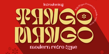 Introducing Tango Mango Modern Retro Font, access your OpenType features to access the large selection of alternate letters and ligatures. Use this font for any branding, product packaging, invitation, quotes, t-shirt, label, poster, logo etc. Feature Uppercase & Lowercase Number & Symbol International Glyphs Multilingual support Alternative Ligature Feel free to drop us a message any time Hope you enjoy it.
 - NorB Scribe by NorFonts,
$28.00 NorB Scribe is a handwritten text font witch can be used with any word processing program for text and display use, print and web projects, apps and ePub, comic books, graphic identities, branding, editorial, advertising, scrapbooking, cards and invitations and any casual lettering purpose… or even just for fun! It comes with 6 weights featuring Light, Normal, Bold with their Italic version.
 - Bicillesta by Hikhcreative,
$12.00 Introducing a new modern script, Bicillesta! Bicillesta is perfect for elegant logos, upscale packaging, wedding stationery, websites, and any other projects requiring a handwritten and luxurious touch. Alternates and ligatures are included so that you can give your logo or name a custom, calligraphic look. Thanks for checking out my shop, and feel free to get in touch if you have any questions!
 - Round Nib Deco JNL by Jeff Levine,
$29.00 Great type font inspirations can come from any time period and any location in the world. A Febuary, 1932 issue of an Estonian woman’s magazine called “Eesti Naine” had its name hand lettered using a round nib lettering pen. This extra-wide Art Deco design is now available as Round Nib Deco JNL, and is available in both regular and oblique versions.
 - Chitos by madeDeduk,
$16.00 Chitos is a display font, come with single weight, legible and expressive shapes. A lot of stylish alternates characters will makes this font suitable for your any project design. Feature Uppercase & Lowercase Number & Symbol International Glyphs (Cyrillic & Greek) Multilingual support Alternative Ligature Feel free to drop us a message any time and follow my shop for upcoming updates Hope you enjoy it.
 - Marticus by TypeClassHeroes,
$14.00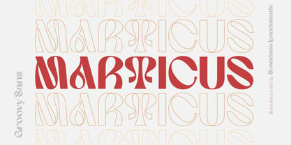 Introducing Marticus is a Groovy Sans, Comes with unique style and access your OpenType features to access the large selection of alternate letters and ligatures. Use this font for any branding, product packaging, invitation, quotes, t-shirt, label, poster, logo etc. Feature Uppercase & Lowercase Number & Symbol International Glyphs Multilingual support Alternative Ligature Feel free to drop us a message any time Cheers!!
 - Buchmann by HIRO.std,
$14.00 Buchmann is Display Font This font describes about about fear, bold, taft, manly, hard, power, stiff, mighty, brave, gallant, rigid. FEATURES - Uppercase letters - Numbering and Punctuations - PUA Encoded Characters - Multilingual Support - Works on PC or Mac USE Buchmann works great in any branding, magazines, poster, social media posts, clothing, advertisements, product packaging, product designs, label, quotes and any projects. Enjoy using! Thanks. HIRO.std
 - Coupler by District,
$25.00 Coupler is a sturdy text face with low contrast, airy counters, and a strong baseline for smaller sizes and extended reading. Lightly bracketed serifs and pleasantly conspicuous italics temper Coupler’s formal demeanor—well suited for financial reports, news magazines, catalogs, academic journals, and any instructional setting. Four weights with italics and advanced typographical support provide design flexibility in any layout.
 - Cosmed Retro by HansCo,
$15.00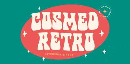 Cosmed Retro font is a retro psychedelic font style with wavy touch. Use this display font to add that special retro touch to any design idea you can think of! Very suitable for logotype, Stickers, Packaging design, Cricut Project, headlines, brand identity, t shirt or apparel industry, posters, magazines, books, YouTube, Instagram, websites, or any of your creative design projects. Enjoy!
 - Mighty Dust by madeDeduk,
$12.00 mighty dust is a blackletter. There's come with 3 style font with much alternative inside. Suitable to create any branding, product packaging, invitation, quotes, t-shirt, label, poster, logo etc. Feature otf. and ttf. file woff and woff2. file Uppercase & Lowercase Number & Symbol International Glyphs Multilingual support Alternative Ligature Feel free to drop us a message any time Hope you enjoy it.
 - Montlake Road by The Styled Script,
$25.00 Say hello to the Montlake Road Script Font. This is a carefree and elegant font with a romantic and feminine flare. Montlake Road has Opentype ligatures that give help give a natural handwritten look while the lowercase swashes add a beautiful touch to any project. This font is perfect for logos, notes, labels, wedding invitations, or branding for any project.
 - Callina by Jos Gandos,
$15.00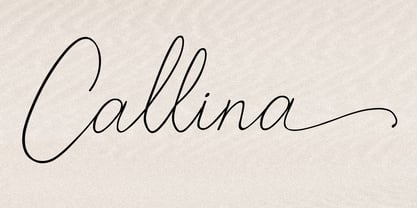 Callina is a new modern & fresh script in handwriting style. This font will make your design look elegant, natural and stylish. Callina handwritten font is perfect for any awesome projects such as photography, watermark, signature, quote design, social media posts, advertisements, logos, branding, invitation, product designs, label, stationery, wedding designs, product packaging, special events or any project that needs a handwriting taste.
 - Agenor Neue by Graphite,
$20.00 Agenor Neue is a geometric sans serif with a slight twist. The selective use of rounded edges gives it a unique and distinct character. Agenor Neue family comes in 7 weights and works great for logotype, headers, titles and any other display usage. The Regular weight is available for free and can be used for any commercial or personal project.
 - Garp Miska by madeDeduk,
$11.00 Gary Miska is a cute font with two style neu and regular fun happiness look and will makes this font suitable for your any project design. Feature Uppercase & Lowercase Number & Symbol International Glyphs Multilingual support ligature Feel free to drop us a message any time and follow my shop for upcoming updates Shoot me on email at: dedukvic@gmail.com Hope you enjoy it.
 - Lova Power by HansCo,
$15.00 Lova Power font is a retro psychedelic font style with rounded touch. Use this display font to add that special retro vintage touch to any design idea you can think of! Very suitable for logotype, Stickers, Packaging design, Cricut Project, headlines, brand identity, t shirt or apparel industry, posters, magazines, books, YouTube, Instagram, websites, or any of your creative design projects. Enjoy!
 - Rahere Sans by ULGA Type,
$18.98 Rahere is a humanist sans with subtle features that give the typeface a distinctive, warm appearance without distracting the reader. Legible at large and small sizes, Rahere is a versatile family suitable for a wide range of applications such as annual reports, advertising, brochures, catalogues, information signage, screen text and visual identities. For projects that need to convey a sense of authority or credibility, this is the ideal sans serif to use. The family consists of six weights ranging from light to extra bold with corresponding italics and the character set covers most of the major European languages. Each weight contains lining & non-aligning numerals in both proportional & tabular spacing. The tabular numerals share the same width across all weights and styles – a must for financial tables in annual reports. Spirited and lively, the italic lowercase is more cursive and calligraphic than the roman, although it harmonises perfectly, displaying enough character to create emphasis without looking out of place. When used on its own, for pull-out quotes or poetry, the italic exudes a charm that draws attention to the text. The typeface is named after Rahere, a 12th-century Anglo-Norman priest, who founded St Bartholomew's Hospital, London in 1123. I will always be indebted to Barts (as it is now commonly known) because in 2007 I was successfully treated for relapsed testicular cancer. Way back in 1992 I designed my first sans serif, Charlotte Sans, and although it was relatively successful, I was never really satisfied with the end result: not enough weights & italics, a small character set, lack of accented characters, and my design skills were still in their infancy. Whilst Rahere shares many common elements with Charlotte Sans, it is much more than just a reworking; it represents over 20 years of accumulated knowledge and experience as a designer.
 - Secession by HiH,
$14.00 Secession is a very readable typeface, suitable for short blocks of text. If you have grown weary of the standard sans-serif faces one sees all the time, you may want to use Secession as a fresh and distinctive substitute. Like Kunstler Grotesk, Secession is one of a number of typeface designs that attempts to reconcile Germany’s blackletter tradition with the international familiarity of roman letterforms in a simple, robust design suitable for meeting the demands of a modern industrial economy, while rejecting the extraneous ornamentation of the departing Victorian era. Unlike Kunstler Grotesk, Secession was designed with a lower case. Secession Bold was originally jointly released as Halbfette Secession by Bauer & Company of Stuttgart and H. Berthold AG of Berlin around 1898. The rest of the family was designed by HiH. The basic family of four: Text, Oblique, Bold and BoldOblique are available in two versions: one set with the standard contemporary lining or ranging numerals for spreadsheets and tables and one set of old-style figures (with OSF in font name) for use with text. The two versions of the basic family, Secession and Secession OSF were released in July 2006. Cousins include ExtraBold, SCOSF Text, and two multi-lingual versions of the text weight. Secession ML includes the Latin Extended-A character set in unicode format plus 17 ligatures and a few strays. Secession GreekML has all the characters of the ML version plus the unicode Greek set and 17 Greek ligatures. Release of the cousins took place in August and October of 2006. Click on BUYING CHOICES. Click on GLYPHS and use drop-down menus and slider to see the all the glyphs for the various fonts. Similar: Birmingham (Ref 100 Ornamental Alphabets, Solo); Spartana (Art Nouveau Display Alphabets, Solo)
 - Aero Blend by Design A Lot,
$25.00 Meet AeroBlend Display Font, a modern and futuristic typeface that brings a touch of sleekness to your creative projects. With its clean lines, intersecting curves, and contemporary vibe, AeroBlend is the perfect typography solution for bold and innovative projects. Designed with precision, this font strikes the right balance between style and readability. It offers a single weight/style that effortlessly combines elegance with a touch of technological sophistication. This makes it incredibly versatile and suitable for a wide range of design applications. From attention-grabbing headlines to memorable branding projects, AeroBlend Display Font helps you make an impact. Its strong presence adds a sense of modernity to your designs, ensuring that your message stands out from the crowd. With AeroBlend Display Font, you have access to an extensive character set. It includes lowercase and uppercase letters, numerals, special characters, accented characters, and a variety of symbols. This comprehensive collection gives you the freedom to express your creativity and bring your vision to life with clarity and precision. Crafted with meticulous attention to detail, this font is available in the .OTF (OpenType) file format, ensuring compatibility across various design software and platforms. One of the notable features of it is its set of alternates. Certain letters have carefully designed alternatives, adding even more versatility and creative possibilities to your designs. Whether you’re a graphic designer, web developer, or simply a typography enthusiast, AeroBlend Display Font is a must-have in your toolkit. It’s crafted to meet the demands of modern design, offering versatility, legibility, and a hint of futuristic charm. It’s perfect for branding, headlines, posters, packaging, monogram designs and more. Take your projects to the next level with AeroBlend Display Font and unleash your creative potential. Let AeroBlend add a touch of modern sophistication to your designs and create an unforgettable visual experience.
 - Night Train by FontMesa,
$19.95 Night Train is a new font built from the ground up; while Night Train may resemble an old classic wood type there are a few lines that make this font a little more modern setting it apart from other wood type revivals. If you're a railroad enthusiast you're sure to enjoy the steam locomotive graphic located on the less than and greater than keys on all versions of this font, due to the fine detail of this train illustration the best printing results will be at 600dpi or higher on a laser printer. An alternate K and R are within the Night Train fonts, for Win Type1 these alternates are on the left and right bracket keys, for Truetype and OpenType you may access the alternates by using the Character Map in Windows or Adobe Illustrator, for OpenType you may also find them on the stylistic alternates page of the glyph map in Illustrator. There's something new with Night Train that the sign making people will love, for the first time FontMesa is pleased to offer a block shadowed version in four directions. One fill font is all that is needed for all four open faced fonts, you'll need an application that works in layers in order to use the fill font with the open faced fonts, simply place the fill font in its own layer then move it behind one of the open faced fonts of Night Train. The Night Train name has been on my list to use as a font name for a few years, a friend from years ago used to sail his boat in the Mackinac race from Chicago to Mackinac Island, the name of that boat was the Night Train. Watching the 2010 Olympic four man U.S. bobsled team win gold with their sled also called Night Train has inspired me to complete this font.
 - Aramus by Hackberry Font Foundry,
$24.95 Aramus is a new serif font in my continuing objective of designing book fonts that I can really use. In many ways, Aramus is a very different direction for me. It comes from a scan of an old display face that has been radically modified to a much smaller x-height than I have been using lately, plus taller ascenders. Many of the characters needed a lot of correction to bring them into my taste. In general, I have decided that many of my fonts create a type color that is too dense. Aramus is an attempt to get away from that look. Although Amitale has been a very successful book family and excellent to work with, I find I still need something more open with a lighter color. Aramus is the first look at the new direction. The original hand-cut serifs vary a lot, different for almost every character. This gives a little looseness and helps the lightness I am looking for. It will be interesting to see where this all goes. This is a normal serif for me in that it has caps, lowercase, small caps with the appropriate figures for each case. This font has all the OpenType features in the set for 2009. I didn't bother with the CE accents (though I can add them upon request. They will be in the final new book family). There are several ligatures for your fun and enjoyment: bb gg ff fi fl ffi ffl ffy fj ft tt ty Wh Th and more. Like all of my fonts, there are: caps, lowercase, small caps, proportional lining figures, proportional oldstyle figures, & small cap figures, plus numerators, denominators, superiors, inferiors, and a complete set of ordinals 1st through infinity. Enjoy!
 - Materia Pro by Elsner+Flake,
$79.00 Minimal, modular, modern—at first glance, Materia shows a contemporary flair, combining pure, strong geometrical form with a subtle, distinct appearance. Actually, the design was inspired by lettering from the turn of the 19th to the 20th century that still can be found in the East of France. While its formal origins date back as far as this, revived e. g. by the constructivists into the nineteen twenties and later on by Dutch information designer Wim Crouwel in the nineteen-sixties, the visual language of Materia still speaks of the »future«. Following a minimalistic concept the font is formally built on a grid. Wherever optical curves are needed for a smoother, more comfortable shape of letters than a simple rectangular block, diagonals cut off the egdes – like a diamond is cut to achieve more beauty. Thus headlines and texts set in Materia are given a certain »egdy« feeling, whereas their tonality is still kept well-balanced, keeping concentation all on information in a nonconfomist way. Materia comes in eight styles, from elegant Thin to attention-forcing Ultra. Even a regular Italic is available, following the classic type-set-principle. Two of the styles are explicitly designed for display use, Shadow and Code. Both are ready for combinations with Bold or each other respectively, the layering of Shadow and Code e. g. allows astonishing effects or highlighting within the letters. For OpenType-users Materia is a real Pro, containing accented Latin letters for over 70 languages, small caps, old style, tabular and lining figures and special condensed titling all caps for cases in which space is all that counts. How useful all of the above mentioned is may be seen in the book David Lynch – Lithos, designed by Koma Amok, published in 2010 by item éditions, Paris, and Hatje Cantz, Germany, which was typeset completely in Materia.
 - Magola by Andinistas,
$39.95 Magola is a creamy flavor font family whose purpose is to season with emotions the reading of words and phrases formed by puffy glyphs coated with a caramel of empty spaces external and internal. Independently or in groups, members of the family serve to decorate and organize packaging or advertising material in letters apparently crafted for food or entertainment contexts. Its starting point was to draw letters like a ballon fish evolved into a black version with empty areas and microscopic contrasted with colorful inflated and filled areas. Then the challenge was based on the sum transferred between full and empty into a lighter caliber. In that vein, its overall design adapted skeletons of italics and Roman calligraphy. Therefore, its regular, bold and black files have great height "x" with upwards and downwards extremely short and large internal counterblocks to facilitate reading. In this regard, to strengthen its objective and capture the reader's attention, its kind of contrast and simulated auctions flat tip brush strokes, and amount of contrast between thick and thin in the black version is slightly inverted. Its sizes, smooth strokes and irregular lines reinforce its traditional spirit, so it is favorable to shine the information on posters or large-format media. In short, its optical conformation based on a non-literal way, in metrics similar in all family members to be easily exchanged without changing the ìxî height. It is therefore a striking and versatile tool, that besides being useful in large sizes, can be used in small sizes as well. And more importantly, its general concept is more profitable when its members are mixed to nest headings, subheadings and short paragraphs, designed according to size, position, color and location in logos, covers, posters, ads and flyers.
 - Aure Teddy by Aure Font Design,
$23.00 Aure Teddy emanates the trusting tenderness of a favorite teddy bear. The hand-penned look of these forms engages the reader with a subtext of comfort. Teddy is delightfully legible as a text font and works well where a more organic look is wanted. It brings an unassuming charm to text and titles and a welcome empathy to astrological expressions and chartwheels. Its engaging charcter serves well in labeling diagrams and personalizing nametags. Teddy is an original design developed by Aurora Isaac. After more than a decade in development, 2018 marks the first release of the CJ and KB glyphsets in regular, italic, bold, and bold-italic. The CJ glyphset is a full text font supporting a variety of European languages. A matching set of small-caps complements the extended lowercase and uppercase glyphsets. Supporting glyphs include standard ligatures, four variations of the ampersand, and check-mark and happy-face with their companions x-mark and grumpy-face. Numbers are available in lining, oldstyle, and small versions, with numerators and denominators for forming fractions. Companion glyphs include Roman numerals, specialized glyphs for indicating ordinals, and a variety of mathematical symbols and operators. The CJ glyphset also includes an extended set of glyphs for typesetting Western Astrology. These glyphs are also available separately in the KB glyphset: a symbol font re-coded to allow easy keyboard access for the most commonly used glyphs. Aure Teddy fills a unique niche, being a modestly decorative font as well as a competant text font. Like Aure Jane, Aure Teddy serves well paired with the decorative touches of Aure Brash and Aure Sable. Give Aure Teddy a trial run! You may discover a permanent place for this font family in your typographic palette. AureFontDesign.com
 - ALS FinlandiaScript by Art. Lebedev Studio,
$63.00 Some 40 km north of Helsinki, surrounded by meadows and a serene Finnish lake, lies Ainola, the former home and now museum of composer Jean Sibelius (1865–1957). I know the place quite well, since it is only a stone’s throw away from the art school where I began my graphic design studies. We sometimes went there after classes—a beautiful walk, especially in spring, when the days were getting longer, the snow melting in the sun and the ice cracking on the lake. The composer often professed his love for this landscape and found constant inspiration in its moods, sounds and scents during different seasons. For many people, Sibelius and his music, most notably his famous symphonic poem Finlandia, are a symbol of Finland. I decided to name the typeface family I’m presenting here FinlandiaScript, because it owes its influence to both Sibelius’ manuscripts and the Finnish landscape around Ainola. The shape of letters, their poise and the rhythm they create resemble Sibelius’ handwriting without copying it. The letters form gently flowing lines of text which is legible without giving up individuality. The font family comes in three styles: FinlandiaScript, FinlandiaScript Bold and FinlandiaScript Frost. Together they are perfect for magazines, websites and brands aiming to create a personal and sincere image. While the fine details of FinlandiaScript Frost are best suitable for display sizes, FinlandiaScript and FinlandiaScript Bold work well in both headlines and texts of smaller sizes. Hundreds of ligatures give them an especially flexible appearance. The FinlandiaScript family contains Western, Central European and Extended Cyrillic character sets and supports almost 100 languages. It is best suited for Opentype savvy programs with the “standard ligatures” and “contextual alternates” features turned on.
 - Ohitashi by Typodermic,
$11.95 Attention all design enthusiasts! Are you tired of the same dull typefaces dominating the design world? Look no further than Ohitashi, the daring and unconventional creation by Typodermic principal Raymond Larabie. In a world where twentieth-century sans-serif typefaces reign supreme, Ohitashi breaks the mold and blazes its own trail. Larabie has masterfully infused this typeface with a unique blend of humanistic stroke contrast, spontaneous licks and curls, and incised detail, resulting in a one-of-a-kind design that defies convention. But don’t let the unconventional nature of Ohitashi fool you. This typeface offers a practical range of three weights—standard, semi-bold, and bold—making it an incredibly versatile option for any design project. Whether you’re looking to add a touch of personality to a marketing campaign, or looking to revamp your brand identity with something fresh and new, Ohitashi has got you covered. So why settle for the same boring old typefaces when you can break free from the rut favored by reductive competitors? Embrace the unconventional with Ohitashi and see your designs come to life like never before. Trust us, your audience will thank you. Most Latin-based European writing systems are supported, including the following languages. Afaan Oromo, Afar, Afrikaans, Albanian, Alsatian, Aromanian, Aymara, Bashkir (Latin), Basque, Belarusian (Latin), Bemba, Bikol, Bosnian, Breton, Cape Verdean, Creole, Catalan, Cebuano, Chamorro, Chavacano, Chichewa, Crimean Tatar (Latin), Croatian, Czech, Danish, Dawan, Dholuo, Dutch, English, Estonian, Faroese, Fijian, Filipino, Finnish, French, Frisian, Friulian, Gagauz (Latin), Galician, Ganda, Genoese, German, Greenlandic, Guadeloupean Creole, Haitian Creole, Hawaiian, Hiligaynon, Hungarian, Icelandic, Ilocano, Indonesian, Irish, Italian, Jamaican, Kaqchikel, Karakalpak (Latin), Kashubian, Kikongo, Kinyarwanda, Kirundi, Kurdish (Latin), Latvian, Lithuanian, Lombard, Low Saxon, Luxembourgish, Maasai, Makhuwa, Malay, Maltese, Māori, Moldovan, Montenegrin, Ndebele, Neapolitan, Norwegian, Novial, Occitan, Ossetian (Latin), Papiamento, Piedmontese, Polish, Portuguese, Quechua, Rarotongan, Romanian, Romansh, Sami, Sango, Saramaccan, Sardinian, Scottish Gaelic, Serbian (Latin), Shona, Sicilian, Silesian, Slovak, Slovenian, Somali, Sorbian, Sotho, Spanish, Swahili, Swazi, Swedish, Tagalog, Tahitian, Tetum, Tongan, Tshiluba, Tsonga, Tswana, Tumbuka, Turkish, Turkmen (Latin), Tuvaluan, Uzbek (Latin), Venetian, Vepsian, Võro, Walloon, Waray-Waray, Wayuu, Welsh, Wolof, Xhosa, Yapese, Zapotec Zulu and Zuni.
 - ATF Garamond by ATF Collection,
$59.00 The Garamond family tree has many branches. There are probably more different typefaces bearing the name Garamond than the name of any other type designer. Not only did the punchcutter Claude Garamond set a standard for elegance and excellence in type founding in 16th-century Paris, but a successor, Jean Jannon, some eighty years later, cut typefaces inspired by Garamond that later came to bear Garamond’s name. Revivals of both designs have been popular and various over the course of the last 100 years. When ATF Garamond was designed in 1917, it was one of the first revivals of a truly classic typeface. Based on Jannon’s types, which had been preserved in the French Imprimerie Nationale as the “caractères de l’Université,” ATF Garamond brought distinctive elegance and liveliness to text type for books and display type for advertising. It was both the inspiration and the model for many of the later “Garamond” revivals, notably Linotype’s very popular Garamond No. 3. ATF Garamond was released ca. 1918, first in Roman and Italic, drawn by Morris Fuller Benton, the head of the American Type Founders design department. In 1922, Thomas M. Cleland designed a set of swash italics and ornaments for the typeface. The Bold and Bold Italic were released in 1920 and 1923, respectively. The new digital ATF Garamond expands upon this legacy, while bringing back some of the robustness of metal type and letterpress printing that is sometimes lost in digital adaptations. The graceful, almost lacy form of some of the letters is complemented by a solid, sturdy outline that holds up in text even at small sizes. The 18 fonts comprise three optical sizes (Subhead, Text, Micro) and three weights, including a new Medium weight that did not exist in metal. ATF Garamond also includes unusual alternates and swash characters from the original metal typeface. The character of ATF Garamond is lively, reflecting the spirit of the French Renaissance as interpreted in the 1920s. Its Roman has more verve than later old-style faces like Caslon, and its Italic is outright sprightly, yet remarkably readable.
 - Reika by Andrey Sharonov,
$20.00 Reika is a super soft and positive script inspired by the summer funny mood, simple street food and fresh drinks. It’s all about smiles, delicious, not too serious time spending with family or friends. Reika looking smooth thanks to 95 ligatures like an ak ch ck th in im ax ux and many others. Script includes Stylistic Alternates of some Uppercase and Lowercase and 12 lengths of End-Swashes (tales). You can use this font for example in logo and package design, in food business, kids and confectionery products. Reika support Western European characters and works with following languages: English, Danish, Dutch, Estonian, Faroese, Filipino, Finnish, French, German, Hungarian, Icelandic, Irish, Italian, Norwegian, Polish, Portuguese, Spanish, Swedish, Turkish. Quick combinations for Opentype features: Alternates - just add «2» End-letter - just add «underscore» End-swashes (tails) - just add -1, -2, -3…up to -12, where number is length of tail. This combinations works only with activated Standard Ligatures option in Opentype panel (Adobe Illustrator / Photoshop).
 - !CRASS ROOTS OFL - Unknown license

- TheOneRing - Unknown license

- 20.000 dollar bail - Unknown license

- Stilda Script by Stringlabs Creative Studio,
$25.00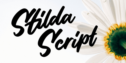 Stilda embodies fun, quirkiness and authenticity. This enchanting script font will turn any creative idea into a true standout.
 - Freska by ActiveSphere,
$30.00 Freska is a custom font which is applicable for any type of graphic design - print, web, motion graphics etc.
 - TigerCat by ActiveSphere,
$30.00 TigerCat is a custom font which is applicable for any type of graphic design - print, web, motion graphics etc.
 - Xira by ActiveSphere,
$30.00 Xira is a custom font which is applicable for any type of graphic design - print, web, motion graphics etc.
 - Keraton by Letterara,
$8.00 Keraton is a monoline script with a signature look. It will take any design project to the next level.
 - Aldrans by FaceType,
$20.00 Aldrans Medium is a homage to the poster style used in the 1920’s to promote skiing in Austria.
 - Hoffelized by Cititype,
$12.00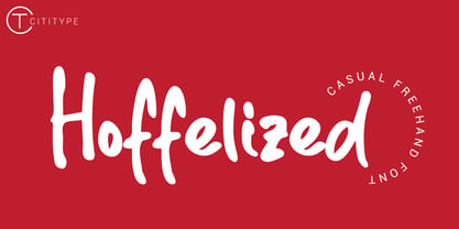 Hoffelized embodies fun, quirkiness and authenticity. This enchanting handwritten font will turn any creative idea into a true standout.
 - Juliet by Skiiller Studio,
$15.00 Juliet is a modern calligraphy script with flowing curves. It will add a romantic touch to any crafting project!


