10,000 search results
(0.029 seconds)
- 1484 Bastarde Loudeac by GLC,
$38.00 Font designed after that used in Brehan-Loudeac (Britanny, France) by Robin Fouquet and Jean Crès in years 1480s to print a lot of texts and books. This font include “long s”, naturally, as typically medieval, and a few special characters and abreviations, also some variants, like for “d”, “r” or “v”. The small “y” is accented, just like in British alphabet of the time, though the texts were printed in French. Added, a lot of accented characters no longer existing on this time. A render sheet, in the font file, makes it more easy to identify on a keyboard. This font is used as variously as web-site titles, posters and flier designs, editing ancient texts... all you need. This font supports easily as large than small size, remaining readable, original and pretty.
 - Stack Braille by Echopraxium,
$5.00 This is a monospace font for the Braille alphabet. The idea came while exploring new ways to display the regular braille glyph ( 3 rows of 2 dots ). The glyph design is inspired by "stackable multiple board" games like the famous Vulcan chess (from Star Trek series) and the Qubic (3D tic-tac-toe). The stack is made from 3 levels, each level is a 3x3 grid with 2 "playable" cells (South-West and North-East). Each cell can be either empty, filled by a white square token or a black square token. The 3D effect is obtained by means of the classic isometric perspective. Lowercase letters use black tokens, while uppercase letters use white tokens. Most special characters (e.g. digits, *$#@, []{}() etc.. ) are also provided for special usages like program source code (see poster 5).
 - Xmas Wishes by Resistenza,
$29.00 Xmas Wishes Font - A collection of 55 calligraphic Christmas greetings and 10 Christmas dingbats. All handwritten with different tools like broad nib pen, pointed pen and brush pen which allowed us to create diverse styles. The letterings are written in different languages; English, French, Spanish and Italian. Add the beauty of calligraphy to your layout and create unique gadgets for this Holiday Season like posters, greeting cards, wrapping paper, tags, and much more! You can also use the designs as photo overlays for your blog or social media content. Open the images to see all the details AWESOME FEATURES 'Font in .otf .ttf' '55 Handlettering Xmas words' '10 Hand-drawn Xmas dingbats' 'Languages in use English, French, Spanish and Italian' 'We highly recommend Turquoise Font to combine with the letterings.'
 - Barela by Scratch Design,
$8.00 Please welcome Barela. Barela is a handwritten font and has character such as friendly, casual type family and smooth. It is intended to be used everywhere where a pleasant feeling should be conveyed like advertising, food, fashion or something that include happiness. It will look great on all of your products and make them more fancy and relax. With the uniqueness of the shapes, Barela can attract attention of anyone and be an eye catching font in your design. The bold letters of this font makes it stand out from the crowd. This font also provide with feature such as Uppercase & Lowercase, Number, Punctuation, Multilingual Support (Western and Europe), Support in Mac and Windows OS and easy to install. We hope you like our Barela and thank you for purchasing. Scratch Design
 - Tusker Grotesk by Lewis McGuffie Type,
$35.00 Tusker Grotesk is a headline typeface designed for robust and high-impact use. The initial inspiration for Tusker came from postwar typefaces like Haettenschweiler, Impact and Helvetica Inserat which use very high x-heights. Other influences in the condensed end of the Tusker family are old grotesques like Folio Extra Condensed and Stephenson Blake Elongated Sans No.1 with their flat terminals and closed-up apertures. Then as the widths in Tusker grow, the lettering takes some more inspiration from gothic style sans such as Inland Type's Title Gothic No.8, while maintaining the optical weight established in the narrow end of the family. Each width set is duplexed, stackable and is ideal for headlines, logos and bold attention-grabbing editorial design. Tusker has extended latin coverage ideal for western, central and eastern European languages.
 - VLNL Wasabi Turbo by VetteLetters,
$35.00 Wasabi is one of the key ingredients in the Japanese kitchen. Also known as japanese horseradish, it is an extremely spicy condiment made out of the graded root of the Wasabi plant. Its spiciness is different than that of a chili pepper though, more like a hot mustard. The spicy taste shoots right through your nose, but does not last for long. Wasabi is traditionally used in sushi and sashimi dishes, soba noodles, and in a number of Japanese snack foods. Equally sharp and stingy, VLNL Wasabi Turbo was designed by Donald Roos. Despite its japanese outward appearance, the font has its origin in lettering found on a German book. It is hot, and edgy like a samurai sword. Wasabi Turbo will stand out as headline and logo!
 - Acris by Andrey Sharonov,
$35.00 Acris Serif is the rich and gracefull font designed in two weights for expressive and luxury projects. If it's had gender, it would be a woman — beautiful but with character like rose with thorns. Acris Serif is very good looking in Big Tittles, Magazine design, Branding, Logotypes, Posters, Wedding invitations, romantic cards and others. This typeface comes with special features like Stylistic Alternates and Discretionary Ligatures. The easiest way you can get Alternates is to add for example number 2, 3 or 4 after character. For this option be sure that bottom named Standard Ligatures is activated in Opentype panel. Multilingual Support Acris support Western European characters and works with following languages: English, Danish, Dutch, Estonian, Faroese, Filipino, Finnish, French, German, Hungarian, Icelandic, Irish, Italian, Norwegian, Polish, Portuguese, Spanish, Swedish, Turkish.
 - GreatVengeance - Unknown license

- KometenMelodie1 - Unknown license

- JustAnotherFont - Unknown license

- ComputerAmok - Unknown license

- Acquaintance - Unknown license

- NeverSayDie - Unknown license

- Gasoline - Unknown license

- Youthquake - Unknown license

- TagsXtreme2 - Unknown license

- Ghostwriter - Unknown license

- BeyondControl - Unknown license

- Blatant - Unknown license

- FatBoySmiles - Unknown license

- Opium - Unknown license

- MassiveHeadache3 - Unknown license

- IronMan - Unknown license

- Protection - Unknown license

- Futurism - Unknown license

- Vitamin - Unknown license

- Piracy - Unknown license

- Levato by Linotype,
$29.99 Levato, the first font designed by Felix Bonge, is an Antiqua that is full of character and is refined but by no means sterile. This typeface provides for a wide range of options for creating individual designs. It was not really Felix Bonge's intention to create a whole font family when, as a second year student, he began several exercises in contrast and proportion as part of the typeface design course of Professor Veljovi? at Hamburg University of Applied Sciences. However, these initial studies developed into a project that Bonge persisted with over the following years while working towards his degree. He continually had new insights and ideas that he was able to exploit for his font. Of particular importance, he claims, was a calligraphy seminar, which prompted him to completely rework his concept. It took him several years before his extensive font Levato™ was ready. Although the forms of Levato are ultimately derived from Renaissance Antiqua, Bonge has slightly increased the relative contrast in his version. This gives the font a graceful appearance that is further emphasized by the reduced x-height and the associated prominence of the ascenders. And, in addition, the relatively fine serifs, which are almost linear at their ends, infuse Levato with a hint of classical Antiqua á la Bodoni. At the same time, Bonge cleverly compensates for the sterilising tendency of this font form. Soft and rounded serif attachments and rounded line apexes offset the severe nature of the font and provide it with an aura of vivacity. This effect is promoted by the calligraphic-like foot of the lowercase h, n and m and the not quite horizontal bars of the uppercase E and F. Overall, Bonge has succeeded in creating a refined and yet very dynamic typeface. Levato is available in five weights; Light, Regular, Medium, Bold and Black, in each case with the corresponding italic versions. Bonge treats Levato Italic as a genuine cursive typeface. Its letters are thus slightly narrower than the analogous upright letters and their forms are considerably more curvilinear. All the versions of Levato boast an enormous range of characters to meet all possible requirements. In addition to four sets of minuscule and majuscule numerals for tabular and proportional typesetting, there are also small caps, numerous ligatures, ornamental characters and even swash variants of letters. With their generous, sweeping curves, the swash variants (available as OpenType versions) can be used for striking titling effects or as initials.
 - Onamura by Balibilly Design,
$22.00 Initially, letterform was inspired by the gothic style of Romance decorative letters in transitional art in the Middle Ages. The conservative type in the Gothic era, especially in decorative romance, has led to the Victorian style being embedded in several forms as accents related but not forced to be combined. Rounded serif seems conventional combined with historically relevant letterform to create a harmonious blend. The art nouveau style also inspires this typeface. Approach to architectural ornamentation from 1880 to 1915, adopting the dynamic lines and curves typical of the civilization of the time. Continue time travel; we also present a more modern form influenced by the digitalization of art nouveau derivatives, familiarly called the psychedelic style. Paying homage to predecessors, we presented The Onamura font in a Japanese Ukiyo-e style that influenced the fine arts movement that broke old conservative art in Europe. We designed this font carefully with the information about the Middle Ages, Ukiyo-E, & Art Nouveau that greatly influenced art worldwide. In this font family, there are collaboration vibes. Both are the basis of the phenomenal blend of idealism between western and Japanese artists. Consisting of 10 fonts in 10 weights, it features an extended charset of over 850 glyphs, covering multilingual support, including Western European, Central European, and Southeastern European. Complete with advanced open type features like stylistic alternates, discretionary ligatures, ordinals, small caps, fractions, and case-sensitive forms. The elegant and refined details seen in this font provide a new aesthetic input, satisfy contemporary style, and give a range of choices for luxury typographic projects. This font is perfectly suited for high-impact headlines. Advance open-type features are stunning on logos, branding, magazines, website, etc. Supports languages: Afrikaans, Albanian, Asu, Basque, Bemba, Bena, Bosnian, Catalan, Cebuano, Chiga, Colognian, Cornish, Corsican, Croatian, Czech, Danish, Dutch, English, Estonian, Faroese, Filipino, Finnish, French, Friulian, Galician, Ganda, German, Gusii, Hungarian, Icelandic, Ido, Inari Sami, Indonesian, Interlingua, Irish, Italian, Javanese, Jju, Jola-Fonyi, Kabuverdianu, Kalaallisut, Kalenjin, Kinyarwanda, Kurdish, Latvian, Lithuanian, Lojban, Low German, Lower Sorbian, Luo, Luxembourgish, Luyia, Machame, Makhuwa-Meetto, Makonde, Malagasy, Malay, Maltese, Manx, Maori, Morisyen, North Ndebele, Northern Sami, Northern Sotho, Norwegian Bokmål, Norwegian Nynorsk, Nyanja, Nyankole, Occitan, Oromo, Polish, Portuguese, Romanian, Romansh, Rombo, Rundi, Rwa, Samburu, Sango, Sangu, Sardinian, Scottish Gaelic, Sena, Shambala, Shona, Slovak, Slovenian, Soga, Somali, South Ndebele, Southern Sotho, Spanish, Swahili, Swati, Swedish, Swiss German, Taita, Taroko, Teso, Tsonga, Tswana, Turkish, Turkmen, Upper Sorbian, Vunjo, Walloon, Welsh, Western Frisian, Wolof, Xhosa, Zulu
 - Proprietor by Sudtipos,
$59.00 The great value of something crafted thoroughly by hand has been observed for years by Guille Vizzari throughout a wide spectrum of clients and projects developed at «Yani & Guille» —the studio he runs cheek by jowl with Yani Arabena—, and they both noticed that recently it has been taking on a new meaning. From barbers at their shops, to a barista that passionately prepares coffee every morning, or a bartender that deeply enjoys diving towards unknown ingredients, and even Guille’s admiration for sign painters worldwide that keep spreading their passion for the perfectly constructed letter. This wide trades universe, where craftsmanship represents a huge difference, is where «Proprietor» lives, and it’s the reason why it exists. «Proprietor» was born in a Moleskine notebook —just pencil, paper and ink— as a tribute to those crafts, and to regain the art behind Type Design that involves the fusion between tools, materials and the action of the hand. Fed by these principles, every single glyph within the whole «Proprietor» Family has been fully designed and illustrated by hand by its author (including all the ornaments, frames and crafts icons that can be seen along this specimen), showcasing Vizzari’s solid formation in the drawing field. Proprietor can be described as a compact type family system illustrated by hand, intended and designed to be able to create solid —but beautifully ornamented— paragraphs, and elaborate compositions. For this purpose, Proprietor Roman and Open displays a notorious x-height which goes perfectly with plenty of ornaments that unfold along the ascenders and descenders, but always containing its swashes inside the text line. The icing on the cake, Proprietor Script, a copperplate-based font unbelievably flooded with ornamented capitals, flourishes and endings to break through the coarse feeling of the Proprietor non-script sets, with a huge load of delicate and warm letterforms. Proprietor Wide and Wide Open hand a complete font set to complement the family for composing extended words in uppercase, matching in style and adding a striking personality. And as being part of Sudtipos’ catalogue «Proprietor» comes packed with full Open Type support —thanks to Ale Paul, fearless to tame this hand–drawn beast, supported by his vast knowledge in programming and optimization—. 7 imperfectly elegant and completely handmade fonts join the «Proprietor» system, bringing life to designs that are meant to represent the spirit of the genuine and skilled craftsmen, showing respect for their trade, and at the same time being part of it.
 - Justin Brown Monoline by Gatype,
$5.00 Justin Brown is a Sans serif display font with a modern, classy, fun, unique and versatile style. It looks amazing on any screen size and is easy to read in any text size. This font also has tons of unique alternatives and binders that will make for stunning design projects. This will add a fun and friendly touch to any of your projects. This font is PUA encoded which means you can access all the glyphs and sweeps easily and more.
 - Arkusi by Gatype,
$10.00 Arkusi is a neatly crafted and highly detailed script font. Whatever the topic, this font will be a wonderful asset to your font library, as it has the potential to enhance any creation. Arkusi is coded with PUA Unicode, which allows full access to all additional characters without having to design any special software. Mac users can use Font Book, and Windows users can use Character Map to view and copy any additional characters for pasting into your favorite text editor / application.
 - Almeira by Almarkha Type,
$35.00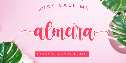 Almeira Lovely Script font with a natural feel, It has sweety swash that are perfect for any creative design. This handmade font will make your design has a beautiful natural touch for each details. It is perfect for any design project as Invitation,logo, book cover, craft or any design purposes. This font is PUA encoded which means you can access all of the magical glyphs and swashes with ease! It also features a wealth of special features including alternate glyphs and ligatures.
 - Fontanio by Ardyanatypes,
$15.00 Fontanio Font comes in a retro psychedelic style. Fontanio has 7 usable weights from thin to thick, making it suitable for any design style. Many designers use this type of font for projects with the theme of happiness and fun. Fontanio is perfect for any project that has a retro and classic style. Fontanio also comes with multiple languages, making it easy to use for any country and language use, and also comes with alternative styles to make your designs more attractive,
 - Winterline by Almarkha Type,
$35.00 Winterline Sweety Script font with a natural feel, It has sweety swash that are perfect for any creative design. This handmade font will make your design has a beautiful natural touch for each details. It is perfect for any design project as Invitation,logo, book cover, craft or any design purposes. This font is PUA encoded which means you can access all of the magical glyphs and swashes with ease! It also features a wealth of special features including alternate glyphs and ligatures.
 - Averia Serif - 100% free

- Old Standard TT - 100% free

- Pecita - 100% free

- News Cycle - 100% free

- Pfennig - 100% free