10,000 search results
(0.018 seconds)
- Academica Sans by Storm Type Foundry,
$53.00 Academica Sans was drawn with the aim of following the artistic features of Josef Týfa's fonts. It has the same proportions as the famous Academica, so both fonts can be successfully combined. It is suitable for all types of literature from scientific to poetry, but also for corporate identity and websites. It has a calm and timeless character.
 - Honey Waffles by Allouse Studio,
$16.00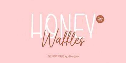 Proudly Presenting, Honey Waffles is a Lovely Font Pairing. Honey Waffles is perfect for any titles, logo, product packaging, branding project, megazine, social media, wedding, or just used to express words above the background. Honey Waffles also come with Multi-Lingual Support. Enjoy the font, feel free to comment or feedback, send me PM or email. Thank You!
 - Film Reel JNL by Jeff Levine,
$29.00 In a World War II training film from the U.S. Signal Corps, the opening title card saying “First Aid” was hand lettered in an extra bold, Art Deco inline style. Those two words (with seven available letters) used as a work model has inspired Film Reel JNL, which is available in both regular and oblique versions.
 - Gofar by Ef Studio,
$10.00 Gofar is a font duo that combine Serif and Script font. The Gofar Serif font looks contemporary and modern, some letters has unique form. You will also find Gofar Script with ligatures that beautiful to pair with. This font perfect for every project like branding, editorial design, book, logo, website, social media, and any project you like.
 - Differentura by ABSTRKT,
$50.00This typeface was developed for the Different Ground exhibition identity (and that explains the name of the font). The aim was to make an absolutely geometric, constructed font. Sometimes even too geometric and too much into it's own rules. But at the same time to make it look very humane, sometimes imperfect and weird, but alive and not soulless. - Volkschaft TF by Tyfomono,
$29.00 Introducing the new script font called Volkschaft. High quality script font with swashes inspired by retro propaganda poster and graphics. Plus OpenType features with Stylistic Alternates, Swashes, Ligatures, Stylistic set that allows you to mix and match pairs of letters to fit your design. This font is good for vintage design, t-shirt, logo, labels, badges, posters and etc.
 - Oui Tobias by Oui Studio,
$12.00 Hello friends! The 'Tobias' font is coming, a dynamic and art nouveau feel. Tobias is very inspired by the art nouveau style with a slightly modern touch. It's perfect for branding, logo, packaging, header, title, t-shirt design, etc. Tobias is great if you pair it with an illustration, it will make the design even more dope. Happy creating :)
 - Lesley by Monoco Type,
$18.00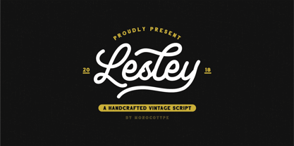 Lesley is a High quality monoline script font with swashes inspired by adventorous vibe and vintage design. Plus OpenType features with Stylistic Alternates, Swashes, Ligatures, Stylistic set, Terminal Form and Ornament that allows you to mix and match pairs of letters to fit your design. This font good for vintage design, t-shirt, logo, labels,badges, posters and etc.
 - Gildan by Sign Studio,
$15.00 Gildan fonts come in 7 measured thicknesses. Inspired by a charming classic style. Equipped with several OpenType features (plain version); Discretionary Ligatures, Small Caps, Stylistic Sets, Oldstyle Figures. We made the italic version simpler but with controlled thickness on each side. Everything is made with the aim of complementing each other and supporting the design well. Regards
 - Akturi by ProtoType,
$18.00 Akturi is a modular, techy and futuristic faux monospace display typeface, aiming to be used for all galactic space travel providers, mysterious coders and developers, and game designers creating strangely beautiful and gripping dystopian worlds. Featuring 471 characters, 7 stylistic sets and 7 weights, this display type offers plenty of customisability, versatility and support for 81 languages.
 - Zara Amorett by Letterhanna Studio,
$19.00 Zara Amorett is a modern urban handwritten script. Heavy and rounded shape. Zara Amorett’s attractive letterforms can be enhanced with extravagant swash, alternates, and endings. Complement your design with 24 underline swash. Try mixing your design with this font. Don't hesitate to pair it with serif or serif in your work idea. Find interesting layouts to complement your project.
 - Anbery by Craft Supply Co,
$20.00 Anbery – Handwriting Font is a playful script typeface that exudes a carefree and fun-loving vibe, perfect for adding a touch of whimsy to your display designs. With its charming, handwritten style, Anbery captures the essence of spontaneity and creativity, making it an ideal choice for projects that aim to convey a sense of playfulness and joy.
 - Cyclic Sans by ArtyType,
$25.00 Cyclic Sans is a legible and highly distinctive type family in four weights, running from Light to Heavy. A stoic sans, imbued with strength and charm, the fonts can be paired with their Cyclic Serif counterparts to stunning effect. Cyclic Sans is a stylish modern face and a versatile all-rounder, ideal for both text and headline use.
 - Quam by Typogama,
$29.00 Quam is a contemporary sans serif typeface, designed to be used as either a display or text font. With a range of alternates, true small capitals and variable numerals, this design aims to be versatile and functional. An added function is the inclusion of the full Cyrillic encoding to allow the application of a wide range of scripts.
 - Afferiants by Uncurve,
$25.00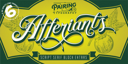 Afferiants is pairing authentic font collection. Thats already match up and to be use together. Afferiant support ligatures and alternates character to make everything awesome design. This Collection best use for vintage or modern design, logo, poster, advertising, branding, invitation, postcard, and more. The extras include badge, catchword and ribbon. Its make you more easier to combine.
 - Gulfs Display by Studio Sun,
$10.00 Gulfs Display Inspired by the 90's playful cartoon & comic books. This playful font comes in six widths; condensed, semi condensed, normal, semi expanded, expanded and extra expanded. This font can be used for modern and vintage designs, also can be easily paired with some graphic elements (Illustration, Photography) this font perfect for, Logotype, Branding, Title, and Packaging.
 - Switzal by Four Lines Std,
$15.00 "Switzal Font" speaks a universal language of happiness and optimism. It transcends age, culture, and borders, making it perfect for projects that aim to connect with a wide audience. Let your imagination run wild as you create eye-catching headlines, captivating slogans, or playful branding. "Switzal" font is your ticket to infuse a dose of happiness into your designs.
 - Royal Kevino by Hanzel Space,
$25.00 This modern serif typeface features serifs. Perfect for gorgeous logos & titles, Royal Kevino will pair beautifully with many fonts and work well with whatever project you're working on. That's it! If you have any questions at all , feel free to pop me a private message , I'm always more than happy to help you along :) Happy creating! Hanzel Studio
 - Organic Space by Melissa Lapadula,
$19.95Organic Space is about preserving what natural goodness there is left in the world, with its use of curves and space usage. It represents the selection of consumers, which choose organic products instead of the alternative genetically modified version. This typeface aims to be organic and unique. This font can function as headings, subheadings and body text. - ArchiType Rounded by Archiness,
$15.00 ArchiType Rounded is not just the rounded version of the ArchiType font. The aim was to get a slightly different balance between the squareness and the roundness of the original font. Now with rounded endings, resulting in a smoother appearance. Every glyph is redesigned, around 70 glyphs have been added and kerning has been vastly improved.
 - 90 Flinders Street by Melissa Lapadula,
$10.95This typeface has been influenced by the Melbourne city landscape. One building in particular reflects this typeface, this building is located at 90 Flinders Street, Melbourne, Australia. This font is also influenced by computer age fonts such as Bubbledot and Digital. This typeface aims to be bold, angular, dynamic and original. Its primary function is heading use. - HK Guise by Hanken Design Co.,
$30.00 HK Guise is a typeface with legible characters for maximum readability and legibility—perfect for interface and signage design projects. Inspired by Swiss Typographic design, HK Guise aims to be a standard go-to typeface for the adventurous graphic designer. Guise, defined literally; is an external form, appearance, or manner of presentation, typically concealing the true nature of something.
 - Avignon by Larin Type Co,
$15.00 Avignon script - a new casual font. This font is light, airy and elegant, perfect for wedding invitation, ideal for branding, blog and to decorate any project. Also with their help, you can create a logo or beautiful frame for your home. Or just use for your small business, notebook, stationery, marketing, magazines and more. Enjoy using!
 - Parkson by Rook Supply,
$18.00 Inspired by the grotesque fonts of the 19th century, Parkson is a tall sans serif typeface of 7 weights along with italic and several outline versions. The contemporary typeface aims to be one of the world's best condensed collection of fonts. Designed for optimum legibility, its clean, geometric look is perfect for logotypes, headers, titles and brochures.
 - IA Airship Captain by Invisible Art Studio,
$14.99 IA Airship Captain is a good readable comic book dialogue font made with a marker with wavy lines, giving it uniqueness and recognition. The family includes Regular, Italic, Bold, and Bold Italic. And contains a large number of kerning pairs. Added extended Latin, extended Cyrillic and contextual autoreplacing crossbar "I" in words like I, I'm, etc.
 - AT Move Tremelo by André Toet Design,
$39.95 TREMELO a typeface based on a logotype (Microtel). We designed it as a complete capital alphabet. The original idea for the logotype font came from the products the firm produced. They provided the parts that go into hearing-aids. We thought the type should have some visual tremor in it. Concept/Art Direction/Design: André Toet © 2017
 - Turismo CF by Connary Fagen,
$25.00 Inspired by midcentury motorsports, technology, and business, Turismo CF is designed for stunning logotypes and gripping headlines. Constructed from strong rectangles with sloping, elongated curves and a confident, affable stance. Turismo CF is a display typeface pairs well with mellow, text-friendly serifs that won't compete visually, like Artifex CF, or humanist typefaces like Artifex Hand CF.
 - Stock Signs JNL by Jeff Levine,
$29.00 Stock Signs JNL is a collection of fifty-two signs resembling those made by engraving letters into plastic using a pantograph process. There is also a pair of blank signs on the parenthesis keys. To make your own signs or layouts emulating this classic look, try Sign Engraver JNL, which is the font used for these designs.
 - Splashdown by Comicraft,
$29.00 Surf's Up! Head on down to the Barrier Reef with your favorite board, your latest pair of Oakleys and join us where the waves break. Zip up your wetsuit and be prepared to Wipe Out! On the other hand, if you'd rather not get wet, simply install this font and experience similar results. Splashdown is totally tubular, dude!
 - Demonic Rhapsody by Hun Liszt,
$50.00 Demonic Rhapsody is a unique typeface inspired by Codex Gigas, featuring Gothic, handwritten glyphs. Perfect for adding mystique to projects such as book covers, album artwork, or unique branding. It's part of the Demonic Rhapsody NFT project, symbolizing marginalized voices. A narrative tool, it pairs well with minimalist typefaces for contrast or textured fonts for an immersive experience.
 - Sweet Patterson by Just Font You,
$16.00 Sweet Patterson, a beautiful and lovely modern calligraphy script font with perfectly imperfect written by the hand. Perfectly fit for branding, logo, wedding things, greeting cards, fashion, anytime you need to pour some love. Included Uppercase, Lowercase, Numbers & Punctuations, Multilanguage Support, Stylistic Alternates for every lowercase letters, and some nice ligatures to aim the handwriting feels.
 - Ignorance by Typogama,
$29.00 Ignorance is a script typeface that mimics traditional handwriting found in America in the 19th century. Full of vitality and personality, this typeface includes a wide range of Opentype ligatures, alternates and swash characters that allow multiple choices for each setting. This design is principally aimed for use in display and titling setting that will reveal it's finer details.
 - TT Tsars by TypeType,
$39.00 TT Tsars useful links: Specimen | Graphic presentation | Customization options The TT Tsars font family is a collection of serif display titling fonts that are stylized to resemble the fonts of the beginning, the middle and the end of the XVIII century. The project is based on title fonts, that is, the fonts that were used to design book title pages. The idea for the project TT Tsars was born after a small study of the historical development of the Cyrillic type and is also based on Abram Shchitsgal’s book "Russian Civil Type". At the very beginning of the project, we had developed a basic universal skeleton for the forms of all characters in all subfamilies of the family, and later on, we added styles, visual features, artifacts and other nuances typical of the given period onto the skeleton. Yes, from the historical accuracy point of view it might be that such an approach is not always justified, but we have achieved our goal and as a result, we have created perfectly combinable serifs that can be used to style an inscription for a certain time period. The TT Tsars font family consists of 20 fonts: 5 separate subfamilies, each of which consists of 4 fonts. Each font contains 580 glyphs, except for the TT Tsars E subfamily, in which each font consists of 464 characters. Instead of lowercase characters in the typeface, small capitals are used, which also suggests that the typeface is rather a display than text one. In TT Tsars you can find a large number of ligatures (for Latin and Cyrillic alphabets), arrows and many useful OpenType features, such as: frac, ordn, sinf, sups, numr, dnom, case, onum, tnum, pnum, lnum, salt (ss01), dlig. Time-related characteristics of the subfamilies are distributed as follows: • TT Tsars A—the beginning of the 18th century (Latin and Cyrillic) • TT Tsars B—the beginning of the 18th century (Latin and Cyrillic) • TT Tsars C—the middle of the 18th century (Latin and Cyrillic) • TT Tsars D—the end of the 18th century (Latin and Cyrillic) • TT Tsars E—conditionally the beginning of the 18th century (only Latin) TT Tsars A and TT Tsars B families (both the beginning of the 18th century) have different starting points: for TT Tsars A it is Latin, for TT Tsars B it is Cyrillic. The development of the TT Tsars A family began in Latin, the font is based on the royal serif Romain du Roi. The Cyrillic alphabet is harmoniously matched to the Latin. The development of the TT Tsars B family began in Cyrillic, which is based on a Russian civil type. Characteristic elements are the curved one-sided serifs of triangular characters (A, X, Y), drops appear in the letter ?, the middle strokes ? and P are adjacent to the main stroke. Latin was drawn to pair with Cyrillic. It is still based on the royal serif, but somewhat changed: the letters B and P are closed and the upper bar of the letter A rose. This was done for the visual combination of Cyrillic and Latin and at the same time to make a distinction between TT Tsars A and TT Tsars B. TT Tsars C is now the middle of the 18th century. Cyrillic alphabet itself did not stand still and evolved, and by the middle of the 18th century, its forms have changed and become to look the way they are shown in this font family. Latin forms are following the Cyrillic. The figures are also slightly modified and adapted to the type design. In TT Tsars C, Cyrillic and Latin characters are created in parallel. A distinctive feature of the Cyrillic alphabet in TT Tsars C is the residual influence of the flat pen. This is noticeable in such signs as ?, ?, K. The shape of the letters ?, ?, ?, ? is very characteristic of the period. In the Latin alphabet, a characteristic leg appears at the letter R. For both languages, there is a typical C characterized by an upper serif and the appearance of large, even somewhat bolding serifs on horizontals (T, E, ?, L). TT Tsars D is already the end of the 18th century when with the development of printing, the forms of some Cyrillic characters had changed and turned into new skeletons of letters that we transposed into Latin. The figures were also stylized. In this font, both Cyrillic and Latin are stylistically executed with different serifs and are thus logically separated. The end of the century is characterized by the reduction of decorative elements. Straight, blueprint-like legs of the letters ?, R, K, ?. Serifs are very pronounced and triangular. E and ? are one-sided on the middle horizontal line. A very characteristic C with two serifs appears in the Latin alphabet. TT Tsars E is a steampunk fantasy typeface, its theme is a Latinized Russian ?ivil type (also referred to as Grazhdansky type which emerged after Peter the Great’s language reform), which includes only the Latin alphabet. There is no historical analog to this typeface, it is exclusively our reflections on the topic of what would have happened if the civil font had developed further and received a Latin counterpart. We imagined such a situation in which the civil type was exported to Europe and began to live its own life.
 - All Over Again, a captivating font created by the talented David Kerkhoff, stands out as a distinguished member of the handwritten font family. David Kerkhoff, known for his ability to infuse persona...
- "Margarite," designed by Maelle Keita, is a font that captivates with its unique and artistic flair, blending the boundary between traditional typography and modern creativity. The essence of Margari...
- The Doggon font by GemFonts | Graham Meade is a distinctive and playful typeface that embodies a sense of whimsy and creativity. Crafted by Graham Meade, a designer known for his diverse and often qu...
- Crox by NumidiaType,
$25.00 Crox™ is a sans-serif professional typeface inspired by crude geometry, creativity, and art. In the font family, there are 19 styles, including upright and italic, It is constructed of big lowercase letters with a maximum x-height for excellent optical reading. English letters are supported as a numerator and denominator set, this feature may aid in the creation of fractions using letters and numbers, as well as for sophisticated scripting and various scientific fractions forms. All weights support over 25 professional OpenType features within each style, with extensive coverage of western languages. These features were originally planned for personal and professional use, including multi-alternative characters in Styles: 1, 2, 4, 10, 11. Operational styles 6, 7 are enhanced with some scientific forms, to write the fit derived (SI units' expressions). Otherwise, it supports a wide range of professional factory pricing styles for business and marketing, as well as retail pricing styles in Sets 5, 8, and 9, with ligatures, old-style numerals, ordinals, swashes... Crox™ is enhanced with a poster weight like the fantastical type to fulfill your creative needs in three styles: poster, poster oblique, and poster italic for ADS and web design, branding, or product design. Glyphs: More than 970 glyphs, including those accessible with OpenType features. Powerful OpenType features: Standard Ligature, Alternate access, Automatic ordinals (English, French...), Case sensitive, localized forms, Numerator set, Denominator set, Subscript, Superscript, Swash, Stylistic alternate, Styles 1,2,3,4,5(Pricing style 1), 6(Derived Units),7(Advanced Fractions for Scientific units, Derived Units Vulgar Form), Set 8 (Pricing Style 2), Set (Pricing Style 3), Proportional Old-style, Tabular Old-style, Proportional Lining, Tabular Lining, Zero with slash, Fractions (Default, Automatic). Suitable for: logo and modern branding, web design, packaging, Product packaging, Articles, scientific document, Product user guides, multiple works in the Media, Design, ADS... Specimen Crox™ is a trademark of Yassine Abdi.
 - Sewn by Typodermic,
$11.95 Introducing Sewn, the typeface that’s tailor-made for your next design project! With its mechanically embroidered letterforms, Sewn is perfect for adding a touch of craft and artistry to your designs. Each of Sewn’s four sizes—small, medium, large, and extra-large—has been carefully crafted to ensure that the thread thickness and stitch density are perfectly balanced, creating a truly unique and authentic look. And with the added benefit of letter pair ligatures, you can add even more visual interest to your designs by breaking up the monotony of repeating letters. Inspired by the legible designs of Doradani, Sewn is the perfect choice for any project that needs to stand out. Whether you’re working on a logo, a poster, or a website, Sewn’s machine-stitched letterforms are sure to make a lasting impression. So why settle for boring, generic fonts when you can add a touch of handmade charm to your designs with Sewn? Try it today and see the difference for yourself! Most Latin-based European writing systems are supported, including the following languages. Afaan Oromo, Afar, Afrikaans, Albanian, Alsatian, Aromanian, Aymara, Bashkir (Latin), Basque, Belarusian (Latin), Bemba, Bikol, Bosnian, Breton, Cape Verdean, Creole, Catalan, Cebuano, Chamorro, Chavacano, Chichewa, Crimean Tatar (Latin), Croatian, Czech, Danish, Dawan, Dholuo, Dutch, English, Estonian, Faroese, Fijian, Filipino, Finnish, French, Frisian, Friulian, Gagauz (Latin), Galician, Ganda, Genoese, German, Greenlandic, Guadeloupean Creole, Haitian Creole, Hawaiian, Hiligaynon, Hungarian, Icelandic, Ilocano, Indonesian, Irish, Italian, Jamaican, Kaqchikel, Karakalpak (Latin), Kashubian, Kikongo, Kinyarwanda, Kirundi, Kurdish (Latin), Latvian, Lithuanian, Lombard, Low Saxon, Luxembourgish, Maasai, Makhuwa, Malay, Maltese, Māori, Moldovan, Montenegrin, Ndebele, Neapolitan, Norwegian, Novial, Occitan, Ossetian (Latin), Papiamento, Piedmontese, Polish, Portuguese, Quechua, Rarotongan, Romanian, Romansh, Sami, Sango, Saramaccan, Sardinian, Scottish Gaelic, Serbian (Latin), Shona, Sicilian, Silesian, Slovak, Slovenian, Somali, Sorbian, Sotho, Spanish, Swahili, Swazi, Swedish, Tagalog, Tahitian, Tetum, Tongan, Tshiluba, Tsonga, Tswana, Tumbuka, Turkish, Turkmen (Latin), Tuvaluan, Uzbek (Latin), Venetian, Vepsian, Võro, Walloon, Waray-Waray, Wayuu, Welsh, Wolof, Xhosa, Yapese, Zapotec Zulu and Zuni.
 - Masqualero by Monotype,
$50.99 The Masqualero™ family is a versatile solution for a deep and broad range of applications. In large sizes, the heavier designs are dark and handsome, while the lighter weights are charming and friendly in text copy. Thanks to its many variations and distinctive demeanor, both print and interactive designers will find that Masqualero expands their creative options, while setting the perfect tone to catch and hold readers’ attention. It’s About the Design Like the legendary jazz song of the same name, Masqualero is haunting and sophisticated. Drawn as a tribute to Miles Davis, its letterforms are as beautiful as his “Masqualero” composition. “I approached drawing the letters as if they were marble sculptures,” Says Jim Ford about his typeface. “Many sharp, black, modern sculptures filling a large park. All of them created with the same qualities – the flair of Miles' electric funk and rock sounds, the sparkly smooth finish and serifs like trumpet bells, the sweet lyricism and the tone and clarity of Miles’ horn.” What’s Available With six weights and italics, in addition to Stencil and Groove display designs, Masqualero is available as a suite of OpenType Pro fonts, providing for the automatic insertion of small caps, ligatures and alternate characters. Pro fonts also offer an extended character set supporting most Central European and many Eastern European languages. Thoughts About Use A book or album cover set in the Masqualero design sends a message: what’s inside is of value. Like jazz, the Masqualero typeface takes ordinary basic concepts and slips them into something special. Readers take notice and immediately recognize that what they’re viewing is a cut above – and radiates quality. “I see Masqualero as a luxurious typeface for exquisite typography,” says Ford. “I wouldn’t use it to sell toys or hot dogs. Masqualero sells diamonds, boats, real estate and champagne.” Perfect Pairings Antique Olive™ Neue Kabel® Neue Frutiger® Quire Sans™ Trade Gothic®
 - Reina by Lián Types,
$37.00ATTENTION! See the newest version of Reina here. Reina Neue is now a family of 45 styles and it's also a Variable Font! Have a look. For the traditional version of Reina, you may stay here ;) --- Reina is Sproviero’s didone of the year. We recommend seeing its user’s guide . Inspired in the sweet letters of calligraphy and typography masters of our past; such as Didot, Bodoni and the incredible Herb Lubalin, its aim was to incorporate the decorative accolades from blackletter and copperplate styles of calligraphy into a Modern Roman typeface. Reina reflects sovereignty due to the enveloping atmosphere and the sensation of greatness that can be felt when using it. It has an unique way of standing over paper and screen, being its swashes responsible of an extreme elegance. Similar to what Lian did in his last font Breathe , Reina was designed to be playful yet formal: While none of its alternates are activated it can be useful for short to medium length texts; and when the user chooses to make use of its open-type decorative glyphs, it can be useful for headlines with dazzling results. TECHNICAL Reina is a family with many members. In order to achieve better results when printing, Lian took his time to design the necessary styles: Reina 72 Pro, prepared for display sizes; Reina 36 Pro, for medium sizes; and Reina 12 Pro, the best for text or decorative words in small size. Each of these members have variants inside, which are open-type programmed: The user decides which glyph to alternate, equalizing the amount of decoration wanted. Reina Engraved Pro has the same features than the variants mentioned above. The family also contains variants which were made exclusively for decoration. These are: Reina Words, a set of the most common words used in english, german, italian, french and spanish; Reina Capitals, which consists in a big set of ornamented capitals; and Reina Fleurons, those little friends which always help to embellish our work.