10,000 search results
(0.022 seconds)
- Bullets by Wiescher Design,
$6.00 BulletNumbers come in very handy for all kinds of lists that don't exceed 100 categories. I have long since been using my own Bullets in positive and negative and four styles, serif, sans, engravers and script, a fitting one for every occasion. Now I added six more designs and perfected the Bullets for all of you. The following is a »must read«! Here is how to use them: (Important! Set letterspacing to '0', otherwise the two digit numbers will have gaps!!!) The numbers 1-0 reside on the standard keys. Two digit numbers 01-99 can be composed out of left and right half circles by using (lowercase) 'abcdefghij' for the first digit (left half circle) and 'lmnopqrstu' for the second digit (right half circle). The critical pairs (all combinations with 1) can be found in various places. Type '!' for 10, '#' for 11, '$' 12, '%' for 13, '&' for 14, '(' for 15, ')' for 16, '*' for 17, '+' for 18, ',' for 19, '-' for 21, '.' for 31, '/' for 41, ':' for 51, ';' for 61, '?' for 81, '_' for 91. The two arrows are on the < and > keys. '100' can be found with shift+option+1. Last but not least, the capital letter bullets A-Z can be found on the shift+letter A-Z. Your very practical Gert Wiescher
 - Aeroko by Monotype,
$49.99 Meet Aeroko, a slick variable typeface that evokes grit and speed, a dynamic play, a future–present competitive edge that evokes motorsport and all progressive brand design. This is a robust type system that creates memorable brand headlines. Powered by four display weights and three widths. Turbo-charged by a two-axes variable font. High performance brands can expect Aeroko to out-pace in every graphic condition. Aeroko is bold and assertive, it moves fast in headlines, it flexes when and where you need it. The forms are boxed and solid from Condensed to Wide, and they provide a distinct contrast when paired with rounder text fonts. Aeroko’s secondary power unit is harnessed from the ever adaptable variable font format. Variable font technology enables vast levels of typographic scale and expression, furthermore it allows Aeroko to react instantly in any digital space to maximize results. Aeroko evokes confidence, this is a typeface that actively encourages you to be courageous and daring with type in your own way. Brands demand distinct and robust typography, much in the same way that drivers demand pace. Aeroko meets these demands with ease, delivering assurance and weight across a valiant aesthetic. Aeroko is designed by Krista Radoeva and the Monotype Studio.
 - Neacademia by Rosetta,
$70.00 Neacademia is a Latin and Cyrillic type family inspired by the types cut by 15th century punchcutter Francesco Griffo for Venetian printer Aldus Manutius. Beyond the letterforms themselves, however, the digital fonts themselves are based on the techniques and methods Griffo employed. The family comprises four distinct variants optimised for specific point sizes, as was traditional in metal type. While the display sizes maintain a visual link to calligraphic roots, text sizes exhibit more typographic qualities, following the hand of the carver. Likewise, Neacademia maintains its even colour on the page by carefully employing alternative letterforms, rather than leaning on a multitude of kerning pairs. A geeky little detail you’ll likely need to point out with a magnifying glass to your type friends, but creating a neat texture that works in readers favour nonetheless. Neacademia’s historically sensitive eye is put to work for modern typographers’ needs. It incorporates Griffo’s italic capitals and harmonizes them with the lowercase and the romans — where the original Aldine italics had no capitals of their own and simply re-used the uprights. It was designed with specific allowances for letterpress photopolymer printing. Printed digitally, it can tolerate – and even benefit from – low resolution, rough paper, and low-grade presswork. In many ways, it feels like using metal type again!
 - South Wind by Ivan Rosenberg,
$16.00 South Wind Font is a handlettered font with 107 ligatures, lot of alternate characters and multilingual support. Is ideal for blog website, instagram, branding, invitations, business cards, weddings and many more. Ligatures list: ab ae al am an ar as at ax ay bb bl cc ch cl ct dd ee ef el en ep er es et ff ft gh ia ic ie il in it iu kt ll of ok ol om on oo op ot ov rr sh sl sm ss st th ts tt Af Ap As Be Dl Em Es Et Eu Ft If Is It Kt Ml Mr Ms Mt Ph Pl Pt Se Sh Sl St Us outh all alt arr ass can cus ell esl etl ett ill obl old oll oth out sim ted South Wind font also include multilingual support for Western and Central Europe. South Wind Font is a set of 542 glyphs, Upper and Lowercase characters with 107 ligatures, numerals, lot of punctuation glyphs, 3 alternates for each lowercase character and 2 alternates for each uppercase character. For access to Stylistic Alternates is required software with glyphs panel like Photoshop, llustrator, Inkscape etc. No special software is required to use Ligatures.
 - Press Gothic by Canada Type,
$24.95 Press Gothic is a revival of Aldo Novarese's Metropol typeface, released by Nebiolo in 1967 as a competitor to Stephenson Blake's Impact (designed by Goeffrey Lee). Though Metropol enjoyed a few short months of popularity and use in Italy, Germany and France, Impact won the technological outlasting battle by moving on to film type then to computer outlines bundled with mainstream software, while Metropol never made it past the metal state until now. Too bad really, since this is one of the few faces that could have played well with all the horrendous stretch'n'squeezing of the 1970s. Just like its inspiration, Press Gothic aims to be a fresh alternative to big economical poster fonts with clear sans serif forms and an urgent, strong, yet elegant design appeal. In the summer of 2008, Press Gothic underwent a major linguistic and aesthetic reworking for an international publishing company. The result of this on the retail side are new small capitals and biform/unicase additions to the main font, as well as expanded language support that includes Cyrillic, Greek, Turkish, Baltic, Central and Eastern European, Maltese, and Esperanto. Press Gothic Pro, the OpenType version, combines all three fonts into one, taking advantage of the small caps feature, and the stylistic alternate feature for the biform shapes.
 - Black Puma by Gergely Soós,
$20.00 The Black Puma typeface was inspired by the rock beats and the honest spirit of today's indie music scene. Just as evolving garage bands', Black Puma’s strength lies in its fresh and brave approach: to playfully experiment and proudly take its imperfections as long as they are needed to stay real and honest. Black Puma's aim is to entertain, while expressing a strong human touch through its handmade and creatively assembled characters. Black Puma's varying rounded and edgy shapes create a vibrating yet coherent visual, which carries a positive, playful atmosphere. Its irregularities and extra bold characters empower Black Puma to have great and touching visual impact, which make it stand out of the mass flow of information delivered in the information society we live today. Black Puma font - with its 370 glyphs - includes all the accented characters of the Latin alphabet, and also comes with a couple of alternate characters (stylistic and contextual) to play around with. And, above all - as mentioned before - it includes its essence: the young spirit. So come, play around and have fun with Black Puma. Use it to create expressive, passionate posters, flyers and art work full of spirit for the awaiting young-minded public. You can find more artwork using Black Puma under the "Gallery" tab above.
 - TT Supermolot Condensed by TypeType,
$29.00 You are on the page of the old display version of the TT Supermolot Condensed font. In 2019, we released an entirely new, completely redesigned, and significantly expanded version of the typeface called TT Supermolot Neue. In addition to 54 styles, TT Supermolot Neue has stylistic alternates, ligatures, old-style figures and many other useful OpenType features. Before you buy the old display version of the font, we suggest that you pay attention to the new superfamily TT Supermolot Neue and study it in more detail. - TT Supermolot Condensed is the narrow version of the TT Supermolot font family. Thanks to its open forms, TT Supermolot Condensed fits perfectly into any contemporary technological design and navigation systems. We've already seen this font family in the sports theme (as the main font for hockey teams branding), we've seen TT Supermolot as the main font inside the gameplay of a popular 3D-shooter. Information transfer in the high-tech areas is the ideal environment for this font family, also TT Supermolot Condensed fits well into army, space, and innovation themes. We've tried to create a maximum number of convenient weights (Thin, Light, Regular, Bold, Black) for you to be able to use this family anywhere, from mobile apps and web pages to big state fairs branding.
 - Boardwalk Avenue by Fenotype,
$30.00 Boardwalk Avenue is an elegant type collection of three styles and two weights of each. It’s divided into Boardwalk Pen, Boardwalk Antiqua and Boardwalk Serif. Boardwalk Avenue’s core is a connected mono linear script that works fantastic when paired with either of the impressive serif styles. All the fonts work great on their own but try putting them all together for a complete display font setup for a project. Here’s a short introduction on what’s included: Boardwalk Avenue Pen is a connected Script. It’s great for headlines, quotes or in packaging. It has a casual hand drawn vibe to it but it’s clean and legible. It’s equipped with automatic Contextual Alternates that keep the connections smooth and versatile. For instance when you type double letter another of them will automatically change to add variation. Or if you type “i” for example, as a first letter after space or after capital letter the code will add starting point to the letter to keep the letterforms more balanced. If you need more ambitious letterforms you can try Swash or Titling Alternates -there’s alternates for every standard letter and seek for even more alternates from the glyph palette. Boardwalk Avenue Antiqua is a high contrast serif with strong character. It’s great for glamorous headlines or as a logotype. Boardwalk Avenue Serif is a low contrast serif with bulky character. It’s great for strong and sturdy headlines or as a logotype.
 - Juniper and Sage by Nicky Laatz,
$23.00 Let Juniper and Sage Script whisk you away for a romantic rendezvous with your love of handwritten scripts. A little bit chic, a little bit classy, Juniper and Sage is a must-have for any handwritten font collection. It includes 55 natural looking Opentype Ligatures - to make the font look more natural as you type. Juniper and Sage has 3 subtle variants - each adds a different feel due to their different slants. Upright being slightly more upbeat and casual and slanted being more elegant. Perfect for: elegant branding, wedding stationery, romantic book cover designs, classy packaging, album covers, handwritten quotes, greeting cards, unique social media posts, and so much more.
 - Madigan Text by Hoftype,
$49.00 Madigan Text is the text optimized version of the Madigan family. More solid, more robust, it repesents the more stabil version to the more delicate Contane family. Stronger hairlines, solid serifs, and slightly wider proportions make it appropriate for bold headlines, as well as for small text sizes. Madigan supports up to 80 languages and it’s OpenType format allows a wide range of typographic applications. 18 styles offer fine graduation of the weights. All weights contain small caps, ligatures, superior characters, proportional lining figures, tabular lining figures, proportional old style figures, lining old style figures, matching currency symbols, fraction- and scientific numerals, matching arrows and alternate characters.
 - Curely Pro by Konstantine Studio,
$15.00 Start from the idea of our free font, Curely, which has hit the milestone - a 70K project views on Behance and a thousand times more download (still going). Now we came up with the Pro version of it. More complex, more features, and absolutely more playful. So, please welcome, Curely Pro. A Versatile casual handmade decorative lettering typeface. Still inspired from the girly things and cuteness overload in every letters. Perfectly fit for your cute, sweet, lovely, and casual branding or logo project. Or any design stuff that need a lovely cute touch on it, let the Curely Pro smooch it all the way baby!
 - Tita Script by Latinotype,
$59.00 Tita is dedicated to my grandmother Hebe, witty and arrabalera 1. The font is inspired by Milonga 2 music and the fileteado porteño 3. I picture it at The Moulin Rouge, sparkling, provocative, loving. It evokes Tita Merello and my grandmum singing her music. Tita is Argentinean to its very core. A font to shout goal and dulce de leche 4 with passion! Its curves originate from polirhythmic calligraphy, which I learnt from my mentor Silvia Cordero Vega. Tita is a pedigree script that is based on hand lettering and Sandra Biondi’s calligraphy works. Font digitalisation by Daniel Hernández. Edited by Javier Quintana / Programmed by Manuel Corradine. 1. A person from the arrabal (a working class neighborhood on the outskirts of the city of Buenos Aires) 2. Musical genre originated in the Río de la Plata areas of Argentina and Uruguay 3. Decorative hand lettering and artistic style that is frequently spotted in Buenos Aires 4. Sweet milk sauce
 - Pais by Latinotype,
$39.00 "País" is a contemporary and modern grotesque sans serif, inspired by the grotesques of the early 20th century, but more geometric and with a wider x-height than its referents; making it ideal for the current times. "País" comes in 2 versions, each with 9 weights, from thin to black, and matching italics, for a total of 36 fonts. The standard sans serif version is fresh, clean, and more ideally neutral. It's a perfect choice for editorial design, branding, headlines, or any other piece of graphic design. The "País Alt" version has more expressive and modern characters, with some giving it a much more playful image. It is ideal for logos, packaging, web and television use. País contains a total of 682 characters that make it possible to write in more than 200 Latin languages and basic Cyrillic.
 - SmallTypeWriting - 100% free

- NiteClub - Personal use only

- Sixty - 100% free

- Madawaska by Typodermic,
$11.95 Introducing Madawaska, the rugged slab-serif typeface that commands attention and exudes an air of authority. Born in Canada, this classic font packs a powerful punch with its stocky, weighty design and distinguished personality. With a total of eight hefty weights and italics, Madawaska offers the versatility you need to convey your message with the utmost impact. And for those who require easy web or application deployment, the font also includes sturdy small-cap styles that are sure to impress. But that’s not all—Madawaska offers even more character with two scuzzy effect styles, Madawaska Jeans and Madawaska River. These unique styles feature custom textured OpenType ligatures that add an extra layer of personality to your designs. So if you’re looking for a typeface that embodies strength, reliability, and a touch of grit, look no further than Madawaska. Let it add a rugged edge to your next project and make a lasting impression on your audience. Most Latin-based European writing systems are supported, including the following languages. Afaan Oromo, Afar, Afrikaans, Albanian, Alsatian, Aromanian, Aymara, Bashkir (Latin), Basque, Belarusian (Latin), Bemba, Bikol, Bosnian, Breton, Cape Verdean, Creole, Catalan, Cebuano, Chamorro, Chavacano, Chichewa, Crimean Tatar (Latin), Croatian, Czech, Danish, Dawan, Dholuo, Dutch, English, Estonian, Faroese, Fijian, Filipino, Finnish, French, Frisian, Friulian, Gagauz (Latin), Galician, Ganda, Genoese, German, Greenlandic, Guadeloupean Creole, Haitian Creole, Hawaiian, Hiligaynon, Hungarian, Icelandic, Ilocano, Indonesian, Irish, Italian, Jamaican, Kaqchikel, Karakalpak (Latin), Kashubian, Kikongo, Kinyarwanda, Kirundi, Kurdish (Latin), Latvian, Lithuanian, Lombard, Low Saxon, Luxembourgish, Maasai, Makhuwa, Malay, Maltese, Māori, Moldovan, Montenegrin, Ndebele, Neapolitan, Norwegian, Novial, Occitan, Ossetian (Latin), Papiamento, Piedmontese, Polish, Portuguese, Quechua, Rarotongan, Romanian, Romansh, Sami, Sango, Saramaccan, Sardinian, Scottish Gaelic, Serbian (Latin), Shona, Sicilian, Silesian, Slovak, Slovenian, Somali, Sorbian, Sotho, Spanish, Swahili, Swazi, Swedish, Tagalog, Tahitian, Tetum, Tongan, Tshiluba, Tsonga, Tswana, Tumbuka, Turkish, Turkmen (Latin), Tuvaluan, Uzbek (Latin), Venetian, Vepsian, Võro, Walloon, Waray-Waray, Wayuu, Welsh, Wolof, Xhosa, Yapese, Zapotec Zulu and Zuni.
 - Pentecoste by Tegaki,
$16.00 Pentecoste is created with stylist and handwritten characters. This handwritten font was PUA encoded. Pentecoste is a natural handwritten style that comes with Extended Latin Characters. Pentecoste works perfectly for logos, display, product branding, wedding invitation card, stationary, packaging, clothing, flyer, apparel, magazines, brochures, lable, posters, badges, etc. Pentecoste comes with 317 glyphs and 87 alternate characters contain with opentype features (supported with contextual alternates mode). Pentecoste also comes with 15 extended ligatures that allowing you to make stuff looks more exclusive and pro standard. You can access all those alternate characters by using OpenType savvy programs such as Adobe Illustrator, Adobe InDesign and CorelDraw X6-X7, Microsoft Word 2010 or later versions. There are additional ways to access alternates/swashes, using Character Map (Windows), Nexus Font (Windows), Font Book (Mac) or a software program such as PopChar (for Windows and Mac). For other programs that doesn't support OpenType features or Glyphs Panel such as Photoshop, you can use Character Map in Windows to access the alternate characters. Files included: Pentecoste (otf) How to access all alternative characters, using Windows Character Map with Photoshop: http://youtu.be/cxonI5QvULk How to access all alternative characters using Adobe Illustrator: https://www.youtube.com/watch?v=y5XTaWYwWA4 If you need help or advice, please contact me by e-mail "tegakiscript@gmail.com"
 - Flash Script by FadeLine Studio,
$19.00 Flash Script is a modern script font. This is a beautiful font with slanted handmade style. Made by soft and slowly aims to give the character of modern writing that is smooth, cute, simple, stylish, sweet and dancing. This font can be used anywhere as the main font or as a pairing font. With a style like this, this font will be suitable in use for lettering logo's, branding projects, homeware designs, product packaging, mugs, quotes, posters, shopping bags, t-shirts, book covers, name card, invitation cards, greeting cards, and all your other lovely projects. Available 611 glyphs in it! So you can freely and comfortably use it when you make your best design work. This Font support with Opentype Feature! Thank you
 - Sans Skript by Felitasari Rekso,
$25.00 Sans-Skript is a display typeface that is inspired by Javanese Script (or Sanskerta in Bahasa Indonesia). Javanese script is one of Indonesia’s many traditional scripts that were commonly used by Javanese people from mid-15th CE to mid-20th CE. Though not commonly used anymore, it is still taught and used in cities across East and Central Java. Sans-Skript translates the high-contrast, modular and organic features of the Javanese Script into the Latin alphabet. (Hence the not-script naming) The typeface is aimed to be used for large format prints, above 100 pt, and can be used alongside Javanese script. Typefaces that pair nicely mimic features of Javanese script, and Hatton by Pangram Pangram Foundry is an example.
 - Patched by Mans Greback,
$39.00 Patches is a multi-faceted, victorian-era serif typeface for when you need something more than plain text. Get that extra attention while adding a genuine, original appearance to your message. Patches was designed from scratch to give a sense quality and depth. Its designer Mans Greback has created a typeface with a complex structure, yet one that will be easy to master. This work will suit every style, taste and skill level. It is a decorative and completely hand-drawn design in vintage lettering, with the perks and flexibility of present-day technology, which is exactly what you'd expect from a modern typeface. Whether you are making a decorative floral headline, drawing a cowboy logo, or creating a unique design based on this ornamental font, the hopes are that Patches can give you a set of tools and inspiration to bring out the best of your artistry. Standing on the shoulders of giants, it was inspired by a wide range of works, and will hopefully be able to continue to teach and inspire future artists. Or at least help you become a better designer when you're designing an elegant and classic headline. Set the coloring of Patches to light gold and cream tones to apply a luxurious look, or in dark tones for a more rugged impression. Bold, bright colors will make it appear In the mid-1800s, decorative design flourished in the Western major cities. Victorian style thrived and encouraged techniques such as enamelling, embroidery and calligraphy. From the 1880s onwards, there were a series of reactions to higher Victorian tastes, with Art Deco reaching the heights of the 20th century. However, the Victorian art persisted popularity, as it changed to more sophisticated designs which made it more attractive to specific professions and groups. The evolution of the Victorian style in the mid-20th century was a key factor in the succession of the movement. Classic shops and salons, sport designs and traditional festivals, and later Rock'n'Roll and Harley Davidson-themed graphics inspired the continued development of the art. Aspiring to carry on this tradition, this typeface family consists twelve different high-quality variations. The main ones are Patched and Patched In – an outlined variation – and each one provided in five weights: Thin, Light, Medium, Bold and Black. Additionally, the two rough fonts Hangaround and Prospects, that tries to grasp the rough, earthy atmosphere of a shady motorcycle club. The font is built with advanced OpenType functionality and has a guaranteed top-notch quality, containing stylistic and contextual alternates, ligatures and more features; all to give you full control and customizability. It has extensive lingual support, covering all Latin-based languages, from North Europa to South Africa, from America to South-East Asia. It contains all characters and symbols you'll ever need, including all punctuation and numbers.
 - Feldicouth Italic - Unknown license

- Alfabetix - Unknown license

- Evolved by Hemphill Type,
$24.00 The evolution of ‘Sapiens’ Evolved is the modern counterpart of its prehistoric cousin, ‘sapiens’. The letterforms have adapted and evolved to fit in a more modern space – this typeface has become more civilized but retains the quirks and character of its predecessor.
 - Aroma Beauty by Nirmana Visual,
$22.00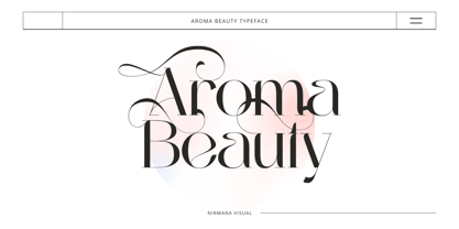 Aroma Beauty is a luxury typeface, full set of lowercase and uppercase letters, numerals and punctuation, multilingual symbols. Very suitable for the title, logo, typography, clothes, magazines, brochures, packaging and much more for your design needs, making your designs more modern and professional.
 - Diva Doodles Too by Outside the Line,
$19.00Diva Doodles Too is more of Outside the Line's top selling font Diva Doodles. More girl things in a line drawn, playful style. Font includes clothes, purses, shoes, jewelry, glove, high heel, bikinis, hats, perfume, flowers and cocktails and the scripted word Diva. - Romestone by Almarkha Type,
$25.00 Introducing our latest collection Romestone, a super bold condensed font family with 4 styles with strong and challenging nuances. Very suitable for titles, typography, clothes, magazines, brochures, packaging and much more for your design needs, making your designs more modern and professional.
 - Tweensco by Uncurve,
$20.00 Tweensco is a thin font with a condensed style. It's playful and feminine but still modern. It contains more than 400 glyph, alternates, multilingual support and ton of ligatures. Tweensco is perfect for headlines, posters, advertisements, logos, covers, magazines, editorials, quotes and more.
 - Bortolotto by Edcreative,
$15.00 Bortolotto is a pretty, elegant, clean and vintage-style font completed with several series of ligatures to make this font more attractive to complement your design. This font is perfect for wedding cards, T-shirts, branding logos, posters, mug designs and more
 - Sevoya Pro by Jonahfonts,
$45.00 Sevoya Pro a captivating robust script font designed with fat strokes for those strong brands and logos. Featuring short ascenders and descenders making it a bit more legible. Sevoya Pro is perfect to create outstanding headings, logos, menus, graphics, and many more applications.
 - Ciao Bella by Oddsorts,
$29.00 Oddsorts’ Ciao Bella family pairs the funky elegance of a hand-drawn copperplate script with a bouquet of ornament fonts. Ciao Bella’s expansive range of alternate opening and closing forms, word-connecting ribbons, and swash characters use the power of OpenType to create a genuinely hand-lettered look. Bursting with over 2,000 characters, the Ciao script mates broad linguistic support with expressive possibilities galore in an easy-to-use software experience. But then there are the ornaments! What’s truly innovative about Ciao Bella’s ornaments is that most of the characters come in pairs that can be set in multiple colors without any stacking, layering, or aligning. They work in any application that supports kerning — even most word processors. See the slideshow and Gallery link above to see how they work. Ciao Bella marries the best of the old world — the warm, classic feel of ink on paper — and the new — the amazing capabilities of “smart” OpenType fonts — in a union that’s sure to delight.
 - Reina Neue by Lián Types,
$29.00 Hey! See Reina Neue in action here! INTRODUCTION When I designed the first Reina¹ circa 2010, I was at the dawn of my career as a type designer. The S{o}TA, short for the Society of Typographic Aficionados, described it as complex display typeface incorporating hairline flourishes to a nicely heavy romantic letterform². And it was like that; that’s what I was pursuing at that time since I was very passionate about ornaments and accolades of Calligraphy. Why? I felt that Typography, in general, needed more of them. These subtle flourishes could breathe life into letters. Maybe, I thought it was the only way I could propose something new into the field of type. However, after some years, I came across a very interesting quote: –Beautiful things don’t ask for attention– Wow! What did this mean? How could something be attractive if it’s not actually showing it. Could this be applied to my work? Sure. I think every type-designer goes through this process (aka crisis) regarding his or her career. At the beginning we love everything. We are kind of blind, we only see the big picture of a project. And that’s not because we are lazy. We actually can’t see the small mistakes nor the subtleties that make something simpler beautiful. We are not able. But, the small subtleties… They are actually everything: With experience, one puts more attention into the details and learns that every single decision in type has to be first meticulously planned. Here I am now, introducing a new Reina, because I felt there was a lot of it that could be improved, also the novelty of Variable Fonts caught my attention and I had to take that to my type library. THE FONT A thing of beauty is a joy forever Now, a decade later, I’m presenting Reina Neue. This font is not just an update of its predecessor: –A thing of beauty is a joy forever– is the first line of the poem ‘Endymion’ by John Keats, and despite the meaning of “beauty” may vary from person to person, and even from time to time (as read in the last paragraph), with Reina I always wanted to bring joy to the eye. In 2010, and now, in 2020. I believe the font is today much better in every aspect. It was entirely re-designed: Its shapes and morphology in general are much more clean and pure. The range of uses for it is now wider: While the old Reina consisted in just one weight, Reina Neue was converted into a big family of many weights, even with italics, smallcaps and layered styles. The idea behind the font, this kind of enveloping atmosphere made out of flourishes, is still here in the new Reina. This time easier to get amazing results due to the big amount of available alternates per glyph and also more loyal from a systemic point of view. However, and as read in the introduction -Beautiful things don’t ask for attention-, if none of the flourishes are activated the font will look very attractive anyway. Reina Neue is ready to be used in book covers, magazines, wedding cards, dazzling posters, storefronts, clothing, perfumes, wine labels and logos of all kind. Like it happened with the previous Reina, I hope this new font satisfies every design project around the world if used, and can be a joy forever. SOME INSTRUCTIONS Before choosing the right style for your project, hear my advice: -Reina Neue Display was meant to be used at big sizes. If you plan to print the font smaller than 72pt, I suggest using Reina Neue, not Display. Otherwise, if the font will be BIG or used on a digital platform, Reina Neue Display should be your choice. For even smaller sizes, use Reina Neue Small. This style was tested and printed in 12pt with nice results. (Note for variable fonts: Print them in outlines) -Reina Italic is not a slanted version of the roman, and this means some flourishes are different between each other. The Italic version has other kind of swirls. More conservative, in general. -All the styles of Reina Capitals have Small Capitals inside. -Reina Capitals Shine should be used/paired ONLY with Reina Capitals Black. The engraved feeling can be achieved if Reina Capitals Black and Reina Capitals Shine are used as layers, with the same word. Variable fonts instructions: -For more playful versions, choose Reina Neue VF, Reina Neue Italic VF or Reina Neue Capitals VF: With them you can adjust between 3 axes: Weight (will change the weight of the font) – Optic Size (will thicken/lighten the thin strokes and open/close the tracking) – Accolades (will modify the weight of the active flourishes). SOME VIDEOS OF REINA NEUE VF https://youtu.be/8cImmT5bpQM https://youtu.be/1icWfPmKAkg https://youtu.be/YC9GkJDL1a8 NOTES 1. The original Reina, from a decade ago: https://www.myfonts.com/fonts/argentina-lian-types/reina/ 2. In 2011, Reina received an honourable mention by S{o}TA. “Great skill is shown in the detailing, and an excellent feel for the correct flow of curves and displacement of stroke weight.” https://www.typesociety.org/catalyst/2011/ Reina was featured in the “Most Popular Fonts of the year” in MyFonts in 2011 https://www.myfonts.com/newsletters/sp/201201.html In 2012, the font was also selected in Tipos Latinos, the most prestigious competition of type in Latinoamerica. https://www.tiposlatinos.com/bienales/quinta-bienal-tl2012/resultados Also, chose as a “Favorite font of the year” in Typographica. https://typographica.org/typeface-reviews/reina/
 - Grand Atlantic by Fenotype,
$35.00 Grand Atlantic is a powerful display package by Fenotype. It’s a genuine Brush script packed with features and Swoosh extras and it’s a striking condensed flared serif in two weights, designed with the same sharp edges on the flares as the Brush. Together they make stunning logotypes, posters or headlines. On top of that there’s a “Printed” version of each. Printed versions are the same but with rugged outlines and a print texture. Grand Atlantic is great for creating powerful identities for artisanal coffee brands, craft beer, organic juice or a sports teams. Grand Atlantic Brush is equipped with Standard Ligatures and Contextual alternates that help keeping the connections between letters smooth. They’re automatically on as you should normally keep them. On top of that Grand Atlantic Brush has Stylistic, Titling and Swash Alternates for standard characters if you need more ornamental letters and if you want to break up the rectangular word shapes. There’s even more alternates in the glyph palette, making it total more than 600 glyphs. Grand Atlantic Swoosh contains 52 shapes designed to go with the Brush. There’s many “terminal swashes” that you can put in the end of a word and it will connect to the last letter, and swirl under the word from there.
 - STP Stencil by Sete Std,
$30.00 Developed from the STP Display, the STP Stencil Typeface follows the same characteristic premise as its sister, in addition to composing the same number of Latin characters. What distinguishes them it’s that the STP Stencil can be applied more easily anytime, anywhere, increasing the possibility of being used in a more craft and artistic way. Since it has characteristics of a stencil font, it brings a more urban and contemporary look, which makes ideal to use it in public spaces with large circulation of people. In addition, wayfinding, architectural, advertising, packaging, posters, among others projects, are a good request for STP Stencil show its vigor and all its beauty. The STP Stencil is a modular feature source, perfect to use it in major event signaling projects or similar. It can also be useful in any demands that requires improvisation and quick solutions. The STP Stencil has very expressive forms and counterforms, but still counts with the practicality of a stencil source and its infinite possibilities of use. With a complete Latin alphabet, STP Stencil covers over 90% of the supported languages, covering the entire American continent, East and West Europe and most of the countries of Africa, Asia and Oceania.
 - Dog Days by Fenotype,
$45.00 Dog Days is an American hand lettering style brush script family. Dog Days is swift, strong and full of bursting energy. Due to its clean features it’s legible even in small sizes. Dog Days is great for any display use -from poster to packaging and logo to t-shirt. Dog Days is also great for lettering works. Dog Days Brush boasts with more than 700 glyphs and plenty of OpenType features: Keep Standard Ligatures on - it adds variety in hand lettering style and keeps the flow steady. If you need more action try turning on Swash, Stylistic or Titling Alternates in any OpenType savvy software. Dog Days Brush is also equipped with Old Style Numerals if you need your numbers to fit more into text. Dog Days Brush uppercase letters are designed to work as initials so if you need to write all caps you might want to use Dog Days Caps or Dog Days Small Caps. Dog Days Caps can also be used as uppercase letters for the script. Dog Days Extras is a set of badges, swashes and swirls designed to play with the font. Dog Days is inspired by a hand lettering sample in a vintage American swimsuit advertisement.
 - Garet by Type Forward,
$36.00Garet is a modern geometric sans serif. It is characterised by high x-height, clean and soft letterforms with a smooth masculine tone. Garet derives its distinctive oval shapes from the optically perfect circle and has closed counters to further emphasise that form. The Garet type family consists of 11 weights ranging from quite thin to extremely fat and their corresponding Italics to make a total of 22 fonts. And all of them are combined into one variable font that will give you unlimited opportunities to explore and express without the restrictions of the predefined weights. We understand the need for more extensive language support. That’s why the typeface includes Extended Latin and Cyrillic and covers more than 200 languages. Garet also comes with several alternative stylistic sets that will change the overall look of a paragraph, giving it a slightly different appearance. In addition to that, the type family is enriched with an extensive list of OpenType features for advanced typographic layout, including standard and discretionary ligatures, tabular and small figures, fractions, language localizations, case-sensitive punctuation, and more. Тhe wide variety of weights, characters, and additional features allow Garet to be implemented equally well both in print and on-screen media. - Austral Slab by Antipixel,
$15.00 Austral Slab is a hand-drawn layered font designed by Antipixel, with unique textures & styles that combine giving your work a distinctive impression. This font comes in three weights, Regular, Light & Thin, with irregular outlines and uneven/crooked strokes, giving your work more personality and making it exclusive and powerful. For this same reason it can be used in a vast variety of projects, such as logos & branding, stationery, book covers, magazine design, clothing prints & tags, packaging, animated videos, and many more! Austral Slab has three sets of alphabets in uppercase and lowercase to avoid repeating the same character pattern, and giving the font a more natural handwritten feel. This is included in the Open-Type Contextual Alternates, which applies an automatic substitution of glyphs as long as the Open-Type features are activated. Also, Austral Slab offers other Open-Type features such as Stylistic Alternates, Ligatures, Discretionary Ligatures, Fractions, Superscript, Subscript, Denominator, Numerator, Scientific Inferiors & Kerning. This font has a very large glyph coverage and can be used in a wide range of languages, including English, Spanish, Italian, French, German, Polish, Czech, Vietnamese, Finnish, Icelandic, among many others. The style Maplines Thin is offered Free for commercial & personal use!
 - Delightful by Jessie Makes Stuff,
$12.00 Delightful is a whimsical and cheerful handwritten font family of varying weights and widths. This typeface is like if Comic Sans had a cousin who studied abroad one summer and now wears scarves to look more grown up, even though inside she's still the same, sweet marshmallow she always was. The letters were inspired by my handwriting on a good day - slowed down, legible, and intentionally drawn. I even threw in some of my favorite doodles as alt characters because the set wouldn't be complete without them. And the name was inspired purely by how it feels when I see it - and by my word of the year, delight. Delightful is ideal for anyone who wants to include a bit more warmth and a personal touch with their messaging. It's friendly and non-threatening, and will enhance personal projects or professional ones alike - whether you're a designer, an Instagram influencer, or you need to create some flyers for the local Mom 'n Pop Shop. There are two versions of this font. The original style is slightly more rounded and gets chubbier as you increase its boldness, and the stretched style is like a condensed version, except it's been stretched taller rather than squished narrower. I hope you delight in it as much as I do!
 - Angeletta by Monotype,
$50.99 Despite being drawn digitally, Angeletta is a typeface in the hand-lettering tradition. It draws on designer Rob Leuschke's three decades of experience with pen and ink, including his time creating scripts for Hallmark Cards. Spontaneous and energetic, Angeletta is satisfyingly inky – with strokes almost spilling into one another. Its quirky personality and titling version makes it a good choice for packaging and social expression, while its distinctive character could work well in branding, perhaps paired with a more sedate sans serif. The Angeletta typeface is a calligraphic script designed by Robert E. Leuschke exclusively for Monotype. It is available in OpenType OTF and TTF fonts formats. Angeletta has 900 glyphs with OpenType typographic features like contextual and stylistic alternatives, swashes, ligatures and fractions.
 - Couturier Poster by Latinotype,
$29.00 Elegance flows through Couturier Poster soul. The new cousin of early launched Couturier, brings higher contrast and an extended family, perfect for big sizes. Inspired by the didones from the 18th century, its design its heavily influenced by contemporary ideas makes it suitable to use for almost anything you can think of. Equipped with swashes, ligatures, small caps and alternates, this typography is very versatile and allows you to set a big range of compositions with discretion or personality. Couturier Poster comes in six weights and matching true italics, from thin to black. It's a good choice to pair with Couturier for smaller sizes and Couturier Poster for the big titles. It has a set of 1248 characters that cover more than 200 languages derived from latin.


