10,000 search results
(0.061 seconds)
- Zega Grot by Isaco Type,
$24.00 Celebrate good times with Zega Grot family! This font is the companion of Zega Text but less “serious” than its predecessor. The Grot version has old vertical proportions, with higher capitals and asc-descenders, height difference between capitals and ascenders, beyond the redesign of various glyphs, giving a less formal tone, more rounded and cheerful. The family consists of 14 styles, 7 weights plus their respective italic versions. The fonts are available in OpenType PS and have extended character set to support CE, Baltic, Turkish as well as Western European languages. You can test Zega downloading the free trial font in Extrabold version (TT only).
 - Right Female by Haksen,
$14.00 Right Female is an elegant bold script with natural texture. I designed it with my own hand-writting style. I really hope you will enjoy it so much when using this font. I love using this one with layer masks in Photoshop, really look natural written. Right Female Script includes over couple ligatures to make everything look totally hand-done. What's Included: - OTF files - Ligatures in script - Numbers + Punctuation - Non-English support - Swashes If you are interested in more fonts of mine: https://creativemarket.com/Haksen/3908083-Attention-l-Combine-with-Extra-Bonus Please contact me if anything question, I'm glad to help :) Happy Designing, Haksen
 - Sassafras by Monotype,
$49.00Arthur Baker's display script Sassafras, designed in 1995, is based on the natural inline effect created when writing with a split-metal nibbed pen. Black and white are nicely balanced, giving this calligraphic face a remarkably smooth appearance. The regular and italic versions of Sassafras include two alternate faces: one with long, tall ascenders and regular-length descenders, and one with shortened ascenders and descenders that allow it to fit where its companion might not. In both, the ascenders increase in width as they move upward, while the descenders taper to a fine point. This variety of form makes Sassafras a very flexible choice for display work. - FS Untitled Variable by Fontsmith,
$319.99Developer-friendly The studio has developed a wide array of weights for FS Untitled – 12 in all, in roman and italic – with the intention of meeting every on-screen need. All recognisably part of a family, each weight brings a different edge or personality to headline or body copy. There’s more. Type on screen has a tendency to fill in or blow so for each weight, there’s the choice of two marginally different versions, allowing designers and developers to go up or down a touch in weight. They’re free to use the font at any size on any background colour without fear of causing optical obstacles. And to make life even easier for developers, the 12 weight pairs have each been designated with a number from 100 (Thin) to 750 (Bold), corresponding to the system used to denote font weight in CSS code. Selecting a weight is always light work. Easy on the pixels ‘It’s a digital-first world,’ says Jason Smith, ‘and I wanted to make something that was really functional for digital brands’. FS Untitled was made for modern screens. Its shapes and proportions, x-height and cap height were modelled around the pixel grids of even low-resolution displays. So there are no angles in the A, V and W, just gently curving strokes that fit, not fight, with the pixels, and reduce the dependency on font hinting. Forms are simplified and modular – there are no spurs on the r or d, for example – and the space between the dot of the i and its stem is larger than usual. The result is a clearer, more legible typeface – functional but with bags of character. Screen beginnings FS Untitled got its start on the box. Its roots lie in Fontsmith’s creation of the typeface for Channel 4’s rebrand in 2005: the classic, quirky, edgy C4 headline font, with its rounded square shapes (inspired by the classic cartoon TV shape of a squidgy rectangle), and a toned-down version for use in text, captions and content graphics. The studio has built on the characteristics that made the original face so pixel-friendly: its blend of almost-flat horizontals and verticals with just enough openness and curve at the corners to keep the font looking friendly. The curves of the o, c and e are classic Fontsmith – typical of the dedication its designers puts into sculpting letterforms. Look out for… FS Untitled wouldn’t be a Fontsmith typeface if it didn’t have its quirks, some warranted, some wanton. There’s the rounded junction at the base of the E, for example, and the strong, solid contours of the punctuation marks and numerals. Notice, too, the distinctive, open shape of the A, V, W, X and Y, created by strokes that start off straight before curving into their diagonal path. Some would call the look bow-legged; we’d call it big-hearted. - FS Untitled by Fontsmith,
$80.00 Developer-friendly The studio has developed a wide array of weights for FS Untitled – 12 in all, in roman and italic – with the intention of meeting every on-screen need. All recognisably part of a family, each weight brings a different edge or personality to headline or body copy. There’s more. Type on screen has a tendency to fill in or blow so for each weight, there’s the choice of two marginally different versions, allowing designers and developers to go up or down a touch in weight. They’re free to use the font at any size on any background colour without fear of causing optical obstacles. And to make life even easier for developers, the 12 weight pairs have each been designated with a number from 100 (Thin) to 750 (Bold), corresponding to the system used to denote font weight in CSS code. Selecting a weight is always light work. Easy on the pixels ‘It’s a digital-first world,’ says Jason Smith, ‘and I wanted to make something that was really functional for digital brands’. FS Untitled was made for modern screens. Its shapes and proportions, x-height and cap height were modelled around the pixel grids of even low-resolution displays. So there are no angles in the A, V and W, just gently curving strokes that fit, not fight, with the pixels, and reduce the dependency on font hinting. Forms are simplified and modular – there are no spurs on the r or d, for example – and the space between the dot of the i and its stem is larger than usual. The result is a clearer, more legible typeface – functional but with bags of character. Screen beginnings FS Untitled got its start on the box. Its roots lie in Fontsmith’s creation of the typeface for Channel 4’s rebrand in 2005: the classic, quirky, edgy C4 headline font, with its rounded square shapes (inspired by the classic cartoon TV shape of a squidgy rectangle), and a toned-down version for use in text, captions and content graphics. The studio has built on the characteristics that made the original face so pixel-friendly: its blend of almost-flat horizontals and verticals with just enough openness and curve at the corners to keep the font looking friendly. The curves of the o, c and e are classic Fontsmith – typical of the dedication its designers puts into sculpting letterforms. Look out for… FS Untitled wouldn’t be a Fontsmith typeface if it didn’t have its quirks, some warranted, some wanton. There’s the rounded junction at the base of the E, for example, and the strong, solid contours of the punctuation marks and numerals. Notice, too, the distinctive, open shape of the A, V, W, X and Y, created by strokes that start off straight before curving into their diagonal path. Some would call the look bow-legged; we’d call it big-hearted.
 - HWT Slab by Hamilton Wood Type Collection,
$24.95 These two extra bold fonts are classic slab serif wood type styles with one detail of difference. Columbian is an extra bold Clarendon wood type that was manufactured by many of the wood type manufacturers in the late 19th century. "Clarendons" feature bracketed or rounded serif joins whereas "Antique" was a class of typefaces that features squared off slab serifs. Some type designs have only minor differences from others. The Columbian design is essentially identical to Wm. Page & Co.'s "Antique no. 4", with the difference being the bracketed serifs. In researching material for the digitization of Columbian, we started with a 15 line font identified as "Columbian" shown in the Angelica Press wood type portfolio (printed in 1976). This font is in fact "Page Antique no. 4". Comparing Antique #4 to Columbian specimens from Hamilton and other manufacturers confirms the only real difference is the serif treatments. Therefore, both fonts are presented as a pair. Each font features a full Western & Central European character set.
 - HWT Unit Gothic by Hamilton Wood Type Collection,
$39.95 The Unit Gothic series was released by Hamilton Manufacturing Co. in 1907. This sans serif family features one of the first multi width/weight type 'systems' anticipating the Univers font system by 50 years. This set of 7 fonts was designed to aid in press room efficiency and with its incremental variation in widths gave poster printers unprecedented flexibility in fitting copy while using consistently harmonious fonts. This HWT release is the first ever digital version of these fonts. Each font contains 600 glyphs including Greek and Cyrillic character sets as well as alternate characters which are based on the actual special character production patterns from the Hamilton Wood Type Museum collection. HWT Unit Gothic system features: •HWT Unit Gothic 716 - 50% wider •HWT Unit Gothic 717 - 25% wider •HWT Unit Gothic 718 - (Standard width which others are based on) •HWT Unit Gothic 719 - 25% narrower •HWT Unit Gothic 720 - 50% narrower •HWT Unit Gothic 721 - 62.5% narrower •HWT Unit Gothic 722 - 75% narrower
 - Ponderosa by Adobe,
$29.00Ponderosa font is a joint work of the typeface designers K.B. Chansler, C. Crossgrove and C. Twombly, who also created Rosewood, Zebrawood and Pepperwood together. As the name suggests, it is so-called wood type. The origins of this kind of typeface can be found in the early 19th century. Called Italian or Italienne, these typefaces quickly became very popular. They are distinguished by square serifs whose width is larger than the stroke width of the characters. When the letters are set together, the heavy serifs build dark horizontal bands. The distinguishing characteristic of Ponderosa lies in its extremely fine figures between heavy serifs. The designers approached the boundaries of the impossible with this contrast. The typeface is reminiscent of the Wild West with its shootouts and heroes as well as of the 1970s with their platform shoes and wild hair-dos. When used carefully in headlines, Ponderosa font will surely attract attention. - Bayshore by Set Sail Studios,
$18.00 Perm your hair, squeeze into your lycra, and retro-fy your text with Bayshore! A totally tubular mono-line script font straight out of the 80's. This hand-drawn font is perfect for creating slick & stylish lettering. Whether it’s for logos, product packaging or merchandise, Bayshore is guaranteed to give your text an unmistakeable retro quality. Bayshore comes as a single font file with added features allowing you to customise your text; End Swashes • Each lower-case character has a separate ‘end-swash’ version, use this for the last letter in a word to give it a custom-feel styling. These end-swashes are accessible via any software with Opentype capabilities, simply by turning on ‘Stylistic Alternates’. Underline Swashes • Four swashes of varying lengths are also available, simply by typing any of the square brackets [ ] { }. These can be used to underline your text and give it a real eye-catching quality.
 - MGT American Copper by Magetype,
$29.00 American Copper Family is a vintage font inspired by an old American motorcycle logo. The logo looks very manly and strong, just like the motorbike. American Copper Script is the dominant one that turns the logo into a font. Whereas the Sans and Block family is a complement to the Script. But all three are a very good unit to be juxtaposed together. American Copper is a font made for you (designers) who love automotives: old cars and motorbikes. Anything related to automotive. Besides these two objects, this font is also very cool for music-themed design needs; rock n roll, metal, rockabilly, and others. Oh yes, Custom Culture is another very interesting thing to be depicted with this font. Workshop logo for example. It will look very unique with Interlock on American Copper Script. Pair it with American Copper Block. And, BOOM! The logo will look very manly. If you are curious, you can download the American Copper Script Demo version to try. Happy Designing. Cheers
 - Red Amaretto by Paweł Burgiel,
$38.00 Red Amaretto is a script typeface influenced by different ancient writing styles. All characters are handwritten by use ink and flat nib pen on coarse paper, scanned, digitized and optimized for best quality without lost its handwritten visual appearance. Coarse glyphs edges are easy visible at medium and higher sizes. Character set support all official and semi-official languages in European Union writen in latin, cyrillic and greek scripts. Supported codepages: 1250 Central (Eastern) European, 1251 Cyrillic, 1252 Western (ANSI), 1253 Greek, 1254 Turkish, 1257 Baltic. Include also spacing characters (M/1, M/2, M/3, M/4, M/6, thin, hair, zero width space etc.) for professional text formatting. OpenType TrueType TTF (.ttf) font file include installed OpenType features: Access All Alternates, Localized Forms, Fractions, Alternative Fractions, Ordinals, Superscript, Tabular Figures, Proportional Figures, Case-Sensitive Forms, Stylistic Alternates, Contextual Alternates, Stylistic Set 1, Stylistic Set 2, Contextual Ligatures. Include also kerning as single 'kern' table for maximum possible backwards compatibility with older software.
 - ZsaZsa Galore by Chank,
$39.95Chank created Zsazsa Galore as a fresh alternative to Mister Frisky, another jerky, hypercaffeinated interpretation of the traditional roman alphabet. The difference this time is that the new font has no descenders. Every letter comes to rest hard on the baseline. It sits there firmly rooted with branches wiggling around in the air. It was released as the Chank Font of the Month in October 1999 and it was named after Zsa Zsa Gabor because she is beautiful. - Triump Rough by Latinotype,
$20.00 The Triump Rough typeface comes with 2 different subfamilies: Blur, a soft, delicate font with a vintage and hipster feel that gives your design a breath of fresh air; and Rock, a strong, hard font in upper and lower case well-suited for high-impact headlines. This version provides a wide variety of OpenType features, such as ligatures, alternates and catchwords as well as a series of ornaments and extras, which help give your artwork a different look!
 - Chapeau by EVCco,
$20.00 The cold, conservative strokes of a typical sans-serif/grotesque descend into a distinctive "bat-wing drip" in this subtly spooky font named after the band for which it was originally designed. Perfect for any wordings which project darkness or menace, yet still require an air of respectability. Business in the front, evil in the back. Comes packaged in both TrueType and OpenType formats with standard complement of alpha-numeric glyphs, punctuation marks, mathematical symbols, and European diacritics.
 - Legendary Legerdemain Leggy by Comicraft,
$29.00 Legendary Legerdemain’s lovely assistant, Leggy is just that -- she’s tall, dazzlingly attractive in her tight-fitting clothes, and has legs right up to her neck! She looks good, strikes attractive poses, and gives LL room to make magic. Gasp as Legendary Legerdemain saws her in half! Cheer as she floats in the air! Look Away as Legendary Legerdemain makes her the target of his knife throwing act! See the families related to Legendary Legerdemain Leggy: Legendary Legerdemain.
 - Vasari NF by Nick's Fonts,
$10.00The pattern for this font was found in the 1906 specimen book for the Keystone Type Foundry under the name Ancient Gothic, which is a pretty accurate description of the particular appeal of this typeface. Use it liberally anytime you want to add an air of mystery or menace...or simply some quaint charm. Both versions of the font include complete Latin 1252, Central European 1250 and Turkish 1524 character sets, with localization for Moldovan, Romanian and Turkish. - Perfect Signature by Letterara,
$26.00 Introducing "Perfect Signature," a captivating handwritten font that brings an air of elegance and sophistication to your projects. With its fluid strokes and impeccable letterforms, this signature font captures the essence of personal touch and authenticity. Elevate your designs with the charm of a handwritten signature, whether it's for branding, invitations, logos, or any creative endeavor that requires a touch of class. Embrace the uniqueness and timeless beauty of Perfect Signature, and let your designs make a lasting impression.
 - Retroteen by Ask Foundry,
$19.00 Meet "Retroteen," the font that takes you on a nostalgic journey back to the vibrant 80s and 90s. The striking contrast between horizontal and vertical strokes adds a unique touch, exuding a bold and dynamic personality. From funky posters and album covers to retro-themed branding and advertisements, this font brings an air of nostalgia and playfulness to any artwork. It is also provides language support for the full Latin alphabet along with Western and Eastern European characters.
 - Freight Sans Pro by Freight Collection,
$39.00 A clean, well-lit design, Freight Sans proves that even a workhorse can be a breath of fresh air while remaining invitingly readable. Ideal for boundless headlines and text, the power and detail of this design also serves well in way-finding and display environs. From web to print to apps, it’s hard to imagine a project where Freight Sans wouldn’t do the job with aplomb. When you need a sans serif–you need Freight Sans.
 - Mantika Sans Paneuropean by Linotype,
$67.99With its well-defined characters that are readily legible even in the small font sizes, Mantika Sans by Jürgen Weltin is ideal for typesetting. The elaborately designed and highly individual set of italics enhances the attractiveness of the font.Jürgen Weltin developed the Mantika™ Sans sans serif font using older designs for an serif font as his inspiration. Nothing more than the merest suggestion of the original serifs has survived. Bevelled line endings and the slight variation in thickness of verticals, in particular, provide Mantika Sans with a very dynamic character that evokes manuscript. Short ascenders and descenders give the font a compact appearance that is also underscored by its condensed proportions. Weltin has achieved his aim of producing a typeface with excellent legibility even in small sizes not just by means of the x-height, which is tall in comparison with the capital letters, but also by using clearly defined and well differentiated designs for critical letters, such as i", "I" and "l". Lower case "i", for example, has a serif while the "l" has a curved base.In addition to uppercase numerals, Mantika Sans also has lowercase or old style numerals that have been designed so that they can be used in both tabular and proportional settings. The uppercase numerals are slightly shorter than the uppercase letters, ensuring that the latter can be sympathetically incorporated within continuous text.The Mantika Sans italics are very unusual. They are inclined at only 4.5° (the usual angle for italics is 10 - 12°) and so appear to be almost upright. In addition, they also have quite distinctive forms. The overall effect calls attention to their curvilinear, manuscript character, enhances contrasts and further emphasizes the terminals. Weltin explains: "Within the variety of forms of the italics there are many contrasting terminal elements that create dynamism. The result is a diversity of interaction between the rounded and angular forms". Mantika Sans Italic thus has all the features of a display typeface, but can also be happily used on its own to set longer text passages. Mantika Sans is available in two weights; Regular and Bold, both of which have corresponding italics sets. Mantika Sans has been designed so that the widths of the four related cuts are identical, meaning that a change of font within a single layout will have no effect on justification. In addition, the members of the Mantika Informal font family, designed by Jürgen Weltin in 2010, also have the same thickness. Other font families having weights with equal thickness can be found in the "Linotype Office Alliance series".The Mantika Sans character sets are paneuropean. There are characters for setting texts in Eastern European languages, Greek and Cyrillic. There is also a range of special symbols, including right-angled brackets, subscript and superscript lower case letters, together with numerals, arrows and many different bullet points.As a vibrant and highly legible text font, Mantika Sans has a broad spectrum of potential applications. Its unusual italics are not just perfect for use in display text. The fact that it has only four cuts means that Mantika Sans is particularly suitable for office use or for the setting of business reports. Its excellent legibility even in the small font sizes also makes it ideal as a text for electronic reading devices; this also applies to Mantika Informal.At the 3rd International Eastern Type Design Competition Granshan 2010, Mantika Sans was awarded in the category Greek text typefaces." - Mantika Sans by Linotype,
$50.99 With its well-defined characters that are readily legible even in the small font sizes, Mantika Sans by Jürgen Weltin is ideal for typesetting. The elaborately designed and highly individual set of italics enhances the attractiveness of the font.Jürgen Weltin developed the Mantika™ Sans sans serif font using older designs for an serif font as his inspiration. Nothing more than the merest suggestion of the original serifs has survived. Bevelled line endings and the slight variation in thickness of verticals, in particular, provide Mantika Sans with a very dynamic character that evokes manuscript. Short ascenders and descenders give the font a compact appearance that is also underscored by its condensed proportions. Weltin has achieved his aim of producing a typeface with excellent legibility even in small sizes not just by means of the x-height, which is tall in comparison with the capital letters, but also by using clearly defined and well differentiated designs for critical letters, such as i", "I" and "l". Lower case "i", for example, has a serif while the "l" has a curved base.In addition to uppercase numerals, Mantika Sans also has lowercase or old style numerals that have been designed so that they can be used in both tabular and proportional settings. The uppercase numerals are slightly shorter than the uppercase letters, ensuring that the latter can be sympathetically incorporated within continuous text.The Mantika Sans italics are very unusual. They are inclined at only 4.5° (the usual angle for italics is 10 - 12°) and so appear to be almost upright. In addition, they also have quite distinctive forms. The overall effect calls attention to their curvilinear, manuscript character, enhances contrasts and further emphasizes the terminals. Weltin explains: "Within the variety of forms of the italics there are many contrasting terminal elements that create dynamism. The result is a diversity of interaction between the rounded and angular forms". Mantika Sans Italic thus has all the features of a display typeface, but can also be happily used on its own to set longer text passages. Mantika Sans is available in two weights; Regular and Bold, both of which have corresponding italics sets. Mantika Sans has been designed so that the widths of the four related cuts are identical, meaning that a change of font within a single layout will have no effect on justification. In addition, the members of the Mantika Informal font family, designed by Jürgen Weltin in 2010, also have the same thickness. Other font families having weights with equal thickness can be found in the "Linotype Office Alliance series".The Mantika Sans character sets are paneuropean. There are characters for setting texts in Eastern European languages, Greek and Cyrillic. There is also a range of special symbols, including right-angled brackets, subscript and superscript lower case letters, together with numerals, arrows and many different bullet points.As a vibrant and highly legible text font, Mantika Sans has a broad spectrum of potential applications. Its unusual italics are not just perfect for use in display text. The fact that it has only four cuts means that Mantika Sans is particularly suitable for office use or for the setting of business reports. Its excellent legibility even in the small font sizes also makes it ideal as a text for electronic reading devices; this also applies to Mantika Informal.At the 3rd International Eastern Type Design Competition Granshan 2010, Mantika Sans was awarded in the category Greek text typefaces."
 - Gizmo - Unknown license

- Lady Ice - Condensed - Unknown license

- Lady Ice - Extra Light - Unknown license

- Lady Ice - Light - Unknown license

- Lady Ice - Expanded - Unknown license

- Gizmo - Shade - Unknown license

- Blackheat by Almarkha Type,
$19.00 Blackheat is a bold, condensed sans with 4 styles inspired by the title of the sports poster. We designed it to look very energetic, taking into account the thickness and density of each glyph. Extra ligatures give you even more possibilities. This family is suitable for the titles, clothes, posters, magazines, brochures, packaging, websites and much more.
 - Autovia by Santi Rey,
$25.99 Autovia is a condensed sans-serif based on the typeface created for the US Highway signs in the 50s. Autovia comes in 6 weights. Has more than 350 glyphs and 8 stylistic sets, and supports all the Latin based languages. A new and more casual addition for the Highway fonts sub-genre ideal for big headlines.
 - Insans by Gassstype,
$23.00 Hello Everyone, introduce our new product Insans - Bold Handmade Carefully All Caps Display, inspired by the title of the sports poster and We make it very energetically. Insans font with strong and challenging nuances. very suitable for the title, typography, Poster, magazines, brochures, packaging,Websites and much more for your design needs, making your designs more modern and professional.
 - Suomi Script by Suomi,
$80.00Suomi Script is a typeface with a twist (pun intended): it has more than 1600 ligatures with two or more glyphs connected to make it look like an odd hand-written script polished by ITC. With Open Type savvy programs this font automatically replaces single characters with the ligatures. Some hand kerning is needed here and there. - La Gateau by RagamKata,
$14.00 La gateau, a classic, elegant yet stylish serif font that will make your project even more stunning. A graceful typeface, with a perfect shape and ligatures will make your design look majestic. This typeface is a perfect for a luxury logo, classy editorial designs, fashion brand and promotion, and much more. Spread your aural with La geteau.
 - Davina by Nirmalagraphics,
$14.00 I made Davina for display purposes and it can be used for logos with a vintage style, for flyers, brochures, leaflets and more. If you like a logo with a semi-vintage style, thick, unique and clean, it means you have to buy and use Davina! This font also has Multi-Lingual support and more than 15 Ligatures.
 - Federasyon by Yasin Yalcin,
$14.00 Federasyon was designed on the principles simplicity, legibility and functionality. The font family includes four weights and each weight has more than 240 characters on its own. Federasyon contains more than 10.000 optical arrangement data for each character to work in harmony with each other. Federasyon supports a total of 22 languages, including Western and some Central European languages.
 - Bright shade by Namara Creative Studio,
$20.00 Bright Shade display font inspired by modern and contemporary serif combined in one. Perfect for any of your design needs, Such as Logo, Poster, Business card, Social Media design and more. Modern contemporary serif display font, Combined unique and elegant styles serif of the '80s. Bright shade come to display your message more attractive and meaningful.
 - Nalgae by Diven,
$40.00 About This Font Nalgae is a Korean modern-traditional conceived from Hermes' shoes. By flowing the end of the letters with a brush, the speed of stroke : express wind, It is a design font created for complement it more as an illustration. This font is for express Hangeul (Korean alphabet) unique, importance, logotype, pattern, title, branding and more.
 - Daisy Lovers by Sarid Ezra,
$15.00 Introducing, Daisy Lovers, a tall handwritten sans! Daisy Lovers is a sans font with handwritten touch. This font will make your project or your design more human. You can use this font for your brands, quotes, book covers, etc. With unique lowercase, Daisy Lovers can make your project more stand out! This font also support multi language. Happy Creating!
 - Gellatio by Din Studio,
$25.00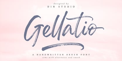 Gellatio is a chic Brush Font. It will make your design project more beautiful. This font is suitable for any design like branding, fashion, print templates, quotes, wedding and more. Features : 88 Beautiful Alternates 6 Beautiful Ligatures 52 Swashes PUA encoded Multi-lingual Support Numerals and Punctuation (OpenType Standard) Full Support Thanks for visiting and purchasing my font.
 - Budhayanti by madeDeduk,
$14.00 Budhayanti is a duo with both a script and sans-serif. This font perfect for poster design, book covers, merchandise, fashion campaigns, newsletters, branding, advertising, magazines, greeting cards, album covers, and quote designs and more. If you need anything else just shoot me an email at: dedukvic@gmail.com Find more previews on my Instagram here : https://www.instagram.com/acekelgondolayu/
 - Avegas Royale by Java Pep,
$15.00 Avegas Royale font is modern sans serif font that is made in 4 styles regular, italic, bold, and bold-italic. The shape is made to contrast curves and lines between light and thick so that it looks more stylish and stands out. This font that perfect for logo, headline, advertising, quote text, invitation card, branding identity, and more.


