10,000 search results
(0.013 seconds)
- Typoskript AR by ARTypes,
$35.00Typoskript AR is based on a metal type which was produced in 1968 by VEB Typoart, Dresden, from a design of the German calligrapher and lettering artist Hildegard Korger. It bears all the qualities of the artist’s inimitable style which will be immediately recognizable to anyone who’s familiar with her Handbook of Type and Lettering (Lund Humphries, 1992) (Schrift und Schreiben, Leipzig, Fachbuchverlag, 1971). The ARTypes transcription retains the roughness of the artist’s pen on paper as it was featured in the original type, as well as the letterfit, ch, ck and f-ligatures. ARTypes have supplied the font with all the standard accents, monetary signs, etc. The original qu logotype is provided as an alternative letter. A printable .pdf specimen of the type can be downloaded from the gallery. - Amati AR by ARTypes,
$35.00Based on the 60-point Amati designed by Georg Trump and issued by C. E. Weber (Stuttgart) in 1953. - Diethelm AR by ARTypes,
$35.00 Based on the 10- and 36-point Diethelm-Antiqua types designed by Walter Diethelm and issued by Haas (Münchenstein) 1948-51. DiethelmAR™ series text-size fonts are based on the 10-point designs. Eastern European accents, swash capitals, alternative figures and small capitals are available. The DiethelmARd fonts are based on the 36-point (dreicicero) designs. OpenType fonts are available individually or in two packages: text fonts (with EE accents, small capitals) and display fonts.
 - Seibi Ai by Nihon Literal,
$169.00 This typeface combines the rhythmic movement of Mincho and the simplicity of Gothic, with a rounded finish for a touch of elegance and style. 明朝のリズム感とゴシックのシンプルさに加え、ラウンド処理することでエレガントでおしゃれなイメージを求めた書体です。タテ画は太く、ヨコ方向はそれより細く、ハネなどはさらに細く、という三段階処理が施されています。昭和50 年(1975 年)頃、レタリング文字として開発。その後デザイン調整を経てフォント化されました。
 - Ars Nova by PintassilgoPrints,
$24.00 Ars Nova is an up-to-date incarnation of the Art Nouveau flair. Suited for striking typographic effects. Suited for some nostalgic pleasure. Specially suited for creative minds. Cheers!
 - Ar Rayyan by LetterStock,
$20.00 Ar Rayyan Ar Rayyan is a decorative font that was inspired by middle east style design that i saw online, and it was crafted by hand to add a natural handmade feeling and i make it clean with pentool. If you looking for decorative font with middle east tyle for your title or even branding and logotype, Ar Rayyan is a great choice for that purpose. Opentype features: Ar Rayyan font is very good looking in logotype, labels, decorative lettering, playful design, product packaging, invitation titled, advertising and others. This decorative font works with folowing languages: Afrikaans, Albanian, Asu, Basque, Bemba, Bena, Chiga, Cornish, Danish, English, Estonian, Filipino, Finnish, French, Friulian, Galician, Gusii, Indonesian, Irish, Italian, Kabuverdianu, Kalenjin, Kinyarwanda, Low German, Luo, Luxembourgish, Luyia, Machame, Makhuwa-Meetto, Makonde, Malagasy, Malay, Manx, Morisyen, North Ndebele, Norwegian Bokmål, Norwegian Nynorsk, Nyankole, Oromo, Portuguese, Romansh, Rombo, Rundi, Rwa, Samburu, Sango, Sangu, Scottish Gaelic, Sena, Shambala, Shona, Soga, Somali, Spanish, Swahili, Swedish, Swiss German, Taita, Teso, Vunjo, Zulu. Thank you for using this font. LS
 - Graphique-AR by ARTypes,
$35.00Graphique-AR is a digital version of a type designed by Hermann Eidenbenz and issued by the Haas foundry in 1946. - Goudy AI by URW Type Foundry,
$35.99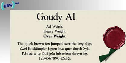
- Gravur-AR by ARTypes,
$35.00Gravur-AR is a digital version of a type designed by Georg Trump and issued as Trump-Gravur by Weber in 1960. - AI Wood by Alphabets,
$17.95These six faces are interpreted from examples shown in Rob Roy Kelly's "American Wood Types" They are not merely scanned copies, but have been redrawn from scratch with various optical adjustments. Kelly points out that the true glory of the American Wood Types are the negative spaces, which are, in their dynamic active forms, the antithesis of the anemic flimsy letters produced by type foundries in the 19th century. The Alphabets Wood Types are designed with digital manipulation in mind. Stretch, curve and distort at will! These designs were released prior to similar revivals from Adobe. Each font has two full alphabets (one full height, one smaller) and numerals. However, certain points and accents will not be found. - Baskerville AI by URW Type Foundry,
$35.99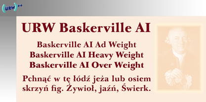
- Troyer AR by ARTypes,
$30.00The Troyer AR ornaments are based on the first series of ornaments designed for American Type Founders by Johannes Troyer (1902-69). They were cast in 36 and 48 point in 1953 by ATF who said that they ‘mark a distinct and refreshing departure from the motif of earlier ornaments, and add a crisp touch to your finer printing’. Kenneth Day, in The Typography of Press Advertisement (1956), found them 'clean-cut and bright and clearly showing their calligraphic origins . . . useful for single decorative touches'. - Ongunkan Linear B Syllabary by Runic World Tamgacı,
$100.00 This font is based on the Latin-based font for Linear B syllable writing. It contains all the characters. To see some full characters, you can use Turkish characters by selecting the font from the add character section of the word program. Linear B was a syllabic script that was used for writing in Mycenaean Greek, the earliest attested form of Greek. The script predates the Greek alphabet by several centuries. The oldest Mycenaean writing dates to about 1400 BC. It is descended from the older Linear A, an undeciphered earlier script used for writing the Minoan language, as is the later Cypriot syllabary, which also recorded Greek. Linear B, found mainly in the palace archives at Knossos, Cydonia, Pylos, Thebes and Mycenae, disappeared with the fall of Mycenaean civilization during the Late Bronze Age collapse. The succeeding period, known as the Greek Dark Ages, provides no evidence of the use of writing. Linear B, deciphered by English architect and self-taught linguist Michael Ventris based on the research of American classicist Alice Kober[5] is the only Bronze Age Aegean script to have thus far been deciphered.
 - Throw My Hands Up in the Air - Personal use only

- Throw My Hands Up In The Air by Kimberly Geswein,
$5.00 Cute, messy (yet still legible) teen girl handwriting with flair.
 - KG Primary Penmanship Lined - Personal use only

- White Line Fever 1.00 - Unknown license

- Square Line Icons Insurance by Howcolour,
$17.00 The square icons focus on maximizing the meaning by minimizing the symbols. Let your viewers understand your data without disorientation. Use a metaphorical icon library, designed for fast, intuitive human recognition.
 - Double Line Deco JNL by Jeff Levine,
$29.00 Take a classic hand lettered Art Deco alphabet, add in a treatment of dual straight vertical lines and the resulting typeface is Double Line Deco JNL.
 - PIXymbols Box 'n Lines by Page Studio Graphics,
$29.00 A font with boxes, bullets, large brace segments, etc. Plus six pt. wide line segments which will generate lines in 16 weights, in any program which supports fonts.
 - Square Line Icons Interface by Howcolour,
$17.00 The square icons focus on maximizing the meaning by minimizing the symbols. Let your viewers understand your data without disorientation. Use a metaphorical icon library, designed for fast, intuitive human recognition.
 - Square Line Icons Design by Howcolour,
$17.00 The square icons focus on maximizing the meaning by minimizing the symbols. Let your viewers understand your data without disorientation. Use a metaphorical icon library, designed for fast, intuitive human recognition.
 - Single Line Deco JNL by Jeff Levine,
$29.00.png) A makeup ad in the December, 1937 issue of Modern Screen magazine inspired Single Line Deco JNL, an Art Deco monoline which is available in both regular and oblique versions. The font is based on the hand lettered headline touting “Modern Eyes”.
A makeup ad in the December, 1937 issue of Modern Screen magazine inspired Single Line Deco JNL, an Art Deco monoline which is available in both regular and oblique versions. The font is based on the hand lettered headline touting “Modern Eyes”. - Old Borders And Lines by RMU,
$15.00 A special offer by RMU Typedesign for those who like it old-style. Now finally with the possibility to create a Greek Meander frame.
 - Square Line Icons Animals by Howcolour,
$17.00 The square icons focus on maximizing the meaning by minimizing the symbols. Let your viewers understand your data without disorientation. Use a metaphorical icon library, designed for fast, intuitive human recognition. All square icons crafted with precision and eye for quality with 32x32 grid system. The metaphors and the compositions designed with pieces from everyday life and popular culture, thus your viewers will never get lost and enjoy a unique and simplified visual style.
 - Square Line Icons Indus by Howcolour,
$17.00 The square icons focus on maximizing the meaning by minimizing the symbols. Let your viewers understand your data without disorientation. Use a metaphorical icon library, designed for fast, intuitive human recognition.
 - Square Line Icons Politics by Howcolour,
$17.00 The square icons focus on maximizing the meaning by minimizing the symbols. Let your viewers understand your data without disorientation. Use a metaphorical icon library, designed for fast, intuitive human recognition.
 - Between The Lines BF by Bomparte's Fonts,
$29.00 The famous Catalan architect, Antoni Gaudí, used to say “there are no straight lines or sharp corners in nature…” However, with Between The Lines that’s exactly what you’ll find: straight lines, parallel and perpendicular, all in a glorious display of Art Deco style. Here the verticals and horizontals dominate while the diagonals “sit this one out”. Curvilinear lines also run free here: they serve as refreshing counterpoints to prominent straights. These forms suggest a somewhat expressive script-like characteristic, (especially in lowercase) wherever the font’s many initials, terminals and contextual alternates are employed. Between The Lines offers many options for alternate letterforms (ligatures, stylistic alternates, contextual alternates, etc.). When these OpenType features are used judiciously and selectively, your typography will be greatly heightened. You’ll find BTL right at home in a number of environments: music album covers, snack food packaging, magazine headlines, cosmetics, signage and more. PLEASE NOTE: due to its very tall ascenders, Between The Lines benefits from generous leading (line spacing). Multilingual support included.
 - Square Line Icons Eye by Howcolour,
$17.00 The square icons focus on maximizing the meaning by minimizing the symbols. Let your viewers understand your data without disorientation. Use a metaphorical icon library, designed for fast, intuitive human recognition.
 - Bold Line Icons Font by Howcolour,
$42.00 Enjoy this exclusive set of line vector icons font pack including 3700 icons with a cheat sheet. They are pixel perfect and infinitely scalable. You can use these icons to design websites, apps, blogs prints. Created with taste and passion! Please Send a message to info@howcolour.com with your order code to get a link to Cheatsheets file.
 - Thin Line Deco JNL by Jeff Levine,
$29.00 The cover of the 1943 sheet music for the song "Jeannie" offered up a hand lettered monoline Deco sans with varying width letterforms. From this design comes the aptly-named Thin Line Deco JNL.
 - Square Line Icons Business by Howcolour,
$17.00 The square icons focus on maximizing the meaning by minimizing the symbols. Let your viewers understand your data without disorientation. Use a metaphorical icon library, designed for fast, intuitive human recognition.
 - Square Line Icons Money by Howcolour,
$17.00 The square icons focus on maximizing the meaning by minimizing the symbols. Let your viewers understand your data without disorientation. Use a metaphorical icon library, designed for fast, intuitive human recognition.
 - Light Line Deco JNL by Jeff Levine,
$29.00 The unusual, thin line hand lettering on the cover of the sheet music for 1936's "If You Love Me" was the basis for Light Line Deco JNL, which is available in both regular and oblique versions.
 - Dual Line Roman JNL by Jeff Levine,
$29.00 Spotted amongst the online page scans from a vintage lettering book, the typeface originally called “Didot Moderne” served as the basis for Dual Line Roman JNL, which is available in both regular and oblique versions. Caps Only Fonts.
 - Dual Line Stencil JNL by Jeff Levine,
$29.00 A set-aside work file featuring a bold sans serif typeface that may or may not have had a vintage source history was given a new treatment. Initially, the solid design was converted to a stencil format and an experiment was undertaken to see what the alphabet would look like with a dual line treatment. Surprisingly, it turned out quite well and the end result is Dual Line Stencil JNL; available in both regular and oblique versions.
 - Square Line Icons Service by Howcolour,
$17.00 The square icons focus on maximizing the meaning by minimizing the symbols. Let your viewers understand your data without disorientation. Use a metaphorical icon library, designed for fast, intuitive human recognition.
 - Square Line Icons People by Howcolour,
$17.00 The square icons focus on maximizing the meaning by minimizing the symbols. Let your viewers understand your data without disorientation. Use a metaphorical icon library, designed for fast, intuitive human recognition.
 - Dual Line Deco JNL by Jeff Levine,
$29.00 Sheet music for the title song from the 1933 Jean Harlow-Clark Gable film "Hold Your Man" has the movie title hand lettered in a dual line sans serif with Art Deco influences. This is now available as Dual Line Deco, and is available in both regular and oblique versions. The song itself was written by Arthur Freed and Nacio Herb Brown, whose vast catalog of musical compositions was tapped for the 1952 musical classic "Singing in the Rain".
 - Red Star Line NF by Nick's Fonts,
$10.00A 1926 travel brochure for a steamship line provided the basis for this darkly sparkly spritely font. Smooth curves and an off-center inline treatment gives this typeface a strong architectural feel.


